
Follow us and stay on top of everything CRO
Read summarized version with
Crafting a winning conversion rate optimization strategy requires a lot more than choosing a metric and running a random test on your website.
While your strategies must align with business objectives and fulfill visitors’ expectations, finding inspiration in successful case studies can be a game-changer as well.
When you observe how other brands have navigated and leveraged conversion rate optimization tools, you gain insights and lessons from their experiences. It is much like a playbook to follow and tread the unpredictable terrain of CRO.
In this blog, we dive into the top 10 CRO case studies. We’ll unravel the strategies employed by leading brands and analyze their outcomes, helping you set practical expectations from your own CRO expedition.
These insights will help shape your business’s approach to achieving optimal conversion rates. Let’s start then!
1. Bear Mattress leveraged cross-sell opportunities and increased revenue by 16%
Goal
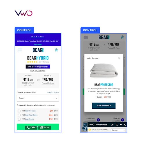
Bear Mattress, a leading seller of top-quality sleep wellness products, strategically aimed to boost revenue by optimizing the ‘Cross-sell Flow’ on the mattress product detail pages of their website.
Observations
After a thorough qualitative analysis, key observations revealed some challenges on Bear Mattress’s product detail pages: Minimal visitor interaction with the ‘Frequently bought with mattress’ section, less clicks on cross-sell products, missing images for ‘Frequently bought’ items, and lack of customer-centric appeal in the copy. The team believed that these issues hindered additional purchases by visitors.
Test
Prompt action was essential to address these challenges. In the optimized variation, the team incorporated a thumbnail image alongside product items, made the copy more visitor-centric, and redesigned offerings. For instance, the Bear frame was exclusively shown to customers who added a foundation to their cart. A subtle nudge was introduced for visitors not interested in additional products, encouraging them to explore the cross-sell items.
The redesigned cross-sell layout proved to be a big success, leading to a 24.18% increase in purchases and a 16.21% boost in revenue.
Bear Mattress maximized the impact of their conversion rate optimization program by following an end-to-end process. They initiated the journey with thorough research, meticulously studied visitor behavior, and identified challenges on their product pages. Next, they planned a strategic roadmap, outlining areas for improvement. Their data-backed hypotheses guided the design changes, such as adding images and refining copy.

Want to explore some other ways to organically cross-sell and upsell in your website’s checkout page for more sales? Read our blog to get some proven ideas to try on your website.
2. Archive Social streamlined the visitor experience, resulting in a 101.68% increase in click-through rate
Goal
ArchiveSocial, a SaaS-based social media archiving solution, focused on enhancing two key performance indicators—lead generation and conversions, through their homepage and ‘Request Demo’ page.
Observations
The team conducted a thorough analysis of their existing pages to formulate practical hypotheses for testing.
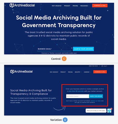
They noticed a problem with the email form on the homepage. It’s at the bottom of the banner and looks too similar to the rest of the page, failing to catch visitors’ eyeballs. Further, understanding the significance of the pricing page in the sales funnel, they put in effort to get the best results out of optimizing this stage.
Tests
Test 1 aimed to enhance the visibility of the primary CTA on the homepage. Giving the CTA button a distinct color and placing it prominently in the first fold increased visitor engagement. In fact, they turned to scrollmaps to further validate improved visitors’ interaction with the changed elements.
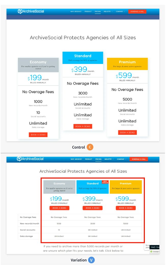
In Test 2, the focus shifted to improving clicks on CTAs across pricing plans, emphasizing the need to guide visitors seamlessly to the Thank You page. This involved highlighting the primary CTA and simplifying plan options on the pricing page to help them make informed decisions.
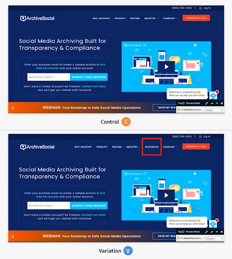
Test 3 introduced the hypothesis that enhancing the findability of the ‘Resources’ section by adding it to the top navigation would boost engagement. This would create an intuitive visitor flow towards this section.
Implementing a systematic, step-by-step approach led to success in all the tests, resulting in a 101.68% increase in click-through rate. ArchiveSocial’s commitment to comprehensive CRO testing and optimization made these substantial improvements possible.
Now, many businesses miss the difference between the click-through rate and landing page conversions, and often think they mean the same. But that’s not the case.
Conversion rate signifies the percentage of visitors taking a desired action, like making a purchase or clicking through a link or a button. Click-through rate measures the percentage of visitors clicking on a link or CTA out of those who view it. To understand where your focus should lie in these two scenarios, read our blog.
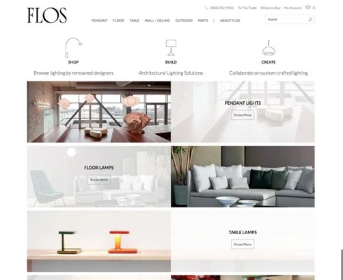
3. Flos optimized its website conversion funnel and increased the checkout rate by 125%
Goal
Flos USA faced a significant challenge—low checkout conversion rates on their website. Determined to address this issue, the Flos team embarked on a strategic and process-oriented optimization journey for their website.
Observations
Leveraging behavior analytics tools such as heatmaps, scrollmaps, and session recordings, they identified the pain points at each stage of the visitor journey.
From the homepage to the listing page, product page, cart page, and checkout—the team wanted to implement targeted enhancements. For instance, they wanted to improve the homepage layout for better site navigation, enhanced visibility, and streamlined visitor access to products. In the product listing, a similar approach was expected to improve navigation and product discovery.
Tests
Consequently, specific changes were made on the product page, such as updating the “Choose Finish” option to showcase color swatches. This adjustment reduced visitors’ confusion and encouraged them to add more items to the cart. Similarly, on the cart page, streamlining information and retaining a clear header with a link to the cart page helped visitors consume information.
Implementing these systematic changes based on visitor behavior yielded great results. Flos USA experienced a staggering 125% increase in checkout conversion rates, translating to an impressive 18X return on investment. This success underscores the importance of a data-driven and visitor-focused approach to the conversion rate optimization of a website.
Flos USA leveraged behavioral analytics to understand the pulse of their website visitors and introduce changes in the entire conversion funnel of their website. With VWO Insights – Web’s improved capabilities, you too can derive golden nuggets of visitor behavior insights and make the right optimization decisions. Take a free trial now.
Analyze your eCommerce website for free
4. POSist, through iterative testing, increased demo requests by 52%
Goal
POSist, a leading SaaS provider in the niche restaurant industry, wanted to increase the number of sign-ups for their platform demo.
Observations
The POSist marketing team wanted to minimize the drop-off rate on critical pages like the homepage and the ‘Contact Us’ page. They also resorted to visitor behavioral analytics to complement quantitative data with qualitative research.
Tests
In test 1, the team decided to shorten the homepage scroll length based on the insights gathered from visitor behavior research. They believed that by cutting out less important parts with low visitor interaction, they could keep visitors engaged and prevent them from leaving the website. The result was a streamlined homepage, rich in key information.
Building on this success, test 2 saw the integration of prominent customer logos, testimonials, and a dedicated section, “Why POSist?” on the homepage. They made these improvements to make the platform more relevant and appealing to visitors.
Shifting attention to the ‘Contact Us’ page, the team delved into form analytics, pinpointing areas of friction. Their hypothesis—narrowing the form width, talking about benefits, and integrating trust signals like logos and testimonials—could improve the sign-up conversion rate. Efforts were also directed at addressing exit points on the contact page, further refining the visitor experience.
The meticulous optimizations led to a remarkable 52% increase in demo requests. This case study shows that understanding visitor behavior not only informs strategic decisions but also helps improve the overall conversion rate.
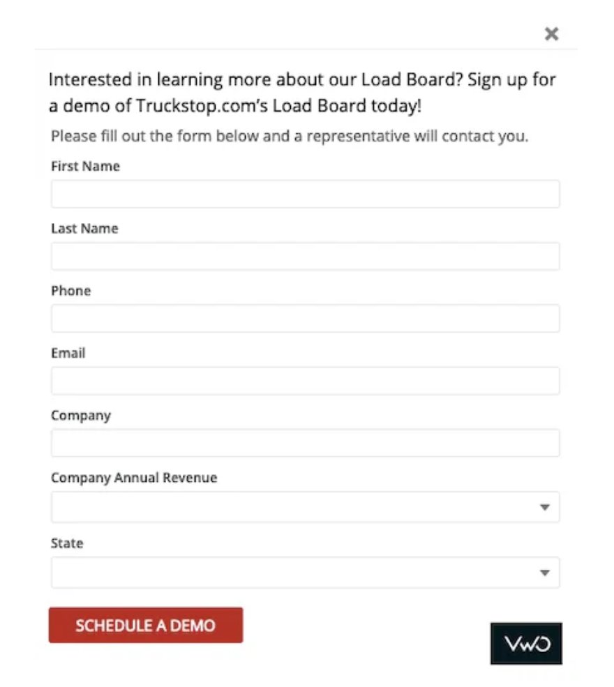
5. Truckstop followed a structured CRO program and increased demo requests by 26%
Goal
Truckstop.com, with 400+ partners across 7 global locations, was dedicated to empowering truck drivers and freight partners for business growth.
Their overarching goal was to see a double-digit revenue increase. Hence, Truckstop.com executed two impactful campaigns focused on generating more Marketing Qualified Leads (MQLs) through increased demo requests.
Observations
What set these campaigns apart was the extensive use of session recording capabilities to gain insights into visitor behavior on their website. Analyzing over 1000 recordings, they tailored each campaign for maximum impact.
Tests
The experimentation team noticed a gap on the initial page that lacked a prominent demo request form. To address this, they decided to test a pop-up demo request form on their broker load board page for campaign 1. For campaign 2, the team extended the test to their carrier’s load board page. Both tests were successful, contributing to a 26% increase in demo requests.
Executing a structured conversion rate optimization program involves crucial steps like visitor research, hypothesis formulation, prioritization, testing, deployment, and extracting insights from concluded tests. Truckstop.com serves as a great example of effective CRO evangelism, emphasizing that in the realm of optimization, only data holds sway.

Do you want more tips on improving demo and free-trial forms to increase conversions? In one of our blogs, we discussed some proven tactics that you can benefit from reading and implementing on your website landing page.
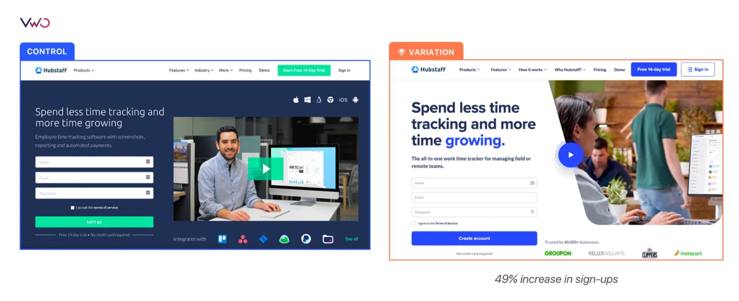
6. HubStaff’s homepage redesign test increased the visitor-to-trial conversion by 49%
Goal
Hubstaff, a time tracking and project management software for companies with expanding remote, in-office, and field teams, wanted to revamp its online presence. While the team made minor modifications to their previous homepage, they decided on a complete overhaul this time. Given that traffic to the Hubstaff homepage directly funnels into trials and paid plans, emphasizing SEO best practices became a priority to attract the right organic traffic.
Observations
As the home page played a crucial role in conversions, they delved into visitor behavior through heatmap analysis to identify where visitors encountered friction, which automatically became targets for improvement. The insights gained from visitor behavior motivated the team to strategically organize copy and visuals to highlight key features on the homepage.
Tests
Hubstaff went for a split URL test on an entirely new page. They meticulously tracked multiple metrics, with visitor-to-trial conversion as the primary one. The results were impressive, showing a 49% increase in the visitor-to-trial conversion rate.
The team delved deeper into research using additional analytics tools, confirming that the redesign did not impact paid subscriptions. This case study once again highlights that success in conversion rate optimization testing hinges on a step-by-step approach—understanding goals, researching visitor behavior, deciding on the test to run, and then analyzing the results.
Revamping a website doesn’t assure increased conversions. In reality, it’s a decision laden with risk and potential consequences. We recommend watching this webinar to gain a clearer understanding of what you might encounter and how you can overcome a website redesign failure.

7. Paltalk optimized visitor experiences and increased Average Revenue Per User by 57%
Goal
Paltalk, a US-based B2C video chat service, wanted to optimize its website for increased revenue. The team observed that the subscription page lacked a visitor-friendly display of options, hindering easy comparison of features. Two prominent issues were the absence of social proof and a less prominent CTA.
Observations
With eight different virtual credit packs available, visitors often struggled to choose the most suitable option. These virtual credits facilitated exchanging virtual gifts among the players within the Paltalk community. Through an analysis of heatmaps and session recordings, it was observed that visitors encountered challenges in effectively navigating Virtual Gifts (VGifts) categories.
Tests
For Test 1, they believed that showing all subscription options in a table above the fold, along with features, would make it easier to compare. Further, adding a few customer testimonials was expected to provide social proof. The variation won with a 6.74% increase in successful purchases.
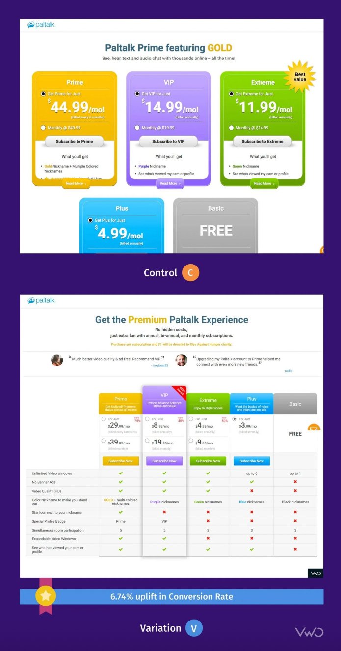
Test 2 aimed to increase Average Order Value (AOV) and overall revenue by incentivizing visitors to choose higher-value credit packs. The variation displayed a pop-up encouraging visitors to opt for pricier packs, leading to a winning revenue uplift of USD 3,900.
With the goal of improving Average Revenue Per User (ARPU), test 3 focused on improving Virtual Gifts visibility. By introducing a cleaner, distraction-free design with a left-hand drop-down menu, showcasing all categories and individual gifts, the variation achieved an 11.32% rise in conversion rates and an impressive 57.32% increase in ARPU. This resulted in a substantial revenue uplift of around USD 21,000.
Keen to improve the metrics that matter for your online store? Watch conversion rate optimization expert Jacob Elbaum share strategies to improve business metrics, such as average order value, and deliver great experiences to your site visitors.

8. IMB Bank optimized its loan application form, boosting conversions by 87%
Goal
IMB Bank used VWO to establish a systematic optimization process for its website. To begin with, they leveraged behavioral analytics tools like heatmaps to identify underperforming areas on its website. They then planned to execute sequential tests to address these identified pain points.
Observations
Upon discovering that approximately 37% of users were abandoning the first page of their personal loan application form, the team wanted to focus on this page first.
Further, funnel analysis revealed that about 84% of visitors began to fill the form but abandoned it before finishing. This strongly suggested a high intent, as visitors were starting the form-filling process. Consequently, IMB Bank recognized the need for a solution to prevent visitor drop-offs.
Tests
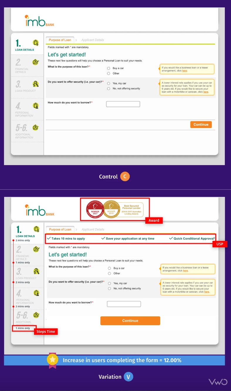
In test 1, the team optimized the loan application form by introducing USPs, highlighting awards, and incorporating the time required to complete each step, among other steps.
In test 2, an exit pop-up was shown, thinking it’d stop visitors from dropping off. However, this addition did not significantly impact form completions. Interestingly, there was a significant increase in the percentage of visitors saving the form. As a result, there was a 9% increase in users completing the form, and a 52% increase in users successfully saving the application.

Now you must understand simply adding an exit pop-up to your landing pages doesn’t help. In digital marketing, it is critical to see through loopholes in your own website and understand why potential customers bounce. Read our blog to know how to fix a high bounce rate and increase conversions.
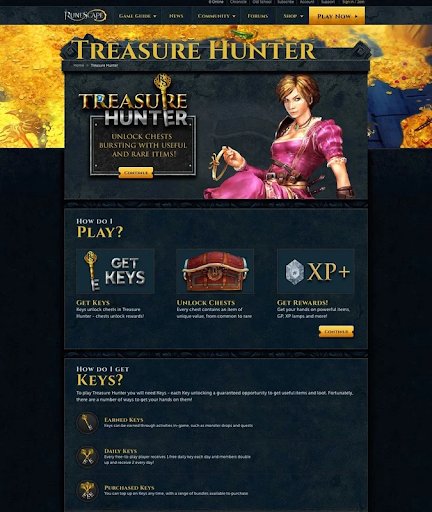
9. RunScape implemented a structured CRO program, increasing purchases by 10%
Goal
RuneScape is a multiplayer online role-playing game, and its CRO team focused on optimizing the key pages close to the payment gateway for increasing revenue.
Observations
The Treasure Hunter page was identified as one of the pages that could be optimized with minimal effort for maximum results. The team turned to heatmap analysis of the page, revealing visitors clicking the non-clickable ‘Get Keys’ section. This indicated a desire for direct key access or more information.
Digging deeper, the team analyzed session recordings, finding visitors from the Payment page returning to the Treasure Hunter page. It became clear that the Treasure Hunter page lacked sufficient information on treasure chest packages to help visitors proceed in their journey on the website.
Tests
Therefore, the team hypothesized that adding details on the Treasure Hunter page would boost conversions on the Payment page. A test was run, and the variation emerged as the winner, contributing to nearly a 10 percent increase in purchases compared to the original page.

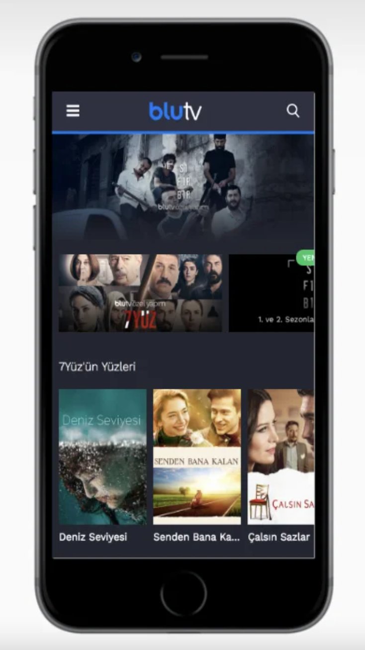
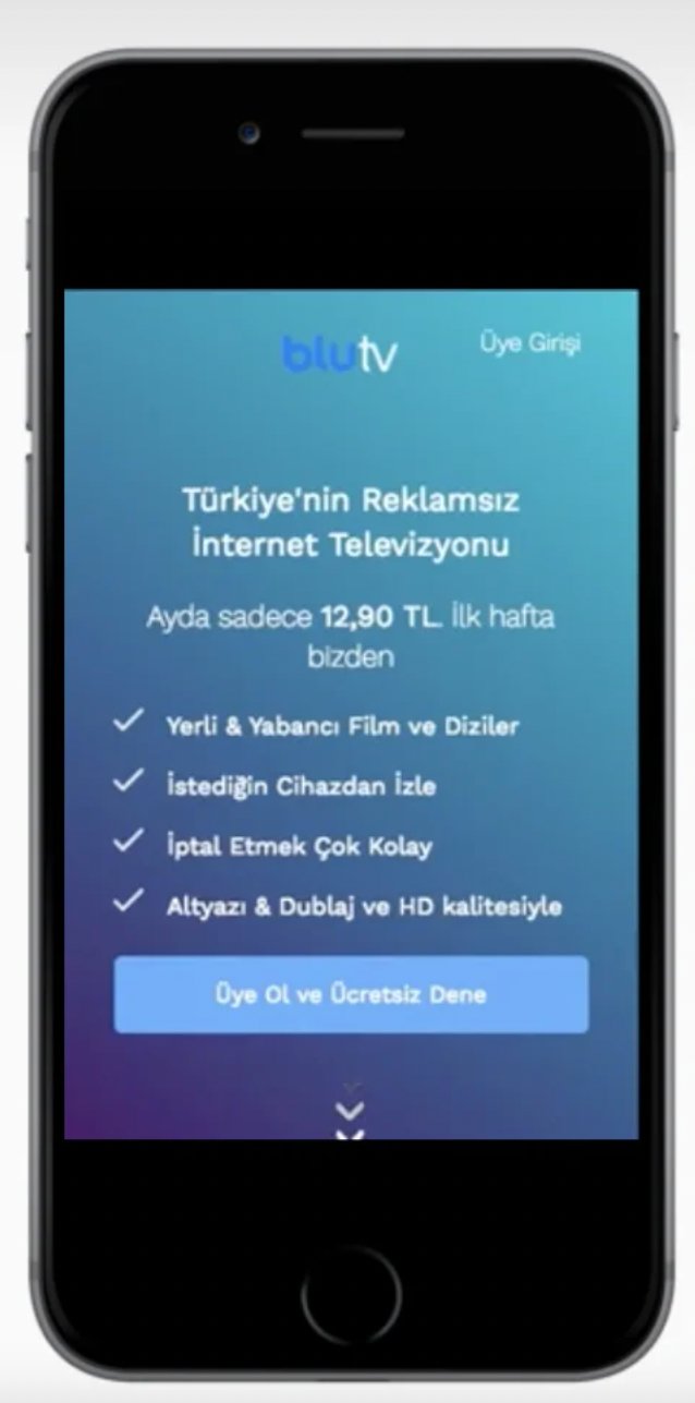
10. BluTv improved experiences for mobile visitors and increased sign-ups by 42%
Goal
BluTV hired Hype, a certified performance marketing agency and VWO Partner, to optimize website conversions. Their main goal was to boost sign-ups for the paid subscription trial.
Observations
Upon a thorough analysis of quantitative data from Google Analytics, the Hype team identified a fall in the conversion rate for mobile visitors compared to the website average. Further, heatmap analyses revealed the mobile homepage catered better to returning visitors than new visitors.
Tests
The team embarked on a comprehensive redesign strategy. The header section was streamlined to retain only the logo and sign-in link. BluTV’s key value proposition was strategically featured, pricing information seamlessly integrated into the hero section, and animated elements introduced for a smoother scrolling experience. Popular content from BluTV’s library was shown in the following section, and an FAQs section was incorporated to address common queries.
Hype executed a split URL test to compare the new homepage with the older version, resulting in a 42% increase in sign-ups. This success story underscores the impact of an end-to-end CRO-focused strategic redesign in enhancing user engagement and conversion rates.
Testing a pricing page is a risky affair and is different from merely increasing conversions. Set the price too low, and you suffer a loss; set the price too high, and potential customers may not proceed in the sales funnel. Given the risks involved, you should analyze every decision, including whether to run just an A/B test or a split test in this scenario.
What should you consider to leverage CRO case studies the right way?
Now that you’ve read the CRO case studies, you might be tempted to try them on your website right away. But hold on. You can’t and shouldn’t blindly follow what other brands are doing. Case studies or examples of any sort are there to inspire you to strategize your own plan.
Remember, your business is different from another. How your visitors behave on your website may differ from visitor behavior on another website. If you blindly follow others, you may fall short of solving your own website issues. Here are some tips to leverage case studies effectively:
Understand the featured company
Before applying insights from CRO case studies, thoroughly examine the featured company. Check if it operates in your industry, understand its audience, and identify its goals—whether it aims for increased revenue, higher CTR, or improved engagement.
Compare these goals with yours. If they align, the strategies might fit well for your business. If not, consider exploring alternative approaches. This foundational understanding helps tailor CRO strategies to suit your specific business context.
Learn from successes and failures
Learn from both the successes and failures in the case study. Figure out why some strategies worked and why others failed. This helps you use successful tactics and avoid potential loopholes in your own efforts. Remember, even if a case study shows the variation as a winner, it doesn’t guarantee the same outcome for your website; it depends on how your website visitors respond to the test.
Similarly, a lost test shouldn’t demotivate you. If you identify a gap on your website that can be addressed by a certain test, go ahead and conduct it, letting the data guide your decisions.
Evaluate methodologies for suitability
Scrutinize the methods and tools used by a business in a case study. For instance, if the company praises a specific A/B testing tool, understand why—it might be suitable for their ambitious testing needs. If their requirements align with yours, you might consider trying the same tool.
Pay attention to any additional steps they take, like checking heatmaps of test variations. You can integrate such steps into your strategy, validating changes with qualitative data. Use your judgment to pick the best practices and assess whether the tools, techniques, and methodologies employed are suitable for your website and business.
Record your own test results
Recording your results allows you to benchmark your performance against industry standards and, more importantly, against the strategies presented in case studies. This comparison helps you compare the effectiveness of your implemented tactics against the successful examples.
Look for the latest trends
Imagine you’ve been following industry trends and noticed a shift in consumer preference towards using the voice search feature in mobile shopping apps. Recognizing this trend, you decide to explore CRO case studies focused on implementing voice search. This way, you can learn how other businesses have already done it and be cautious about what tests to run in your mobile app.
If a case study doesn’t cover the latest trends but you see an opportunity, go ahead and implement it in your test. Let’s say you see an opportunity to try hyper-personalization. You can implement it even though the featured business didn’t do so, and see how your app users respond. Data will help you make the final call anyway, so why not give it a shot and see where it goes?
Conclusion
In wrapping up, we hope you found these case studies both informative and engaging. What makes these brands stand out isn’t just diving into Conversion Rate Optimization (CRO), but their dedication to weaving experimentation seamlessly into their decision-making process. Playing a pivotal role in this journey, VWO has been helping these brands establish solid experimentation processes for sustainable business growth.
Listen to CRO expert Manuel Da Costa talk about building an experimentation ecosystem:
Ready to kickstart your own CRO journey? Look no further! Take a free trial of VWO now and tap into its integrated behavior analytics and testing capabilities. It’s the tool you need to supercharge your business strategy and pave the way for optimal results.


