
Follow us and stay on top of everything CRO
Read summarized version with
What is a website heatmap?
A website heatmap is a data visualization tool that helps businesses understand how particular pages on their website are performing.
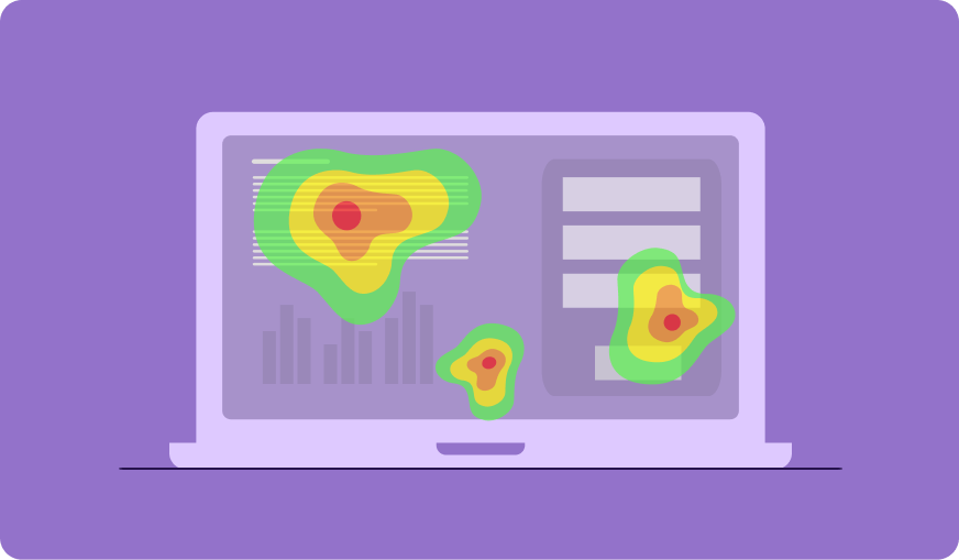
In simpler terms, a website heatmap is a graphical representation of data in the form of a diagram or a map, with different colors denoting different data sets and values
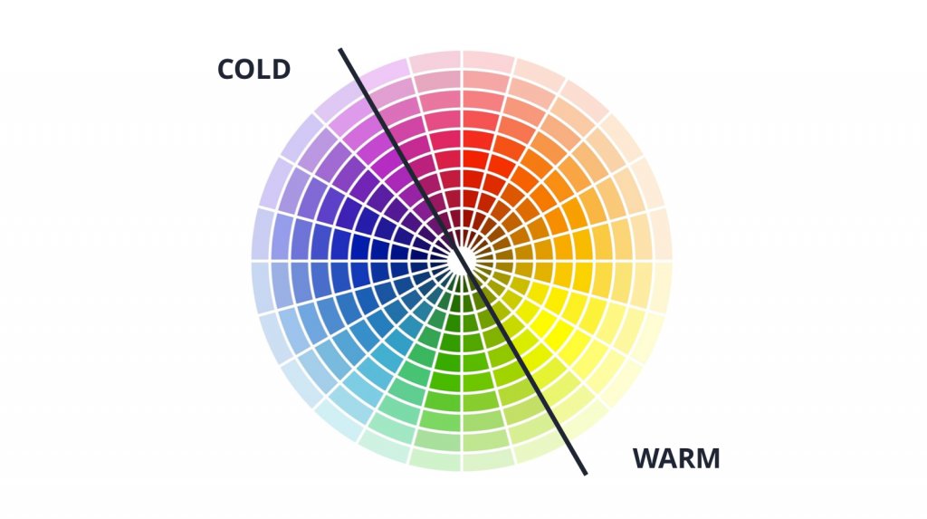
Website heatmaps use a warm-to-cold color scheme to show a web page’s performance, with the warmest color indicating the highest visitor engagement and the coolest indicating the lowest visitor engagement.
It uses colors to indicate the intensity of visitor engagement on different sections of a page.
If you want to figure out which section of a webpage has the highest visitor engagement, where visitors are clicking the most, if or not visitors are clicking on the CTA, whether they reach the bottom of the fold, and many such visitor behavior insights, a website heatmap is the way to go.
Website heatmaps gather all the data on how visitors behave on your webpage and help you make informed optimization decisions. They eliminate the confusion caused by numbers and represent data in an easy-to-understand manner.
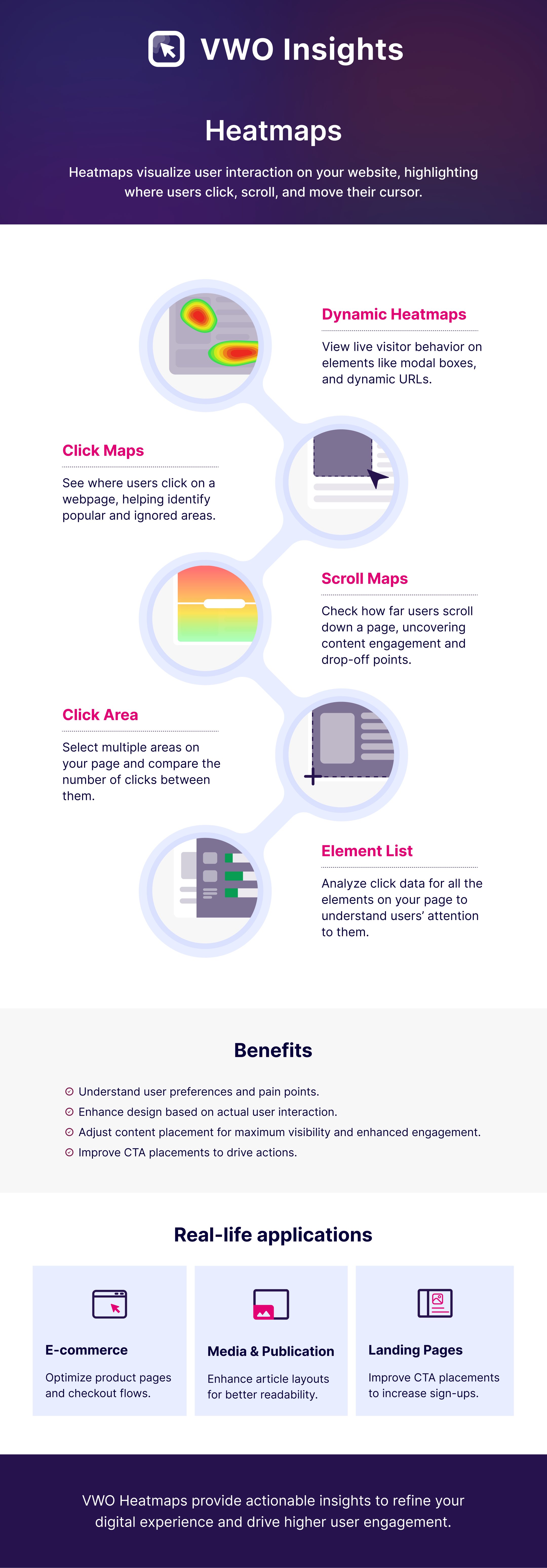
Types of website heatmaps
There are 5 main types of website heatmaps: Heatmap, Clickmap, Scrollmap, Mouse Tracking Heatmap, and Eye-Tracking Heatmap.
Heatmap
Heatmaps help you gather visitor behavior insights so that you can use that data to customize your website to suit visitors’ expectations. It visually represents how various pages on your website are performing in terms of delivering a good user experience and answering your visitors’ queries. Use VWO’s AI-powered free heatmap tool to understand how visitors are likely to engage with your page’s elements.
Clickmap
Clickmaps indicate which parts of your webpage are clicked on the least and most. Apart from visually representing which elements of your web page are most popular, clickmaps also help identify navigational gaps on your webpage.
Using clickmaps, you can track clicks on:
- Images: Track clicks on the images on your webpage to see which ones visitors are clicking on most, and then add relevant links to them as well as place them according to your visitors’ expectations. Imagine a scenario where, when browsing through your eCommerce store, visitors increasingly clicked on the non-hyperlinked product images expecting to be redirected to a page with product descriptions, but instead, the image took them nowhere because it was not linked to any other page. This may lead to confusion and create friction. With the help of clickmaps, you can identify such patterns and make data-backed changes.
- Links: Use clickmaps to identify where visitors expect certain links to be and place those links according to your visitors’ expectations. Let’s say, for instance, after setting up clickmaps on one of your pages and running it for a set period of time, you find that after browsing through different pages, to go back to the homepage, your visitors mostly clicked on a section or element that does not have any links to the homepage. This indicates that your page’s structure does not match your visitors’ expectations, and it is time to change it.
- CTA: Use clickmaps to see if visitors are clicking on the main CTA or are getting distracted by other elements. Identify all such distractions and place your CTA on the most popular part of your webpage.
- Navigation: Check your website’s navigability using clickmaps and improve user experience (UX). For instance, on clicking the ‘continue’ button on the cart page, your visitors may expect to go back to the exact product page they were on before adding a product to the cart. But contrary to your visitors’ expectations, the ‘continue’ button takes them to the next step in the checkout process. This means that your website’s navigation does not match your visitors’ expectations and needs to be modified to match them.
Scrollmap
Scrollmap is a visual representation of your visitors’ scrolling behavior. It indicates how far users scroll down a page as well as which sections they spend the most time in. It tells you the number of visitors who scrolled through to the bottom of a page, visitors who scrolled through 50% of a page but not 100%, or where most visitors abandoned a page, etc.
Tip: Based on the scrollmap report, place the most critical elements of the web page on sections where visitors spend the most time.
Scrollmaps do not just indicate data with various colors but also reflect percentages that are given to make you aware of the number of users who moved further down on your webpage and those who didn’t. They help identify important content that is being ignored.
Use scrollmaps to:
- Calculate the ideal length of a webpage beyond which visitors don’t scroll down, identify whether or not visitors reach the content below the fold, and spot false floor or false bottom.
- Identify where visitors are spending the most time and where they are losing interest.
- Identify the most suitable area where key information or elements, like CTAs, should be placed.

Mouse tracking heatmap
Mouse Tracking Heatmap (also commonly known as Hover Maps, Attention Maps, Move Maps) indicates areas over which visitors hover their cursor the most.
You can use mouse tracking heatmaps to:
- Identify which sections visitors hang around the most in and then place important content, primary CTA, necessary advertisements, and so on in those sections.
- Gather insights on where a visitor is looking while browsing through your web page by analyzing where their mouse pauses and where they hover past at a faster speed.
One interesting fact is that visitors often tend to hover over areas which they either find engaging and interesting or they are taking longer to understand because the messaging may be confusing or difficult to understand. This is why mouse tracking heatmaps can help identify areas on which visitors are spending the most and least time.
However, it is important to remember that the above may not always be true, especially for online news sites. This is because of something called ‘parkers’. Parkers are visitors who leave their cursor in one spot irrespective of what they are reading, which section they are in, or if they are reading at all. Overlooking the possibility of parkers affecting your mouse tracking heatmap data often increases the chances of data pollution. One way out of this is segmenting on the basis of time spent.
For instance, let’s assume that the article on your news site with the highest traffic has a read time of 6 minutes. Giving visitors an extra buffer of 4 minutes you can segment visitors to include only those users who spend less than 10 minutes on the page. This way, you not only include data of only those visitors and users who actually read the article in your analysis but also eliminate the risk of data pollution due to the presence of parkers.
Eye-tracking heatmap
Mouse tracking heatmap is often confused with eye-tracking heatmap. Based on fixation length and the frequency of how many times an image is looked at by a visitor, eye-tracking heatmaps represent the most attractive elements of a page for visitors in the form of “hot” and “cold” spots by tracking the movement of a visitor’s eyeballs.
Humans have a tendency to favor sight over any other sense and this is exactly what can come in handy for many businesses. For example, an eCommerce store can benefit a lot if they can figure out what visitors are looking at most when they come on their website. Knowing what sections catch the eye of a visitor most and identifying elements that can benefit from being placed in sections where eye interaction is most can help businesses make data-backed changes to their website that match visitor expectations. Eye-tracking heatmaps are especially useful to ascertain how engaging certain images on a website are.
You can use eye-tracking heatmaps to:
- Identify where visitors are looking at most on your pages for information.
- Identify if visitors’ gaze is being distracted by any element (visual or textual) on the page.
- Track visitors’ gaze pattern to place all important content and images in the most attention-grabbing sections of the page.
Why should you use website heatmap?
Traditional or quantitative user analytics tools only tell you how many visitors came to your page and how many converted but fail to answer exactly what happened during those two steps, which led to the resultant actions. Here’s where understanding the quality of those interactions comes into play. Say, an eCommerce store sees about a thousand new visitors a day, with about 20 new customers buying something. For the store owner, in order to understand why the remaining 980 visitors did not convert, they would need to know all the various reasons that led to them leaving the store without making any purchases. Reasons can be, not being able to find the ‘Add to cart’ button or not being able to find the shipping information or ‘spending too much time creating the guest account for checkout’ and so on. Such information can be easily discovered using qualitative analytics tools like heatmaps. Heatmap is a gift that keeps on giving. Heatmap is one of the most powerful and efficient diagnostic tools with which you can uncover a plethora of insights on how visitors interact with your web pages and use those insights to improve your website’s engagement and design for it a smarter UI.
- Measure website performance: With the varied heatmap color hues depicting different performance levels, heatmaps instantly highlights major issues on your website. With clickmaps tracking visitors’ clicking pattern, scrollmaps determining the optimal page length and mouse tracking maps telling where a visitor is hovering while browsing through your web page, you can easily ascertain how engaging your website is and how good a job it is doing in keeping visitors interested in your brand.
- Simplify numeric data: As mentioned above, heatmaps compliment the hypothesis created by numbers and represent data in an easy-to-understand manner. Based on the color scheme it uses, you can easily ascertain which parts of your webpage are performing well, which sections have scope for improvement and which sections need a complete redesign.
For example, let’s say you own an eCommerce store, and you want to set-up a heatmap on your product page to see how well it is doing in terms of answering all your visitors’ questions. After choosing a sample size of 3000 visitors and a sample period of 2 weeks, you kick start the heatmap. After the completion of the sample period, you get a graphical representation of your product page’s performance on a single screen. Just look at the color concentration and further analyze each section’s performance and engagement potential. If you were to do the same exercise using data from sources like GA and tools like Excel, it would take more than double the time to sort all the data indicating each section’s performance. Plus, manually entering every numerical data also increases the chances of mistakes and data corruption. - Read your visitors’ mind: You can redesign your entire website and still not improve its performance if you do not consider what your visitors expect to find where. Heatmaps help you make assured changes that match your visitors’ expectations. The best thing that heatmaps can do is tell you exactly how visitors behave on your website and how they expect things to be. Put simply, website heatmaps help you read each of your visitors’ minds and make changes accordingly.
You may argue that even forms and surveys can serve this purpose. But think about it for a second. Reflect back on all the feedback forms and surveys that you have filled through your life. Inevitably, some bias always finds its way into the process of filling forms and surveys, especially when answering personal questions, questions on topics that you have been associated with for a long time, and so on. Heatmap eliminates this bias as your visitors come to your website looking for certain things and with the expectation of finding the things they are looking for in particular places. These 2 parameters combine and shape your visitors’ browsing pattern. And heatmaps track exactly this and gives you meaningful and actionable insights. - Optimize your website’s conversion rate: All the above benefits contribute to one large exercise of optimizing your website to the best and smartest possible version. Every visitor tracked on a heatmap means added actionable insights for optimizing your website.
Let us take an example to understand how heatmaps contribute to overall website optimization. For any online business, the homepage is where every visitor’s journey begins (unless they land directly on a product or offer page via external links, paid ads and so on). Whether they go on to purchase a product, subscribe to a newsletter, fill a lead form, or drop off without converting, their entire journey begins from the homepage. Let’s assume that you own an eCommerce store, and you want to see how visitors are reacting to your homepage. So you set-up a heatmap on the homepage for a sample period of 2 weeks and sample traffic of 3000 new visitors. The heatmap successfully runs for the sample period and gives you tons of insights on visitor behavior. After looking at the heatmap thus generated, you notice that there are a few sections of your homepage that attracted a lot of visitors. These were the sections that were at the top of the page: the hero image, the title of the homepage, and product reviews. What you also notice is that not a lot of visitors were scrolling to the bottom of the homepage and that is where you placed your homepage’s primary CTA – ‘Subscribe to our monthly style guide’.
Now that you have all these insights, are they of any use apart from letting you know what visitors think about your website? ABSOLUTELY YES!
-Enter Conversion Rate Optimization–
Now that you know that the hero image, the title of the homepage, and product reviews gained the most attention, you can work on making these sections better and also add other important information in these sections. You can also change your homepage’s primary CTA’s location and bring it above the fold and in a section that gets maximum attention. What these changes will do is that they will turn your homepage into a version that matches your visitors’ expectations, improve your website’s user experience (UX) and therefore help increase your website’s conversion rate.
Heatmap is part of a wider program namely, Conversion Rate Optimization (CRO). Within CRO, heatmaps are qualitative research tools that give insights on visitor behavior based on which you make changes to your website. You set up heatmaps, analyze the results, create variations based on them, test the variation(s) against the original, and deploy the winning version. You can make small changes like changing CTA placement, page length, as well as big changes like redesigning particular pages, complete website redesigning, and so on with the help of the insights generated by heatmaps.
| Without Website Heatmap | With Website Heatmap |
| Remain clueless of how visitors are engaging with your web pages. | Track in real-time how visitors are engaging with your web pages. |
| Make changes on your website based on your gut feelings and guesses. | Make data-backed changes using visitor behavior data generated by a website heatmap. |
| Settle for the only information that visitors are not converting | Get insights on why visitors did not covert. |
| No insights on the browsing pattern and expectations of specific segments of your audience. | Slice and dice, and dive deep into the browsing pattern of specific segments of your audience. |
| Make design changes based on common industry best practices which may or may not work for your website. | Make design changes for better user experience, and smarter user interface based on direct visitor behavior insights. |
Advanced heatmap insights to discover conversion opportunities
All types of website heatmaps discussed above can give you insights about visitor behavior on a web page. However, combining website heatmaps with other CRO tools provides a broad range of insight for running a successful CRO campaign.
While Google analytics provides you with all the relevant numbers on a dashboard, Google’s Page Analytics tool enables you to visualize the real-time click data on a web page in terms of percentages by generating a GA heatmap. It bridges the gap between the quantitative and qualitative analysis of your visitor data. This feature is limited only to click data.
Website heatmaps feed data-backed insights into iterative A/B testing. A/B testing tools such as VWO enable heatmaps on the A/B test variations to validate the testing hypothesis. This seamless communication of two CRO tools helps you make crucial business decisions based on testing.
Similarly, session recordings are another useful CRO tool that renders insights into individual user experience on a website. By combining session recordings with heatmaps, you can visualize where the visitors are clicking or not clicking, and how they are interacting with your website elements.
On-page surveys enable you to gather visitor insights to improve the UX of your webpage by asking visitors the relevant questions to assess the cognitive load and friction points on your website. For example, heatmaps running on a web page can also help you identify design issues of your survey forms. Utilizing heatmaps with surveys enables you to gauge visitor behavior on your website and therefore, allows you to ask them about their hesitations via surveys.
How does a website heatmap work?
Now that you know the benefits of using heatmaps, surely you will have tons of ideas and hypotheses that you want validated through visitor behavior data. This section will equip you with step-by-step knowledge on how you can set up website heatmaps on any of your web pages and then validate your hypotheses.
- Setting up goal/s: Whenever you build a web page, it always has an end goal. And every business faces obstacles on the path to their goal. Before deciding to use a website heatmap, you have to identify a problem area to solve for which you need visitor behavior data. Once you identify the problem area, you can decide the type of heatmap that you want to use. Another important reason for which you should always set a goal at the start of your heat mapping exercise is that your analysis should flow from your goals.
For example, if you are a B2B Saas business, then maybe you would want to use website heatmap to identify distractions on your website’s sign-up page. If you are a news site, you may want to use scrollmaps to find the optimum length your articles should be. Or if you are an eCommerce business, you may want to use clickmaps to find out where visitors are clicking most on your homepage. After identifying the problem area and setting a goal, the process of setting up website heatmaps begins. - Choosing the right tool: The second step to using website heatmap is choosing a tool that has the right features to help answer all your questions. With the demand for website heatmaps rising, many heatmapping tools have also surfaced. And not all of them offer the same capabilities. The key to finding the best tool is to ensure that you choose one that allows you to customize your sample traffic, to segment users basis current business demands, and enables you to freely deep dive into the data procured while at the same time fitting your budget. Refer to websites like G2Crowd, and TrustRadius which rank business software based on verified user reviews.
- Setting up a heatmap: The third step involves setting up the finalized tool to start collecting data. First, you need to finalize the pages on which you want the heatmap to be plotted. Plotting it on the entire website will not make sense because you will only end up being swamped by tons of useless data.
Choose pages which: get a good amount of traffic, are business-critical and are diverse enough for analysis.
For instance, for an eCommerce website, it would be beneficial to either choose 1 business-critical page (like homepage, cart page, product page, payment page, and so on) or a mix of homepage, category page, and product page whose performance have a bearing on each other, rather than plotting heatmaps on all the pages of the website.
Second, you need to choose the type of heatmap that you want to use for your visitor behavior research. The type of heatmap you choose will always depend on the goal/s you set:
| Goal | Type of website heatmap |
| Identifying the ideal length of a webpage | Scrollmap |
| Identifying which sections visitors hover around the most and least | Mouse Tracking Heatmap |
| Identifying hyperlinking opportunities that visitors anticipate | Clickmap |
| Testing the website’s navigability | Heatmap and Clickmap |
| Identifying friction areas in lead collection forms, sign-up forms, and the likes | Clickmap and Mouse Tracking Heatmap |
| Identifying the ideal length of content pieces | Scrollmap |
| Discovering if critical elements like Call-to-action buttons (CTA) are getting enough attention | Clickmap and Mouse Tracking |
| Identifying if primary CTA of a page is located in the most popular sections or not | Heatmap and Clickmap |
| Identifying if images on your webpage are distracting visitors from converting | Eye-Tracking Heatmap, Clickmap, and Heatmap |
Once you finalize the pages you want insights on, move on to setting up heatmaps on them. Every tool will ask you to install a smart code on the page you want to analyze so a heatmap can be plotted on it. This smart code enables the tool to start tracking clicks and movements.
However, just setting up the tool is not enough to gather insightful heatmap data. To gather meaningful data, you need to set your sample size and sample period, which is representative of your entire traffic otherwise, the data collected will only represent half of the ground reality. Your sample size should include visitors of every possible segment that can affect your website’s performance. Ideally, your sample period should cover all the days of the week so it can track should also be set keeping in mind external elements like sale, holidays, and so on that can affect data collection.
Once you are done with the first 3 steps, start the website heatmap so it can gather as much insightful data as possible to be used by you.
When setting up website heatmap on your web pages, it is important that you inform visitors about the cookies that track anonymized click behavior for website performance analysis and take their consent. You do not want to and should not violate any regulations that are set to safeguard your audiences’ information and privacy.
- Analyzing the heatmap data: The fourth step involves analyzing the collected data. This is the most crucial step in the entire process of how website heatmaps work. The most common problem that most marketers face when analyzing a website heatmap is that they don’t know where to start.
The analysis of heatmap data differs based on the type of website heatmap you use:
Heatmap: Using a heatmap, you can get a basic direction about sections and elements on your page that get the most and least attention. You can use heatmaps to identify the most popular sections of a page, to identify distractions that are stopping visitors from clicking on the main CTA on your homepage, etc. It is easy to plot a heatmap but if your analysis of it is flawed, then it will fail to give you meaningful insights.
Let’s assume that you just redesigned the entire website. To see how visitors are reacting to it, you plot a heatmap onto its homepage. You fix a sample size of 1000 visitors and kick off data collection for a decided sample period. After the completion of the sample period, you get on with the task of analyzing the gathered data. After analysis, the data indicated that 500 visitors reacted positively to the new design and converted. So without conducting any further research, you deploy your new design with a 50% conversion rate as your final design.
The analysis is successful and over right? Wrong!!
Many marketers may stop their analysis of the heatmap as soon as they find out that the new design is driving 50% conversions. If you consider the high-level goal of finding out how visitors were reacting to the new website, then yes, the analysis is done. But to reap out every ounce of insight that your heatmap can provide, you should deep dive and ask ‘why’ – why did the other 50% of visitors not convert? what stood out for the 50% visitors who converted? and so on.
The best way to get the answers to such questions as above is by analyzing the data generated by a heatmap in terms of segments. Since you did not segment your sample visitors, you failed to notice that out of the 500 visitors who converted, 400 were new visitors, and 100 were return visitors. Had you segmented your sample into new and returning visitors, your website heatmap data would have shown you that while 80% of the new visitors reacted well to the new design and converted, only 20% of return visitors found the new design engaging.
Now that you have successfully identified that return visitors were not too happy with your website redesign, you can create a survey for them to find out what exactly was it that pushed them away from converting.
Such an in-depth understanding of visitors is only possible if you dive deep into the individual behavior of segments and personas during analysis. Segment visitors on a page based on people who arrive from a specific country, a specific device type, or specific referring domains, and so on.
Tip: Pair your website heatmap tool with other qualitative and/or quantitative research tools for deeper and reliable actionable insights.
Clickmap: Using a clickmap, you can track the number of clicks on each element or section on your webpage. Clickmaps also allow you to compare the clicks of one section with another, of one section with the entire page, and of one section with multiple others.
For a B2B Saas business, good quality leads are extremely crucial for survival. The most important source of these leads are forms: sign-up form, demo request form, gated content form, and so on. If you have two forms on the same page, clickmaps will help you track and compare the number of clicks each of them gets. If you have a form on one of your ad’s landing pages along with a video, you can use clickmaps to identify if the video is distracting visitors from filling the form by comparing the number of clicks on the two. Additionally, you could also use a video heatmap tool to understand how engaging that video, was for the distracted visitors.
Using clickmaps, you can track clicks on form fields to identify if there is any field in which visitors are clicking multiple times. Too many clicks on a form field may mean that your question is not clear, and that is why visitors are making so many mistakes in the same field. You can then use this insight to optimize your form.
One thing to remember when analyzing clickmap data for any goal is to not ignore dead area clicks. Too many dead clicks on a particular element mean that visitors may be expecting to get out of clicking there but are not. For instance, if there are too many dead clicks on the omnipresent hero image of your website, maybe, visitors are expecting to be taken to the homepage on clicking the hero image. This insight can help you add missing links in places your visitors expect them to be.
Scrollmap: If executed and analyzed correctly, scrollmaps can help you identify the ideal length that your webpage should be of. For instance, a publishing house’s key conversion metric may be increasing readership by getting more people to sign up for the monthly newsletter. Correctly analyzing scrollmaps can help you identify the best position for the newsletter sign-up form. Comparing the data gathered by two different sources always helps find new insights that the two sources individually could not unearth.
Your scrollmap can tell you that most visitors are scrolling through to the bottom of the page and even going below the fold where your main CTA is whereas a clickmap on the same page may tell you that the areas closer to the end of the page are receiving the least number of clicks. By combining and then analyzing the 2 data sets, you can identify the core problem: visitors are scrolling to the bottom of the page but not clicking in the area. This may indicate that the messaging on the bottom area is not clear enough to urge visitors to click on the CTA or the page was so long that by the time visitors reached the bottom of the page, they had already lost interest and did not even notice the CTA.
Based on your goal, you can build many hypotheses and use the scrollmap insights to pinpoint the exact problem.
Tip: Pair scrollmaps with other types of heatmaps to uncover hidden insights.
Mouse tracking heatmap: By tracking visitors’ mouse movement, mouse tracking heatmap helps you identify areas on which visitors hover over most and which areas receive the least attention. With in-depth analysis, mouse tracking heatmaps can help you collect, visualize, and understand collective visitor behavior. It records how visitors’ use their mouse, where they move, the path they take to reach where they did, and where they bounce off of your website. By analyzing visitors’ mouse movement, you can identify the best spot to place ads, irrelevant sections of a page, and also ascertain how visitors want your website’s structure and content to be, etc.
Let’s take a mouse tracking heatmap use case for the travel industry to better understand how it works. One way a mouse tracking heatmap can help improve your travel company’s conversion rate is by identifying the problem in your main booking form. By tracking down the form field on which visitors spend the most time or the field on reaching which they bounce off your website, and then analyzing that data, you can identify the problem area in those fields and optimize the booking form to reduce bounce rate and improve website conversions.
Mouse tracking heatmaps can also be useful to B2B SaaS businesses for figuring out leaks in their form flows and fixing them. Look at the following image:
As you can see, the mouse tracking heatmap plotted on the page above highlights all the areas in which visitors hover their mouse over the most and the least. Using such insights, you can track visitors’ browsing behavior on your form pages and the forms themselves and make necessary changes to reduce drop-offs
Eye-tracking heatmap: Like all other types of heatmaps, by using eye-tracking heatmaps, you can drastically improve your website’s user experience (UX) and user interface (UI). Look at the screenshot below:

This is an advertisement for one of Dolce & Gabbana fragrances featuring Scarlett Johansson (a leading Hollywood actor). You may look at the advertisement and go ‘Wow! This is the perfect way to advertise our new line of perfumes’. Now look at the eye-tracking heatmap that was generated on this ad:

Looking at the heatmap, you can clearly see that visitors are getting distracted by the face of the actor and not looking at the product which is advertised. Rather than adding value to the product and attracting more and more visitors to try out the product, the way the image and product are placed is overshadowing the product image in favor of the product endorser in the advertisement. Would you still replicate this ad design for your product? Without eye-tracking heatmaps, you will more often than not commit the mistake of replicating other designs and ideas without any data backing you or challenging it. Correct analysis of heatmap data provides actionable insights that help you understand exactly where your web pages are going wrong and also helps you make changes that match visitor expectations.
- Validating analysis through experimentation: As explained above, the way you analyze a heatmap will depend on the goal that you are tracking and the type of heatmap that is used. Once you are done with analyzing the plotted heatmap, make observations on how to reach your goals. Say for instance, after analyzing the clickmap plotted on your homepage, you observe that most visitors clicked on a text which is not even your page’s primary CTA. And the primary CTA of the page received less than 20% of the total clicks on the page. You infer from this that your CTA is located in an area that receives the least visitor attention, and therefore in order to improve conversions, you should relocate the CTA to the area where the text which is most clicked on is located.
After you set a course of action based on your heatmap data, you can validate the findings using multiple methods. One of the most common methods is A/B split testing. Once you decide that relocating the CTA to the area where the maximum clicked text is will help increase conversions, you can cross-check if your hypothesis is valid by A/B testing it against the original version.
Tip: Flawed analysis will lead to flawed conclusions.
How to create heatmaps?
While heatmaps can be created utilizing Google Sheets/Excel and Google Analytics for drilling down your data sets for visitor behavior insights, integrated tools such as VWO heatmaps allow you to create heatmaps to study the performance of your website in the direction of your CRO efforts. VWO heatmaps analyze millions of engagement data with a small code snippet called Smartcode inserted into your website, making it a robust behavioral visualization tool.
When should you use website heatmap?
When we talk about research, there are 2 kinds of research methods: Quantitative research and Qualitative research. Quantitative research tools like Google Analytics (GA) generate data that help you with numbers. Quantitative data tells you how many visitors came to your website, how much time they spent on it, how many visitors converted, how much is your website’s bounce rate, and so on. If you want concrete numerical facts about your website’s performance, quantitative data serves the purpose quite successfully.
What happens when you want to dig deeper than numbers? How will you understand why visitors spend as much time as they do on your website, why did ‘x’ number of visitors convert and others didn’t, why is your website’s bounce rate what it is? Quantitative data answers the ‘whats’ but not the ‘whys’. Only qualitative data can help you understand the reason why your website is performing the way it is.
Businesses from all industries alike strive to accomplish one thing in common: successfully understanding visitors and modifying their websites based on that understanding. Bottom line – you should use heatmaps almost all the time. No matter how big or small the requirement, heatmaps help you understand the ‘why’ behind visitor behavior. And, when you have VWO’s comprehensive experimentation suite by your side, the task becomes all the easier.
A B2B business may be stuck with low lead count, an eCommerce store may be struggling with a high cart-abandonment rate, a media and entertainment house may be struggling with a dwindling audience, a publishing house may be dealing with low readership and low subscription rate, and so on. The list of problems that businesses face is endless.
Heatmap comes in handy when your goal is to track your visitors’ interaction with a page. It shows the performance of each section on your webpage from different aspects. There is no set guideline as to when you should or should not use heatmaps. Heatmaps are so versatile that they can be used for any event or circumstance demanding answers from your visitors’ perspective. It is thus a good practice to use heatmaps for all your analysis regardless of the scope of the project. They are so intuitive and useful that you should run one even for the tiniest of insights needed when it comes to your visitors’ behavior. To understand better when to use heatmaps, let’s look at some specific instances when you can use heatmaps:
- Redesigning for more intuitive UI: Redesigning may range from minor design tweaks to complete design revamping. When you redesign something, you want the new version to be better than the last one. Additionally, redesigning a website can be tedious and expensive so, you would want to test and verify all your user research hypotheses before going live with a new site. One way to make sure you are on the right path when redesigning your website is by using heatmaps. As mentioned earlier, nothing can tell you about your visitors better than qualitative tools like a heatmap.
With the help of heatmaps, you can uncover how different elements on your page, such as content placement, color choice, CTA text, and the likes impact visitor behavior. Once you uncover these insights, you can use them to profitably redesign your website for more intuitive and smarter UI that would not only increase visitor engagement but also increase conversions. - Reducing bounce rate: Your website may be generating a lot of traffic but is its bounce rate equally high? Are you struggling to figure out what is making visitors bounce off your website without converting or without spending enough time? Let heatmaps do the job for you. Heatmaps help you identify distractions on your website, optimize your website’s layout and content placement, fix navigational gaps, and put the right type of content to increase visitor engagement thereby reducing bounce rate and increasing conversions.
- Fixing navigational gaps: Often, your website’s navigation may not match your visitors’ expectations because you structured it without knowing how visitors expect the navigation to be. This makes for bad user experience and creates friction when visitors fail to find what they are looking for exactly where they expect it to be. Use heatmaps to figure out how your visitors expect your website’s navigation to be like, and structure it accordingly to increase conversions.
- Increasing sign-ups: For a B2B Saas business, sign-ups (be it for a free demo, a free trial or a newsletter) serve as the ultimate source of leads. If visitors are not completing actions that add to the qualified leads pool, it may be time to take another look at your form and its placement.
For instance, let’s assume that you own a B2B Saas business and your main source of good leads is your free trial request form. Say, in your current homepage design, the free trial request form is placed at the bottom of the page. You look at your GA data and see that even after getting a good amount of traffic, your website’s conversion rate is less than impressive. So you decide to run a scrollmap on the page. After successfully completing the sample period, you look at the scrollmap hence generated and notice that more than half of your visitors never even found the free trial request form as they did not scroll to the bottom of the page. You can now run a heatmap to identify the most popular sections of your page and place the demo request form in one of those sections to drive maximum visitor engagement. - Running A/B tests: One instance when you can absolutely not pass the opportunity to use heatmaps is when planning to run A/B tests. A/B testing can help increase your conversion rate and prevent your business from struggling each day. But this only stands true when A/B testing is data-backed. All your A/B testing campaigns should be preceded by a good qualitative analysis of your visitors’ behavior on your website.
Your current design is failing to convert visitors, so you know you have to tweak it a little or change it completely. How will you decide if it needs a little tweak or a complete transformation? With the help of heatmaps. With heatmaps, you can unearth the reason behind your current design not driving the desired conversion. You can identify high as well as low attention spots and create a variation based on that for your A/B test.
Apart from the above business needs, different pages and elements of a website also have different use-cases for website heatmaps. They can be the most business-critical pages and elements that drive conversions for your business. Heatmap analysis for webpages also differs based on the goals you track. Let us look at how website heatmap can help improve each of your conversions driving web pages and elements:
- Homepage: Your homepage is what holds your entire website together. Every webpage on your website branches out from it. It also shapes the way visitors view your brand. Your homepage is what gives the first impression of your brand. If your homepage is not well designed with the ability to deliver a good user experience, and if it fails to meet visitor expectations, your visitors are more likely to drop out rather than go deeper into your conversion funnel.
You can use clickmaps to identify where visitors are clicking most on your homepage. You can also use scrollmaps to figure out if your homepage is too short or too long and to find the optimum length that your homepage should be. With constant monitoring through heatmaps, you can easily identify the most popular sections of your homepage and place key content and CTA in those sections. - Product page: Your product page determines if visitors’ add items to their cart or not. If your product page is not informative enough, if it does not have good quality product images, or if the size guide is too hard to be found, visitors will definitely bounce off your website without purchasing. You can use website heatmaps to track how users navigate on your product pages, to identify if they are finding it hard to find the size guide if they are looking for offers and much more.
For instance, as an eCommerce business owner, you decide to plot a heatmap on your product page. After the completion of the sample period, you go back and analyze the data.
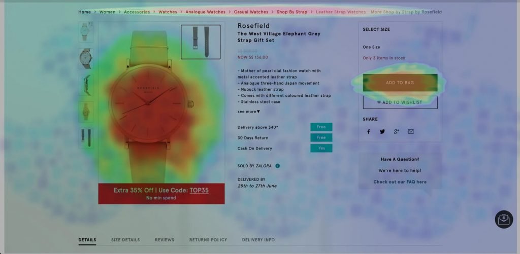
After looking at the heatmap, you observe that a lot of users clicked on the product image and as per your existing design, on clicking the product image, it does not expand. What the heatmap did here was it told you exactly what users were expecting from your product page and gave you actionable insight on how you can optimize your product page to match visitor expectations and improve your website’s UX.
- Checkout page: Checkout page is the last page in your conversion funnel. Hence, it becomes absolutely important that visitors find all the necessary information on this page itself. If this is not the case, then visitors might exit your website looking for missing information and then never return. Website heatmap can help you identify all such missing information by tracking user behavior on the checkout page.
For example, your Google Analytics (GA) data showed that most visitors who add products to their cart, drop off on the checkout page. You decide to plot a heatmap on your checkout page. After analyzing the gathered data, you notice that a large number of visitors clicked on the ‘Apply Coupon’ field and then exited your website to never return again.
Using this insight, you can now hypothesize that adding a dropdown list of all applicable coupon codes or auto-filling the field basis each customer’s eligibility will help reduce cart abandonment rate and increase purchases. - Blogs and other resource pages: When you want to ascertain what the optimum length that your blogs, case studies, articles, and other content pieces should be, heatmaps can work like magic. Scrollmaps tell you how far users scroll down a page, the number of visitors who scrolled through 50% of a page but not 100%, etc. Using scrollmaps, you can optimize your content and plan it’s length according to the scroll pattern of your visitors and users.
- Call to action (CTA): Your web page’s ‘Call-to-Action’ or CTA is where all the real action takes place. If you choose the wrong text, color, or area to place it, your website conversion rates are going to be drastically affected. Use website heatmap when you want to identify the most popular sections of your webpage so that your CTA can be placed in that section, or when you want to track if visitors are even scrolling through the entire page and reaching below the fold where your CTA is placed, and so on.
Common mistakes made while using website heatmaps
You may think that with a tool like heatmap, which is such a quick and easy way to evaluate on-page visitor behavior, there are fewer chances of making mistakes. You will be surprised by the simple mistakes that marketers often make when setting up and using heatmap on their websites.
- Sample size: Marketers often forget that heatmaps should be treated like any other statistical tool and that they should use choose sample size that is representative of the entire target audience.
When selecting the sample size, be mindful that it should not be too large or too small because then, the sample size will not be representative, and the heatmap report will not be of much use. Apart from being dependent on the goal that you want to track, your sample size also depends on other factors. You can calculate the correct sample size for your heatmapping exercise based on the following parameters:- Actual monthly traffic: Total monthly traffic of the pages you want to plot heatmaps on.
- Margin of error: The margin of error that you set reflects how much your research results can differ from the true picture of the entire population.
- Confidence level: Percentage that reflect how confident you are that the sample you choose will produce a certain result.
If your website gets huge traffic, you can easily set the sample size for your heatmap using the following formula presented by Scott Smith:
(Z value)² X standard deviation (1-standard deviation)/(margin of error) = n²
Where,
Z value corresponds to your chosen confidence level. You can easily find tables online that enumerate z values for confidence level slabs that are most common.
| Confidence level | Z score |
| 99% | 2.58 |
| 95% | 1.96 |
| 90% | 1.65 |
| 85% | 1.44 |
| 80% | 1.28 |
Standard deviation is the degree of difference between the mean of a data set and individual data points in the data set.
You may also opt to use online sample size calculators to avoid committing any calculation errors.
One such online sample size calculator is offered by SurveyMonkey, an online survey portal that conducts online surveys.
- Traffic type: Apart from the sample size, it is also important to avoid using the wrong traffic type. For example, businesses from any industry always have 2 kinds of visitors to their websites in common: new or first-time visitors and old or returning visitors. Now, the behavior tracking parameters for first-time visitors and return visitors are very different. A return visitor may react to the messaging on your website in a very different way than a first-time visitor. Or, a return visitor may come to your website looking for a different piece of information than a first-time visitor.
Like your sample size, the type of traffic you choose also depends on the goal you track. Imagine that you want to improve the number of repeat purchases on your eCommerce website. For your chosen traffic to be representative and for the heatmap to produce meaningful insights, only select returning visitors as your audience. Again, if your goal is to test the usability of your new website design, segment visitors into new and returning visitors so that the final data speaks for both the segments.
It is crucial that your heatmapping tool allows you to segment your visitors according to your business needs.
- Sample period: While setting up a heatmap on your web page, be mindful of the time period you choose for which you run it. When deciding the sample period, remember the following points:
- Your sample period should be set considering external factors like holidays, festivals, sale period, weekends, and so on.
- Your sample period should consider different buyer behaviors.
If the above points are not considered when setting the sample period, the chances of your heatmap report not being representative increases. For instance, you own an eCommerce store, and you start a heatmap on one of your pages a week before Christmas. Do you think the results generated will be representative of the whole year? No, it will probably not. Purchase behavior during festivals or occasions is drastically different from the rest of the year.
To take another heatmap example, let’s say you set up your tool to collect data on the first 5,000 visitors on your homepage. What happens when it hits the 5000 mark in the first 2-3 days? It stops collecting any more data after hitting the mark. If your sample period began on a Friday and collected data on the 5000 visitors by Sunday, how will the data account for visitors who came to your website on the weekdays?
- Polluted data: As marketers, we always look for ways to get quick results. In some cases, this might be beneficial, but in others, this can be detrimental. When it comes to heatmaps, this inquisitiveness hampers the quality of data generated. This is especially true for organizations that are new to using tools like heatmaps. When you repeatedly sneak a look into a heatmap or when you deduce conclusions from it before its sample period is over, you are basically polluting your own heatmap data.
For instance, you set up a heatmap on your homepage. After 2 days you notice that a huge red color blob has formed around the hero image which does not have a link. You now want to know why that element is attracting so many visitors and hence ask your colleagues for insights. To look for an explanation, your colleagues go to the homepage, browse through it, and contribute to the clicks on the hero image, thereby polluting your heatmap data.
To ensure accurate heatmap data generation, make sure all IPs within your organization that can pollute the data are blocked.
- Rushed conclusion: One of the most common and detrimental mistakes that marketers make is taking early winning trends as the ultimate result and stopping the heatmap before the sample period is over.
Say, for instance, you set-up a heatmap on one of your web pages and take 2 weeks as the sample period. At the end of the first week, you look into the data and notice that a lot of visitors were clicking on a section with not links rather than clicking on the primary CTA. Without waiting for the second week to finish, you make changes and deploy them.
By making changes based on assumptions, you are compromising the validity of your heatmap report. By rushing to a conclusion early, you may miss out on key insights that the heatmap is capable of generating for your business.
You should always avoid drawing inferences early on before the sample period is over.
- Isolated exercise: Heatmap is not an isolated data collection tool. Treating it as such is one of the most common of all the mistakes that marketers make. It should always be used as part of a wider data set. Heatmaps should be combined with other web analytics tools like Google Analytics (GA), session recordings, and so on, so that the changes you propose and the data you gather can be cross-referenced and confirmed.
For example, after looking at the data, you suspect that the heatmap you set-up on one of your web pages got contaminated for whatever reason. How will you confirm it or cross-check the numbers if no other data gathering tool is being used by you?
Having alternate tools run alongside a heatmaps makes multiple options available to validate your heatmaps data and report. It will also help you make the right choices for your business.
- Wrong tool: Today, multiple low-cost heatmap tools have surfaced in the market due to its growing popularity. However, not every available tool is equally good. Look for heatmap tools that give you multiple choices on how you can set it up (a few free tools are also available in the market). Conduct thorough research on all the available tools and choose the one that lets you segment visitors based on multiple parameters, record visitor activity, offer visitor-feedback options, and so on.
What are the challenges of using website heatmaps?
No matter how intuitive or simple a tool is, it always brings with it its own set of challenges. However, this does not mean that you cannot overcome those challenges when using the tool. Heatmaps are simple in theory, but complex in practice. Let us look at some of the most common challenges associated with using heatmaps of any kind:
- Dynamic URL tracking: Qualitative research tools are a favorite among marketers trying to understand visitor behavior. Website heatmaps are popular because they provide visitor behavior insights in an easy to understand graphical manner in multiple forms as scrollmaps, clickmaps, and so on. Lately, however, marketers have come to realize that when it comes to dynamic pages, heatmaps don’t do very well in terms of providing deep insights on how visitors navigate on the website. Such in-depth analysis is especially important when you wish to provide personalized service to each and every user. This challenge is faced across all industries as even the smallest of businesses today have dynamic rather than static URLs for most of the pages on their website. Most webpages today are dynamic with expanding menus, multiple animations, pop-ups, and so on. This is where dynamic heatmaps come into play.
Unlike static heatmaps, dynamic heatmaps can be easily plotted on dynamic pages like cart page, orders page, customer profile, etc. They allow you to dive deeper into how each individual visitor interacts with the page, which sections grab their attention, what they expect out of certain sections, and which sections nudge them to bounce off, etc. Because dynamic pages have dynamic URLs, they cannot be analyzed using normal website heatmaps. Dynamic heatmaps allow you to navigate through the website and into pages with dynamic URLs to help you get deeper insights into your visitors’ online browsing pattern.
For example, let’s assume that you own an eCommerce store, and you want to understand your visitors’ browsing pattern on your cart page. You set up a dynamic heatmap on the cart page and wait for the stipulated time to get over. The report thus generated will look something like this: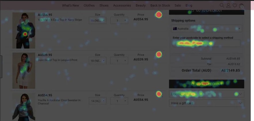
The above dynamic heatmap screenshot represents the activities of 1 unique visitor. The red patches indicate areas with the highest interaction, and the light blue patches are areas with the lowest interaction. At first glance what you may be able to observe is high activity on the selected product image, on the cancel button, on the postcode field, on the discounts option, and on the checkout page. Using these observations, you can easily gain an in-depth understanding of individual visitors and may be able to optimize the page to match visitors’ expectations better. Such an in-depth analysis is made possible only through dynamic heatmaps.
- Data analysis: Heatmaps are beautiful: the vivid colors, the easy to interpret data, all make it very attractive and beautiful. But this beauty can also kill your entire heatmap exercise if you are not careful. Many marketers struggle with one question while interpreting heatmap data: where to start? Using heatmaps is more intuitive and faster than traditional data collection and representation methods like excel. But they still need to be interpreted correctly.
One thing to keep in mind while analyzing a heatmap is that the analysis should flow from your goals and not the other way round. If you initialize analysis of a heatmap without setting any goals, you will most likely fail to identify distractions that are stopping visitors from converting into customers.
For instance, let’s assume that the primary CTA of your publishing house’s website homepage asks visitors to subscribe to the monthly newsletter – ‘Subscribe To our Monthly Newsletter’. The CTA is also placed below the fold on your homepage along with other important information like donate now, contact us, and intern with us, etc. You look at your GA data and see that despite getting good traffic, the conversion rate was drastically low. So you set up a heatmap on your homepage. But without defining any goals, you start collecting data through the heatmap. After the completion of the sample period, you start analyzing the data collected. The moment you see the final heatmap, you are drawn to a section which is the brightest. So you instantly decide to relocate the primary CTA to that section.
Because you did not set any goals before plotting the heatmap, you did not realize that had you plotted a scrollmap on the page, you could have discovered that most visitors did not even scroll to the bottom of the homepage thereby missing out on the primary CTA as well as all the other important information placed there. Maybe, by relocating your CTA to the most popular section, you were able to increase the number of newsletter subscriptions. But by not having all the insights, you will miss out on opportunities that the other content below the fold created.
Heatmap examples
Website heatmaps in eCommerce
E-commerce businesses use heatmaps to increase their conversions because website heatmaps help them figure out and analyze exactly how visitors behave on their website. To understand how this works in reality, let’s take an example of a website heatmap about how shoppers use Amazon when buying a book.
If you look at the heatmap, you can easily ascertain the areas that receive the most attention on the page:
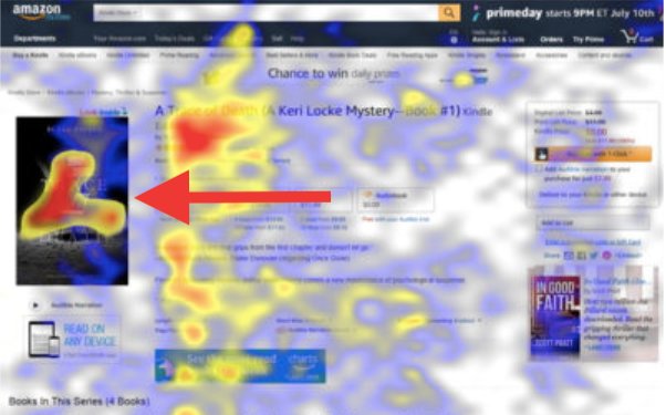
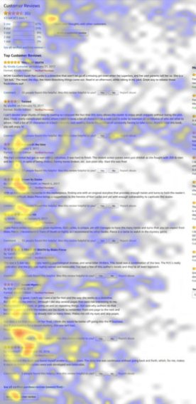
What this heatmap reveals is that the most attention-grabbing sections and the sections driving the most engagement are at the top of the page. Another observation is that visitors were also clicking on the “customers who bought this also bought” section, ‘sponsored products’ section, and ‘books in this series’ section:
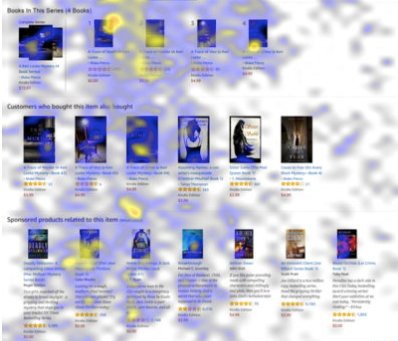
Using insights like the above, eCommerce stores can place related products and important content in the most popular areas and drive higher conversions.
To understand a more specific use of heatmaps in the eCommerce industry, let us look at how an online store selling baby products used website heatmaps to identify distractions and used that very distraction to their benefit. Below is a heatmap plotted on the original page:
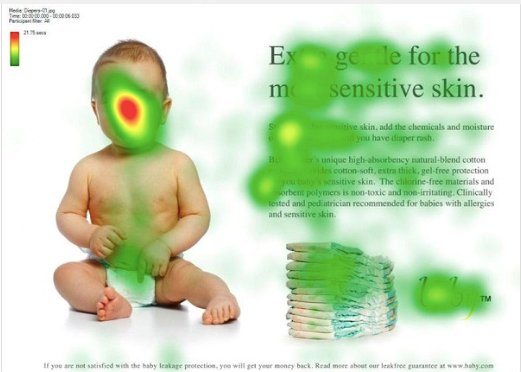
On analysis, the heatmap revealed that the baby’s face in the page was getting most of the visitor attention when it should have been the messaging and the product on the right-hand side that should have been the most popular areas. Further research revealed the rationale behind the attention that the baby’s face was garnering: women, babies, and attractive people are the main subject of visitors’ gaze on any page. Basis all these insights, the design of the page was changed, and this is the heatmap of the new design:
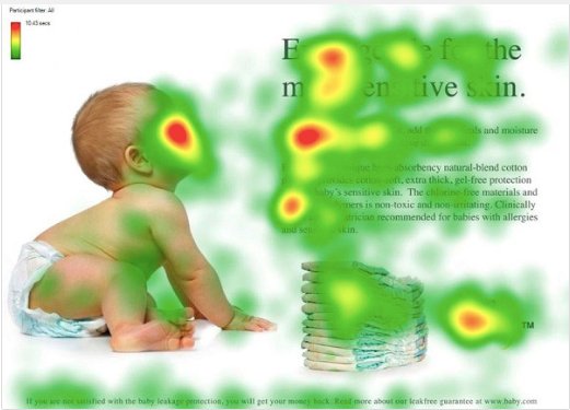
In the first screenshot, it was noted that the baby’s face was a distraction for visitors. So the baby’s subject of sight was changed to the product and messaging, and the new design’s heatmap shows that while the baby’s face continued to garner attention, visitors increasingly paid attention to the content and product on the right-hand side by following the baby’s line of sight.
Optemeria increased their add-to-cart ratio by 34% using website heatmaps to analyze the browsing behavior of visitors.
Website heatmaps in Media & Publishing
An online publishing firm may produce newsletters, newspapers, monthly magazines, and so on. Whatever the content type, the main aim is always to increase readership and subscriptions for the various products they offer. The fact remains that people will only read your articles and digital newspapers and subscribe to them if your piece adds value to their existing knowledge. Therefore it becomes imperative that you put only the most informative pieces that people want to know more about in the most viewed sections of the page. For example, let’s look at Guardian’s heatmap of one of their newspaper issues:
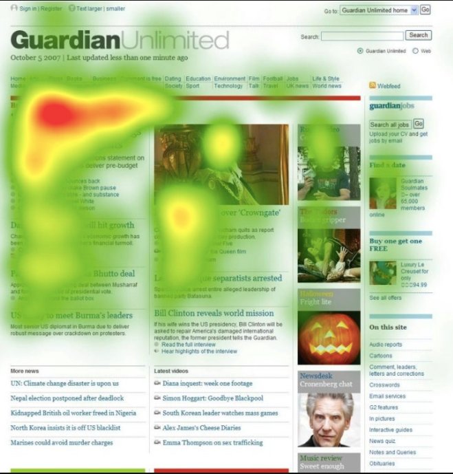
The heatmap reveals that most of the attention is concentrated on the top left sections of the page and the bottom and right side of the page get little to no attention at all. If some sections of your page get most of the attention and the other sections are completely ignored, your page needs redesigning. Let’s say, for instance, the section ‘more news’ on the above page may have news items that align with a lot of readers’ interests. But because their attention span dwindles by the time they reach the bottom section, they only end up really interacting with the top left sections which do not have topics of their interest. This may lead to friction and bad user experience. Website heatmaps can help you identify such browsing patterns and allow you to place news items in alignment to your visitors’ interests and expectations.
In the video streaming industry, Netflix is the king when it comes to using various means to conversion optimization like A/B testing, website heatmaps, and other visitor behavior analytics tools to personalize experience for their users. One of the strongest evidence of this is the 2013 overhaul of their entire user interface aimed at reducing their users’ cognitive load. This is what Netflix’s page looked before the overhaul:
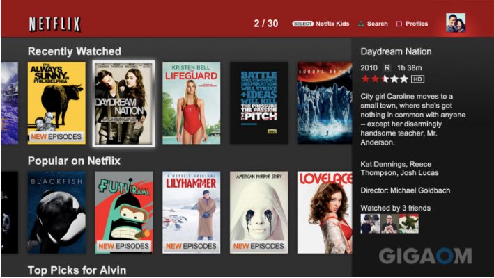
In 2009, Netflix launched the above-pictured format for smart TVs and connected devices. However, this format presented unending rows of box cover art. So in 2012, designers at Netflix embarked on the quest to build mock-ups for a UI format that would focus on big pictures and replacing box art with shelves. This is what the new design looked like:

Along with changing the way videos were shown to users, Netflix also removed the textual description on the right-hand side of the page that the 2009 version had and shifted it above the title to top left. This was done because an eye-tracking heatmap plotted on the page revealed that users had to constantly juggle between the text on the right and the title on the left.
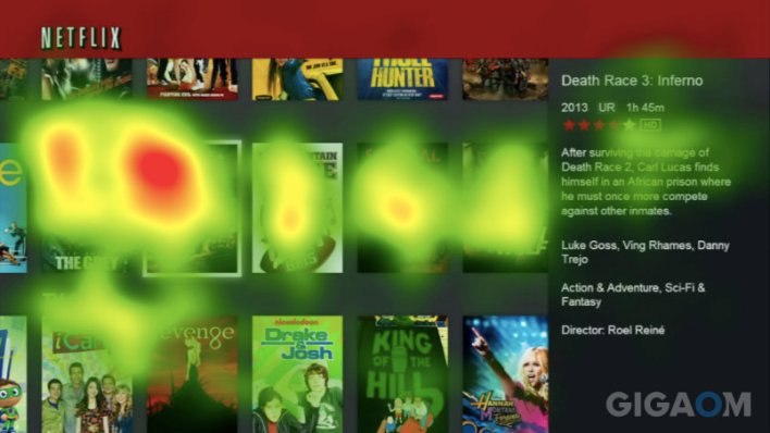
The team at Netflix also plotted a heatmap on the new interface.

The resultant heatmap on the new interface revealed that the new interface called for way less to-and-fro from one piece of information to the other and ended up reducing their users’ cognitive load. Netflix ran a record of 7 A/B tests to examine the new interface and then made it live. The Netflix we know and see today is an optimized version of the newly overhauled interface shown above.
Website heatmaps in Travel
Ever wonder how some travel websites have the exact information you want at the exact place you expect them to be? Here is one possible way they do it – website heatmaps. For any travel company’s website, the primary goal is always to increase bookings. But it also serves other user requirements like getting flight information, online check-in, grievance redressal, and so on. To increase the number of online bookings, and to make it easy for users’ to find any information they are looking for on the website, travel businesses often turn to website heatmaps for help. As mentioned earlier in this guide, heatmaps help you track your visitors’ and users’ browsing behavior on your website so you can use the information to improve your website’s UX and UI.
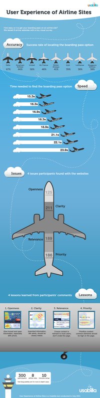
Headquartered in Amstelveen, Netherlands, and founded in 1919, KLM Royal Dutch Airlines is the oldest airline in the world still operating under its original name. According to a study on the user experience of airline websites, users took the longest to find their boarding passes in KLM Airlines’ website.
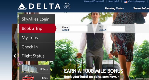
Delta Airlines topped the list with users finding it the easiest to get their boarding passes on their website. This is what Delta Airlines’ page looked like:
This is what KLM airlines’ homepage looked like:
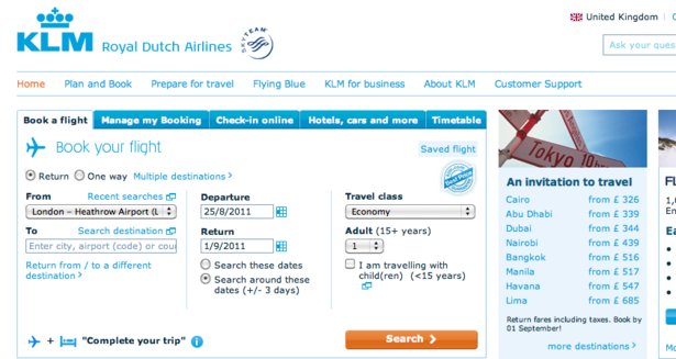
The experience optimization team at KLM decided to run a heatmap on their homepage to figure out why it was taking the users longest to find boarding passes on their website compared to other airlines’ websites. Below is the heatmap that was generated on the page:
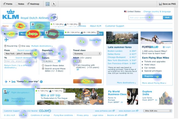
If you compare KLM’s website with that of Delta’s, you will see that there is a drastic difference between their respective pages. Delta’s page’s design is clean, to-the-point, and not cluttered. Whereas, the KLM’s website heatmap above shows how cluttered their homepage is, and this might be the very reason for their low performance when it came to finding boarding passes online.
Another interesting way travel websites can use heatmap for conversion optimization is not in the backend to analyze visitor behavior but in the frontend to help visitors improve their booking experience. Hipmunk, a website offering comprehensive travel search for different modes of transportation as well as hotels and vacation rentals, and helps compare top travel sites to show the best and cheapest options, were the first one’s to use heatmaps in the frontend. Below is how the heatmap looked to the visitors:
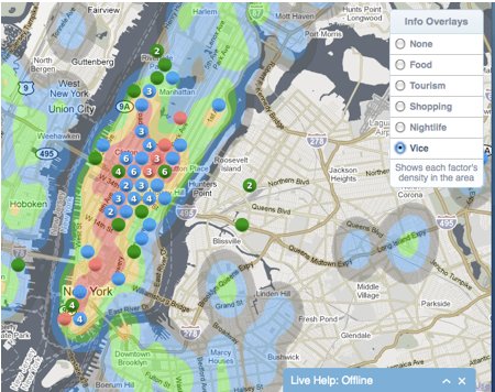
Based on the heatmap data, visitors on Hipmunk’s website could easily decide where to stay, where to eat, which places to visit and decide other major parts of their itinerary. Because visitors didn’t need to go to multiple sites to look for recommendations on different aspects of their trip, Hipmunk’s user experience improved drastically and it showed in their conversion rates.
Following Hipmunk’s footsteps, other competitors like Kayak.com, for example, have also started offering visitors a heatmap view of the hot and cool spots of the city that they are planning to visit.
Website heatmaps in B2B SaaS
Qualified leads are extremely important to a B2B SaaS company. Without good, qualified leads, a B2B business will not thrive because it will fail to sell any of its products. And the main source of such leads are the various forms hosted on their website: sign up form, demo request form, case study download form, newsletter, and so on. These forms are located on various pages and scattered through multiple CTAs across the website. Many B2B businesses use website heatmaps of different types to identify the best section on a page to place such CTAs and forms as well as to identify breaks in the form flow and rectify them to match visitors’ expectations.
A B2B SaaS business’s homepage is one of the most important pages on its entire website this is because it not only has multiple lead collection forms on it but also because the homepage takes visitors everywhere else on the website (unlike they land on a specific page via ads, social media promotions, and other such channels). To tap on the unexplored opportunities that their homepage offers and to remove all possible blockers from their conversion funnel, Sumo, a Saas-based company offering multiple marketing tools, decided to plot a heatmap on its homepage. This is what the resultant heatmap looked like:
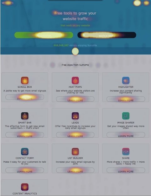
After looking at the heatmap plotted on the homepage, the team at Sumo made a few observations:
- The elements on the banner of the page got good attention.
- In the banner, visitors clicked most on the ‘About us’ link.
- The 2 main CTAs of the page – ‘Get Started” and ‘Watch Video’ – were clicked on substantially as well.
- The free tools listed on the body of the page were clicked on at an individual level, but the general trend was that tools listed on the left side of the page got clicked more than the tools listed on the right-hand side of the page.
- The arrow directing to move below the banner of the page was clicked on a lot even though it was not hyperlinked. This meant that visitors were expecting it to be hyperlinked.
These observations then went on to help the team at Sumo in making design and content changes to the page, which eventually led to an increase in Sumo’s conversion rates.
Conclusion
Now that you have read this guide, you should be equipped with knowledge on everything heatmaps – starting from what it is to how it works. Website heatmap is an indispensable visitor behavior analytics tool but using it without knowing the intricacies of the entire process and according to unstructured approach will give you distorted data.
When done correctly, keeping in mind all the small mistakes that you can make, the kinds of insight you can use, and by using the correct type of website heatmap, you can tweak your website design and content based on real time visitor interactions on your website.
If you found this guide informative and useful and you think that it helped answer some of your questions as a marketer, then spread the word and stop fellow marketers from facing the same roadblocks.
Frequently asked questions on website heatmaps
Heatmap works by collecting visitor behavior data from visitors’ interaction on the selected webpages. It then uses a color palette to display which sections and elements are interacted with more and which ones get less attention. For example, on a web page, the area where viewer clicks the most gets highlighted with a warmer color, and where the viewer gives no attention, gets colder color.
To use a heatmap, first, select the right tool based on your use-case and industry. Then select the pages to be included in the heatmap campaign, configure the setting depending on your goal, install the selected tool’s code snippet onto your website, and start recording. Know more in this guide.
Heatmapping tool is a piece of software that helps you to graphically represent numerical data where individual data points contained in the matrix are represented using different colors. The heat mapping tool can also be defined as software that aids you in data visualization.
In simplest terms, the purpose of heatmaps is to represent data in an easy-to-understand manner. Based on the color scheme that a heatmap uses, you can easily ascertain how well you are performing, which sections have scope for improvement, and which sections need a complete overhaul.


