

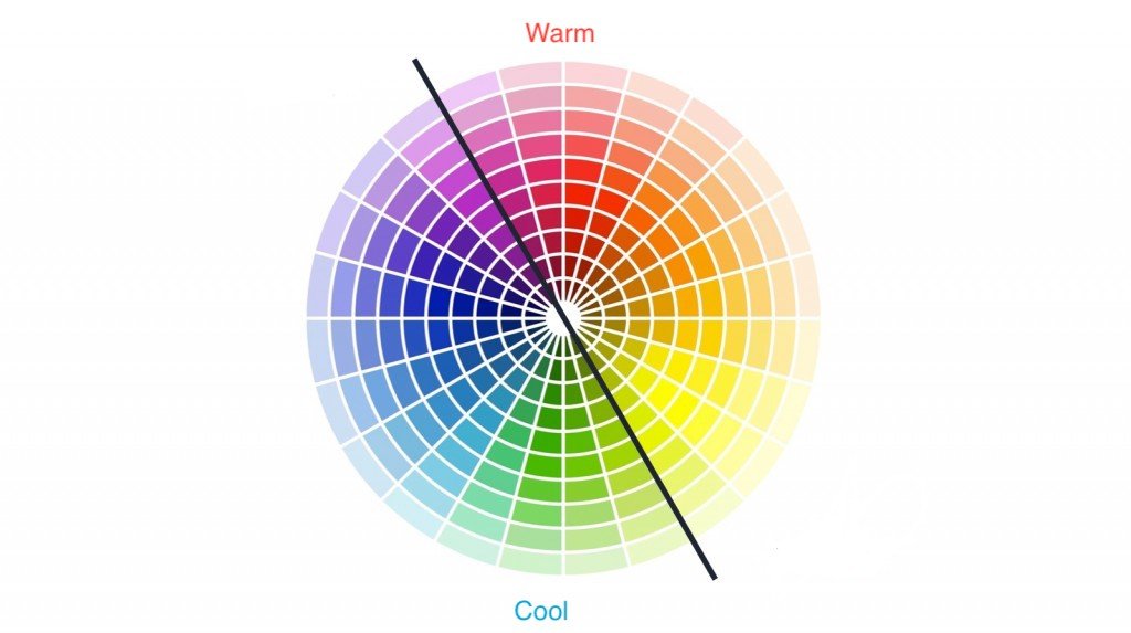
The earliest record of the distinction between warm color and cool color, as suggested by the 1890 attestation of the Oxford Dictionary, can be found in a 1764 poem, written by Oliver Goldsmith. It suggests that this distinction originated from the very nature of each of the colors – warm colors being associated with daylight or sunset and cool colors being associated with a gray or overcast day.
Download Free: Website Heatmap Guide
More recent theories include some like the color theory or traditional psychological associations, which argue that warm colors are active or advancing, while cool colors appear to be receding. Upon classification, warm colors fall under the red-yellow spectrum, while cool colors fall under the blue-green spectrum.
So, how important is this 18th-century distinction between warm and cool colors?
The answer is simple – today, every color palette is designed keeping the temperature and intensity of the colors in mind. This essentially means that it holds relevance for every work of art that is created, every new piece of clothing that goes out, and every technology that involves using colors.
With the progress of the 19th century, its relevance and application spread to statistical methods of data visualization like heatmaps and is being used by professionals of every field such as geographers, biologists, online marketers, UX designers, and so on.
This blog will help you gauge the significance of using colors in heatmaps, specifically the warm-to-cool color scale, get a glimpse of what the colors on a heatmap represent, and learn how to ensure you have the right color palette for your heatmap.
What do the colors on a heatmap show?
Heatmaps pictorially or graphically represent the measured value of numerical data using a chosen color scheme, with one end of the color scheme representing the high-value data points and the other end representing the low-value data points of one or more data sets. The guiding idea behind increasingly using heatmaps as a data visualization tool across industries is to simplify the interpretation of complex numerical data to make the decision-making process faster and more efficient. And colors are a central part of it.
For instance, website heatmaps track and visualize visitor behavior on webpages and indicate the page sections with maximum activity with the warm colors and the sections with the least activity with cool colors. So, for a website owner, a UX designer, or a digital marketer, heatmaps can give insights about the weak links on the website that creates friction in the overall user experience, thereby providing them a direction on what improvements the website requires to improve conversions.
Similarly, heatmaps can help stock market analysts to visualize current market trends, team coaches to optimize game strategy, athletes to plan the course they will take, consumers to visualize their wifi connectivity and discover network breakages, and so on. Heatmaps help businesses and individuals from virtually every sector and industry visualize and consume numerical data better – and the colors on a heatmap help in accomplishing exactly this.
Hence, to reduce cognitive load as much as possible on those using heatmaps as a data visualization tool, the heatmap colormap used has to be the correct one.
Choosing the right color palette for your heatmap
Choosing the wrong color palette may compromise the very rationale behind using heatmaps, i.e., the entire purpose of making data interpretation easy using colors. This can happen if, for instance, the colors do not automatically flow from each other, or the color palette is such that it fails to reflect a decrease or increase in the value that the colors are supposed to indicate. Look at the heatmap below:
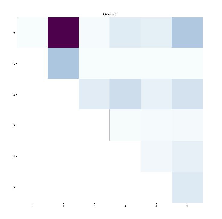
The heatmap above uses a color palette with shades of the same color. But what is wrong with the result is that it lacks a standard when it comes to the changing intensity of the color shade as value changes. Barring one very dark and random purple tile indicating ‘0’, all of the data points are very light-colored. The problem with this is that at first glance, the viewer of this heatmap might end up interpreting the heatmap colormap in the sense that there is a huge value difference between the dark tile and the other light tiles, which is not actually the case.
Each data set warrants the usage of a color palette that can visually represent it in the most readily consumable manner. Therefore, it is important that you choose a color palette that best suits your use case or your data sets. In conclusion, while choosing or creating a heatmap color palette, considering the following pointers may help:
Choose from an existing color palette
If creating your own custom color palette is not something you want to get your hands into, or if you do not approve of the default color palette of the heat mapping tool that you use, you can choose from existing color palettes that have been tried and tested by fellow practitioners. For instance, there are three types of data visualization color palettes you can choose from to be plotted on your heatmap – qualitative palettes, sequential palettes, and diverging palettes:
Qualitative palettes:
Qualitative palettes are the most suitable when the data matrices are categories like mobile phones, television, and desktop, or state, country, or continent. It involves the use of distinct colors for each data set hence it should be chosen for data sets with ten or less than ten individual data points. This is because too many colors on a single heatmap can cause misinterpretation of the visualized data.

Sequential palettes:
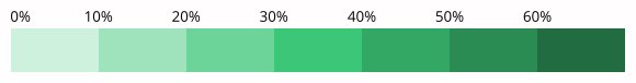
Sequential palettes are most suitable for numbered values that are of a certain order (ascending or descending). You can either use shades of a single primary color, a single color hue, or mix two or more hues with the warmer ones on one end indicating higher values and the cool ones indicating lower values. The data values are indicated by the lightness and darkness of the shade in the tile or area.
Diverging palettes:
Diverging palettes are most useful when a data set has a zero-like central value. Two sequential palettes make one diverging palette, with the sequential palettes sharing an end-point that makes the new palette’s central value. They typically consist of two color hues or a palette consisting of warm to cold colors.
Colors on one side of the central value indicate data points with values less than the central value and colors on the other side indicate data points with values higher than it.

Download Free: Website Heatmap Guide
Don’t use too many colors
It is okay to use as many heatmap colors as the data set demands but when you can work with limited color hues, do not get overwhelmed and use way more colors than required. Surely the heatmap generated may look very colorful and attractive but it can leave the viewer with more questions than answers, and increase the required cognitive load.
It is always best to use colors that flow from each other, as mentioned above. For instance, it may not always be the best idea to use a rainbow palette.

A rainbow scale has many colors of striking differences and this is precisely the problem with it. The difference between the colors is such that even humble value differences may appear to be of big magnitudes. Additionally, there are multiple warm colors on the rainbow scale thus bringing into scrutiny the consistency in viewers’ perception of which color represents the highest values. This problem is eliminated with the adoption of single-color hue heatmaps.
Use tools that help create color palettes
There are many heatmap-free tools as well as paid ones available online that help create heatmaps and color palettes based on the nature of your data set.
Python Seaborn is a case in point. Seaborn offers an API that provides choices for plot style and color palettes and makes the selection of the right color palette for your heatmap drastically easy.
Choosing the heatmap colors may appear to be a very simple decision but as enumerated above, it involves taking a lot of precautions and measures so the most appropriate color scheme is selected for the data type to be represented. Wrong color selection means the added cognitive load on the heatmap viewer. Once you are clear on what you want from the heatmap, choose the right color palette that visualizes data in a ready-to-consume manner with zero cognitive load on the part of the heatmap viewer.
VWO heatmaps is another robust tool that allows you to customize your heatmap color palette and along with that, offers a wide range of capabilities to visualize visitor behavior on your website. Their free AI-powered heatmap generator allows you to predict how visitors interact with your web page. It enables you to gauge bottlenecks based on user experience for you to take required optimization measures.
Along with heatmaps, you can also leverage scrollmaps and clickmaps to discover how far visitors scroll on your web pages, the elements that grab their attention and receive clicks, and the ones that distract them. Sign up for a full-featured free trial of VWO heatmaps to assess it for yourself or request a personalized demo from one of our optimization experts.

FAQs on heatmap colors
Heatmap colors are used to represent the calculated value of numerical data using a predetermined color scheme, with one end of the color scheme representing the higher value data points, and the other end representing the lower value data points of selected data set(s)
Choosing the right heatmap color palette depends upon your requirements. The three popular types of heatmap color palettes are Qualitative palettes, Sequential palettes, and Diverging palettes.
Read this full post to know more.
The best heatmap colors create a clear contrast between the different levels of intensity or value. Generally, a gradient ranging from cool colors—like blue or green—to warm colors—like yellow, orange, or red—is a good choice. This gradient will allow easy differentiation between low and high values.
Colors in a heatmap represent different levels of intensity or value. In general, cooler colors, such as blue or green, stand for lower values or less intensity. The warmer colors, like yellow, orange, or red, refer to higher values or more intensity. The exact meaning of each color can differ depending on the heatmap’s specific design and the data being represented.
Define your data range: Determine the minimum and maximum values in your dataset.
Pick a color gradient: Decide upon an appropriate color gradient for your data. For example, if you need to represent increasing intensity, then use the blue-red color gradient.
Apply color mapping: Map data values onto the colors in your gradient. Low values should correspond with the cooler colors and high values with the warmer colors.
Use a color scale: Be sure you have a heatmap color scale or legend to interpret colors to their corresponding values.
Categories:


![Top 10 Shopify Heatmap Apps [With Features – 2026]](https://static.wingify.com/gcp/uploads/sites/3/2020/04/Feature-image_Shopify-Heatmaps-All-you-need-to-know.png?tr=w-300,h-150)


