

In 2023, we’re looking at around 5.25 billion smartphone users worldwide, with a yearly increase of about 4.9%. This underlines the ongoing trend of mobile taking desktop visits in the latter half of the decade.
Together Android and iOS offer close to 6 million mobile applications today. Given the unprecedented speed at which mobile apps are taking over the digital space, it is imperative to understand user behavior in-depth to deliver converting mobile experiences. While taps underline mobile usage, desktop visits are driven by clicks. Consequently, experiences need to differ.
Download Free: Mobile App A/B Testing Guide
For example, one of the derived inferences from the tap versus click difference is the fact that mobile app screens do not have the luxury of combining multiple elements on a single page as their desktop counterparts. The page would be prone to erroneous taps because of a high density of elements resulting in a categorically horrible experience.
This is just one of the many examples of how user experience designers might want to factor in innate differences between devices and incorporate these in the prototyping stage. One of the most powerful mechanisms to identify if your mobile experiences are optimized for delight (and hence conversions!) is to study mobile heatmaps.
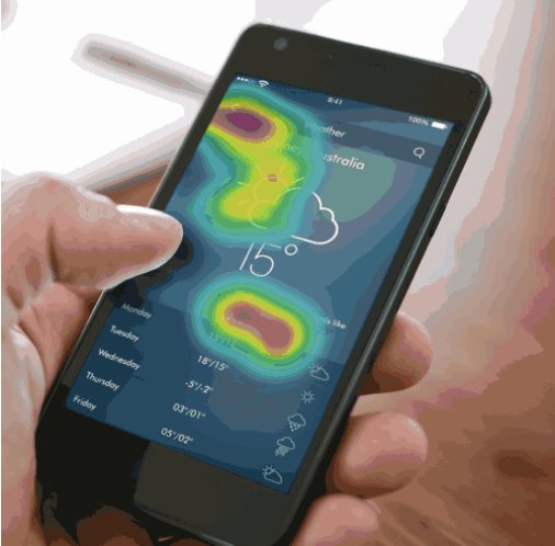
What is a mobile heatmap?
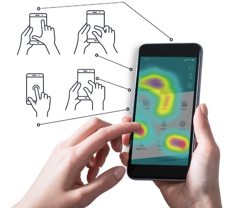
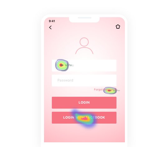
Mobile app heatmaps capture users’ in-app interaction and engagement and visually present the data using an overlay of colors. Red (warm) areas indicate high user engagement, whereas blue (cool) areas indicate low engagement.
This color-based projection of interaction and engagement data onto the mobile screens allows you to comprehend exactly where your app users are focusing simply by looking at the overlaid aggregated usage data. This aggregation helps businesses in two ways:
- Abstract a large amount of engagement data and concentrate them in hot vs. cold zones for quick interpretations.
- Identify UX improvement opportunities by identifying areas of traction (or lack of.)
How does a mobile app heatmap work?
Mobile heat map app collects users’ touch data. The captured data is gesture-based, which means that the SDK of the heatmap tool you select captures every micro-interaction on the app. This includes all gestures saved on respective screens, which get aggregated to generate mobile app heatmaps.
Mobile app heatmap tools must consider their respective development platforms (like IONIC, Native, etc). The complexity magnifies because the same app could differ for different operating systems.
In simpler terms, the number of variables impacting mobile app render is multifold compared to desktop renderings, making them prone to UI/UX inconsistencies.
Download Free: Mobile App A/B Testing Guide
So, mobile app heatmaps work by capturing and visualizing where and how users interact with the app, helping developers understand user behavior and improve the app’s UI/UX.
The complexity of mobile environments means that heatmap tools must be robust and adaptable to different platforms and operating systems.
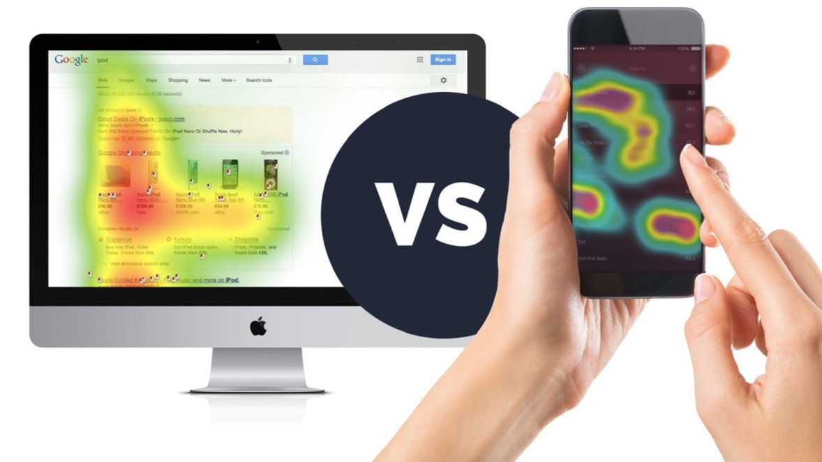
Mobile app heatmap vs browser heatmap
Mobile app heatmaps collect data on how users interact with a mobile application. This involves capturing every touch gesture such as taps, swipes, and pinches.
On the other hand, browser heatmaps track user interactions on websites accessed through desktop or mobile web browsers. These heatmaps typically record clicks, scrolls, and mouse movements.
Unlike mobile app heatmaps, browser heatmaps focus on interactions within a web page’s structure, such as clicking on links, hovering over elements, or scrolling through content.
Browser heatmap tools usually integrate via JavaScript snippets embedded in the website’s code, making them easier to implement and use across various web platforms.
While both provide insights into user behavior, mobile app heatmaps are tailored for touch interactions within apps on different mobile devices, and browser heatmaps focus on click and scroll interactions within web pages.
Key features of mobile app heatmap
Mobile app heatmaps are powerful tools for understanding user behavior and improving the user experience within mobile apps. Let’s look at some important features of mobile app heatmaps.
1. Track touch gestures
Mobile app heatmaps capture a variety of touch gestures, including taps, swipes, pinches, and long presses. This comprehensive tracking provides a detailed view of how users interact with the app’s interface.
2. View screen-specific data
Heatmaps can display interactions on a per-screen basis, allowing you to see which areas of each app screen are receiving the most attention. This helps in identifying popular features as well as areas that may require improvement.
3. Segment and filter reports
Heatmaps can segment data based on user demographics, behavior, or device type. This feature allows for more granular analysis and helps in understanding how different user groups interact with the app.
4. Replay sessions
Some heatmap tools like VWO offer session replay functionality, enabling you to watch recordings of user sessions. This feature provides context to the heatmap data, making it easier to understand the reasons behind specific user actions.
5. Get visual feedback
Color-coded overlays that highlight areas of high and low user engagement provide crucial visual feedback. This intuitive visualization helps quickly identify patterns and trends in user behavior.
What are the benefits of using a mobile app heatmap?
The benefits that app owners can reap from using mobile app heatmaps are endless. Every industry can have its own unique set of use cases and pain points they solve using heatmaps.
Let’s look at some reasons that make a heatmap app a necessity, not a luxury, in a business’s toolkit.
Improve user engagement
Don’t wait until issues arise to leverage heatmap mobile analytics. Regularly monitoring how users interact with the UI elements through mobile heatmaps is crucial to keep up with their changing behavior in your app.
Are users engaging less with the main CTA button? Or perhaps they are scrolling less toward the screen’s bottom?
Sometimes, the UI may seem a bit messy, leading users to make unintended clicks or taps. If you suspect such issues, run a hygiene check and tidy things up to ensure a friendly user experience.
Formulate data-backed hypothesis
User engagement with UI elements has a significant impact on your business growth. More engagement with the right elements (conversion points) indicates users are progressing through the conversion funnel, while less engagement suggests the opposite.
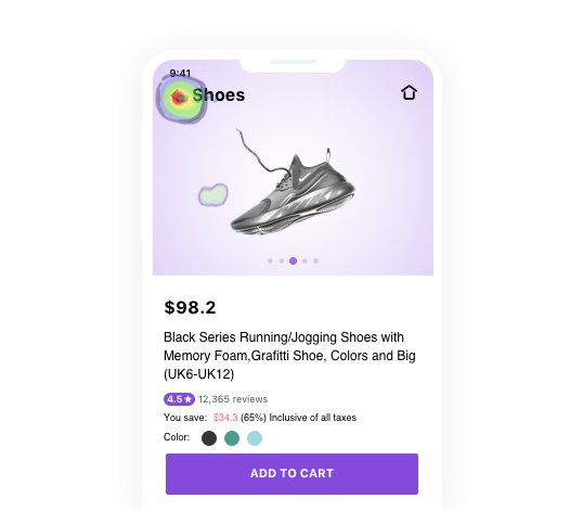
For example, if users aren’t interacting with the add-to-cart button, it means they’re not moving to the next step for some friction they’re encountering.
You can formulate and test hypotheses to see if making certain changes improves user interaction with the button.
This is consistent across your app. You can formulate and run tests based on heatmap data to improve user engagement and increase conversions.
Grow conversions and sales
The stronger your hypotheses rely on user behavioral data, the higher the chances of test success.
So, if you hypothesized that making the add to cart button sticky will capture user attention, backed by behavior research using heatmap data, your test is likely to succeed.
This, in turn, improves your metrics, conversions, and sales. Even if the test doesn’t yield the desired results, don’t give up. Run an iterative test and see how it goes. Overall, the more you align your mobile experience with users’ expectations, the more encouraged they will be to engage with your app, pushing your sales upward.
Types of mobile app heatmaps
Mobile app heatmaps come in various types, each providing unique insights into user interactions and behavior within the app.
1. Touch heatmaps
These heatmaps visualize where users tap, swipe, and pinch on the screen. They highlight the most and least interacted areas, helping you understand user preferences and identify problematic UI elements.
2. Gesture heatmaps
Gesture heatmaps track specific touch gestures like swipes, long presses, and pinches. By analyzing these gestures, you can gain insights into how users navigate the app and interact with different elements.
3. Click heatmaps
Similar to touch heatmaps but focused on click interactions, click heatmaps show where users click within the app. This is particularly useful for apps that have elements like buttons and links that require clicking.
4. Scroll heatmaps
Here, you can visualize how users scroll through your app screens. They indicate which parts of a screen are viewed most frequently and where users tend to stop scrolling, helping optimize content placement and screen layout.
5. Attention heatmaps
Attention heatmaps track user focus and engagement by analyzing the duration and intensity of interactions on different screen areas. These heatmaps help identify which parts of the app capture users’ attention the most.
6. Engagement heatmaps
Engagement heatmaps combine various interaction data to provide a comprehensive view of user engagement. They show how different elements and features within the app contribute to user satisfaction and retention.
How are UI and UX related?
UI and UX are very closely knit—the UI of an app is optimized to improve its UX.
Everything that an app user sees on their screen comprises the app’s user interface, i.e., UI or mobile app interface. It can be broadly divided into content, images, layout, color schema, CTA buttons, and navigation. Mobile app heatmap’s gesture tracking captures each tap, swipe, and zoom on every single page of the app, thereby providing user behavior insights to optimize each element of the mobile app interface.
For instance, an eCommerce app’s analyst or interface designer can identify distractions and confusing content or discover broken links that keep preventing visitors from signing up and becoming loyal users, simply by looking at the touch heatmap of the app’s login page.
Or, the marketing teams of a travel app can apprehend if the icon they added to take users directly to the app’s home screen from anywhere on the app is discoverable enough or not. If users keep tapping on other elements and areas on the screen before finding the right button, it can indicate a navigational flaw in the app that needs optimization.
Analysts, interface designers, and marketers across industries can use mobile app heatmaps to iteratively optimize all the elements comprising an app’s UI, thereby improving its UX.
User Experience is what the app users experience on your app—the better the experience, the higher the engagement. The more intuitive and optimized the elements of the app interface, the better the experience, hence, the higher the engagement.

There is an 88% chance for online consumers to be less likely to return to a site after a bad experience. If 88% of the opportunities are lost, your app’s core conversion metrics will take a sizable hit.
Top KPIs that can be improved with heatmap apps
Mobile heatmaps shed powerful insights on improving engagement KPIs. In fact, by complementing your testing efforts, they also help boost your revenue metrics. Here are some KPIs you should keep an eye on to get an authentic view of your app performance.
Time on-page
Time on Screen(ToS) is based on sessions and starts when a user opens the app and ends when they exit. This metric measures the duration for which the user is actively interacting with the app.
Let’s say you have a mobile app for a weather service, which displays current weather conditions, as well as a 7-day forecast. By examining the mobile app heatmaps, you notice that users tend to spend the most time on the current weather conditions.
With this information, you might consider enhancing the display of current weather details, making it more interactive or personalized to keep users engaged longer. This will have a direct positive impact on ToS.
The number of interaction events
Most mobile heatmaps will point you towards areas that drive taps but are not supposed to. These areas can be anything—text elements that are high on emotion (“Latest and greatest handset!”), visual elements that are meant to serve as cues but do not, a down arrow that does not do anything, etc.
Through mobile app heatmaps, you can make a note of these and trigger an action corresponding to these events. For example, if users frequently tap on a down arrow that doesn’t have a function, you could make it perform a specific action, like jumping down the page, to align the app’s functionality with user expectations.

Stickiness ratio
The stickiness ratio measures how often users engage with your app. You calculate it by dividing daily active users by monthly active users. To improve this ratio, you can use heatmaps to understand user behavior and explore optimization opportunities.
For instance, you own a new publishing app. You find that users are often tapping on the news headline, but there’s no clear way to navigate back to the main menu and explore other articles.
With heatmap data, you can redesign the user interface to make it easier for users to explore the app further, thereby improving the stickiness ratio.
Retention
The retention rate is a crucial metric that indicates whether your app offers real value to users. It quantifies how many users return to your app after their initial use. This is a strong indicator of user satisfaction and the app’s overall performance. To calculate the retention rate, divide the number of monthly active users by the number of app installations.
Want to know how different mobile apps can improve retention by using heatmaps? Read this blog and understand the role played by user experience analytics in-app user retention.
Purchases
Heatmaps can be a game-changer for increasing purchases by mobile app users, no matter which industry your app belongs to.
Imagine you own an eCommerce app, and your goal is to boost in-app purchases. Mobile heatmaps tell you where users are looking, what they’re clicking on the most, and which parts of the screen they’re totally ignoring.
Now, let’s say you notice that users almost never click the checkout button because it’s kind of hidden by the more prominent ‘continue shopping’ button.
So what can you do? You can run an experiment tweaking things like button placement, color, and size to make the checkout button more eye-catching. That way, more visitors will be nudged to complete their orders and make more purchases.
Customer lifetime value
Customer Lifetime Value (CLV) is the total revenue a business can earn from a customer during their relationship with the app. A high CLV means your app boasts loyal, higher-spending users.
Imagine you have a mobile gaming app, and your goal is to increase CLV by keeping users engaged and encouraging in-app purchases.
By examining heatmap data, you observe that some players tap on specific virtual elements but don’t complete the purchase. This could indicate hesitation or confusion among the players.
Based on these insights, you optimize the in-app purchase experience. You improve the layout, add more payment options, and provide clearer instructions for completing purchases.
Due to these heatmap-informed optimizations, you see an increase in in-app purchases, longer player retention, and therefore higher CLV.
Mobile heatmaps shed powerful insights on improving engagement KPIs. Two ways in which you can use heatmaps are to improve:
Time on-page
A mobile heatmap can throw light on the most significant elements getting traction so that you can rearrange content order, directly increasing your time on the page.
The number of interaction events
Most mobile heatmaps will point you toward areas that drive taps but are not supposed to. These areas can be anything—text elements that are high on emotion (“Latest and greatest handset!”), visual elements that are meant to serve as cues but do not, a down arrow that does not do anything, etc.
Through heatmaps, you can make a note of these and trigger an action corresponding to these events. For example, clicking on your down arrow can make the user jump down the page.
What are the best mobile app heatmap tools?
VWO Insights – Mobile App
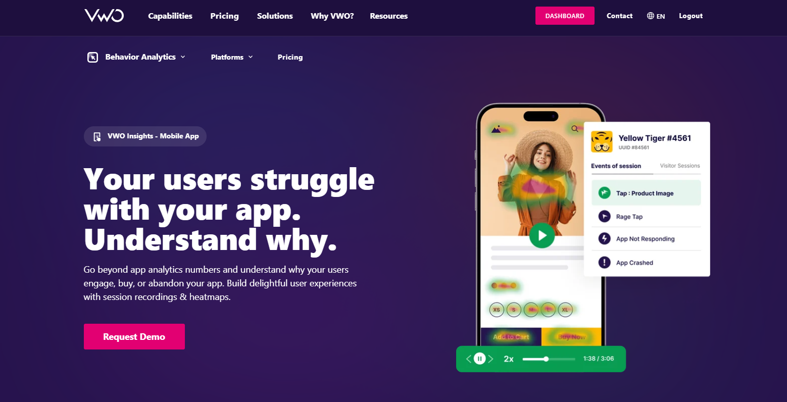
VWO Mobile Insights offers real-time visibility into user actions, enabling you to pinpoint friction points and user behavior trends across multiple sessions through a comprehensive timeline view.
Using its color-overlay heatmaps, you can visualize click patterns and engagement hotspots in your app. Further, you can implement your findings with session recordings. Additionally, you can collaborate with your team and share valuable discoveries within or outside your VWO account.
VWO’s lightweight Android and iOS SDK ensure smooth app performance while maintaining privacy throughout.
But there is more to it. Why should VWO be your preferred heatmap tool? VWO’s platform seamlessly integrates insights and testing, simplifying the process of using heatmap observations to test hypotheses on a single platform.
VWO’s mobile app testing features are advanced and outshine many competitors. This will help scale your optimization program, baking data-backed experimentation into your organizational culture.
UXCam
UXCam provides heatmaps that show how users navigate, where they tap, and what elements they interact with in your app. This tool moves beyond basic metrics and shows you advanced metrics like custom events, crashes, UI freezes, screens, and sessions in the dashboard against which you can assess the interaction of your users.
This mobile heatmap app also comes with funnel analytics to help you understand where and why users drop off from your app. You can also play session replays that give you a full picture of user behavior and watch them in action in your app. The best part is this tool supports heatmaps for Android mobile apps, iOS apps, and hybrid apps.
Smartlook
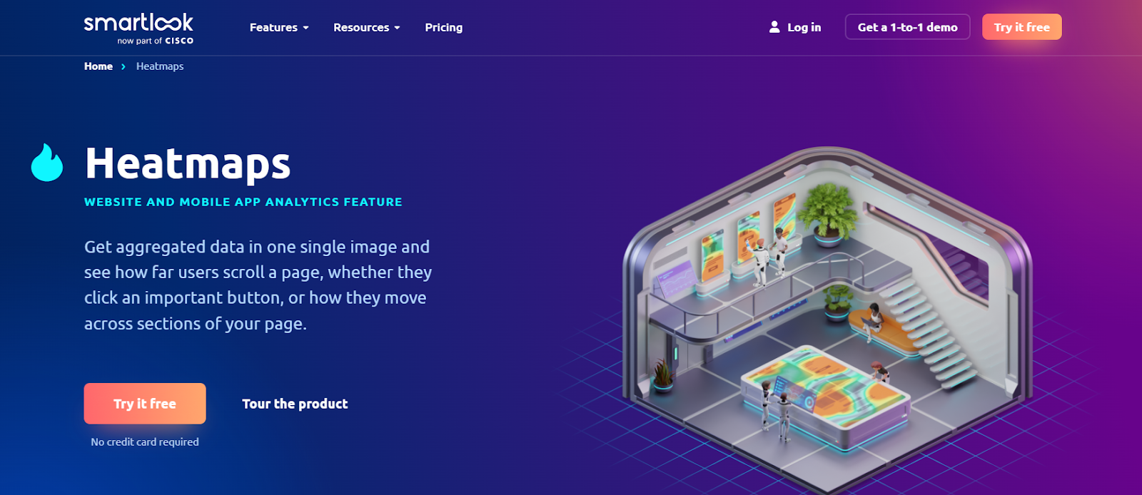
Smartlook is an innovative mobile heat map app that simplifies data visualization by presenting key user behaviors in a single image. You can effortlessly track user scrolling, button clicks, and page navigation, gaining insights into what engages your audience without the hassle of data sampling.
Smartlook offers different heatmap types, such as click, movement, and scroll. Plus, you can segment data by data and complement your research with further insights through session recordings. The organized galleries in the tool make it convenient for you to access all your heatmap insights in one place.
FullStory
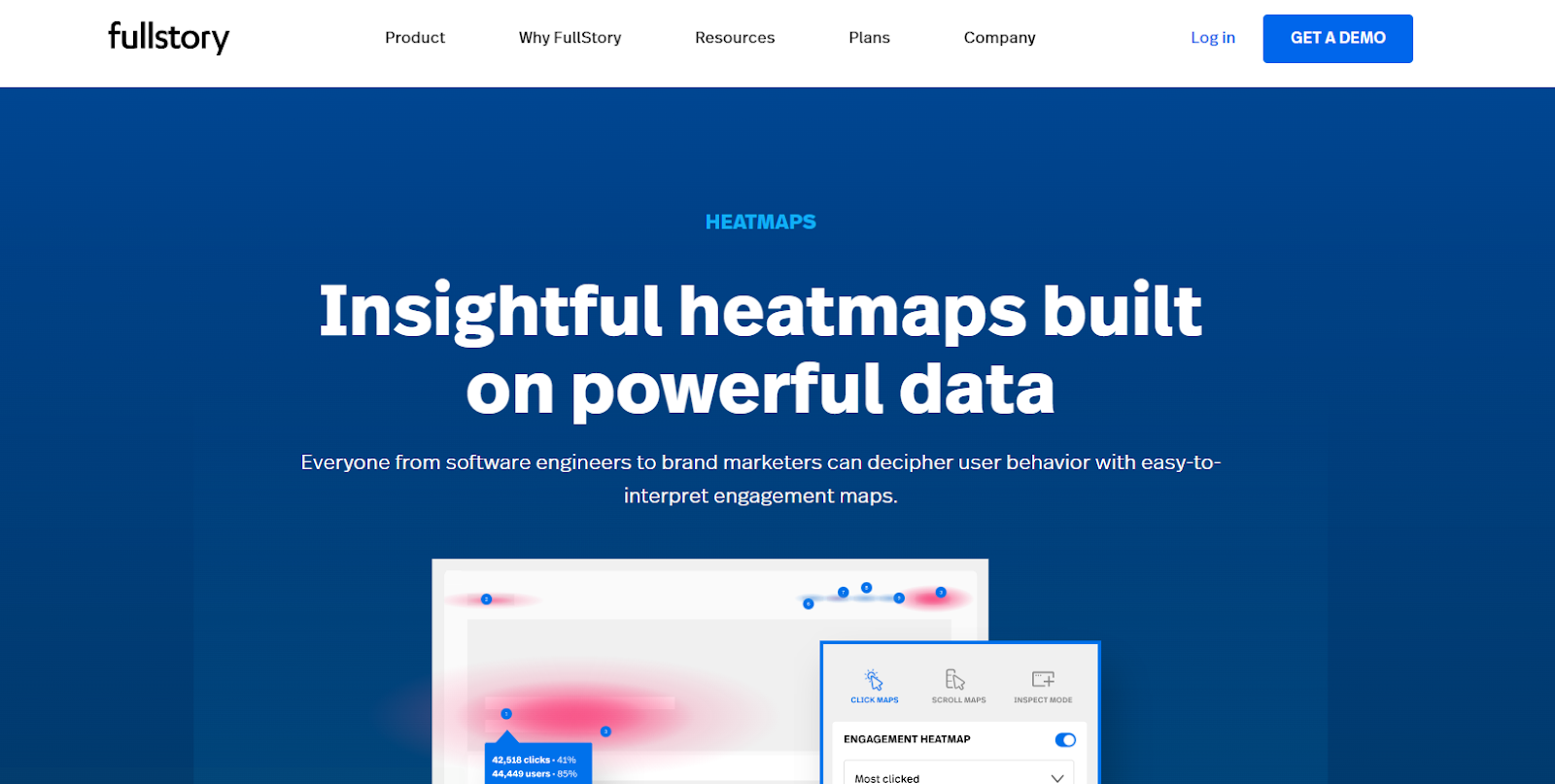
With this heatmap app, you can assess user behavior on your app, helping you validate your design and messaging in your app. You can prioritize hypothesis testing by studying scrolls and clicks, and pinpointing opportunities for optimization.
When running mobile heatmaps, you have the flexibility to choose between the Android or iOS page and select page properties, device type, time range, and segment to filter your heatmap outcomes based on your requirements.
ContentSquare
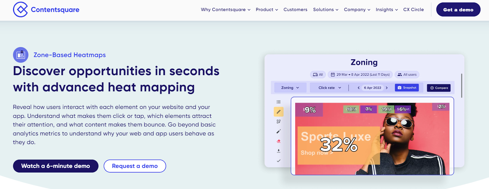
Contentsquare’s heatmaps offer a comprehensive view of in-page and on-screen actions, including clicks, taps, hesitations, scrolls, and swipes. You can perform a side-by-side analysis on the platform or on-site using the live zoning extension.
You can conveniently export and share heatmap data with digital teams and stakeholders using this tool. Plus, you can explore deeper insights effortlessly through shortcuts session replay and customer journey analysis. This analytics tool is compatible with Native iOS, Android, Flutter, and React Native.
Mobile app heatmaps help to improve user experience
If there is one certainty in the dynamic landscape of devices, it is that smartphone penetration is only going to increase.
So, if you’re looking to make your app a powerhouse of engagement and conversions, mobile heatmap analytics are your golden ticket to watch the stories behind every user interaction in your app. Just weave mobile heatmaps into your workflow, and you’ll be surprised to see how it takes your optimization to a new height.
And if you’re wondering where to start, look no further than VWO Mobile Insights – it’s your go-to tool for supercharging your entire optimizing journey. Give it a try, and explore its superb features, and we’re confident it will become an essential tool on your user behavior discovery journey.
FAQs on mobile app heatmap
Yes, you can use VWO to optimize the user experience on your mobile app. With VWO Insights for Mobile Apps, you can track how users interact with your app and understand why they struggle. Features like mobile app heatmaps and session recordings enable you to gain valuable insights into user behavior and help you uncover the reasons behind every action taken on your mobile app.
Mobile app heatmaps work on the data gathered from the mobile app users’ touch. Some examples of the type of touch data collected are swiping, tapping, or zooming. Based on the data collected, a mobile app heatmap shows the different areas of engagement of the user with the mobile app.
UI and UX for a Mobile app are very closely bound. Mobile App heatmaps help to track every gesture of the user on the mobile app interface, i.e. UI of the mobile app. The insights derived from tracking the elements can be used to optimize those elements, thereby improving the experience for the users, i.e., UX.
A mobile app heatmap is a visual data representation of tracking and illustrating user interactions within the app. It uses color-coded overlays to reveal where users click, tap, or spend the most time. Warm colors like red indicate high interaction, while cool colors like blue indicate lower user interaction in an app. Mobile app heatmaps help you understand user feedback through their behavior, identify areas of engagement or bounces, and make data-driven important to enhance user experiences and retention.
They provide valuable insights into user behavior, helping app developers optimize the user experience. Heatmaps identify popular app features, pinpoint areas of high and low interaction, and reveal scrolling behavior. This data-driven approach enables you to make informed design and functionality improvements, enhancing user engagement, and retention. By addressing pain points, app heatmaps can boost conversion rates, reduce drop-offs, and ultimately contribute to improved app performance, making them a valuable tool for enhancing mobile app success.
Heatmap for mobile apps provides valuable insights into user behavior by pinpointing areas of high and low interaction in apps. Based on the data collected, you can make informed design and functionality improvements, enhancing user engagement, and retention. By addressing pain points, heatmaps help reduce drop-offs, increase conversions, and enrich the overall experiences in mobile apps.
VWO Mobile Insights, UXCam, Smartlook, ContentSquare, and FullStory are some of the best mobile app heatmap tools. To know more about their heatmap features, read the relevant section in the blog.
Categories:


![Top 10 Shopify Heatmap Apps [With Features – 2026]](https://static.wingify.com/gcp/uploads/sites/3/2020/04/Feature-image_Shopify-Heatmaps-All-you-need-to-know.png?tr=w-300,h-150)


