Call-to-action (CTA) buttons are your visitors’ guides that help them accomplish a goal and contribute to your website’s conversion rates. Anyone who has tried A/B testing knows what a good call-to-action can do for their conversion rates.
Some of the most common A/B tests involve changing button color and size, followed by tracking to identify the best-performing combination that helps in navigating visitors to convert.
But wait. A successful CRO plan begins with gathering maximum user information and insights. Everything stems from there and sets out an effective roadmap. Before jumping straight into experimentation, understand the visitor behavior on your website and create effective hypotheses even for button tests. Against the common perception, it is NOT a hit-and-trial game!
Download Free: Landing Page Optimization Guide
In this blog post, we have chalked out a plan and listed best practices to design and deploy high-converting call-to-action buttons on your website.
Prioritizing your CTAs
Although it’s highly recommended across the industry by experts that you stick to only one CTA per page, if your conversion strategy requires a secondary CTA, it’s important that you’re clear with their prioritization.
Real-life testing scenarios can be complicated and may involve multiple variables than just the revenue conversion rate of individual CTAs. In that case, I suggest that you make a table as shown below to decide on your primary and secondary CTAs. You need to hypothetically score each of the variables on a scale from 0 to 5. Calculate the sum score to find your primary call to action. For example:
| Variable1 | Variable2 | Variable3 | Total | |
|---|---|---|---|---|
| CTA 1 | 4 | 5 | 1 | 10 |
| CTA 2 | 3 | 2 | 4 | 9 |
The variables here can be anything, like previous CTRs, revenue conversions, ease of effective management, technical complications, and others. Every case is unique and can have its own set of complex variables. The important thing is, you should know how to get your priorities straight in such cases.
One thing you should know here is that even when you have two call-to-actions on the same page, they should still be somewhat related to each other. And the ultimate conversion goal of both buttons should be the same.
4 factors you must consider for higher converting CTAs
As CTAs are crucial elements on your landing page and impact your conversion funnel, their design strategy demands close attention during conversion optimization.
1. Button text
Value. Yes! Your CTA buttons should answer the question, “Why should I click this?” In other words, it should convey a benefit to the reader as clearly and simply as possible. A neat example of this is the Netflix CTA given below.
Amidst the COVID-19 pandemic, Netflix had 207.64 million paid subscribers worldwide as of the first quarter of 2021, owing to the lockdowns and popularity of the streaming app. The clean CTA button design on their form is easy on the eyes, and the text does not communicate aggressively; instead, it invites you to get started. The additional text is also reassuring and thus enables prospects to make a quick decision.

Your button text should be specific, simple, and crisp. The extra details around your CTA should facilitate your visitor’s decision-making process rather than leaving them confused.
One more hindrance that button text can eliminate for you is anxiety. Website visitors hesitate in taking action for multiple reasons. Understanding visitor hesitations by directly asking what stops them from taking action on your web page can help you discover a goldmine of insights that you can utilize to optimize your CTA buttons and your website in general.

2. Button color
I’m not here to suggest that orange has better conversions than red, or green is the color you should stick to for your CTA button color. The one-size-fits-all deal defeats the purpose of experimentation.
You can create an effective hypothesis that the button color should be in stark contrast to your background colors because it catches visitors’ attention at first glance. Then run an A/B test, using a/b testing platforms, to validate this hypothesis.
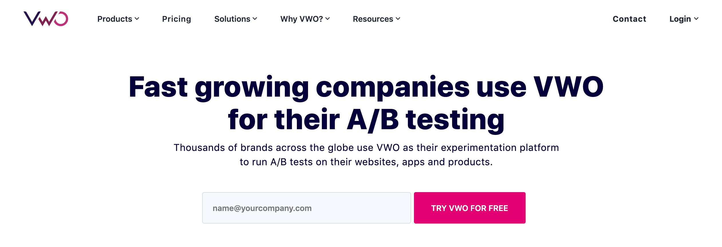
For example, take a look at VWO’s free trial magenta CTA against a white background on their homepage:
3. Placement of your call-to-action
Okay, we all know that it should be in a prominent position on the web page. So no points for calling out the page header, left sidebar, or center of the page.
Did someone say, above the fold? Interesting but not always true! Yes, “the fold” is just a myth. Many times, moving the call-to-action below the fold has been shown to have a higher conversion rate. As it seems, for some complicated offers, people like to understand the deal a little better before they prefer to take action. In such cases, if your CTA is placed above the fold, not many people will bother to click it.
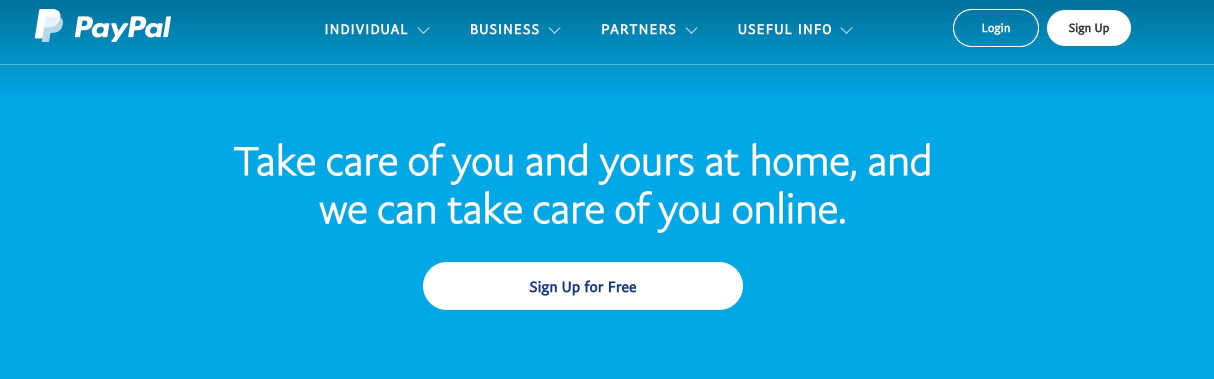
Call visitor attention to your CTA by using a good chunk of white space. It helps the CTA stand out to guide visitors’ eyes in the right direction. Although in an attempt to place your button on whitespace, make sure you do not end up placing them so far from the main text or surrounding elements on the page that it starts to look disconnected. This can again reduce your conversion rate.
See how PayPal uses whitespace on their website:
Download Free: Landing Page Optimization Guide
4. CTA size
Your CTA should go easy on the eyes, be readable, and not overwhelm the visitor. There are situations wherein you have to make your primary CTA distinctive from the secondary CTA.
You should A/B test your CTA buttons for size and color to know which set of variations receives the maximum number of clicks and views, contributing to your conversion goals.

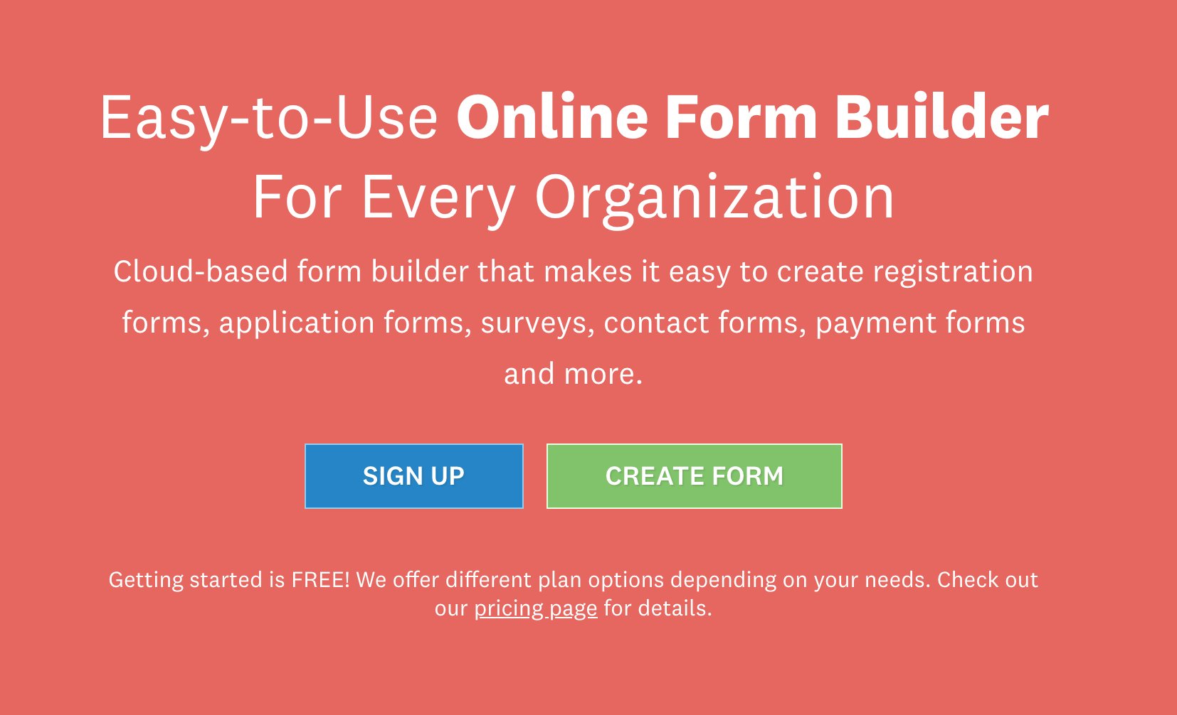
Below is an example of Wufoo.com showing two CTAs in different colors:
Analyze your eCommerce website for free
Some additional tips
- Place your privacy policy below your CTA button
This improves the credibility of your offer for consumers. It is also considered a good SEO practice by many webmasters (there’s no proof available for this), mainly because it might contribute to the site’s credibility factor if it undergoes Google’s manual review. Still, it won’t make much of a difference to your site’s ranking, though.
The link to the “Privacy policy” page placed next to the call-to-action buttons may not distract visitors and negatively impact the conversion rate. Therefore, this should not be a point of concern.
- Remove distractions
The positioning of the CTA on your web page should be clutter-free. Social media buttons, any unrelated content should be nowhere near the CTA. The only elements that can push the offer better should be near the CTA.
Get started with these free resources for creating high-converting CTA buttons
Here goes the list of free resources on creating buttons that convert and examples to get you started:
Photoshop Resources
- Make A Big, Beautiful Call-To-Action Button In Photoshop [Sitepoint.com]
- Top 100 Useful Photoshop Buttons and Badges Tutorials [SpeckyBoy.com]
Ideas for buttons
Conclusion
Small tweaks in your CTA button design might look insignificant, but can considerably impact your website’s conversion rates if optimized well. And to do so, understanding visitor behavior on your website lays the foundation of your experiment with a crisp hypothesis based on the insights derived.
Iterative A/B testing of your CTA designs can help you validate your hypothesis, which in turn can skyrocket your conversions.