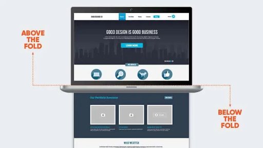
What is below the fold?
‘Below the fold’ refers to the bottom section of a web page that is only visible after scrolling down. In other words, the content is not immediately visible when the user first lands on the page so they must scroll down to view it.
It is important to understand the spacing on the platform when you are strategizing webpage content and call to action buttons.

Fun fact
Before we continue, an interesting fact – this terminology originates back to a time far before anything was digital. That’s right, we’re talking print journalism. Because of the large size of newspapers, they had to be folded when displayed on newsstands. This led to the content that was considered less important being placed below the fold.
Similarly, in the digital marketing era, it is believed that ‘above the fold’ content gets more attention, and is, therefore, more valuable than below the fold content.
This results in web designers focussing on the above the fold content to grab the users’ attention while deciding the structure of a page.
How to measure the fold of a webpage?
It is not possible to define the exact placement for a webpage fold. This is because the exact location is dependent on the screen resolution of the device being used. Screen sizes differ for phones, computer monitors, and tablets. However, most designers suggest that the fold line is about 1,000 pixels wide and 600 pixels high. The best scenario for a common screen resolution is to set the viewport at 1024 pixels wide, with a maximized browser window without toolbars at the top and the content pushed down.
Is below the fold important?
In one word the answer is: Yes, but not as much as the first fold.
Regardless of screen size, the user experience is extensively influenced by the content visible at the top vs. the content hidden at the bottom. The average difference in user interaction with the information above vs. below is 84% as per a study by the NN Group.
Now the above analysis is important if you’re deciding on the placement of a call to action (CTA) to bring users to your product page. A poor viewability can result in a huge decline in clicks, conversions, and revenue.
However, it may not be a big deal if the below the fold content is placed on a page which already provides engaging content to the user and they want more information about a product or service. You can A/B test the placement of elements on your page to determine what works best with your audience.
Due to its low visibility, ads placed below the fold are usually less expensive as compared to ads placed above. Many companies selling ads on their websites provide discounted prices to place ads below the fold.
Do devices matter?
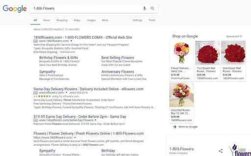
Yes, the type of device matters when deciding the placement of an ad. Let’s look at an example of a Google search to understand the difference:
When a search is done on a desktop, multiple ads are visible without much scrolling:

But the same search on a mobile narrows the results and the race to earn the top ad spot gets more intensive:

The risk of falling below the fold in SERPs varies depending on the device used to search.
Consideration for mobiles
The popularity of mobile devices used for web browsing is challenging the concept of “fold designing”. The availability of different sizes and dimensions of mobiles has forced designers to come up with new ways of designing websites. This is because most smartphone users browse in portrait mode and tablet and desktop users browse in horizontal mode. To overcome this problem, responsive designs are an effective solution to ensure a good user experience.


