You must have heard the age-old saying, “Do not judge a book by its cover.”
Well, it doesn’t quite apply to the World Wide Web. In fact, here the case is just the opposite.
A study revealed that web users only take 50 milliseconds — or 0.05 seconds — to form an impression about a website!
Download Free: A/B Testing Guide
People judge a website by its cover.
And a website’s first impression on its users depends a lot on its “above the fold” content.
However, with the users’ behavior evolving over time, the traditional usage of the fold might no longer be relevant.
This post digs deeper into the subject and offers you relevant actionable tips to increase conversions.
You can find the following topics inside the post:
- What Does “Above the Fold” Mean?
- Why a Website’s Above the Fold Matters for CRO
- Legacy Above the Fold Practices
- Why Legacy Practices are Irrelevant Now?
- Current User Behavior and Above-the-Fold Practices
- Actionable Tips
What does “Above the Fold” mean?
Above the Fold is the portion of a web page that is visible without scrolling.
It is the first sight that visitors encounter on a web page. Consequently, website designers and developers give a lot of thought to what goes above the fold.
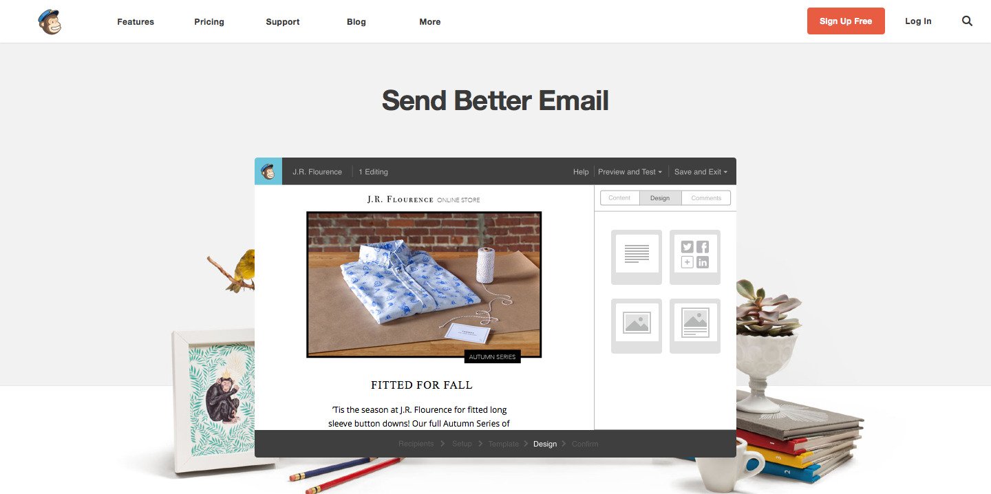
For example, this is what Mailchimp displays above the fold on its homepage:
Quick Trivia: The term “Above the fold” has originated from the newspaper industry.
Newspapers are usually folded in half before they are put on sale. Since readers can only see the top half of a newspaper, it is imperative for the content above the newspaper’s fold to be compelling — influencing readers to buy a piece. It has, therefore, become a common practice to display a newspaper’s most intriguing stories and graphics above the fold.
During the web’s early days, the above-the-fold concept was carried over from newspapers to websites.
Why a website’s above-the-fold matters for CRO
Whenever visitors land on a web page, they expect to immediately find the information they require. If the web page doesn’t offer information/value right away, visitors leave.
By including relevant information and user actions above the fold, your website will keep visitors engaged — right from the start. With this, the chances of your visitors exploring your offerings will be higher.
And, the better the visitors understand your offerings, the better they are positioned to make a conversion.
Legacy above the fold practices
The legacy best practices — during the 90s and early 2000s — advised putting all of a web page’s important elements above the fold.
This was based on the theory that anything placed below the fold will rarely be viewed by web visitors.
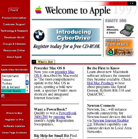
Here is Apple’s website from the 90s:
Many websites limited themselves to around 600 pixels in height. Articles on websites spanned multiple pages, requiring users to click instead of scrolling to read more.
Why did these practices exist?
At this time, scrolling was not so intuitive for users. Navigating down a website used to take some effort (owing to clumsy scroll bars).
Jacob Nielson, from the Nielson Norman Group explained this further: “This reluctance to scroll made sense at the time, because people were used to having computers show all their choices. Dialog boxes, CD-ROM multimedia shows, and HyperCard stacks all worked that way, and didn’t require scrolling.”
These factors heightened the importance of the above the fold space.
Above the fold, thus, became the most valuable real estate of a web page.
Download Free: A/B Testing Guide
Why legacy practices are irrelevant now
Because now, users scroll!
Scrolling down a website on PCs has become effortless — with the scroll wheel of a mouse or the double-finger slide on a touchpad.
Still, the changing behavior of users can be largely attributed to the increased usage of mobile devices.
While using a smartphone or a tablet, users scroll down almost involuntarily. With the smaller screen size of the devices, users expect a web page to provide more information below the fold.
As the limitation — that users will rarely view below-the-fold content — is no more in place, websites don’t have to constrain themselves to just above the fold.
Moreover, the whole concept of the fold becomes ambiguous when multiple screen sizes are involved.
Currently, there are numerous devices with different screen sizes available across the world. This makes it impossible to define a single point where the fold lies.
Below are the different screen sizes for mobile Android devices:
![Luke Wroblewski on Twitter: "There is no fold. [part 6] http:::t.co:T1b7AnkDCS" 2015-08-17 16-41-51](https://static.wingify.com/vwo/uploads/sites/3/2015/08/Luke-Wroblewski-on-Twitter-There-is-no-fold.-part-6-httpt.coT1b7AnkDCS-2015-08-17-16-41-51.jpeg)
In addition, more and more websites with Responsive Design are being rolled out.
A responsive design allows a website to change its layout according to the screen resolution of the device on which it is being viewed.
These design practices, too, make it impossible to define a universal fold.

Furthermore, there are multiple studies that show how elements placed below the fold attract similar (or higher in some cases) user attention, compared to elements placed above the fold.
“Positions slightly below the fold between 600 and 1000 pixels typically have both high viewership and high engagement” — Chartbeat.
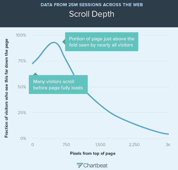
“66% of attention on a normal media page is spent below the fold” — Chartbeat.
“For continuous and lengthy content, like an article or a tutorial, scrolling provides even better usability than slicing up the text to several separate screens or pages” — UXMyths.
“The most clicked link on the homepage is at the very bottom” — Milissa Tarquini.
Current user behavior and above-the-fold practices
The above section makes it abundantly clear that the fold does not drive user engagement on a web page.
Yet, above the fold holds a great deal of importance for web pages.
Let’s see how.
With the overwhelming availability of information across the internet, users are spoiled for choice. They have become impatient, and they leave a website that doesn’t offer them information right away.
For this reason, users spend the majority of their time looking at information above the fold — judging the website.
Above the fold is where users decide whether to stay on a website or not.
However, the objective of Above the Fold has now changed from providing all the information through 800×600 pixels.
It is now used to engage users and provide cues about what the web page has to offer.
Today, above the fold space focuses on building up users’ intent towards making a conversion.
Delving further.
Yes, users scroll. But they don’t scroll just for the fun of it.
To scroll down a web page, the users need a compelling reason. And this compelling reason cannot lie far down the web page. Most users would bounce before even reaching that point. The users must be kept intrigued right from the start — above the fold.
A web page above the fold should be promising. It should make the users scroll down and browse through additional content. As users will be engaged for a longer time, the conversions are set to rise.
You can additionally use the above-the-fold space to highlight your brand image.
By positioning certain branding elements above the fold, you can clearly project yourself as a differentiated brand in the industry.
Actionable tips to boost conversions:
Below are a few actionable tips to make users scroll through, and engage more with your website.
1) Encourage users to scroll
Consider your web page as a story. With each content line and element, your users should be impelled to view the next section of your web page.
The climax of the web page story should be accompanied by a CTA.
Here are some techniques to make your users scroll down:
Include a web element that lies on both sides of the fold.?
Here is an example from VWO’s homepage.
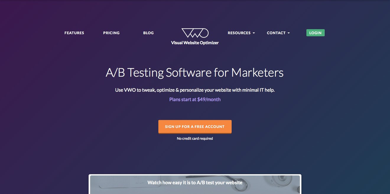
The web page presents users with a partial rectangular graphic right on the fold.
The text over the graphic says, “Watch how easy it is to A/B test your website.” This makes it almost obvious that the graphic is a video. And since the users cannot view the video just yet, they will scroll below to do that.
You can use any web element in place of the video to achieve your end goal — even plain text!
Offer a preview of the content that the web page contains below.
For instance, I’ve given a preview of this post’s contents at the start.
The preview makes the users aware of everything the web page has to offer. If the users want to browse through the information offered on the preview, they will scroll.
Offer an explicit cue for scrolling.
Instead of providing subtle cues, you can directly tell your visitors that the page contains more information below the fold.
You can display a downward arrow, a scroll icon, a “Scroll down” text, or anything similar.
Here is an example:
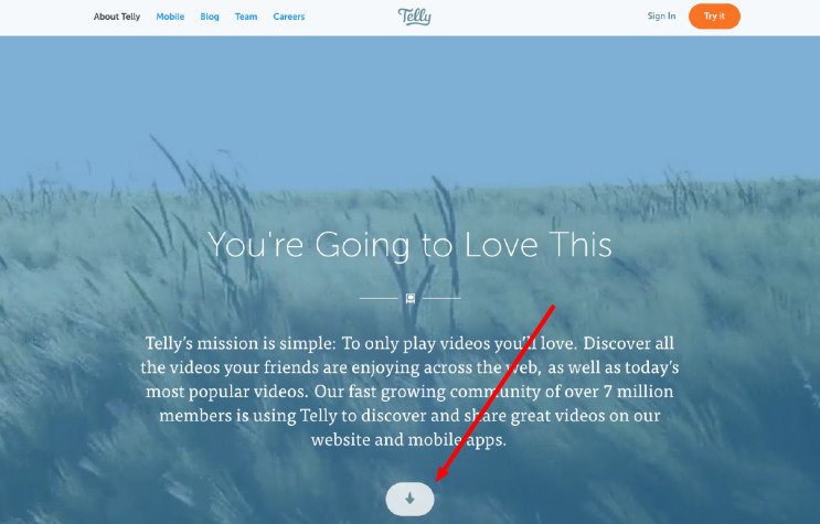
Image Source: DesignWoop
2) Offer website’s differentiators above the fold
There have been multiple cases where placing a website’s credentials — trust badges, social proof, etc. — above the fold has resulted in an increased number of conversions.
Below is an example — the variation outperformed the control.
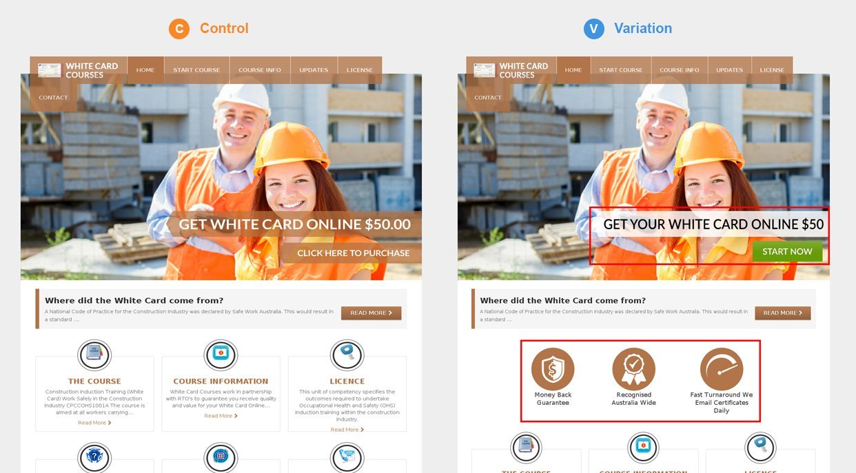
Higher conversions imply that users engaged more when websites displayed their differentiating factors clearly.
That being said, you shouldn’t put up these web elements above the fold without testing their effectiveness. You can create an A/B test to see which version of your website performs better.
Related Post: See How Betfair Used Persuasion Principles to Increase Conversions by 7%
3) Keep your content top-notch
“Content is still the king“
Following all the best practices, or having a visually appealing above-the-fold design doesn’t guarantee you high engagement with users. Largely, the quality of your content determines how far the users are going to browse through your web page.
Hence, a well-thought above-the-fold design should always be coupled with awesome content.
What else would you like to read about? Email us at marketing@vwo.com!
- https://www.tandfonline.com/doi/abs/10.1080/01449290500330448
- https://cxl.com/blog/first-impressions-matter-the-importance-of-great-visual-design/
- https://www.nngroup.com/articles/how-long-do-users-stay-on-web-pages/
- https://www.nngroup.com/
- https://uxmyths.com/post/654047943/myth-people-dont-scroll
- https://www.nngroup.com/articles/scrolling-and-attention/
Categories: