
What is responsive web design?
Responsive web design refers to creating websites that function properly across all platforms and screen resolutions.
Responsive web design adapts to users’ preferences and the gadgets they’re utilizing. Based on the dimensions and features of the devices, the layout varies.
With responsive design, page components are rearranged in response to changes in viewport size. It uses proportion-based grids to reorder the text and design components.
A single codebase can serve users with various viewport widths rather than having to create numerous websites and associated codebases for wide-screen displays, desktops, laptops, tablets, and phones of all sizes.
The viewport, which changes depending on the device, is the portion of the window where online content may be viewed.
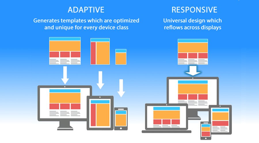
Responsive web design vs adaptive design
Although the approaches are distinct, they are both important web design trends allowing web developers to customize their site’s appearance on various devices. Let’s look at the differences.
| Responsive Design | Adaptive Design |
| It can modify the layout and appearance based on the device’s screen size. | It demands designing a unique layout for each platform that the website will be used on. |
| Built on a flexible grid | Uses multiple static layouts |
| Works well with large-sized sites | Better for smaller sites |
Importance of responsive web design
With the advent of smartphones, tablets, and smart gadgets like Kindles, gaming consoles, etc., responsive design has become increasingly popular. Today’s users expect to view any website from a wide variety of devices. All possible scenarios should be supported by your website.
Let’s look at some significant benefits of responsive web design:
- A responsive design and mobile-friendly behavior help websites rank better in search engines as Google encourages websites that appear well on devices such as smartphones.
- Consistency in user experience among all devices strengthens engagement, enhances lead generation, and increases sales and conversions.
- Your target audience may be reached and your messages can be delivered on all different sorts of devices (tablets, phablets, smartphones).
- It strengthens customer trust and brand identification. Consumers are more inclined to endorse a brand if its mobile website is well-designed.
- It is economical. Instead of building different versions of the same website to accommodate various screen sizes, responsive design is more affordable.
- It demands little maintenance. To manage your platform with several versions, there is no need to engage a whole firm.
- It provides you an opportunity to keep one step ahead of your rivals as over 50% of businesses worldwide continue to disregard mobile behavior and flexible layout.
Benefits of responsive web design
The key advantages of utilizing a responsive website are
- A steady visual experience
- An enhanced customer experience
- Redirects are not necessary
- Reduced bounce rates
- Fast loading of websites
- No additional charges to create and maintain several versions
- Streamlined analytics reporting
Building blocks of a responsive website design
An effective responsive website design consists of the below building blocks:
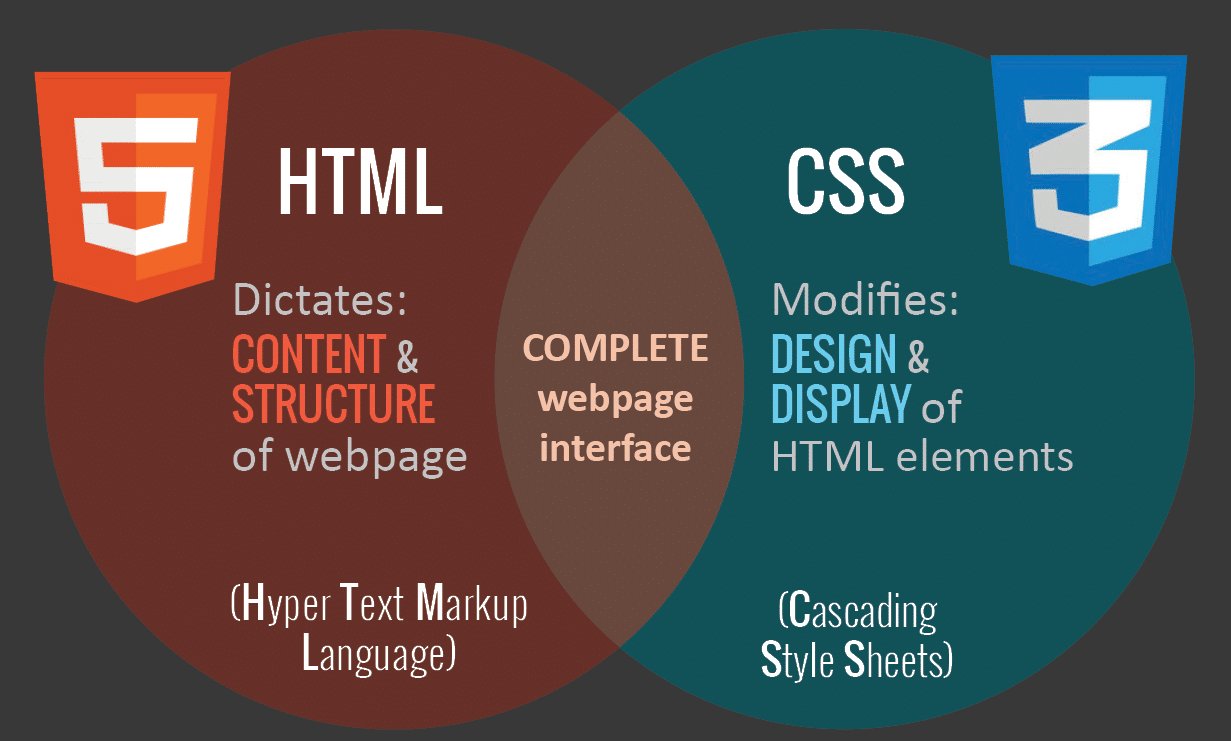
CSS and HTML
The integration of the two languages, HTML and CSS form the backbone of a responsive design. The below infographic shows the respective functions:
Media queries
Media query is a key component of CSS3, which enables you to display information to adjust to various conditions, such as screen size or resolution.
A responsive breakpoint or screen size breakpoint is required to engage with media queries. In CSS, a breakpoint is the width of the screen where new styles can be implemented. Some common screen sizes where media queries can be implemented are
- Mobile: 360 x 640
- Mobile: 375 x 667
- Mobile: 360 x 720
- iPhone X: 375 x 812
- Pixel 2: 411 x 731
- Tablet: 768 x 1024
- Laptop: 1366 x 768
- High-res laptop or desktop: 1920 x 1080
Fluid layouts
A fluid layout is a crucial component of contemporary responsive design, which focuses on dynamic values such as a percentage of the viewport width
rather than static values.
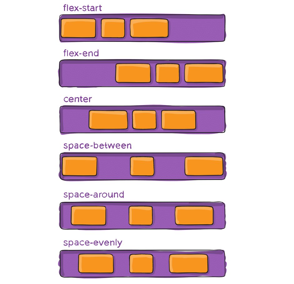
Flexbox layout
Flexbox is a CSS module created as a more practical approach to organizing many components, even if the container’s contents have unpredictable sizes.
Using this layout method is ideal if you want to fit different-sized items comfortably in a row or rows. Smaller items will take up less space, while larger items will get more space to occupy.
A flex container may extend or contract contents to fill space or to stop spillage. Many special features, such as justify-content, are only available in these flex containers and cannot be changed using a standard HTML element.
Responsive images
The simplest version of responsive photos uses a dynamic unit to regulate the width or height, which is the same idea as a fluid layout. The trouble with this method is that each user—even those using mobile devices—must download the entire image.
Speed
The loading time of your website should be your top concern when trying to develop it with a responsive layout. Several ways to make pages faster are
- Optimized images
- Caching
- Minification
- More efficient CSS layout
- Avoiding render-blocking JS
How to make your website responsive
While developing a responsive website design, the below steps should be kept in mind
Create suitable responsive breakpoints
Devices with various screen sizes and resolutions are used to visit any website. Every screen size must be represented flawlessly by the program. There can be no editing, cutting, or obscuring of content or photos.
When CSS breakpoints are used, website content adapts to screen size and presents itself in an appealing manner that makes it easier for users to view it.
Begin with a fluid grid
Nowadays, instead of using historically common pixel measurements, webpages are designed using a concept known as the fluid grid.
The columns of a fluid grid are adjustable, rather than having fixed heights and widths. The size of the screen affects the text and element dimensions. Working with the website’s source code enables the creation of a fluid grid’s rules.
A fluid grid:
- Arranges and place web components on a site by the screen size it is shown on.
- Enables components to adapt and adjust to match the size of the screen rather than being created in a fixed, predetermined size specified in pixels.
- It aids in maintaining a site’s aesthetic consistency across various devices.
- Additionally, it allows for quicker evaluation in terms of design and provides improved alignment control.
Create “touch-friendly” websites
The precision of a mouse or stylus is being traded for the ease of using one’s fingertips as mobile surfing becomes more and more popular. As a result, all of your website’s interactive components—including links, buttons, CTAs, and other elements—must be “touch-friendly.” Use a size that is appropriate for your buttons’ height. Your site’s navigation is as smooth and simple as possible thanks to the objects, which are large enough and fluid enough.
Flexible typography
A responsive design should allow for the proper text size adjustment to fit the screen size. To adapt to screen size and be legible on a variety of devices, this is important.
Test for responsiveness on actual devices
Examining how the website looks on various devices is crucial when creating and implementing responsive design. Test responsive designs on actual devices whenever feasible to ensure that they function exactly as intended for end users.
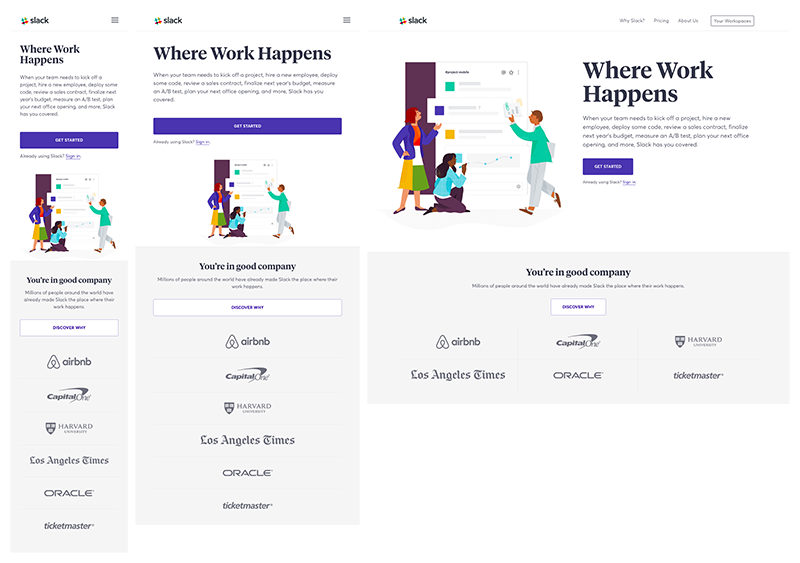
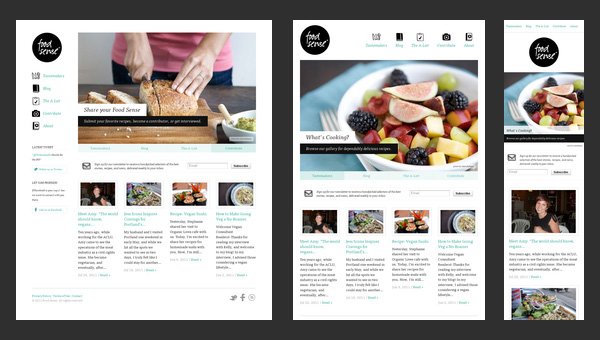
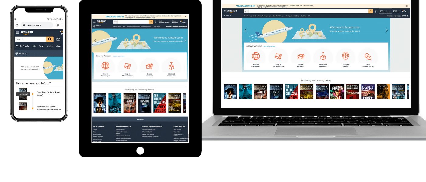
Examples of responsive design
Below are a few examples of responsive website designs which show the different looks on multiple devices.
Conclusion
A better user experience is made possible every time thanks to responsive web design, which enables us to build unique solutions for a greater variety of people on a wider range of devices. As technology advances in the upcoming years, we will need to constantly experiment with new gadgets, screens, and technologies to consistently enhance the user experience.