Above the fold: Meaning
The original meaning of “Above the fold” was in context to the first fold of the newspapers. Earlier, the newspapers used to be presented on the newsstands, folded in half so that the passerby could easily read the top headline at a glance.
In the digital world, ‘above the fold’ in a website means the content a visitor sees when your page loads before they scroll down.
Importance of ‘above the fold’
The ‘above the fold’ section, or ‘first fold’ as it is also called, gains its importance from being the part of the webpage that is first displayed to visitors. It is the primary section presented to the visitor. That’s why it should be catchy, attractive, and should be able to hook the visitor.
The above the fold section should consist of engaging and important content and be aligned to your business goals. For example, for an eCommerce website, placing their latest discount offers above the fold may lead to an increase in leads and conversions.
Above the fold and Search Engine Optimization (SEO)
As per Google, if your page doesn’t have a certain degree of content in the first fold, then your rankings may see a drop, and in the case of a new website also it will become an issue to rank the website initially. Since Google wants to serve their users with the best experience and relevant information right away, they have recommended putting relevant chunks of information in the first fold itself.
Also, for publishers that rely on ads for their revenue, if large blocks of ads persist to appear in the first few folds and it makes it harder for the visitor to find the actual original content on the page then this page layout algorithm will tend to impact such sites’ rankings.
Above the fold optimization: Best practices
The simpler the page, the more it will be able to grab the visitor’s attention. Below are some of the best practices that will help you optimize the above the fold section on your landing pages.
1. Page heading (H1) and primary copy
The H1 of the page should be clear, concise, and compelling. The primary copy should consist of your unique selling point (USPs). Your heading and primary copy should be able to clearly tell the visitors about what you’re offering and how you can solve their problems.
2. The right CTAs
Depending on your business goals and audience you should focus on creating the right CTAs and placing them on the right part of the website. Generally, the CTAs are placed on the top right corner of the page so that they are easy to find and take actions such as “Contact Us”, “Free Trial”, “Add to Cart”.
3. Page load time is the key to conversions
Page Load time is the most crucial thing for both Search Engine Optimization (SEO) and Conversion Rate Optimization (CRO). It takes less than a second for a visitor to form an impression about your website, hence above the fold content should load before the rest of the page loads. Removing unnecessary JavaScript from the header and optimizing the CSS will help in decreasing the page load time.
4. Remove all distractions
You want your visitors to get attracted to the compelling copy that you wrote in the first fold right? Avoid adding too many elements above the fold. Too many images, videos, sliders, pop-ups may distract the user and make them exit the website. Always stick to the thumb rule, show the most important information first.
5. Image optimization
Using images in the first fold is a very general practice, but the most important thing to remember is more graphics add to an increased page load time. It is advised to optimize images by decompressing them and serving them in the next-gen formats (webp, png) so that a high-quality image can be served quickly.
While best practices are recommended, what works for one business differs from what works for another. There is only one sure-shot way of identifying what works for you – and that is through A/B testing.
How to A/B test the first fold design
Now that you have a better understanding of what exactly above the fold is and how you can optimize it, it becomes important to test what will work better for you before you push it live for all your visitors..
What could be better than A/B Testing? To test your headings and primary copy, you can easily set up an A/B test using VWO Testing and see which version of your page performs better. Try Now. You won’t need developer help for this.
See how Elegant Steps tested above the fold elements on their website with VWO and improved their conversions by 200%. Elegant Steps’ main USP i.e. free shipping, did not appear above the fold on mobile devices. It was hypothesized that displaying “Free Shipping” above the fold will help reduce the bounce rate and encourage users to continue down the conversion funnel. The results kicked in within a month, and these were highly positive. The mobile conversion rate increased by 200%.
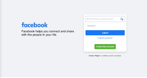
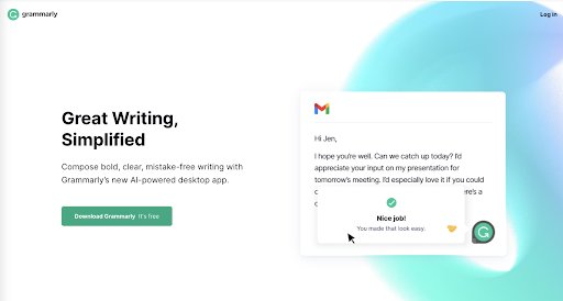
Above the fold examples
Below are some of the examples to give you a glimpse into what a good above the fold section looks like:
- Grammarly has a clear headline, with a concise primary copy conveying it’s USP and an obvious CTA asking the visitor to download the app.
- Facebook’s website also has a clear copy conveying about the USP of the company and then the sign-up form encouraging the visitor to engage with the page.