

The Call To Action (CTA) is one of the most important attributes on a landing page of any website you could imagine. So how do you create a CTA that inspires your website visitors to perform the said action?
Download Free: Landing Page Optimization Guide
To answer this, here are 5 parameters (along with call to action button examples) you need to consider if you want to drastically increase the conversion rate of your CTA:
1. Target Audience
Constantly learn about your target audience. This will positively impact your marketing efforts.
Creating a successful, high-converting landing page requires numerous skills, among which knowing your target audience is an essential one. Without knowing who they are and what they want, it’s hard to create any marketing material potential customers will respond to.
Essentially, marketing is a process of communication with your potential or existing clients, where your target audience sets the framework, language, tone, or mood for this communication. It’s unimaginably crucial to define your digital marketing communication strategy based on the target audience, including the points of what you can and cannot say (and share) if you want your marketing campaigns to be efficient.
So while making any important marketing decision, including the one on how to create and optimize your CTA, you should always keep your target audience in mind.
2. Copy
Unless you want to create a mystery, use very clear wording in your copy. For example, say “Order”/”Buy” instead of “Submit”.
Research and success stories show that simply changing the copy of a CTA from “Submit” to something more human, like “Buy” or “Order”, significantly increases conversion rate in most cases. However, this is not a one-size-fits-all solution.
Your CTA copy should comprise of action words that motivate your target users to click or perform any other action you are expecting them to take. It should create a sense of urgency ( ‘Limited Time’ offer) and nudge potential customers to actually convert. To achieve this, make sure it is clear what the visitor will get by performing the action; with no hidden agendas, small print, or surprises waiting on the other side of the click.
Use emotions, pep talk, powerful words or jargon if applicable. Don’t be afraid to experiment and get outside the typical, square Call To Action button box – just make sure your CTA speaks to your audience and stands out from what they’re used to seeing on the web.
3. Position
Test which of the three main strategies of placing the CTA works best for you:
- Above the fold
- Further down in the page after presenting information about your product
- Only after some engagement with the page (for example, after 10 minutes of watching a video)
The most common strategy is to place the CTA on the first screen, above the fold. However, I recommend experimenting with other placement ideas as well to see what works best for your business.
While placing the CTA above the fold makes it visible to the visitor right away, in most cases, he is not ready to perform the action right after entering the website. So, an alternative way to motivate the visitor to perform an action is presenting him with the CTA after showing him more details about your offer. To solidify your message, showcase some trust signs like client/customer feedback, ratings, certificates, add some urgency in the form of time-limited offers, and indicate your competitive advantages that will lure the customers in. And once the visitors have engaged with that, present them with the CTA, placing it somewhere down in the page.
Many landing pages use both the tactics – placing the same CTA above the fold and somewhere along the scrolling process. Another popular solution is to show the CTA above the fold and then move it to a fixed position on the screen (for example, the top right corner) when the visitor scrolls through the page.
You can even test showing the CTA only after some engagement from the visitor with the page when you are solid sure the visitor is ready to schedule a meeting or browse the product section. You can place your CTA in a few different ways – but always make it bold, vibrant, and eye-catching.
4. Focus
Make the CTA the most prominent element on the screen.
CTA should be one of the most notable elements on the page and without a doubt, the most notable element on the screen too.
In many cases, even if the CTA is bold and hard to miss, other elements with the same visual focus take up the spotlight and get your visitors distracted, which may negatively affect your conversion rates. Let’s assume, ‘Free Trial’ sign-ups is the primary objective of your marketing campaign. Then clearly directing visitors’ focus towards the free-trial CTA by avoiding distractions will make your CTA an effective one.
It is not uncommon to have a visitor randomly click on different prominent elements of the webpage and leave when he doesn’t get the expected result.
Download Free: Landing Page Optimization Guide
5. Context
Use the AIDA model to structure your page better to increase engagement.
The success of a landing page relies not only on the text, color, size, and placement of the elements but also on how well they play along together. The surroundings tell the users not only what they should do, but also why they should be doing it.
The entire landing page should aim to create an experience that motivates the visitors to perform the desired action.
An efficient way to increase the conversion rate of your CTA is to use the marketing model called AIDA – Attention, Interest, Desire, and Action. In AIDA, you lead visitors through the funnel the way we lead them through the landing page. So, use this method to structure your landing page accordingly.
As visitors consume information by pieces, plan it out in a way that will lead the user from entering the page – to reading and absorbing the information on your offer – to the CTA.
According to the AIDA model, you must show which visitor problems the product is solving, how it is doing so, why, and all of this while providing social proof and other trust signs, which will finally lead them to take the action you’ve been expecting.
Case Study
To give you an example of how the parameters I discussed above work in reality, here’s one of my case studies, where I used these ideas, which helped me significantly increase the conversion rate and sales of my client.
The client is an online designer dresses store with 30,000 unique visitors a day (at the time of the test). The client asked us to work on his product page. Here’s how it looked like:
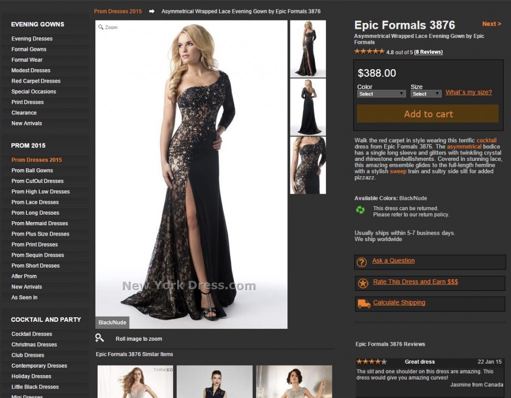
Not the best design, a bit outdated, but other than that looks like a normal eCommerce product page.
We at InsightWhale believe in the hardcore design approach “form follows function”, meaning that it is much less important how beautiful an interface is than how good it is at solving the problem.
In this case, the problem to solve was to make the visitor click “Add to cart”.
The first thing to be done was to analyze the structure of the page. I broke it down into a few basic components (such as product info, service info, trust signs, etc.) to understand what the page had and what it lacked. I noticed that there weren’t enough trust signs of the product on the page and the ones present, were out of the visitors’ sight.
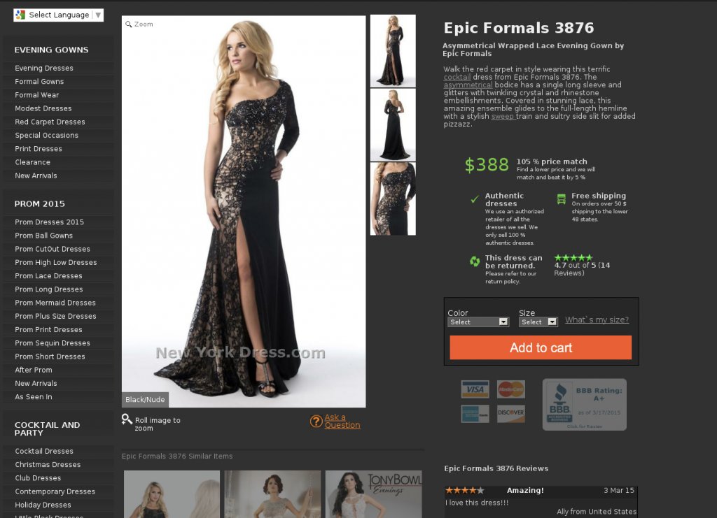
Keeping this information in mind, I re-structured the page using the decision-making funnel (my alternative to AIDA; showcasing information in the order that assists purchase decision-making).
In this case, I used principles of position and context (showing the CTA button after ‘crucial for decision-making’ elements) and focus (making the CTA button the most prominent element on the page).
Here’s how my variation for testing looked after redesign:
Below you can see how my variation (called “Tony”) performed compared to the original and another one created by a competing agency (called “Dave”).
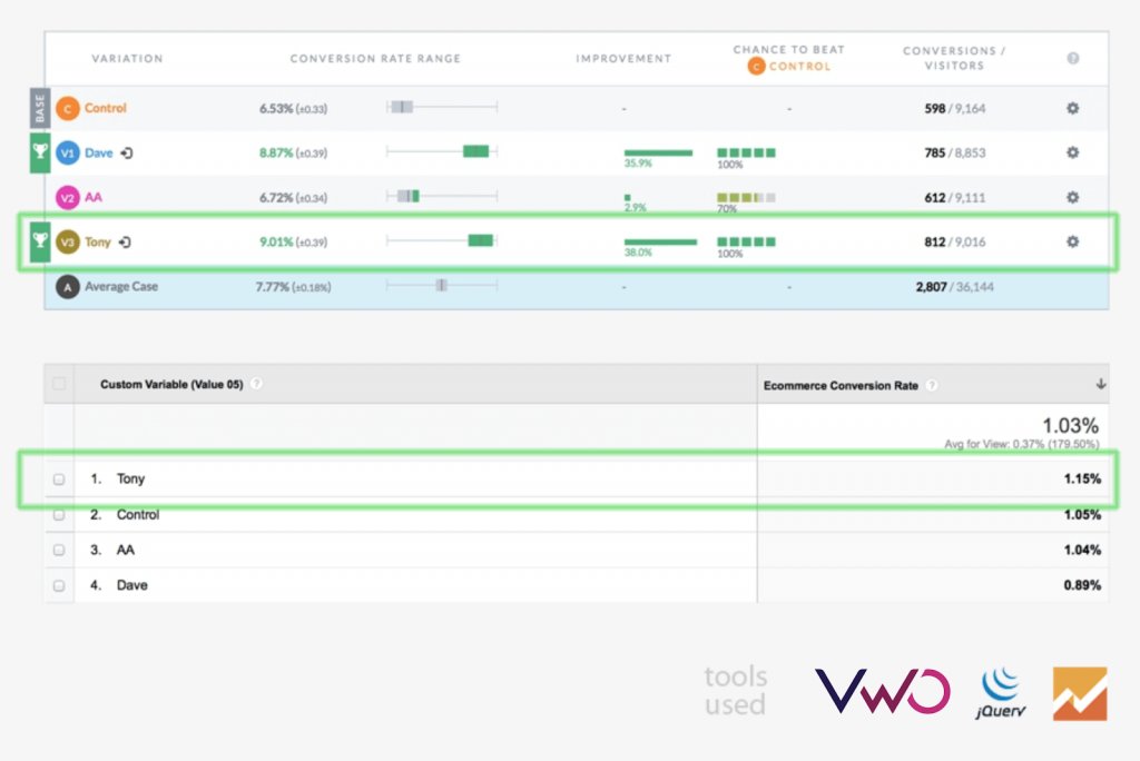
The first table shows a change in the “Add to cart” goal, while the second one shows the ecommerce conversion rate during the experiment.
Conclusion
Use these 5 parameters to create a CTA that grasps your visitors’ attention and results in increased conversion rates. And remember that the ideas given in this article are a good place to start, but to get real results, we advise you to test, test, and test again!
Categories:


![7 Best Sales Funnel Software for Every Business in 2026 [Backed by Expert Reviews]](https://static.wingify.com/gcp/uploads/sites/3/2025/01/Feature-image-7-Essential-Sales-Funnel-Software-for-Every-Business_-Top-Picks-for-Every-Purpose.jpg?tr=w-300,h-150)

![7 Top Landing Page Optimization Tools for 2026 [Ranked by Marketers]](https://static.wingify.com/gcp/uploads/sites/3/2024/10/Feature-image-Top-7-Landing-Page-Optimization-Tools-1.jpg?tr=w-300,h-150)


