

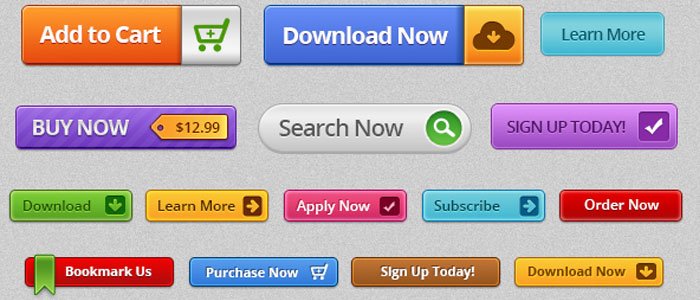
Add To Cart. Start Free Trial. Click Here. Book Tickets. Learn More. How do these phrases make you feel? Do they make you want to click on a button or link? Yes, but only when they are positioned and designed correctly. With the right message, they urge you to take action — whether to get more information about the product or service or make a purchase.
Download Free: Landing Page Optimization Guide
From email marketing and blogging to landing pages and social media posts, these phrases or Calls-To-Action (CTAs) tell your target audience what they should be doing once they click on the button or link. Simple examples of CTAs are “Shop Now!” and “Know More.”

The more information you provide your potential customers through your CTA, the better. You can then persuade them to take immediate action utilizing a clear and direct message. A CTA comes in different forms:
- Button
- Text hyperlink
- Plain text with no link
A CTA can also run longer, such as “Never miss an update from us; subscribe now!”. The possibilities are endless.

However, many marketing teams still neglect their CTAs across platforms. Research shows that 70% of small business websites lack a CTA on their homepage.
In fact, 90% of site visitors that read your hero banner also check out your CTA copy.
Therefore, you not only should use CTAs more often in your marketing but also learn to properly formulate them. This article is about the latter.
But before we jump into writing the perfect call-to-action, let us first study the key types of CTAs.
Key types of CTAs
1. Lead generator
Lead-generation CTAs aim to convert visitors into leads. Their placement is often strategic depending on where the content sees a high percentage of new visitors. This could be on the hero banner of the homepage.
If you use an eCommerce website builder, you can also easily place a CTA as a floating banner in the corner of the web page. This CTA should be visually appealing complemented by a crisp copy that communicates its value appropriately.
2. Social butterfly
Despite the rise of digital marketing, word-of-mouth still rules all forms of promotion. The digital version of “word of mouth” is, in fact, sharing the content through social media platforms. This comes in handy during blog promotions as you can create in-line sharing CTAs or add social sharing icons on the sidebar of posts to nudge readers to share within their network.
3. Continue reading
Have you ever come across CTAs such as Find Out More, Explore Our Products, and Learn More? These are the most used CTAs on websites, emails, and even social media posts. They help guide users to the page of their interest.
The copy should be convincing enough to make the user click. They work well on hero banners and can also be used for blogs and other resources.
Six ways to write a persuasive CTA
1. Using action words in the copy is a must
You have to be clear and direct with your CTA. You will not always get an option to write a sentence for a CTA. Therefore, it is best to get straight to the point asap. Tell your potential customers the action you want them to take. For instance:
- Promoting a new eBook? Write a CTA like “Grab Your Free Copy” or “Download Now”.
- Run an eCommerce store? Use words like “Buy,” “Order,” “Save,” and so on in your CTA.
- Want your site visitors to share their contact details? Start your CTA copy with “Please share your details in the form below…”.
Let us go back to the eCommerce example. If you launched a new range of superhero t-shirts, you want to be sure your audience understands how to purchase those. Simply writing “Our latest superhero t-shirt collection is now available” is not going to cut it.
A call-to-action such as “Click here to buy your superhero t-shirt today” is more direct and informative. It compels your audience to go for it!
VWO’s GPT-3.5 Turbo-powered AI copy generator can provide various copy alternatives for the existing CTAs on your page. Take a free trial to see how this works.
2. Creativity is key
Slapping a few words together would not make your CTA valuable. When writing calls-to-action, you need to strike a balance between wittiness and clarity. You want your CTA to be easily understood, but you also want to stay away from generic CTAs used by everyone else in the industry. So what do you do? Set context behind your CTA copy.
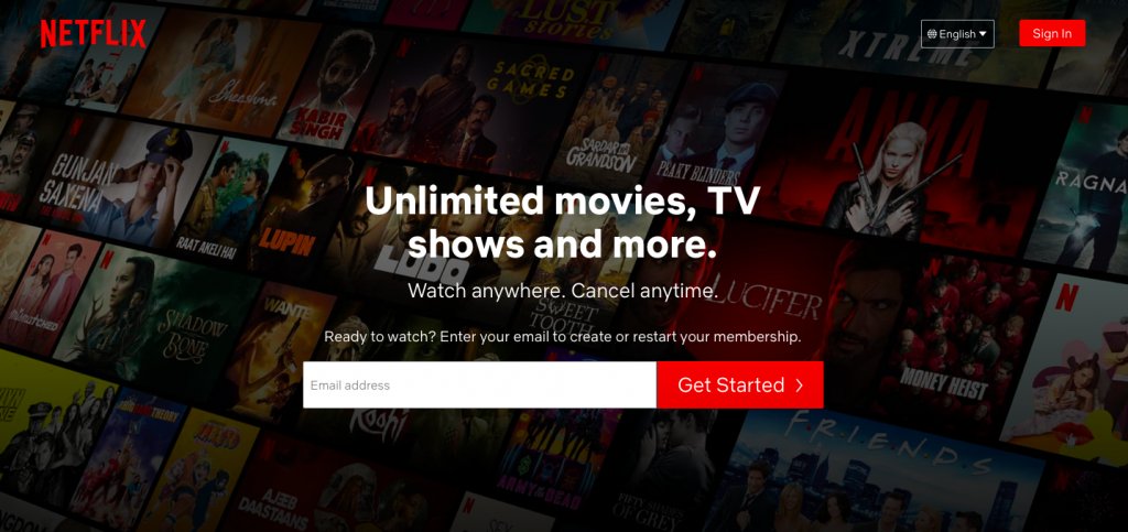
Netflix plays it simple, but it gets creative with its surrounding copy, giving its customers a clear picture of what they will receive when they get started. Therefore, do not hesitate to get a little creative with your pitch.
3. Stir up those emotions
The idea behind writing a CTA is to elicit a response from your target audience. If your CTA is enthusiastic, your audience will be equally jumpy.
With a CTA like “Shop Now & Get 70% off!” you provide them with a massive benefit. And who would not be thrilled to avail such a high discount?
Similarly, a CTA like “Find Your Dream Home With Us” excites potential homeowners and makes them eager to click on it. Also, add an exclamation point and give your CTA copy a little extra kick. Here is what you can do to evoke an emotional response from your CTAs:
- Add adjectives: “Book Your Dream Holiday With Us!”
- Make a promise: “Lose 20 Kgs In 6 Weeks!”
- Leverage your USP: “Purchase Your Hand-Made Soap Today”
- Back up with a number: “Buy Now & Get 70% off!”
- Play upon their FOMO: “Get Your Free T-Shirt! Offer Stands Till Midnight”
Your CTA copy must be conversational even when it is intended to be transactional.
4. Take your audience to the land of promises
Show them what is in it for them? Will buying from you make them happy? Feel more satisfied? Get better at their jobs? Save money? Play on your USP because it is not enough to identify the problem faced by your customers. You have to make a solution available to them.
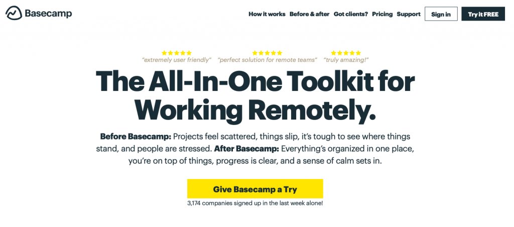
Project management tool Basecamp gives you the exact reason why a website visitor should sign up and use their software. The brand highlights their USP clearly, suggesting the user to give Basecamp a try in the CTA copy.
5. Appeal to their FOMO
Fear Of Missing Out or FOMO is an effective motivator. In an age of instant gratification, most people are scared of missing out on the latest trends. When they think they might lose out on an opportunity to experience something or benefit from it, they will quickly initiate action.
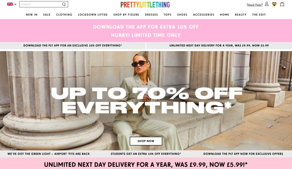
UK-based fashion retailer Pretty Little Thing sets a fantastic context for FOMO. It powerfully highlights the benefits that the customers would miss out on if they do not shop now.
From halving next-day delivery expenses to giving 10% off on mobile app downloads, the eCommerce store covers all its bases. It creates a deadline (without actually setting a date) and creates a real sense of fear to prompt the audience to act.
6. Play with colors and choose the best size
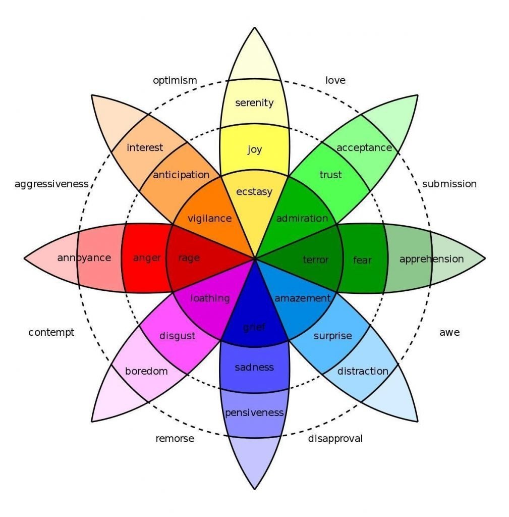
Colors matter when designing your CTA. A study by Emma shows that color is the main reason why 85% of people purchase a specific product or service. For example, orange initiates immediate action while blue builds trust and security.
Yellow creates a lower level of anxiety but gets attention. On the other hand, red increases a sense of urgency. You can also take help of the following color chart to understand which emotion relates to which color:
Besides colors, find the best shape and size for your CTA button. A button size of 44 x 44px is recommended. The key is to make it stand out but not so much that it ruins your design. Also, round the corners of rectangular buttons. Our brains tend to avoid pointy corners.
Download Free: Landing Page Optimization Guide
Examples of some incredible CTAs
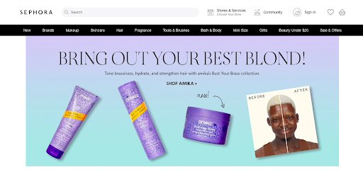
1. Sephora
Sephora gives all the reasons to its website visitors why they must check out their latest product line. The CTA is short and precise, directing the potential customers to check out the new Amika range on Sephora.
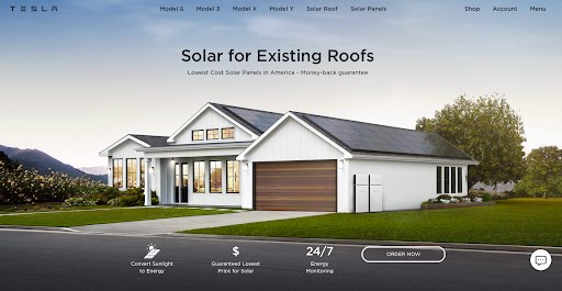
2. Tesla
The electric vehicle and clean energy company leverages its USP while marketing solar panels. The copy surrounding the CTA explains what the solar panels are for, shines a light on the costing, and shares three benefits customers will avail on ordering them.
3. Apple
This tech giant thrives on simplicity. Just like their products, Apple keeps its CTAs short and to the point. In their hero banner, it gives clear information about their latest phone range, i.e., iPhone 12, and Apple gives two CTAs to choose from.
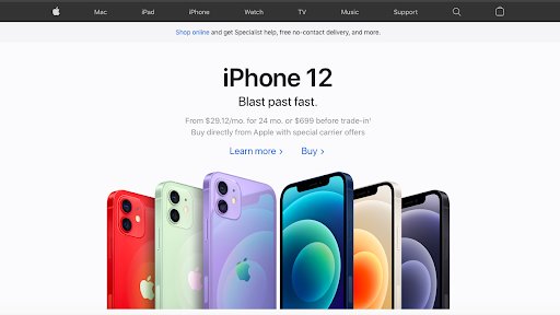
Remember, your audience can come to your website wanting different experiences. Apple knows this, and their homepage banner reflects that.
4. Spotify
As soon as you land on Spotify’s website, their goal is pretty straightforward. They want to nudge visitors to try out their service without the hassle of submitting their credit card details. The CTA “Get Spotify Free” is simple and self-explanatory.
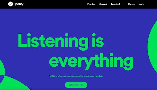
Besides, they use a stunning contrast of blue and green, drawing the visitors’ attention to the primary banner copy and the CTA.
AIDA: The framework model for CTA copy creation
Many copywriting models are used in this day and age. However, one has stood the test of time, i.e., AIDA — Attention, Interest, Desire, and Action. And it can be personalized to write a compelling CTA copy.
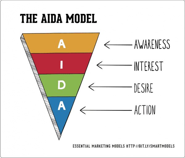
Attention: The key is to formulate a copy that will grab the audience’s attention, provoke curiosity in them to learn more, or create a sense of urgency. Here is an example: “Limited Collection; Buy Now” — similar to what Pretty Little Things did.
Interest: The copy should be able to hold attention by generating interest. You can do so by demonstrating common consumer pain points, testimonials, or sharing interesting facts. You could write something like “Add To Wishlist” or “Check How Out Dave Fetched 50K Unique Visitors For His Website.”
Desire: Sell your benefits, not your product or service. Use persuasive, motivating language to spark the necessary willingness to convert mere readers into customers. An example could be “Lose 20 Kgs With Us In 6 Weeks!”
Action: This is rather direct and you nudge your potential customers to take the next step, i.e., “Subscribe To Our Newsletter,” “Download A Brochure,” “Add To Cart.”
Moreover, you can listen to this engaging discussion that we had with Julia Ritter where she shares actionable strategies to convert users from your email campaigns.
Find the CTA that appeals to your visitors
While the best practices and examples of effective CTAs make a good starting point for researching CTA design and copy, the only way to remove guesswork from this exercise is by A/B testing various CTA alternatives along with their positioning.
PriceCharting, a US based company that provides current and historic prices of new and rare video games and consoles such as Atari 2600 and Super Nintendo, changed its CTA from “Download” to “Price Guide” and increased click throughs by 620.9%! You can read details about this A/B test here.

Over to you
Writing the perfect CTA is challenging but fun. Some key points to remember are to keep the CTA copy short and relevant and place them in an ideal position where they are likely to get higher impressions.
Of course, you would not get your CTAs right the first time, so be sure to experiment a lot and monitor which CTAs are fetching you maximum clicks. You will soon get the hang of writing CTAs that get you the desired results.
Categories:


![7 Best Sales Funnel Software for Every Business in 2026 [Backed by Expert Reviews]](https://static.wingify.com/gcp/uploads/sites/3/2025/01/Feature-image-7-Essential-Sales-Funnel-Software-for-Every-Business_-Top-Picks-for-Every-Purpose.jpg?tr=w-300,h-150)

![7 Top Landing Page Optimization Tools for 2026 [Ranked by Marketers]](https://static.wingify.com/gcp/uploads/sites/3/2024/10/Feature-image-Top-7-Landing-Page-Optimization-Tools-1.jpg?tr=w-300,h-150)


