

Each page on your eCommerce website has multiple elements that impact your conversions enormously. We believe that collating broad 10 or 15-odd testing ideas in a single blog would not be enough to discuss the testing opportunities that remain hidden in the nook and corner of your eCommerce site.
We, therefore, bring you the blog series, A/B testing ideas for eCommerce, where we discuss testing ideas for the most impactful eCommerce web pages in each blog. For the first blog in this series, we discuss A/B testing ideas to improve your eCommerce homepage. So dive right in.
First impressions are not a hoax. They make or break our chances to make the right kind of impact.
We may cut fellow humans some slack, but we certainly can’t do the same for websites. Online shoppers take less than a minute to form opinions about websites as soon as they land on them.
This is especially true for your eCommerce website homepage. The homepage is the face of your eCommerce store, and if it falters to make the right first impression, your users are likely to leave unamused.
And what happens next is your brand loses the opportunity to resonate with users and win them over. As a result, it won’t matter how organized and effective the rest of your website is if the homepage, the door to your eCommerce presence, doesn’t make a mark in your visitors’ minds.
Hence, consistent testing is the key to understanding the needs and preferences of your visitors and ensuring that your eCommerce homepage is meeting their expectations. To enhance the user experience and address any gaps, we suggest starting with the following impactful ideas. Let’s begin.
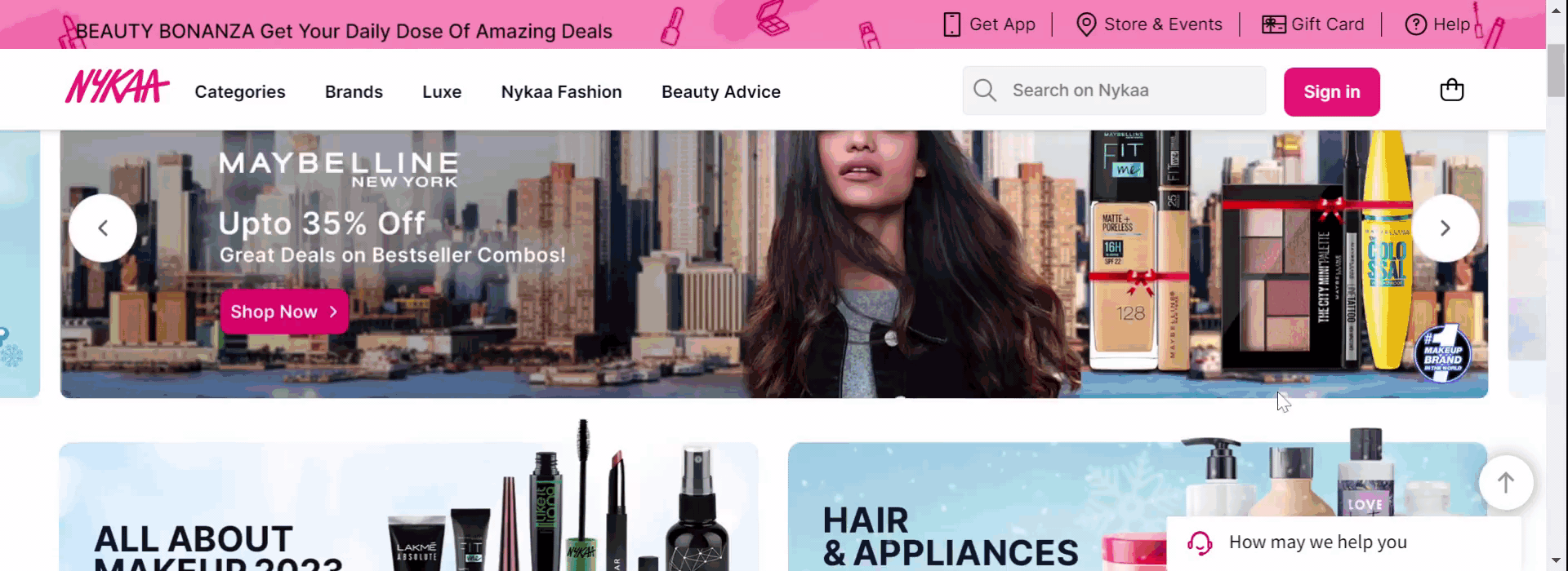
1. Navigation bar
Visitors to your eCommerce homepage are often unsure about what they want to purchase from your website. They’re here to experience the look and feel of your website and then plunge into product exploration. This is where the navigation has to handhold customers and assist them in their buying journey. Poor navigation that complicates instead of simplifying product discovery will put a damper on the user experience of your website.
Test idea 1 – Clickable images of subcategories in the navigation
Let’s say you want to grow your homeware selling website but your product inventory is not very vast yet. Qualitative tools like session recordings and clickmaps tell you that users hovering on the mega menu are not clicking through the links to subcategories. In this scenario, you can hypothesize that the clickable images of subcategories (because they are fewer in number) can stir visitors’ interest and improve their engagement. Have a variation created based on this and pit it against the original version. Based on the result, you can release the most suitable experience to your users.
Next, lay out the subcategories as clearly as possible. Make sure you mention the main menu items first and list only relevant subcategories below them. This way, your users can navigate in an organized manner and avoid browsing aimlessly.
Test idea 2 – Subcategories under the right parent category
Is each of your product subcategories under the right parent category? Arranging them correctly could be another test idea to improve sales of certain products.
For example, yours is a baby shopping online store whose navigation menu reads – newborn clothes, kids clothes, maternity care, baby gear, baby care, and baby furniture.
Session recordings show that users expect to find baby tubs and bath stands under the baby furniture category, but they are listed under the baby gear category on your eCommerce website. This behavior is based on the common idea that baby gear refers to products like strollers, walkers, prams, and car seats.
You can test to see if moving tubs and bath stands from under the baby gear to baby furniture category helps people find the desired product and improve its sale.
If you are using VWO Testing, you can easily count on its visual editor to move or rearrange elements. Not only can you preview the change before making it live, but you can also add a goal to track. In this case, your goal can be to track clicks on the baby tubs and bath stands subcategory link that takes users to the concerned product page.
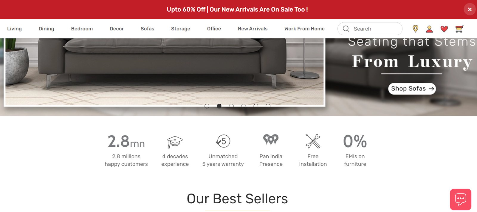
2. Header or footer
Showing navigation in the header is the standard practice in eCommerce. While there is nothing wrong with it, you can also try utilizing the footer to accommodate and display your site’s additional areas. It can also boost your SEO efforts because enriching your footers with anchor links is rewarded by search engines with high SERP rankings.
Test idea 3 – Navigation links in the footer
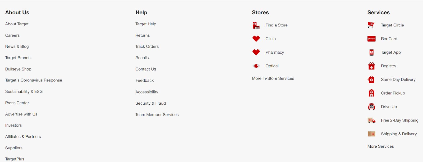
What does your homepage footer show other than your company’s contact details? Nothing? Test if adding links to different areas helps improve user engagement on your eCommerce website. See below how Target, one of the US’s leading grocery marketplaces, has shown links to different web pages like about us, help, stores, and services in its footer.
Test idea 4 – Social media icons in the footer
Social media icons may not be as important as other elements on your homepage conversion-wise but they help grow your following on different social media channels. And the footer is the best place to show them with 70% of websites already having social icons in footers. Create a variation using VWO where you add social media icons in the footer and see if users scrolling down to the bottom are clicking on them.
3. Sticky or moveable
Does the nav menu disappear when users scroll down on your online store? If not, in its place, you can add a scroll to the top link and have it up and running using VWO Web Rollouts. But if you have neither, you’re leaving your visitors in the lurch.
Test idea 5 – Sticky or moveable navigation menu
You can create two variations – one with a sticky nav and another with the scroll to the top link. Test and see how visitors respond to each of them. Once again, roll out the experience that drives higher engagement.
Sticky navigation is a fixed navigation bar that remains in its position even if users scroll down on the page. Stick navigations are a must-have for actionable websites that need customers to take an action like purchasing a product. The ‘stickiness’ makes users feel more confident when browsing an eCommerce website. It serves as an assurance that they won’t be lost in an ocean of choices and can switch to any product category they like as if they have control over their surroundings.
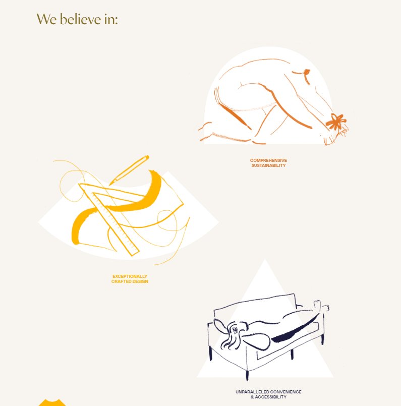
USP bar
Don’t leave it to customers to discover the positives about your brand. Your job is to make the job easy for them. Bring all the reasons to their fingertips, so they don’t have to wonder why they should buy from your eCommerce website. This is why brands add a USP bar to their website homepage to make a positive impression on potential buyers.
Durian, a top furniture brand in India, shows a USP bar just below the above-the-fold banner content. Whereas, Sabai, one of the leading furniture-selling brands in the US, shows the USPs of their products in the form of a full-screen image.
Test idea 6 – A USP bar or a full-screen image highlighting USPs
First, learn which type of USP display connects with your users. Qualitative tools can help you with that exercise. If you don’t have USPs on the homepage of your online store right now, create 2 variations – one with a USP bar (inspired by Durian) and another with a full-screen image, taking a cue from Sabai.
Test idea 7 – Moving up the position of the USP bar
Let’s say you already have a USP bar on your homepage but it’s at the bottom. Because heatmaps tell you that users are not scrolling so deep on your page, you want to test and see if moving it up can help improve users’ interaction with the section. For this, you can have a variation where you place the USP bar at the top and see how it performs against the control.
Test idea 8 – Visually-driven USP section
This test idea is about seeing if your visually-driven variation performs better text-loaded control.
Is your current USP section text heavy? Like a lot of lines and even paragraphs? Chuck it!

Instead, use icons to highlight what your USPs stand for. This can look super catchy and squeaky clean.
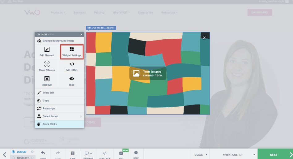
Here too, VWO Visual Editor allows you to make changes to the design layout because of which you can easily pull off these tests without having to resort to developers’ help (even if you need it’s really minimal). You can modify images, and videos, copy, move elements, change to the code editor, and add goals to track using this tool.
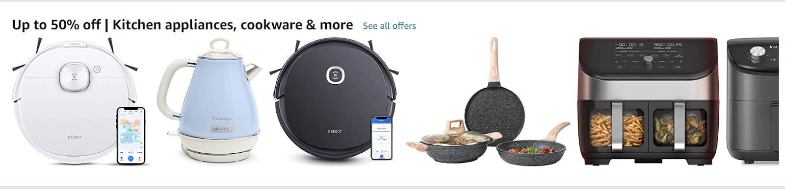
5. Images
Remember, unlike what happens in physical stores, customers can’t see, feel, or touch products when buying online. The closest they can get to that tangible experience is seeing (in fact scrutinizing) product images to make a buying decision.
It’s a no-brainer that you must add high-quality images relevant to what you offer on your eCommerce website. Avoid showing stock images because they lack authenticity and don’t represent your offerings in the best way. If you can, go for lifestyle imagery as it impacts the psyche of your target audience and makes them visualize how using your products might feel. When strategically placed on your homepage, videos can also do a killer job of engaging your website visitors.
Test idea 9 – Branded video to improve user engagement
Imagine you own an online coffee-selling shop and in one section of your homepage, you have text content explaining the specialty of your company in roasting coffee beans naturally. Do you know what can make this more interesting? Create a variable containing a video on this where you can use animations or have real people talk about their experiences.
VWO Testing can do all the heavy lifting so that you can easily embed videos on your homepage using the visual editor and get started. Set ‘Track engagement’ as your goal to see if this change motivates visitors to interact better with your eCommerce website.
6. Product recommendations
Users landing on your eCommerce homepage through direct search or organic search are still in the process of discovering your brand and its offerings.
Give them enough choices to explore. Let them have a glimpse of what they can expect from your brand.
Test idea 10 – Product recommendations for new visitors
New customers need to be told what sets your brand apart from the rest. To do this, you can display ‘Bestseller’, ‘Top picks’, and ‘New Arrivals’ product recommendation tiles to catch their attention and even encourage them to convert.
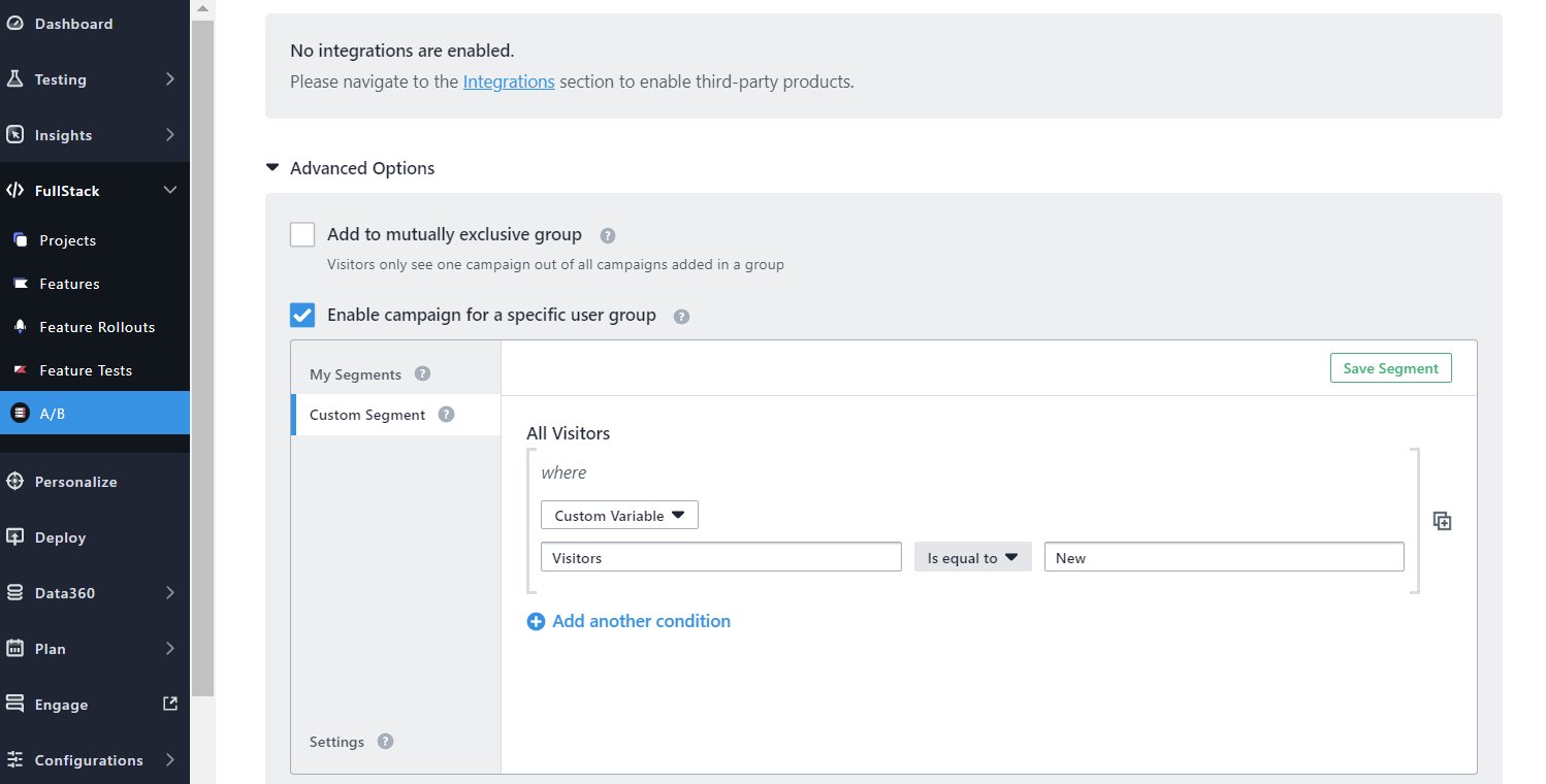
Test idea 11 – Personalized recommendations for returning visitors
What about your returning customers? Will they benefit from seeing the above product recommendations? Yeah, why not, but what can really stand out is offering personalized product recommendations on the homepage of your online store. Some product titles that are worth adding to your homepage are ‘Based on your search history’, ‘Curated for you this week’, ‘Continue browsing these brands’, and so on.
Using VWO FullStack, you can run tests on recommendation engines with help from your developers. Further, custom segments in VWO will allow you to target a specific segment for a test (new customers for the first test and returning customers for the second test). To see if this test is motivating new customers to purchase, you can track conversions and set add-to-cart value as a goal identifier.
7. Seasonal offers
No matter how fastidious customers are about sharing personal details when online shopping, 85% of them are ready to exchange data for discounts. Yes, you read that right. Nothing appeals to customers as much as discounts do. Whether you’re running a buy one and get one free deal or offering flash sales, make them known to your visitors through your eCommerce homepage.
The simple logic behind why discounts work is that it encourages more customers to purchase, which increases your profits. But beware that decreasing prices beyond a point can disturb profit margins.
Test idea 12 – Discounts to encourage more purchases
Let’s imagine this. You’re currently offering a 30% discount as a part of a clearance sales strategy to your customers. On seeing that not many customers are responding, you can create a variation with a 50% discount, which you test to check if a higher discount rate (agreed upon by the management) motivates customers to purchase. Set your goal to ‘Track revenue on’ on VWO to obtain the test result.
Test idea 13– Discount placements: carousel or horizontal bar
Now, where to place your offer banners so they grab customers’ eyeballs? Most brands highlight offers in carousels with attractive product or lifestyle images in the above-the-fold section on their homepage. Behemoths like Amazon and Walmart have pioneered the use of this style of offer display. For your case, you can have a carousel in the first variation and show a horizontal banner at the top in the second variation. The one that has a higher probability of improving your conversions should be rolled out to all.
Test idea 14 – Offer-based recommendations
Offer-based recommendation titles can also be a good testing idea to try out and see how it works for your online store. Amazon categorizes products on which attractive deals are available under a particular recommendation category on its homepage.
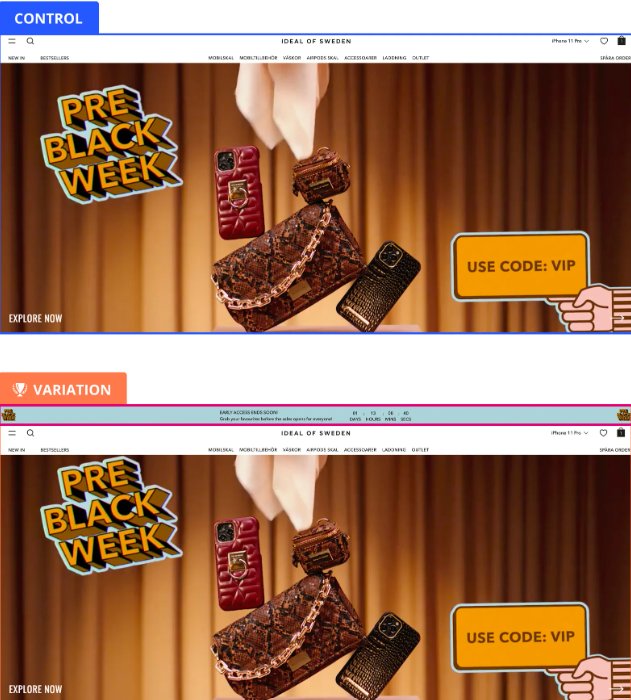
One of VWO’s clients, Ideal of Sweden, a Swedish lifestyle brand, wanted to make the most of the Black month to boost sales from their online store. So, the team aimed to encourage visitors to purchase before the sale was over, with discounts being the motivator. As a result, it was hypothesized that implementing a countdown banner would create fear of missing out in the minds of customers, thereby encouraging them to purchase soon. The variation was implemented throughout the website and led to a 5.6% increase in the primary metric of add-to-cart. To know more about their learnings from the test and the next roadmap, read here.
8. Pop-up form
A few days back, I found an interesting post by Johnny Longden, Director of Digital Experiment Services, where he called out an online kitchen appliance seller for showing an email pop-up 4 times within 15 seconds of landing on its website. And he believed that this could lead to a high drop-off from the online store.
As we near the cookie-less future, we understand your urge to collect first-party data to stay competitive. And asking visitors to share their email addresses by offering discounts, newsletters, and membership in pop-up forms is one of the effective ways to get there.
But pop-ups are two-edged swords. While showing them increases your chances of getting desired customer data, the premature display can be detrimental to user experience as it can distract visitors from deriving value from your eCommerce website.
Test idea 15 – Pop-up form display at the right time
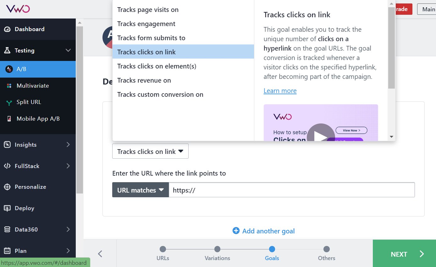
Run a test where you increase the time between users landing on the website and showing the email pop-up. Say you increase the time from 15 seconds to 30 seconds, giving users a chance to consume some of your content. Using VWO, you can set the goal to ‘Track clicks on element(s)’ and see if more users are filling up the form in the variation.
Test idea 16 – Persuasive copy for your form
Think there’s scope to improve the copy of the form? Ask only what is required. Asking a lot of questions can raise suspicion among visitors and make them leave your website. Also, ensure the copy is persuasive and catchy. You can show something like – More than 20k visitors have already signed up. Now is your turn to get attractive offers in your inbox. The combination of a persuasive copy and numbers acts as great social proof that creates an urgency in the minds of visitors to take action so they don’t get left behind.
Test idea 17 – Minimized pop-up banner
Is your email pop-up full page? It’s possible that your website visitors find it distracting. A high drop-off rate could be a testimony to that. You can try showing a minimized pop-up at the corner of the homepage and see if it is better received by audiences. Using our Visual Editor, you can add different types of widgets and adjust the shape and placement of the existing widgets. Take a full-featured trial to test these ideas today.
9. Call to Action Buttons
Inundating your homepage with a lot of words is not a great idea. Striking a balance between text and visuals (even whitespace) is super important to reduce cognitive load for users on your online store.
Test idea 18 – Call to action button copy
As suggested for the email pop-up form, you should see if there is scope to optimize call-to-action (CTA) buttons in different places on your homepage. If your current CTA ‘Browse products’ is not getting as many clicks as you’d like it to get, you can see if tweaking the copy to something like ‘Explore our collection’ improves user clicks on the button.
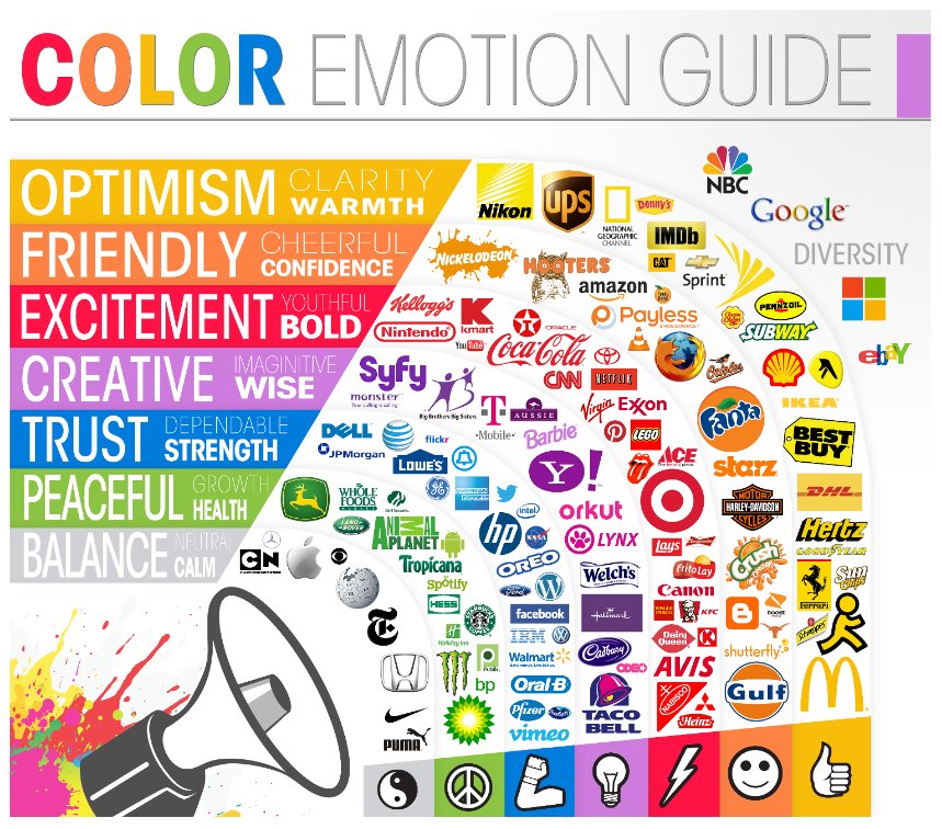
Test idea 19 – Colors of CTA buttons
When you’re deciding the colors of your CTA buttons, consider the background hues, whitespace, and other visual elements on the homepage. Say your layout is made in light yellow. You can’t expect a similar shade to stand out when used for a CTA button. Instead, you may try other shades like honey, gold, fire, and dijon to make the CTA button stay at the top of the visual hierarchy and draw visitors’ eyeballs to it.
Test idea 20 – Above the fold placement of CTA buttons
Your homepage is not a maze that your visitors have to solve. If you want them to stay on your website, keep the interactive elements, especially CTA buttons, in predictable and prominent places. Is your main CTA button below above-the-fold? Move it up and incorporate it with the header image. You can hardly go wrong with this one. Still, test and see how it works for you.
The Chicago-based apparel company RIPT tested and found their best-performing CTA button using VWO. Not only did they add a discount but they also added a countdown timer that created FOMO (fear of missing out) among your visitors. As expected, the variation was a winner with a 6.3% increase in purchases. Read here to know the learnings from the test.
10. Search bar
No talk about the homepage is complete without mentioning the search bar. But then the search bar functionality in itself is a broad topic that deserves its own article. For this one, let’s stick to its placement on the homepage.
It goes without saying that the search bar should be positioned in a prominent place so visitors can easily see and access it. Here are some examples to inspire your test idea.
Amazon has split the top menu into two bars – it shows the search bar along with users’ account, return, and add to cart icons at the top and the mega menu and hamburger menu in the second bar.
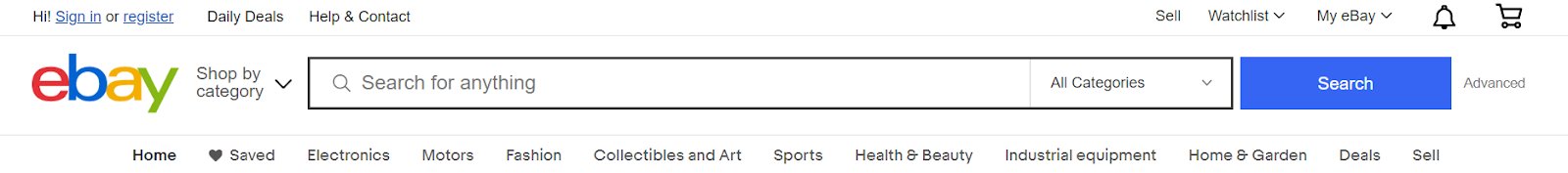
Whereas eBay has split the top menu into three different bars – The first one shows add-to-cart and account sign icons, watchlist and My eBay dropdown, and so on. The second bar just houses the search box with a shop by category drop-down alongside. The third one lists and displays all main navigation menu items for users to explore.

Test idea 21 – Search bar design and placement
Let’s consider that visitors on your homepage are not clicking on the search box. But you’ve observed that visitors who search have better chances of converting. For the variation, you can make the search box more center-aligned and its border more prominent to raise its discoverability. Test this against the control where the search box is inconspicuous. See if the variation increases the number of visitors clicking and searching for products.
Best Choice Product, a California-based online store, found that 50% of traffic to its website were mobile users and visitors searching for products were converting 60% better than the rest. They used VWO to run a test where it was hypothesized that increasing the size of the search box and placing it in the center can help improve conversions. The test was a success with an increase of 30% in click-through rate on main CTAs.
Wrapping it up
The homepage offers a window for users to take a peek at your brand and what it offers. You need to experiment and see what helps keep users on your eCommerce website, prove that your online store is worth spending time on, and gradually move them down the buying funnel.
Hope you enjoyed reading the first blog on A/B testing ideas for your eCommerce homepage of this series. You might be tempted to try these testing ideas, hoping to skyrocket user engagement and conversions. But bear in mind that any test you run should be backed by research that is contextual to your website and users.
Take advantage of the integrated experimentation platform VWO to dive into user behavior analytics, unified customer data, and full stack to inform your website testing roadmap. Sign up for a free trial to take the first step toward your homepage revamp!
Categories:


![7 Best Sales Funnel Software for Every Business in 2026 [Backed by Expert Reviews]](https://static.wingify.com/gcp/uploads/sites/3/2025/01/Feature-image-7-Essential-Sales-Funnel-Software-for-Every-Business_-Top-Picks-for-Every-Purpose.jpg?tr=w-300,h-150)

![7 Top Landing Page Optimization Tools for 2026 [Ranked by Marketers]](https://static.wingify.com/gcp/uploads/sites/3/2024/10/Feature-image-Top-7-Landing-Page-Optimization-Tools-1.jpg?tr=w-300,h-150)


