Best Choice Products Unlock Hidden Revenue Streams with ‘Search’ Bar A/B Testing
Improving conversions with Search Bar A/B Testing
More than 30% of e-shoppers site search while shopping online. When visitors use the search bar on a website, they know what they’re looking for.
Yet, optimizing and continuously experimenting with search UI/UX is one of the most under-utilized best practices by eCommerce business owners.
Nothing kills a visitor’s enthusiasm faster than a search bar that does not deliver accurate results or worse, is not noticeably visible.
Meet Best Choice Products
Best Choice Products is a California based eCommerce company selling high quality, low priced home, garden, music, children, and fitness products. BCP takes pride in its diverse categories and selections by aiming to provide an uncomplicated shopping experience for their customers.
Fast forward about 16 years, Sky Billiards has transformed from a small-scale business to a thriving and diverse e-commerce brand called Best Choice Products (BCP).
Goals
Alex and Kelly are the marketing and design innovators at BCP. Like most eCommerce marketers, they are obsessed with driving mindshare in the fiercely contested red ocean and improving the shopping experience on their site.
“We are constantly iterating our designs in tandem with user insights. Earlier we weren’t checking how these releases were impacting our conversion rate, revenue, and other metrics beyond GA data. We were using a different tool that didn’t offer A/B Testing capabilities.
We realized that we were collecting data, but weren’t acting on it. That’s how we started looking for an all-inclusive platform that provides A/B testing, heatmaps, scroll maps, on-page surveys – and we came across VWO.” says Kelly Klopfer, UX Design Manager at Best Choice Products.
Alexandra Diaz, UX Designer at BCP adds, “We’ve seen that a lot of marketers act on hunches. They’ll claim things like, I believe that our conversions will increase if we add a picture carousel instead of a static image. But what if your visitors don’t like the carousel? What if they find it too distracting? The truth is, you’ll never really know what works with your customers and what doesn’t unless you test it.”
Observations
Taking The Guesswork Out of Mobile Web Optimization
Alex and Kelly noticed that more than 50% of their traffic were mobile users. On diving deeper into their analytics data, they realized that — Users looking for products using the search icon in the header were converting 60% higher than others.
“BCP sells products that people already know of and use in their day-to-day lives. Since visitors using the search bar were making a purchase v/s the ones that weren’t, we decided to test our search bar. We created a variation with a giant search bar and placed it right at the center of the website’s header, like how Amazon does it. Our goal was to drive conversions by making the search bar more prominent” says, Kelly Klopfer, UX Design Manager at Best Choice Products.
Tests run
Setting Ground Rules
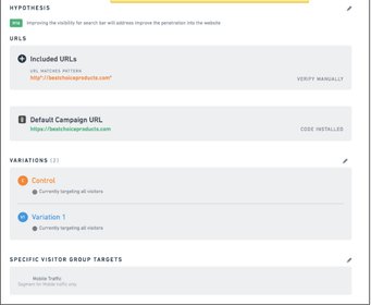
Objective: Improving the visibility of the search bar will improve user penetration into the website
- Audience segmentation: Mobile traffic
- Variations: 1
- Duration: 1 week
- Goal: Track conversion rate by identifying visitors that reach the post-purchase thank you page
A/B test details
Test and Learn Without Limits
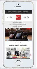
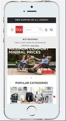
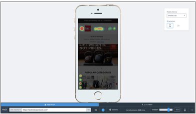
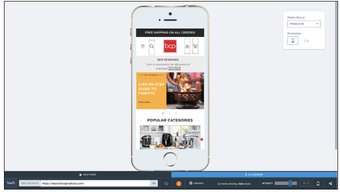
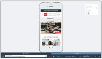
The goal of the A/B test was to find out if a bigger search bar gets better conversions. Here’s how both the versions of the test looked like.
Decoding User Behavior
Analyzing Heatmaps:
BCP - Heatmaps - Control
As shown in the picture, Variant received higher clicks as compared to Control.
They further analyzed click maps to see which version was more preferred by visitors.
Analyzing click maps:
Control
Variant
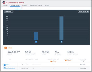
After running this test for a week, Alexi and Kelly decided to see the results. The report was divided into two sections – the impact on revenue and the impact on conversions.
Tracking All The KPIs
Lift in Conversions
Control
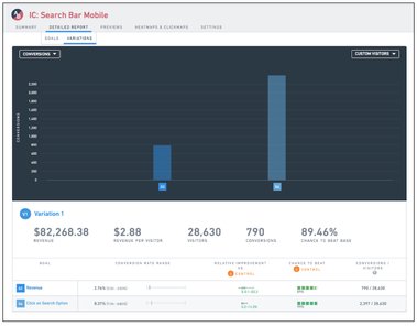
Variation
Side-by-side comparison of both the variations

Total revenue
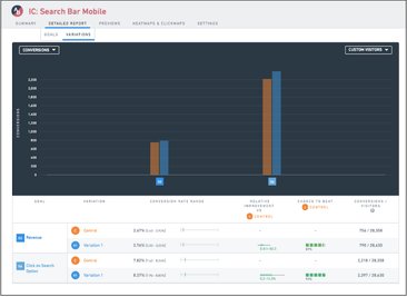
Conversions per visitor
Lift in revenue
Conclusion
Managing Trade-Offs Like A Boss
This experiment helped Kelly and Alexi understand both the positive and negative impacts of the campaign. They went through session recordings to understand how users are interacting with the new search bar v/s the old. Apart from conversions, they also made observations based on visitor drop-offs, page sessions, time spent on each page, etc for future experiments. Take a 30-day free trial with VWO today to get in depth knowledge of user behaviour on your website
Don’t ignore the Search Bar
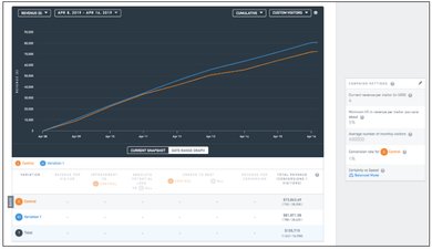
We asked Kelly for her concluding thoughts on the experiment and here’s what she had to say, “ We hadn’t changed our mobile header navigation in over a year. Revealing the search bar helped us get more clicks, searches and a revenue uplift of 0.1% within a week! I’m sure we’ll see higher numbers in the months to come.” Kelly Klopfer, UX Design Manager at BCP.
“There’s so much one can do with A/B testing, the possibilities are endless! Experimentation has become the new go-to-market strategy for BCP. We generate ideas by looking at data from VWO & GA and explore design solutions. Then, we compare them with competitor designs and discuss them with the development and management team before moving forward with the campaign.” adds, Alexandra Diaz, UX Designer at BCP.

Location
Tustin, California
Industry
Retail
Experiment goals
Improve the UX, Increase CTR on main CTAs
Impact
30% increase in Conversion