Digital NRG optimizes website forms and CTAs via behavior insights and testing
About Digital NRG
Digital NRG, located in Bristol, UK, is a digital marketing agency that assists businesses to excel in the digital landscape. They provide a broad range of services, including website design, search engine optimization (SEO), pay-per-click (PPC), conversion rate optimization (CRO), email marketing, and paid social media among other digital marketing solutions.
At the agency, optimization efforts for clients are spearheaded by a CRO lead and a team of executives who conduct around 50 experiments per quarter across 18 different accounts. The team fosters a culture of experimentation, viewing unsuccessful tests as an opportunity to gain insight into user behavior and improve customer journeys for their clients.
Why VWO
DNRG’s choice of CRO tool became VWO due to their outstanding level of insight into customer data, sufficient quota to run multiple experiments, and efficient support system.
VWO is competitively priced and has a good product offering. It has offered the team here at Digital NRG a great level of insight into customer behavior on our client websites and has allowed us to run a great number of tests. They also have a very responsive team, who are very helpful and take feedback on board when it is needed.

Freya Gay
CRO Lead at Digital NRG
Also, the capability to test multiple variables in parallel via multivariate testing made it a go-to product for them.
VWO’s multivariate testing feature supports testing on a larger scale along with understanding consumer behaviors and shopping habits. It is really useful for eCommerce clients as we can identify the highest converting combination of CTAs and messages from easily digestible data.

Mercedesz Molnar
Senior SEO Executive & Outreach Lead at Digital NRG
Goals
For two of its clients, Digital NRG wanted to run conversion optimization campaigns.
- Trent’s Drains, a 24/7 drainage specialist in Bristol. The goal was to improve the conversion rate of the contact us form for the mobile version of the website.
- Enhance Insurance, a medical aesthetics insurance provider in the UK. The goal was to reduce the dead clicks and increase engagement.
In the following case study, we deep dive into the details of tests run for each of these clients.
Trent’s Drains
Observations
The CRO team discovered that a significant proportion of website traffic, precisely 60% of the total traffic in three months, originated from mobile devices. Surprisingly, there were no conversions on mobile, as per their Google Analytics report.
In order to identify the underlying cause of this issue, the team decided to analyze user behavior on the contact page by studying VWO’s session recordings (here’s how it works) on mobile devices. Additionally, they analyzed the heatmap data to determine if users were scrolling down to reach the contact form section of the landing page and if there were any dead clicks or hesitation on the form itself.
Hypothesis
Based on the observation, the team formed a hypothesis that repositioning the contact form and modifying its plain text CTAs would result in a reduction in bounce rate and an increase in form completion.
Tests run
Based on the hypothesis, the CRO team at the agency performed an A/B test on the mobile version, where the control and three variations were compared. Each variation involved moving the contact form up and adding a plain-text CTA before the form. Here are details about the control and variations.
- Control – The plain text CTA is “Proudly serving customers throughout Bristol, & the South of England.”, and there are social icons below it.
- Variation 1 – The plain text CTA is the same as the control, the main heading is simplified, and social icons are removed.
- Variation 2 – The plain text CTA is “Call us on 0117 453 5994 Or use the form below”, and the heading within the contact form has been removed.
- Variation 3 – The plain text CTA contains a call icon with a contact number and a mail icon with an email id, and the main heading is simplified.
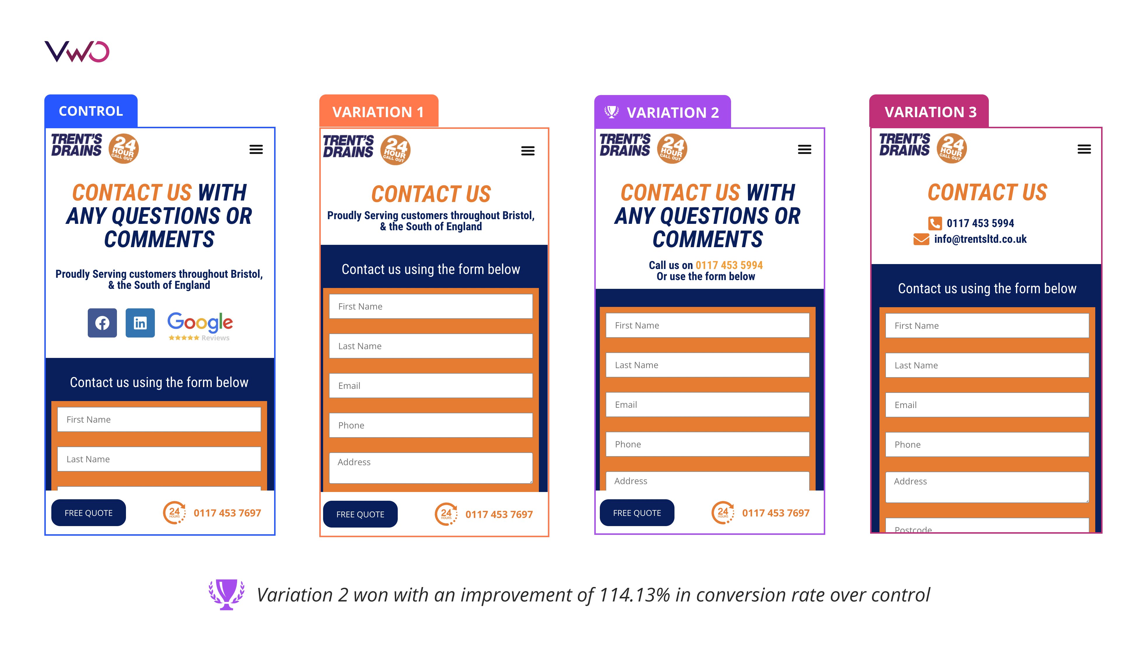
The A/B test ended with Variation 2 outperforming other variations and control with respect to the number of form submissions. Variation 2 included the mobile number and the option to use a contact form as a plain-text CTA. The heading within the contact form was also removed. Here is the detailed report from the VWO dashboard:
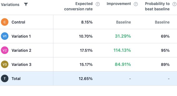
The team discovered that presenting the contact form above the fold and making it visible to the user as soon as the page loads, resulted in the most significant improvement in contact form submissions. By simplifying the above-the-fold messaging, the user navigation of the contact page was enhanced.
Enhance Insurance
Observations
Based on research, the CRO team discovered that the landing page had a significant number of dead clicks above the fold. Users needed a clear outline of how to engage with the company more efficiently and find out more about their policies.
To investigate the root cause of this issue, the team analyzed user behavior on the key landing pages of the website using VWO’s session recordings and VWO’s heatmaps. This approach helped them identify dead clicks and determine how far customers scrolled on the page, as well as assess the impact of the content located above the fold.
Hypothesis
The observation led to the hypothesis that inserting an additional CTA button above the fold and tailoring the button wording to suit the target audience would address dead clicks and increase CTA button engagement.
Tests run
Considering the hypothesis, the team generated an A/B test with control and one variation having a CTA button to the contact form above the fold.
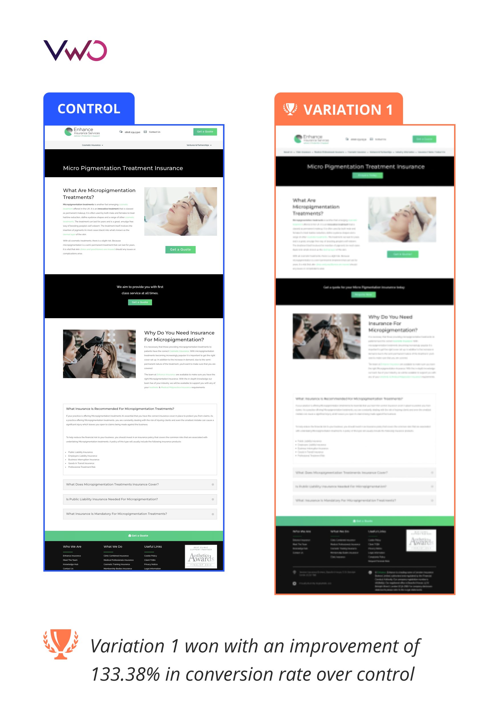
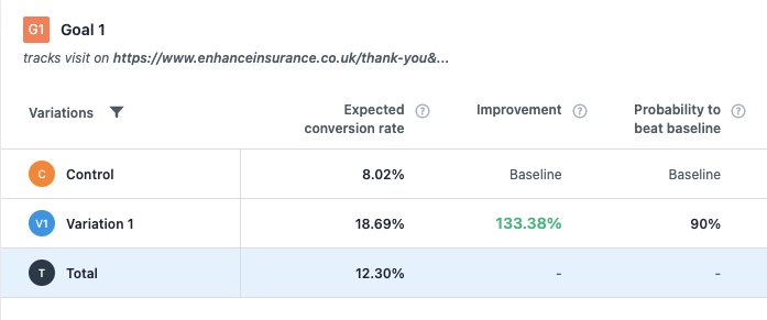
The test ended with variation 1 as the winner, which had an expected conversion rate of 18.69% for the main CTA button that led to the contact form page (a 133.38 % improvement from the baseline conversion). Here is the detailed report from the VWO dashboard.
The team concluded that including more CTAs above the fold motivated users to contact them immediately upon landing on the website. It was particularly effective since 83.3% of users previously scrolled the page to try and find a suitable CTA.
Conclusion
The Conversion Rate Optimisation Agency implemented a mixture of regular client communication and VWO Insights for user behavior analysis to understand the existing user experience. It helped them to generate hypotheses and conduct A/B tests using VWO Testing for their clients. The optimization efforts resulted in significant improvements in website conversion rates and user experience.
Take a 30-day all-inclusive free trial to explore all VWO capabilities and unleash your digital properties’ true potential.
Industry
Agency
Experiment goals
Increase in form submissions and engagement
Impact
133.38% increase in CTA clicks