

User experience (UX) is a gauge of how people feel when they interact and engage with your brand through your website, products, and customer support. It’s one of the most critical aspects of eCommerce operations because it can significantly influence the buying decisions of your online customers. Their decisions and actions as they navigate through your website can affect your conversion rates, and ultimately, your bottom line.
Download Free: Improve Conversions In 60 Days Guide
As an eCommerce store owner, you need to make sure your store’s website user experience is at its peak—and one place we see user experience being neglected the most in eCommerce? The homepage.
eCommerce brands can put in the work to optimize product pages, category pages, and even checkout processes. But if your homepage is one of the first touchpoints your customer has with your brand, it makes sense to optimize your homepage for the best customer experience that drives more sales.
And how important customer experience has become indeed. We’re also not only referring to the new shopping habits of consumers as we enter a post-pandemic world, where almost 29% of surveyed participants claim that in the future they prefer to do more shopping online, but only visiting sites that deliver great experiences. But we also mean even Google is doubling down on the importance of user experience and how it affects your overall rankings on search. Its newest 2021 update urges users to consider core web vitals and a host of other factors that elevate a user’s experience on your site.
To help you create a better user experience for your site visitors, here are 7 eCommerce homepage best practices that you might want to implement in your business.
1. Design your website for mobile-first
With 7.1 billion mobile users worldwide, more and more people are doing online transactions using their smartphones, tablets, and other mobile devices. Mobile users are not only searching online, but also performing various mobile eCommerce transactions like shopping, paying bills, and booking tickets.
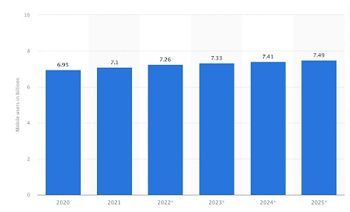
Image source: Statista
With the rise of mobile eCommerce, it has become necessary for eCommerce websites to follow a mobile-first approach in web development.
A mobile-first approach means designing a website for smaller screens first and then working up towards larger screens. Part of the approach is to have a responsive design, which enables on-site elements to automatically adjust and rearrange themselves to fit the screens of different devices.
With this approach, the content of the website is displayed in a way that’s comfortable for the users. It removes the need to perform operations like zooming, panning, resizing, or scrolling when users browse through the website. It contributes to the website user experience positively.
According to Alex Williams of Hosting Data, “A responsive site is of prime importance as people nowadays are mostly doing their shopping on their mobile devices. It won’t be surprising if one day we realize that we do most or all of our shopping using our phones in the future. So future-proof your eCommerce store as early as now and check if everything operates right on mobile.”
2. Optimize your homepage loading speed
Page loading speed refers to how quickly your content loads when a user visits a specific page of your website. It’s one of the factors that determine how long a site visitor stays on your website. A slow loading time will turn most people off and go somewhere else.
But how fast should the homepage loading speed be? It turns out, site users will not wait for more than 3 seconds for an eCommerce page to load. A slow loading time is a contributing factor to page abandonment and kills conversions.
According to research done by Google, as page load time goes from 1 to 6 seconds, the probability of the user abandoning the site (bounce) increases 106%. It’s safe to say, a slow homepage loading speed is a dealbreaker for many site visitors.
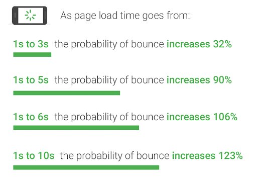
Image source: Think with Google
If the user experience takes a hit, it can have a negative effect on sales for an eCommerce site. The opportunity to engage site visitors and make sales vanishes when they abandon the site.
To speed up your homepage, here are some best practices you may want to keep in mind and implement right away:
- Compress your images. Large image files will significantly slow down your page, so use compression tools like Smush or Website Planet to squash out excess data that could be bloating up images.
- Minify your HTML. Another element of your homepage and eCommerce store in general that can tend to slow down your loading speed is your HTML. Minification is the process of optimizing your site’s code, like deleting unnecessary or redundant code or shortening code when possible.
- Enable browser caching. When you enable caching, any resources and elements that load on your site are “remembered.” What this then does is allows your homepage to load faster since elements like logos and photos don’t need to reload every single time.
3. Simplify search and navigation
A complex website design makes it difficult for users to navigate your site. Unnecessary clicks and extra steps to find the relevant content will negatively impact their user experience. If they don’t find what they are looking for right away, they will give up and move on.
When designing an eCommerce homepage, you should take into account users’ expectations and what they find most useful. Easy navigation enables them to find things more quickly and efficiently.

Image source: WISETR
The design elements must be logical and intuitive, from the placement of the search box to the location of the menu and toolbars. The structure should give users the ability to navigate between pages effortlessly. This contributes to a great user experience and ensures that they stay engaged while navigating through your site.
Because of this, consider adding a search bar at the top of your homepage menu so that users can easily navigate to different products, categories, promos, and even news and blog posts on your site.
For best results, conduct an A/B test for your search bar. Experiment with different search bar positions and designs to see which one brings higher conversions.
For instance, in this A/B test conducted by Best Choice Products for the search and navigation bar on their eCommerce store, their results found that a bigger search bar on mobile, versus a simple magnifying glass icon, gave them a boost in conversions.
We can infer that this is because users may not see the search bar right away when it’s only an icon on their phones. So by stretching out and revealing the actual bar where they can tap and type their query, it can help facilitate searches through their eCommerce store.
Of course, for your own store, it’s best to base this on your customers’ preferences, so this is where the A/B test comes in handy: you’ll know what’s the best way to simplify search and navigation with actual user data. Start A/B testing your design ideas to boost UX with VWO Testing 30-day free trial.

Download Free: Improve Conversions In 60 Days Guide
4. Maximize the space above-the-fold
Above-the-fold in website design refers to the section on a web page that is visible to the user without scrolling. This concept dates back centuries ago, to the beginnings of the printing press.
Since newspapers are printed on large sheets of paper, they have to be folded, with only the top half of the paper visible when they are displayed on the newsstands. The newspaper industry found a way to use it to advantage by putting attention-grabbing headlines, sensational stories, and eye-catching imagery above the fold.
In the case of websites, the fold pertains to the scrollbar. So, any content that is not immediately visible and requires users to scroll down is considered below the fold.
A good example is this page of FreshBooks. All the relevant information, links, and call-to-action are displayed above the fold. This makes it easier for leads and customers to know what to do next when they land on a page using their mobile phones.
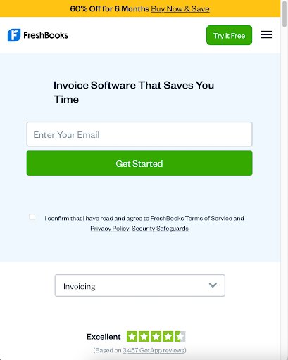
Image source: FreshBooks
Applying the above-the-fold concept to websites is not as simple as the newspaper version because not all screens are the same. Different devices have different screen sizes and resolutions, so it’s quite tricky to determine where the fold line is.
There are no hard and fast rules but a good starting point is to know how the website’s dimensions appear to the user, taking into account the different screen sizes of devices. To maximize the space above the fold, put the most relevant, the most engaging, and the most important content that users expect to find once they land on your homepage.
Don’t be afraid to get creative and think out of the box. By implementing a split URL test, you can even see how an entire redesign of your homepage might help you boost your conversions and make more sales from your store.
This way, you can really make big changes in your above-the-fold elements to see which one performs best. Experiment with different copy, images, or call to action to see which homepage converts the most over a period of time.
5. Highlight your most popular products
It might seem counter-intuitive to promote products that are already popular because logic dictates that you should be making efforts to draw customers’ attention to products that are not selling well. But there’s a method to this madness.
Popular products already have a lot of buyers. In that sense, these products fulfill a need or solve a problem. People tend to be attracted to products that are popular because their popularity is perceived as a testimonial of sorts to the quality and benefits of the products.
By highlighting popular products on your eCommerce homepage, you are not only attracting potential buyers to purchase the popular products, but you are also creating an opportunity for them to buy other items from your product catalogue.
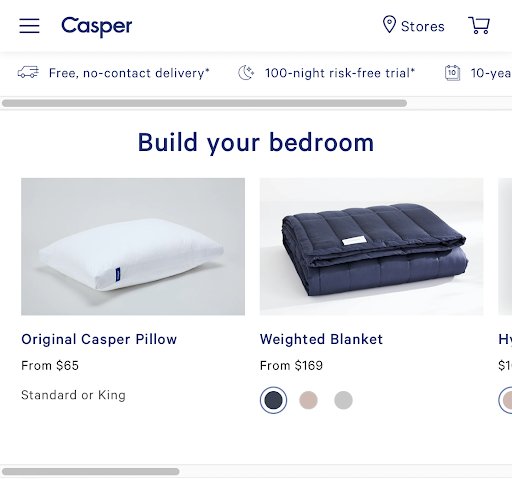
Image source: Casper
By doing this, you also can provide a better user experience for return customers. Your loyal buyers might be looking to repurchase their favorites. By making it ridiculously easy to spot then purchase their popular picks right from your homepage, you can encourage faster checkout every time.
Also, if you are looking to boost conversions, listen to our engaging conversation with Rishi Rawat, Founder of Frictionless Commerce, where he explains how you can optimize your product pages and increase sales.
6. Streamline your checkout process
Getting customers to visit your site is just the first step in their purchase journey. Even if they add items to the online shopping cart, it does not guarantee that they will push through and complete the transaction.
According to the Baymard Institute, 69.8% of customers who add items to their cart will leave and not proceed to the checkout process. While there are several reasons for cart abandonment, one that deters people from completing a purchase is a long and complicated checkout process.
Creating a streamlined and customer-friendly checkout process has a positive impact on user experience and helps increase conversion rate. You must establish a clear route to the final purchase so that they can go through the process smoothly without distractions such as excessive upselling.
If you bombard customers with too much information and options, they are likely to get confused and abandon the cart out of frustration. You must remove unnecessary steps required to complete a purchase. Fewer clicks mean faster checkouts. Some platforms make it possible to have a two-step checkout process for eCommerce stores. Amazon has a 1-click checkout option which makes purchasing extremely fast.
It’s also important to present a clear order summary with a breakdown of quantity and cost so they know what they are buying. You must also provide an option to remove items and make it easy to go back and continue shopping.
The streamlined checkout process must be complemented by an easy payment process. This requires carrying out research on the payment preferences of your target audience so that you can integrate the payment gateways into your site.

7. Make it easy for your customers to come back
Every business wants to acquire new customers and get repeat sales from returning customers. High-quality products and excellent customer service usually do the trick. But a few strategies can make it easy for your customers to stick around.
Repeat customers help generate a steady stream of income for your eCommerce business, so it’s important to give them a reason to shop again. Incentives like loyalty programs, discounts, free shipping, and special offers can all be integrated into your eCommerce site so that they will be encouraged to visit more often.
But more than the incentives, it’s the constant improvements on your site that will make customers come back. If you make shopping more convenient for them, they are likely to return, even with just the occasional email reminder.
Customers want to have an easy way to contact you if they have questions or concerns. You can make your customer service team available through a live chat integrated into the site itself. This also improves your interaction with them and you can get valuable feedback which you can use to further improve your service.
Online purchases require customers to have some level of trust in your eCommerce site. They want assurance that their data is safe when they transact business through your online platform. You must give that assurance for their peace of mind.
The ability to track their orders and shipments is a great way to get customers to come back to your site. If they are on the site, there’s always a chance that a product or an offer will get their attention, which is another opportunity to make a sale. More so, if they get personalized recommendations and tailored content that will encourage them to engage with your brand.
Image source: Nosto
Another way to help customers keep coming back to your site is through the use of push notifications. eCommerce stores and websites have increasingly been making use of this relatively new feature to get their customers’ attention and have them return to their site even if the browser is not currently opened.
Set up a push notification opt-in on your homepage, so when a visitor subscribes, they’ll get notified for any new promotions, offers, or flash deals your store might want to share. And because push notifications get much higher click-through rates than email, you can increase conversions without worrying that customers aren’t receiving your notifications.
Key takeaways
When customers reach your eCommerce homepage, they expect to find relevant information about the product they wish to buy and want a quick and hassle-free online transaction. Your job is to meet and exceed customer expectations by providing them with a positive user experience at every step of their purchase journey.
Following these seven eCommerce homepage best practices makes it easy for visitors to interact and engage with your brand and it increases the likelihood of completing a purchase. When your customers have an enjoyable shopping experience, they are likely to return and repeat the process all over again. Start a 30-day free trial or request a demo to get started with optimizing your homepage to boost UX and conversions on your eCommerce website.

Categories:


![7 Best Website Monitoring Tools [2026]: Expert Insights to Help You Pick the Right One](https://static.wingify.com/gcp/uploads/sites/3/2025/02/Feature-image-7-Best-Website-Monitoring-Tools-How-to-Pick-the-Right-One.jpg?tr=w-300,h-150)


