

Analysts use heatmaps to analyze the magnitude of an event using visual cues. A data visualization technique, heatmaps are utilized to derive quick interpretations of the intensity of an event and do course corrections accordingly.
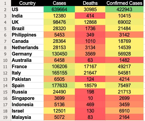
One of the examples of heatmaps can be the visual representation of COVID-19 cases being registered globally. The following map shows the geographic distribution of the cumulative number of COVID-19 cases reported per 100,000 people worldwide. Darker shades of orange denote the most affected countries, and the light yellow hues indicate the opposite.
![How to Create A Heat map in Excel (Image 01) - Geographic Heatmap in excel [COVID-19 cases]](https://static.wingify.com/gcp/uploads/sites/3/2020/04/Global-COVID-19-heatmap.png)
There are quite a few efficient ways to generate a heatmap, such as using readily available free heatmap generators like VWO’s AI-powered heatmap generator or integrated analytical tools. Microsoft Excel or Google Sheets is another great option to explore. Let’s dive right in!
What is a heatmap in Excel?
A heatmap is an effective way of presenting data in applications like Excel, where data values are represented by colors, simplifying the entire data analysis process. You can notice patterns and trends at a glance, which helps drive insights and faster decisions.
The best thing about Excel is that its built-in features make heatmap creation easy. You can apply conditional formatting to data in just a few clicks, and it automatically assigns colors to the values in the cells. The user-friendly interface, preset color scales, and numerous customization options make it possible for even less technical users to create a heatmap chart in Excel.
Learn how to create a heatmap in Excel
When using Excel or Google Sheets, you can either create a heatmap by manually coloring each cell depending on its value or act smartly and enter a formula/function to do all the taxing work for you. We’d suggest you use the latter method to create a heatmap.
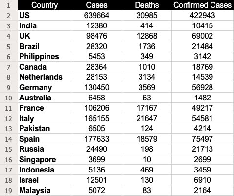
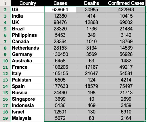
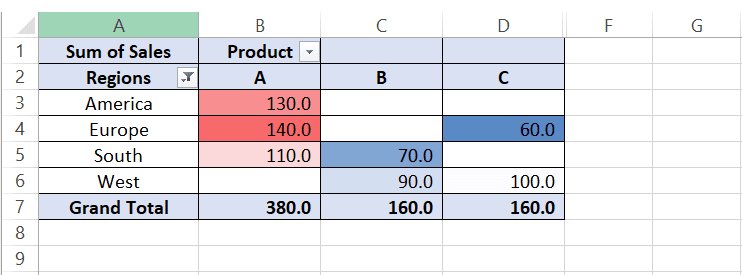
Let’s consider the dataset extracted from the above represented COVID-19 globally registered cases as an example to learn how to create a heat map using the function—apply “Conditional Formatting.”
| Country | Cases | Deaths | Confirmed Cases |
| US | 639664 | 30985 | 422943 |
| India | 12380 | 414 | 10415 |
| UK | 98476 | 12868 | 69002 |
| Brazil | 28320 | 1736 | 21484 |
| Philippines | 5453 | 349 | 3142 |
| Canada | 28364 | 1010 | 18769 |
| Netherlands | 28153 | 3134 | 14539 |
| Germany | 130450 | 3569 | 56928 |
| Australia | 6458 | 63 | 1482 |
| France | 106206 | 17167 | 49217 |
| Italy | 165155 | 21647 | 54581 |
| Pakistan | 6505 | 124 | 4214 |
| Spain | 177633 | 18579 | 75497 |
| Russia | 24490 | 198 | 21713 |
| Singapore | 3699 | 10 | 2699 |
| Indonesia | 5136 | 469 | 3459 |
| Israel | 12501 | 130 | 6910 |
| Malaysia | 5072 | 83 | 2164 |
Image source: European Centre for Disease Prevention and Control
Step 1: Enter the data
Enter the necessary data in a new sheet. We entered the data above.
Step 2: Select the data
Select the dataset for which you want to generate a heatmap. In this case, it would be B2 through D19.
Download Free: Website Heatmap Guide
Step 3: Use conditional formatting
If you are using Excel, go to “Home,” click on “Conditional Formatting,” and select “Color Scales.” The color scale offers quite a few options for you to choose from to highlight the data.
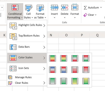
In our case, we’ve used the first option where cells with high values are colored in green and ones with low values in red.
If you are using Google Sheets, you will find “Conditional Formatting” under the “Format” option in the menu bar.
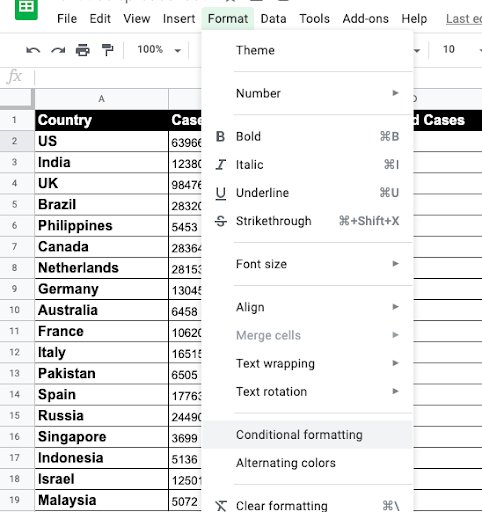
Then select “Color Scale” and choose the relevant colors for the midpoint, minpoint, and maxpoint.
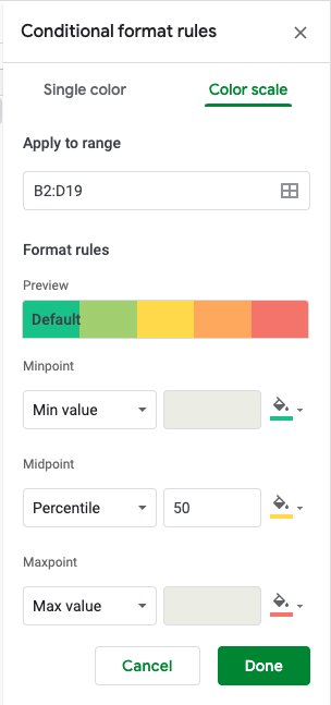
Note: Use a color scheme that best matches your data interpretation needs.
Step 4: Select the color scale
Once you select a color scale, you’ll see a heatmap as shown below:
In this color scale, Google Sheets assign a green color to the cells with the highest values and red to the ones with the lowest values. Meanwhile, the remaining values are assigned colors based on the descending value order showing a gradient of shades falling between green and red. And there you have it: your beautiful heatmap to analyze visitor experience and get more conversions.
How to make a heatmap in Excel without numbers
Ideally, you should not remove the numbers, as the heatmap in Excel is based on cell values. Removing them defeats the purpose. However, you can hide the values using custom number formatting.
- Select your heat map.
- Hit Ctrl + 1 to display the Format Cells dialog box.
- Click Custom under Category on the Number tab.
- Type 3 semicolons in the Type box.
- Click Ok to apply the custom number format.
How to create dynamic heatmaps in Excel
When you change a cell’s value, conditional formatting immediately recalculates and adjusts accordingly. This feature enables the creation of dynamic heatmaps in Excel. Let’s explore methods for creating these dynamic visualizations.
Making a dynamic pivot table heatmap
This is how it works:
- Select any cell in your heatmap.
- On the Home tab, go to the Styles group.
- Click Conditional Formatting > Manage Rules.
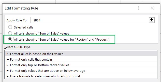
- In the Conditional Formatting Rules Manager, select the rule and click Edit Rule.
- In the Edit Formatting Rule dialog box, under Apply Rule To, choose the third option: ‘All cells showing “Sum of Sales” values for “X” and “Y” parameters as shown in the boxes.
- Your heat map is now dynamic, and when you add new data, it will update automatically.
- Remember to refresh your PivotTable to see the updates.
Conditional formatting will be removed if you alter the row or column fields. For instance, if you remove the Date field and then reapply it, the conditional formatting will be lost.
Creating a dynamic heat map in Excel with scroll bar
1. Insert a scroll bar
Control your dynamic heatmap with a scroll bar using these steps:
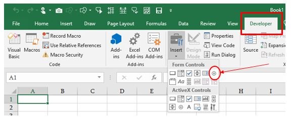
- Click on ‘Developer’ → ‘Controls’ → ‘Insert’ → ‘Scroll Bar’.
- Click on the worksheet to insert the scroll bar.
2. Format the scroll bar
- Right-click on the scroll bar and then click on ‘Format Control’.
- Set the minimum and the maximum values for the scroll bar.
- Select a cell (Say Sheet1!$A$1) to link to the scroll bar value.
3. Set the formula up
- In cell B2, type the formula as below
=INDEX(Sheet1!$B$1:$H$13, ROW(), Sheet1!$A$1 + COLUMNS(Sheet2!$B$1:B1) – 1)
This formula dynamically retrieves data depending on the value in the linked cell of the scroll bar.
4. Adjust the scroll bar:
- Resize and reposition the scroll bar at the bottom of the data range or wherever is most appropriate.
- Change in the value of the scroll bar results in updating the value of the linked cell (Sheet1!$J$1). The linked cell can now change the displayed data, and hence all related visualizations and calculations, such as a heat map.
These steps enable you to interact with data dynamically in Excel—users can use a scrollbar to control the visibility of the data set or its calculations.
Creating a dynamic heatmap in Excel with checkbox
If you want to show and hide your heatmap, you can use the checkbox to decide its visibility. Keep going through these steps:
Insert a checkbox:
- Go to the ‘Developer’ tab.
- Click ‘Insert’ in the Form Controls section.
- Select ‘Checkbox (Form Control)’ and place it next to your dataset.
Link the checkbox to a cell:
- Right-click the checkbox and select ‘Format Control’.
- In the ‘Control’ tab, enter a cell address in the ‘Cell link’ box and click ‘OK’.
Set up conditional formatting:
- Select your dataset.
- Go to the ‘Home’ tab, click ‘Conditional Formatting’ → ‘Color Scales’ → ‘More Rules’.
- Choose ‘3-Color Scale’ in ‘Format Style’.
- Enter the following formulas in the ‘Value’ boxes:
- Minimum: =IF($O$2=TRUE, MIN($B$3:$M$5), FALSE)
- Midpoint: =IF($O$2=TRUE, AVERAGE($B$3:$M$5), FALSE)
- Maximum: =IF($O$2=TRUE, MAX($B$3:$M$5), FALSE)
- Select your desired colors and click ‘OK’.
Hide the TRUE/FALSE value:
- Link the checkbox to a cell in an empty column.
- Hide that column to keep the TRUE/FALSE value out of view.
Now, your heat map visibility is controlled by the checkbox.
Creating a dynamic heat map in Excel with radio button
Step 1: Insert radio buttons
Go to developer →Insert →Form Controls→Option Button Insert the option buttons.
Step 2: Format radio buttons
a) Right-click on each option button, and below the option, click ‘Format Control’
b) Place each of the option buttons on a particular linked cell e.g., Sheet1!$K$1, so that when selecting them, the value will be updated.
Step 3. Set up conditional formatting
a) Highlight the data range you wish to format.
b) Access ‘Home’ → ‘Conditional Formatting’ → ‘New Rule’.
c) Opt for ‘Use a formula to determine which cells to format’.
d) Craft a formula utilizing the linked cell (e.g., to highlight the top 10 values if Sheet1!$K$1=1):=RANK.EQ(A1,$A$1:$A$10)<=10
e) Apply the desired formatting and confirm with ‘OK’.
Step 4. Apply conditional formatting
a) Select the data range you would like to highlight and apply formatting Home →Conditional Formatting →New Rule.
c) Choose ‘Use a formula to determine which cells to format’.
d) Create a formula that utilizes the linked cell, e.g. to format top 10 values if Sheet1!$K$1=1):
=RANK.EQ(A1,$A$1:$A$10)<=10
e) Select the formatting as needed and then ‘OK’.
How to create a geographic heatmap in Excel
Creating a geographic heatmap in Excel is simple. To begin, click on ‘Insert’, then ‘Maps’, and choose ‘Filled Maps’. This action will display a blank map in your spreadsheet. Allocate one column for geographic locations and another for corresponding data. Enter your locations into the worksheet to place them on the map. Alongside each location, input data that will determine the shading of each area. As you enter data, the Excel heatmap will automatically display varying shades to represent different values within each location.
While these were some of the ways to generate a heatmap using Excel or Google Sheets, you can get as creative as you want. It also gives you the leverage to drill down and create mapping views of specific data sets as well. They not only help you see how visitors engage with your website but also highlight web elements that catch their attention or distract them.
If you’re planning to create heatmaps to study the performance of your website or particular pages, we’d recommend you to use more robust and integrated tools than Excel, such as VWO heatmaps.
VWO Heatmaps not only help you see how visitors engage with your website but also highlight web elements that catch their attention or distract them.
Watch the video to get an overview of VWO Heatmaps:
VWO’s free AI-powered heatmap generator allows you to predict how visitors interact with your web page. It enables you to gauge bottlenecks based on user experience for you to take required optimization measures. You can follow your visitors’ trails on your web pages and analyze granularly how they interact with each static or dynamic element.
VWO’s free AI-powered heatmap generator allows you to predict how visitors interact with your web page.
Conclusion
Ultimately, it boils down to choosing the heatmaps that meet your needs. If your work requires you to analyze static data patterns and trends, Excel heatmaps will suffice. However, if your business has advanced needs, you might prefer heatmaps tailored to specific industries. For understanding visitor behavior on websites, your go-to tool should be VWO Heatmaps.
To know more about how you can leverage VWO heatmaps to visualize visitor behavior and draw valuable insights, sign up for a free demo session from one of VWO’s optimization experts or opt-in for a free trial to give it a spin yourself and assess whether it meets your unique requirements.
FAQs
A heatmap visualizes data through color gradients, showing the intensity of values in different areas. It helps identify patterns, trends, and areas of interest, such as user interactions on a website or data concentrations.
Yes, you can make a heatmap chart in Excel using conditional formatting. Excel allows you to apply color gradients to cells based on their values to visualize data intensity.
Select your data range, go to the “Home” tab, click “Conditional Formatting,” then “Color Scales.” Choose a custom color scale to apply a gradient based on the values in your cells.
Use the “Insert” tab, select “Maps,” then “Filled Map.” Add your geographic data, and Excel will generate a map with color coding based on your data values.
Click “File,” then “Save As” or “Export,” and choose your preferred file format (e.g., PNG, PDF). Save the heatmap as an image or document for sharing or presentation.
Categories:


![Top 10 Shopify Heatmap Apps [With Features – 2026]](https://static.wingify.com/gcp/uploads/sites/3/2020/04/Feature-image_Shopify-Heatmaps-All-you-need-to-know.png?tr=w-300,h-150)


