

One of the many questions that user experience designers want to answer with considerable certainty is – “Which areas of my interface do users engage with emotionally or cognitively, more than others?”
If user experience research paper linguistics is not your flavor of the day, allow me to keep it simple – “Where do people look at, in your interface?”
Heatmaps hold the key to much of that deceptively simple question. Put simply, heatmaps are a rich visual interpretation of responses triggered by users interacting with digital systems. A typical characteristic of the visual interpretation of heat maps is the abstraction of large swathes of this user interaction data in actionable quant – elements with most clicks, pages with deepest scroll depths and interface areas with the highest density of mouse movements, to name a few.
Download Free: Website Heatmap Guide
This quantification has powerful ramifications for UX teams. By means of this article, we attempt to decode a few interpretations and their practical applications for better usability.
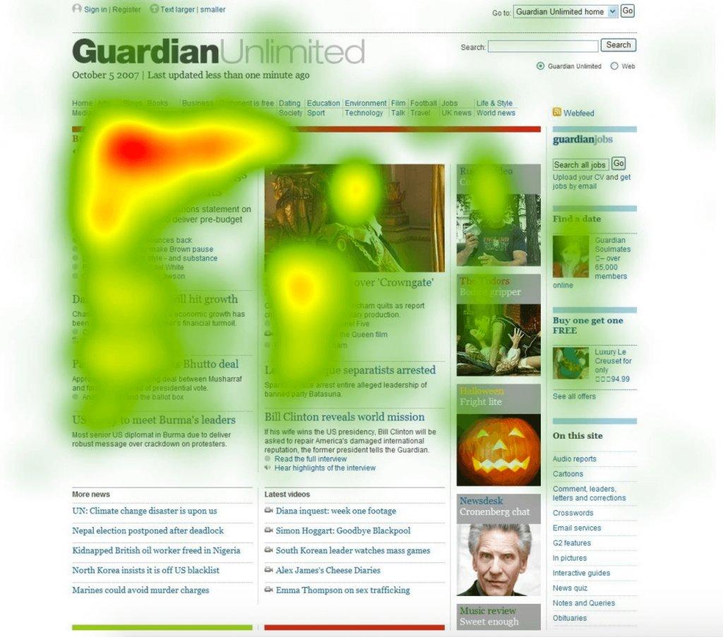
A heatmap of Guardian Unlimited’s homepage
Image Source: Talkroute
Why is heatmap analysis important to improve user experience?
There are 2 types of data that can help you understand the current user experiencequantitative data and qualitative data.
Quantitative data is gathered using research tools like Google Analytics (GA). The problem with relying on quantitative data alone is that even though it can give you a performance number against each metric that you track, it, however, fails to provide any insight into the reason behind the performance – good or bad.
For example, if a visitor churned when moving from stage A to stage B in their journey, quantitative data will only tell you that they churned and not why they churned.
And this is where website heatmap, a qualitative UX research tool that tracks and visualizes visitors’ on-site or on-page behavior, comes into the picture.
The first thing to keep in mind when designing an interface or when designing for better user experience is that this process is a continuous one – there is no one final, fixed design that will work forever. People change their choices and often modify their needs.
This, coupled with the large number of updates on every digital platform, calls for continuous design iterations and hence, makes the exercise of gathering, analyzing and leveraging user interaction data ever more important.
And what better way to achieve this than leveraging the power of a robust website heatmap tool. Heatmap tools tell you exactly what works and what doesn’t, and also provides actionable data, so the changes you make are data-backed.
How can heatmaps be used to improve user experience?
There are different kinds of customer experience heatmaps, and each one has its own way of revealing how visitors behave on your website. Let’s see what these customer experience heatmaps are all about and how they help improve user experience.
Clickmaps
Clickmaps display the number of clicks different areas on your website receive. More clicks indicate higher engagement from visitors. This insight can help you enhance the site navigation by arranging the elements to align with visitors’ expectations and behavior.
Identifying areas where visitors might encounter friction, such as non-clickable elements that they expect to be interactive, is crucial. By removing or optimizing areas causing friction, you can significantly improve the overall experience on your website.
Scrollmaps
Scrollmaps visualize how visitors scroll through a webpage. Colors indicate the intensity of a visitor’s attention, with warmer colors indicating higher engagement and cooler colors suggesting less engagement.
By analyzing scrollmaps, you can identify at which point they lose interest and drop off. This helps CRO experts, marketers, and UX designers understand the optimal scroll depth for placing important information. Finding important info towards the top can pique visitors’ interest and keep them on the page.
Dynamic heatmaps
Dynamic heatmaps help you analyze visitors’ engagement with interactive elements such as pop-ups, sliders, and dynamic content. This unique feature is available in only a select few heatmap tools, like VWO Heatmaps.
Further, recording visitor data in real-time on the live state of your website helps you quickly identify potential issues before they start impacting your website conversions. This way, you can proactively enhance user experience and win audiences’ trust.
Click areas
Click areas allow users to select and compare multiple areas on a webpage simultaneously. As this approach goes beyond analyzing individual elements in isolation, you can comprehensively understand visitors’ preferences through interaction comparison.
If an element receives fewer clicks compared to other areas on a page, you can remove or optimize it to increase engagement. This all-around analysis positively contributes to your website’s UX.
What are the benefits of using heatmaps for user experience?
User behavior analysis
Your opinion about your website doesn’t matter. Understand what your visitors think with the help of heatmaps. They reveal navigation patterns, highlight popular click zones, and expose elements that visitors may ignore. These observations allow you to develop a more in-depth understanding of their needs and preferences. Your objective should be to make your website align with their mental model by implementing the right measures.
Data-driven insights
A heatmap for user experience offers data-driven insights by giving you a sneak peek into the actual visitor behavior on your website. While quantitative data tells you the ‘what’ behind the actions, heatmaps delve into the ‘why,’ revealing the reasons audiences behave the way they do. This combination forms the basis of your CRO process, shaping your test plan accordingly.
Optimization opportunities
Now that you have data-driven insights in hand, it’s time to construct your testing ideas based on them. For instance, if your heatmap data reveals low visitor interaction with the search bar on your website, you can brainstorm testing ideas on how to optimize it. Such analyses help in refining design elements and enhancing their visibility, relevance, and accessibility to visitors. All of this, in turn, boosts engagement and conversion rates.
How to interpret a heatmap for UX?
Interpreting interactions from heatmaps the right way will help you make sense of visitors’ behavior and make strategic decisions based on it. Here’s what you should look at:
Hotspots
Look at the areas with the highest color intensity, usually warmer colors like red or oranges. These areas are where users are most engaged. Ensure the elements in these regions are always optimized to maintain this level of engagement.
Coldspots
Next, identify areas with cooler colors like blue, indicating lower interaction. A greater portion of your optimization ideas should center around improving these areas to boost visitor engagement here. Making the right improvements will help fix the problem of a leaky bucket on your website and improve conversions.
Clicks
Check the number of clicks critical elements receive compared to the total clicks on your page. For instance, if you observe an abysmally low percentage of total clicks on the CTA button, use this information to brainstorm ways to attract more clicks to this element. Consider tweaking the copy or repositioning the button for better engagement.
Scroll depth
Observing how the number of views changes as visitors scroll allows you to pinpoint where they tend to drop off on a webpage. This information helps you strategically position the most important sections on your page.
Which elements of a website can you analyze using heatmaps?
CTA Buttons
CTA buttons are one of the major elements on both a website and an app, and having clear CTAs with optimized copy and placement can make all the difference to its UX, and ultimately conversions.
For visitors to have a seamless experience, the copy of your CTA should be self-explanatory in terms of what the button is about, and it should be placed in a way that visitors and users do not have to struggle to locate it.
Using heatmaps, UX designers and analysts can identify if the main CTAs are indeed getting traction or not, identify elements on the page is getting clicked on if not the CTA, if the CTA copy is compelling enough or not, if the CTAs below the fold are getting enough attention or not, and much more.
For instance, SaaS demand generation teams can quickly scan through their resource page’s heatmap to see if the CTA with the download link to their blockbuster ebook that cost them thousands of Dollars and a whale of their time is getting clicks or not.
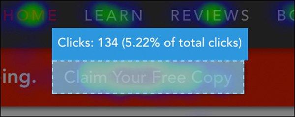
Image Source: Digitalmarketer
And all these insights can be unearthed by studying the on-site behavior of existing visitors, thereby eliminating the need for investing in acquiring new traffic.
U-Digital, a Netherland-based digital agency, leveraged heatmaps to analyze user interactions on its client’s mobile website product page. The insights they collected helped them identify several friction areas. Consequently, they optimized the page which resulted in a 21.46% increase in click-through rates.
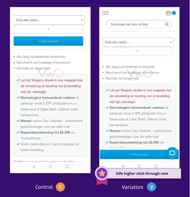
Control vs Variation
Navigation
Flawed navigation with multiple friction areas or one that does not match visitor expectations calls for an experience breakage and hence a bad UX. When visitors have to struggle to find what they came looking for on your website or when the navigation flow demands higher cognitive load on the part of the visitors, frustration ensues, leading to visitors dropping off without converting.
Heatmaps can help you track and analyze visitors’ navigational patterns so that you can construct a navigation map that matches visitor expectations. Website heatmaps also equip you with data that helps identify missing/broken links as well as redundant ones that affect the overall navigation of your digital property.
For instance, an eCommerce website’s UX team can analyze their homepage’s heatmap to ascertain the discoverability of the navigation bars and icons on it and analyze the ease with which visitors are able to move from point A in their journey to point B as well as identify potential distractions.
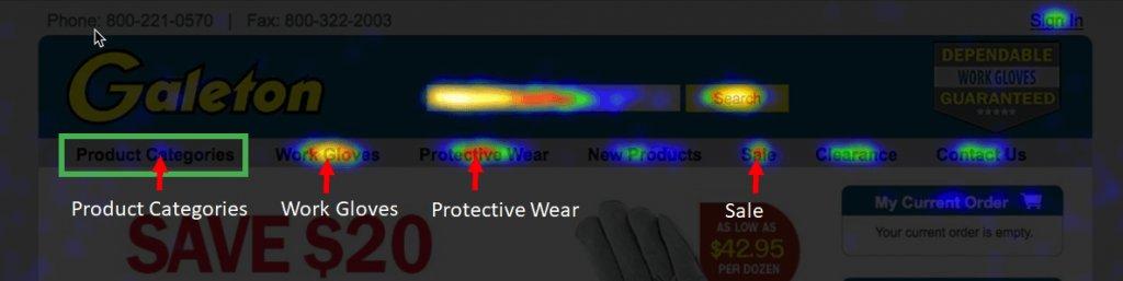
Image Source: Galeton
In fact, the above heatmap data is from a test that Galeton ran on its website’s navigation bar. Testing ideas based on the insights collected using heatmaps, Galeton optimized their navigation and witnessed a 14% increase in sitewide conversion rate.
Images and Text
Images and text comprise the major part of a website’s design. The challenge here arises when these two elements are not at their most optimized forms in terms of conversion driving quality and placement.
Using heatmaps, you can identify the most popular section of a web page and place the most critical text and images in those sections. Using mouse tracking heatmap, you can follow the movement pattern of visitors’ cursor and discover if the copy is confusing based on the cursor’s hovering pattern.
Using clickmaps, you can identify areas where users tend to click the most, where they expect a certain image to be, identify images that are expected to be hyperlinked, and more. Using eye tracking heatmaps, you can gather data on visitors’ gaze length and frequency and find out where visitors are looking at the most, which images catch their attention, which text makes them linger around longer, and so on.
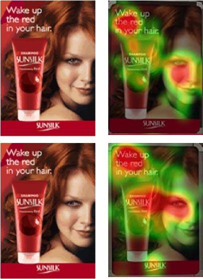
Image Source: Pinterest
For instance, the above image shows the heatmap of 2 different ad versions of the same product. A quick comparison of the two heatmaps can tell designers and marketers that in the second design where the endorser is looking directly at the product, the latter attracts more visitors as compared to the first design. Even the copy in the second design gets more traction than in the first design.
The list of use cases for heat maps can go on, but the bottom line is that website heatmaps help you unravel the dynamic and ever-changing universe of visitors’ needs and behavioral trends.
Muc-Off employed heatmaps to analyze visitor engagement on its retail website’s homepage. They observed that visitors were not scrolling down to see product images, resulting in drop-offs after viewing product information. So, they expected that displaying eye-catching product images above-the-fold would improve visitor engagement. This insights-driven optimization reduced drop-offs and improved purchases by 106% for the brand.
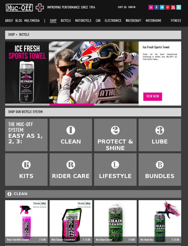
Control
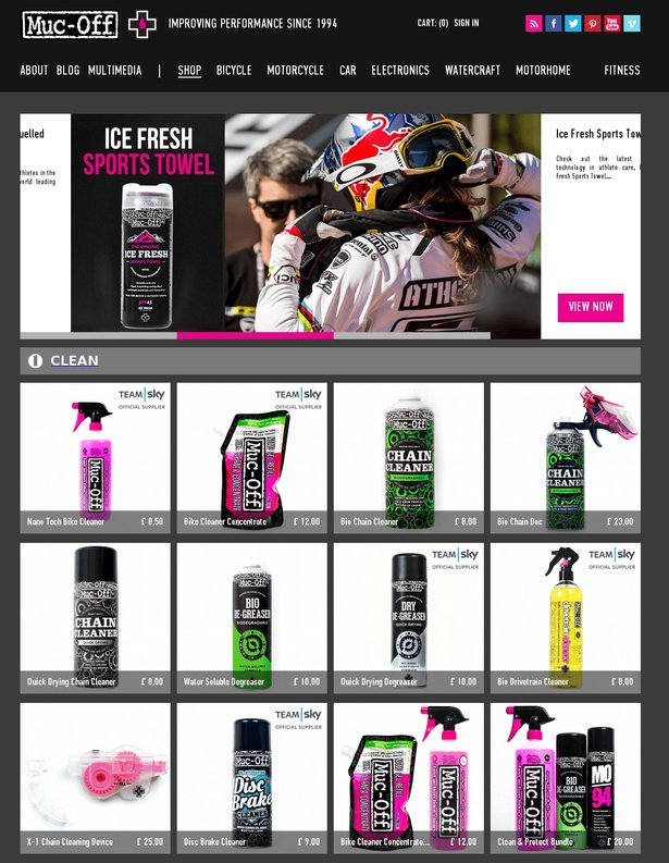
Variation
Page Length
Nobody likes scrolling endlessly on their phones or desktops looking for something on one single website. This being said, every business is different, with each of their websites flaunting unique goals. Hence, the page length always depends on the goal/s that particular web pages or websites aim to achieve.
Scrollmaps can be of enormous assistance when determining the page length for your website.
For instance, using scroll maps, blogging and publishing websites can identify the sections of a page where visitors are scrolling to the most, pinpoint the fold beyond which visitors don’t bother scrolling or which witnesses highest number of bounce-offs, gauge the readability or traction that the below-the-fold content warrants, discover false floor, and much more.
They can ascertain the ideal length for their blogs and articles by leveraging such actionable insights that website heatmaps arm them with.
Download Free: Website Heatmap Guide
Overall Page Layouts
Testing every element in silos and ensuring that each of them works does not necessarily mean that each of these elements works together as well.
You may have a world-class product or service, you may even have the best copy written for its website, and the most appropriate images shortlisted.
This does not automatically mean that all of these will work together – your copy may be compelling, but the image next to it may hijack all the eyes; your product page may be splendid in terms of product images and specifications, but the CTA button may be hard to find; you may also strike the right balance between the various elements on your page but too many folds prevent most visitors from reaching the main CTA at the bottom – the list can go on.
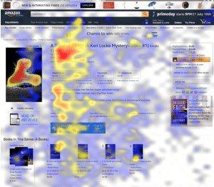
Image Source: Kindlepreneur
By highlighting the most and least popular sections of a page, by equipping you with actionable insights on possible experience breakages, website heatmaps help you place important information in the most popular sections and design the perfect layout for high converting landing pages, homepage, checkout page, product page, and so on.
How Heatmaps came to dictate UX in omnichannel experiences?
There is no second-guessing that the credit for the dominance of website heatmaps when it comes to designing for a stellar UX majorly goes to the incomparable, quality insights on visitors’ on-site behavioral trends that they arm marketers and UX designers with.
But, there is another element at play here that appears to be slowly becoming a major contributor to this dominance, namely omnichannel experience.
The aggregate experience that a website delivers to each visitor, across devices is an omnichannel experience.
That being said, we live in an age where each individual can own a desktop, a mobile phone, a tablet, or any other device all at the same time. And they use all of these devices to browse through different websites and sometimes, the same website using different devices.

Image source: Freepik
In a conundrum like this, where there is no certainty about which device a visitor starts their journey on, and on which they end it, it becomes imperative that the interface be designed in such a manner that each element is in its most optimized form (as far as visitor expectations are concerned) and is consistent in delivering a good user experience throughout the journey, across devices.
Delivering a good omnichannel experience to each visitor has become everything now, and this is why website heatmaps have gained a further impetus into assuming a pivotal position in the entire UX designing process.
With its ability to track and visualize user behavior data on each device type individually as well as the ability to create aggregate heatmaps of data from all devices combined, website heatmaps empower you to collect, visualize, and analyze data from multiple devices in a way that best suits your roadmap to achieving your UX goals.
How can you combine heatmaps with other UX tools?
Session recordings
Integrating session recordings into your qualitative research provides deeper context for your heatmap data. Let’s say, you observe a surge in clicks on the ‘add-to-cart’ button compared to the ‘checkout’ button in a heatmap. Session recordings reveal that visitors hesitate to click ‘checkout,’ opting instead for ‘add to cart’ or scrolling back to product details.
This insight prompts questions— Are they looking for the price to drop before purchasing? Would free shipping incentivize them to complete the purchase? This comprehensive analysis forms the basis for logical hypotheses in your testing strategy.
On-page surveys
Surveys offer direct feedback from users, offering insights into their preferences, challenges, and satisfaction levels. For instance, suppose learners click the course description on your eLearning website but don’t enroll. To understand why, you deploy an on-page survey asking questions like ‘What information are you looking for before enrolling in this course?’
Analyzing the survey responses, you might find learners want more details on pre-requisites, instructor credentials, and fees. This deeper understanding complements heatmap data, filling in information gaps you might miss with just heatmaps.
Form analytics
If your site includes forms, integrate a form analytics tool to analyze user interactions within forms, highlighting areas that may cause friction or lead to drop-offs. Consider, in a SaaS website’s sign-up form, heatmaps reveal a hotspot on the “Submit” button, indicating user engagement. Form analytics revealed a drop-off at the company size field, showing users hesitate or encounter errors.
Combining insights, it becomes clear that although users are interested in signing up, confusion around the company size input causes some to abandon the form. This integrated approach guides targeted optimizations, such as refining field labels or providing more clarity, to streamline the sign-up experience and boost conversion rates.
Conclusion
That website heatmaps became an analytical frontrunner in the entire process that goes behind designing for spectacular UX comes as no surprise.
When combined with A/B testing, its ability to enable marketers and designers to step into their target audience’s and visitors’ shoes to test and build the website experience from the latter’s POV makes website heatmap a highly valuable and indispensable analytics tool.
With the entry of testing in the picture, the Heatmap-UX duo only got stronger. It is only a matter of time that like CRO and UX/UI, website heatmaps will come to assume central positions in other fields of the online world as well.
To stay ahead of the curve, try VWO Heatmaps, which has several cutting-edge features missing in other heatmap UX tools. Take a free trial and explore how it can help aid in enhancing visitor journeys on your website.
Understand visitor behavior analysis in detail with this video.
FAQs on Heatmaps for UX
Heatmaps help UX professionals by enabling them to figure out the areas of maximum user engagement either on their website or their app interface.
Heatmaps can be used to collect data on any type of element- Dynamic or static. UX professionals can leverage the insights collected through heatmaps to optimize the main elements such as CTAs, navigation, images, headings and sub-headings and page length.
The primary objective of a heatmap UX design is to visually interpret visitor interactions on a website. You can see where users click, move, and engage the most. In this heatmap analysis, marketers and designers recognize hotspots, coldspots, understand user preferences, and optimize layout and content placement. By pinpointing areas of high and low interaction, designs can take the right optimization decisions for better user experiences.
Reading a heatmap in UX design involves interpreting color gradients to understand visitor engagement. Hotspots, depicted in warm colors, mean areas with high interaction, while cooler colors suggest lower user engagement. Cold spots pinpoint areas for improvement to enhance visitor interaction with the elements in those regions. Refer to the sections above for more detailed insights.
Heatmaps are visual representations of how visitors behave on your website, using colors to indicate levels of engagement. Warm colors show areas of high engagement, while cool colors show areas of low engagement, enabling you to understand what is and isn’t working in your website’s UX. Based on these insights, you can improve the layout, navigation, and content to enhance the user experience.
A heatmap is a vital tool in your design thinking process. When you run a heatmap on your website, it provides invaluable visitor behavioral insights. Whatever improvements you make will be based on the insights this tool gathers. It highlights areas of high and low engagement, allowing designers to make informed decisions about layout adjustments, content placement, and UI modifications to improve website UX.
Categories:


