
Eye tracking enables business owners and marketers to understand user interaction with their websites and landing pages. You can draw a lot of startling insights by using eye tracking with heatmaps and strategizing the design of your landing pages.
Are you struggling to meet the desired business goals and want to consider eye tracking to peep into your user’s mind to uncover why? If yes, please read on.
Download Free: Website Optimization Guide
What is eye tracking?
Eye tracking is the process of measuring and analyzing patterns of visual attention of your prospects when they land on your website. Fixation of eye movements is the typical metric of an eye-tracking system. When collated over some time, the data can provide you with crucial insights, such as where on a web page or other pieces of digital content a visitor has looked at and paid most of their attention. Analytical tools like heatmaps serve very handily when it comes to mapping eye movements.
What eye tracking can do to your website design?
Eye tracking can provide you with valuable insights, such as:
- Where your site visitors are looking and for how long they are looking
- How their focus moved from one item to another on your web page
- What parts of the user interface do they miss
- How they are navigating through a particular page
- How the size and placement of various page items is affecting their attention
Having said that, below mentioned are ten smart ways to use eye tracking to enhance your site’s design and improve conversions.
1. ‘Fold’ isn’t always as important as you think
People do scroll. You just need to give them the right design cues to prompt their curiosity and move beyond the first-page fold.
For instance, many marketers argue that placing your call-to-action(s) above the fold is always a better option as the chances of your visitors easily identifying and clicking on them are comparatively high. Several success stories prove otherwise. They’ve concluded that it typically depends upon your visitor’s motivation.
If, after looking at your audience’s eye movements, you think that placing your call-to-action on the left side of the page is not getting you the number of clicks as anticipated, change its position. Develop a hypothesis and run an A/B test. Rule out the guessing game and use actual data. Take a 30-day free trial with VWO to try our insights and testing capabilities.
2. Visuals attract instantly
Our brains are far more engaged by storytelling, especially when they’re accompanied by images and videos than heavy text placed all over the page. The reason is, people are more drawn toward visuals as they enrich their experience.
See Google search results below from an eye-tracking study:
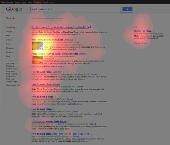
Results with video thumbnails are getting more attention than textual results.
Your prospects tend to look first at the image and then read the text if the visuals are captivating enough. With this human behavior, the ball lies in your court as it can facilitate the rise in conversion rates by fast-tracking the decision-making process of your prospects.
Furthermore, the placement of your visuals and the kind of visuals you’re using matter. Exact Target, a global SaaS provider of digital marketing services, increased its conversion rate by 40.18% by simply replacing its landing page image.
Formerly, the image on their landing page showed a laptop screen to draw attention to the announcement of the conference, giving a false impression that the event was a virtual conference instead of a live event.

Image Source: Exact Target
However, their CTR shot to 40%, when they replaced the laptop screen with an image of a conference as shown in their variation below confirming that relevant images play a crucial role in pushing visitors down the conversion funnel:

Image Source: Exact Target
3. Apply the Contrast Principle
Before-after examples allow easy comparison and force people to pay attention to everything you intend to bring to their notice.
Robert Stevens of ThinkEyeTracking.com experimented to confirm this behavior in real life. The first group of people was shown only the promotional items.
The second group of people was shown promotional items stacked with full-price items. The eye-tracking study showed that these believed-to-be useless ‘pre-sale’ prices were not that useless after all.
Consumers from the second group took note of the full price of items during the purchase. They were more satisfied with getting a good value for money rather than their counterpart, which was shown as promotional items only.
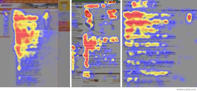
4. Adapt to an F-shaped reading pattern
It’s a human tendency to begin reading from the left side of the page and move toward the right. The f-shaped reading pattern authenticates the same.
As a visitor lands on a page, they automatically pay more attention to the elements placed on the left side of the page than the right ones and that follows even when they move further down.
So, this makes one thing clear — try and keep all your important content on the left side of the page. Underwater Audio, one of the leading eCommerce companies, used the F-shape pattern to its advantage and increased its sales by 35.6%.
They shifted important testimonials from the right side of the page to the left side so that they’re prominently visible before the call-to-action. As hypothesized, the testimonials influenced prospects’ thought sequences besides enhancing their user experience, helping them increase their sales as anticipated.
The f-shaped pattern also suggests that a website’s header gets a lot of attention. You should put information, such as free shipping, contact number, search bar, money-back guarantee, et al. in a strategic position to increase visibility and optimize the website’s conversion rate.
5. Guide visitors with directional cues
Human eyes tend to follow the direction they’re pointed in. As the call-to-action is your most important page element, you must point your prospects toward it.
Notice in the image given below how the arrow brings attention to the search bar immediately, making the purpose of the page very clear for prospects:
However, using a pointer is not the only way to guide an individual’s attention in a particular direction. With images, it gets more subtle than that.
Eye-tracking studies have shown that it matters where subjects in images are looking. Subconsciously, people tend to follow the gaze of subjects and look in the same direction. This is illustrated in the image below, taken from an eye-tracking study:
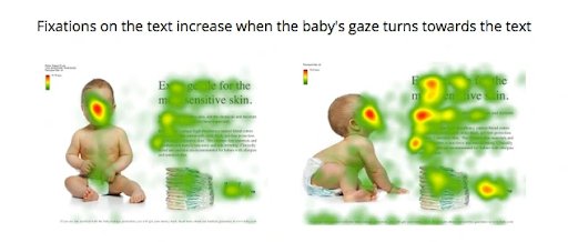
Make your subject look or point in the direction of your call-to-action (or important information you’re trying to convey) and test it to see how it impacts your conversion rate.
ConversionXL conducted research on which visual cues drive the most attention. They created variations of a lead gen page featuring different visual cues.
The variations had one of the cues each from the following:
- Human looking away from the form
- Humans looking toward the form
- Arrow
- Triangular graphics
- Line
- Prominent form
6. Don’t make visitors dwell on the “dead weight”
Fitt’s law states that an element’s ‘weight’ in the visual hierarchy determines the attention it gets. Your call-to-action should ideally have the highest weight on the page. But if a less critical, non-clickable element carries the weight that diverts visitors from the call-to-action, you must take measures to fix the visual hierarchy.
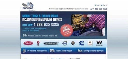
A great example here is TechWyse’s case study. See their original page below followed by its heatmap:
Heat map of the above landing page:
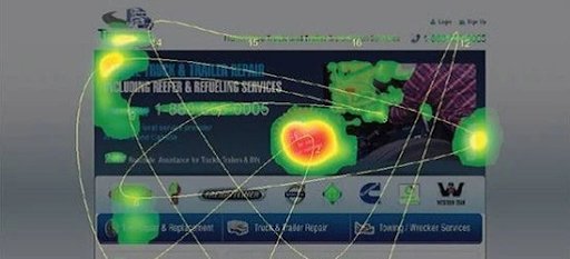
The ‘No-Fee’ badge is attracting maximum attention on the page. But the problem is that it is a non-clickable element and hence, stealing away the thunder of the main call-to-action button. Removing the badge fixed the flaw in the visual hierarchy of the page, allowing the call-to-action button to get the attention it deserved:

Download Free: Website Optimization Guide
7. Use white space wisely
Any space that is free from images or text is white, no matter what color it might have. Appropriate use of whitespace increases legibility and allows natural eye flow on the page. As a result, essential page elements get the necessary traction and improve the chances of more conversions.
Placing call-to-action and headlines on whitespace helps to make them stand out on the page. When you use a larger-than-life image as the backdrop, it serves as a perfect whitespace to reel people in.
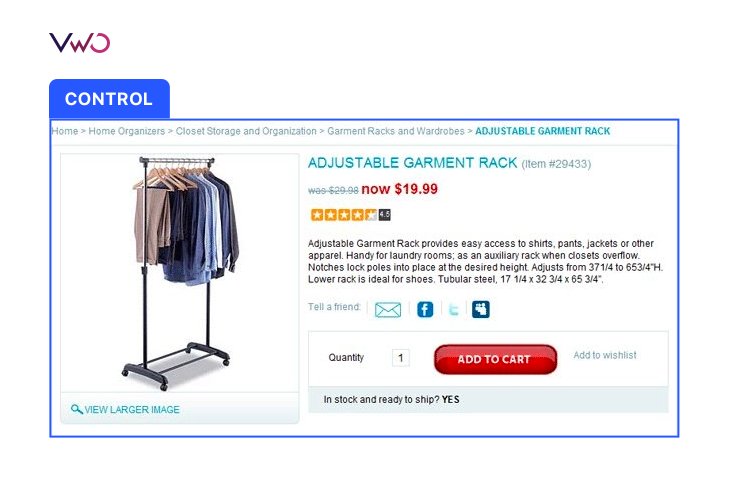
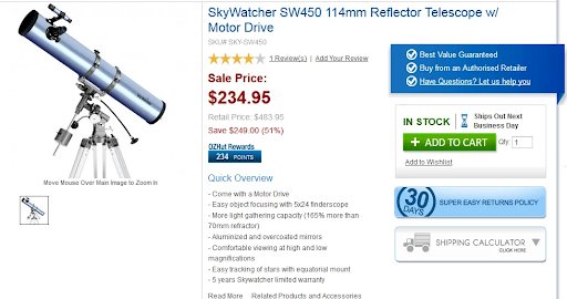
The use of white space comes with a disclaimer, though. Too much whitespace can also give a sense of disconnect between your page elements. This is why when Trinity Insight displayed its product price closer to the ‘Add to cart’ button, it increased its sales manifold.
Their control looked as shown below:
Their variation that lifted their conversion to 10% applied an efficient buy box strategy, as shown below:
Therefore, we recommended A/B testing the visual elements on your page or validating a larger redesign of your page with split-URL testing.
8. Tune your typography
How you style or present your text is what makes people decide whether or not they’d want to explore and engage with your site. Crammed text like the one shown in the image above will dissuade people from reading it. But only taking care of text spacing isn’t enough either.
Headings and subheadings must stand out to adapt to online scan behavior. Give them relevant h1, and h2 tags. Use short paragraphs and sentences, and a font style and size that’s easy to read.
Bullet points in the text also come in handy when it comes to giving a quick overview to readers about the important points. Sometimes knowing what to emphasize can make a big difference.
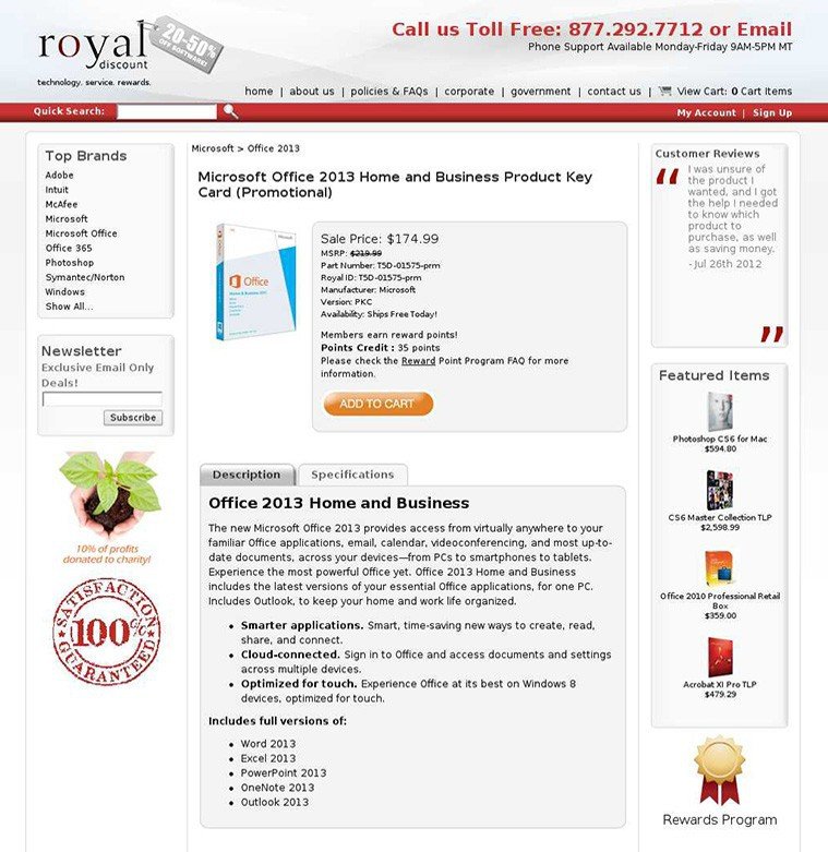
Royal Discounts, a leading eCommerce company, increased the font size of their sale price on their product page only to see their conversions improve by 36.54%.
Their control looked like as shown below with the sale price mentioned as standard text which was not standing out from the rest of the content:
Their variation, as shown below, had the price emphasized in the bold font that resulted in a massive rise in click-through-rate as well as in revenue:

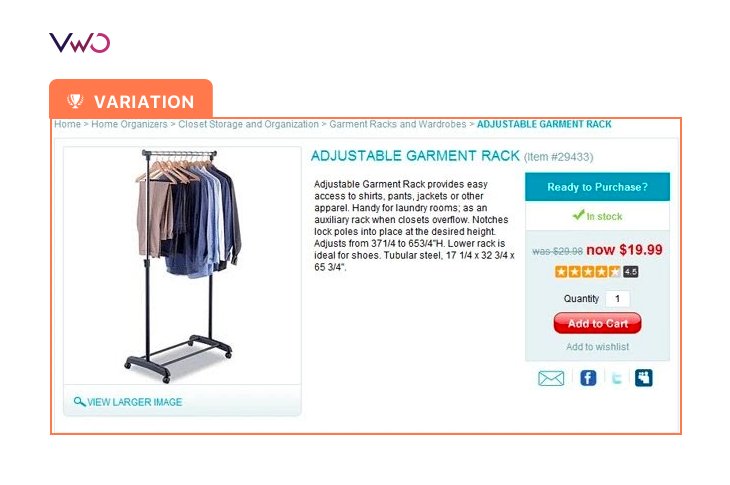
9. Encapsulate what’s important
The foundation of good visual hierarchy is based on prioritizing your website goals that are aligned with your business goals. Call-to-action buttons, lead-generation forms, or even some important points listed in a box can all work well for your conversions.
Frames draw eyes to what’s inside them. For example, Ozscopes rests buyer anxiety by addressing their main concerns in a neatly designed box that cannot be missed on their product pages. Check out the image given below:
Bonus content: Watch a webinar to learn how UX research contributes to a testing program
Conclusion
All the above points are necessary to understand how you should guide visitors’ eyes on your webpage for better conversions.
However, you must do your research and ensure that your business goals are well-aligned with your expectations from the eye-tracking tool, before finalizing it as a potential website marketing strategy for your enterprise. Also, the insights that you receive from eye tracking should be used as hypotheses to be validated via A/B testing. VWO offers an all-inclusive and guided 30-day trial that you can use to make the most of your website optimization efforts. Try it out for yourself.
Categories:


![7 Best Website Monitoring Tools [2026]: Expert Insights to Help You Pick the Right One](https://static.wingify.com/gcp/uploads/sites/3/2025/02/Feature-image-7-Best-Website-Monitoring-Tools-How-to-Pick-the-Right-One.jpg?tr=w-300,h-150)


