Underwater Audio Improved Visuals To Increase Its Purchases Using VWO
VWO and Underwater Audio
Underwater Audio is a US-based supplier of products such as aqua goggles, swimbuds headphones, and waterproof iPods. Customers from several countries around the globe order its exclusive products through its eCommerce website.
The company uses the VWO platform for its website optimization work.
Goals: Increase sales
This is what the original home page (the control) looked like:
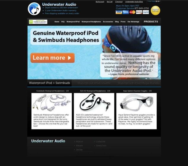
The primary business need was to increase sales through the company’s online store.
Tests run: Improving visual hierarchy to guide visitor actions
The Underwater Audio team knew that it had only a few seconds in which to grab the attention of visitors, convey to them what your site is about and the value they will derive and how you want qualified leads to move forward (towards the purchase).
As the team considered additional elements that could be changed to drive engagement and sales, the concept of “visual hierarchy” was proposed. In essence, this is about using subtle visual cues to guide the thought pattern of visitors so that they process information the way you want them to and take the action you want them to.
While visual hierarchy is a much-talked-about subject, not many consider it as the basis for A/B testing ideas. But the Underwater Audio team decided to test this aspect of its website.
Specifically, the team wanted to test the hypothesis that because of the F-shaped eye scan pattern of visitors, swapping the placement of the call-to-action (CTA) button and the testimonial bubble would visually reinforce the thought progression of title>quotation>action. In turn, this would make Underwater Audio’s case more compelling, and thus increase sales.
An added benefit of this change would be that the main image of the product, which was hidden under the testimonial bubble in the Control page, would become more clearly visible.
With VWO, you can easily validate your redesign ideas through A/B testing. Take a free trial to check out for yourself!
This is the variation page after the CTA button and the testimonial bubble were swapped:
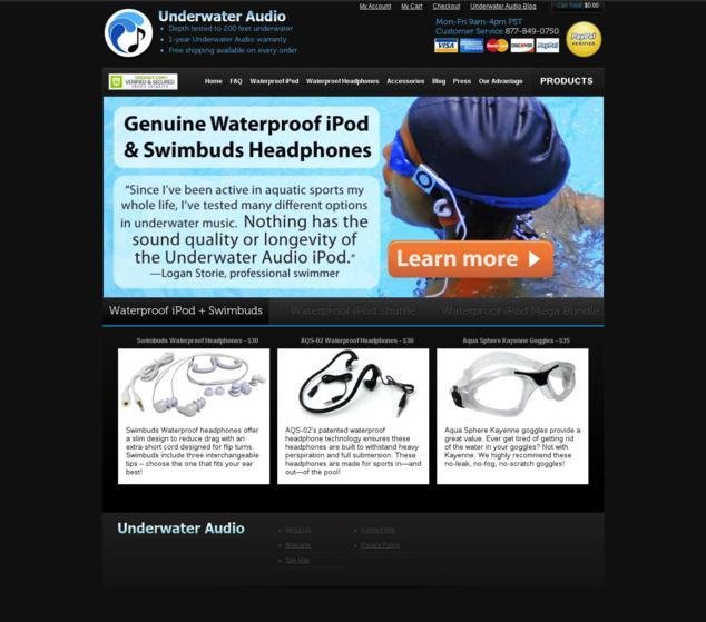
The A/B test was set up and run on the VWO platform.
Conclusion: 35.6% Increase in sales
The A/B test proved the hypothesis. The Variation beat the Control with a 35.6% increase in sales.
Here’s a comparison image that shows what changes were made in the variation:
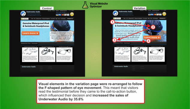
This success story emphasizes that web design is not only about aesthetics. The relative “visual weight” of various elements on the web page is what decides how clearly it conveys your message to visitors.
In this case, the variation improved the prioritization of visual elements. Right after telling visitors what product was available, the new visual hierarchy almost forced visitors to read the customer testimonials. This served to increase credibility by providing social proof and in turn, guided visitors’ decision-making further into the sales funnel. Thus, it was the new visual hierarchy created by Underwater Audio that helped visitors connect the dots and understand the story being told by the web page.
In the Control page, visitors who proceeded to the next page probably did not read the customer testimonial; this made the product and its value proposition less credible, and possibly impacted sales.
The redesigned landing page follows many landing page best practices mentioned by Oli Gardner, Co-Founder of Unbounce.
Some other aspects worth mentioning although they remain unchanged in both versions:
- The most important category “Products” in the top navigation bar is reinforced by bold text and increased font size.
- The testimonial by a professional swimmer is absolutely relevant to their aquatic industry type. The larger font size is used to bring attention to the important part of the testimonial.
- The color of the CTA button made it stand out even though its placement was switched from the whitespace in the Control to a relatively darker background in the Variation.
- Details such as price are not mentioned on the homepage to avoid scaring away visitors. This information is revealed only after the visitor has shown some interest- by which time, some credibility has been built around the product and its value.
- Trust elements such as the customer care telephone number on the top right and the security seal from GoDaddy on the top left add credibility to the site.
- Free shipping, warranty period, and payment methods available are other basic concerns that are addressed on the home page itself so that only qualified leads proceed to the next step.
For effective visual hierarchy, before you begin designing your page, it is important that you first figure out the goals of the web page that are most important for you and those elements of the content that will contribute to those goals.
VWO gives you the ease and confidence to validate your test ideas before you ship them. Take a free trial to understand how.

Location
US
Industry
Retail
Impact
35.6% increase in Purchases