‘Why is my conversion rate so low?’ – A question that almost every website owner has found themselves asking at some point.
Your SEO strategy is rock solid. You’ve invested sufficiently in paid advertisements. But what makes converting traffic into leads so challenging?
Maybe there’s something you’re not paying enough attention to. Your Conversion Rate Optimization (CRO) strategy.
Yes, it might need a commitment of time and expertise for effective implementation. But once you get started, CRO can offer you user insights like no other marketing activity. Based on these insights, you can experiment with different ideas and optimize your website with the best experiences.
Before it gets too late and your conversion rate hits rock bottom, reshift your focus on CRO and figure out the broken areas on your website that need immediate attention.
Take your first step by reading this blog where we discuss what’s probably causing low conversions on your website and give measures to correct them.
Intrigued to learn more? Let’s start.
What is a low conversion rate?
A low conversion rate simply means that not many people visiting your website are taking the desired action, whether making a purchase, filling out a contact form, or signing up for a newsletter. But remember, determining if a conversion rate is low or not depends on factors like the type of website you have, the desired action you want visitors to take, and most importantly the industry you operate in.
Wordstream, an online advertising agency, conducted research where they looked at conversion rates in different industries. If you’re an eCommerce player and your conversion rate is between 4% and 6%, it can be considered good. But if you’re in finance, a conversion rate of 4% is rather underwhelming because the top performers are achieving five times more!
Therefore, you must measure your website’s performance against your industry-specific conversion rate, instead of considering the average across all industries.
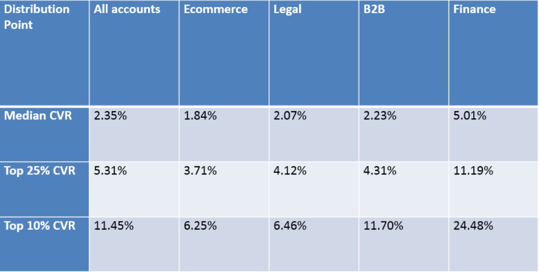
Image source: Wordstream
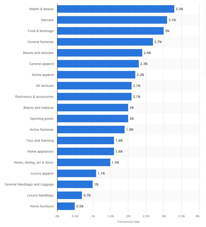
If you are in eCommerce, here’s the vertical-wise conversion rate in 2022 by Statista. This should give you an idea about how your website is faring against the vertical average.
What are some potential reasons for low conversion rates?
It matters only a little if you think you’ve built an amazing website. A low conversion rate shows that your audiences don’t think the same. There must be reasons why they’re not converting on your website. We look at some of the common reasons in this section.
Poor navigation
Where is the navigation bar on your website located? People expect to see a usability feature as important as navigation in predictable places on your website. If it’s nested at some corner, bring it to prominence by placing it as a horizontal bar at the top.
Also, a mega menu is a standard navigation style today, and users are more comfortable interacting with it. If you’ve implemented a hamburger menu on your website, it’s very likely to go unnoticed, thereby preventing audiences from searching for products or services.
Some websites, especially in eCommerce, display product categories serving navigation purposes. Have you checked if the scroll arrows on the sides of these product categories work fine? When users try to scroll sideways but the arrows don’t work, it’s frustrating for them.
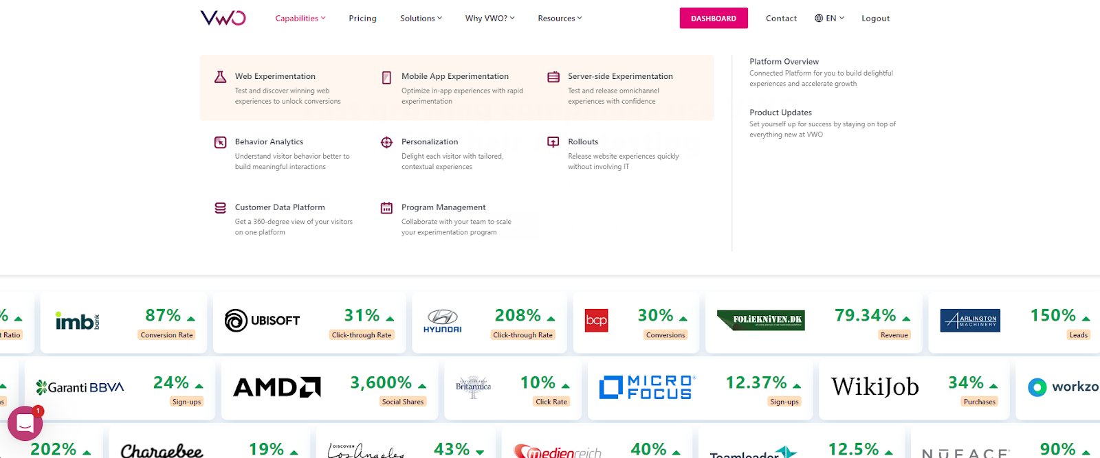
I’ve seen websites that show jargon as category labels (maybe to sound niche), which didn’t help me understand what these labels wanted to convey at first glance. I’m sure many felt the same as me. As an inspiration, look at how we’ve aced this practice at VWO. We’ve used labels like Capabilities, Pricing, Solutions, Why VWO, and Resources. You can easily figure out what each of these labels stands for. Simply hover and you can see the subcategories as well.
Unclear call-to-action buttons
No matter which page is it – homepage, service/product page, or checkout page – CTA buttons are the lifeblood of your website. This is because they tell your visitors to perform an action. If users can’t understand what your CTAs want to convey, they will get confused and leave your website.
Sometimes CTA buttons don’t stand out because their color blends in with the rest of the website layout. Plus, insufficient white space around them increases the cognitive load for users, for they have to put in extra effort to distinguish these buttons from the rest of the visual.
Have you checked the CTA copy? Is it a verb and action-driven? If not, consider changing it to something persuasive. Let’s say you’re offering a free eBook to download and the CTA button says ‘Download’. Now that sounds generic and meh! Instead, something like ‘Grab your free copy’ sounds more action-driven and can nudge visitors toward taking the action.
Another mistake you don’t even realize you’re making but can cost you dearly is giving equal weightage to primary and secondary buttons. Often add-to-cart pages show ‘Checkout now’ and Continue shopping’ buttons. You would want your visitors to check out before they change their minds, right? In this case, asking them to continue shopping takes a backseat and is a secondary button. Consequently, the ‘Checkout now’ needs more prominence than the other CTA.
Missing trust signals
Where do you display security badges on your website? While the traditional practice is to place these badges during the checkout, the idea to show them on the homepage is being embraced by an increasing number of businesses. With customers being more aware of their security when shopping online, showing these badges early on their journey helps you win their trust from the get-go. Consequently, they feel safer sharing personal or financial information with your brand.
We can’t stress enough how important trust signals customer reviews are. 95% of customers read reviews when shopping online. Seeing that other customers have had positive experiences with your products or services can help reassure potential customers that they are making a good decision by choosing to shop or do business with you.
Sometimes businesses make the mistake of showing generic reviews on specific product pages. Stop doing this! Customers are picky more than ever before and it will take them a fraction of a second to leave your website if they don’t find relevant reviews on product pages. This, without any doubt, leads to a low conversion rate.
Broken checkout process
I myself have dropped off from a number of websites because their checkout processes gave me cold feet. Even if I did end up purchasing the first time, I never went back to shop with them again. Long and confusing checkout processes with a never-ending form to fill up can be any user’s nightmare. Filling out repeated information in the absence of form field validation, error notifications, and autofill options makes it all worse.
If you’re not showing trust badges during checkout, you must at the soonest. And if you’ve trust badges already, make sure they are easy to spot, especially on the payment page. Further, there are two more reasons why users drop off from checkout. First, unexpected shipping cost – bombarding your users with unexpected shipping costs in the checkout stage is never a good idea. Free shipping is ideal, but if you have to charge them for shipping, make that clear from early on in their journey on your website.
Second, not enough payment options – the use of digital wallets is surging by the day. So, facilitating payments by card is not enough today. If you’re not integrating the payment methods popular among customers into your checkout process, you’re losing your chance to generate sales from them.
Subpar product or service descriptions
Whether yours is an eCommerce website or a B2B SaaS website, are your product and service descriptions communicating your value proposition clearly to your audiences? We’ve come past the days when website copy was all about ‘ We’re the best’, ‘We’re the #1 in our industry, ‘We’ve earned the X award’, and so on.
Today, users want to know how your product can help them solve their problems. If your content doesn’t show that, they’ll abandon your website for another that empathizes with their problems. Tie your offerings (whether product or service) with benefits. Suppose, your website sells bed mattresses and you highlight that your mattresses boast of a polyform and memory foam in product descriptions. But do you mention how this foam provides your audiences with a good balance of durable support and pressure relief when sleeping? Get the point, right?
See below how Databox clearly elucidates how customers can benefit from using their platform.
Low-quality images
Poor-quality images can make it difficult for customers to get a clear and accurate representation of the product. This can lead to confusion and uncertainty about what they can expect to receive, which increases the risk of returns and dissatisfaction.
Using a lot of stock images robs you of the chance to build a connection with your visitors and win their trust. A lack of branded visuals reflects ingenuity and influences audiences to drop off. In fact, the use of stock images is more prevalent in B2B websites which unlike B2C websites have no vast product inventory to display. Adding high-quality images, videos, and animations can help reverse low conversions and improve user engagement.
How does VWO Insights help you dig into the reasons?
The above are probable reasons causing a low conversion rate on your website and drawn from our experiences working with several brands over the years. But how do you analyze user behavior and confirm the reasons for churns on your website particularly? VWO Insights can be your guiding light in this exercise.
Goals
By setting up goals in VWO Insights, you can track how many visitors are completing an action on your website. And this action can be almost anything, starting with making a purchase, signing up for a newsletter, or contacting you through a form. You can also set up multiple goals and track multiple actions on your website. This can help you understand which areas of your website are working well and which areas need improvement.
Heatmaps
Through heatmaps, scrollmaps, and clickmaps, you can gauge how users are interacting with different areas on your website. For example, if you notice that users are clicking on the secondary CTA button, instead of the primary CTA button on the homepage banner, you can use this information to optimize the placement or design of those buttons.
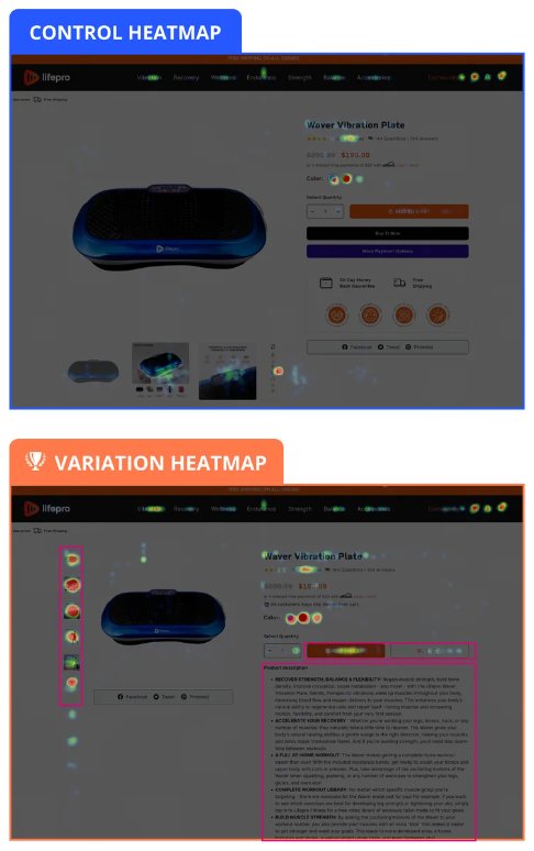
Dallas, a US-based agency, used VWO to perform a heuristics analysis of the website of one of their clients, Life Pro Fitness. VWO Heatmaps, Clickmaps, and Session Recordings helped them uncover the pain point that visitors had to search for information required to convert. To make this information easily accessible to visitors, they made the product images more prominent, placed CTAs clearly in the first fold, and moved the product description to the first fold in the variation.
Heatmaps showed that visitors interacting with the variation had a higher engagement. The variation outperformed the control by a 15.63% increase in conversion rate. The team monitored an increase in revenue and obtained an increase of $0.67 per visitor.
Funnels
Funnels help you identify where the drop-off points are and take action to improve the user’s journey. Suppose, you notice that users are dropping off from the payment page. Based on this observation, you can investigate if there are any issues with the payment process or if certain payment options are missing.
Session Recordings
Want to watch users in action and derive observations based on it? Session recordings help you do that! Let’s take an example of how users browse your navigation. If your audiences click on the nav bar but do not click through any product category, this should tell you that something might have prevented them from taking the predictable step. Taking a cue from this, you can hypothesize that changing the arrangement of product categories can encourage users to find what they are looking for.
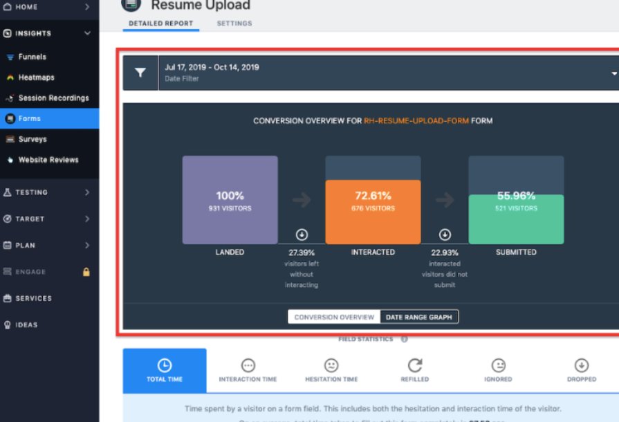
Form Analytics
As the name suggests, this feature helps you analyze the end-to-end performance of your web forms. If you notice that users are dropping off from the shipping address form during checking out, you can investigate further if any fields are causing confusion or if the form is too long and make adjustments accordingly.
Qualicorp, a Brazil-based healthcare organization, partnered with VWO to increase leads generated on its website. Using VWO Form Analytics, they found that a major drop-off happened while filling out the form. The team hypothesized that asking for fewer details could encourage users to complete the form fillup. Based on this hypothesis, 3 tests were conducted which led to an increase of 16.93% in sign-ups for the company. Read about those tests and their results in detail here.
Surveys
Instead of watching from afar, you can reach out to your audiences through surveys and seek their feedback. What is it they like on your website? What can be improved on your website? Could they find what they intended to? With VWO’s On-Page Surveys, setting up surveys is easy and quick and gives you a clear picture of user expectations from your website.
How can you improve your website conversion rate?
Once you’ve discovered the reasons why users drop off from your website without purchasing, it’s time to look for solutions. And in that venture, you need robust tools like VWO Testing and VWO Personalization by your side.
Let’s say you’ve observed in qualitative analysis that users are hovering on the navigation menu but not clicking any product categories. Instead, they’re simply exiting the website without browsing any further. In this case, you can test if rearranging subcategories (bringing the most important subcategory to the top) or changing category labels can help improve user engagement with your navigation menu.
Now, what are the elements you can personalize on your website? Start with the homepage header. Imagine you run an eCommerce store that sells outdoor gear and you want to personalize the headline on your homepage. One way to do this would be to use location-based targeting. You could create a personalized headline that says ‘Welcome to the best outdoor gear store in [City]’ for visitors who are located in that city.
Can you personalize the CTA buttons? Sure, you can. Say you’ve shown a site-wide sale banner on electronic items. You may personalize experiences for new and returning customers where you show the ‘Explore more’ button for the former and ‘Buy Now’ for the latter. From there, you dive in further and see sales from Houston are below your expectations. You can personalize the CTA to ‘Buy now and get 10% off’ for customers from this city to encourage more purchases.
Diagnose low conversions and fix them!
You’ve struggled enough with low conversions! Roll up your sleeves and get to the root cause that might be causing the problem. We’ve already discussed the possibilities of where you might have gone wrong, but do your own user research to diagnose the real problem. Because your research is unique to your website, what it offers, and visitors. When that’s done, test or personalize based on the type of problem you’re trying to solve. And remember, you can always fall back on VWO to help you along the way.