Struggling because your free trial and demo request forms aren’t delivering the leads you want? It’s possible to turn things around. But before we dive into how to get more free trials, let me ask you – are you sure your forms have all the elements necessary to convert visitors into leads?
In the world of B2B SaaS, free trials and demo request forms are more than shooting just a list of questions to prospects. In your pursuit to humanize B2B marketing, you should focus on building connections with your audiences, generating trust among them, and convincing them to try what we offer. And the starting point for all of this is having them sign up for a trial or request for demos.
It may seem like a lot of work, but it’s worth the effort.
Of course, your forms need the right ingredients to achieve their objectives. But to tap into their true potential, turn your focus on A/B testing. This strategy not only allows you to test one experience against another but also to understand what works and what doesn’t at that point for your website.
So, let’s begin discussing how to approach revamping forms and utilizing A/B testing to increase lead generation in this blog post.

Ways to skyrocket your SaaS sign-ups
1. Analyze the performance of your current forms
Before you give your web forms a makeover, make sure to diagnose the pain points.
By examining user behavior and identifying where they’re getting stuck or abandoning your form, you can make targeted improvements that will increase your conversion rates and drive more leads.
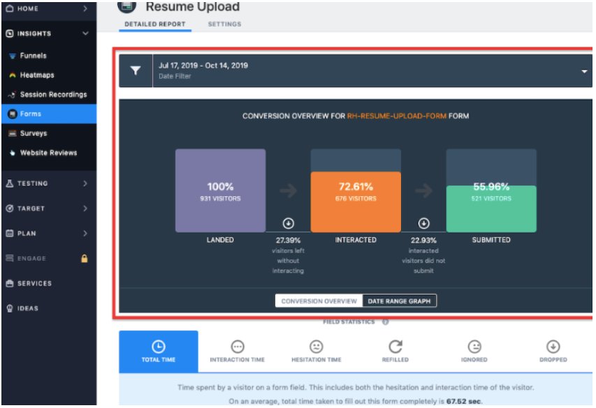
And that’s where the VWO Form Analytics tool comes in. It can track and analyze user behavior to give you all the juicy deets on what’s working and what’s not. From drop-off points to time spent filling out each field, our form analytics tool helps you delve into macro-level as well as field-level statistics. Once you’ve gotten your hands on these data, you can work towards building high-converting forms by testing and incorporating the right elements.
2. Beware of what you’re asking for
Less is often more, and in the world of forms, this couldn’t be truer! Ever found yourself abandoning a form because it was long and you did not have the time to fill it out? But your audiences don’t have to go through the same. Make this process easy for visitors by reducing the number of questions you ask them to answer. This way, they can focus on the most important ones and save a lot of time. They’ll appreciate that you’re not too curious to collect too much personal information and therefore trust you enough to try your offering.
Suppose you’ve asked users to enter both personal and official email addresses in a free trial form. But for this purpose, entering just one email address could work. Some forms ask a ton of questions like, “How many employees do you have?”, “What industry is your company in?” and “How long have you been in business?” which are often not important to be answered at the outset. Let’s stop overwhelming users with so many questions from the get-go. If your product is solid, they’ll stick around.
Having said that, we also believe that asking questions can sometimes help a brand evaluate the potential fit between the product and the customer. At VWO, filling out our free trial and request demo forms is a breeze. However, to ensure we connect with prospects who are truly invested, we’re ramping things up by scheduling one-on-one meetings with our team immediately after they submit their basic information on the request demo form. The winning experience saw an increase in clicks on the request demo CTA button by 35.32% and demo page visits by 3.01%.
3. Mandatory fields and form validation
Imagine you spend time filling out a form but all your efforts go in vain as you see an error message telling you that you entered the wrong information after you’ve filled out most of the fields. This is where form validation comes in. Form validation helps users ensure that they are filling out all the fields correctly on the go, which reduces the chances of making errors and speeds up the submission process.
Highlighting mandatory fields is also crucial in helping users save time. Imagine your prospects are to fill out your request demo form which is quite lengthy because you need to ensure the product-customer fit. But the form doesn’t clearly indicate which fields are required. When mandatory fields are highlighted, users can identify which fields should be filled in and focus on them, resulting in a faster form submission rate.
4. Clear and attention-grabbing CTAs
CTA buttons can make a big impact on your leads and bookings. They are the ones that seal the deal and get those leads coming in. But if they are not attention-grabbing, they are highly likely to be overlooked by users.
Suppose your free trial form features a “Try now” CTA button, but it’s barely getting any clicks. A CTA like this one might fail to motivate visitors to take action. What you can do now is run a test by creating a variation featuring a far more interesting CTA copy – “Start your 30-day free trial now” This specific CTA gives visitors a clear picture of what they’ll get by clicking it. With years of experience helping brands, we’re confident that this variation will be a winner. But we still suggest you study visitor behavior on your website and then decide if you’d like to run this test or not.
5. Testimonials and social proof
Testimonials and social proof are like stamps of approval from your existing customers. They show that these customers have already taken the plunge and had a great experience using your product. As a result, prospective clients can also take the leap following their footsteps.
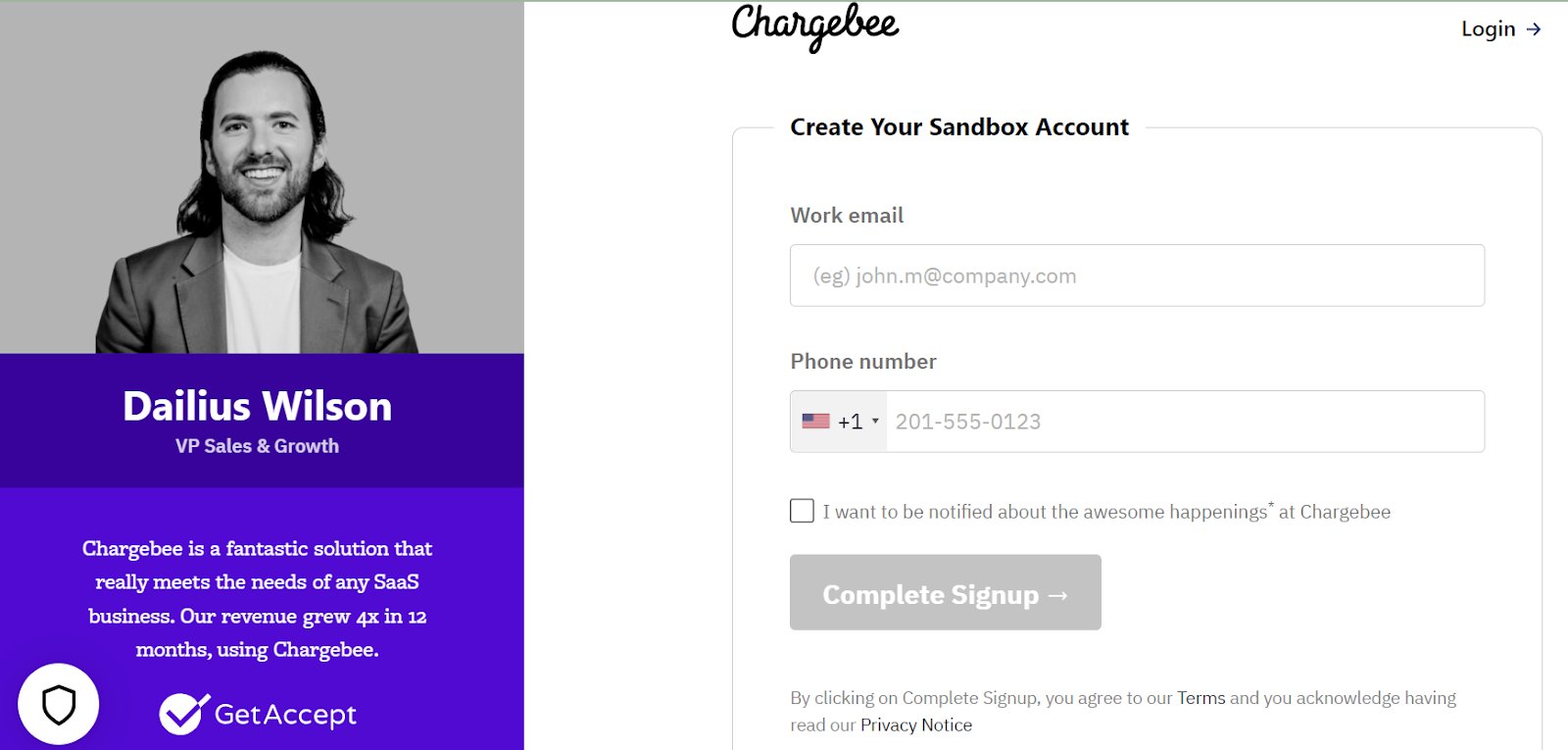
If your form ticks most of the boxes of best practices yet doesn’t bring in any leads, try adding testimonials and see how that performs. Below is how Chargebee encourages users to sign up for a free trial by displaying a testimonial on the left side of the form.
Using VWO Visual Editor, you can add any type of form modal or widget to pop up on your website. You can also edit and customize them to suit your brand guidelines and improve request demo/free trial conversion rates.
With the VWO Editor, it is also possible to preview the changes on both desktop and mobile before the test starts.
6. Form placement
If your forms are not easily noticeable, visitors are less likely to take the pain to find them all by themselves. So, keep them in a prominent position, making it easier for visitors to engage with it and use it to submit their information.
To determine the right placement of your form, you can A/B test different form placements. At VWO, we ourselves champion the use of pop-up forms on our website. Our pop-ups are not at all intrusive in nature as they show up only when users click the CTA button.
Why not give your website visitors a hassle-free experience by embedding your form above the fold? This smart placement eliminates the need for scrolling and allows them to fill out the form with ease.
A case in point:
ICICI Lombard, a leading auto and home insurance provider in India, partnered with Tatvic to improve lead submissions on its health insurance page. By moving key plan details above the fold and placing the mobile-number field at the start of the form, the team saw a 30.09% increase in form completions and a 44.25% rise in mobile-number submissions. To know the details of this case study, read here.
Alternatively, you can also place the CTA of the form in a sticky header that remains at the top of the page as visitors scroll down. Clicking the CTA button can open either a separate landing page or display a web pop-up.
The age-old question, pop-ups or landing pages, which is the better form submission tool? We say, test them and see which one of them brings the maximum conversions for you.
Pop-ups ask for minimal information, such as an email address, to sign up for a free trial. Landing pages, on the other hand, show detailed information about your product or service and may ask for more information to be submitted, such as name, company, or phone number.
If you go for landing pages, make a statement with head-turning information and take advantage of all that extra space. Give your landing page the attention it deserves by including SEO keywords, showcasing your success with testimonials, and adding reviews or security badges. Plus, you can add a compelling video that showcases what your product can do for your prospects.
Does VWO help you test landing pages? Oh sure, it does! You can use VWO to test either individual elements of your landing page or conduct split-URL tests to validate complete overhauls. Request a demo and have our experts explain this in detail.
7. Concise and convincing copy
One of my favorite sayings on LinkedIn these days is ‘Sell benefits, not features”. And that’s what I’m suggesting you do in your free trial or request demo forms. Users want to know how your product helps them solve their problems. If you’re not getting that part right, they can switch to brands that do that better.
Tell your users what they can expect by signing up. Apart from a catchy headline, you must also list the benefits awaiting them after they are up for request demos. Think your current copy is not performing well? Our Visual Editor can come to your rescue. Its AI-powered copy generator can suggest great copies that resonate with your prospective customers. A/B test and see if the improved copy helps drive more conversions or not. The results will impress you, we’re sure.
8. Personalize your messaging
Personalizing your forms can increase the likelihood of conversions. Here’s an example to help you understand how.
Let’s say yours is a customer relationship management platform. You’ve observed that most new visitors are starting to fill up the free trial form but not completing the signing process, based on the insights uncovered from segmented visitor groups on VWO Form Analytics. To push them down the lead conversion funnel, you can personalize your form and test it against the non-personalized generic form for this audience group.
Suppose the control has something like “Unlock a 15-day free trial to start building better business relationships.” To appeal to this segment of the audience specifically, you can now tweak your offer to “Unlock a 30-day free trial to start building better business relationships”. The duration of the free trial can make a big difference in driving responses from visitors.
Similarly, for a request demo form, you can offer 3 days of free inbound marketing consultation with one of your in-house experts who can customize a plan in the areas of marketing and sales for a prospect’s business. Run this test against the regular request demo form without a consultation offer. Roll out the experience that drives maximum demo bookings to all new customers.
Keep leads coming in with simple form fills!
Free trial forms and request demo forms are the gateways to your SaaS products that spark user interest and guide them towards exploring what you have to offer. Whatever we discussed in this blog are the basic components of a good free trial form. But remember, with user experience being unique to each website, A/B testing is key to finding your perfect fit.
Whether you’re analyzing current form performance or testing out new optimization ideas, VWO has got your back. From form analysis to a range of testing options, it’s the ultimate tool for boosting your leads and taking your business to the next level. So, don’t settle for mediocre results. Let your free trial and demo forms soar with VWO!
Categories: