Conversion Rate Optimization
What is conversion rate optimization?
Conversion rate optimization (CRO) is the process of optimizing your site or landing page experience based on website visitor behavior to help improve the probability of the visitor taking desired actions (conversions) on the said page by using a/b testing or other methods.
In today’s world, online traffic is highly inconsistent. If you’re unable to get visitors to enter your conversion funnel in the first go, the chances of them coming back and performing the desired action are quite low. This is nothing but an opportunity lost for your business. The best way to improve your chances and get more conversions is by running effective conversion rate optimization campaigns.
A good conversion rate optimization campaign not only means saving your time, money, and effort but also exploring new growth strategies that were unknown in the past. In other words, conversion rate optimization helps you understand your website’s usability better while giving customer behavior insights and tips on how to make your UX better to meet your goals.
At a strategic level, conversion rate optimization, or CRO is an ongoing process of learning and optimizing. Unfortunately, the “ongoing” aspect often gets ignored while discussing conversion rate optimization and its elements.
What are the 6 primary elements of conversion rate optimization?
CRO is a comprehensive process that sprawls across a multitude of stages. A successful CRO campaign uses in-depth data to analyze results, runs multiple tests, tweaks content to make it more relevant to the visitors, and draws necessary conclusions. Throughout the journey of a CRO process, a marketer will encounter six primary elements that can be optimized.
Landing page design
Landing page design is the first and foremost element that defines the usability and success of a website. The more aesthetically designed a site is, the more traction it will get!
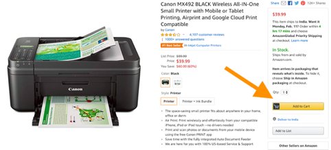
Let’s understand this using an example most of us may be familiar with. Assuming that most customers landing on any of Amazon’s product pages come with the pure intention of buying its product(s), understanding the importance of design in driving conversions (how it can make or break a deal for the eCommerce giant), is important. The giant has strategically designed each of its product pages to make even the minutest of details prominently visible to its customers. For instance, when on a product page, customers can instantly add the product to their cart by conveniently clicking on the “Add to Cart” button (in a color that’s prominently visible – Orange) placed right next to the product information column.
How does this help? Orange is an intense color that complements the website’s white background making it easy for the visitors to identify and take the necessary action instantly.
Furthermore, the effective use of white space to highlight the product’s features and the smart use of large images on the left side of the page instill trust and quickly capture the attention of the visitors.
Website copy
While a well-designed and aesthetically pleasing website can get more website traffic flowing on your site, words can verbally hook your visitors and convert them into potential leads. Writing relevant and engaging content that emphasizes the product’s persuasiveness can make the difference between visitors staying on your website and taking the necessary actions and visitors leaving your site without taking any action. Website copy can be further divided into two subsections:
1. Headline
Headlines are the first and foremost thing a visitor sees on your landing page. It typically defines their first impression of your business. If they do not like it, they’ll not scroll down and check the rest of your page. To ensure you’re on the right track, focus on the following things:
1. Formatting: Typically focusing on the font type, font size, and color to ensure it captures your visitors’ attention and is easily readable.
2. Writing style: Keep the following things in mind:
- Ask a question – e.g. Do you know email marketing can add 30% more revenue to your business?, How to find the products of your choice? etc.
- Split your content into two parts – e.g. Internet marketing: what lies in store?
- Address directly – e.g. Can you rely on content marketing?
- Focus on the numbers – e.g. 10 ways to ensure email marketing adds to your conversions!
In either case, one should keep the headline short and to the point ensuring it talks exactly about what the product or service is about in a clear, concise manner.
2. Body content
A well-written body of content is essential for a website. It must answer the basic question – “What’s in store for me?” It must also be clear, concise, and to the point, and portray your brand’s persona most efficiently.
To draft good body content, consider the following:
A. Formatting:
- Cut content into relevant paragraphs for easy readability
- Use necessary subheadings to break down the content into glance-able chunks
- Bullet points or numbered lists wherever necessary
- Font type, size, and color that matches the overall design guidelines of the brand
B. Writing style:
- Right tonality as per the target audience (fun, professional, casual, etc.)
- Stylistic elements such as metaphor, adjectives, etc. to highlight certain points
- Address directly to the end-user and what they are here for, answering their questions
- Add key phrases to improve the overall usability and easy takeaways
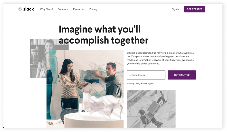
As an example, Slack, a modern collaboration hub space that allows teams to stay connected and work together, has a strong landing page headline followed by subsequent content that focuses on its USPs.
A catchy headline accompanied by content that’s concise and answers all the necessary questions makes any page look attractive and does the desired work – getting customers onboard.
Call-to-action
A call-to-action (CTA) is exactly what it sounds like – a request or call for customers to take the desired action. This action could be anything – from subscribing to a newsletter to booking a slot in a webinar, making a purchase, availing a service, and so on. The stronger and crispier the CTA, the more leads it can generate.
But, is it this simple? Take a look at some of the industry’s best CTA strategies and you’ll see that they all make use of basic psychology to define their CTAs.
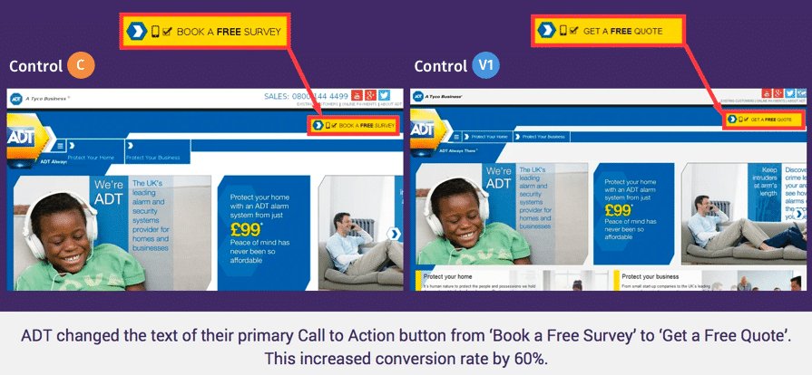
Quoting an example here, ADT, a Tyco International company, was able to increase its conversion rate by 60% by simply changing the primary text of its CTA button – from “Book a Free Survey” to “Get a Free Quote.”
Navigation and site structure
Your site’s structure must focus on building an experience that’s easy to navigate. Site structure, at its core, is typically a graph of how different pages of your site interact with each other.
Although every site is different and has different navigations, this hierarchy style is a standard example.
You typically start navigating from the homepage, then explore its series of categories and subcategories until you’ve found what you were looking for. If this entire process is fluid, as explained in the graph above, then your users will not have an issue navigating through your site. But, if it’s unstructured, they’ll be lost in the process; ultimately abandoning your site.
To accomplish this, one must ensure users are easily and quickly able to move between important sections of the website and can find whatever they need to accomplish their goals in the fewest clicks possible.
In other words, creating a fluid, easy-to-navigate website is the key to increasing conversions as well as your brand’s reputation.
Forms
Forms are crucial to most companies, especially if they’re a part of their sales funnel. Optimizing these important customer touchpoints can extensively help improve the conversion rate. While many theories follow on how to build a good and effective form for your website, these may or may not work equally for all. In some cases, having a comprehensive form may work wonders, while in many other cases, concise forms may just be enough to get the conversions going up the graph. The secret ingredient here is to always maintain a balance between lead quality and the volume of leads that get the best ROI.
Yet, four basic optimization tips to take your forms from okay to outstanding are as follows:
- The fewer the fields, the better it is. True in most cases but not always, especially when you want your sales team to focus on only the most serious leads or in cases where it is paramount to get additional lead information like the industry or the city if you have lead workflows dependent on these additional fields.
- Good-looking forms often equate to a nice user experience. Good forms constitute no flashing text, clear and consistent styling, and tooltips and validation built at the right places. Good forms typically also have the most important fields are the top followed by less important fields. One can also experiment with progressive forms to improve their conversion rates without compromising on the depth of user information.
- Easy password creation makes the entire form-filling process an easy breeze. As per internal VWO data, the password is one of the fields that takes up the most time to fill. Needless to say, guiding users on creating strong yet easy-to-remember passwords is the key to making this process more fulfilling for both the user as well as the business.
- Having one-click form submissions using Facebook or Google SSO can also work wonders for your conversion process. Most times users are already logged into one of these sites and this helps them convert much more easily. It also alleviates the pain of creating and remembering new passwords. This, however, may not work in all cases, especially in B2B contexts, where businesses work with the business email IDs of their prospects.
Page speed
Page speed or page load time has a huge impact on the overall performance of your site. It directly affects the experience of a user, the conversion rate of the site, and its ranking on the search engine. According to a blog published by Semrush, if a site loads in 1.7 seconds, it’s comparatively faster than 75% of the web. On the other hand, if it loads in 0.8 seconds, it’s faster than nearly 94% of the web.
A load time delay of even one second can reduce your conversions by 7%. For instance, if your site is generating a revenue of $100,000 a day, then even a second’s delay in its load can cost you about $7,000 per day or even more.
The same one-second delay also means that you’re prone to losing about 11% of your potential customers as they’ll simply close your page or back out without even thinking twice.
Benefits of conversion rate optimization: Why is it important?
CRO enables you to optimize your website’s functionality while helping you understand the whys and hows of visitor behavior. The fact is, your site never reaches its maximum potential until it’s rigorously experimented with. Broadly the benefits of a CRO program can be categorized into two:
Improving marketing ROI
A well-structured and well-thought-out CRO program based on strong analysis can go a long way in improving the return on almost all your marketing activities by:
A. Improving the quality/speed of experiments run on your website: CRO allows you to analyze the performance of your site by running tests and looking for the best possible variations that promise conversions. By experimenting with different elements on your landing pages, you can not only check the areas that are giving the best results but also use the gathered data as a fundamental benchmark for your next round of tests/experimentations.
B. Better revenue with the same traffic/incremental business returns: One of the prime benefits of running a CRO campaign is that every change you implement on your site, which eventually increases your conversions, is an incremental win for your business.
For instance, an online eCommerce company planning to enhance its customer experience in a way that it makes purchasing products easy and convenient for its customers can immensely benefit from CRO. How?
By running an A/B test, if it’s able to enhance its conversion rate even by 3%, it means that it’s getting 3% extra revenue day in and day out. Meanwhile, if it has a high volume of sales, a 3% improvement can effectively translate its sales into hundreds and thousands of extra dollars for its business
Australian-based eCommerce company ShowPo saw a 6.09% increase in its revenue by running a series of A/B tests and introducing new and improved variants on its product pages!
Enhancing UX
The benefits of a CRO program spread well across just marketing ROI to give an improved user experience across all lifecycle stages of a visitor whether they’re a first-time visitor or they’re a customer through:
A. Personalizing experience for your site visitors: In today’s time, visitors are too impatient. Unless you’re offering them a site that’s easy to navigate with fewer clicks and makes the entire process an easy breeze, they won’t stick around and will eventually look for alternative options. By helping personalize sections of your site based on the visitors’ geography, device, local time, or past browsing history, you can make the website that much more relevant to them.
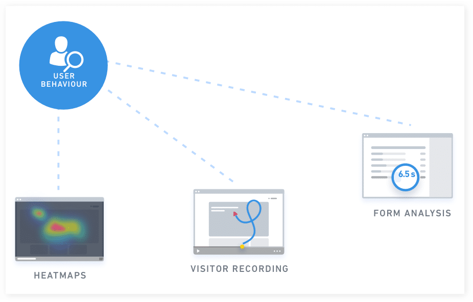
B. Better insights into your visitor behavior: The CRO process begins with understanding customer behavior through tools like heatmaps and clickmaps. Such tools tell you which site sections visitors spend more time on. Other conversion rate optimization tools, such as user session recordings and session replays, help understand their overall experience. They shed light on the exact journey visitors took to accomplish a set goal on your website and even highlight the friction areas that caused them to drop off and abandon your site. Meanwhile, form analytics and website surveys also help understand a visitor’s overall site-wide experience. Such qualitative data is enough to create a good UX, and further pave the way for conversions.
Who is conversion rate optimization useful for?
Conversion rate optimization is beneficial for all types and sizes of businesses irrespective of their industries. Here are some interesting business use cases defining the pervasive nature of conversion rate optimization.
CRO for B2B/SaaS companies
Lead generation is the initiation of grabbing the interest of your customers by engaging them on your site, gathering their information through various means (forms, sign-ups, surveys, etc.), and contacting them to convert them into loyal, recurring customers. As a B2B/SaaS business, it becomes your duty to help your customers find what they’re looking for, capture their interest, and support their buying decisions.
Case study: Continuous testing helped POSist improve their demo requests by 52%!
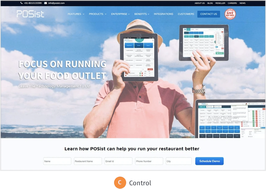
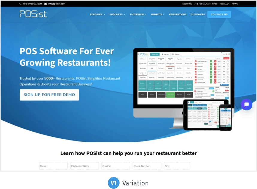
POSist is one of the leading SaaS-based restaurant management platforms that provide a complete range of online Point-Of-Sale (POS) solutions for all kinds of restaurants. The company wanted to increase its demo requests and reduce drop-offs on its homepage and Contact Us page. Evidently, these were two of the most important pages, which helped the company get maximum conversions.
POSist decided to run a CRO campaign to achieve their goal, which eventually helped them identify the gray areas. The company modified its homepage by adding more relevant and conversion-centric content. This not only improved user experience but also generated conversions. POSist generated about 52% more leads in a single month, which further lifted their website’s conversion rate to 3.4%, marking an overall 25% increase.
CRO for eCommerce companies
Shopping cart abandonment serves as one of the major challenges to eCommerce companies, costing billions in sales revenue generation every year. According to an analysis done by the Baymard Institute, nearly 69% of all eCommerce visitors abandon their shopping carts due to innumerable reasons. Hence, building a user-friendly eCommerce site with a great design, exclusive products, and nominal shipping cost that not only solves the cart abandonment problem but addresses other drop-off issues such as complex payment processes, lack of basic information, and so forth, is crucial.
Common reasons why people leave a site are as follows:
- Distractions: Too many pop-ups or forms to fill can distract your customers.
- Difficulty of checkout: The site may not offer a friendly check-out option, which may complicate the purchasing efforts of first-time users.
- Hidden costs: Most visitors get intimidated by hidden costs such as additional shipping charges, other taxes, and more.
Running a CRO campaign helps to identify and address such bottleneck issues and significantly contributes to improving the site’s conversion rate.
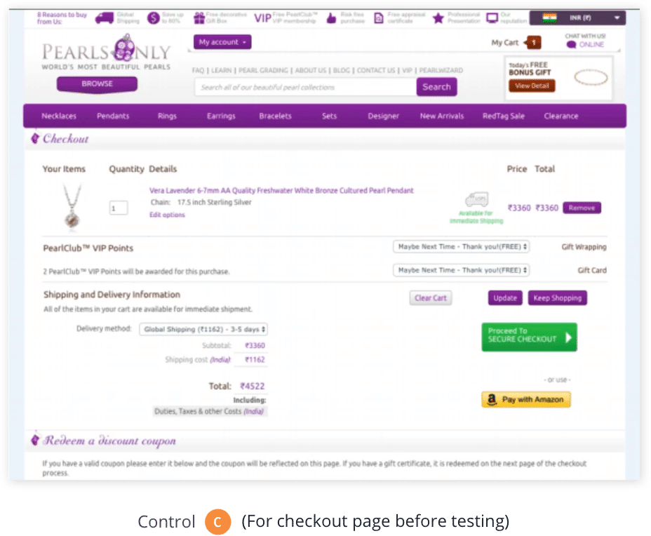
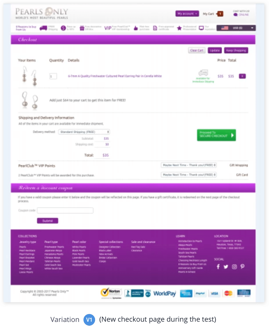
Case study: PearlsOnly increased its revenue by 12% by making its check-out page more CTA-centric!
PearlsOnly is an online jewelry store based out of Houston that specializes in the sale of pearls. Since its inception, the organization has constantly been testing its website and making necessary amendments to stay abreast of the industrial trends and offer the best services to its clients. Yet, it wasn’t able to get as many conversions as it aimed. Running a CRO campaign, they concluded that their checkout page was too cluttered and distracted its site visitors, making them leave the page before they took the desired action.
PearlsOnly, with the help of VWO services, optimized its checkout page while ensuring all its USPs were duly highlighted. They ran the campaign for about a month, and the results were outstanding. The test helped PearlsOnly increase its revenue by 10%.
CRO for Media/Publishing houses
For businesses like media agencies and publishing houses, reaching a larger audience base and keeping them engaged on their platform is crucial for their growth. Here, CRO can help them with this as well as test various site elements such as email sign-ups, social sharing icons, recommended content, and other promotional options to capture more attention.
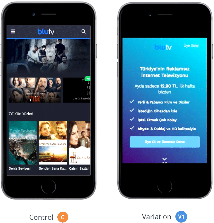
Case Study: BluTV increased its mobile conversion rate by 42% by simply making the homepage more service-friendly!
Being a subscription-based, over-the-top (OTT) video-on-demand service provider, BluTV’s success entirely depends on the number of active subscribers it has. Its primary objective was to get as many visitors to sign up for its paid subscription trials as possible. To start a trial, a visitor had to share their credit card information, and they would be charged only after they’d completed their 7-day free trial period.
Researching visitor behavior on BluTV’s site, Hype, a VWO Certified Partner performance marketing agency, found that the conversion rate for mobile visitors was quite low compared to BluTV’s website average. The service provider’s mobile home page emphasized serving its active customers rather than the new visitors. Basis this, the two companies decided to revamp BluTV’s mobile home page completely. They removed all the distractions in the header section, promoted some of its most popular content, and added an FAQ section at the end. Running a split URL test for a duration of 19 days, they saw the alternate variation increased their conversion rate by over 42%
CRO for OTAs or Travel agencies
Compared to other industries, travel companies usually face greater difficulties in getting conversions. Consumers in the category tend to take longer than usual to decide whether or not to make a purchase. They browse through various sites, compare deals, interact with their peers, and only then take a call. Further, complex booking behavior also adds to the industry’s challenge. Running a CRO campaign can effectively help travel companies analyze their potential and drawbacks and enhance conversions.
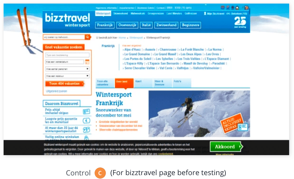
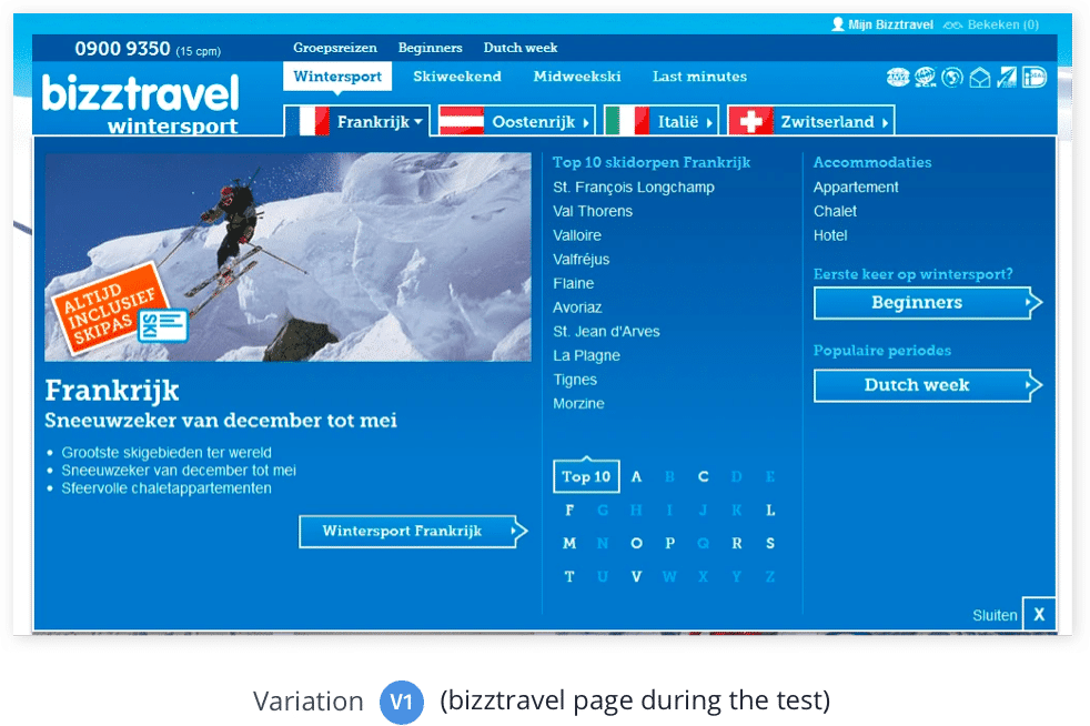
Case study: Bizztravel Wintersport increased its conversions by 21% by simply decluttering its home page!
Bizztravel Wintersport is a Dutch travel company that improved its conversions by 21%, simplifying how users searched for holiday destinations on their website. The company decluttered its site’s homepage by keeping only the most relevant information intact.
CRO for Agencies
Talking about various sectors that have benefited from CRO, agencies like digital marketing, web development, and dedicated CRO agencies are no exception. Running conversion rate optimization campaigns for their own websites or their clients can significantly add to their conversions and uplift revenue, which can lead to better ROI for their work and help in retaining clients and giving an overall good experience for their business.
Digital marketing agencies engaged in offering multiple services to their clients, such as social media promotion, web content development, brand building, and so forth, can pitch CRO services to their clients as a way to get more out of their existing traffic. This can not only help them pitch more clients by offering an additional service besides their usual services but also enhance their overall business impact.
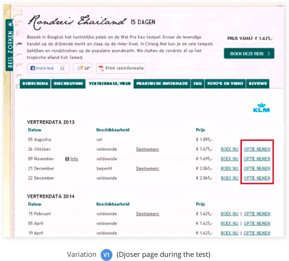
Case Study: Traffic4u helped its client Djoser increase their travel bookings by 33.1%!
Traffic4u is an online marketing agency that uses VWO to optimize its clients’ websites and get them more conversions. In one such attempt, Traffic4u helped Djoser, one of the leading Dutch travel agencies, optimize their site and increase their online bookings.
Deeply studying the Djoser site’s data, Traffic4u concluded that making an actual booking was a significant step for the users. Giving them an alternate option with greater flexibility to confirm their booking would encourage more users to book. Here, they decided to create a variation with an extra link attached called “Take an option.” By clicking on the link, users were given the option to reserve their seats or opt for cancellation within 72 hours. If no action is taken within the defined time period, the seat will be considered booked. Running the test for about 7 weeks, the variation resulted in a 33.1% increase in Djoser bookings.
Conversion rate optimization steps: Understanding the process
Multiple conversion rate optimization frameworks exist that can effectively help conversion rate optimizers plan and execute optimization campaigns. At the simplest, the conversion rate optimization process can be divided into 5 steps.
Stage 1: The research phase – Identifying the areas of improvement
Only one in every seven A/B tests gives a winning result. Why? Research!
Many marketers often replicate successful CRO processes and strategies from other businesses. But it’s no one-size-fits-all approach.
To understand user actions, start with analyzing quantitative data like bounce rates, traffic sources, demographics, and more on your website. Next, for qualitative analysis, analyze session recordings, heatmaps, and surveys to understand the “why” behind visitors’ actions.
By combining quantitative and qualitative data, you have a comprehensive understanding of visitor behavior. This helps you make strategic, tailored improvements that benefit your business in the long run.
Quantitative data | Qualitative data |
Insights: Purchase journey of a customer. The exact root cause of abandonment(s).Customer thoughts about your product(s) and/or services(s). Their fears, doubts, or hesitations before and during the purchase. Their feedback after they receive/use the product(s) and/or service(s) | A subjective approach that offers in-depth narrative information, such as feedback, etc. |
Insights: Pages most and least visited by the visitors.Amount of time spent by a visitor on a particular page. Entrance path taken by the visitors to land on the site. Pages they exit from. Number of incoming visitors who convert. Site’s bounce rate. Links and pages least and most ignored by visitors. | Insights: Purchase journey of a customer. Exact root cause of abandonment(s).Customer thoughts about your product(s) and/or services(s). Their fears, doubts, or hesitations before and during the purchase. Their feedback after they receive/use the product(s) and/or service(s) |
Precise Information | Draws generalizations |
Measurable data | Descriptive Data |
Conclusive Approach | Exploratory Approach |
Stage 2: The hypothesis phase – construct an educated hypothesis
Remember, a logical hypothesis has three parts: a specific change based on behavioral research, a desired effect (a conversion metric, for example), and the reasoning behind the change. For instance, “Adding social proofs on product pages will result in a 5% increase in add-to-carts because visitors are more likely to feel confident in purchasing if they see validations.” A well-structured hypothesis guides optimization efforts and keeps your testing program in the right direction.
Stage 3: The prioritization phase – choose an order
Here, a number of frameworks can help you through the process. Of these, the P.I.E. framework formulated by Chris Goward at WiderFunnel is what we most recommend:
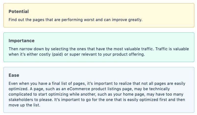
Each of these has its own importance attached which can effectively help in prioritizing your testing elements and take you in the right direction.
Stage 4: The testing phase — A/B, split, or multivariate?
Before running a test, understand the basics:
- What is statistical significance, and why is it critical?
- How long do you need to run a test?
- What should I use—A/B, Split, or Multivariate test?
A significant result means you can trust that the changes you see are real, not just luck. For example, if a test shows a 93% statistical significance, there’s only a 7% chance it happened by accident. This suggests it’s the right time to end the test, provided it has run long enough for reliable conclusions. Use our testing duration calculator to decide the statistical significance of your test.
Next, you decide which type of test you want to run: A/B testing, Split testing, Multivariate testing. A/B testing is suitable for comparing two variations on the same webpage. Split tests w
ork when you test two pages with different URLs. Multivariate testing lets you test multiple variations of multiple elements on web pages.
Stage 5: The learning phase – how to analyze A/B test results
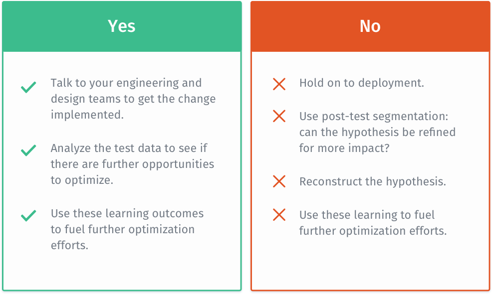
This phase is where you analyze your test results, complete the testing loop, and gather insights for future tests. Don’t be done with checking if a variation won or failed. It’s important to go deeper in your analysis. If you have a winner, check if the costs of changes are justified by expected revenue. In case of a loss, see it as a learning opportunity and delve into your research, break down the data, find insights, and refine your hypothesis for future tests.
Quick CRO analysis tips for better conversion
Conversion Rate Optimization (CRO) analysis is a methodical approach to improve a digital platform’s performance to convert visitors into customers. This process requires closely examining how your website operates—from its design and content to how users navigate and interact with it—to identify what encourages visitors to complete actions such as purchasing, signing up for a newsletter, or filling in a contact form.
At the core of effective CRO is a strategy rooted in data-driven insights, encompassing several critical steps:
- Evaluating the conversion funnel: This step focuses on analyzing a visitor’s steps from entering the site to completing a desired action. By scrutinizing this pathway, businesses can pinpoint where visitors are losing interest and address these areas to improve conversion rates.
- Using analytics dashboards: Tools like analytics dashboards are crucial for measuring the impact of changes. These dashboards track essential metrics, helping businesses identify which adjustments will improve their financial returns most effectively.
- Applying heatmaps and session recordings: Heatmaps and session recordings are invaluable to delve deeper into how users interact with the site. They can reveal user experience issues that may deter conversions, guiding targeted design and content updates.
- Conducting A/B and multivariate testing: Testing variations of web pages or elements against each other helps determine the most effective versions for driving conversions. This process is grounded in data, ensuring decisions are based on what genuinely works best for engaging visitors.
CRO analysis is vital for businesses aiming to enhance their online presence. It combines analytical depth with strategic modifications to uncover and apply solutions that not only draw in visitors but also effectively convert them into customers. Through a consistent and structured approach to CRO, businesses can transform their website into a dynamic tool that supports growth and success in the digital realm.
5 CRO strategies that offer quick wins for optimal results
Having tips and tactics is just the beginning. Consistently improving conversions demands implementation of meticulous strategies. It’s key for a steady stream of impactful and consistent results.
Optimized conversion path
By optimizing the conversion path on your website, you facilitate a seamless journey for visitors as they navigate their buying process. With VWO Insights, you can start by analyzing visitor behavior.
Do they search for product category navigation tiles on the homepage? Do your visitors want the option to continue shopping from the add-to-cart page? How do you nudge them toward checkout while still providing the option they desire? By understanding their current behavior, you can pinpoint necessary changes, eliminate friction, and effectively guide them toward conversion.
Steady lead flow
Capturing leads by offering value on your website establishes an effective lead flow for your business. For instance, displaying a discount sale in a pop-up as visitors navigate your site enhances their experience with your brand.
With these leads in your database, you can regularly provide them with personalized, relevant offers, content, and recommendations. This approach encourages consistent engagement, resulting in increased conversions and repeat business.
Content optimization
Don’t let your high-performing content go unnoticed. Make the most of those popular blog posts by strategically placing relevant CTAs. Further, you can tweak underperforming landing pages with advanced SEO tricks, like semantic indexing, for a potential visibility boost on Google.
Whether it’s a headline, CTA copy, or a product description, you can experiment with copy variations on your website. VWO’s improved text recommendation engine gives you contextualized copy results tailored to your brand. These measures not only attract but also effectively guide and convert your audience.
Rule of congruence
Applying the rule of congruence is essential for your conversion rate optimization plan to work. For example, when your paid ads align with the message of your landing page, it sends a clear message to prospects, eliminating guesswork and ensuring they know exactly what to expect.
Similarly, in a congruent design, a website maintains consistent colors, fonts, and imagery for a cohesive identity. Without this, it risks looking disjointed, confusing visitors, and diluting the brand message.
Anchored CTAs
Placing CTAs within relevant context and compelling language captures user attention and guides them toward the desired action. This is because users are more inclined to respond, leading to improved conversion rates as they move smoothly from absorbing informative content to taking actionable steps.
Learn about CRO tests: how, examples, types, and tools
A CRO test involves conducting experiments on your website to identify enhancements that can make visitors take the desired action and convert them into customers. But without a methodical strategy, Businesses might miss out on getting the most from CRO testing. To lead you to impactful results, we suggest the following steps:
Derive ideas from research:
Begin by gathering ideas through research. Use behavior analytics tools like heatmaps and session recordings to understand user behavior on your website.
Sort your ideas:
After generating different test ideas, prioritize those with the most significant impact on your business goals, whether it’s driving revenue or addressing navigation bottlenecks.
Run the right type of test:
Choose the appropriate test type – A/B testing, split URL testing, or multi-armed bandit testing. A/B testing compares two versions, split testing compares variations of a webpage, and MAB testing provides faster results. Platforms like VWO offer a seamless process for research, test execution, analysis, and documentation.
Delve into analysis:
Evaluate how the test affected your metric. Analyze results by breaking them down into groups based on age or devices for deeper insights.
Use qualitative insights to complement your analysis. VWO provides detailed heatmaps for visual insights into testing variations.
Iterate for better results:
If the variation wins, consider implementing it. If it doesn’t or the uplift is below expectations, iterate by refining and optimizing elements based on insights from previous tests. Iteration allows systematic addressing of new hypotheses, incorporating them into your ongoing optimization strategy.
Types of tools at every stage of CRO testing:
Ensuring you have the right tools at every CRO stage is essential. Explore tools that streamline research, facilitate smooth experimentation, and guarantee thorough analysis.
Research stage:
Leverage tools like Google Analytics 4 or Mixpanel for obtaining quantitative data to identify the problem areas. VWO Insights, with its advanced capabilities and AI, delivers engagement scores, page-level heatmaps, and recordings.
Hypothesis generation stage:
Generate hypotheses effortlessly with free tools like Convert and Conversionista. VWO’s AI-generated testing ideas can be obtained in seconds by scanning web pages URLs, rooted in scientific principles and seamlessly integrated into the VWO Plan.
Pre-experimentation stage:
VWO offers pre-experiment tools to assist in setting duration, determining sample size, and calculating statistical significance, ensuring a hassle-free optimization journey.
Experimentation stage:
Opt for a versatile testing platform like VWO, featuring advanced capabilities and comprehensive behavior analytics. VWO serves as an all-in-one solution, eliminating the need to juggle between different tools.
Analysis stage:
For thorough post-experiment analysis, the chosen tool should provide clear yet comprehensive insights. VWO allows a deep dive into segments and easy result sharing. Further, you can maximize your insights by integrating VWO with Google Analytics 4 for additional A/B test insights.
Conversion rate optimization best practices
9 mistakes to avoid when running a CRO campaign
Indeed, CRO is one of the best practices to optimize your site and increase conversions. Most individuals/companies jumping into the pool are unaware of CRO’s lengths and breadths and end up wasting a lot of time, money, and effort in the process. Here are the top four mistakes every CRO beginner must avoid:
Mistake #1: Making changes based on opinion rather than statistical data
Just because your site’s design looks cleaner, and features better content than its previous version doesn’t mean it will churn out better results. At the same time, getting inspired from other businesses who ran a similar A/B test as yours on their websites and saw an uplift in their conversions, doesn’t really mean that you’ll see the same results on your site as well. This is because there’s no one-size-fits-all conversion optimization strategy. What may work for one business will not necessarily work for the other as well.
Mistake #2: Writing copy that doesn’t match your business goals
Carefully drafted and SEO-optimized content can do wonders. But, if it’s distorted and doesn’t match your business’s goals, it becomes useless. Build unique content that adds value to your site.
- Focus on your brand’s USP.
- Use simple language. Let it be crisp, precise, and to-the-point.
- Write for scanners, not for readers.
- Bullet points and ordered lists work better.
- Write catchy headlines.
- Add keywords that rank better.
Mistake #3: Going for small tests before the big ones
When it comes to CRO, most people believe that running small tests is better than big ones. The fact is, small tests will only have a minor impact on the conversion rate. Bigger tests with significant chances, wherein more than two elements are optimized will leave a lasting, noticeable impact off the table. These changes may include:
- Redesigning the page above the fold
- Redesigning the entire home page
- Redesigning the navigation menu
- Moving important elements to improve visibility
- Changing headlines, which is catchier and more impactful than before.
Mistake #4: Running too many tests and pop-ups at the same time on the same page
Running multiple tests at the same time can significantly affect the analysis accuracy of each test. Every new element experimented with may influence the test results of others. Furthermore, running numerous pop-ups and site designs in the same user session disrupts their overall experience. In fact, it’s quite possible that such pop-ups may annoy and confuse users, making them abandon the site, and never come back.
Mistake #5: Not paying much attention to basic design elements
A. Giving more importance to automatic image sliders
Almost all conversion experts suggest that image sliders can significantly reduce your conversion rate.
Image carousels do not allow users to explore the site at their own pace. Instead, they hinder with a visitor’s experience and create banner blindness. Popular conversion experts, like Peep Laja, strongly recommend that businesses must give a deep thought to adding automatic image sliders. Here are some reasons to back this theory:
- The human eye strongly reacts to movements. If images scroll faster than the human eye can see or read, it will miss out on the important stuff.
- Too many messages mean no message at all. Instead, focusing on adding the primary message on your banner images and the required action is always more effective.
It’s always recommended to run an A/B test here to see what works best for your business.
B. Using cheesy stock photos
Stock photos may give your web page a good, heavy look, but they significantly reduce the credibility of your brand. And, of course, people like to deal with humans, not websites. A case study by Market Experiments also demonstrates the same. A financial investment consultation service providing company improved their signups by 35% simply by replacing a cheesy stock photo on their homepage with a picture of their Founder.
C. Not giving much weightage to videos
Show your product in action. Make instructional videos if you offer something complicated. Believe it or not, adding videos pays off well. And, there are a plethora of businesses that have benefited a lot from this very addition.
Dr.Muscle is one such example to quote here. The website integrated a video on its sales page, which significantly increased the number of visitors who clicked on its price/guarantee page, by 46.15%.
However, as a marketer, you must ensure that your videos contain a clear call-to-action (CTA). When your visitors are already enjoying your video, they’ll be happy to follow your CTA, and possibly convert into a customer.
Mistake #6: Undermining the importance of call-to-action buttons
As stated above, call-to-action buttons make for one of the most important page elements that persuade your website visitors to take the desired action and start the conversion process. But often marketers do not give weightage to CTAs and lose out on a lot of potential conversions. Below are some mistakes which you, as a marketer or website designer, must avoid.
A. Using the wrong color combinations
RIPT Apparel, a Chicago-based online retail shop, increased its conversion rate by 6.3% simply by changing its CTA color from black to green. In addition to this, many optimizers also suggest that using a CTA color that hasn’t been used anywhere on your web page can also help draw the necessary attention.
B. Not using power words in the call-to-action button test
Instead of saying something like, ‘Submit’ or ‘Sign-up,’ use powerful words to grab the attention of your users. Some popular CTA text copies are as follows:
- Save Your Seat. Book Now!
- Are You In? Let’s Get Started!
- Yes! Let’s Start My Free Trial.
- Grab Your Free Copy!
- Insights Delivered Daily to Your Inbox!
- Where Should We Send Your Free Copy?
- Add this Summer Dress to Your Wardrobe!
ADT, a Tyco International company that provides safety solutions for commercial and properties corrected its CTA copy – from ‘Book a Free Survey’ to ‘Get a Free Quote’ – and saw a 60% increase in their conversion rate.
C. Placement of CTA buttons
While some marketers emphasize placing your CTA buttons in the first fold of your web page to make them prominently visible, many others argue that placing the same below the fold can yield equally good results. The reason is, that it all depends upon how motivated your prospect is to click on your CTA button. The more exclusive your offerings are, the more the chances of your prospect clicking on your CTA button irrespective of your placement on the web page.
D. A CTA text link or a CTA button? Which one’s better?
Text links are often lost amid the rest of the text, making them difficult to spot on the web page. Meanwhile, button CTAs are more prominently visible to the eyes and increase the chances of more clicks. Here’s an example to showcase the difference.
Mistake #7: Not creating a sense of urgency
When you offer your visitors a limited-time incentive and give them a good reason to believe why they should bother to take the desired action now rather than later, they will convert.
Here are some examples to back our claim:
Zappos creates a sense of urgency on its product pages by showing how many items are left in a particular size and color combination for visitors to purchase before they go out of stock.
Amazon uses the phenomenon as well. It showcases the exact number of hours/minutes within which a visitor must complete their purchase process to get the order delivered at their doorstep the very next day.
The eCommerce giant also dramatically uses a running countdown on its homepage to show how long a particular sale will last.
Mistake #8: Not establishing business trustworthiness upfront
No matter how persuasive your call to action is or how simple your website is, if you do not give the impression of trustworthiness to your visitors or give them confidence in your website, you are not very likely to improve your website’s conversion rate. There are a plethora of ways to increase visitor confidence in your website and products.
- Assure your visitors that you value their privacy and that you have a secure site. Add HackerSafe (or similar) badges that showcase that your business takes website security seriously.
- Add client testimonials. These aren’t just pieces of content praising your business offerings, they’re an ideal means to establish your brand’s credibility among website visitors.
- Display your privacy policy wherever you ask for personal information from the visitor.
Mistake #9: Complicating conversion funnels
The conversion funnel is a set of pages (like the checkout process or registration form) that leads to your conversion goal (like a product purchase or subscription). You may be surprised to know that most visitors abandon Step 2 of your conversion funnel because your entire process is too complicated for them to complete. Below are some tips and tricks to simplify your funnel and increase conversions:
- Remove all extraneous links from pages within the conversion funnel
- Remove all unnecessary steps from the conversion funnel
- Don’t put too much focus on up-selling other offers
- Only ask for information that is completely necessary for completing the conversion process.
- In the case of shopping carts, let the visitor know about postage and packaging costs, taxes, and your returns policy as early in the process as possible
- And make sure that you remind your visitors what they’ve added to their cart by placing a link back to the product/service
Also, adopting new and enhanced techniques such as website personalization is the need of the hour. And, as per statistics published by Zoominfo, 98% of marketers agree that personalization has the potential to create advanced customer relationships.
For instance, the Hubspot Blog offers content specifically catered to three major segments of its visitors: marketers, sales professionals, and agencies.
The Sales Benchmark Index Blog takes website personalization a step further. It asks its visitors to choose a persona that suits them the best and then displays relevant content to them.
Similarly, you can offer personalized content to your visitors based on the industries they belong to, or where they lie in your conversion funnel.
Website personalization is especially effective for eCommerce websites, and Amazon is one of the best examples to quote here.
7 Conversion rate optimization challenges to address
CRO is one of the best ways to optimize your website and increase conversions. But it comes with its own set of challenges and misconceptions, which must be addressed to ensure smooth adoption and implementation.
Challenge 1: Support from stakeholders
When stakeholders are on board, it becomes easier to implement data-driven insights and foster collaboration across different teams. Here’s how you can gain the support and confidence of relevant stakeholders in your organization.
Solution:
- Educate people about the real benefits of CRO.
- Present competitive analysis
- Highlight the gaps in your current approach
- Show the data.
Challenge 2: Structure to support CRO
Is it worth hiring a dedicated conversion optimization team; would it add to overall organizational expenditure; who will take the responsibility in case of failures; and so on?
Solution:
Before getting into the depth of CRO, it’s important to draft a proper CRO process. Create a dashboard or platform to plan, update, and record all your conversion activities. Share the statistics with your employees. Encourage them to contribute to conversion optimization and make smart decisions based on factual data.
Challenge 3: Insufficient budget allocation
While companies back in 2013, spent as low as only 5% on CRO activities, the trend has improved with organizations increasing their spending on optimization. However, the problem lies in the correct budget allocation.
Solution:
Before zeroing in on an amount, organizations must analyze their ROI from CRO. They must invest in conversion optimization tools after thoroughly examining their goals and actual gains.
Challenge 4: Lack of right tools to meet business goals
Marketers have a variety of tools to choose from to meet their business goals. For example, when deciding on an A/B testing tool, they have to choose between a:
- Frequentist-based statistical engine
- Bayesian statistical engine
Moreover, multiple tools help marketers accomplish specific objectives. However, using a combination of tools can make reporting a pain. So, how should marketers proceed? How to choose the right conversation rate optimization tools?
Solution
For selecting the correct tool, marketers must weigh the pros and cons of their actions. They must evaluate the tool based on how effectively and efficiently it will solve their specific business problems and meet their goals. For enterprises looking to invest in a tool for business growth, here’s a post on what decision-makers need to know before investing in CRO or A/B testing software.
Challenge 5: Ending an A/B test too early
Ending an experiment in between just because your variation isn’t yielding the results as anticipated, doesn’t mean that it won’t stand a chance to win in the end. There are a plethora of tests that take time to showcase necessary results due to a number of factors.
Solution:
The first rule of running an A/B test is to let the experiment run its course until it reaches its statistical significance. Give your test some time to breathe. If you still feel your experiment is on the verge of failing, do a deep analysis of the experiment.
Challenge 6. Giving up optimization after failed tests
When you’re optimizing a crucial page of your conversion funnel, you may develop a hypothesis to improve its conversion rate and run an A/B test. What do you do if the test fails? It would be absurd to leave the page to its original state because the page is crucial and requires optimization.
Solution
The alternative is to learn what the losing variation lacked and why users didn’t find it more appealing. Employ tools like heatmaps and click maps to observe user behavior. Use this information to devise a new and better hypothesis and run more A/B tests, incrementally improving chances for a high-performing test.
Challenge 7. Not tracking macro-conversions
So your A/B test result has come in. Your variation has outperformed the control. The result is statistically significant and it has positively improved your conversion rate. Now while you rejoice, did your variation only increase your micro-conversions (e.g. form-submits, blog signups, visits to the next page, etc.), or did it improve your macro conversions (e.g. revenue) as well?
If the answer is “Yes! It increased only micro-conversions,” it’s time to revisit your testing strategy. While these small wins will surely add to your conversion goals, they will not amount to anything in totality.
Solution
The trick here is to carefully decide your A/B testing goals and tie your macro-conversion goals to micro-conversion ones. Unless you do it, it’ll become a case of not seeing the wood for the trees. Acknowledge all the website optimization gains that you can get, no matter how small they are. Learn from your pitfalls and relaunch a better, more data-backed test.
CRO for mobile
Implementing CRO for mobile is a crucial aspect of any business that deals with apps and mobile sites. Not only does it help optimize user experience, but it can also improve various other factors that contribute to high rankings on search engines.
Here are four simple ways to improve the conversion rate on mobile devices.
1. Optimize for the thumb zone
Enhance the user experience by designing your mobile app or website to cater to the natural thumb zone. This involves placing essential elements within easy reach of the user’s thumb, ensuring seamless interaction. Focus on gestures like taps, and swipes to further improve navigation.
2. Reduce website load time
Even a one-second delay can significantly impact mobile conversion rates. Try to identify potential bottlenecks that might be causing slow loading speeds. Also, remove non-essential elements like large images, which can improve website performance.
3. Simplify content presentation
Streamline the presentation of content and information on mobile screens to avoid overwhelming users. Use sticky menus or buttons for easy access to essential features. Mobile-friendly pop-ups are also a great way to guide users and offer a clutter-free browsing experience.
4. Use persuasive language for CTAs
Crafting compelling CTAs by infusing urgency and emotional appeal to prompt immediate user action. Validate the effectiveness of each CTA through rigorous testing, and use visitor behavior insights to refine them for maximum impact. Incorporating these strategies into your mobile optimization approach can enhance user engagement, streamline conversions, and drive overall business growth.
5 CRO tips to boost your conversions
CRO is focused on turning your existing website visitors into customers. By doing so, it decreases your customer acquisition costs and boosts your profitability. Given below are some proven tips that will help you get the best results out of your conversion rate optimization efforts.
Simple and clean design:
No matter which industry you operate in, a clean user interface (UI) is crucial for creating positive user experiences on your website. If you own an online retail store, an uncluttered design aligns with the aesthetic preferences of your audience, encouraging engagement. This design subtly guides them towards their goals, such as making a purchase.
User-friendly copy:
The importance of a simple and clear copy cannot be overstated. Whether your website is technical or casual, breaking down complex terminology is essential. Even for niche audiences, your copy should clearly communicate how your product or service benefits them, saving time and effort. This clear communication in straightforward language helps build customer trust and loyalty over time.
High-quality images and videos:
High-quality visuals are not exclusive to eCommerce websites. In the automotive industry, detailed videos showcasing a car’s features help users make informed decisions. Similarly, in the travel sector, captivating images and videos highlighting destination highlights engage audiences. Avoid using stock photos to appear genuine and reliable to your audience.
Easy navigation:
For websites with many pages, easy navigation is critical for user engagement. A streamlined menu and intuitive search functionality make it easier for users to find content. This principle applies to online retail websites with multiple product pages and extends to e-learning and streaming platforms, where clear navigation helps audiences explore choices before making decisions.
Social proof:
Customer reviews and testimonials play a critical role in purchase decisions. In a clothing brand, visitors prefer reviews featuring customers wearing the dress, adding a stamp of approval to the products. Similarly, for a SaaS company, client testimonials appeal to your potential clients. Display these testimonials strategically on critical pages, such as the product or home page, to positively influence decisions at crucial moments in their journey with your brand.
No matter which of the above conversion tips you implement on your website, remember the process needs you to follow the below strategies. Doing so increases your chances of improving your conversion rate.
Know your website’s goals:
Before initiating your conversion rate optimization strategy, precisely define your website goals. Metrics such as page visits, clicks on links, and form submissions can serve as benchmarks for your conversion optimization. Clearly outlining these goals from the outset will facilitate the generation of testing ideas or hypotheses to meet these objectives.
Back your ideas with visitor data:
Eliminate the guesswork from your optimization efforts. Dive into quantitative data, including bounce rates and page sessions, as well as qualitative data such as heatmap data and customer feedback. Base your optimization ideas on user data, focusing on solutions that address existing user issues on your website.
Conduct competitor analysis:
Pay close attention to your competitors’ strengths and weaknesses. Leverage your advantages over them to appeal to your target audience. However, avoid blindly copying their strategies, as each brand’s customers behave differently. Strike a balance between meeting your audience’s preferences and considering your competitors’ approaches.
Look at the full conversion funnel:
Avoid analyzing visitor journeys in isolation for a comprehensive understanding of their experience with your brand. Use funnels to identify where visitors are dropping off and engage the most. Track conversions across funnels and optimize specific stages in their journey with your brand.
Optimize page layouts:
Ensure that any element you optimize or change fits seamlessly into the layout of your pages. Design enhancements should eliminate friction and enhance user experiences. Compatibility with mobile devices and minimizing page load time are crucial. If adding a form, optimize it for mobile users.
Test everything before deployment:
Conduct A/B testing for data-backed optimizations. Test changes against the original version of a webpage to identify the most effective variations before universal deployment. Utilize tools like VWO Testing for efficient testing and deployment.
SEO Conversion Optimization
SEO (Search Engine Optimization) and CRO are two distinct aspects, however, since both of these strategies aim to offer an optimized experience to users, they complement each other and can help boost the overall performance of your website.
While SEO primarily focuses on driving traffic to a website through improved search engine visibility, SEO conversion optimization takes this a step further by ensuring that the incoming visitors take the desired action.
Here are a few important benefits of SEO conversion optimization.
1. Test and identify the best versions of important pages
Testing your SEO ideas before pushing them live is a great way to avoid any kind of negative impact on the ranking or performance of your website.
With continuous testing of critical elements like headlines, images, CTAs, and overall page layouts, SEO conversion optimization allows you to identify the most effective versions for converting visitors.
2. Optimize crucial elements of your landing pages
Landing pages play an important role in both SEO and conversion rate optimization. With SEO conversion optimization, you can improve the landing page experience according to the targeted keywords.
Moreover, it also allows you to optimize your conversion funnel, making it easier for visitors to take the desired actions.
3. Align important keywords with user intent
While common SEO strategies involve targeting specific keywords to attract relevant traffic, SEO Conversion Optimization can help you understand the intent behind these keywords.
This is important as it allows you to optimize the content and align it with user expectations, thus increasing the chances of conversion.
4. Boost the overall website experience
With SEO Conversion Optimization, you can leverage key insights about visitor behavior to deliver optimized experiences that push the visitors to take the desired actions.
This not only boosts your website conversions but also drives revenue, and business growth, and most importantly, improves the ROI of your SEO efforts.
CRO for local search
The local search process begins with a users’ casual queries like “near me” or “best XYZ store in the city”. Then, they explore online directories and sift through business ratings and reviews. After shortlisting the businesses with the most positive feedback, they might visit the website or get directions to the store for additional information before taking action. CRO for local search involves analyzing each step of this journey, identifying any conversion leaks, and implementing targeted campaigns to enhance the process.
Here are some ways to do conversion optimization for local search.
a. Launch review acquisition campaigns for local SEO optimization efforts.
When people search for local businesses on search engines, they tend to choose those with the highest ratings and positive reviews. To increase visibility in local search results, businesses can run campaigns to encourage customers to leave reviews. These campaigns can include offering incentives, using digital prompts, and running contests. By actively engaging with customers and incentivizing reviews, businesses can improve their online reputation and attract more potential clients.
b. Tailor the website landing page experience to align with local search intent.
Tailoring the landing page of a website to suit local search is crucial for connecting with potential customers and meeting their needs and expectations within the area. To achieve this, it is important to incorporate trust-building elements such as testimonials and reviews displayed prominently on the page. To establish a connection with visitors, the content should be localized using relevant regional keywords and phrases. Highlighting local initiatives and events through visual representations emphasizes the business’s presence in the community. Additionally, to enhance credibility and commitment to the local area, it is important to quantify the local impact by providing statistics on the number of clients served.
c. Monitor and test website experiences to improve local search experience
While your site might already be optimized for local SEO, there’s always room for improvement. By utilizing behavior analytics tools like heatmaps, session recordings, form analysis, and surveys, you can gain valuable insights into how visitors from specific locations interact with your website. For instance, analyzing scrollmap reports may reveal drop-off points, prompting adjustments to key elements like CTAs to enhance user engagement. Form analysis can uncover pain points in the conversion process, leading to targeted optimizations. Leveraging these insights, you can create experiments and innovative features to improve user satisfaction.
Long-term success lies in periodic behavior analysis and experimentation campaigns. Platforms like VWO offer comprehensive solutions for local search optimization, providing robust behavior analytics and seamless A/B testing for experimentation. With features like segmentation and precise targeting, you can optimize experiences for specific locations without affecting others.
B2B conversion rate optimization
B2B conversion rate optimization is the process of improving digital touchpoints to enhance performance using behavioral and analytical data. The aim is to improve metrics like ROI and lead generation. Due to longer purchase cycles in B2B, CRO plays a significant role in achieving a consistent digital experience. Even minor fluctuations in conversion rates can have substantial financial impacts, which makes optimization imperative. B2B CRO campaigns include content optimization, A/B testing, personalization, server-side experimentation, and website enhancement campaigns. These efforts aim to tailor experiences, increase conversions, and inspire ongoing optimization strategies in the dynamic landscape of B2B interactions.
Here are three strategies for B2B CRO:
- Enhance Insights with a Customer Data Platform (CDP). To achieve successful B2B CRO, businesses can integrate a CDP for unified data processing, providing a comprehensive view of customer behavior. While a CDP itself might not directly interest potential clients or address their queries, it serves as a powerful tool for understanding the reasons behind challenges in engaging or converting them. It acts as a diagnostic tool, allowing businesses to uncover insights to inform targeted strategies to enhance customer experience and drive conversions.
- Boost Product Credibility with Persuasive Copy and Elements. Potential clients often delve into the history and past performance of a company during the early stages of product research. Therefore, your landing pages should strategically convey the credibility of your product through compelling copy. You can showcase a client base or statistics about the average improvement your product or service brings to boost product credibility.
- Adopting a multi-step approach to lead generation forms. Many B2B companies struggle with lead generation forms. They need extensive information to deliver a personalized experience, but presenting a single form with too many fields can overwhelm visitors and cause them to drop off. To solve this problem, a strategic approach is to use a multi-step lead generation form. This innovative solution breaks down the form into manageable segments, which creates a positive user experience by reducing perceived intimidation. By allowing customers and leads to input their information in smaller, more digestible chunks, this approach improves user satisfaction and ultimately increases conversion rates.
Conversion rate optimization tools
There are many tools available in the market, but choosing a tool depends on your budget, business goals, and features that you need to optimize different stages of the conversion optimization stage. Here are some top conversion rate optimization tools, each with its unique features and capabilities.
VWO
VWO is a comprehensive CRO tool designed to optimize each stage of optimization. In the initial user research stage, VWO provides VWO Insights, facilitating in-depth user behavior research through tools such as heatmaps, session recordings, on-page surveys, and funnel analytics. Moving on to the hypothesis prioritization stage, VWO offers the VWO Plan, simplifying the management of experimentation programs by providing a centralized platform. For the testing phase, VWO presents VWO Testing, a renowned tool that enables A/B testing, split testing, and multivariate testing.
Additionally, VWO offers the capability to conduct complex experiments with VWO Testing Server-side. Furthermore, you can create personalized user experiences using VWO Personalize. From gaining insights into user behavior to providing personalized experiences, VWO comprehensively addresses all aspects of conversion rate optimization on the web, mobile web, and mobile app.
Google Analytics
Google Analytics is a powerful tool for the user research stage, offering extensive data on website visitors, their behavior, and conversions. This information helps identify improvement areas, track CRO progress, and measure the impact of website changes. Key features like goal tracking, funnel visualization, and segmentation enhance CRO effectiveness by monitoring valuable actions and identifying conversion bottlenecks and specific visitor groups.
Heap Analytics
Heap Analytics stands out as a digital insights platform, providing a comprehensive view of user behavior on websites and mobile apps.
Equipped with features like session replay for reliving user journeys, heatmaps for visualizing interactions, journeys for mapping user flows, funnels for analyzing task completion steps, and Cohorts for segmenting users. Heap Analytics empowers teams to derive meaningful insights and make data-driven decisions.
TestRail
TestRail is a robust test management platform designed to streamline the planning, execution, and tracking of software test cases. It offers a centralized repository for efficient management of test cases, test suite organization, and execution of test runs, all contributing to the assurance of software quality. It’s a CRO tool that caters to the stage of hypothesis prioritization and testing.
Five Seconds Test
The Five-Second Test tool follows a user research method that assesses how users perceive a website within five seconds. It reveals areas that need simplification, optimizes design for first impressions, and measures the impact of design changes. The product allows user behavior research via tests like card sorting, five-second tests, preference tests, prototype tests, and surveys with this tool.
Selecting the right CRO tool can have a significant impact on a business’s success by effectively increasing conversion rates and enhancing the overall user experience. For CRO tools that are not offered for free, be sure to explore whether a full-featured free trial is available before finalizing your choice. This step helps you understand how well the tool integrates with your workflow. With VWO, you can access a comprehensive 30-day trial to explore its features and understand how they can assist you in driving successful CRO campaigns.
Top case studies you must read for CRO success
Drawing inspiration from examples is a practice we’ve long valued for its ability to bring clarity and context to any subject. This principle holds true in the world of CRO. Observing how brands leverage CRO becomes a valuable playbook, offering insights and lessons for crafting a winning strategy. Read top CRO case studies to unravel the strategies employed by leading brands. Gain insights that will help you refine your approach and achieve optimal conversion rates.
Bear Mattress
Bear Mattress, an eCommerce website’s goal was to increase revenue by optimizing the ‘Cross-sell Flow’ on their product detail pages. The redesigned cross-sell layout proved to be a big success, leading to a 24.18% increase in successful purchases and a 16.21% boost in revenue.
ArchiveSocial
ArchiveSocial focused on lead generation and conversions through the homepage and ‘Request Demo’ page optimizations. Their meticulous approach led to an impressive 101.68% increase in click-through rate, showcasing the power of comprehensive CRO testing.
Flos USA
Flos USA addressed low checkout conversion rates with strategic enhancements across their website, resulting in a staggering 125% increase in checkout conversions and an 18X return on investment.
POSist
POSist wanted to increase platform demo sign-ups, achieving a remarkable 52% increase through optimizations of their homepage and ‘Contact Us’ page.
Truckstop.com
Truckstop.com executed impactful campaigns using VWO Session Recording for analyzing visitor behavior and VWO Testing for conducting tests on their website. Their well-structured approach led to a 26% increase in demo requests.
Hubstaff
Hubstaff revamped its homepage, achieving a 49% increase in visitor-to-trial conversion rate, highlighting the importance of understanding goals and analyzing visitor behavior in CRO testing.
Do you want to understand the strategies of these brands in detail? Discover their detailed plans, along with our tips, suggestions, and additional resources in our blog.
Effective strategies for app conversion rate optimization
Today, people are using numerous apps, spanning social media, music, gaming, grocery, and more. The opportunity is huge, but the competition is cutthroat. Regardless of your industry, launching an app for your business presents the challenge of making it stand out. Without fail, you must focus on app conversion rate optimization to continuously enhance user experiences and generate revenue from your app.
Dive into user behavior
By leveraging behavioral analytics, such as heatmaps and session recordings, you delve into user interactions. Heatmaps reveal hotspots and areas of low engagement, uncovering user preferences and potential bottlenecks. Session recordings let you watch individual user journeys, pinpointing areas of confusion or abandonment.
Swift onboarding
Lengthy onboarding procedures can test users’ patience. Try simplifying the process by requesting only necessary information. This user-centric approach ensures a smooth start, increasing users’ inclination to explore the app’s offerings and subsequently boosting conversion rates.
Prominent CTA buttons
Making CTA buttons prominent is essential on smaller screens, where space is limited. Users may become frustrated if CTAs are not readily visible. Clear labeling, proper visual hierarchy, and strategic placement ensure that users can quickly identify and interact with CTAs.
Display trust elements
Demonstrating trust and security in mobile apps is crucial, given the prevalence of mobile transactions these days. Displaying trust badges, security certifications, and customer reviews reassures users about app reliability, instilling confidence in app usage. Incorporating security elements like SSL certificates and two-factor authentication further enhances user trust, ultimately encouraging app engagement.
Show gamification features
Integrating gamification elements into mobile apps improves user engagement and conversions. By adding rewards, challenges, leaderboards, and shared achievements, apps create a dynamic and immersive user experience, fostering a sense of achievement and community among users.
Interested in discovering more tips for app optimization along with key metrics you must track? Explore our blog for insights on increasing app conversion rates.
CRO budget and buy-in
Before you kickstart your Conversion Rate Optimization (CRO) program, you must have complete clarity about the overall cost and investment required for it. Let’s take a look at some of the most crucial factors that you must consider while preparing a CRO budget.
Human capital cost:
To achieve your conversion rate optimization (CRO) goals, you need to invest in human capital. This includes the time and effort of your current staff, upskilling them with CRO courses and certifications, and hiring new team members. However, creating an in-house team for CRO is usually more expensive than outsourcing the program to an agency.
Tool cost:
Factor in the expenses for the tools or equipment required to run your CRO program. Depending on your level of CRO expertise, you can use a single, integrated tool like VWO that caters to all your optimization needs. VWO offers a comprehensive and guided 30-day free trial, allowing you to test the tool for yourself.
Opportunity cost:
Sometimes, you lose revenue because of the decisions that were not made. A/B testing is a crucial part of the CRO process that prevents you from making changes that don’t improve conversions or worse, changes that negatively impact your conversions.
Experimentation regret:
When conducting a test, one version usually outperforms the other, regardless of how big or small the difference may be. Experimentation regret occurs when the variant performs worse than the current version, leading to a decrease in the overall website performance.
How to design an initial test case that generates buy-in from relevant team members?
The best way to generate buy-in for your CRO program is to build a test case. Ideally, test cases are low risk but high reward. This means that the time or money invested should be minimal, while the outcome should either reduce cost or boost earnings.
Here are some crucial characteristics that you must consider to build a test case:
- Low cost – both in terms of the financial cost and time.
- Easy to implement
- Easy to replicate or re-run if necessary
- Controlled for other variables. For example, you should not run your CRO test on a special day like Black Friday since any kind of increase in revenue will be attributed to the sale instead of your efforts.
Choosing the right CRO agency
A successful conversion rate optimization (CRO) program requires a combined effort and a dedicated team. However, building an in-house CRO team comes with its own set of challenges and limitations.
A typical CRO team includes CRO specialists, data analysts, UI/UX designers, web developers, and also digital marketers.
This is why organizations usually prefer hiring a CRO agency to run their optimization program.
Since the entire process is based on research, analysis, and continuous improvement, you must look for an agency that has the bandwidth and experience necessary to implement your CRO plans successfully.
Suppose you wish to choose the right CRO agency for your business. In that case, you must look at several other important factors such as their process, their way of collaboration, the CRO tools they use, and also their method of monitoring data.
Based on these factors, you can have detailed discussions and understand how agencies view conversion rate optimization. Here’s a list of some of the best CRO agencies that you can consider for your business.
(Note: The agencies are listed below in alphabetical order.)
1. Conversion
2. GetUplift
3. SiteTuners
4. Speero
5. Thrive
CRO trends you must know for next-level optimization
Ignoring trends can be detrimental, demanding constant innovation and strategic decision-making for sustained business success. As we delve into the dynamic realm of online visitor interactions with brands, the evolution of Conversion Rate Optimization (CRO) becomes paramount. The way visitors behave on websites mirrors their changing preferences, making it critical for businesses to embrace and integrate CRO trends for long-term growth.
Harness the power of Gen AI
The advent of Generative AI introduces a new era of cutting-edge technologies with extensive applications in CRO. Harnessing AI for iterating real-time experiments, summarizing survey responses, and suggesting future steps based on historical visitor behavior data accelerates testing for faster growth.
Focus on Augmented & Virtual Realities
Augmented Reality (AR) and Virtual Reality (VR) provide personalized experiences influencing purchasing decisions. Integrating these technologies into CRO strategies can enhance the online shopping experience, giving businesses a competitive edge.
Take advantage of social proof
Social proof, derived from customer reviews, shoutouts, user-generated content, and testimonials, validates choices for potential customers. Incorporating social proof makes website visitors feel confident about their choices, removing doubts, fostering trust, and increasing conversion rates.
Pay attention to data quality
Prioritize regular audits of data collection processes to eliminate inaccurate or incomplete data. Ensuring the reliability of analytics tools and platforms, removing duplicates, and maintaining dataset quality through focused analysis enhances the accuracy of CRO tests and results.
Dive into visitor behavior research
The growing significance of visitor research emphasizes addressing the desires and pain points of the target audience. Utilizing tools such as heatmaps, session recordings, form analytics, and surveys enables businesses to proactively identify and address issues, enhancing the visitor’s journey.
Speed up testing velocity
In the rapidly evolving online landscape, increasing testing velocity is crucial for swift adaptation. Businesses can efficiently experiment with various website elements, iterating and refining strategies to maintain an upward-trending average website conversion rate. The power of AI in VWO simplifies the process of generating testing ideas, enabling continuous conversion rate optimization.
Staying ahead of the curve in CRO requires a strategic blend of technology integration, customer-centric approaches, and a proactive mindset towards emerging trends. Eager to uncover the key trends that will propel your business ahead of the competition? Read our list of top 14 CRO trends to empower your business with the foresight needed to stay ahead in a dynamic market landscape.
Top 10 conversion rate optimization statistics you should know
Still relying on outdated marketing strategies from a few years back? In a fast-paced landscape where trends and customer behavior evolve swiftly, that old data is no longer relevant. You can’t base your optimization efforts on outdated statistics. Find below the latest conversion optimization rate stats to inform you about what works today. This way, you can ensure your strategies are current and effective in converting website visitors into paying customers.
1. The B2B eCommerce average conversion rate stands at 1.8%.
B2B companies must prioritize understanding their customer journey, creating relevant content, and implementing targeted strategies to navigate complexities and boost conversions. Tactics like a multi-step checkout, personalized pricing, and live chat can be valuable for B2B eCommerce success.
2. The finance industry boasts an average conversion rate of 3.1%.
Financial institutions can streamline applications, personalize financial content, and A/B test trust-building elements. Implement interactive tools like loan calculators and gauge their impact on engagement and conversions through testing.
3. By 2025, approximately 30% of companies are expected to leverage AI to enhance their testing processes, a significant increase from the 5% reported in 2021.
The transformative impact of AI extends across various industries, including the medical and technology sectors, driving increased efficiency. It is crucial for businesses to invest in CRO tools that harness the capabilities of Gen AI. For example, AI in VWO generates testing ideas and summarizes survey responses in minutes.
4. Companies invest $1 in improving conversion rates for every $92 directed towards acquiring new customers.
Prioritizing marketing efforts towards existing customers proves more cost-effective, reducing the need for extensive advertising and outreach. This not only maximizes the lifetime value of customers but also fosters a more sustainable and efficient business model.
5. The average conversion rates from SEO stand at 2.1% for B2C and 2.6% for B2B.
To maximize your SEO strategy’s impact, delve into comprehensive keyword research, consistently produce high-quality, user-centric content, and maintain a technically optimized, mobile-friendly website. Strategic backlink building and enhanced visitor experience will also increase visibility and drive more organic traffic.
6. Exit pop-ups typically lead to an additional 2 to 4% conversion of your website traffic.
Surprising, right? These pop-ups work by showing a targeted message or offer just as users are about to leave, making some reconsider and complete a desired action before exiting the website.
7. 25% of businesses point to outdated technology as their primary challenge in improving website conversions.
Modern technologies, with their array of features and smooth cross-platform integrations, simplify the process of optimizing websites for businesses. Read our blog to learn about key factors to consider when selecting the best innovative CRO tools for your business.
8. The average conversion rates from webinars stand at 1.3% for B2C and 2.3% for B2B.
Webinars engage audiences through live discussions, a dynamic learning experience with visuals and audio, and the expertise of thought leaders. Despite the common perception that webinars are primarily for B2B, data reveals that with the right approach, webinars can also be a feasible tool for engaging and converting B2C audiences.
9. Showing clickable text CTAs in blogs has the potential to boost conversion rates by as much as 121%.
Clickable text CTAs are preferred because they seamlessly blend into the content, avoiding a disruptive design. They integrate naturally, maintain a clean look, and allow for a more reader-focused experience. This subtle approach can lead to better engagement and increased conversion rates.
10. In the Food & Beverage sector, the average conversion rate stands at 2.6%.
In this industry, players can enhance their strategy by improving product visibility, highlighting unique features, and experimenting with promotions like bundle offers or limited-time discounts to encourage quicker decision-making.
Intrigued to learn more about the latest CRO stats? Explore our blog for the most recent 40+ statistics, CRO ideas, and examples.
Conclusion
From mapping the importance of website optimization to strategizing the means and ways to improve site performance, conducting A/B tests, and using the results to boost marketing efforts, conversion rate optimization has become a mainstream effort. It not only enables companies to understand how customers think, use, and perceive their brand and its offerings but also exposes them to an incredible range of data to shape their future business strategies. CRO is not just another tool to enhance your brand’s online performance, it’s ‘the’ tool to make you stand out!