Follow us and stay on top of everything CRO
Read summarized version with
What is A/B testing?
A/B testing compares two versions of an app or webpage to identify the better performer. It’s a method that helps you make decisions based on real data rather than just guessing. It compares options to learn what customers prefer. You can test website/app layouts, email subject lines, product designs, CTA button text, colors, etc.
A/B testing, also known as split testing, refers to a randomized experimentation process wherein two or more versions of a variable (web page, page element, etc.) are shown to different segments of website visitors at the same time to determine which version leaves the maximum impact and drives business metrics.
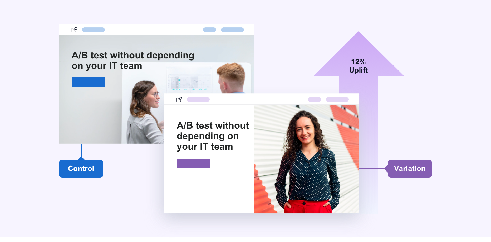
Essentially, A/B testing eliminates all the guesswork out of website optimization and enables experience optimizers to make data-backed decisions. In A/B testing, A refers to ‘control’ or the original testing variable. Whereas B refers to ‘variation’ or a new version of the original testing variable.
The version that moves your business metric(s) in the positive direction is known as the ‘winner.’ Implementing the changes of this winning variation on your tested page(s) / element(s) can help optimize your website and increase business ROI.
The metrics for conversion are unique to each website. For instance, in the case of eCommerce, it may be the sale of the products. Meanwhile, for B2B, it may be the generation of qualified leads.
A/B testing is one of the components of the overarching process of Conversion Rate Optimization (CRO), using which you can gather both qualitative and quantitative user insights. You can further use this collected data to understand user behavior, engagement rate, pain points, and even satisfaction with website features, including new features, revamped page sections, etc. If you’re not A/B testing your website, you’re surely losing out on a lot of potential business revenue.

Why should you consider A/B testing?
If B2B businesses today are unhappy with all the unqualified leads they get per month, eCommerce stores, on the other hand, are struggling with a high cart abandonment rate. Meanwhile, media and publishing houses are also dealing with low viewer engagement. These core conversion metrics are affected by some common problems like leaks in the conversion funnel, drop-offs on the payment page, etc.
Let’s see why you should do A/B testing:

1. Solve visitor pain points
Visitors come to your website to achieve a specific goal that they have in mind. It may be to understand more about your product or service, buy a particular product, read/learn more about a specific topic, or simply browse. Whatever the visitor’s goal may be, they may face some common pain points while achieving their goal. It can be a confusing copy or hard to find the CTA button like buy now, request a demo, etc.
Not being able to achieve their goals leads to a bad user experience. This increases friction and eventually impacts your conversion rates. Use data gathered through visitor behavior analysis tools such as heatmaps, Google Analytics, and website surveys to solve your visitors’ pain points. This stands true for all businesses: eCommerce, travel, SaaS, education, media, and publishing.
2. Get better ROI from existing traffic
As most experienced optimizers have come to realize, the cost of acquiring quality traffic on your website is huge. A/B testing lets you make the most out of your existing traffic and helps you increase conversions without having to spend additional dollars on acquiring new traffic. A/B testing can give you high ROI as sometimes, even the minutest of changes on your website can result in a significant increase in overall business conversions.

3. Reduce bounce rate
One of the most important metrics to track to judge your website’s performance is its bounce rate. There may be many reasons behind your website’s high bounce rate, such as too many options to choose from, expectations mismatch, confusing navigation, use of too much technical jargon, and so on.
Since different websites serve different goals and cater to different segments of audiences, there is no one-size-fits-all solution to reducing bounce rates. However, running an A/B test can prove beneficial. With A/B testing, you can test multiple variations of an element of your website till you find the best possible version. This not only helps you find friction and visitor pain points but helps improve your website visitors’ overall experience, making them spend more time on your site and even converting into a paying customer.
4. Make low-risk modifications
Make minor, incremental changes to your web page with A/B testing instead of getting the entire page redesigned. This can reduce the risk of jeopardizing your current conversion rate.
A/B testing lets you target your resources for maximum output with minimal modifications, resulting in an increased ROI. An example of that could be product description changes. You can perform an A/B test when you plan to remove or update your product descriptions. You do not know how your visitors are going to react to the change. By running an A/B test, you can analyze their reaction and ascertain which side the weighing scale may tilt.
Another example of low-risk modification can be the introduction of a new feature change. Before introducing a new feature, launching it as an A/B test can help you understand whether or not the new change that you’re suggesting will please your website audience.
Implementing a change on your website without testing it may or may not pay off in both the short and long run. Testing and then making changes can make the outcome more certain.
5. Achieve statistically significant improvements
Since A/B testing is entirely data-driven with no room for guesswork, gut feelings, or instincts, you can quickly determine a “winner” and a “loser” based on statistically significant improvements in metrics like time spent on the page, number of demo requests, cart abandonment rate, click-through rate, and so on.
6. Redesign the website to increase future business gains
Redesigning can range from a minor CTA text or color tweak to particular web pages to completely revamping the website. The decision to implement one version or the other should always be data-driven when A/B testing. Do not quit testing with the design being finalized. As the new version goes live, test other web page elements to ensure that the most engaging version is served to the visitors.
What can you A/B test?
Your website’s conversion funnel determines the fate of your business. Therefore, every piece of content that reaches your target audience via your website must be optimized to its maximum potential. This is especially true for elements that have the potential to influence the behavior of your website visitors and business conversion rate. When undertaking an optimization program, test the following key site elements (the list, however, is not exhaustive):
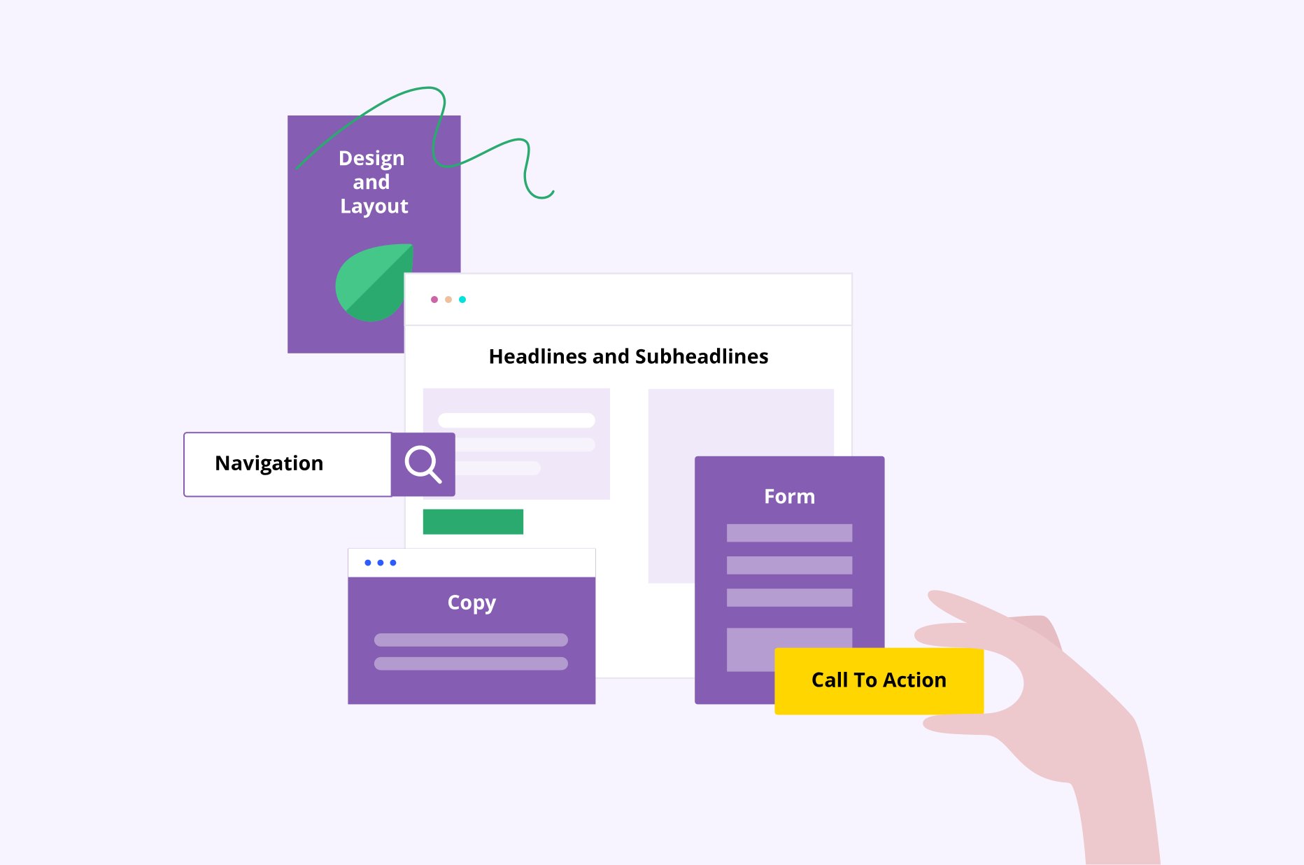
Copy
1. Headlines and subheadlines
A headline is practically the first thing that a visitor notices on a web page. It’s also what defines their first and last impression, filling in the blanks on whether or not they’ll go ahead and convert into paying customers. Hence, it’s imperative to be extra cautious about your site’s headlines and subheadlines. Ensure they’re short, to-the-point, catchy, and convey your desired message in the first stance. Try A/B testing a few copies with different fonts and writing styles, and analyze which catches your visitors’ attention the most and compels them to convert. You can also use VWO’s AI-powered text generation system to generate recommendations for the existing copy on your website.
2. Body
The body or main textual content of your website should clearly state what the visitor is getting – what’s in store for them. It should also resonate with your page’s headline and subheadline. A well-written body can significantly increase the chances of turning your website into a conversion magnet.
While drafting your website’s content, keep the following two parameters in mind:
- Writing style: Use the right tonality based on your target audience. Your copy should directly address the end-user and answer all their questions. It must contain key phrases that improve usability and stylistic elements that highlight important points.
- Formatting: Use relevant headlines and subheadlines, break the copy into small and easy paragraphs, and format it for skimmers using bullet points or lists.
Interestingly, experience optimizers can now take advantage of artificial intelligence to create website copies. GPT-3.5 Turbo or Generative Pre-trained Transformer 3, is an AI-powered neural network that has the ability to produce nearly flawless text content relevant to any given context. Built by OpenAI, GPT-3.5 Turbo uses machine learning to predict and draft content just like a human. The best part? You can now integrate OpenAI’s GPT-3.5 Turbo with the VWO Testing account and create variations for your website copy and deploy them without the help of an expert writer or IT, respectively.
3. Subject lines
Email subject lines directly impact open rates. If a subscriber doesn’t see anything they like, the email will likely wind up in their trash bin.
According to recent research, average open rates across more than a dozen industries range from 25 to 47 percent. Even if you’re above average, only about half of your subscribers might open your emails.
A/B testing subject lines can increase your chances of getting people to click. Try questions versus statements, test power words against one another, and consider using subject lines with and without emojis.

Design and layout
Because everything seems so essential, businesses sometimes struggle with finding only the most essential elements to keep on their website. With A/B testing, this problem can be solved once and for all.
For example, as an eCommerce store, your product page is extremely important from a conversion perspective. One thing for sure is that with technological progress in its current stage, customers like to see everything in high definition before buying it. Therefore, your product page must be in its most optimized form in terms of design and layout.
Along with the copy, the page’s design and layout include images (product images, offer images, etc.) and videos (product videos, demo videos, advertisements, etc.). Your product page should answer all of your visitor’s questions without confusing them and without getting cluttered:
- Provide clear information: Based on the products you sell, find creative ways to provide all necessary context and accurate product descriptions so that prospective buyers do not get overwhelmed with an unorganized copy while looking for answers to their queries. Write clear copies and provide easily noticeable size charts, color options, etc.
- Highlight customer reviews: Add both good and bad reviews for your products. Negative reviews add credibility to your store.
- Write simple content: Avoid confusing potential buyers with complicated language in the quest to decorate your content. Keep it short, simple, and fun to read.
- Create a sense of urgency: Add tags like ‘Only 2 Left In Stock’, countdowns like ‘Offer Ends in 2 Hours and 15 Minutes’, or highlight exclusive discounts and festive offers, etc., to nudge the prospective buyers to purchase immediately.
Other important pages whose design needs to be on point are pages like the home page and landing page. Use A/B testing to discover the most optimized version of these critical pages. Test as many ideas as you can, such as adding plenty of white space and high-definition images, featuring product videos instead of images, and testing out different layouts.
Declutter your pages using insights from heatmaps, clickmaps, and scrollmaps to analyze dead clicks and identify distractions. The less cluttered your home page and landing pages, the more likely it is for your visitors to easily and quickly find what they’re looking for.

Navigation
Another element of your website that you can optimize by A/B testing is your website’s navigation. It is the most crucial element when it comes to delivering an excellent user experience. Make sure you have a clear plan for your website’s structure and how different pages will be linked to each other and react within that structure.
Your website’s navigation starts on the home page. The home page is the parent page from which all other pages emerge and link back to each other. Make sure your structure is such that visitors can easily find what they’re looking for and do not get lost because of a broken navigation path. Each click should direct visitors to the desired page.
Mentioned below are some ideas to help you step up your navigation game:
- Match visitor expectations by placing your navigation bar in standard places like horizontal navigation on the top and vertical down the left to make your website easier to use.
- Make your website’s navigation predictable by keeping similarly themed content in the same bucket or in related buckets to reduce your visitor’s cognitive load. For example, as an eCommerce store, you may be selling a variety of earphones and headphones. Some of them may be wired, while others may be wireless or ear-pods. Bucket these in such a way that when a visitor looks for earphones or headphones, they find all these varieties in one place rather than having to search for each kind separately
- Creating a fluid, easy-to-navigate website by keeping its structure simple, predictable, and matching your visitors’ expectations. This will not only increase the chances of getting more conversions but also create a delightful customer experience forcing visitors to come back to your website.
Forms
Forms are mediums through which prospective customers get in touch with you. They become even more important if they are part of your purchase funnel. Just as no two websites are the same, no two forms addressing different audiences are the same. While a small comprehensive form may work for some businesses, long forms might do wonders for their lead quality for other businesses.
You can figure out which style works for your audience the best by using research tools/methods like form analysis to determine the problem area in your form and work towards optimizing it.
CTA (Call-to-action)
The CTA is where all the real action takes place – whether or not visitors finish their purchases and convert if they fill out the sign-up form or not, and more such actions that have a direct bearing on your conversion rate. A/B testing enables you to test different CTA copies, their placement across the web page, toy with their size and color scheme, and so on. Such experimentation helps understand which variation has the potential to get the most conversions.
Social proof
Social proof may take the form of recommendations and reviews from experts in particular fields, from celebrities and customers themselves, or can come as testimonials, media mentions, awards and badges, certificates, and so on. The presence of these proofs validates the claims made by your website. A/B testing can help you determine whether or not adding social proof is a good idea. If it is a good idea, what kinds of social proof should you add, and how many should you add? You can test different types of social proofs, their layouts, and placements to understand which works best in your favor.
Content depth
Some website visitors prefer reading long-form content pieces that extensively cover even the minutest of details. Meanwhile, many others just like to skim through the page and deep dive only into the topics that are most relevant to them. In which category does your target audience fall?
A/B test content depth. Creating two pieces of the same content, one that’s significantly longer than the other, provides more details. Analyze which compels your readers the most.
Understand that content depth impacts SEO and many other business metrics such as the conversion rate, page time spent, and bounce rate. A/B testing enables you to find the ideal balance between the two.

What are the different types of A/B tests?
Post learning about which web page elements to test to move your business metrics in the positive direction, let’s move ahead and learn about the different kinds of testing methods along with their advantages.
Ideally, there are four basic testing methods – A/B testing, Split URL testing, Multivariate testing, and Multipage testing. We’ve already discussed the first kind, namely, A/B testing. Let’s move on to the others.
Split URL testing
Many people in the testing arena confuse Split URL testing with A/B testing. However, the two are fundamentally very different. Split URL testing refers to an experimentation process wherein an entirely new version of an existing web page URL is tested to analyze which one performs better.
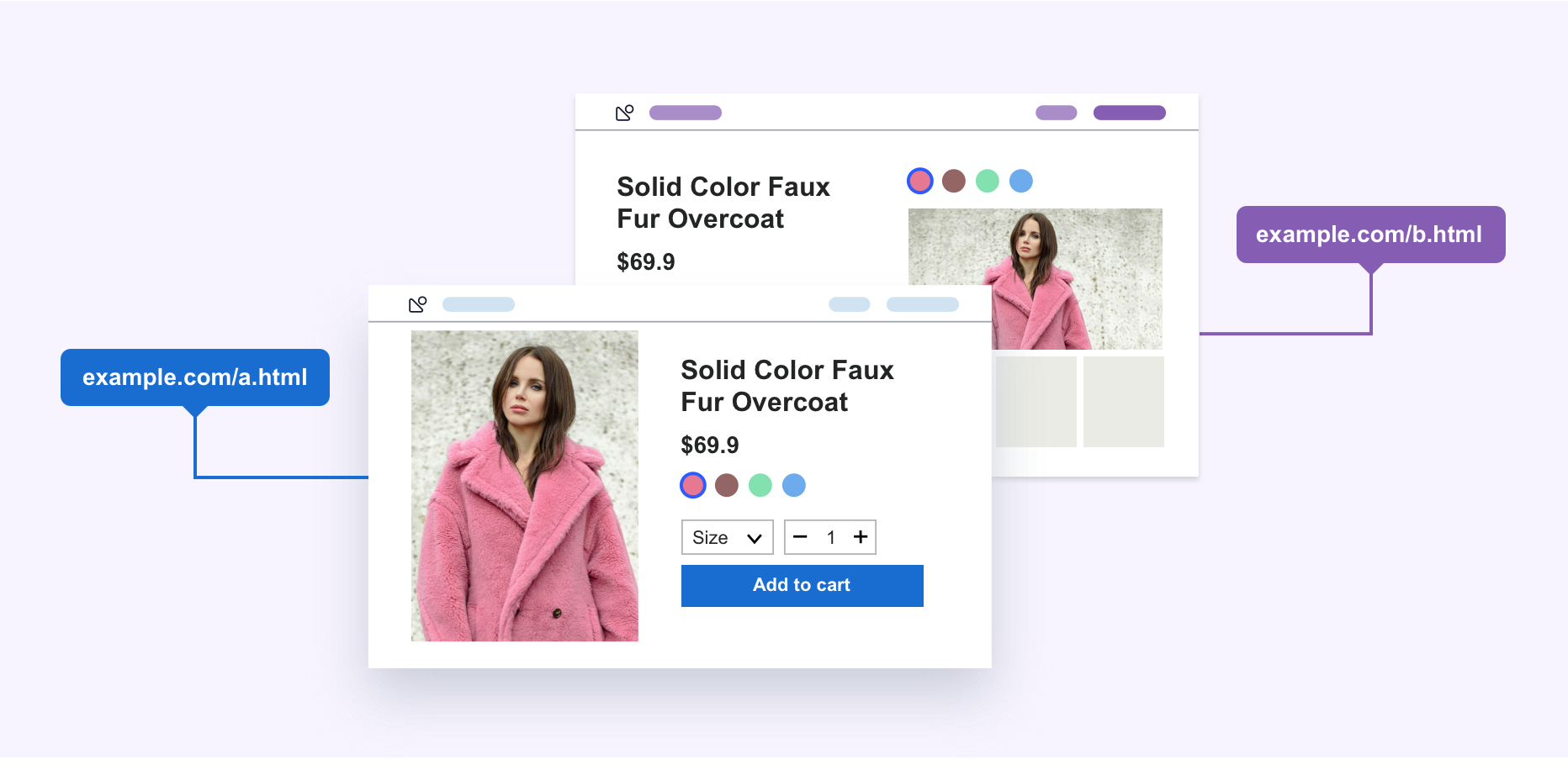
Typically, A/B testing is used when you wish to only test front-end changes on your website. On the other hand, Split URL testing is used when you wish to make significant changes to your existing page, especially in terms of design. You’re not willing to touch the existing web page design for comparison purposes.
When you run a Split URL test, your website traffic is split between the control (original web page URL) and variations (new web page URL), and each of their respective conversion rates is measured to decide the winner.
Advantages of Split URL testing
- Ideal for trying out radical new designs while using the existing page design for comparative analysis.
- Recommended for running tests with non-UI changes, such as switching to a different database, optimizing your page’s load time, etc.
- Change up web page workflows. Workflows dramatically affect business conversions, helping test new paths before implementing changes and determining if any of the sticking points were missed.
- A better and much-recommended testing method for dynamic content.
Multivariate testing (MVT)
Multivariate testing (MVT) refers to an experimentation method wherein variations of multiple-page variables are simultaneously tested to analyze which combination of variables performs the best out of all the possible permutations. It’s more complicated than a regular A/B test and is best suited for advanced marketing, product, and development professionals.
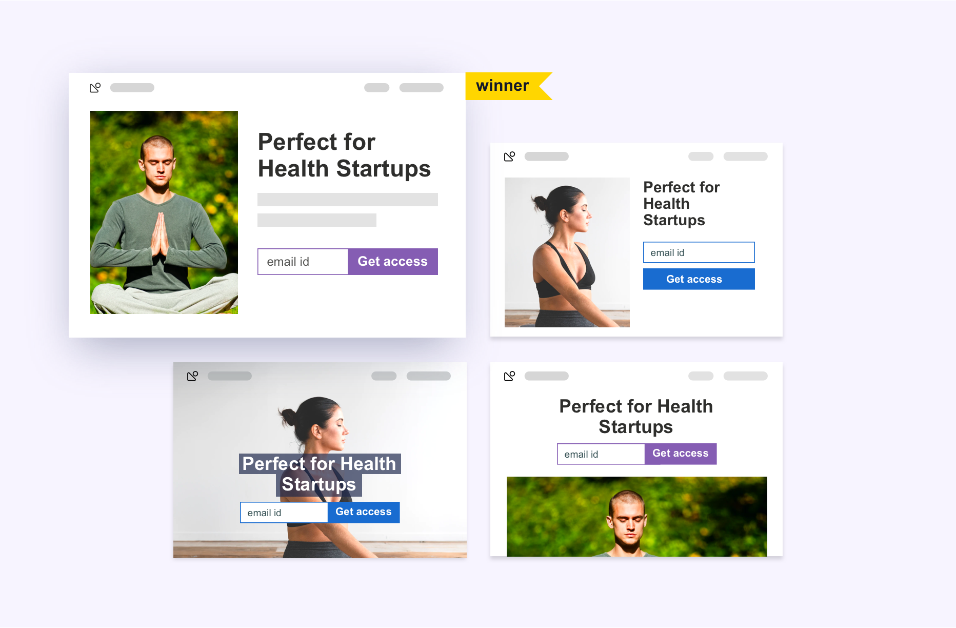
Here’s an example to give you a more comprehensive description of multivariate testing. Let’s say you decide to test 2 versions, each of the hero image, call-to-action button color, and headlines of one of your landing pages. This means a total of 8 variations are created, which will be concurrently tested to find the winning variation.
Here’s a simple formula to calculate the total number of versions in a multivariate test:
[No. of variations of element A] x [No. of variations of element B] x [No. of variations of element C]… = [Total No. of variations]
When conducted properly, multivariate testing can help eliminate the need to run multiple and sequential A/B tests on a web page with similar goals. Running concurrent tests with a greater number of variations helps you save time, money, and effort and come to a conclusion in the shortest possible time.
Advantages of Multivariate testing
Multivariate testing typically offers primary three benefits:
- Helps avoid the need to conduct several sequential A/B tests with the same goal and saves time since you can simultaneously track the performance of various tested page elements.
- Easily analyze and determine the contribution of each page element to the measured gains,
- Map all the interactions between all independent element variations (page headlines, banner images, etc.).
Multipage testing
Multipage testing is a form of experimentation where you can test changes to particular elements across multiple pages.
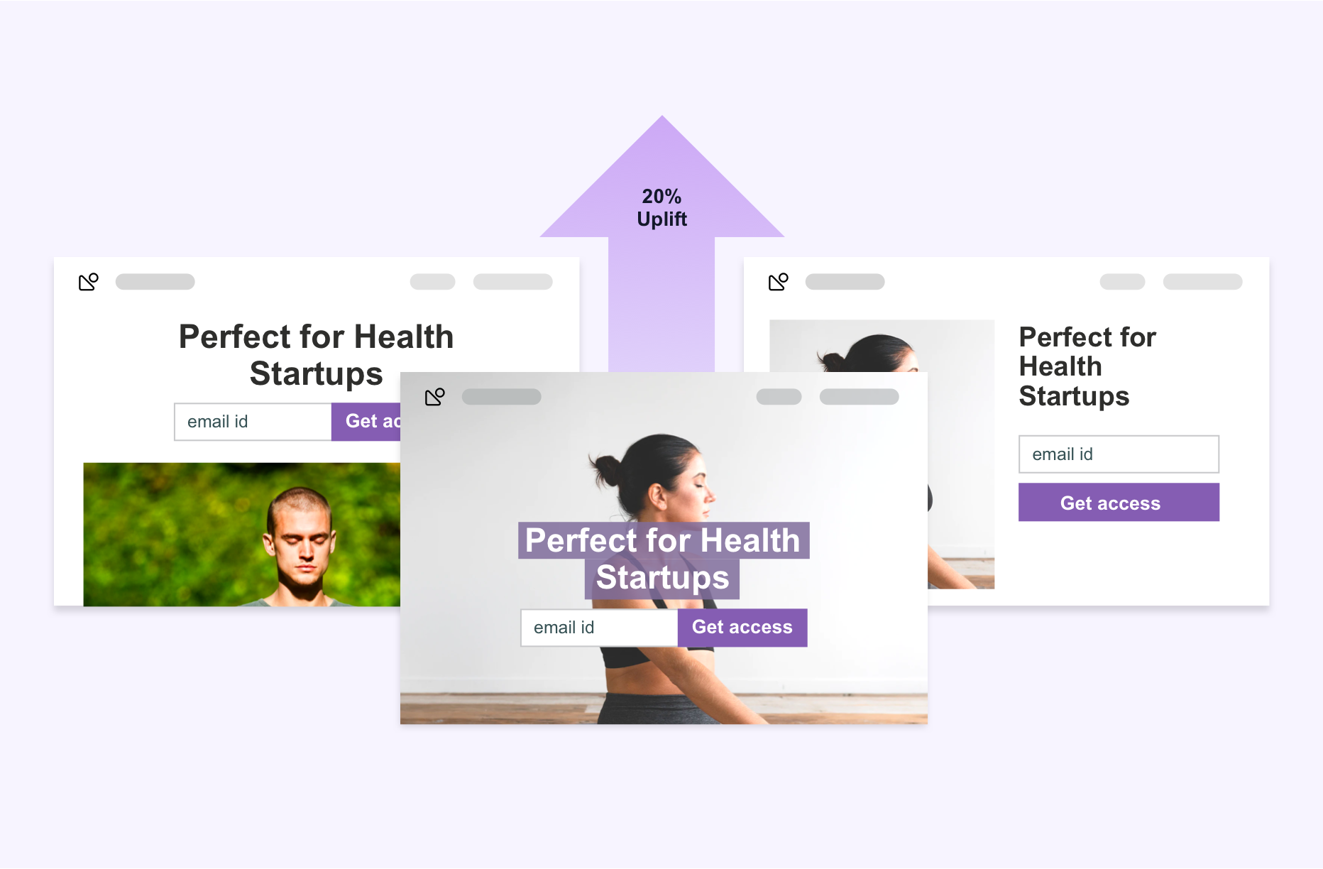
There are two ways to conduct a multipage test. One, you can either take all the pages of your sales funnel and create new versions of each, which makes your challenger the sales funnel, and you then test it against the control. This is called Funnel Multipage testing.
Two, you can test how the addition or removal of recurring element(s), such as security badges, testimonials, etc., can impact conversions across an entire funnel. This is called Classic or Conventional Multipage testing.
Advantages of Multipage testing
Similar to A/B testing, Multipage testing is easy to create and run and provides meaningful and reliable data with ease and in the shortest possible time.
The advantages of multipage testing are as follows:
- It enables you to create consistent experiences for your target audience.
- It helps your target audience see a consistent set of pages, no matter if it’s the control or one of its variations.
- It enables you to implement the same change on several pages to ensure that your website visitors don’t get distracted and bounce off between different variations and designs when navigating through your website.

Which statistical approach to use to run an A/B test?
Post learning about four different types of A/B testing experimentation methods, it’s equally important to understand which statistical approach to adopt to successfully run an A/B test and draw the right business conclusion.
Ideally, there are two types of statistical approaches used by A/B/n experimenters across the globe: Frequentist and Bayesian. Each of these approaches has its own pros and cons. However, we, at VWO, use, support, and promote the Bayesian approach.
The comparison between the two approaches given below will help you understand why.
Frequentist approach:
The frequentist approach of probability defines the probability of an event with relation to how frequently (hence the name) a particular event occurs in a large number of trials/data points. When applied to the world of A/B testing, one can see that anyone going with the frequentist approach would need more data (a function of more number of visitors tested and over longer durations) to come to the right conclusions. This is something that limits you in scaling up any A/B testing effort. According to the Frequentist approach, it is essential to define your A/B test’s duration based on sample size to reach the right test conclusions. The tests are based on the fact that every experiment can be repeated infinite times.
Following this approach calls for a lot of attention to detail for every test that you run because for the same set of visitors, you’ll be forced to run longer duration tests than the Bayesian approach. Hence, each test needs to be treated with extreme care because there are only a few tests that you can run in a given timeframe. Unlike Bayesian statistics, the Frequentist approach is less intuitive and often proves difficult to understand.
Bayesian approach:
As compared to the Frequentist approach, Bayesian statistics is a theory-based approach that deals with the Bayesian interpretation of probability, where probability is expressed as a degree of belief in an event. In other words, the more you know about an event, the better and faster you can predict the end outcomes. Rather than being a fixed value, probability under Bayesian statistics can change as new information is gathered. This belief may be based on past information such as the results of previous tests or other information about the event.
Unlike the frequentist approach, the Bayesian approach provides actionable results almost 50% faster while focusing on statistical significance. At any given point, provided you have enough data at hand, the Bayesian approach tells you the probability of variation A having a lower conversion rate than variation B or the control. It does not have a defined time limit attached to it, nor does it require you to have an in-depth knowledge of statistics.
In the simplest of terms, the Bayesian approach is akin to how we approach things in everyday life. For instance, you misplaced your mobile phone in your house. As a frequentist, you would only use a GPS tracker to track it and only check the area the tracker is pointing to. While as a Bayesian, you will not only use a GPS tracker but also check all the places in the house you earlier found your misplaced phone. In the former, the event is considered a fixed value, while in the latter, all past and future knowledge are utilized to locate the phone.
To get a clearer understanding of the two statistical approaches, here’s a comparison table just for you:
| Frequentist Approach | Bayesian Approach |
| Frequentist Statistics follow the ‘Probability as Long-Term Frequency’ definition of probability. | Bayesian Statistics follow the notions of ‘Probability as Degree of Belief’ and ‘Logical Probability.’ |
| In this approach, you only use data from your current experiment. The frequentist solution is to conduct tests and draw conclusions. | In this approach, you use your prior knowledge from the previous experiments and try to incorporate that information into your current data. The Bayesian solution is to use existing data to draw conclusions. |
| Give an estimated mean (and standard deviation) of samples where A beats B but completely ignores the cases when B beats A. | It takes into account the possibility of A beating B and also calculates the range of the improvement you can expect. |
| Requires the test to run for a set period to get correct data from it but can’t figure out how close or far A and B actually are. It fails to tell you the probability of A beating B. | Gives you more control over testing. You can now plan better, have a more accurate reason to end tests, and get into the nitty-gritty of how close or far apart A and B are. |
Once you’ve figured out which testing method and statistical approach you wish to use, it’s time to learn the art and science of performing A/B tests on VWO’s A/B testing platform.
How to perform an A/B test?
A/B testing offers a very systematic way of finding out what works and what doesn’t work in any given marketing campaign. Most marketing efforts are geared toward driving more traffic. As traffic acquisition becomes more difficult and expensive, it becomes paramount to offer your users the best experience who comes to your website. This will help them achieve their goals and allow them to convert in the fastest and most efficient manner possible. A/B testing in marketing allows you to make the most out of your existing traffic and increase revenue inflow.
A structured A/B testing program can make marketing efforts more profitable by pinpointing the most crucial problem areas that need optimization. A/B testing is now moving away from being a standalone activity that is conducted once in a blue moon to a more structured and continuous activity, which should always be done through a well-defined CRO process. Broadly, it includes the following steps:
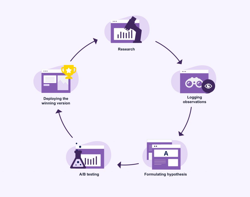
Step 1: Research
Before building an A/B testing plan, one needs to conduct thorough research on how the website is currently performing. You will have to collect data on everything related to how many users are coming onto the site, which pages drive the most traffic, the various conversion goals of different pages, etc. The A/B testing tools used here can include quantitative website analytics tools such as Google Analytics, Omniture, Mixpanel, etc., which can help you figure out your most visited pages, pages with most time spent, or pages with the highest bounce rate. For example, you may want to start by shortlisting pages that have the highest revenue potential or the highest daily traffic. Following this, you may want to dive deeper into the qualitative aspects of this traffic.
Heatmap tools are the leading technology used to determine where users are spending the most time, their scrolling behavior, etc. This can help you identify problem areas on your website. Another popular tool used to do more insightful research is website user surveys. Surveys can act as a direct conduit between your website team and the end user and often highlight issues that may be missed in aggregate data.
Further, qualitative insights can be derived from session recording tools that collect data on visitor behavior, which helps in identifying gaps in the user journey. In fact, session recording tools combined with form analysis surveys can uncover insights on why users may not be filling your form. It may be due to some fields that ask for personal information or users, maybe abandoning your forms for too long.
As we can see, both quantitative and qualitative research can help us prepare for the next step in the process, making actionable observations for the next steps.
Step 2: Observe and formulate hypothesis
Get closer to your business goals by logging research observations and creating data-backed hypotheses aimed at increasing conversions. Without these, your test campaign is like a directionless compass. The qualitative and quantitative research tools can only help you with gathering visitor behavior data. It is now your responsibility to analyze and make sense of that data. The best way to utilize every bit of data collated is to analyze it, make keen observations on them, and then draw websites and user insights to formulate data-backed hypotheses. Once you have a hypothesis ready, test it against various parameters such as how much confidence you have of it winning, its impact on macro goals, and how easy it is to set up, and so on.
While brainstorming new testing ideas, if you ever find yourself facing a creativity block, don’t worry—VWO has a solution for you. You can now get AI-generated testing ideas within minutes.
The webpage URL you entered is scanned to show personalized testing ideas for that page. For instance, if you enter the URL of your pricing page, you will be presented with several relevant ideas supported by correct hypotheses, valid scientific principles, and feasible actionables. Additionally, you can generate testing ideas based on a specific goal for that page.
For example, if your objective is to ‘Increase clicks on the contact sales team CTA,’ you will see relevant ideas to help you achieve that goal. You can then add these testing ideas to VWO Plan and create a robust pipeline of tests to be carried out in the future. Swiftly jotting down recommendations and aligning them with specific goals can help save time and accelerate the testing process.
Step 3: Create variations
The next step in your testing program should be to create a variation based on your hypothesis, and A/B test it against the existing version (control). A variation is another version of your current version with changes that you want to test. You can test multiple variations against the control to see which one works best. Create a variation based on your hypothesis of what might work from a UX perspective. For example, enough people not filling forms? Does your form have too many fields? Does it ask for personal information? Maybe you can try a variation with a shorter form or another variation by omitting fields that ask for personal information.
Step 4: Run test
Before we get to this step, it’s important to zero upon the type of testing method and approach you want to use. Once you’ve locked down on either one of these types and approaches based (refer to the above-written chapters) on your website’s needs and business goals, kick off the test and wait for the stipulated time for achieving statistically significant results. Keep one thing in mind – no matter which method you choose, your testing method and statistical accuracy will determine the end results.
For example, one such condition is the timing of the test campaign. The timing and duration of the test have to be on point. Calculate the test duration keeping in mind your average daily and monthly visitors, estimated existing conversion rate, minimum improvement in conversion rate you expect, number of variations (including control), percentage of visitors included in the test, and so on.
Use our Bayesian Calculator to calculate the duration for which you should run your A/B tests for achieving statistically significant results.
Step 5: Analyse results and deploy changes
Even though this is the last step in finding your campaign winner, analysis of the results is extremely important. Because A/B testing calls for continuous data gathering and analysis, it is in this step that your entire journey unravels. Once your test concludes, analyze the test results by considering metrics like percentage increase, confidence level, direct and indirect impact on other metrics, etc. After you have considered these numbers, if the test succeeds, deploy the winning variation. If the test remains inconclusive, draw insights from it, and implement these in your subsequent tests.
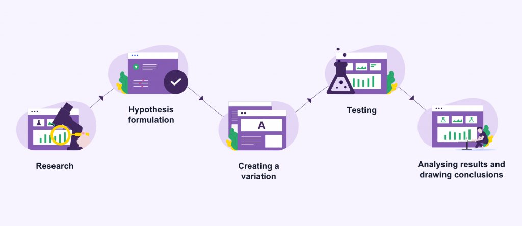
A/B testing lets you systematically work through each part of your website to improve conversions.

How to make an A/B testing calendar – plan & prioritize
A/B testing should never be considered an isolated optimization exercise. It’s a part of a wider holistic CRO program and should be treated as such. An effective optimization program typically has two parts, namely, plan and prioritize. Waking up one day and deciding to test your website is not how things are done in CRO. A good amount of brainstorming, along with real-time visitor data, is the only way to go about it.
In plain words, you begin by analyzing existing website data and gathering visitor behavior data, then move on to preparing a backlog of action items based on them, further prioritizing each of these items, running tests, and then drawing insights for the future. Eventually, when, as experience optimizers, you conduct enough ad-hoc based tests, you would want to scale your A/B testing program to make it more structured.
The first step to doing this is by making an A/B testing calendar. A good testing calendar or a good CRO program will take you through 4 stages:

Stage 1: Measure
This stage is the planning stage of your A/B testing program. It includes measuring your website’s performance in terms of how visitors are reacting to it. In this stage, you should be able to figure out what is happening on your website, why it is happening, and how visitors are reacting to it. Everything that goes on in your website should correspond to your business goals. So before everything else, you need to be sure what your business goal/s is (are). Tools like Google Analytics can help you measure your goals. Once you have clearly defined goals, set up GA for your website and define your key performance indicators.
Let’s take an online mobile phone cover store as an example. The business goal for this store is to increase revenue by increasing online orders and sales. The KPI set to track this goal would then be the number of phone covers sold.
This stage, however, does not simply end with defining website goals and KPIs. It also includes understanding your visitors. We have already discussed the various tools that can be used to gather visitor behavior data. Once data is collected, log in observations and start planning your campaign from there. Better data means higher sales.
Once the business goals are defined, KPIs set, and website data and visitor behavior data analyzed, it is time to prepare a backlog.
Backlog: “an accumulation of tasks unperformed or materials not processed.”
Your backlog should be an exhaustive list of all the elements on the website that you decide to test based on the data you analyzed. With a data-backed backlog ready, the next step is formulating a hypothesis for each backlog item. With the data gathered in this stage and its analysis, you will now have enough context of what happens on your website and why. Formulate a hypothesis based on them.
For example, after analyzing the data gathered using quantitative and qualitative research tools in the 1st stage, you come to the conclusion that not having multiple payment options led to maximum prospect customers dropping off on the checkout page. So you hypothesize that “adding multiple payment options will help reduce drop off on the checkout page.”
In short, by the end of this stage, you will know the whats and whys of your website.
Stage 2: Prioritize
The next stage involves prioritizing your test opportunities. Prioritizing helps you scientifically sort multiple hypotheses. By now, you should be fully equipped with website data, visitor data and be clear on your goals. With the backlog, you prepared in the first stage and the hypothesis ready for each candidate, you are halfway there on your optimization roadmap. Now comes the main task of this stage: prioritizing.
In stage 2, you should be fully equipped to identify problem areas of your website and leaks in your funnel. But not every action area has equal business potential. So it becomes imperative to weigh out your backlog candidates before picking the ones you want to test. There are a few things to be kept in mind while prioritizing items for your test campaign like the potential for improvement, page value and cost, the importance of the page from a business perspective, traffic on the page, and so on.
But how can you ensure that no subjectivity finds its way in your prioritization framework? Can you be 100% objective at all times? As humans, we give loads of importance to gut feelings, personal opinions, ideas, and values because these are the things that help us in our everyday lives. But, CRO is not everyday life. It is a scientific process that needs you to be objective and make sound data-backed decisions and choices. The best way to weed out these subjectivities is by adopting a prioritization framework.
There are many prioritization frameworks that even experts employ to make sense of their huge backlogs. On this pillar page, you will learn about the most popular frameworks that experience optimizers use – the CIE prioritization framework, the PIE prioritization framework, and the LIFT Model.
1. CIE Prioritization Framework
In the CIE framework, there are three parameters on which you must rate your test on a scale of 1 to 5:
- Confidence: On a scale of 1 to 5 – 1 being the lowest and 5 being the highest – select how confident you are about achieving the expected improvement through the hypothesis.
- Importance: On a scale of 1 to 5 – 1 being the lowest, and 5 being the highest – select how crucial the test (for which the hypothesis is created) is.
- Ease: On a scale of 1 to 5 – 1 being the most difficult, and 5 being the easiest – select the complexity of the test. Rate how difficult it will be to implement the changes identified for the test.
Before you rate your hypotheses, consider these 3 things:
A. How confident are you of achieving the uplift?
Prototyping the user persona, you are targeting can help you determine the potential of a hypothesis. With a sound understanding of your audience, you can make an educated assumption on whether the hypothesis will address the users’ apprehensions and doubts and nudge them to convert or not.
B. How valuable is the traffic you are running this test for?
Your website may be attracting visitors in large numbers, but not all visitors become buyers. Not all convert. For example, a hypothesis built around the checkout page holds a higher importance than the one built around the product features page. This is because visitors on the checkout page are way deep in your conversion funnel and have a higher chance to convert rather than visitors on your product features page.
C. How easy is it to implement this test?
Next comes determining the ease of implementing your test. Try to answer some questions: Would it need a lot of strategizing on your part to implement the hypothesis? What is the effort needed in designing and developing the solution proposed by the hypothesis? Can the changes suggested in the hypothesis be implemented using just the Visual Editor, or does it warrant adding custom code? It is only after you have answered all these and other such questions should you rate your backlog candidate on the easing parameter.
2. PIE Prioritization Framework
The PIE framework was developed to answer the question, “Where should I test first?”. The whole aim of the prioritization stage in your A/B testing journey is to find the answer to this very question. The PIE framework talks about 3 criteria that you should consider while choosing what to test when: potential, importance, and ease.
Potential means a page’s ability to improve. The planning stage should equip you with all the data you need to determine this.
Importance refers to a page’s value: how much traffic comes to the page. If you have identified a problem page, but there is no traffic on that page, then that page is of less importance when compared to other pages with higher traffic.
The third and final criteria is ease. Ease defines how difficult it is to run a test on a particular page or element. One way to determine ease of testing a page is using tools like landing page analyzer to determine the current state of your landing pages, estimate the number and scale of change it would require, and prioritize which ones to do or whether to do it at all. This is important from the perspective of resources. Many businesses drop the idea of undertaking and A/B testing campaign because of the lack of resources. These resources are of 2 kinds:
A. Human resource
Even though businesses have been using CRO and A/B testing for many years, it is only recently that the two concepts gained a front stage. Because of this, a large segment of the market does not have a dedicated optimization team, and when they do, it is usually limited to a handful of people. This is where a planned optimization calendar comes in handy. With a properly planned and prioritized backlog, a small CRO team can focus its limited resources on high stake items.
B. Tools:
As popular as CRO and A/B testing are getting, so are hundreds of A/B testing tools– both low end and high. Without the perspective of an expert, if businesses were to pick one out of the lot, say the cheapest one, and start A/B testing every single item on the backlog, they will reach no statistically significant conclusion. There are 2 reasons for this: one, testing without prioritization is bound to fail and not reap any business profits. Two, not all tools are of the same quality.
Some tools may be costlier, but they are either integrated with good qualitative and quantitative research tools or are brilliant standalone tools making them more than capable of producing statistically significant results. While the other lot may be cheaper and lure businesses during capital crunch and with a huge backlog, these tools will only be an investment loss to them without any benefits. Prioritization will help you make sense of your backlog and dedicate whatever little resources you have to a profitable testing candidate.
Backlog candidates should be marked on how hard they are to test based on technical and economic ease. You can quantify each potential candidate as a business opportunity based on the above criteria and choose the highest scorer. For example, like an eCommerce business, you may want to test your homepage, product page, checkout page, and thank you (rating) page. Now according to the PIE framework, you line these up and mark them potential, importance and ease:
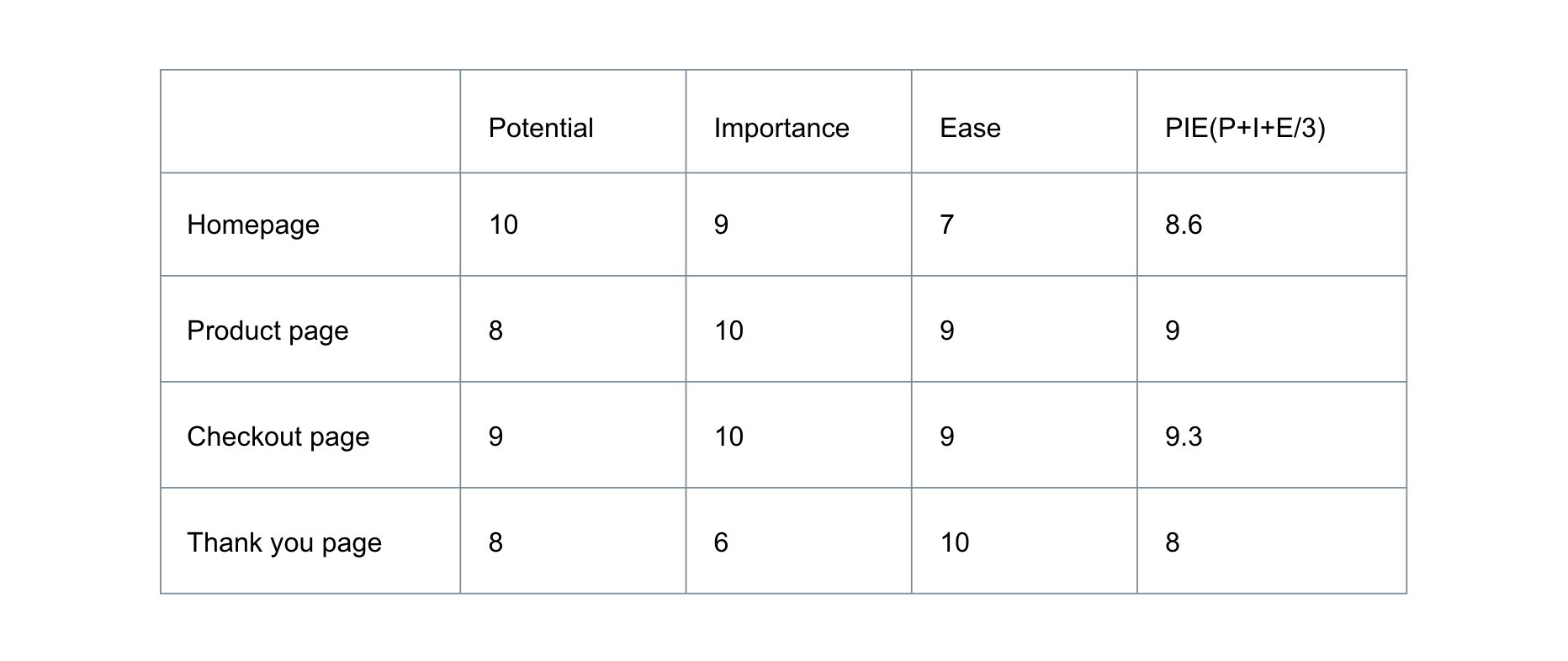
*marked out of a total of 10 points per criteria.
3. The LIFT Model
The LIFT Model is another popular conversion optimization framework that helps you analyze web and mobile experiences, and develop good A/B test hypotheses. It draws on the 6 conversion factors to evaluate experiences from the perspective of your page visitor: Value Proposition, Clarity, Relevance, Distraction, Urgency, and Anxiety.
With prioritization, you can have your A/B testing calendar ready for execution for at least 6 to 12 months. This will not only give you time, and a heads-up to prepare for the test but also plan around your resources.
Stage 3: A/B test
The third and most crucial stage is the testing stage. After the prioritization stage, you will have all the required data and a prioritized backlog. Once you have formulated hypotheses that align to your goal and prioritized them, create variations, and flag off the test. While your test is running, make sure it meets every requirement to produce statistically significant results before closure, like testing on accurate traffic, not testing too many elements together, testing for the correct amount of duration, and so on.
Stage 4: Repeat
This stage is all about learning from your past and current test and applying them in future tests. Once your test runs for the stipulated amount of time, stop the test and start analyzing the data thus gathered. The first thing you will realize is one of the many versions that were being tested had performed better than all others and won. It’s time for you and your team to now figure out why that happened. There can be 3 outcomes of your test:
- Your variation or one of your variations will have won with statistical significance.
- Your control was the better version and won over the variation/s.
- Your test failed and produced insignificant results. Determine the significance of your test results with the help of tools like the A/B test significance calculator.
In the first two scenarios, do not stop testing just because you have a winner. Make improvements to that version and keep testing. In the third scenario, recall all the steps and identify where you went wrong in the process and re-do the test after rectifying the mistake.
Here is a downloadable A/B testing calendar sample for your reference. To use this spreadsheet, click on the ‘File’ option in the main menu and then click on ‘Make a copy.’
File > Make a copy

When scaling your A/B testing program, keep in mind the following points:
A. Revisiting previously concluded test:
With a prioritized calendar in place, your optimization team will have a clear vision of what they will test next and which test needs to be run when. Once you have tested each element or most elements in the backlog, revisit each successful as well as failed campaigns. Analyze the test results and determine whether there is enough data to justify running another version of the test. If there is, then run the test again – with necessary edits and modifications.
B. Increasing testing frequency:
While you should always be cautious of testing too many elements together, increasing your testing frequency is essential in scaling your testing program. Your optimization team will have to plan it in such a way that none of the tests affect others or your website’s performance. One way to do this is by running tests simultaneously on different web pages of your website or testing elements of the same web page at different time periods. This will not only increase your testing frequency but also, none of the tests will affect others. For instance, you can simultaneously test one element each of your homepage, checkout page, and sign-up page at one time and other elements (1 element at a time) of these pages after the current test concludes.
C. Spacing out your test:
This flows from the previous point. If you look at the calendar above, you will see that not more than two tests overlap each other at any given week. In a quest to increase your testing frequency, do not compromise with your website’s overall conversion rate. If you have two or more critical elements to be tested on the same web page, space the two out. As pointed earlier, testing too many elements of a web page together makes it difficult to pinpoint which element influenced the success or failure of the test most.
Let’s say, for example, you want to test one of your ad’s landing pages. You lock in on testing the CTA to increase sign-ups and banners to decrease the bounce rate and increase time spent. For the CTA, based on your data, you decide to change the copy. For the banner, you decide to test a video against a static image. You deploy both tests at the same time, and at the conclusion, both your goals were met. The problem here is that data showed that while sign-ups did increase from the new CTA, the video (apart from reducing the bounce rate and increasing average time spent on the page) too helped in this. Most of the people who watched the video also ended up signing up.
The problem now is that, because you did not space the two tests, it became impossible to tell which element contributed most to the sign-up increase. Had you timed the two tests better, much more significant insights could have been gathered?
D. Tracking multiple metrics:
You usually measure an A/B test’s performance based on a single conversion goal and put all your trust on that goal to help you find the winning variation. But sometimes, the winning variation affects other website goals as well. The example above is applicable here too. The video, in addition to reducing bounce rate and increasing time spent, also contributed to increased sign-ups. To scale your A/B testing program, track multiple metrics so that you can draw more benefits with less effort.
Having a thoroughly built calendar helps to streamline things to a great extent. VWO has an inbuilt calendar-making feature known as the Kanban board that helps track your tests’ progress at various stages.
What are the mistakes to avoid while A/B testing?
A/B testing is one of the most effective ways to move business metrics in a positive direction and increase the inward flow of revenue. However, as stated above, A/B testing demands planning, patience, and precision. Making silly mistakes can cost your business time and money, which you can’t afford. To help you avoid making blunders, here’s a list of some of the most common mistakes to remember when running an A/B test:
Mistake #1: Not planning your optimization Roadmap
A. Invalid hypothesis:
In A/B testing, a hypothesis is formulated before conducting a test. All the next steps depend on it: what should be changed, why should it be changed, what the expected outcome is, and so on. If you start with the wrong hypothesis, the probability of the test succeeding decreases.
B. Taking others’ word for it:
Sure, someone else changed their sign-up flow and saw a 30% uplift in conversions. But it is their test result, based on their traffic, their hypothesis, and their goals. Here’s why you should not implement someone else’s test results as is onto your website: no two websites are the same – what worked for them might not work for you. Their traffic will be different; their target audience might be different; their optimization method may have been different than yours, and so on.
Mistake #2: Testing too many elements together
Industry experts caution against running too many tests at the same time. Testing too many elements of a website together makes it difficult to pinpoint which element influenced the test’s success or failure the most. The more the elements tested, the more needs to be the traffic on that page to justify statistically significant testing. Thus, prioritization of tests is indispensable for successful A/B testing.
Mistake #3: Ignoring statistical significance
If gut feelings or personal opinions find a way into hypothesis formulation or while you are setting the A/B test goals, it is most likely to fail. Irrespective of everything, whether the test succeeds or fails, you must let it run through its entire course so that it reaches its statistical significance.
For a reason, that test results, no matter good or bad, will give you valuable insights and help you plan your upcoming test in a better manner.
You can get more information about the different types of errors while dealing with the maths of A/B testing.
Mistake #4: Using unbalanced traffic
Businesses often end up testing unbalanced traffic. A/B testing should be done with the appropriate traffic to get significant results. Using lower or higher traffic than required for testing increases the chances of your campaign failing or generating inconclusive results.
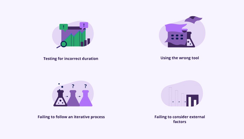
Mistake #5: Testing for incorrect duration
Based on your traffic and goals, run A/B tests for a certain length of time to achieve statistical significance. Running a test for too long or too short a period can result in the test failing or producing insignificant results. Because one version of your website appears to be winning within the first few days of starting the test does not mean that you should call it off before time and declare a winner. Letting a campaign run for too long is also a common blunder that businesses commit. The duration for which you need to run your test depends on various factors like existing traffic, existing conversion rate, expected improvement, etc.
Learn how long you should run your test.
Mistake #6: Failing to follow an iterative process
A/B testing is an iterative process, with each test building upon the results of the previous tests. Businesses give up on A/B testing after their first test fails. But to improve the chances of your next test succeeding, you should draw insights from your last tests while planning and deploying your next test. This increases the probability of your test succeeding with statistically significant results.
Additionally, do not stop testing after a successful one. Test each element repetitively to produce the most optimized version of it even if they are a product of a successful campaign.
Mistake #7: Failing to consider external factors
Tests should be run in comparable periods to produce meaningful results. It is wrong to compare website traffic on the days when it gets the highest traffic to the days when it witnesses the lowest traffic because of external factors such as sales, holidays, and so on. Because the comparison here is not made between likes, the chances of reaching an insignificant conclusion increase. Use VWO’s A/B Test Significance Calculator to know if the results your test achieved were significant or not.
Mistake #8: Using the wrong tools
With A/B testing gaining popularity, multiple low-cost tools have also come up. Not all of these tools are equally good. Some tools drastically slow down your site, while others are not closely integrated with necessary qualitative tools (heatmaps, session recordings, and so on), leading to data deterioration. A/B testing with such faulty tools can risk your test’s success from the start.
Mistake #9: Sticking to plain vanilla A/B testing method
While most experience optimizers recommend that you must start your experimentation journey by running small A/B tests on your website to get the hang of the entire process. But, in the long run, sticking to plain vanilla A/B testing methods won’t work wonders for your organization. For instance, if you are planning to revamp one of your website’s pages entirely, you ought to make use of split testing. Meanwhile, if you wish to test a series of permutations of CTA buttons, their color, the text, and the image of your page’s banner, you must use multivariate testing.
What are the challenges of A/B testing?
The ROI from A/B testing can be huge and positive. It helps you direct your marketing efforts to the most valuable elements by pinpointing exact problem areas. But every once in a while, as an experience optimizer, you may face some challenges when deciding to undertake A/B testing. The 6 primary challenges are as follows:
Challenge #1: Deciding what to test
You can’t just wake up one day and decide to test certain elements of your choice. A bitter reality that experience optimizers are now coming to realize is that not all small changes that are easy to implement are always the best when you consider your business goals and often fail to prove significant. The same goes for complex tests. This is where website data and visitor analysis data come into play. These data points help you overcome the challenge of ‘not knowing what to test’ out of your unending backlog by generally pointing to the elements which may have the most impact on your conversion rates or by directing you to pages with the highest traffic.
Challenge #2: Formulating hypotheses
In great resonance with the first challenge is the second challenge: formulating a hypothesis. This is where the importance of having scientific data at your disposal comes in handy. If you are testing without proper data, you might as well be gambling away your business. With the help of data gathered in the first step (i.e., research) of A/B testing, you need to discover where the problems lie with your site and come up with a hypothesis. This will not be possible unless you follow a well-structured and planned A/B testing program.
Challenge #3: Locking in on sample size
Not many experience optimizers are statisticians. We often make the mistake of calling conclusive results too quickly because we are more often than not after quick results. As experience optimizers, we need to learn about sample sizes, in particular, how large should our testing sample size be based on our web page’s traffic.
Challenge #4: Analyzing test results
With A/B testing, you will witness success and failure at each step. This challenge, however, is pertinent to both successful and failed tests:
1. Successful campaigns:
It’s great that you ran two tests, and both of them were successful in producing statistically significant results. What next? Yes, deploying the winner, but what after that? What experience optimizers often fail to do or find difficult is interpreting test results. Interpreting test results after they conclude is extremely important to understand why the test succeeded. A fundamental question to be asked is – why? Why did customers behave the way they did? Why did they react a certain way with one version and not with the other versions? What visitor insights did you gather, and how can you use them? Many experience optimizers often struggle or fail to answer these questions, which not only help you make sense of the current test but also provide inputs for future tests.
2. Failed campaigns:
Sometimes, experience optimizers don’t even look back at failed tests. They either have a hard time dealing with them, for example, while telling the team about the failed tests or have no clue what to do with them. No failed test is unsuccessful unless you fail to draw learnings from them. Failed campaigns should be treated like pillars that would ultimately lead you to success. The data gathered during the entire A/B testing process, even if in the end, the test failed, is like an unopened pandora box. It contains a plethora of valuable data and insights that can give you a head start for your next test.
Additionally, with the lack of proper knowledge on how to analyze the gathered data, the chances of data corruption increase manifold. For example: without having a process in place, there will be no end to scrolling through heatmaps data or sessions recording data. Meanwhile, if you are using different tools for these, then the chances of data leakage while attempting to integrate them also increase. You may also fail to draw any significant insights while wandering directionless through data and just drown under them.
Challenge #5: Maintaining a testing culture
One of the most crucial characteristics of optimization programs like CRO and A/B testing is that it is an iterative process. This is also one of the major obstacles that businesses and experience optimizers face. For your optimization efforts to be fruitful in the long run, they should form a cycle that roughly starts with research and ends in research.
This challenge is not just a matter of putting in effort or about having the required knowledge. Sometimes due to resource crunch, businesses rarely or intermittently use A/B testing and fail to develop a proper testing culture.
Challenge #6: Changing experiment settings in the middle of an A/B test
When you launch an experiment, you must commit to it completely. Try and not to change your experiment settings, edit or omit your test goals, or play with the design of the control or the variation while the test is running. Moreso, do not try and change the traffic allocations to variations as well because doing so will not only alter the sampling size of your returning visitors but massively skew your test results as well.
So, given all these challenges, is A/B testing worth undertaking?
From all the evidence and data available on A/B testing, even after these challenges, A/B testing generates great ROI. From a marketing perspective, A/B testing takes the guesswork out of the optimization process. Strategic marketing decisions become data-driven, making it easier to craft an ideal marketing strategy for a website with well-defined ends. Without an A/B testing program, your marketing team will simply test elements at random or based on gut feelings and preferences. Such data-less testing is bound to fail.
If you start strong with a good website and visitor data analysis, the first three challenges can easily be solved. With the extensive website and visitor data at your disposal, you can prioritize your backlog, and you won’t even have to decide on what to test. The data will do all the talking. With such quality data coupled with your business expertise, formulating a working hypothesis becomes just a matter of going through the available data and deciding what changes will be best for your end goal. To overcome the third challenge, you can calculate the apt sample size for your testing campaign with the help of many tools available today.
The last two challenges are related to how you approach A/B testing. If you treat A/B testing like an iterative process, half of the fourth challenge may not even be on your plate. And the other half can be solved by hiring experts in the field or by getting trained on how to analyze research data and results correctly. The right approach to tackle the last challenge is to channel your resources on the most business-critical elements and plan your testing program in a way that, with the limited resource, you can build a testing culture.
A/B testing and SEO
As far as implications of SEO on A/B testing are concerned, Google has cleared the air on their blog post titled “Website Testing And Google Search. The important bits from that post are summarized below:
No cloaking
Cloaking – showing one set of content to humans, and a different set to Googlebot – is against our Webmaster Guidelines, whether you’re running a test or not. Make sure that you’re not deciding whether to serve the test or which content variant to serve, based on user-agent. An example of this would always be serving the original content when you see the user-agent “Googlebot.” Remember that infringing our Guidelines can get your site demoted or even removed from Google search results – probably not the desired outcome of your test.
Only use 302 redirects
If you’re running an A/B test that redirects users from the original URL to a variation URL, use a 302 (temporary) redirect, not a 301 (permanent) redirect. This tells the search engines that this redirect is temporary – it will only be in place as long as you’re running the experiment – and that they should keep the original URL in their index rather than replacing it with the target of the redirect (the test page). JavaScript-based redirects also got a green light from Google.
Run experiments for the appropriate duration
The amount of time required for a reliable test will vary depending on factors like your conversion rates, and how much traffic your website gets. A good testing tool should tell you when you’ve gathered enough data to be able to draw reliable conclusions. Once you have concluded the test, you should update your site with the desired variation(s) and remove all elements of the test as soon as possible, such as alternate URLs or testing scripts and markup.
Use rel=”canonical” links
Google suggests using rel=“canonical” link attribute on all alternate URLs for you to be able to highlight that the original URL is actually the preferred one. This suggestion stems from the fact that rel=“canonical” more closely matches your intent in this situation when compared to other methods like no index meta tag. For instance, if you are testing variations of your product page, you don’t want search engines not to index your product page. You just want them to understand that all the test URLs are close duplicates or variations on the original URL and should be grouped together, with the original URL as the hero. Sometimes, in these instances, using no index rather than rel=“canonical” in such a situation can sometimes have unexpected bad effects.
A/B testing examples
A/B testing in Media & Publishing Industry
Some goals of a media and publishing business may be to increase readership and audience, to increase subscriptions, to increase time spent on their website by visitors, or to boost video views and other content pieces with social sharing and so on. You may try testing variations of email sign-up modals, recommended content, social sharing buttons, highlighting subscription offers, and other promotional options.
Any of us who is a Netflix user can vouch for their streaming experience. But not everyone knows how they manage to make it so good. Here’s how – Netflix follows a structured and rigorous A/B testing program to deliver what other businesses struggle to deliver even today despite many efforts – a great user experience. Every change that Netflix makes to its website goes through an intense A/B testing process before getting deployed. One example to show how they do it is the use of personalization.
Netflix uses personalization extensively for its homepage. Based on each user’s profile, Netflix personalizes the homepage to provide the best user experience to each user. They decide how many rows go on the homepage and which shows/movies go into the rows based on the users streaming history and preferences.
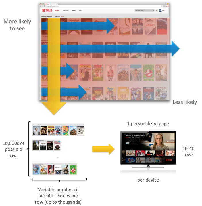
They follow the same exercise with media title pages as well. Within these pages, Netflix personalizes what titles are we most likely to watch, the thumbnails we see on them, what title text entices us to click, or if social proof helps make our decision easier, and so on. And this is just the tip of the iceberg.
A/B Testing in eCommerce Industry
Through A/B testing, online stores can increase the average order value, optimize their checkout funnel, reduce cart abandonment rate, and so on. You may try testing: the way shipping cost is displayed and where, if, and how the free shipping feature is highlighted, text and color tweaks on the payment page or checkout page, the visibility of reviews or ratings, etc.
In the eCommerce industry, Amazon is at the forefront in conversion optimization partly due to the scale they operate at and partly due to their immense dedication to providing the best customer experience. Amongst the many revolutionary practices they brought to the eCommerce industry, the most prolific one has been their ‘1-Click Ordering’. Introduced in the late 1990s after much testing and analysis, 1-Click Ordering lets users make purchases without having to use the shopping cart at all.
Once users enter their default billing card details and shipping address, all they need to do is click on the button and wait for the ordered products to get delivered. Users don’t have to enter their billing and shipping details again while placing any orders. With the 1-Click Ordering, it became impossible for users to ignore the ease of purchase and go to another store. This change had such a huge business impact that Amazon got it patented (now expired) in 1999. In fact, in 2000, even Apple bought a license for the same to be used in their online store.

People working to optimize Amazon’s website do not have sudden ‘Eureka’ moments for every change they make. It is through continuous and structured A/B testing that Amazon is able to deliver the kind of user experience that it does. Every change on the website is first tested on their audience and then deployed. If you were to notice Amazon’s purchase funnel, you would realize that even though the funnel more or less replicates other websites’ purchase funnels, each and every element in it is fully optimized, and matches the audience’s expectations.
Every page, starting from the homepage to the payment page, only contains the essential details and leads to the exact next step required to push the users further into the conversion funnel. Additionally, using extensive user insights and website data, each step is simplified to their maximum possible potential to match their users’ expectations.
Take their omnipresent shopping cart, for example.
There is a small cart icon at the top right of Amazon’s homepage that stays visible no matter which page of the website you are on.
The icon is not just a shortcut to the cart or reminder for added products. In its current version, it offers 5 options:
- Continue shopping (if there are no products added to the cart)
- Learn about today’s deals (if there are no products added to the cart)
- Wish List (if there are no products added to the cart

- Proceed to checkout (when there are products in the cart)
- Sign in to turn on 1-Click Checkout (when there are products in the cart)
With one click on the tiny icon offering so many options, the user’s cognitive load is reduced, and they have a great user experience. As can be seen in the above screenshot, the same cart page also suggests similar products so that customers can navigate back into the website and continue shopping. All this is achieved with one weapon: A/B Testing.
A/B Testing in Travel Industry
Increase the number of successful bookings on your website or mobile app, your revenue from ancillary purchases, and much more through A/B testing. You may try testing your home page search modals, search results page, ancillary product presentation, your checkout progress bar, and so on.
In the travel industry, Booking.com easily surpasses all other eCommerce businesses when it comes to using A/B testing for their optimization needs. They test like it’s nobody’s business. From the day of its inception, Booking.com has treated A/B testing as the treadmill that introduces a flywheel effect for revenue. The scale at which Booking.com A/B tests is unmatched, especially when it comes to testing their copy. While you are reading this, there are nearly 1000 A/B tests running on Booking.com’s website.
Even though Booking.com has been A/B testing for more than a decade now, they still think there is more that they can do to improve user experience. And this is what makes Booking.com the ace in the game. Since the company started, Booking.com incorporated A/B testing into its everyday work process. They have increased their testing velocity to its current rate by eliminating HiPPOs and giving priority to data before anything else. And to increase the testing velocity, even more, all of Booking.com’s employees were allowed to run tests on ideas they thought could help grow the business.
This example will demonstrate the lengths to which Booking.com can go to optimize their users’ interaction with the website. Booking.com decided to broaden its reach in 2017 by offering rental properties for vacations alongside hotels. This led to Booking.com partnering with Outbrain, a native advertising platform, to help grow their global property owner registration.
Within the first few days of the launch, the team at Booking.com realized that even though a lot of property owners completed the first sign-up step, they got stuck in the next steps. At this time, pages built for the paid search of their native campaigns were used for the sign-up process.
Both the teams decided to work together and created three versions of landing page copy for Booking.com. Additional details like social proof, awards, and recognitions, user rewards, etc. were added to the variations.
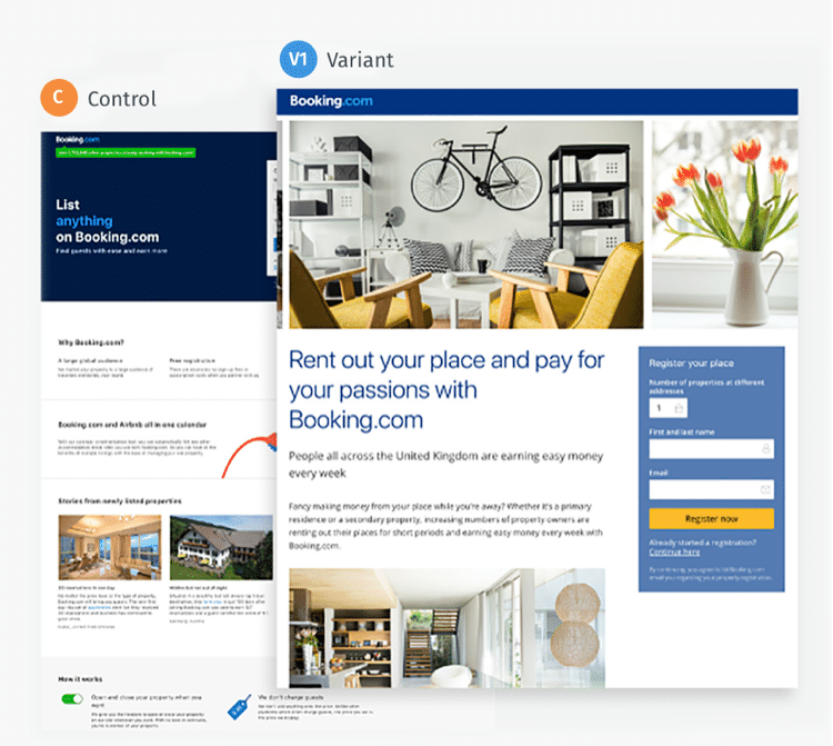
The test ran for two weeks and produced a 25% uplift in owner registration. The test results also showed a significant decrease in the cost of each registration.
A/B Testing in B2B/SaaS Industry
Generate high-quality leads for your sales team, increase the number of free trial requests, attract your target buyers, and perform other such actions by testing and polishing important elements of your demand generation engine. To get to these goals, marketing teams put up the most relevant content on their website, send out ads to prospect buyers, conduct webinars, put up special sales, and much more. But all their effort would go to waste if the landing page which clients are directed to is not fully optimized to give the best user experience.
The aim of SaaS A/B testing is to provide the best user experience and to improve conversions. You can try testing your lead form components, free trial sign-up flow, homepage messaging, CTA text, social proof on the home page, and so on.
Their website homepage and Contact Us page are the most important pages in their funnel. The team at POSist wanted to reduce drop-off on these pages. To achieve this, the team created two variations of the homepage as well as two variations of the Contact Us page to be tested. Let’s take a look at the changes made to the homepage. This is what the control looked like:
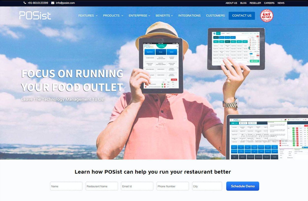
The team at POSist hypothesized that adding more relevant and conversion-focused content to the website will improve user experience, as well as generate higher conversions. So they created two variations to be tested against the control. This is what the variations looked like:
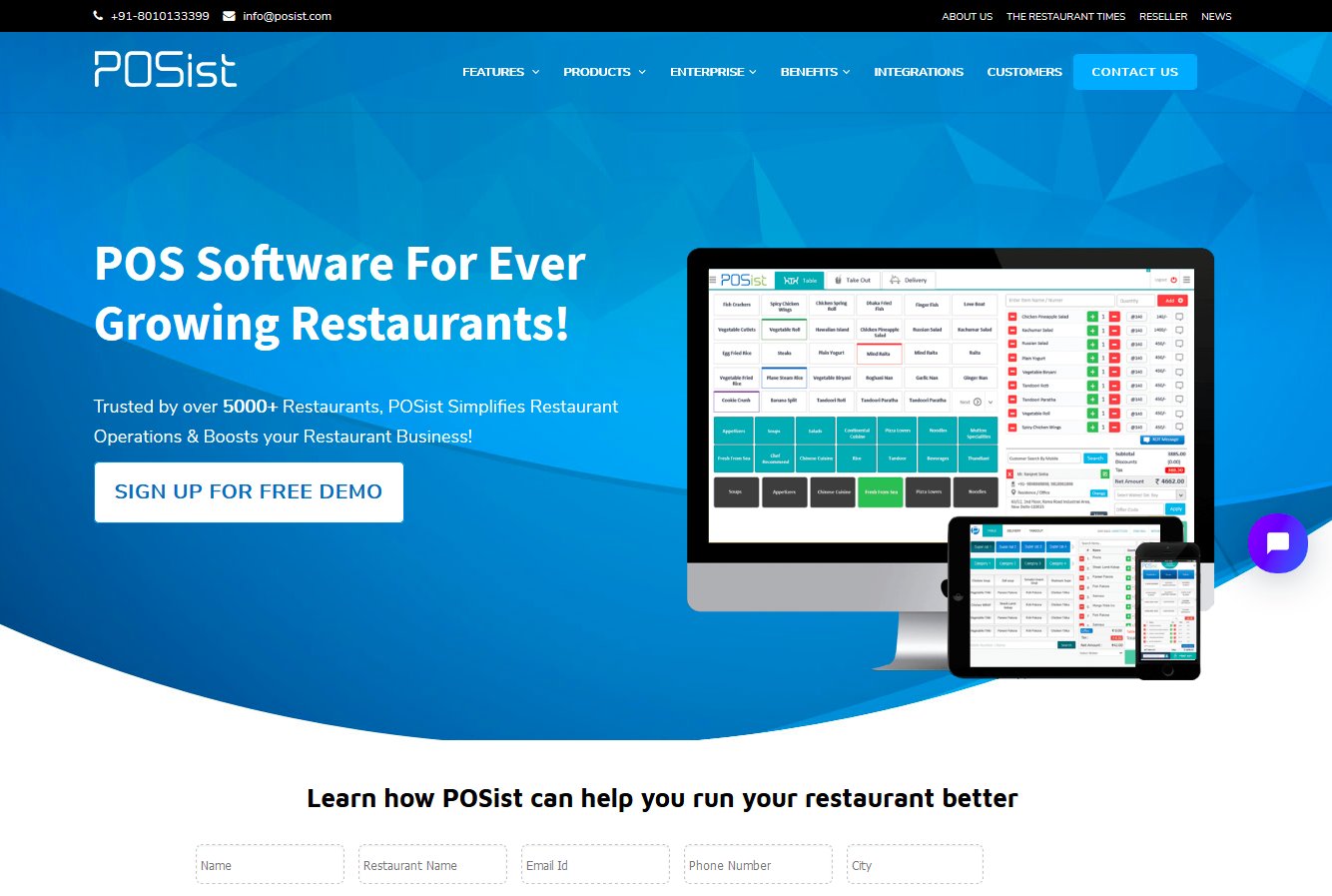
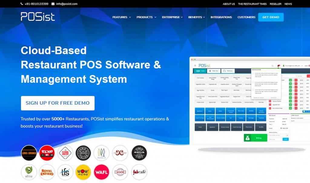
Control was first tested against Variation 1, and the winner was Variation 1. To further improve the page, variation one was then tested against variation two, and the winner was variation 2. The new variation increased page visits by about 5%.
Conclusion
After reading this comprehensive piece on A/B testing, you should now be fully equipped to plan your own optimization roadmap. Follow each step involved diligently and be wary of all major and minor mistakes that you can commit if you do not give data the importance it deserves. A/B testing is invaluable when it comes to improving your website’s conversion rates.
If done with complete dedication, and with the knowledge you now have, A/B testing can reduce a lot of risks involved when undertaking an optimization program. It will also help you significantly improve your website’s UX by eliminating all weak links and finding the most optimized version of your website.
If you found this guide useful, spread the word and help fellow experience optimizers A/B test without falling for the most common pitfalls. Happy testing!
Frequently asked questions on A/B testing
A/B testing is the process of comparing two variations of a page element, usually by testing users’ response to variant A vs. variant B and concluding which of the two variants is more effective.
In digital marketing, A/B testing is the process of showing two versions of the same web page to different segments of website visitors at the same time and then comparing which version improves website conversions.
There are various reasons why we do A/B testing. A few of them include solving visitor pain points, increasing website conversions or leads, and decreasing the bounce rate. Please read our guide to know the rest of the reasons.
In A/B testing, traffic is split amongst two or more completely different versions of a webpage. In multivariate testing, multiple combinations of a few key elements of a page are tested against each other to figure out which combination works best for the goal of the test.


