
CellBell Improved Revenue With Mobile UX Improvements Across Three Funnel Stages
About CellBell
CellBell is a leading Indian brand offering ergonomic office chairs, gaming chairs, and a wide range of seating solutions built for comfort, support, and durability.
With an affordable yet quality-driven product lineup, CellBell has earned a strong following among Indian consumers seeking chairs for long hours of work and gaming.
CellBell partnered with ConvertPolo to optimize its mobile shopping experience, identify friction across its funnel, and run structured experiments to address it.
ConvertPolo, a VWO partner agency, brings a data-driven approach that enables brands like CellBell to spot friction, test solutions, and build shopping experiences that convert.
Why VWO?
Experimentation is at the core of how we grow, and VWO gives us the infrastructure to do it well. The depth of insight we get into user segments has sharpened our decision-making and helped us consistently deliver better outcomes for our clients.

Anirban Chakraborty
Founder & CEO
Goals
The goal was to optimize every stage of CellBell’s mobile funnel so users could find products faster, evaluate them with confidence, and complete their purchase without hesitation.
Observations
CellBell’s mobile traffic was healthy, but users weren’t converting at the rate the team expected. A closer look revealed friction at three distinct stages of the journey:
- Product Detail Page (PDP): Critical information such as dimensions, weight capacity, assembly time, and delivery timelines was either buried or unclear, leaving users with unanswered questions at the moment they needed confidence to buy.
- Product Listing Page (PLP): Weak visual hierarchy and low CTA prominence made browsing feel effortful rather than intuitive.
- Home page: In the first fold, users could see just one category tile at a time. This meant they had to scroll multiple times to explore different categories, making it a very time-consuming process.
Together, these issues stalled the user journey and created friction in the funnel.
Tests run
ConvertPolo used VWO Testing – Web to run a focused set of experiments across CellBell’s mobile experience.
Test 1: Product detail page revamp
On the original page, key product details such as dimensions, weight capacity, and assembly time were not immediately visible.
Trust signals were not prominent, and the add-to-cart button was not consistently accessible as users scrolled.
ConvertPolo hypothesized that the following changes would reduce hesitation and drive faster purchase decisions:
- Surface critical specifications in the first fold
- Strengthen trust signals
So, the team placed key specs front and center, added a ‘Best Seller’ tag to relevant products, and introduced thumbnail navigation for users.
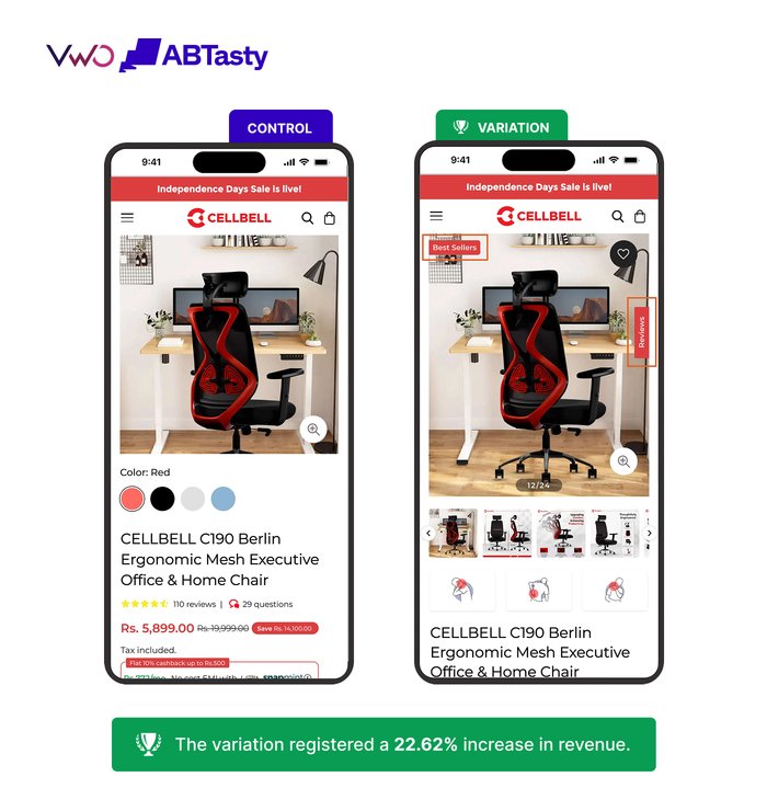
Finally, they ran an A/B test with this revamped version to confirm their hypothesis.
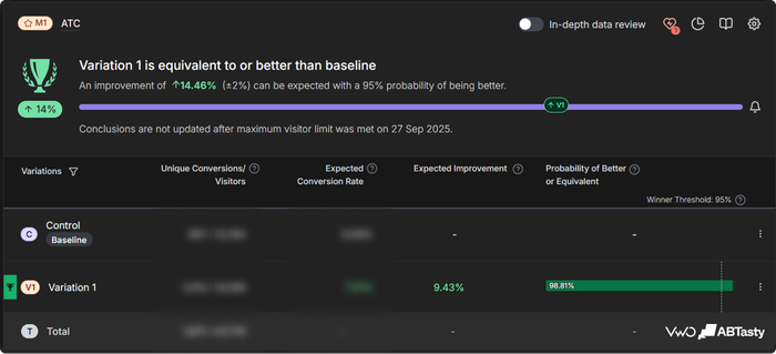
Result: 22.62% increase in revenue and a 9.43% uplift in the add-to-cart rate.
Test 2: Product listing page optimization
Users were finding it difficult to compare products on the product listing page.
On the one hand, the product cards lacked a strong visual hierarchy, while on the other, the pricing details and badges were not prominent enough.
Additionally, the CTA failed to draw enough attention, making it harder for users to browse decisively.
The team hypothesized that improving card structure and strengthening CTA prominence would lead to more intentional browsing and higher purchase intent.
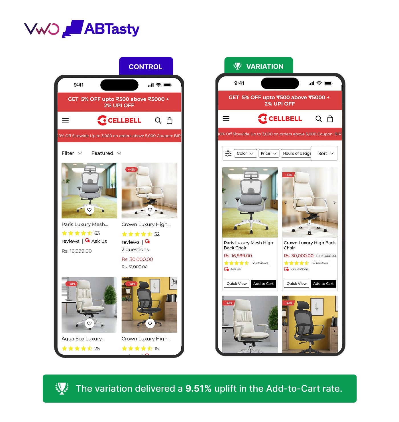
Based on these insights, they ran an A/B test with a cleaner card layout, better-prioritized information, and a more prominent call to action.
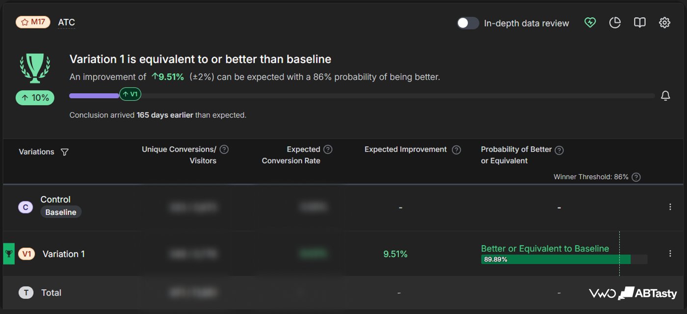
Result: 9.51% increase in the add-to-cart rate.
Test 3: Homepage category visibility
In the original version of the homepage, users could only see one category tile at a time in the first fold, forcing them to scroll further before they could meaningfully explore.
This extra step added unnecessary friction at the very start of the journey.
Hence, it was hypothesized that displaying multiple category tiles together in the first fold would enable users to dive deeper into the catalog with less effort.
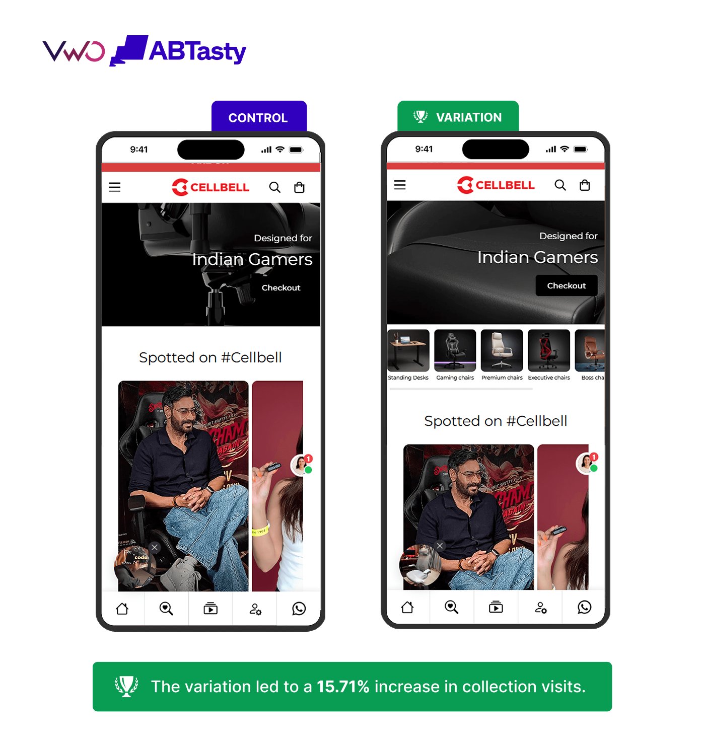
They ran an A/B test with a variation that displayed multiple category tiles, giving users an immediate overview of what CellBell had to offer.
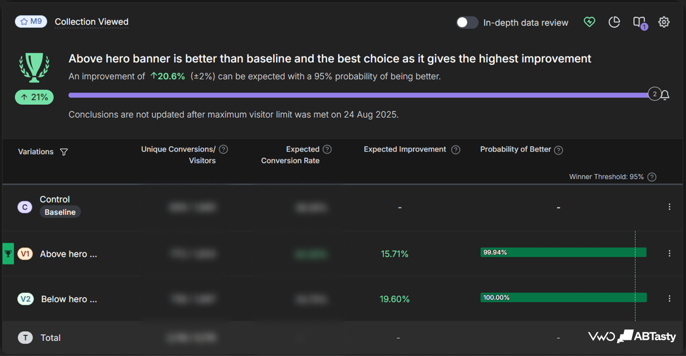
Result: 15.71% increase in collection visits and 9.85% growth in the add-to-cart rate.
Overall impact
Across three experiments targeting three distinct stages of the funnel, CellBell’s mobile experience went from hesitant to confident.
- Better product information reduced evaluation friction.
- A clearer browsing structure made decisions easier.
- Stronger category visibility enabled users to explore more before they even reached a product page.
This led to a 22.62% growth in revenue, a 28.79% increase in the add-to-cart rate, and a 15.71% uplift in collection visits.
Conclusion
CellBell’s results show what’s possible when experimentation is applied thoughtfully across the full user journey.
ConvertPolo used VWO to address challenges in product discovery, browsing, and product evaluation, enabling users to navigate with ease and buy with confidence.
Schedule a demo to see how VWO can help you build a more conversion-focused experience.

Location
India
Industry
eCommerce
Experiment goals
Improve conversions across the mobile shopping funnel
Impact
22% increase in mobile revenue