How iTokri Increased Revenue by Improving the Mobile Shopping Experience
About ITokri
iTokri is an online platform that curates and sells handcrafted products made by Indian artisans. With a focus on ethical sourcing and traditional craftsmanship, it offers fabrics, apparel, home décor, jewelry, and accessories to customers in India and around the world.
Despite a strong product catalog, iTokri’s mobile shopping experience presented several opportunities for improvement across product discovery, category navigation, and product evaluation.
To better understand these challenges and improve conversion performance, they partnered with ConvertPolo. Using VWO as its experimentation platform, ConvertPolo designed and implemented a series of UX experiments across the mobile customer journey.
Why VWO
What I love about VWO is that it has raised the bar for how we experiment and grow. The combination of robust testing capabilities and deep user insights helps us make decisions based on accurate data. We’ve seen a measurable impact on how quickly we iterate and how confidently we scale.

Anirban Chakraborty
Founder & CEO
Goals
The primary objective was to improve the mobile shopping experience and remove barriers that prevented users from discovering products and completing purchases.
Specifically, the team aimed to:
- Improve product discovery and category engagement
- Simplify navigation across the mobile experience
- Increase add-to-cart actions
- Improve eCommerce conversion rates
- Drive sustainable revenue growth through experimentation
Observations
Following a detailed analysis of iTokri’s mobile shopping experience, ConvertPolo identified strong opportunities for improvement:
- Product categories were not immediately visible on the homepage, forcing users to navigate deeper before discovering relevant collections.
- The mobile navigation displayed product categories as simple text, which did not resonate with shoppers as they struggled to quickly understand the available categories and offerings.
- Product Detail Pages (PDPs) lacked key persuasion elements such as trust indicators, review visibility, intuitive product galleries, and prominent calls-to-action, creating friction during purchase decisions.
Tests run
ConvertPolo optimized key touchpoints across the mobile customer journey through a series of experiments conducted on VWO Testing – Web.
Test 1: Introducing product category tiles on the homepage
The control homepage primarily displayed individual products, with key categories accessible only through navigation or additional browsing.
The homepage variation introduced prominent visual category tiles near the top of the page. These tiles provided direct access to key product collections and were positioned before the main product listings. The redesign also incorporated a more structured homepage layout to help users quickly identify areas of interest and begin exploring products.
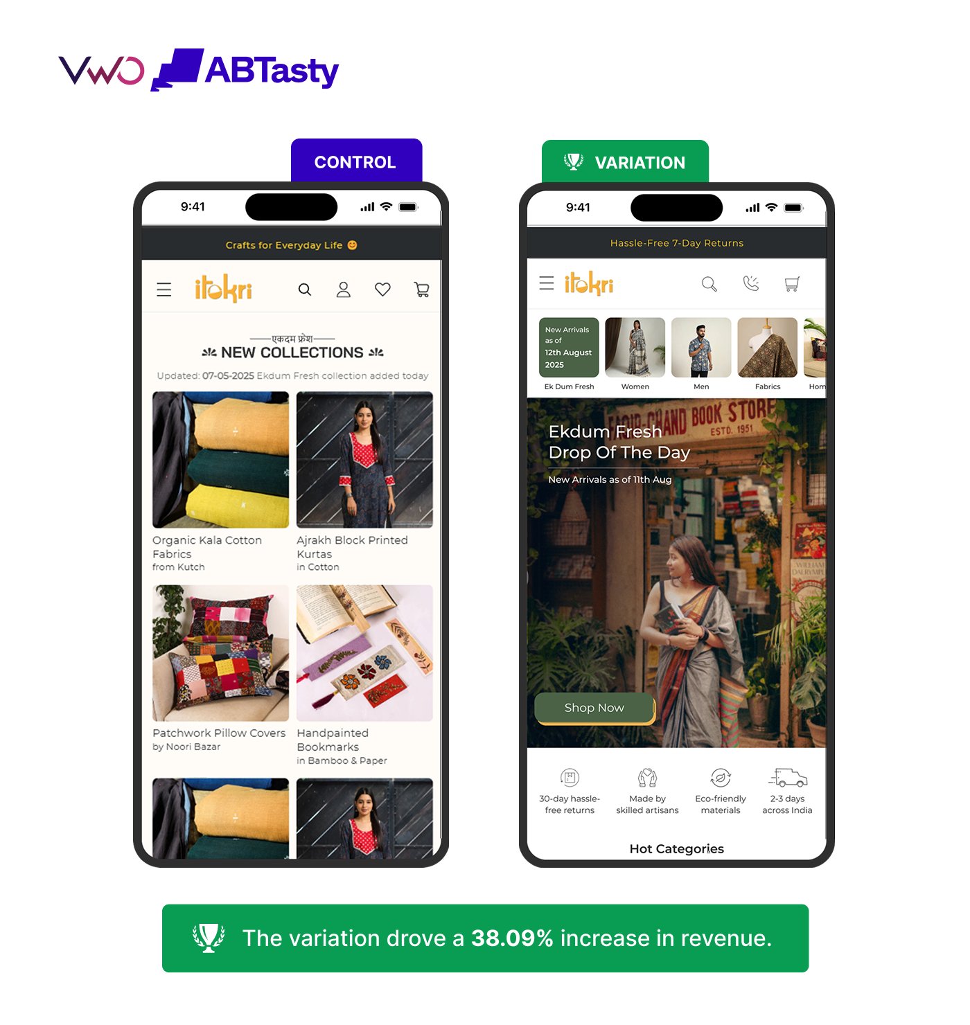
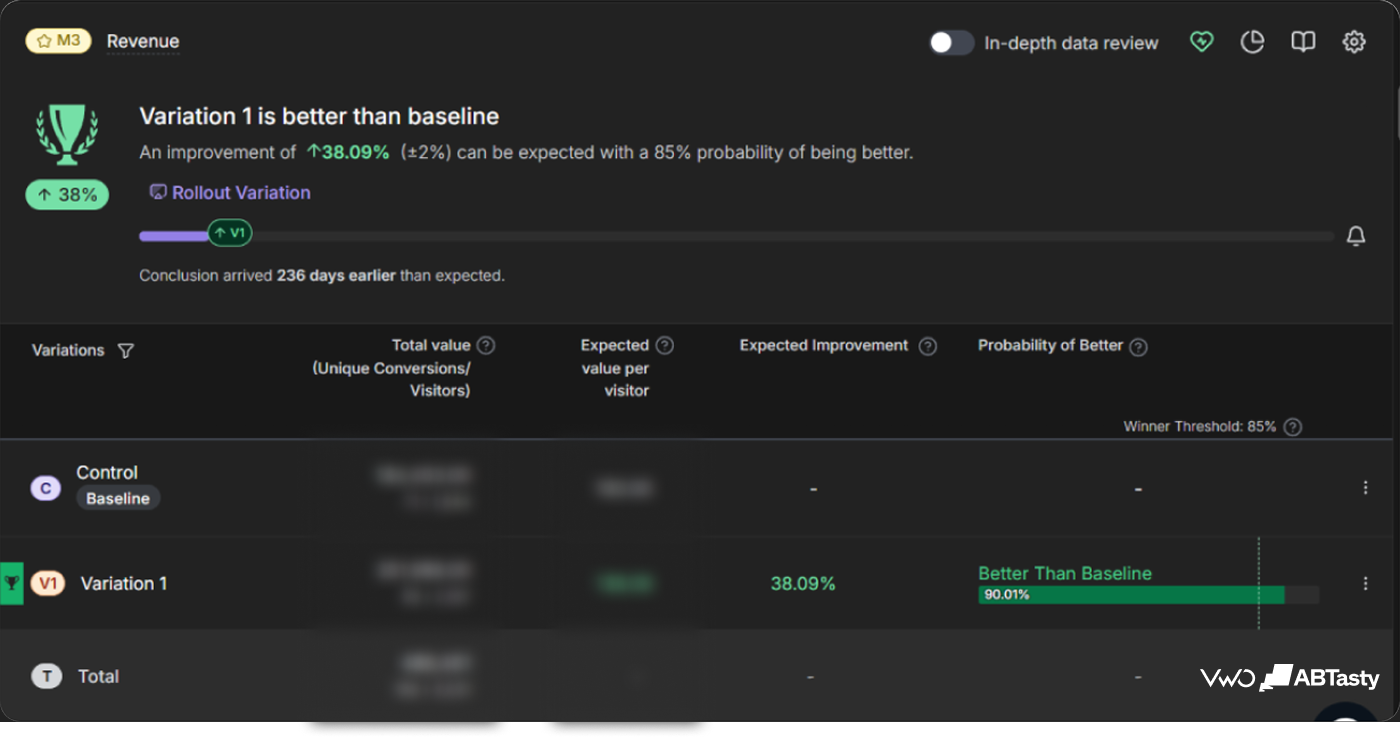
Result: The variation resulted in a 12.82% increase in conversion rate, a 38.09% increase in revenue, and an 18.88% increase in category engagement.
Test 2: Simplifying product category exploration with visual hamburger menus
The original mobile navigation menu presented categories as a text-only list. Without visual context, users often struggled to understand category offerings and navigate confidently.
In the variation, the text-only menu was replaced with a visually rich layout featuring category images and labels. By showcasing representative visuals for categories such as Women, Men, Fabrics, and Home & Decor, the redesigned menu made it easier for shoppers to recognize collections and explore products easily.
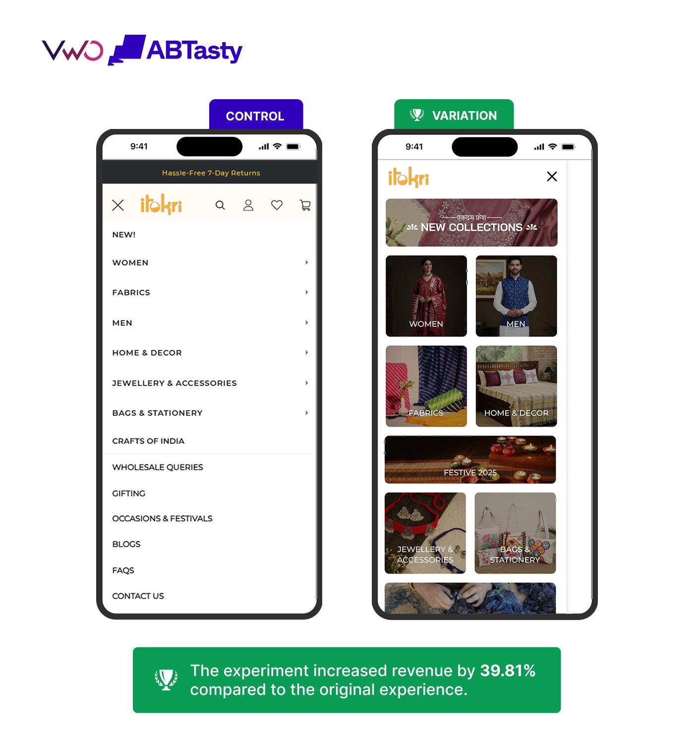
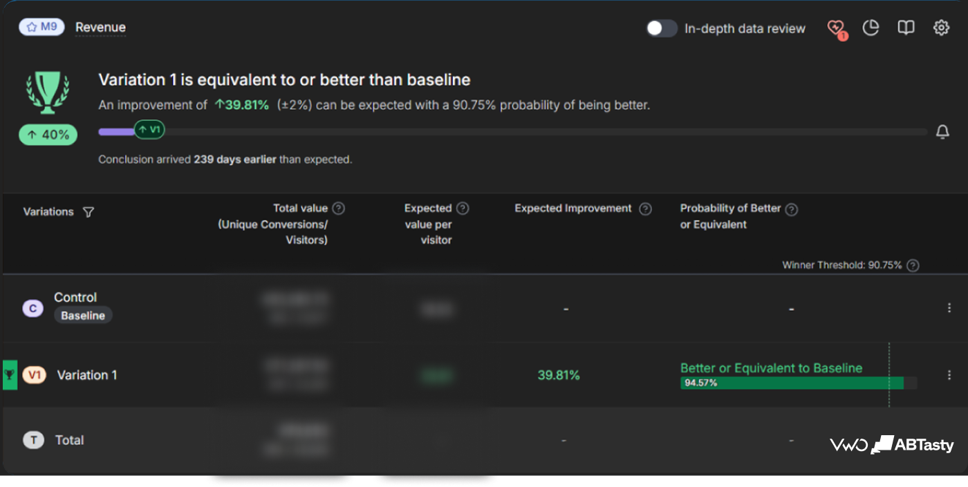
Result: The experiment generated an 8.97% uplift in conversion rate and a 39.81% increase in revenue compared to the original experience.
Test 3: Redesigning the PDP to reduce purchase friction
Previously, the PDP focused primarily on the product image, basic product information, and pricing. Important decision-making elements such as customer reviews, product thumbnails, and prominent purchase actions were either absent or not easily accessible,
To give shoppers more context and reduce friction in decision-making, the redesigned PDP included:
- Prominent customer reviews and ratings
- A sticky add-to-cart button
- Improved image galleries and thumbnails
- Product-related navigation elements
- A cleaner mobile-first layout optimized for product evaluation
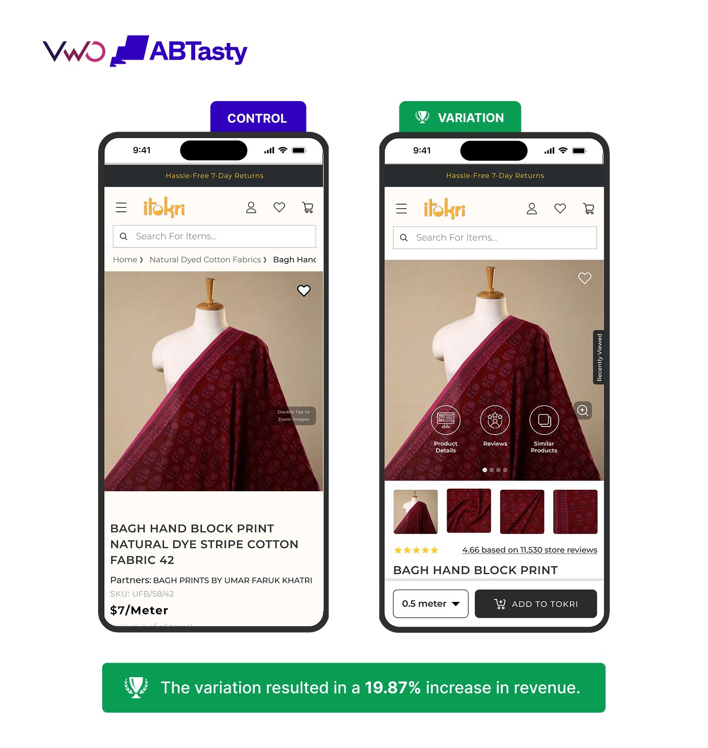
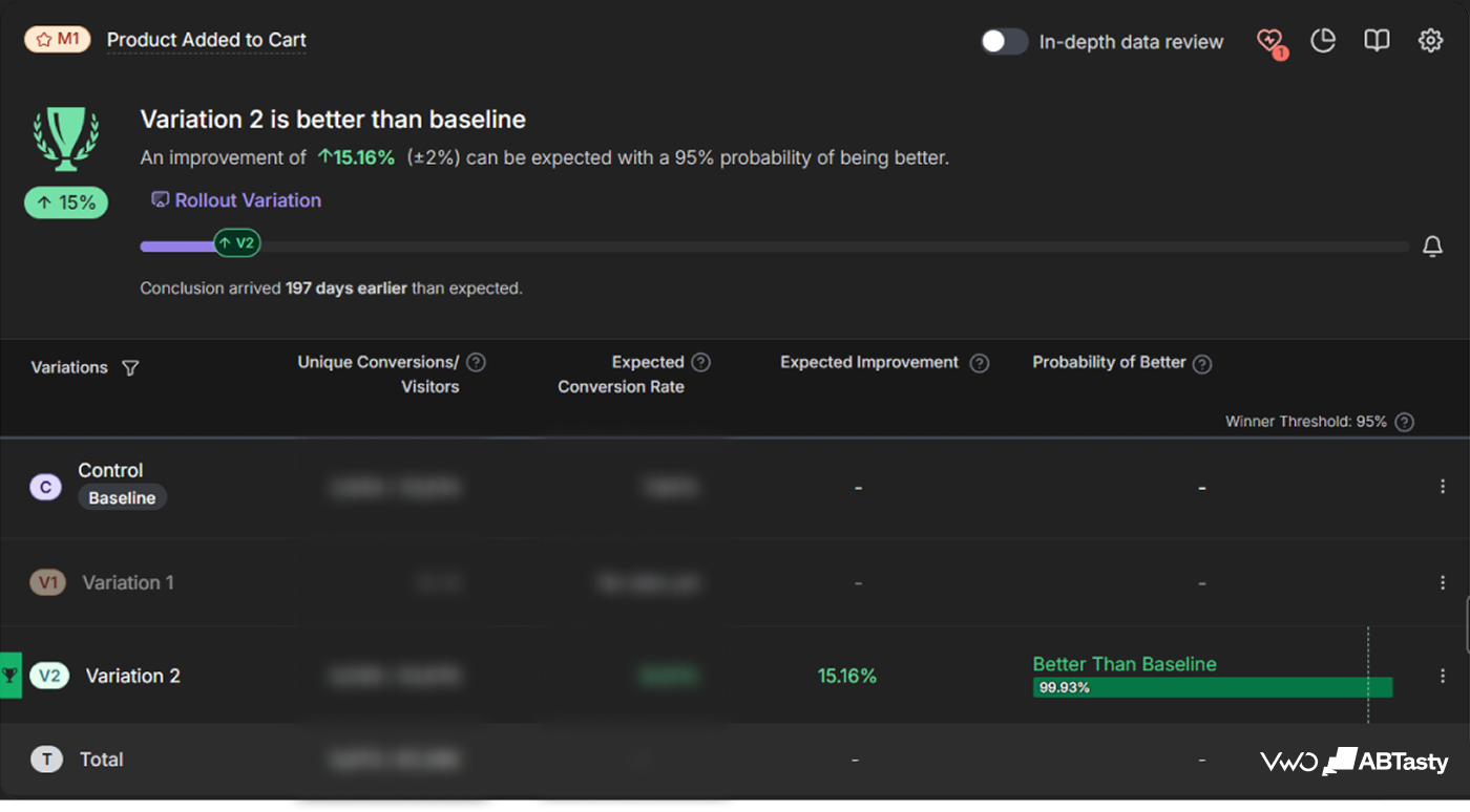
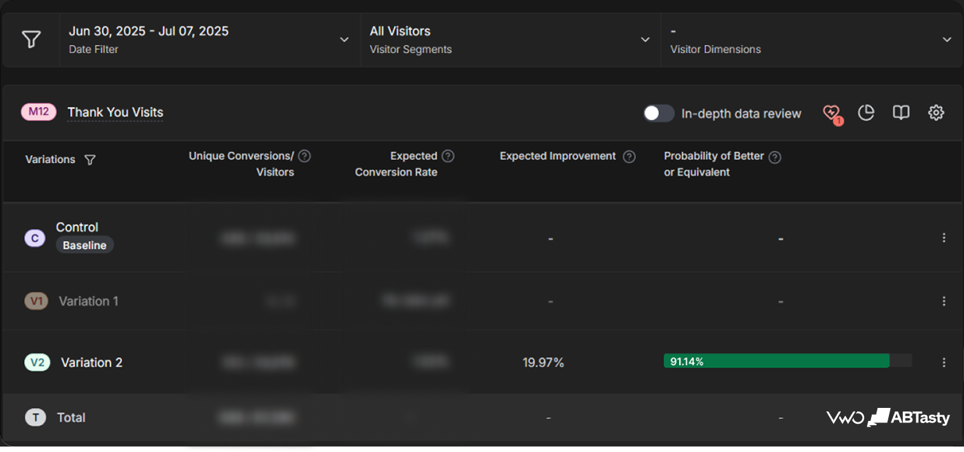
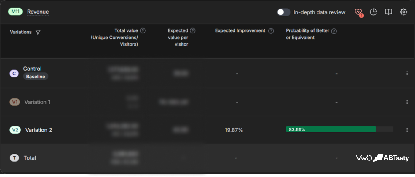
Results: The variation resulted in a 15.16% increase in add-to-cart rate, a 19.97% increase in conversion rate, and a 19.87% increase in revenue.
Overall impact
Together, these experiments improved product discovery, navigation efficiency, and purchase confidence across the mobile shopping journey.
The combined impact generated:
- 15.16% increase in Add-to-Cart actions
- 41.76% growth in eCommerce conversion rate
- 98% increase in revenue
Conclusion
iTokri’s experimentation program demonstrates how targeted UX improvements can drive meaningful business outcomes without requiring a complete site redesign.
By making categories easier to discover, improving navigation clarity, and optimizing product evaluation experiences, the team reduced friction at critical stages of the customer journey. Each experiment addressed a different aspect of the mobile experience, but together they contributed to significant gains in engagement, conversion, and revenue.
Throughout the optimization process, VWO enabled ConvertPolo to launch experiments efficiently, validate ideas with confidence, and make data-backed decisions at every stage of the customer journey.
Start a free trial or request a demo to see how VWO can help your team test faster, learn quicker, and optimize every step of the customer experience.
Location
Gwalior
Industry
Retail
Experiment goals
Increase purchase intent across the mobile shopping journey
Impact
98% increase in revenue