How 160 Driving Academy A/B Tested Website Images To Increase Conversions
About 160 Driving Academy
Illinois-based 160 Driving Academy offers truck-driving classes and even guarantees a job on graduation. To contact the academy, visitors primarily used the contact form on the home page or called the prominently displayed phone number.
To improve the conversion rate on its truck-driving classes page, the academy reached out to Spectrum Inc, a lead-generation software and internet marketing company that is a certified VWO partner.
Goals
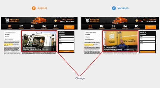
On its home page, the academy had been using the stock image of a man driving a truck. Spectrum Inc decided to test the page with the photograph of a real student instead.
The rationale behind the hypothesis was that the image of an actual student would increase trust level and should, therefore, outperform the stock image the academy had been using.
…in this case we had a branded photo of an actual 160 Driving Academy student standing in front of a truck available, but we originally opted not to use it for the page out of concern that the student’s ‘University of Florida’ sweatshirt would send the wrong message to consumers trying to obtain an Illinois, Missouri, or Iowa license. (These states are about 2,000 kilometers from the University of Florida).

Brian Mckenzie
Senior PPC Manager
Two conversion goals were targeted by the test:
The primary conversion goal: Number of visits to the Thank You page. These are the pages that visitors are taken to after they fill out a conversion form on the main page, such as the Contact Us form.
The secondary conversion goal: Number of visits to the Registration page. The academy carries a CTA button on its page that says “Register for Classes.” A conversion would be recorded every time a visitor clicked the button and visited the Registration page.
Tests run
Spectrum Inc decided to run an A/B test.
Here are the control and variation used for the test.

Conclusion
The test results were impressive. The primary conversion goal, which was the number of visits to the Thank You page, went up by 161%. The 98% confidence level associated with the result meant that the probability of this jump in conversions being random and not because of the variation being more effective was only 2%.
The secondary goal, which was the number of visits to the Registrations page saw a 38.4% increase. Here too, the confidence level was an impressive 98%.
With VWO as an a/b testing platform, you can easily validate your redesign ideas through A/B testing. Take a free trial to check out for yourself!
As always, it is useful to understand the art and science behind the role images play in user experience. Even on websites, an image is worth a thousand words. But not any image–it must be relevant to the target audience and the business, and as far as possible, must be unique.
Here’s why:
Concepts learned in the form of images are more easily and frequently recalled than other ideas learned through text. Wikipedia explains that this effect is more pronounced in older people. So if your business targets people older than 25+, images are a great way to pass on brand-related information for better recall.
Images are processed 60,000 times faster compared to text. Billion Dollar Graphics explains, and I quote, “human brain deciphers image elements simultaneously, while language is decoded in a linear, sequential manner taking more time to process.” This is illustrated in the following image.

See how much easier it is to understand from the image than from its textual description that that the reference is to a square? If you are in the mood for some serious reading, I strongly recommend this incredibly insightful post on the power of visual communication.
This frequently quoted eye tracking study from NN also confirms that we spend more time on images on a webpage rather than on the text itself.
A test of an “About Us” page that contained thumbnail portraits of each of the members of the team found this: “Here, the user spent 10% more time viewing the portrait photos than reading the biographies, even though the bios consumed 316% more space. It’s obvious from the gaze plot that the user was in a hurry and just wanted to get a quick overview of the FreshBooks team, and looking at photos is indeed faster than reading full paragraphs.”
Evidently, people focus more on images on a page than on the text itself. And they retain it longer. The case for images cannot be overemphasized.
Now that we understand the importance of images in the context of websites, let’s look again at the 160 Driving Academy home page—the images used originally and in the more effective variation.
The original page had an image—but yet, conversions were low. This can be attributed to three factors.
We love ignoring images that look stock
Stock images were a rage back in the late 90s, when taking a good picture was best left to professionals with complex, expensive cameras. Naturally, online businesses that were just starting out had to resort to relatively inexpensive and definitely good-looking stock photos.
Here’s the issue: we have been exposed to banner advertisements for so long that our eyes have gotten trained to ignore any web element that evokes the feel of an advertisement. The adage “familiarity breeds contempt” holds true and banner blindness has been confirmed to be a real phenomenon in numerous studies.
Stock images are not unique
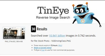
I popped the stock image from the client’s old home page into TinEye, a reverse image search engine; and this is what it threw up.

That’s 30 other instances on the webpage where the same stock photo was found.
Just to bring home the point, here’s what Google Image Search found for me.

175 results! So much for uniqueness and product differentiation. There are more of that image. How’s that a big deal, you might ask. Where do you suppose the stock image of a man driving a truck would figure on the web?
Here are a few examples.

The same stock image is likely to be found on the websites of other businesses that are are also related to trucks; websites which your potential customer might have visited already. Google took just 0.45 seconds to find 175 places on the web where the image appeared. Human users would take longer, but they’ll get there eventually.
And when a potential customer sees a familiar image on your site, how would they judge your business and its credibility? How would anyone recollect seeing the same image somewhere in a corner of the web? Because we are super smart and can identify images seen for as little as 13 milliseconds. To put that in perspective, the time we take to blink once is about 300–400 milliseconds.
Using stock images, in and of itself, is not the real problem. There are ways to use good, relevant stock images without running into the problem of duplicates; like having a Rights Managed Licence. Instead, the real problem is:
Using irrelevant stock images
Stop being yourself for a moment; slip into the user’s shoes, and I promise we would see better. You are looking to get a truck licence. Google suggests you check out 160drivingacademy.com. So you do what you always do—you click and reach the site.
Now, remember, you form the first impression of a website in 50 milliseconds. And you’d typically leave a website in 10–20 seconds unless you find a good reason to linger on. What you are looking for is relevance, a sort of a validation that you are in the right place.
You scan the page and see the image of a man in the truck. But what information do you actually glean?
- How established is the place?
- Does the academy look credible?
- Why is there a severely cropped image of a man sitting inside a truck?
- Is he the coach?
Oh wait, no! I’ve seen this image before! The Verdict? I can’t trust these guys. Where’s the back button! And curtains down!
The variation with the real photo
Stay in the user’s shoes for a while longer, while we analyze the variation to understand why it converted visitors so much better.
It’s all about relevance
You know the drill: Google tells you, you listen, you are on the academy’s page; but it has the real image now.
“How does the place look?” “Don’t really know. But that’s a big truck. Branded and all. Place must be established.”

“Is it credible?” “Can’t be sure, but it looks real! That guy in the picture looks happy, he must be a student. I might even get to learn on one of those trucks in the picture!”
“Alright, no harm getting in touch with them. Now, how do I contact them?”
Enough said.
We love images that look real!
This study shows that users focus their attention on images that look genuine, the ones with real people and objects. Consequently, we ignore images that seem to only have decorative (read stock-ish) purposes. Real images evoke trust.
On a business site, users are not looking for emotional gratification. They are looking for hints, information about what they’d get if they decide to buy your product/service. A website that uses real images screams at its users, “This is exactly what you will get if you choose us! It’s great, and we know it!”
Get the trust, make the sale. Over the years, we’ve been so indiscriminately exposed to every kind of scam, sham, and spam, that we don’t trust easily. Least of all, on the internet. A website that reveals its offerings, plain, and clear leads us to believe there won’t be any nasty surprises. Hence, we trust.
Clever branding and the hidden call to action
What? Where?
Without the variation image, there was exactly one part of the site that called out “160 Driving Academy.” With the variation, there are three such places.
We’ve already seen how our eyes are drawn to images much quicker than it is to text. The variation image draws attention to itself, and in the few seconds that a visitors’ eyes stay on it, the mind picks up 2 strong branding signals. The brand name itself, and the color associated with it – yellow – generously splashed across the truck in the image. A deceptively simple way to make sure that even users who bounce off the first time remember the brand.
I wouldn’t be wrong in asserting that a considerable number of conversions resulted from users who revisited the page.
No, that’s not all.
A call to action – that little big thing.
“Call Today”

What better place to have it than in the image itself! That too, right next to the contact form. It gives the user direction on what’s to be done if they are interested in taking things ahead, and it creates urgency using the term “Today!”. So there, little relevant things matter.
Room for Further Testing
If you check the academy’s current page, you’ll see that the “Florida Gators” print has been edited out of the student’s sweatshirt. If you remember, Brian had pointed out how the reference to “Florida” might confuse prospects who are primarily from Illinois. Removing the “confusing” text from the image should improve conversions even better. Brian also pointed out that the average age of a student at the academy is close to 40, while the student in the image is closer to 25. From this context, Brian shares his vision for further testing: “..trying to narrow down whether pictures of actual customers, pictures of actual employees, or pictures of actual products/equipment/objects convert best. Then you can do more incremental tests, like whether a 40-year-old student would convert better than a 25-year-old or whether the student should be holding up his license or just standing in front of the truck.”
Take a free trial with VWO and take your optimization journey to the next level today!

Location
Evanston, USA
Industry
Services
Impact
161% increase in Conversion


