Optimizing for Mobile Users Gave Tough Mudder an Uplift in Session Value
About Tough Mudder
Tough Mudder offers mud and obstacle courses designed to test physical strength, stamina, and mental grit. Rather than timed competitive races, these team-based activities are meant to promote camaraderie and accomplishment as a community.
To ensure that enrolment on their mobile website was smooth and easy for their users, Tough Mudder partnered with VWO and altima°, a digital agency specializing in eCommerce.
Goals
altima° expected that customers on the mobile might not be able to discover events easily. Therefore, the core objective of taking up the optimization effort was to ensure easy identification of relevant events and seamless sign-ups for users.
Tests run
To identify hurdles in the participants’ paths to enrolment, altima° analyzed Tough Mudder’s Google Analytics (GA) data. An analysis of existing rates from the Event List indicated that interested shoppers were not able to identify the events appropriate for them.
Tough Mudder and altima° hypothesized that on the mobile version of the original page, the most relevant pieces of information such as the event location and date were being pushed too far down the fold. In addition, less relevant page elements were possibly distracting the users.
This is what the original mobile page looked like:

Clearly, Event Location and Date were way below in the fold. altima° decided to make the following changes to the variation:
1. Simplified header: The header copy was limited to focus on the listed events. The following image shows how this looked:

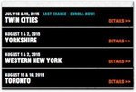
2. List redesign: Filter and event list were redesigned to prominently feature the events. The list was redesigned to optimize the event location and date. This is what it looked like:

3. Urgency message to push quicker enrolments: An urgency message was added to encourage interested users to enrol as the events approached their deadlines. The following image to shows how this was done:

Based on these 3 variations, 7 different combinations were created. A multivariate test was run by using VWO. The test led to over 2,000 event sign-ups across 4 weeks. The tests also involved addition of social proof like Facebook icons.
Following is the list of combinations that were made:

Conclusion
After 4 weeks, Variation 2, which included the control’s urgency message, header copy, and redesigned event list, had won. This is not to say that other test variations were not successful—just that Variation 2 was the MOST successful. The winning variation produced a session value uplift of 9%! Combined with the next 2 rounds of optimization testing, altima° helped Tough Mudder earn a session value uplift of over 33%!
altima° attributes the performance of Variation 2 because of the following reasons:
- Social proof and header copy
Social proof demonstrated itself to be a worthy component of conversion optimization initiatives. These often include customer reviews and/or indications of popularity across social networks.
Tough Mudder experienced a significant lift in the session value due to the test involving the addition of Facebook icons. It’s likely that the phrase “Our Events Have Had Over 2 Million Participants Across 3 Continents” warranted its own kind of social proof. - List redesign
The most ambitious testing element from a design and development standpoint was also the most successful.
It appeared that an unnecessary amount of real estate was being afforded to the location filter. This was resolved by decreasing margins above and below the filter, along with removing the stylized blue graphic.
The events themselves now carried a more prominent position relative to the fold on mobile devices. The list itself was more easily readable, thanks to a light background and nondistracting text. - Urgency message
It was believed that the urgency message would prove to be valuable. The underperformance of this element came as a surprise.
Something to consider is that not every event included an urgency message. Also, not every enrolment period was to close soon. Therefore, it may have been the case that customers whose individually relevant events were not closing soon may have put off the decision till later. It might also have been that an urgency message was introduced too early in the steps to event enrolment.
Nonetheless, the experience reinforced the benefits of A/B testing by using specific hypotheses supported by VWO tools.

Location
New York, US
Industry
Health
Experiment goals
Increase in session value
Impact
9% increase in session uplift


