Follow us and stay on top of everything CRO
Read summarized version with
No matter what industry you belong to, a significant portion of your target audience uses their mobile phones to visit your app or website.
Having a dedicated strategy to convert these users into customers is a no-brainer given that mobile users tend to behave differently than regular desktop users.
In this blog, we will understand more about mobile CRO and look at some effective strategies to improve the conversion rate on mobile.

What is mobile conversion rate optimization?
Conversion rate optimization (CRO for mobile is all about optimizing the user experience on mobile devices and maximizing conversions. The goal is to analyze user behavior, identify roadblocks in their mobile journey, and optimize their digital experiences to increase the number of users who take the desired actions.
Now, these actions may vary depending on your business or industry.
If you manage an eCommerce business, the ideal conversion goal is to get the user to make a purchase. On the other hand, an online fitness app would want the user to sign up and book a fitness class.
Since every user navigates a website or app differently, you must build an optimized experience for every buyer persona based on their unique needs and behaviors.
No matter the end goal, implementing mobile conversion optimization strategies is a win-win as you not only understand the unique needs of your mobile users but you also have a better chance of converting them into customers.
Optimizing the mobile experience and aligning it with user expectations will eventually have a positive impact on key business metrics like conversion, retention, and, of course, revenue.
Why is mobile conversion rate optimization important?
Investing in CRO for mobile is essential for businesses looking to stay ahead of the competition in today’s digital landscape.
It not only improves the overall user experience but can also impact search engine rankings and contribute to increased mobile conversions and revenue.
Here are some crucial benefits of implementing a conversion rate optimization strategy for your mobile app or website.
1. Improved user experience
One of the most important benefits of CRO for mobile is that it helps you improve user experience like never before.
The most crucial aspects of CRO are research and analysis. Implementing CRO for mobile involves analyzing user behavior to identify areas that can be optimized.
By doing so, you can proactively identify critical friction points and optimize them to build a seamless experience for mobile users.
Effective mobile CRO allows you to build an app or mobile website that offers a positive experience and successfully persuades the user to take the desired action.
2. Increased conversions and revenue
The main purpose of mobile CRO is to increase the percentage of users who convert or take the desired actions on your app or website.
By implementing CRO strategies, businesses can easily identify and address potential barriers to conversion for mobile users.
This, in turn, has a positive impact on key business metrics like average order value (AOV), cost of acquisition (CAC), and so on.
For instance, by implementing CRO for mobile, you can not only identify potential roadblocks in your checkout flow but you can also take appropriate measures to fix them so that more users take the required action.
Moreover, every decision taken in a CRO program gives you deeper insights into visitor behavior which you can leverage to improve various aspects of their experience.
3. Enhanced visibility in search engines
52% of users are less likely to engage with a brand that offers a poor mobile experience.
This is why Google and other top search engines prioritize mobile-friendly websites in their rankings.
As we saw earlier, one of the main benefits of any CRO program is that helps you to consistently improve user experience. Whether it is a first-time user or a returning one, an effective CRO program helps you to build an optimized experience that is relevant for every type of user.
Thus, an optimized user experience will eventually give your mobile website a much-needed SEO boost along with improved visibility on your target keywords.
4. Adaptation to mobile trends
With the increasing use of smartphones for online activities, businesses that invest in CRO for mobile stay ahead of the curve and align with evolving consumer behaviors.
Imagine a travel agency optimizing its website for mobile users.
By providing a seamless experience with easy mobile navigation, quick loading times, and mobile-friendly booking options, the agency can cater to travelers who prefer planning and booking their trips on a mobile device.
This adaptability ensures the business remains relevant and appealing to a wide range of customers.
5. Reduced bounce rate
A well-optimized mobile site ensures that visitors stay engaged and navigate through your content, reducing the bounce rate.
Consider an example of an online news platform that implements mobile CRO. With a mobile-friendly layout and quick access to articles, users are more likely to explore multiple web pages, reducing the likelihood of bouncing back to search results.
This increased engagement can also lead to higher ad impressions, subscription sign-ups, or other desired actions on the site.
How to improve the conversion rate on mobile devices?
Now that we’ve covered the importance of CRO for mobile, let’s look at the various strategies and ideas through which you can boost the conversion rate on mobile.
1. Optimize for the thumb zone
While most brands optimize for mobile and desktop users, you should take this further and optimize your app or website for their thumb zone.
As the name suggests, the thumb zone is an area on a mobile screen that is naturally and easily accessible to a person’s thumb.
Why should you bother doing this? Well, around 49% of users hold their mobile devices with one hand, meaning most of your mobile visitors use only their thumb to interact with the screen.
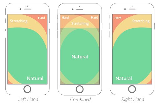
Image source – Smashing Magazine
This is an aspect of mobile optimization that is often overlooked by businesses, even though it is a crucial part of mobile device users.
Designing apps or mobile websites for thumb-driven interactions is the best way to build an optimized experience. What this means is that you must also focus on placing important elements and widgets within the thumb zone.
Moreover, you must also ensure that the commonly used gestures on mobile phones such as tap, pinch, swipe, and press are all placed within the thumb zone.
2. Reduce website load time
A delay of one second in mobile load times can impact your mobile conversions by up to 20%. Due to reduced attention spans, your visitors are more likely to abandon your site if it takes longer than a few seconds to load.
This is why brands must leverage CRO to optimize their apps and mobile websites. Let’s say, you manage the mobile website of a popular eCommerce home decor brand.
Lately, the site has been struggling with a high page load speed as well as an increase in bounce rate. To understand more about this problem, you decide to watch session recordings of the visitors who bounced within 3 seconds of landing on the site.
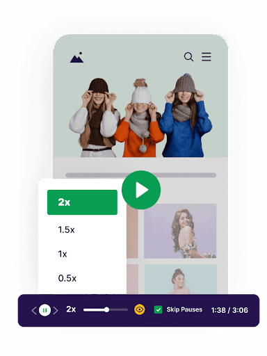
While doing so, you notice that even though the page is loading within the given time frame, the banner image that takes up the upper half of the screen fails to load in 3 seconds.
This is probably causing the visitors to leave the site and look for other options. To confirm this hypothesis, you can run an A/B test and compare the original version (control) with a new, redesigned version (variation) where you have completely removed the banner image.
This entire process can be a part of an ongoing CRO strategy where you:
- Conduct research to identify areas for improvement
- Create a hypothesis based on your observations
- Run a test to confirm your hypothesis
- Implement changes based on the test results
3. Opt for small doses of digestible information
There’s only so much content you can show on a mobile screen. Brands often make the mistake of adding too many elements, menus, or links to their screen, which ends up confusing the mobile user.
Also, users sometimes struggle to find a particular button or link on the screen and are forced to scroll or navigate a lot through the entire site.
This is a major pain point for mobile sites as it impacts navigation and usability too. A good way to overcome this challenge is to provide sticky menus or buttons with actionable links either at the top or bottom of the screen.
So, instead of being overwhelmed by too many buttons or links, users can simply access these elements to explore important sections of the site or app.
Moreover, you can also assist and guide your users by displaying mobile-friendly pop-ups at the right time. This prevents the need for excessive scrolling and allows you to provide a seamless, clutter-free experience to the users.
4. Focus on user intent and behavior
The foundation of any mobile CRO program is built on the research and analysis of user behavior. Before you focus on improving the mobile conversion rate, you must first understand how users interact with your site.
Additionally, you must also identify what exactly are your users trying to achieve when they arrive on your site or app. Do they wish to take a certain action or do they just want to explore the product?
By focusing on these aspects, you get a better idea of how well your site matches user intent, and more importantly, you understand how easy or difficult is it for users to take the desired actions.
Based on these insights about intent and behavior, you can identify areas where your users need assistance and make the necessary improvements to build an optimized experience.
This mobile CRO strategy will help you to optimize key areas or web pages such as the onboarding page, transaction page, landing page, and so on.
5. Use persuasive language for CTAs
Whether it’s making a purchase, downloading a PDF, or signing up for a newsletter, your CTA should instantly convey the value and benefit that users will get when they click on the button.
A strong and persuasive CTA should be one of the top goals of your conversion rate optimization strategy as it can make or break your CRO efforts.
Using persuasive language is one of the most popular CTA best practices, however, getting it right is a real challenge even for the most experienced marketers.
For starters, you can try to create a sense of urgency with your CTAs by using words like “now”, “limited time”, or “exclusive offer”. This type of persuasive language often drives users to take immediate action.
This strategy also involves tapping into the emotions or pain points of your users, allowing you to connect with them on a deeper level.
Finally, before you make changes to your existing CTAs, you must first run tests to compare them with the new ones. This is a crucial part of your mobile CRO program as it helps you make decisions that are based on actual data and mobile user behavior.
6. Improve the checkout flow
A crucial part of any conversion funnel is the checkout process. At this stage, the user is convinced of your offering and is ready to convert into a paid customer.
However, if users face any issues or challenges during this process, they might just abandon the entire purchase and will most likely never return to your brand. In fact, mobile users have the highest cart abandonment rate of about 85.65%.
This is why you must focus on improving the checkout experience on your app and website through mobile CRO. The best way to go about this is to conduct an in-depth analysis of the entire checkout flow and understand how users are interacting with it.
For example, you can watch session recordings of users who abandon a purchase on your mobile app and identify potential friction points that might be causing this behavior.
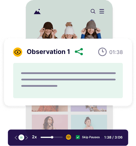
Once you discover these friction points, you can come up with a hypothesis to fix these problems and use mobile app testing to confirm your decision.
7. Focus on user privacy
Improving the different aspects of your mobile app and website is important, but what’s even more crucial for your users is privacy and trust.
Almost 84% of mobile users consider privacy or security of information as an important factor when deciding whether to install an app.
Users hate it when brands are not transparent about their privacy and data collection policies. This is a big concern especially when they are asked to share some personal information like mobile number, email ID, address, etc.
A good way to overcome this challenge is to use social proof like testimonials and genuine reviews from folks who have already done business with you.

Displaying these reviews on lead forms or important web pages makes it easier for a mobile user to take the next step. Moreover, you should also display the privacy badges and security certifications that you’ve received to reassure the user and gain their confidence.
8. Optimize for mobile-specific actions
Tap, pinch, zoom, swipe, scroll – these are the most common actions or gestures that mobile users rely on to navigate through mobile apps or websites effortlessly.
Incorporating responsive design elements that cater to these mobile-specific actions is crucial for enhancing the user experience.
For instance, making sure that product images can be easily zoomed in, or enabling a smooth swipe and scroll functionality for browsing through product sections, contributes to a more interactive and enjoyable mobile experience.
By aligning the design and functionality with the natural behaviors of mobile users, you not only make the interface more user-friendly but also increase the likelihood of users completing the desired actions, such as making a purchase or filling out forms, on their mobile devices.
CRO for mobile real-life examples
Let’s look at some case studies of businesses that used CRO to drive growth and optimize user experience on mobile devices.
1. A streaming platform increased subscription trials by 42% for mobile users
BluTV is Turkey’s leading OTT platform, offering a wide range of content, including award-winning original programs. The company follows a subscription-based business model and their primary goal is to get more visitors to sign up for a paid subscription trial.
While conducting research into visitor behavior, the team at BluTV noticed a significant difference between the conversion rate for mobile visitors and desktop visitors.
The team used website heatmaps to further analyze the behavior of mobile visitors and concluded that their current home page serves its active users more than the new visitors.

Based on these actionable insights, the team revamped their mobile home page and addressed the potential friction points identified during research.
For example, they kept only the logo and sign-in link in the header section, getting rid of all other distractions. They also included information about pricing in the hero section.

Moreover, they started promoting their most popular content in the next section and also added an FAQ section at the end of the page. The team then launched a Split URL test to test all these changes and compare the old version (original) against the new version (variation).

The test included close to 90k visitors and lasted around 19 days, as the new version ended up increasing the conversion rate for mobile visitors by over 42%.
2. A retail store increased conversions by 20% on its mobile website
Headquartered in Ontario, Walmart Canada is one of Canada’s largest retail companies and offers a wide collection of fashion, electronics, furniture, etc.
The company noticed that a large number of their visitors were coming from mobile devices, especially tablets.
However, the current version of their website was not optimized for mobile. Also, they realized that the load time was quite high on mobile devices while the overall look and feel of the site left a lot to be desired.
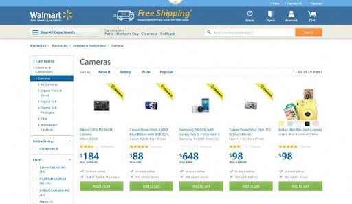
Image source: CXL
To overcome this challenge, the team started analyzing their data and identified the screen sizes, browsers, and devices that were used the most by their visitors.
Also, based on their previous research, they decided to completely revamp the mobile website and tried to improve the overall user experience.
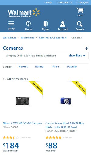
During this period, Walmart Canada also conducted A/B tests on various elements and also made changes to increase the load speed of the website.
For example, one of the changes they made was related to the presentation of product availability. The team identified products that were not available for online purchase and removed the ‘Add To Cart’ button for these specific products.

This simple change led to a boost in conversions and enhanced the user experience as well. Also, the new mobile website design resulted in a 20% increase in conversions on all devices, while the number of orders on mobiles increased by 98%.
3. An online forum for truckers improved conversion rate by 79.3%
TruckersReport is an online platform that connects professional truck drivers and helps them find various job opportunities. On the website’s original landing page, visitors were asked to fill up a form to get job recommendations through email.
The company wanted to improve the conversion rate and conducted a thorough analysis of the landing page with the help of various behavior analytics tools like heatmaps and session recordings.
During their research, the team at TruckersReport noticed that mobile visitors made up almost 50% of their total website traffic. Also, they realized that the headline of the page was too generic and did not address the pain points or needs of the truck drivers.

Image source: Single Grain
Based on these insights and observations, the team made various changes to the landing page and conducted tests to verify their hypotheses.
For example, one of the major changes was the fully responsive design of the page that was aimed towards mobile visitors. The team also tested a new headline, reduced the number of form fields, modified the layout, and replaced a generic stock photo with a compelling image of a truck driver.

The team created different iterations of each test and continued to gather insights from them. Due to these efforts, Truckers Report managed to achieve a conversion rate of 21.7%, which was 79.3% better than their original landing page.
VWO – The #1 platform for end-to-end mobile conversion rate optimization
Mobile users are evolving every day. Implementing a CRO strategy to boost your conversion rate is the ideal way to stay on top of these evolving trends and behaviors.
VWO Insights – Mobile App is an advanced mobile analytics tool that enables you to look beyond the generic mobile analytics data like bounce rate or session time and helps you understand the ‘why’ behind every user action.
With features like mobile heatmaps and mobile session recordings, you can see how a mobile user interacts with your app and discover the challenges or friction points that users encounter during their journey.
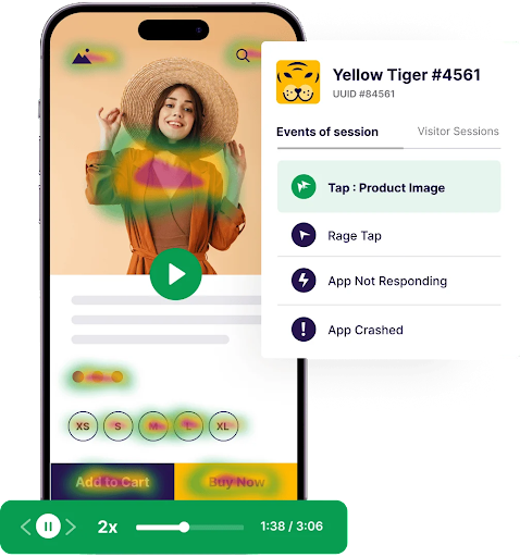
These are crucial insights that give you a complete view of a user’s journey and help you identify areas that need improvement or optimization.
Based on these insights, you can come up with certain hypotheses to improve the mobile experience. However, instead of directly making any changes to your app or website, you can use VWO Testing to run a test and confirm your hypothesis.
By doing so, you not only avoid falling into the trap of assumptions but also adopt a more data-driven optimization approach, which is the most crucial aspect of mobile CRO.
Do you want to get a first-hand experience of all these features and capabilities? Take a free trial with VWO right away and get ready to convert your mobile users into paying customers.


