
E-commerce Conversion Rate Optimization (8 Easy To Implement Tips)
Let me be honest – no one will buy your products at first sight.
The average conversion rate (percentage of website visits that end up with transactions) is around 2-4% across different industries and product types. That means that of 100 web visitors, only two or eventually four will buy your product. That’s not a lot.
The real question now is, how can you improve this?
By taking your conversion rate optimization (CRO) to the next level. And is there some other way of improving your conversion rate optimization for e-commerce than learning from the best?
Of course not.
Download Free: Conversion Rate Optimization Guide
So in this article, we’re gonna see in-depth how 3 successful e-commerce websites are optimized for conversions. We’re gonna analyze different pages and different CRO strategies each one of them implemented.
But before we dive deep into their conversion rate optimization strategies, we’ll need to understand what exactly CRO is, why it’s important, and what its impact on the overall e-commerce sales funnel.
What is conversion rate optimization for e-commerce?
In a nutshell, CRO is the process of optimizing your e-commerce website for more sales. When you want to optimize your website for more conversions, there are plenty of strategies you can implement for different pages.
For example, you can optimize your product pages for more sales, your checkout, and your blog, you can add a human element, use popups, use psychology, and a lot of other tactics. We will mention some of them further in the article while analyzing how 3 successful e-commerce stores are optimized for more sales.
Why is CRO important for e-commerce?
Why you should do it? Let’s quickly go through different situations.
1. You’ll have more sales
This is the main idea and goal of implementing CRO strategies. Your sales will go up. If you improve your conversion rates for, let’s say, 15% – your sales will also go up by 15%. According to VentureBeat, the implementation of CRO strategies has an ROI of 223%.
How much will your overall CRO be improved – depends mostly on the type of strategy you choose.
For example, Unbounce reports that reducing the form size from 11 to 4 fields can improve your conversion rate by up to 120%. Small change – big results.
So without any doubt – we can conclude that popups can boost your sales – especially if you’re running on Shopify.
2. CRO will save you money
To be honest – CRO is one of the cheapest growth strategies you can use. For instance, PPC ads can cost you around $10 – $40 per click.
Math is simple: If your conversion rate is 2% – that means that you’ll need to drive 100 visits from your PPC ads. If the average PPC ad cost is $15 – it means that you’ll pay $1500 to drive 100 website visitors.
Now since your conversion rate is 2% – you will be able to make just 2 sales.
Will you fit into this budget? Hardly.
To be honest – CRO is one of the cheapest growth strategies you can use. For instance, PPC ads can cost you around $10 – $40 per click.
Math is simple: If your conversion rate is 2% – that means that you’ll need to drive 100 visits from your PPC ads. If the average PPC ad cost is $15 – it means that you’ll pay $1500 to drive 100 website visitors. Now since your conversion rate is 2% – you will be able to make just 2 sales.
Will you fit into this budget? Hardly.
So, at the end of the day, we can also conclude that CRO for e-commerce will save you a lot of money – and be proud if you include that in your annual report.
Besides these two, most important reasons, CRO will also help you to:
- Learn more about your customers – by implementing different CRO strategies, you’ll get accustomed to eCommerce A/B Testing, Split Testing, user segmentation, surveys, and usability testing are the other things that will help you to understand your target audience more and learn what they think about your products
- CRO will also boost your Google rankings – Without any doubt, user experience is a huge factor Google considers when it comes to ranking websites. The more user-friendly your website is – the more sales you’ll make. The more user-friendly your website is – you can expect bigger rankings. It’s also important to mention that pages that rank first on Google usually have a click-through rate of over 30%.
Latest e-commerce CRO benchmarks
Here are some of the latest e-commerce CRO benchmarks to help you know how it can elevate your performance. In 2023, the global average conversion rate for e-commerce websites in 3.65%. To be honest, if your e-commerce conversion rate is above 4 around 2% – you should be more than satisfied. But, there are always ways to improve it.
If you want to dive deep into the CRO marketing waters, it’s important to mention that, although it’s not very expensive, it still requires some hard work and money. In 2023, the marketing budget as a percentage of the company budget dropped to 12.3%, near pre-Covid levels. But CRO is still a key contributor to the company’s ROI.
On top of this, if you leverage the power of digital marketing automation (and that’s something we’re gonna mention since it’s an excellent CRO strategy), you can improve your conversion rates by up to 50%.
On another hand – according to Hubspot – if you use product videos on your pages, you can improve your conversion rate by up to 86%. But – whatever statistics speak – we can be sure that the CRO strategies implemented by the three brands below definitely have some effect.
Are you ready to dive deep into their conversion rate optimization?
Let’s get started!
8 easy to implement e-commerce CRO tactics
Negative Underwear is a women’s lingerie brand – since its launch day, it has grown by more than 150% in revenue. Pretty impressive.
Let’s see how they optimized their website for conversions.
1. Use widgets to build an email list
Popups are a powerful way to optimize your e-commerce website for conversions. Popups can improve your e-commerce conversion rates by up to 9%.
When it comes to Negative, it uses popups in a very smart way.
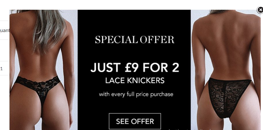
If you spend around 15 – 20 seconds on their homepage, you’ll trigger the first popup:
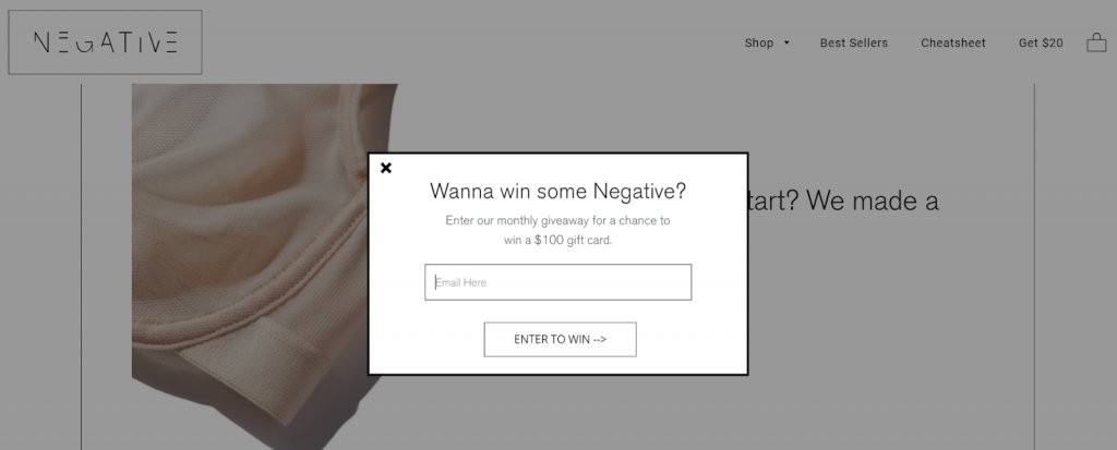
As you can see, this popup asks you for the email in exchange for the chance to win gift cards of over $100. This popup is clean, readable, and simple.
There are 4 crucial elements and popup best practices for converting popups:
- Context – Are reaching out to your website visitors with your offer at the right time?
- Copy – Is your text compelling and interesting enough?
- Offer – How great (for your potential customers) your offer is?
- Design – Is your design eye-catching? Does it engage with your website visitors?
In the Negative Underwears case – they crushed it in all things. The context is amazing, the copy is compelling enough (“Yeah, I want to win something!), The offer is unrefutable, and the design is simple and clean. But, this is just the first popup. There’s a second one I honestly like more.
When you browse through Negatives’ website, you’ll see a little “Get $20” page in the navigation menu:

Authors’ note: Using your navigation menu to showcase your offers is a great way to engage with your website visitors and improve your conversion rates. In this case, Negative Underwear used the navigation menu to let their visitors know about the free US shipping on all orders.
Once you click on this Get $20, you’ll see the following popup:
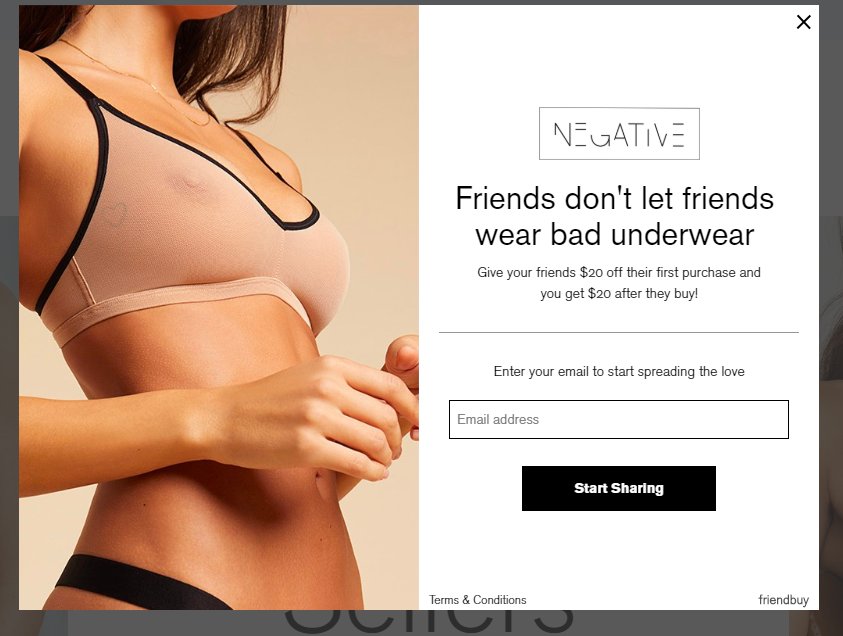
As you can see – Negative Underwear offers you $20 off if you recommend their underwear to your friends. In that case – they also get $20 off.
It’s a great way to boost eCommerce conversions and get referrals at the same time. But what’s so special about this popup? It isn’t triggered automatically. It’s triggered only when you click on that Get $20 text. This means that whoever sees this popup is almost immediately ready to buy your products. This popup will only prompt them to do that with a bigger desire.
Authors’ note: Shoppers tend to add some items to their shopping cart but they don’t finalize the purchase. This is a great way to prevent cart abandonment from happening.
2. Write product descriptions that convert
There are a lot of landing page best practices you can use to improve your CRO, now let’s see some of them that Negative is implementing. Once you choose one of the Negative Underwear products, you’ll go to their product page.
It looks like this:
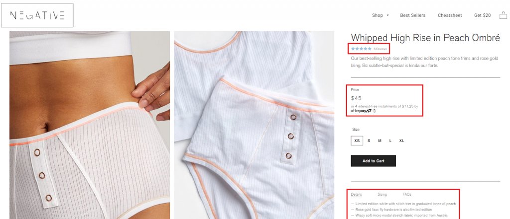
There are a couple of elements I liked the most about this page:
- Huge product images on the left (both of the product itself and how it looks when someone wears it) – this is a great way to showcase your products and their quality/implementation.
- Social proof right below the product name – Social proof is a great way to improve anticipation and make your shoppers more engaged with the product they want to buy.
- Option to pay in 4 interest-free installments – This is a great way to make your products “more affordable” and hence improve your overall conversion rates.
- In-depth product descriptions – Without any doubt – everyone writes product descriptions. But why do I like Negatives ones? They’re in-depth and have a special voice that correlates with their target audience.
Short and funny descriptions for every image. Why are they great?
First of all – they can resolve any doubts your potential customer has.
On the other hand, if you know your target audience well enough, you can use image descriptions to build a better relationship with them – just as Negative Underwear is doing. Now let’s see what happens after you add a product to the card.
3. Optimize the checkout flow
Once you click the Add to Cart button, slideout from the right side with your cart will popup:
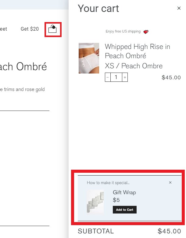
There are two things I particularly like here:
- Nice (and not expensive) upsell – if your shoppers are buying a gift for someone – then this is a perfect way to add a little bit more revenue to your bank account.
- Subtle hotspot on the cart icon – It’s not unusual for website visitors to add something to the cart and then forget about it or go to do something else. In that case – their website session ends up without the transaction. This little hotspot reminds them about their item in the cart
We saw how Negative Underwear is optimized for conversions. Now let’s see how Taylor Stitch is taking CRO to the next level.
4. Incentivize subscribers through rewards
Taylor Stitch is another apparel e-commerce website. Just 3 years after their launch, they’ve made an amazing $1.5 million in sales – and they’ve continued to grow after that. Now let’s see how this $1.5 million online store is optimized for conversions.
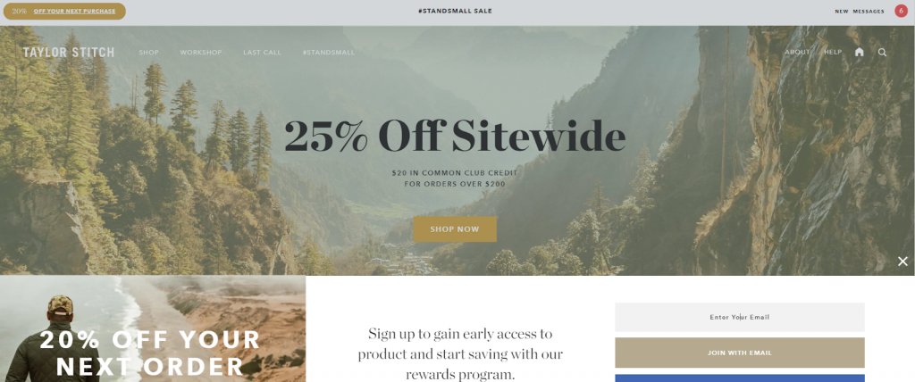
One thing that blew my mind is how the Taylor Stitch team optimized their website for conversions with constant reminders of the current discounts, reward programs, and other things. Once you visit their website, you’ll first see the huge modal asking you to subscribe and get rewards and early access to new products

This is a great way to engage with your potential buyers early on – especially if they’re returning customers. In this way – you’re able to improve retention. But, my knowledge won’t be valuable if I also sometimes showcase some bad things and bad practices.
Although this modal helps them to acquire new customers early on – I would make some tinny changes that could improve their conversion rates even more:
- Text is invisible – the white color doesn’t match with the background – so I think that they should either change their background or the color and font of the text.
- The font is not quite appropriate – for this background, I would put some bold or weightier font.
But, after all, this is a good practice you can implement on your e-commerce store – perhaps they could also try to implement some Shopify chatbot. I’m sure it will help them to showcase their rewards and discounts even more.
Now the question is: what happens after you close this? Well – you’re redirected to the homepage.
And – on the homepage – we can see a nice slideout popping up from the bottom:
It’s quite similar to the previous model – but with a different offer. Inside this slideout, you have the option to subscribe (if you haven’t in the previous opt-in) – and in exchange, you’ll get 20% off your next order.
Why do I like this?
Well, I love this especially because this slideout serves as the second opt-in for those who haven’t subscribed on the first one. It’s a great way to improve your conversion rates.
You also have a huge headline on the hero image with the discount. This is another reminder for those who skipped the first two steps. Once you close this, in the header you’ll see the following link:
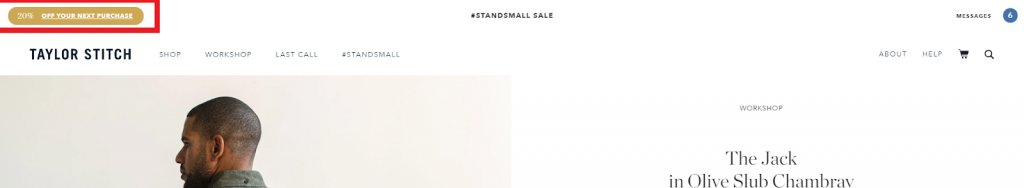
So, again, for the fourth time – Taylor Stitch is announcing to us that they’re offering a discount for the next purchase. Did you miss the first three? Then you will hardly miss the fourth one. But, if you’re accidentally missing the fourth reminder, you definitely can’t mix the huge notification on the shop page that’s present throughout your entire user journey.
Wherever you go – discounts are following you.
And probably this is the biggest CRO factor that helped Taylor Stitch to make over $1.5 million in sales. But, let’s move forward and see how Taylor Stitch optimized their product pages for conversions.
Download Free: Conversion Rate Optimization Guide
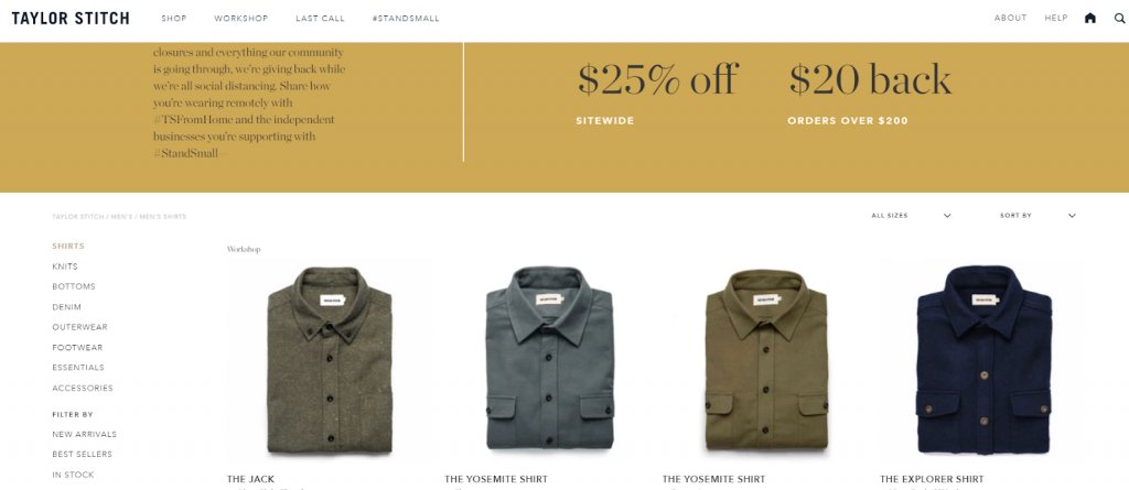
5. Optimize the product pages
Once you visit some product, you’ll see the following screen:
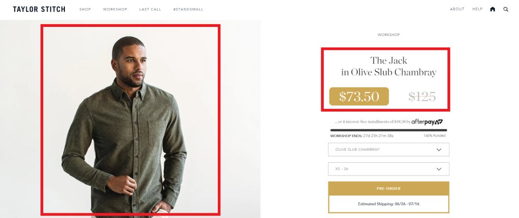
Here we can find two things that I particularly love.
Image of the human being with the product – why is this so special? Well – in the beginning, Taylor Stitch uses the human element to engage with their potential buyers. In the era of robots, AI, and automation, the human element is something we rarely use to close more deals – and believe me when I say that it’s super important. On the other hand – this is also a great way to showcase your product in practice.
Pro Tip: Whenever you can – try to use the human element to engage with your website visitors and build relationships. It’s’ super powerful. For instance, when we asked the founder of Contenthorse about his TOP 1 CRO strategy – he said that once he changed the testimonials on his website – he saw a 2x increase in the number of calls and leads. This is how his testimonials look right now:

Do you see the difference between casual and ordinary testimonials or customer reviews and this testimonial powered by the human element? Now let’s get back to the subject.
The second thing that I like about this product page is how they showcased their pricing. Showing two different prices – one bigger and the second one significantly smaller is a great psychology trick. In a nutshell – it encourages your potential buyers to purchase your product now or never. Especially if they see a big difference between the prices.
If you scroll down a little bit more on the product page, you’ll see the following:
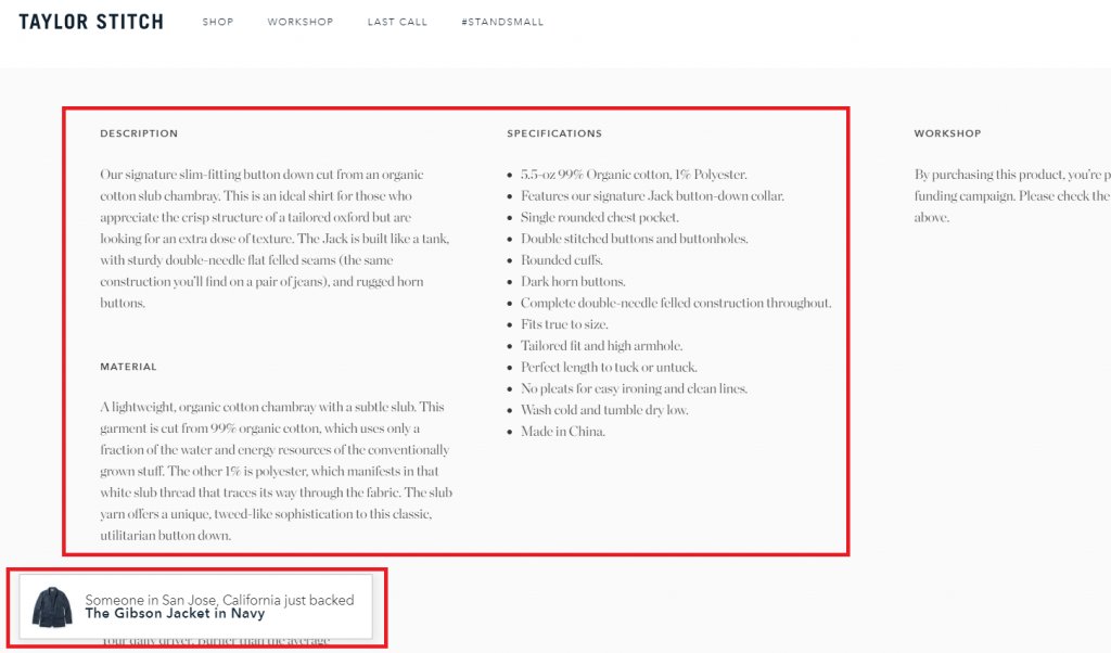
The first thing that pops up in front of our eyes is the pretty in-depth, detailed and engaging description of the product. And of course, there’s also one little slideout in the down-left corner that notifies us whenever someone buys something (or the particular item we’re looking at).
Although without any doubt, this strategy is now widely used by different e-commerce stores – it’s still a great way to improve your conversion rates – especially if you also put the limited mark beside your products. In this way, whoever is looking at your products at that moment will have a sense of urgency.
6. Build trust with the audience
Bluebella is another woman’s lingerie brand. They’re claiming that their products are built from unusual materials. Since I don’t wear women’s lingerie – I can’t speak in that name. But, on the other hand, I can show you how amazing their overall CRO strategy is.
The homepage is the best place to leave a great first impression and engage with your website visitors. In Bluebella’s case, they’re doing that with sliders. There were two images from the slider I particularly liked:
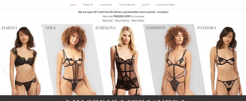
In the first image, you’ll see a set of different people who bought Bluebella’s products.
Why do I like this slider?
Three things:
- It uses the human element which creates relationships with website visitors
- It’s showcasing different Bluebella’s products
- These high-quality images help potential buyers to imagine themselves inside Bluebella’s lingerie.
And, what I especially like is the combination of the first slider and the second one:
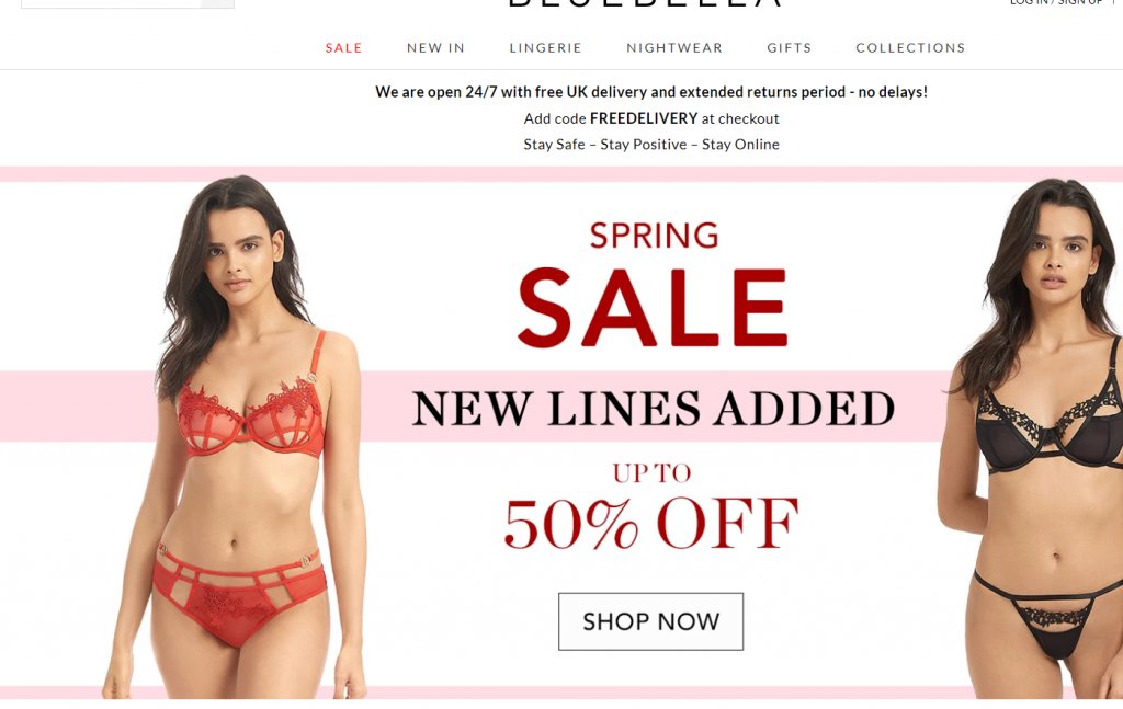
As you can see, this “slider strategy” is based on two things:
- Embracing potential buyers to imagine themselves in the lingerie
- And motivate them to buy products they like with an amazing 50% off.
7. Reduce cart abandonment
In a nutshell – exit-intent popups are the popups that are triggered whenever someone tries to leave your website. Using them is a great way to prevent your visitors from leaving your website and make them shop more. In Bluebella’s case, if you spend some time inside the shop, and you try to leave the website, you’ll see this exit-intent popup:
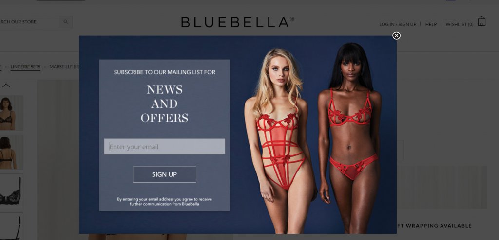
Why do I like this exit-intent popup?
A couple of things:
- It allows them to nurture their leads through the funnel – If someone sees this popup, their context is the following: They either didn’t find anything interesting in the store, or they found something but they don’t have enough money right now. Whatever the situation is – they would like to see the new offers from Bluebella
- It has an eye-catching design – I’ve seen a lot of different pop-ups in my career – and to be honest with you – this one is one of the best. Nice background color with high-quality pictures that leverage the power of the human element. Frictionless subscribe form and compelling copy. Everything you need for great conversion rates.
We can conclude that this exit-intent popup has only one goal:
To collect emails of people who are interested in their products, but not ready to buy them yet.
Why would they do this?
The answer is simple – to engage with them later on and convert them into customers.
8. Cross-sell like a pro
This part is something I liked the most about Bluebella’s CRO strategy. Firstly, let’s see the product page:
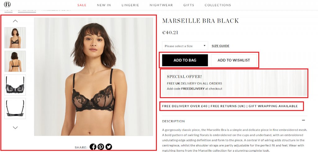
As you can see – the product page has 4 exceptional parts:
- High-quality images that (again) leverage the power of the human element
- Catchy CTA buttons
- Special offers are another CRO strategy to prompt visitors to purchase the product now, not later.
- Another special offer (free delivery) – to prompt them again, in any case.
Once you add some item to the bag, you will be redirected to the following part of the page before you’re able to go to the cart:
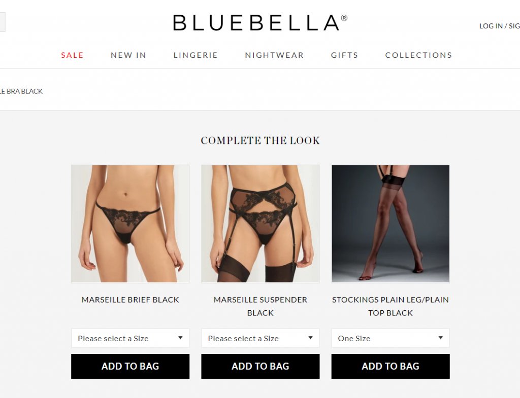
What a great upsell! Once you add some item to the bag, you’ll be redirected to the page with other products. But – these products are not similar to what other websites are doing. Also, these are not frequently bought together products.
These are the products that can be directly paired with the product you’ve just added to your cart. Pretty great CRO and upsell strategy. Nevertheless, I haven’t chosen any of these products.
Let’s see what happens after we go to the cart.
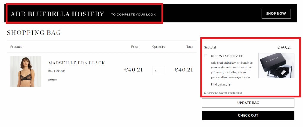
As you can see, there are two different things right now worth mentioning:
- Here we have another example of using “packaging” as the service for upselling.
- Also – on top of the page you can see the link that leads you to other products that are relevant to the one you chose.
Let’s finish our shopping here and click on check out. Here’s what happens next:
Now we can see another pop-up with great context, offer, and design. At the end of the day – we can conclude that the Bluebella team did a pretty great job when it comes to the CRO and upselling.
Are you interested in learning more? Watch the webinar on e-commerce optimization:
Conversion rate optimization tools for eCommerce
Now that we’ve gleaned some fantastic tips from studying these three brands, let’s briefly explore some conversion rate optimization tools that can assist you with implementation.
VWO (Visual Website Optimizer):
- Comprehensive CRO tool covering user research, hypothesis prioritization, and testing stages.
- VWO Insights provides in-depth user behavior research.
- VWO Plan streamlines experimentation program management.
- VWO Testing facilitates A/B, split, and multivariate testing.
- Supports complex experiments with VWO Testing Server-side.
- Enables personalized experiences with VWO Personalize.
Google Analytics:
- A powerful tool for user research, offering extensive data on website visitors, behavior, and conversions.
- Key features include goal tracking, funnel visualization, and segmentation for monitoring actions, identifying conversion bottlenecks, and analyzing specific visitor groups.
Heap Analytics:
- Digital insights platform providing a comprehensive view of user behavior on websites and mobile apps.
- Features like session replay, heatmaps, journeys, funnels, and cohorts empower teams to derive meaningful insights and make data-driven decisions.
TestRail:
- Robust test management platform streamlining planning, execution, and tracking of software test cases.
- Caters to hypothesis prioritization and testing stages.
- Provides a centralized repository for efficient test case management, suite organization, and execution of test runs.
Five Seconds Test:
- User research tool assessing how users perceive a website within five seconds.
- Optimizes design for first impressions and measures the impact of changes.
- Includes tests like card sorting, five-second tests, preference tests, prototype tests, and surveys.
Choosing the right CRO tool is crucial for business success, and exploring full-featured free trials, where available, is recommended. For instance, VWO offers a comprehensive 30-day trial for users to explore its features and understand how it can drive successful CRO campaigns.
Key takeaways
Huuh – going through these 3 successful e-commerce websites and analyzing their entire CRO strategy was a hell of a ride, right?
But, at the end of the day – it was worth it!
Here’s what we learned from those 3 websites when it comes to optimizing websites for conversions:
- Using popups is a great way to showcase your rewards and offerings in the right context and time. But, pay attention to the design, offer, copywriting, and triggering point. For your popups to work, you’ll need to implement all 4 things correctly. You can use some of the Privy alternatives to build your popups.
- Upsells are playing an important role when it comes to e-commerce CRO. Try to upsell your products whenever you can.
- The human element is the next big thing when it comes to optimizing your website for conversions. Try using the human element on your website as much as you can – it will pay off.
- If someone is still not ready to buy, don’t waste the opportunity. Try to get their email and nurture them through your sales funnel later on. Eventually – they’ll end up buying from you.
- Pricing psychology plays a big factor in e-commerce CRO. Try to showcase the difference between the old and the new price. It will prompt your potential buyers and motivate them to purchase your product.
- In-depth, catchy, detailed, and engaging product descriptions are a must. If your product descriptions are poor, outdated, and non-valuable – you might lose a lot of customers during the checkout process or on the product page. You don’t want that to happen.
So, the last question I have for you is:
What’s the first CRO strategy you’re gonna implement first?


