Most of us here will agree that pop-ups are annoying.
Nobody likes when these pop-ups sprout, blend, and bloom in from all sides while they are attentively reading or watching content.
However, pop-ups have been around for ages, and there’s a reason why they still exist.
They work!
Pop-ups help websites catch the attention of their visitors and convert them into customers or leads, using lucrative offers.
Download Free: Customer Engagement Guide
Exit intent pop-ups, especially, have become increasingly popular in recent years. It’s because they not only deliver conversions for websites, but are also less annoying than traditional pop-ups.
Exit intent pop-ups are displayed to visitors only when they try to leave a website. The pop-ups, typically, offer something of value to visitors (e.g., product discount coupon, free product demo, etc.) that aims to keep them from leaving the website.
Here is an example:
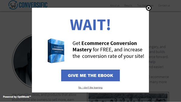
Still, just setting up an exit intent pop-up won’t guarantee you conversions (and it might even hamper the user experience). Therefore, you need to optimize your pop-ups for your website and the visitors, appropriately.
This post will walk you through 6 important factors that determine the effectiveness of exit intent pop-ups.
Note: All “pop-ups” mentioned in this post from here-on refer to “exit intent pop-ups.”
1) Target the Right Visitors
All your website visitors aren’t the same.
Some visitors might be on your website just out of curiosity, some might be there for doing comparison shopping, and only some will become your customers.
Primarily, you must pursue those visitors who have shown at least some intent to become a customer. Next, you should engage more with the new visitors of your website, and lead them down your conversion funnel.
To do that efficiently, you’ll need to segment your website visitors, and target them differently.
Firstly, capture those visitors who have a higher chance of converting. For instance, if you want to acquire subscribers to your blog through pop-ups, target visitors that have visited multiple pages and spent a good amount of time on your blog. For eCommerce sites, it makes more sense to provide attractive offers to those visitors who are abandoning the products in their cart.
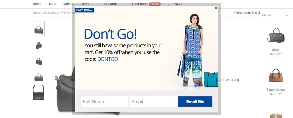
You can target visitors based on their location. This will help you get leads and customers from specific geographies that are tactically important for your business.
You can also target visitors who have actually read the content on your web pages. You can do that by tracking how far they’ve scrolled down a page and how much time they’ve spent on it. For instance, you can set pop-ups for only those visitors who’ve scrolled down more than 70% and spent more than 90 seconds on a webpage. This is especially useful for content based web pages, such as blogs and other reading material focused pages.
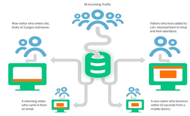
Moreover, you have to be particular about the visitors whom you don’t want the pop-ups to be displayed to. For example, you need to ensure that users who’ve closed the pop-up once do not see it again. Similarly, you shouldn’t display pop-ups with a subscription form to visitors who’ve already signed up.
2) Employ Contextual Offers
Your pop-ups — no matter how targeted — can still ruin the user experience on your website if they aren’t contextual.
Your pop-ups must relate to visitors’ activity in each of their user sessions. In other words, they need to be in line with the web page visitors are on.
Suppose, you have a fashion eCommerce website catering to both men and women. On pages that feature men’s products, setting up a pop-up that offers a sale on women’s products will, obviously, not be effective. However, if the pop-up offers a discount on the same product that a visitor is abandoning (exiting the product page), the chance of the visitor staying back and making a purchase is much greater.
Similarly for SaaS websites, it would make sense to offer discounts for visitors that are on the pricing page. In contrast, when visitors are on the features page, your pop-up can offer a resource that demonstrates how your product features are better than the competition.
Take a look at this example:
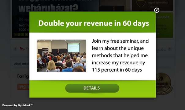
The above pop-up features a “free seminar” to visitors who are on the content-offering pages of the website. We can safely assume that the visitors are interested in the website’s content, and a seminar might interest them further.
Ideally, you should look at your website as a conversion funnel. The web pages that attract the bottom-of-the-funnel visitors should contain pop-ups with high value offerings, such as discount coupons, product comparisons, case study of known brands, etc. Web pages that largely attract top-of-the-funnel visitors can offer a generic freebie (or skip having pop-ups altogether).
3) Write Scannable Copy
The average attention span of web users is less than 9 seconds. The attention given to your exit intent pop-up is even lesser.
When encountering an exit intent pop-up, visitors will only give the pop-up a short glance. (Remember, they are trying to leave the website.)
This makes it vital for the pop-ups to have scannable and snackable content. No visitor is going to go through a pop-up having 1000 words of text.
You need to keep your pop-up copy short and clean. Here’s a great example from WhichTestWon:
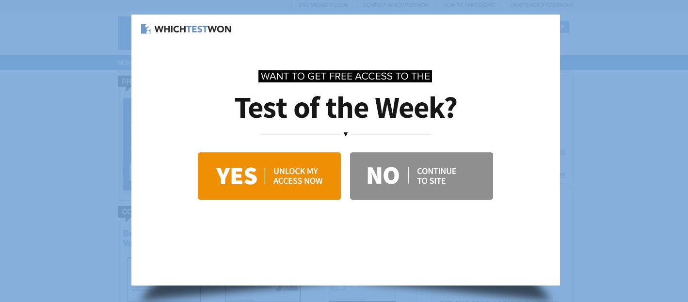
The pop-up features minimal text and attention-grabbing call-to-action, making it easy for visitors to read it instantly. However, it’s important to notice that even with such less content, the pop-up is able to successfully put across value (free access to the “test of the week”) to visitors.
You will also notice that the pop-up does not include any form-field. That is because it hides behind the “Yes” button. It looks like this:
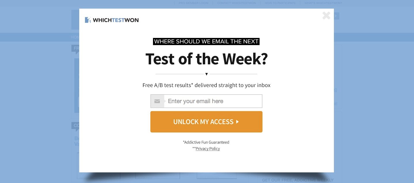
By not showing the form-field upfront, the pop-up reaps a couple of benefits. Firstly, it is able to comfort visitors about the fact that they can proceed with just a click. Secondly, it is able to secure higher form-fill rate as only high-intent visitors (those who’ve clicked on the “Yes – Unlock My Access” button) reach the form.
You can follow WhichTestWon’s cue, and employ multi-step lead gen pop-ups that help you minimize the content. Or, you can go a step further and develop a landing page dedicated for your pop-up.
In order to keep your pop-ups lean, you should also aim to offer self-explanatory resources. Ideally, you shouldn’t spend any text explaining the resource.
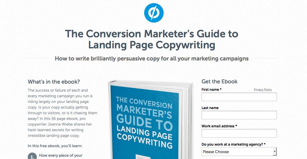
Although contextual, a long description of your free resource will repel the visitors’ attention. Remember, your pop-up isn’t a typical lead-gen form and your free resource isn’t a typical lead magnet. For instance, below is a regular lead gen form and this is NOT how your pop-up should end up looking.
Related Post: 10 Actionable Tips to Build An Effective Lead Magnet
Download Free: Customer Engagement Guide
4) Offer Something Truly Valuable
The most important feature of a pop-up is the offering it contains for visitors. It goes without saying that the offering must have great value in order to impel visitors into taking an action on the pop-up.
Sometimes, it is pretty straightforward. You can put up discount coupons or other offers like free shipping on your pop-ups. Other times, you have to get innovative.
Let’s take an example from XeroShoes. XeroShoes offers barefootwear that can be used for outdoors and recreational activities. Since barefootwear is a fairly novel concept, XeroShoes has to try hard to convince its website visitors. If XeroShoes wants its visitors to convert into customers, it must provide them with solid advantages of barefootwear over regular shoes. And, this is exactly what one of their exit intent pop-ups did. It offered a well-researched, detailed report on the benefits of barefootwear.
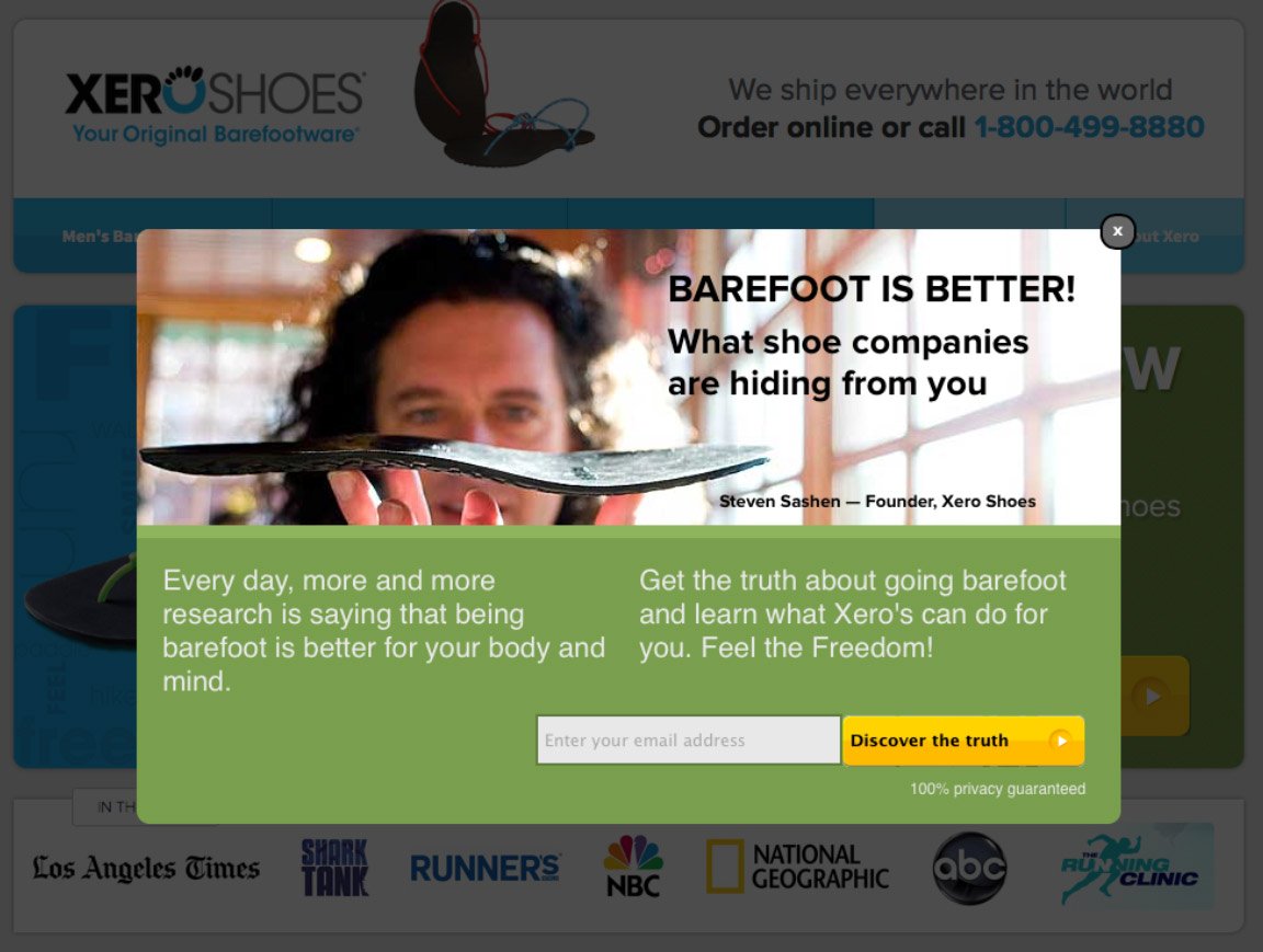
The pop-up made 2.5% of abandoning visitors download the report. And out of those visitors, 28.4% visitors went on to make a purchase.
Another fine example is from Gr8tFires. The website offers gas and wood-burning fireplaces and stoves. Their sales cycle is typically long, which requires educating the customers about various aspects of their products. One such aspect is “installation.” The installation cost is one factor that influences the purchase decision of the visitors.
Keeping that in mind, Gr8tFires offered an “installation cost calculator” to its abandoning visitors.
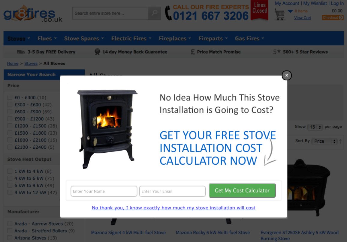
The pop-up caused a 300% increase in Gr8tFires’s sales leads per month.
The offering in the above two pop-ups helped visitors through their purchase decision. This is what your pop-up should aim at, too.
5) Fine Tune Your Call-to-Action (CTA)
The CTA on your pop-up should be clear, and resonate with the action that visitors are expecting on the button click. Look at the CTA from this pop-up by WP Beginners.
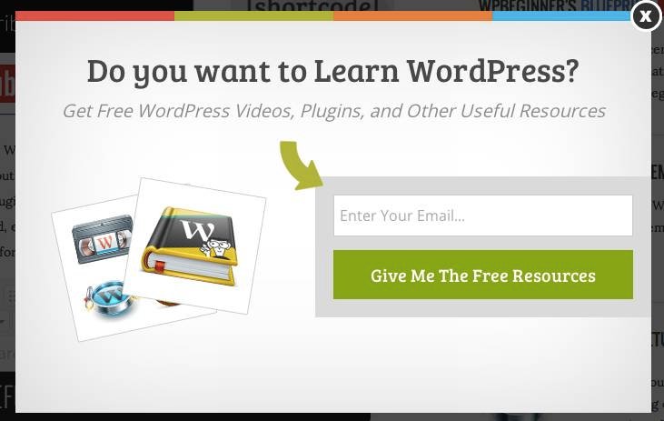
The CTA has a considerably large presence on the pop-up, and displays text that encourages visitors to take an action.
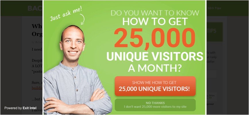
Additionally, you can add a negative CTA alongside the main CTA to make it even more compelling. The negative CTA influence visitors by making them think that they’re missing out on a valuable resource. It employs the psychological factor known as FoMO (or Fear of missing out).
Here’s how Backlinko does it. The negative CTA in the pop-up reads, “I don’t want 25,000 more visitors to my site.” Surely, not many visitors will not want 25,000 extra visitors to their website. And for those who want it, the negative CTA tries to establish a FoMO.
6) Optimize for Mobile
It’s no news that a significant share of internet traffic comes from the mobile medium. Your website, too, might have a good percentage of mobile visitors (you can track that using a website analytics tool).
Considering this, your pop-ups must be optimized for the mobile screen. Ensure that your pop-ups are built on a responsive web design.
Additionally, you should view your pop-ups on a mobile screen to know if the text content and CTA(s) are optimally placed.
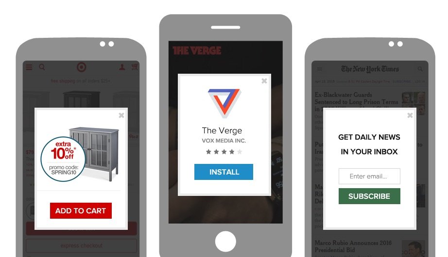
Your mobile pop-ups can prove to be effective if most of your site abandoners use the mobile channel.
Furthermore, you can employ pop-ups that you want to display to your mobile visitors only. For instance, your mobile pop-up can feature your mobile application and ask visitors to download it, when they try to leave your website.
Related Post: A Guide to Using Google Analytics Metrics and Dimensions for Conversion Optimization
Before You Leave
Tell us which optimization technique did you find the most useful? Have your own optimization idea? Write to us at marketing@vwo.com!


