How Susty Party Used VWO To Increase Conversions
About Susty Party
Susty Party creates disposable tableware for parties. This Brooklyn, New York-based venture sells compostable yet colorful, highly-functional, and responsibly made plates, spoons, forks, glasses, and other items sourced from nonprofit factories that employ and empower visually impaired people. In their own words, they “respect the earth and party on,” so it is only fitting that the “susty” in the brand’s name stands for “sustainable.”
Susty Party was featured in a number of influential media circles, so its website was attracting sizeable traffic. But sales conversions were low. In other words, people visited the website, but did not purchase their products.
To drive engagement and sales from its website traffic, they reached out to Uplift ROI, the conversion rate optimization experts who use VWO for helping clients with their conversion optimization(CRO) needs.
Goals: Redesign Specific Website Elements to Increase Conversions
From website data and analytics, it emerged that Susty Party experienced a high bounce rate on its home page. Visitors to the site left without much engagement. Even visitors who engaged, left before a sale was consummated. This led to poor conversion along the sales funnel.
This gave the digital marketing agency a direction to work on. Given the home page design and execution, it became clear that Susty Party could improve conversions by adopting some best practices widely followed in eCommerce circles.
The agency’s primary goal was to increase conversion on the home page through clicks on the banner. The secondary goal was to enhance the CTA clicks on the checkout page.
Tests run: Website Changes Were Driven by Data and Aligned to Visitor Behavior
The agency team developed some hypotheses around how click-throughs and conversions could be improved. They identified improvement possibilities on both the home page and the checkout page.
On the Home Page
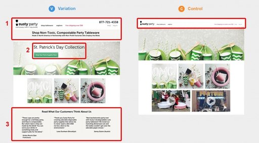
A clear USP: The Susty Party home page (at that time) lacked a clear USP. The agency hypothesized that adding a clear, selling proposition would help visitors understand the benefits of Susty Party and nudge them them toward greater engagement on the site.
Testimonials were lacking at that time. It was hypothesized that adopting this staple among eCommerce best practices by adding real customer testimonials would help lift conversions on the home page.
There was no CTA on the banner, so another hypothesis was around adding a CTA to increase conversions.
Removing Videos: This was counterintuitive. But the older version of the Susty Party website contained product videos right on the page fold. So, it was hypothesized that the videos were a distraction that drove visitors away from completing the desired action on the page, which was a click-through to the product page.
On the Checkout Page
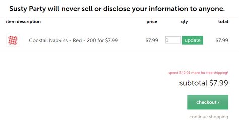
Adding Security Affirmation: The eCommerce checkout page lacked any security affirmations. The agency hypothesized that adding one would encourage visitors to click “checkout.”
The agency developed a variation and A/B tested it against the original page (the control). Both screenshots are shown below.
Conclusion: 250% Increase in Conversions from the Home Page; 98.4% Increase in Checkouts
The changes to the home page and checkout pages yielded super results. Conversions from the home page increased by a mammoth 250% at 99.99% confidence level. That’s like saying there is almost ‘0’ chance for this to have happened by fluke. The checkout page also benefited from the change. With the variation, checkouts saw a 98.4% spike at a 97% confidence level.
The changes made to the home page did indeed cause more visitors to convert. Also, remember that the older version contained no CTA and, therefore, clicks on the home page banner were expected to be low. Even so, that doesn’t take away from the fact that the variation engaged visitors much better, enticing them to click the CTA through to the product page.
Well-constructed hypotheses, combined with A/B testing, helps optimize conversions. When you partner with VWO, you not only get robust features but also perspectives, insights, and practical advice that will help you get more out of your investments in conversion optimization. Here are some insights to explain how and why the website changes boosted Susty Party’s conversion rates.
Changes to the Home Page
Clear USP
Operating in a niche of their own, the client had a reason to believe the images on the home page were self-explanatory. The oversight was that users have a million distractions. You literally get 5 milliseconds to make a good impression. If, in a couple of seconds, you do not give visitors a good enough reason to remain on your site, they will leave. Not only must your site have a good enough reason, but also convey the same effectively, in a couple of seconds. That is why adding this banner helped.
It establishes both points of parity and points of difference. The visitor immediately understands that Susty Party is about partyware and the fact that its products are non-toxic and compostable differentiate them from partyware sold by others. The subheading makes it clear that the business is North America-based and thus contributes to the region’s economy. Visitors also see that by buying Susty Party products, they would be helping the disadvantaged.
The most important point is that visitors are given all this information in one place and are not inconvenienced by having to find all this out by themselves. The marketing message in the heading is quite clear.
Testimonials
Genuine customer testimonials essentially let you say this: See, we are awesome, but you don’t have to take our word for it. Listen to what these guys, who are just like you and have already used our product, say about us.
Using testimonials on eCommerce pages has become so prevalent that users more or less expect them. Most visitors think on the lines of: If your product is as good as you claim it to be, you must have lots of customers. And if they like it, they would’ve said something good about you. Ergo, if you don’t have real customer testimonials, I don’t see how I can trust your product.
CTA on the Home Page Banner
If there is no specific call-to-action that guides visitors to the next step of the funnel, many of them will leave. Think of your eCommerce website as a maze, at the end of which you have placed some goodies. Your visitors are wanderers who have deliberately walked into the maze, hoping to find something they like and are willing to pay for. You need them to browse the maze and find exactly what they need. (Okay, it’s a maze they can walk right out of, anytime they so wish, but you get the point!). But for now, they are disoriented and directionless and look to you for guidance. Every twist and turn inside the maze is a decision they need to make. And they won’t know what to do unless you tell them exactly where to turn and what they can expect around the corner.
CTAs are the signboards to guide and direct. These need to be put up generously, at every turn you need visitors to take. Call-to-Action buttons tell the visitor what they are supposed to do, and what they can expect upon doing it.
Read this comprehensive post on CTA buttons, what works, and why.
Also, how about some awesome flat-design CTA freebies you can start using right away? Click the button below to download, no landing pages, no nothing. Just some awesome free goodies.. It’s a zip file with .ai, .psd and .eps files included. If you like what you get here, you can thank Shawn Rubel at Vecteezy and check out what else they’ve got there.
Removing Videos
I love this part because removing videos is not a best practice by any means. There are dozens of success stories that extol the use of videos as a means to effect greater conversions. This one for instance. Or this.
Why then, didn’t the videos work for Susty Party? Primarily because they were not as relevant as testimonials. Although the videos took up precious real estate on the home page, they were not as relevant for visitors as were the testimonials. Think about this: if you were looking for party-ware and landed on Susty Party’s website, would you be more interested in a video that showed how party cups looked or would you be keen to know what other customers who have used the products felt about them? I’d put my money on the latter.
Products like party-ware would typically require low involvement from the customer; they don’t cost much, and they don’t last long enough for a customer to put too much thought into the buying decision. More than a comprehensive understanding of the product, consumers of such products look to understand if they are value for money. Would the cups leak? Can these be disposed of easily? Are these microwave friendly? Hardly questions whose answers would need you to watch videos, right?! An FAQ section with product images might be of greater help and would help visitors make quick decisions.
Changes to the Checkout Page
Adding security affirmation is vital. Say, you just became a father and are throwing a party for your dear ones. Scouting for good party-ware, you come across Susty Party and find the product to be refreshingly new. So you click, click, and click some more till you get to the product page. You are a seasoned online buyer so you realize that this is the point of no return. You have to make a decision that involves spending money. More importantly, your decision could impact the success of your party.
Suddenly, there are doubts, apprehensions, and lack of trust. You don’t see any trust badges or guarantee badges, or affirmations. Nothing that tells you that you can trust the products or the seller. So you do what you do. You leave. Or, in another universe, you see it on the checkout page.
Do not rely blindly on “best practices.” Or test for the sake of testing. Identify your concerns, study the data, and understand what the data says. Construct hypotheses based on what the data tells you and not on the basis of what best practices tell you. Sure, best practices could act as references, and you might even be able to reverse engineer your way to find what could be improved on the site. But do not consider best practices (or blind A/B testing, for that matter) to be shortcuts to a pot of gold at the end of the rainbow.
Because A/B testing isn’t that rainbow. Your website is.
It is up to you to decide the shape and colors of your rainbow. A/B testing can only help you figure out what kind of rainbows are more likely to attract people.

Location
New York, US
Industry
Retail
Impact
250% increase in Conversion