Follow us and stay on top of everything CRO
Read summarized version with
What is Usability Testing?
Usability testing is a user-centered design technique where you evaluate a product/app/website by testing it on a group of people with no prior exposure to it.
The goal is to measure the intuitiveness of your design, user flows, and content with users who closely represent your target market.
In plain English, usability testing is about finding a group of real people, similar to potential users of your app or website, and then having them test it out in various ways.
The tests can range from extensive laboratory testing with a crew of usability and user psychology experts to remote tests with automated surveys and recorded user sessions.
By designing and administering different tests, you can observe and analyze a person’s behavior and how they interact with your website or app. This helps you identify issues, sticking points, or deficiencies you would otherwise not have noticed.
Usability testing helps you eliminate assumptions and get real data on the user experience of your app, website, or product.

And it’s not restricted to established products.
Engaging with usability testing before launch can improve onboarding and retention from the get-go.
It’s an invaluable tool that helps businesses create the product their potential customers want.
What is a Usability Assessment?
Usability assessment is another word for the same process as usability testing, more often used to describe the process of testing physical products than digital products.
For digital products, the terms “usability testing” and “usability evaluation” are typically used.
What is the Purpose of a Usability Test?
Only 53% of consumers feel that brands meet their expectations for user experience, but 87% of companies think they are delivering the goods.
This gap highlights a common problem with developing new products or updating existing ones:
The product team doesn’t have a realistic impression of the user experience of their product.
Because the developers, designers, and product managers can’t unlearn what they know about the product and often have a very different background than their target market, they can’t make an objective evaluation of what they’re offering.
That’s where usability testing comes in. It puts your product in front of real people from your target market. You get to see first-hand what their experience looks like, and what they think about your product.
UX tests highlight potential issues with your app/website and will confirm or deny your existing assumptions and theories. You can quickly iron out issues in vital flows like signup, checkout, or onboarding.
The end result is a user experience that not just meets but exceeds the expectations of your ideal customers.
The Benefits of Usability Testing
Usability testing doesn’t just offer intangible benefits like a “smoother flow” or new design ideas.
It directly transforms the user experience.
And improving your UX can lead to increasing your conversion rates by up to 400%. In this way, UX testing can transform the results of every promotion, campaign, and dollar you spend on acquisition.
And that’s not the whole story. Below, we break down the top eight benefits of user testing, and how it will impact your product, app, or website.
1. Get Real Feedback Before Launching Your Product
If you are yet to launch your product, website, or application, usability tests can give you tangible insights into how your market will respond. By exposing it to real users without a public release, you can optimize the interface pre-launch.
This way, once you do release it to the market, you make the right impression and build trust and lasting customer relationships from the start.
2. Find and Eliminate Onboarding Bottlenecks
Are you struggling to convert free trial users? Do most customers unsubscribe without using your service to its full potential?
Usability testing can help you identify issues with your tutorials, video training, and general onboarding process that lead to fewer users mastering your product.
Finding and fixing those problems will lead to better retention rates and higher profits.

3. Identify User Issues with Completing Tasks
To truly improve your UX, you can’t focus solely on checkout/signup and onboarding. You must test different task flows for all the essential features in your app or website.
For example, with a collaboration app, you want to ensure that users not only can send private messages, but create and join groups, share documents, and more, without issue.
Making sure users can complete all necessary tasks with minimal training is integral to keeping them for the long term.
4. Get a Better Understanding of Your Customers and Their Needs

User-centered design has become the gold standard for designing apps and products in the modern age.
But you can’t create the right solution if you don’t understand what your users want. Personas are only fallible guesses based on assumptions you make about your users.
The testing process will give your team a better understanding of your target market and their needs.
Differences between expected user behavior and real user behavior can highlight key usability issues with your product/website.
You might discover vital features that your users miss or, or find that they don’t use entire sections of your site/app.

5. Save Time on the Development Process
By understanding what to prioritize, you give your development team clear goals. You will also know many low-priority features to avoid from day one, saving you time on time-consuming iteration and testing.
You can go straight into developing the features/experience your customers want.
6. Use the Data to Solve Design Debates and Break Ties
Designing and developing a new product can be a challenging process. Since there are no precedents, there isn’t a right textbook answer to solve internal design debates and challenges.
Real data from user tests can help you quickly solve stalemates and make informed decisions that lead to a better product.
7. Get New Ideas for Solving Design Problems
When your real target customers take your product for a test drive, it’s not just glaring problems that they help you find. Their experiences and opinions can directly lead to entirely new ideas for solving specific problems.
For example, you might set out to lower the task time for a product discovery process starting from a category. But halfway through the test, by talking to your users, you could discover that the majority of them prefer to search.
In this way, the user testing process can help you pivot your approach to solving specific problems.
8. Create a Better User Experience
Ultimately, usability testing will help you create a better experience for all your users. From free trial users to veterans who are already familiar with the ins and outs of your service.
And an improvement in UX will help you retain more users for longer, improve customer loyalty, lead to better word of mouth, and more.
How to Do Usability Testing?
When you decide to do a usability test, you can’t just choose a moderator and source participants from your own company. People who are too close to the project won’t lead to a quality dataset or any new insights to build on.
To get the best results, you need to research your options, choose your plan of attack, and source a varied group of test participants that match your target market.
Here’s a sustainable process, broken down into five steps.
1. Choose the Type of Usability Test
First, you need to decide on the type and scope of your test. When choosing a test type, you need to consider your budget, time-frame, test scope, and goals.
Here are the leading usability test types:
- Moderated In-Person
- Unmoderated Remote
- Guerilla Testing
- Problem Discovery
- Benchmark
- Learnability
- Eye Tracking
Moderated in-person tests require a larger budget, while guerilla and unmoderated remote tests are quick and cheap to implement.
We’ll cover each of these different types and methods in detail in the section below.

2. Source Your Test Participants
For the best results, you need to find a group of people that closely represent your ideal target customer.
With remote tests, there are many online testing platforms where you have access to a global audience and can cherry-pick your participants based on a variety of factors.
For guerilla and other in-person tests, choose a varied group of participants and collect relevant data points (age, education, profession, computer/mobile usage) so you can look for discrepancies based on backgrounds
3. Select and Ask The Right Questions
To get high-quality data, you need to ask your test participants the right questions, both pre- and post-test.
To come up with the right mix, you might need to set aside time to brainstorm with your team and any potential early beta testers. We cover some common, useful questions in the section below.
4. Choose Key Metrics to Focus On
The success rate, or completion rate, is the average number of people who are able to complete a task. It is the most common metric for measuring usability.
For moderated tests, facilitators will note if participants succeed, with unmoderated tests, you can let them self-report or analyze session recordings post-test.
But the success rate alone doesn’t tell the whole story. It only shows how many people eventually finished the task, not what the actual user experience was like.
You also want to focus on other metrics like:
- Number of Errors: How many mistakes or unnecessary actions did a user make when completing a task? User errors are very prevalent, with benchmark numbers being as high as 0.7 errors per user.
- Task Time: Task time or task completion time is just a measurement of how long a user takes to finish a task. There are no general benchmarks here, as it is too reliant on the individual app/website.
- Task Difficulty: Task difficulty can be measured with a simple post-task survey like the SEQ. The average SEQ task difficulty rating is 4.8 out of 7.
- Single Usability Metric (SUM): The SUM metric combines the success rate, task times, and task difficulty ratings to calculate the general usability. The average score is around 65% across industries.
- Post-Task Satisfaction/Task-Level Satisfaction: You can also use a survey to test user satisfaction rates after individual tasks.
Combining multiple metrics, for example, by using the SUM formula, will give you a fuller image of each trial user’s experience.
5. Leave Your Assumptions Behind
If you let your assumptions and biases affect the testing, you won’t find the highest value insights and solutions.
From the questions you ask to the way you interpret the data, your team needs to keep an open mind throughout every step of the process.
To ensure this, select a varied group of facilitators, including staff who are less familiar with the specific product/process you are testing. A diverse group will help you avoid group-think and biased conclusions.
Types of Usability Testing
In the new world of big data and failing fast, there’s a ton of test variations and methods you could use to test your website or app’s usability. It’s easy to get confused or spend too much time in the planning phase.
Below, we’ve highlighted seven simple and effective approaches that any company can use to test a digital product or service:
1. Moderated In-Person
Moderated in-person usability tests usually happen in a laboratory setting, with third-party professionals overseeing the trial in person and analyzing the results.
Since the tests are happening right in front of the facilitators, it’s easy to oversee every step of the process and uncover unforeseen issues or user behavior.
This method is most suited for established companies with a large existing user-base, where there is a considerable upside to every small usability win. It can also be suitable for startups with big budgets and aggressive growth goals.
There’s a high barrier to entry since tests of this kind require a significant investment of money and working hours. Even getting started can be a long process, making it a bad match for SMBs and early-stage startups that want to move quickly.
2. Unmoderated Remote Usability Testing
Remote usability tests don’t take place in a specific physical location, but instead, use a web-based service to monitor the test and administer survey questions. Since the software controls the test and records user actions, there is no need for test facilitators.
It’s a lot easier to do at scale, and you can run multiple different tests simultaneously without issue. With the right questions and session recordings, you can gain comparable insights to the much more pricey usability lab tests.
Since you can set up unmoderated usability testing experiments easily using online tools, it’s a great place to start for any company with an app, digital product, or website.
3. Guerilla Testing
As you might have guessed from the name, guerilla testing is all about going out and getting random people on the street or in a cafe to try your website, app, or product.

It has the lowest barrier of entry of any testing method, but it also yields the roughest and lowest quality data. Because you select the people at random, there’s no guarantee they align with your ideal customers.
Tests like this are more useful during pre-launch stages of a product, or if you are struggling to onboard enough alpha/beta users to get feedback. It can also be a helpful setting to run your first problem discovery tests.
4. Problem Discovery
With problem discovery, you test if users can complete certain tasks without running into any issues.
First, you give a set of test users a sheet with critical tasks to fulfill on your website/app. Then, your facilitators will observe each test user and identify any problem that arises.
With unmoderated remote tests, testers will self-report issues, and the UX team can analyze recorded test sessions instead.
Because it’s about letting test users freely explore how your product/website structures a task, problem discovery is a great initial test for existing products/websites and working prototypes.
The feedback can help you quickly develop new versions for further testing.
5. Benchmark
With a benchmark test, you directly compare the usability of two different versions of your app/site. Typically, the goal is to find the best way to complete a specific task.
For example, you could test a drop-down menu that appears on hover, versus an expandable category menu that appears on-click. The testers will give you insight into which choices are the best for your target audience before you choose an option for your live website.
Benchmark tests are great for testing potential solutions after you have identified problems with your UX. It doesn’t matter if you are developing a prototype, or optimizing an existing app/site.
You can also benchmark two different solutions in a live environment by setting up a split test with A/B testing tools.
6. Learnability
With learnability tests, you aren’t looking for specific usability problems, but rather testing how easy or difficult it is to learn to complete tasks effectively over time.
Typically, you arrange for the same test group to complete the same tasks multiple times.
By measuring the differences in task completion times, you can visualize the learning curve with a graph.

In the example above, the test users reduced the task completion time by around 6 minutes on average from their first try to their fourth.
These tests can help you identify inefficient processes that impact all your users.
Learnability testing is best suited for SaaS and consumer apps/software, where users complete a core set of tasks regularly.
7. Eye Tracking
Eye tracking is a standard approach for testing design solutions for websites and applications.
It monitors where a test user’s attention starts, and in what order they focus on every element that follows.
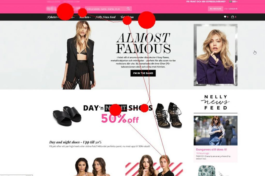
They are useful for designing landing pages and ensuring that high-priority elements get the attention they deserve. This insight makes it a valuable tool for eCommerce and other customer-facing companies.
Heatmaps are similar, but they monitor mouse cursor activity, rather than tracking the eyes directly.
Early-Stage Usability Testing
We examined above how you could test and improve a live website or app that’s already in production, but you don’t need a working prototype or live beta to start testing.
Early-stage usability tests can help you create the ideal app/website structure and flow before you even begin development.
They help you make informed design decisions and cut back on later stage iteration and testing.
1. Card Sorting

With card sorting, you can find the most logical way to structure your site or app before writing a single line of code, or creating a single webpage.
First, your design team creates the cards, each with a single concept relevant to your project on it. You then ask a group of testers to sort and categorize this list of pages into a category tree.
The way they structure things into major categories and subcategories will help you design your primary and secondary navigation and structure.
2. Tree Testing
Tree testing is a way to test the efficiency of website or application navigation and categorization. In some ways, it’s a different take on card sorting.
You typically ask test participants to find specific information in a purely text-based hierarchy. An eCommerce store might ask them to “find laptops suitable for creative professionals.”
A hotel booking service might ask them to “find the 4-star hotels in a location.”
The video below will explain the process in further detail.
Simply put, tree tests check if your planned content structure will make it easy for users to find relevant information.
3. Functional Salience Testing
Mastering information architecture isn’t just about categorization. You also need to know which functions and content to prioritize in your navigation.
That’s the purpose of functional salience testing. In essence, you ask your test users to single out the 3-5 most important functions/pages.
For a newspaper, it might be the top three most popular news categories. For a SaaS app’s website, it might be pricing, features, and case studies.
The results will show you precisely which pages/functions to highlight in the header of your site/app.
Usability Testing Questions
If you don’t ask the right questions, you could be leaving the most crucial test user insights on the table.
You might not identify a critical bottleneck, or you might not know your participants enough to understand why there’s a discrepancy in the ability to use your product.
The following is a selection of screening questions to find the right test group mix:
- How old are you?
- What is your highest level of education?
- Do you consider yourself to be proficient with computers and new technology?
- Have you ever used a similar product/app/website?
- What device do you usually use for [similar tasks]?
You can use these to vet users and collect data points to compare for discrepancies in test results later. (For example, you can check whether participants who struggled to complete a task match your ideal customer profiles.)
Once you’ve selected the right mix of participants and had them test your site/app, you need to ask the right follow-up questions.
- Did you struggle to complete any of the tasks?
- Which task was the most difficult to complete?
- What did you think of [A], [B], and [C]?
- Which of these options was the easiest for you? Why?
- Why didn’t you use [X] feature?
- What did you think of the tutorial/instructions?
- Are there any features you frequently use on [competitor] that you missed here?
- Did you identify another way to accomplish [your task]?
For broader follow-up questions, you can also give the participants a scale to choose from 1-5, not just a yes or no.
- How would you rate the layout of the content?
- How would you rate the checkout experience?
- How would you rate the overall user experience?
The average score will help you evaluate your overall experience, in addition to other usability metrics.
But don’t just copy and paste the questions above and think you’re ready to go. Your questions should depend on the subject and scope of your test.
Ask questions that answer not just whether or not users were able to complete a task, but how they experienced it. You should also ask whether or not their experience matched expectations.
If you are armed with the right questions, even an unmoderated test can provide you with game-changing insights.
Isolate Flows to Test
If you want to improve an existing product, or you have a working alpha/beta release, you should isolate essential task flows to test.
A task flow is just a succession of actions a user must take on your site/app to complete a specific task.
Below you can see a visualization of what a task flow for item discovery by using the search function might look like.
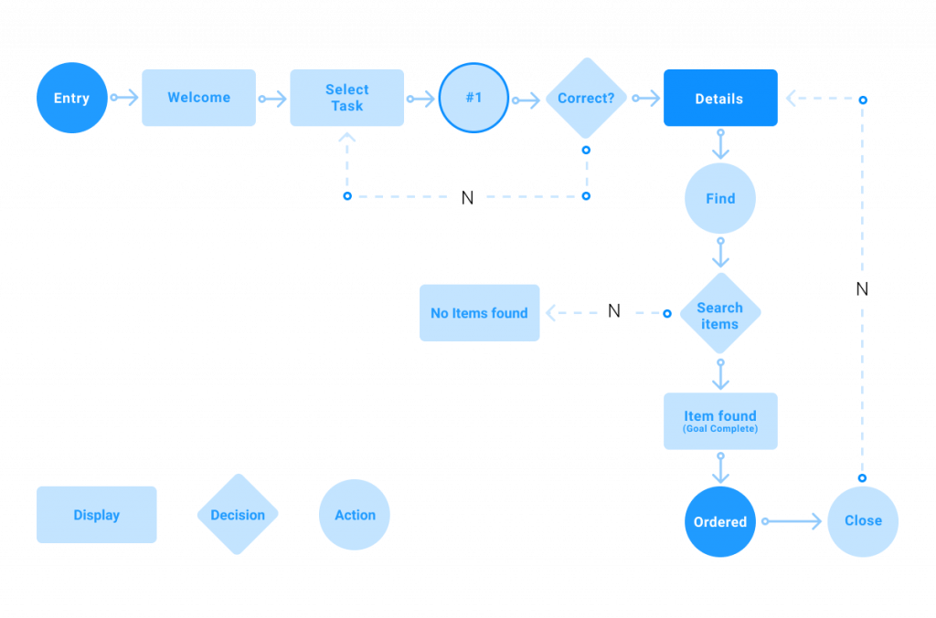
By visualizing the ideal flow of the customer, it’s easy to identify where users make mistakes or get lost.
And there’s a clear upside to not trying to test everything at once. Focusing on single tasks speeds up the process, making it easier to administer tests and implement possible solutions.
You can quickly eliminate bottlenecks in the areas that are most important to acquisition, onboarding, and retention.
First, let’s take a more in-depth look at some flows that are essential to a high-performing eCommerce store.
Product Discovery
When someone finds your website or a category page through organic search or other channels, is it easy for them to find the relevant product pages?
If a potential customer can’t quickly find what they are looking for, they will most likely leave your site and go to a competitor.
Checkout
Once someone has decided to purchase something, the process shouldn’t break with their expectations or add unnecessary complexity.
Every extra step added to this flow means abandoned carts and lost sales.
Editing Cart
A slightly less obvious task is the editing of items in an existing shopping cart. You want to make it easy to change the volume of products and add/remove current items.
A potential customer could abandon a cart because they changed their mind about a single item and can’t remove it.
Next, let’s examine some key task flows a SaaS app should test and improve.
Signup
It doesn’t matter what service you are providing; you want it to be as easy as possible to sign up as a user for your service. It’s an essential task flow to put to the test. (This also includes trial and demo users.)
Tutorial / Onboarding
If new users can’t figure out how to use your product, it doesn’t matter how good it is. To start off on the right foot, you must test that your onboarding process and your tutorial content is as easy to understand as humanly possible.
Other Essential Tasks
The essential task flows to put to the test depend on your product or service.
For a CRM, you’d want to test a user’s ability to create and populate customer records and if they can quickly find relevant information when on a call. Put every task that is essential to solving your user’s business problems to the test.
After deciding on the tasks, create a task list, and administer the test using one of the approaches we covered above.
Usability Testing Case Studies
For the best results with usability testing, you have to tailor the tests, so they match your product, market, platform, your ideal customers.
If you run an eCommerce store, you need to focus on essential task flows like product discovery and checkout, which will be less relevant for a SaaS app, a consumer mobile app, or a company website.
Usability Testing Example: eCommerce
As per Baymard Institute, the average documented online shopping cart abandonment rate is 69.82%. That gives any eCommerce store owner massive room for improvement of their checkout flows and general usability.
Focus on the areas below to reduce abandoned carts and create more loyal customers.
- Navigation/Discovery: Are the users able to quickly find the products they are looking for without issue?
- Checkout: Can users quickly complete checkout without running into any unexpected actions, costs, or other roadblocks?
- Editing cart: Can customers see all products in their cart, and edit the volume of each product, as well as remove items from current orders easily?
- Re-Ordering Products: Does your website make it easy for returning customers to re-order consumables?
- Product Recommendations: Are product recommendations relevant to each user based on their previous purchase history?
Scenarios/tasks to test:
- Landing on a product page from an ad/organic search.
- Finding a product from the home page.
- Ordering the product.
- Editing items in the cart, the volume of items, removing orders, etc.
- Contacting customer support.
- Tracking a package.
- An overlooked UX issue for eCommerce sites and apps is editing or finalizing a shopping cart. In this case study, only 33% of guerilla test users were able to edit their shopping bags in the Zara store from mobile.
By analyzing the individual actions of each user, the test facilitator was able to create and test a drafted solution quickly.
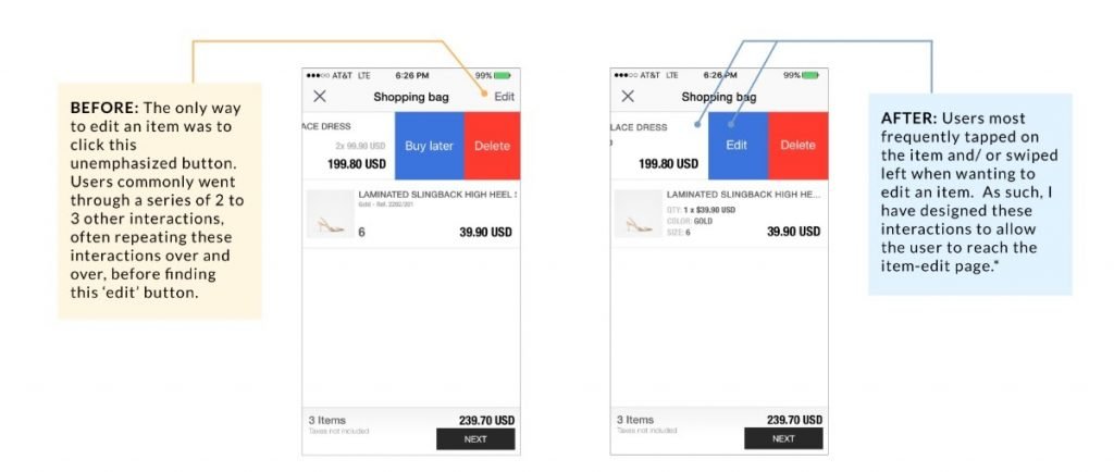
In the original version, clicking the product image opened the full-size version of the picture. That was confusing for most users, who expected to be able to edit that specific item in their order through that action.
In the suggested draft, users could click the product image to open an item-specific menu page, where they had the option to edit or delete the order.
In the iterated version of the app, no test users had any problem with editing their cart, so there was a 100% success rate.
If a customer can’t remove items they aren’t interested in purchasing from their cart, they are unlikely to follow through to checkout. By improving the overall UX of your cart, you can lower abandonment rates and sell more products.
Usability Testing Example: SaaS
Any SaaS solution is supposed to help a person or business do a task more efficiently. But that’s only possible if the user can use your software correctly. And that’s a big if.
For 41% of SaaS companies, 90% of free trial users never amount to anything else. And the numbers don’t look great for the rest either.
The transition to using a new tool to solve an old problem is more complicated than most product managers give it credit for. Instead of getting lost in adding more features, you can use usability testing to develop an onboarding process that works.
A SaaS solution only becomes an asset when your users know how to use it.
- Landing Page/Signup Process: Do users understand what your product does? Is it easy to sign up as a user/start using your product?
- Onboarding Tutorial/Docs: Can the average user learn how to use your product effectively through your regular onboarding process?
- Essential App Tasks: Is the average user able to complete crucial tasks in your app without issue?
- Contacting Support/Getting Help: Is it easy for users to get the help that they need?
You must test users of different proficiency levels:
- Users who are familiar with competitor SaaS solutions.
- Users who have never used a similar solution.
- (For B2B SaaS) users who match the profile for buyers in your industry.
An interesting SaaS example is this case study on a user testing-focused redesign, by web design asset SaaS, Icons8[7]. They discovered that they were getting three times fewer page views and actions than one of their competitors. They quickly discovered a key issue; they forced users to shift their focus in between actions.
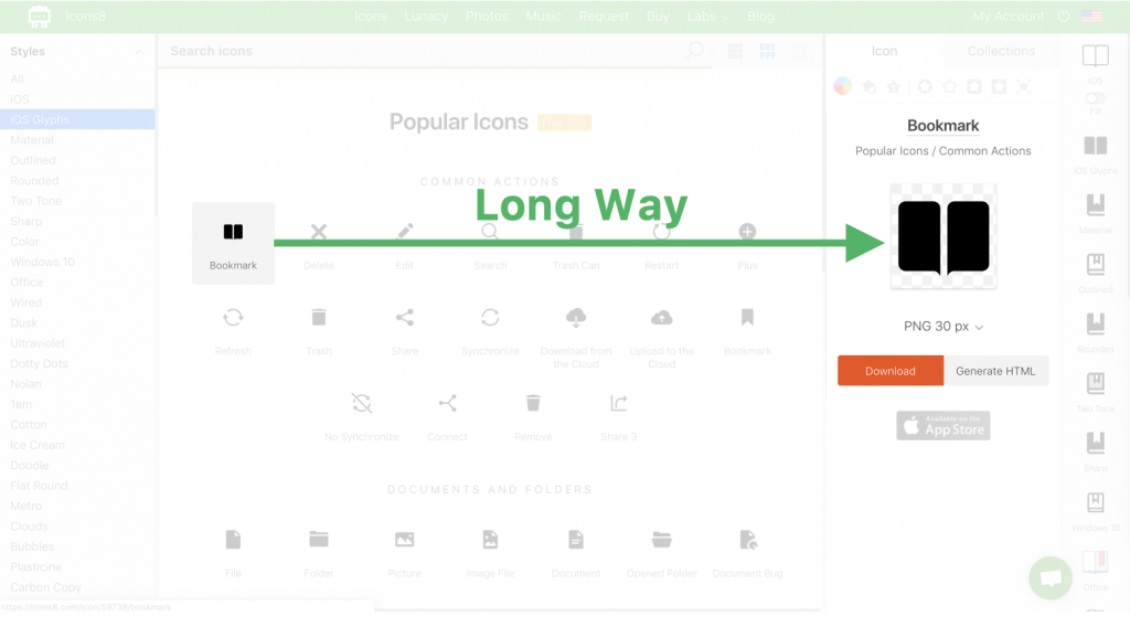
When a user selected an item, it didn’t expand a section below the icon the user clicked. Instead, it opened up a new section on the right-hand side of the screen.
The distance was a distraction and created a clunky experience. So the expanded dialogue was moved to directly below the selected icon.
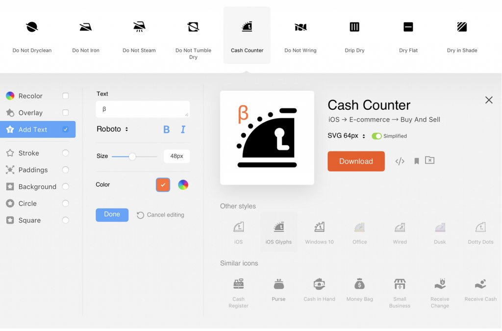
By shortening the distance, they were able to speed up the process for their users, make it easier, and in turn, lead to more actions, page views, and customers.
And that wasn’t the only usability issue they discovered either. By testing several significant task flows, they were able to improve the general usability of their app in a lot of areas for users of all levels of technical literacy.
Usability Testing Example: Company Website
When it comes to your company website, you might think that usability doesn’t need to be a priority.
But you’d be wrong. 57% of internet users won’t recommend a business that has a mobile website with a poor user experience.
Your website is often the gateway through which customers get to know more about your company. To make an excellent first impression, you have to take UX seriously.
Answer the following questions to get a real view of your site’s usability:
Navigation/Discovery: Is it easy to find the page/information users commonly look for? Are central pages highlighted in primary navigation at the top of the page?
Homepage Content Clarity: Does the average website visitor understand what your company does?
It might seem surprising, but with many websites and landing pages, a large part of the visitors don’t correctly judge what services the company offers.
In a case study, 24% of first-time visitors to a company site didn’t correctly answer the question[8], “What do you think this company does?”
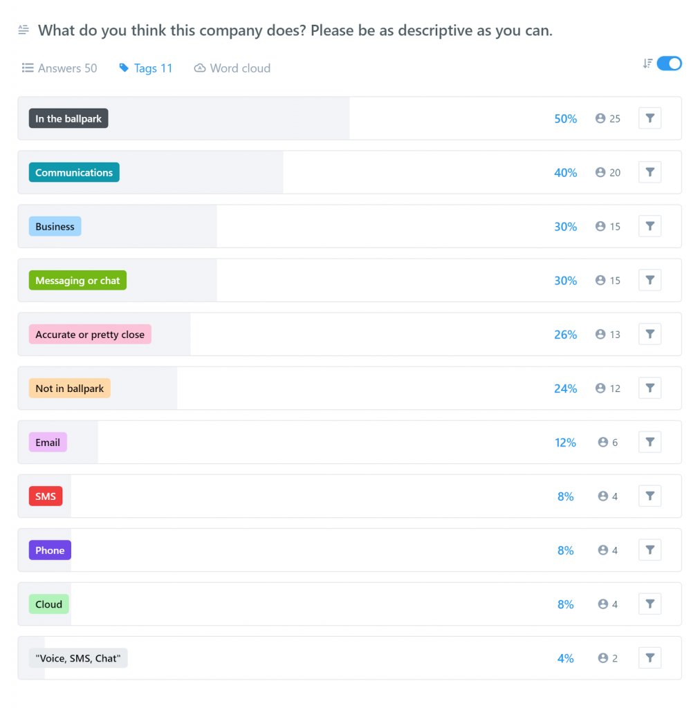
And only 26% of the answers were accurate or pretty close to the answer. The majority of test users were in the ballpark, with only a general idea of what the company does.
In the following test, they benchmarked two headline variations against the first result. They decreased the “not in ballpark” answers by 6%, and increased the accurate answers by 26%.
If 30% of all your visitors better understand what your company does, that could mean a 30% increase in potential customers generated from your web presence.
And of course, that’s not the only part of website usability that you can improve through testing. By running a basic problem discovery test, you can discover even more low-hanging fruit.
Usability Testing Example: Food Delivery App
On average, it takes just 5.8 days from the last time a mobile user opens your app until they delete it.
If you don’t want it to be uninstalled, you need to double down on UX and make sure that every time users open your app, they get a great experience from it.
To make sure that this is the case, focus on the following:
- App Store Page: Do users clearly understand what your app does?
- Downloading/Installation: Is it a seamless process to download and install your app?
- Essential App Tasks: Are users able to complete essential tasks? Does the average mobile user need instructions to be able to use the key features of your app?
- Navigation: Will the average user be able to find relevant pages/features without issue?
In this case study, a designer set out to discover and solve the most significant issues with the Caviar food delivery app.
Through guerilla testing, she was able to quickly identify a variety of common issues, unused features, and major pain points.
One major issue was that the app didn’t have filters to help users locate the specific foods that they were craving. Another issue was that users weren’t finding and using the search function.
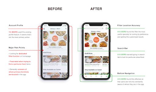
By using the information from her problem discovery test, she was able to develop a new user interface that delivered a user experience that better aligned with users’ expectations.
Users were able to filter the location results with 60% better accuracy, with the dedicated search bar, 100% of the test users used the function to look up a particular food/place.
9 Common Usability Testing Mistakes
The testing process is challenging and, whether you use a lab or not, can take hundreds of working hours and cost thousands of dollars.
It’s a big investment, so do your UX research, lay the groundwork, and avoid the following mistakes to get the best results.
1. Starting Too Late
One of the biggest mistakes when it comes to UX testing is to begin after you release your product.
At that point, there’s little-to-no budget assigned to design and development, so progress tends to be slow. Plus, even if you discover major issues, it can be very challenging to implement fixes and changes with an existing user base.
Instead, start testing as part of the initial design process. You can use real feedback from your target customers to build a product or website/app that they will use and love from day one.
2. Narrow Testing Group
To get the most value out of the testing, you need to represent the whole spectrum of potential users. So include different age groups, different levels of technical proficiency, different professions, and more. In general, try to gather as broad and varied a group of participants as possible, within the confines of your target market.
3. Not Specifying Metrics
While problem discovery and success rate will give you essential initial insights, they aren’t the end-all-be-all of user testing.
To get the best results, you also want to highlight questions to ask and metrics to measure for learnability, efficiency, and more. Not specifying additional metrics leads to a narrower dataset and, ultimately, shallower insight.
4. Using the Wrong Questions
If you are just testing for the accuracy of your landing page’s impression on users, or fundamental website usability, using standardized questions will get you most of the way there.
But they won’t hold up if you are testing custom task flows. When testing the unique features of your software, you must select and develop the right questions for the task. Not knowing the right things to ask their test groups can render an otherwise sound test useless.
5. Not Combining Different Methods
Every approach and test type has its pros and cons and unique applications. If you want fast initial data to create benchmarks for further testing and improvement, unmoderated tests are a great choice.
If you want a more in-depth understanding of how users interact with your product, a moderated test in a lab setting might be the way to go. Combining multiple methods is the only way to get the complete picture, and perfect your UX.
6. Rushing the Process
The faster you can gain valuable insights on your UX, the quicker you can improve it and get better business results. So it’s tempting to simply get a test up and running as quickly as possible.
Even with problem discovery tests, you must take your time to select the right test group, tasks, and questions. Rushing the process can lead to inadequate datasets and poorly informed design decisions that lead to a worse UX for your ideal users.
7. Trying to Test Too Much
Once you get started, it can be hard to limit yourself. Instinctively, many test every nook and cranny of their website/app. The reality is that 20% of your pages/features see at least 80% of the traffic and are the main reasons why users choose you over a competitor. So instead of trying to test everything, focus on your essential task flows, pages, and features.
8. Misinterpreting the Data
Since testing groups are often quite small, it’s easy to get swayed by the experience of a single individual, even when it’s not representative of the whole.
To avoid getting hung up on outliers, visualize the results with graphs and tables, and consider how your small sample size affects the average.
For example, if you run a task flow test, and five people take over 10 minutes to finish a task, they will significantly drive up the average, even as a minority group.
But if you look at any distribution chart, you can see that the main usability winnings are found in the 30-60 seconds and 1-2 minutes, which makes up 71% of your users.
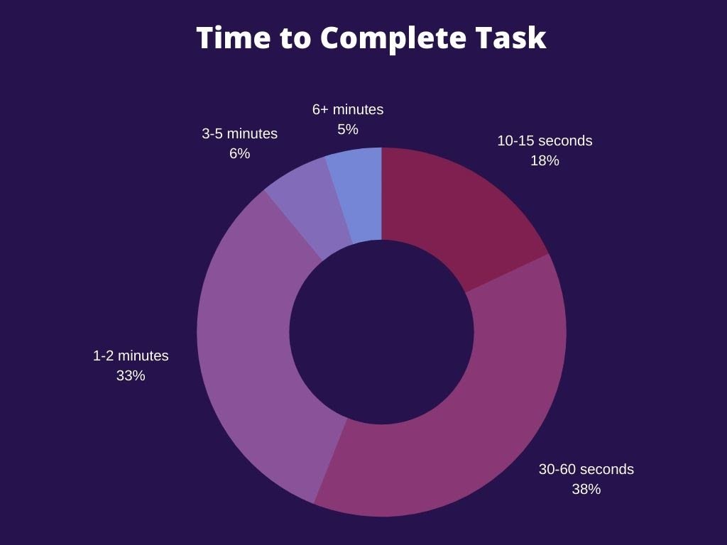
Addressing their problems would have a significant impact on your retention than focusing on the extremes.
You should also confirm that any outlying results (whether good or bad) actually fit within your target market before devoting more resources to tackle their issues.
9. Not Implementing the Results
Some companies arrange UX tests, but never develop any iterations or implement any changes based on what they learned. Settling for average is a guaranteed way to stunt the growth of your company.
If you already have a successful version of your product running, it can seem daunting to implement live changes based on the experiences of a few people.
But you don’t have to make the switch all at once. You can test new designs in limited traffic split tests, and even specifically exclude loyal users who are already accustomed to your old UX.
Conclusion
Usability testing helps you understand how real people use your product at every step of the development process. But it’s not just a tool to help your design and development teams make decisions. It enables you to build a better product that appeals to and works better for more people. And, ultimately, when a product works better, it makes it easier to market to, sell to, and onboard users. Once they’ve signed up, a better UX leads to higher retention rates and improves your bottom line. For optimal results, tailor the process to your product and your target market, and avoid common mistakes like starting too late or not selecting a varied testing group that covers your bases.
Frequently Asked Questions on Usability Testing
The purpose of usability testing is to put your product or website in front of real people from your target market.
You will get to know first-hand what the user experience of what your product looks like, & what they think about your product.
Read more in this guide.
Usability testing in web testing is a user-centered design technique where you evaluate a web app or website by testing it on a group of people with no prior exposure to it.
There are many benefits of usability testing.
A couple of them are getting real feedback before launching your product, using data to solve design debates, save time on the development of products and finally improving user experience.
The different types of Usability testing are:
1. Moderated In-Person
2. Unmoderated Remote Usability Testing
3. Guerilla Testing
4. Problem Discovery
5. Benchmark
6. Learnability
7. Eye Tracking
Know more about each one of them in depth in this guide.


