Qualicorp Streamlined Their Lead Generation Forms and Increased Sign-ups
VWO and Qualicorp
Qualicorp is a Brazil-based healthcare organization. The company focuses on administering and managing healthcare plans. They promote and sell group health and dental based insurances.
Qualicorp has been using VWO since 2015 and has been working actively on improving both mobile and web UX through VWO Testing & VWO Insights to achieve KPI goals. This has been immensely aided by VWO Services, the optimization consulting wing of VWO.
Goals
Economize Qualicorp, the domain that recommends best insurance plans based on user inputs, is the main experimentation arena for Qualicorp, based on its high traffic and use case offered. The primary objective of the domain is lead generation and increasing conversions via the ‘Insurance quotation’ page (Dados Para Coatacao: Resultado and Request received pages*) for plans.
*Resultado Page – Displays the list of health insurance plans based on user input values
*Request Received Page – Confirms the interest of the user in an insurance plan
Observations
With the aim to increase lead generation, Economize Qualicorp, took VWO Services’ guidance. Together, they made a few observations on the website:
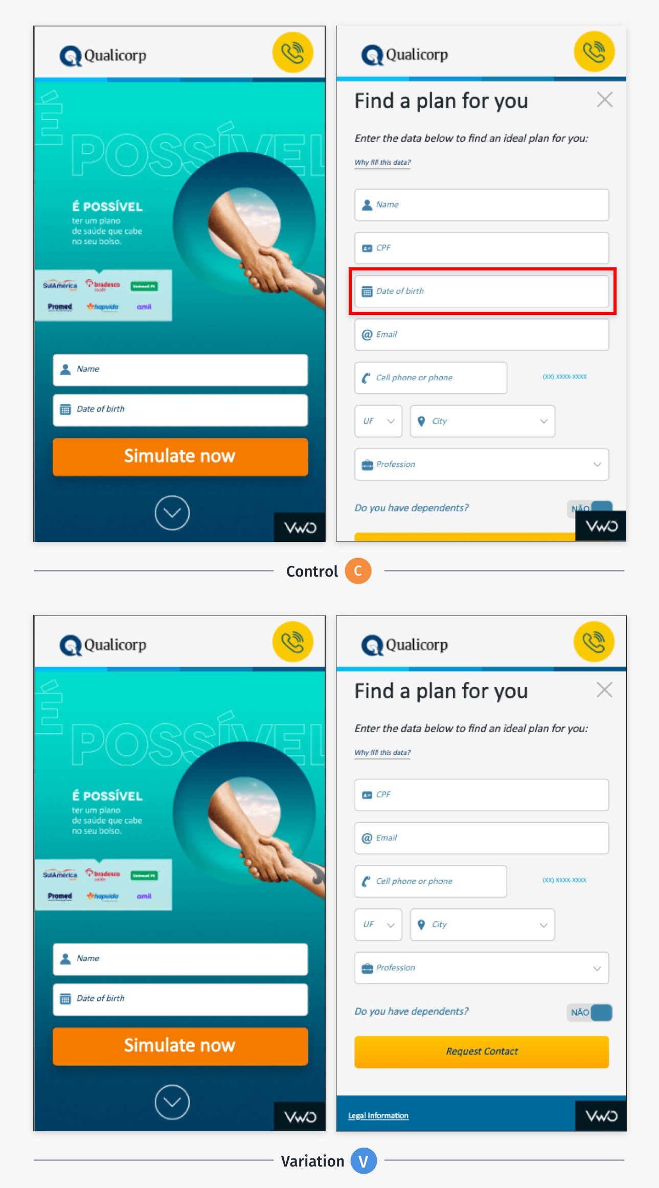
- When users landed on the homepage, two fields were displayed – “name” and “date of birth” and on the 2nd step of the form, they were again asked to fill these pre-filled fields to complete the step.
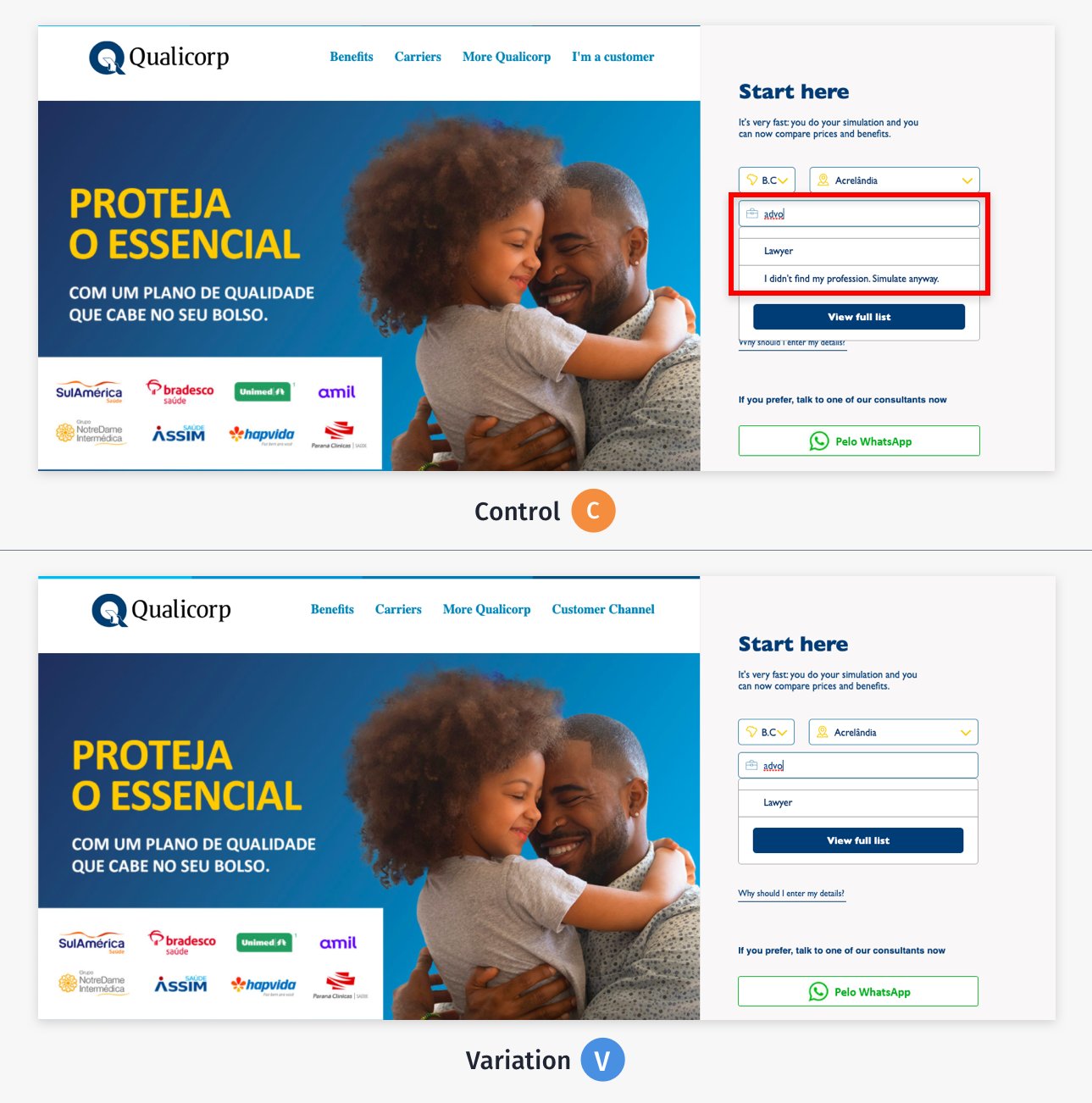
- Users were getting no results on the ‘Resultado Page’ when they selected the N/A option in the ‘Profession’ field.
- The ‘count of plans available’ form field could be skipped, which should be a must fill for the users.
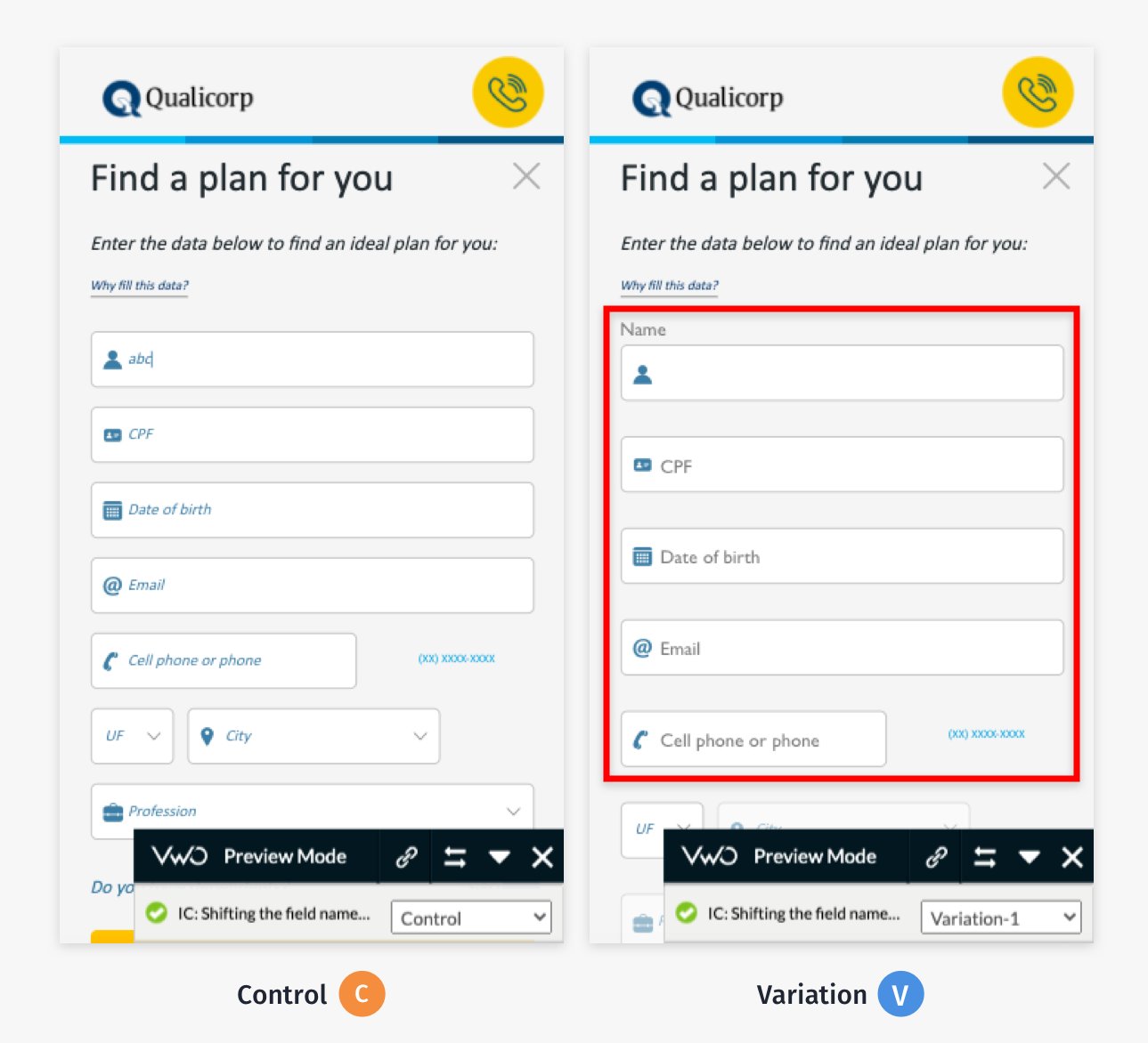
Through VWO form analysis, it was also realized that a major drop-off was happening while form filling. This was due to field names not being discernable at the time of form filling, leading to fewer users reaching the Resultado page.
Tests run
Each of the above observations was tackled through different tests, each with a different objective.
Test 1:
Since users were already filling the fields such as “name” and “date of birth” on the homepage, it was decided not to ask for the same information in Step 2. It was hypothesized that fewer details requested from the users, may lead to an increase in the users landing on the Request received page.
Result: The test ran for 14 days, with traffic being equally split between the control and the variation, with the entire traffic participating in the trial. The clicks on Primary CTA for form submission “Solicit Contato/Request Contact” improved by 24.68% with 100% significance and visits on Request Received Page improved by 19.31% with a 100% confidence level.

Test 2:
The objective of this test was to improve both the quality and quantity of prospective leads moving from Resultado towards the Request received page.
Showing more options in the ‘profession’ field instead of displaying ‘none’ in the field was seen as the solution to users not submitting this information.
A variation was created where the “profession” field was made mandatory so that users could not proceed without filling it. This led to more qualified leads landing on the Request Received Page (Interest confirmation).
Result: The campaign ran for 7 weeks, with traffic being equally split between control and variation. The visits on the Resultado page improved by 4.33% and visits on the Request Received Page improved by 12.52% with a 100% confidence level.
Since the complete campaign displayed improvement in lead generation the variation was deployed on the site.
VWO Insights lets you map the performance of your website forms to create seamless customer experiences. Take a free trial today to explore its features!

Test 3:
The objective of this test was to improve the drop-off happening at Step 2 of the form and hence push more users down the conversion funnel, i.e. Resultado page.
It was hypothesized that showing field names to users at only the most pertinent moment as well as making it look less cluttered will help in improving the form submissions.
A variation was created where once the user clicked on the field box, only then the field name would hover over the box, rather than being always-on. Field name font and size were also pruned and improved, so as to make them more legible.
Result: This experiment ran for 12 days and with all traffic participating, equally split between the control and the variation. The variation won with a 16.93% jump in the primary goal, Visits to the Request received page, with 100% significance. The variation is now live for all the users.

Conclusion
The winning variations running on the website have made it more effective and seamless for users than before. The team is also more confident about the website’s performance since the changes have been made through testing, and the impact of each is better known.
Needless to say, having made a significant impact on the website experience, lead generations, as well as the lead form user journey from step 1 to request received page, the Qualicorp team has developed a lot of faith in the process of conversion rate optimization and the VWO Services’ guidance. Now their aim is to increase their testing velocity and be more data-driven, through closer working with VWO Services. You can also take a free trial with VWO to understand more about how we can help you build seamless experiences for your customers.
We have significantly enhanced our website’s user experience and have created a substantial positive impact with the enhanced quality leads. The VWO team has been helping across, right from GA reporting to superior testing and management services to providing thoughtful design inputs of our new site. For me, the most impressive aspects of the VWO Services are communication and quick turnaround time.

Beatriz Yanagui
Marketing Analyst

Location
Brazil
Industry
Health
Experiment goals
Increase the number of Sign-ups
Impact
16.93% increase in sign-ups


