Tinkoff Bank Used A/B Testing To Improve Conversions By 36%
About Tinkoff Bank
Tinkoff Bank, a major online financial services provider based out of Russia, was launched in 2006 by Oleg Tinkov. In a relatively short period of time, it has emerged among the top 4 credit card issuers in Russia. Global Finance named it Russia’s Best Consumer Digital Bank in 2015.
Tinkoff operates through a branch-less digital platform and, therefore, relies heavily on its website to find new customers. Therefore, the bank constantly explores new ways to improve its website conversion rate. A dedicated web analytics team plans and executes their conversion optimization strategies.
Goals
Increase the Number of Visitors Submitting Completed Credit Card Application Forms
Tinkoff Bank lets users apply for a credit card through an application form on its website. Users filled up the application form and submitted it to the bank for approval. After the application was approved, the credit card would be dispatched to their home at zero shipment cost.
This was the original application page:
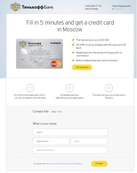
The application page on the website was fairly elaborate, consisting of a multistep form and details about the application process and the credit card plan. This was the page from where conversions (form-submits) occurred.
As the form involved multiple steps for completion, Tinkoff tracked each step of the form along with submissions for completed forms. Tinkoff refers to these conversions as short-application submits and long-application submits, respectively. Tinkoff’s ultimate goal was to increase these conversions.
Tests run
Conduct A/B Tests to Identify What Changes Delivered Better Conversions
Tinkoff’s CRO team used Adobe Site Catalyst to analyze website visitor data and found that the credit-card application page had a significant bounce rate. The team then brainstormed ways that would help users stay on the credit card application page and submit the completed form (that is, complete the conversion).
They team zeroed in on 3 elements of the webpage. The hypothesis was that introducing new features would improve user experience on the page and encourage conversions. However, the team needed to be absolutely sure about the effectiveness of these new features before applying changes to the webpage permanently.
There was only one way to do it objectively—through A/B testing.
Tinkoff used VWO to carry out A/B tests on the page to determine whether the planned changes would be beneficial in terms of increasing conversion rates. Three separate tests were conducted.
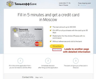
Test 1 was around the hypothesis that providing additional details about the credit card above the form would increase the number of submitted applications.
Tinkoff created two variations of the original (control) page.
The first variation included a “More details” hyperlink underneath the “Fill out form” CTA button placed above the fold. When clicked, the hyperlink led to a new page which provided additional information about the credit card scheme. Here’s how it looked.
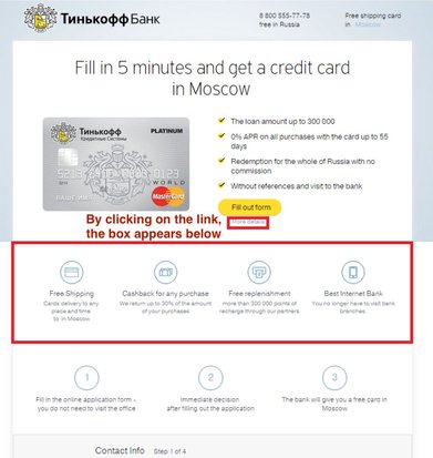
The second variation had the same More Details link below the CTA button. But this time, the link opened up a box right below that provided additional information about the credit card, through text and graphics.
Here’s the second variation.
The test was run on more than 60,000 visitors for a period of 13 days.
Results
The first variation couldn’t outperform the control; in fact, it had an even lower conversion rate than the control. The second variation, however, improved the page’s conversion rate by a remarkable 15.5%. Moreover, it beat the control every single time.
Test 2 was around the hypothesis that providing a “progress bar” on top of the four-step application form would motivate users to fill the form completely, resulting in a higher conversion rate.
Here again, Tinkoff designed 2 variations of the original form page.
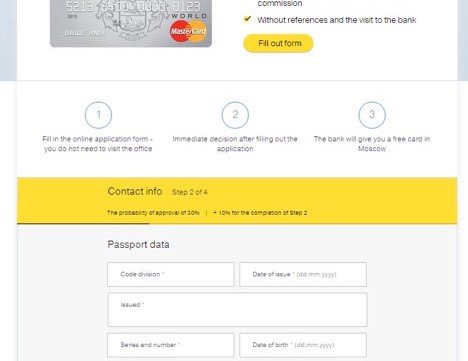
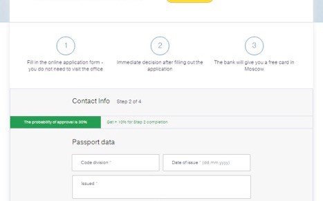
The first variation had a yellow banner-like progress bar, right above the form. The progress bar highlighted which step the user was at. The user’s progress on completing the form was also displayed graphically through a black line at the bottom. The bar mentioned the probability of approval of a credit card based on how far the user had filled the form.
This is the first variation:
The second variation also had a progress bar, but with a different design.
Similar to the first variation, the second variation progress bar too displayed which step the user was at and the probability of approval of a credit card. But here, the progress bar was green in color. And it didn’t have the additional black line to graphically show the user’s progress on the form. Instead, the bar itself represented the user’s progression graphically: The green portion of the bar grew as users moved further on the form.
This is what this variation looked like.
The test was run for more than 190,000 visitors for a period of 39 days.
Results
Both variations outperformed the control, and both had a 100% chance to beat the original page.
The first variation had a 6.9% higher conversion rate than the control, while the second variation improved conversion rates by an impressive 12.8%.
Test 3 was around the hypothesis that by giving users an option to fill their passport details on the application form later, the number of form-submits would increase.
Only 1 variation that was pitted against the control.
On the original page, users were required to submit their passport-related information on the form’s second step. The variation gave an option to the users for completing this step later, using a Don’t remember passport details? checkbox. On clicking this checkbox, a small window appeared, asking users to choose phone or email by which they could provide their passport details later. Users could complete the form whenever they had their passport details handy.
Here are the screenshots of the checkbox and the pop-up window.


The test was run on over 265,000 visitors for a period of 23 days.
Results
The variation beat the the control page, improving the conversion rate by a whopping 35.8%. The after-filling conversion rate, too, increased by 10%. And in this test too, the variation had a 100% chance of beating the control.
Conclusion
A/B Tests Help Deliver Double-Digit Increases in the Conversion Rates
Conversion rate optimization is not about testing random ideas on your website. It is about improving your website’s user experience through a coherent process. This process involves identifying areas of improvement on your website and suggesting changes based on traffic data and user behavior, and best practices. It is followed by A/B testing these changes and learning about the effectiveness of the changes. Only when the changes improve the conversion rate of your website do you apply them permanently.
We explain below the learning from each of the 3 A/B tests Tinkoff conducted, highlighting the underlying principles that can be applied to other conversion optimization efforts as well.
Test 1
Placing key differentiators on a web page prominently is an important CRO best practice. Key differentiators enhance the image of a brand in the eyes of users and influence them to make a conversion. Tinkoff displayed its differentiators within a box, behind the More Details link.
The box clearly illustrated key differentiators such as free shipping of the card, free card recharge, and cash back on all purchases made through the card.
Free shipping influences customers; in fact, lack of free shipping is the number one reason why people abandon their shopping carts. Therefore, displaying Free shipping prominently on the application page worked well for Tinkoff.
Note: Although free shipping was already mentioned on the original page’s top right corner, it didn’t have much contrast against the background. It may not have been noticed by visitors. The variation, however, increased the chances of visitors spotting the much loved free shipping offer. A/B test the design, copy, and position of your CTAs with VWO to find one that gets maximum engagement. Start your 30-day, all-inclusive free trial now.
Reassuring users at each step of the conversion process improves the conversion rate. This is the reason trust badges, testimonials, and social proof work for so many websites. The features box on the application page reassured users about Tinkoff’s credibility because it provided key information: Tinkoff is the leading internet bank providing more than 300,000 points of recharge and how its service is completely digital and users don’t ever have to visit branches. This helped increase users’ trust in the bank’s services, thereby increasing form submits.
The A/B test also offered insights on why the first variation did not do well. The More details link on the first variation page led users to a new page with additional information about the credit card. This feature probably distracted some users away from the application form. And because web users have a short attention span, some users didn’t return to complete the form. In other cases, visitors may not have taken the trouble to visit the More details page, and so did not get to see the credit card features. The combined effect of these factors was to reduce the total number of credit card applications submitted.
Test 2
Users generally do not like filling long forms on websites. They are willing to do so only when they expect equal or higher value in return. When users find lengthy forms, they often become anxious because they aren’t sure of gaining satisfactory value after completing the form. Many times, user anxiety causes them to bounce off the form (or the website altogether).(A/B test your form to find the optimal length that works for your website visitors. Take a free trial with VWO to understand how easy this is)!
However, there are various website elements that can be used to reduce user anxiety, a progress bar being one of them.

Progress bars help curb user anxiety by providing them a visual cue about the effort required to complete a process. It reassures users that the process is underway and will be completed in due time and effort. This keeps them from bouncing off the page, a conclusion that has been reached by various studies on website and application designing.
Most users would have played video games of some kind and, therefore, would be familiar with progress bars displayed within such games. In video games, progress bars are usually associated with the gamer’s progress with respect to the game’s objective (or beating a certain opponent in the game at a certain stage of the game).

Tinkoff adopted a gaming style progress bar on the credit card application form page. The progress bar would only be fully filled when users completed the form. A partially filled progress bar motivated users to complete the form and submit it.
Tinkoff’s progress bar also used rewards, another gamification technique, to motivate users. Text was overlaid on the progress bar. For example, when users were on the second step of the form, the text read The probability of approval is 30% and Get 10% for Step 2 completion. As users invested time and effort in applying for their credit card, they would have wanted to maximize the probability of approval. By realizing that each step increased the probability of approval, users were further motivated to complete the application forms and submit them.
The A/B test also offered insights into why the second variation performed better: the progress bar had greater visibility. Providing contrast to your key elements on a webpage is the basic principle of web design. The first variation progress bar was a black line at the bottom of a yellow banner. As the color scheme of the overall page included white, gray, and yellow, the progress bar and the banner didn’t have much contrast. For some users, the progress bar could have easily blended with the page’s theme. Moreover, the progress bar was quite thin, which may have made it harder for some users to even notice it.

The second variation progress bar was green in color, giving it ample contrast and visibility on the page. The width of the bar, too, was large enough to make it noticeable to the users. And of course, after the progress bar was noticed by users, they came under its persuasive influence.
Test 3
This test exemplified 3 important design principles, as highlighted below:
Acknowledging users’ issues: The second step on the application form required detailed information about users’ passports (e.g. date of issue, series and number, code division etc.). Most users don’t have these details memorized or handy at the time of filling the form. This could have caused them to bounce off the form. With the variation offering users the option to submit the passport details later, users no longer had a reason to leave the application form partially-filled.
Providing freedom to Users: After users clicked on the “Don’t remember passport details” checkbox on the page, they were given the option of completing the form via an email link or through a phone call with Tinkoff’s executives. The latter option reduced user effort and this feeling of “freedom” contributed to reduced bounce rates and in turn, increased conversions.
Virtually shortening the form length: Once users chose to fill their passport details later, they were left with only two of the four steps to complete. So, effectively, users had already completed half of the application form—information that was reinforced by the progress bar on the form. As users had completed the first half of the form in a breeze, they looked forward to completing the next half equally quickly. The option to submit passport data through a phone call converted the form into virtually a 3-step process.

Location
Moscow, Russia
Industry
Finance
Impact
35.8% increase in Conversion