How VWO Helped Billund Airport Increase Its Online Shopping Page Click-throughs
About Billund Airport
Billund Airport, West Denmark’s International Airport’s team used VWO to help figure out what would help drive traffic to the shopping page of their web site.
Goals
The main objective behind undertaking A/B testing for their homepage was to drive more visitors to explore their online shopping page.
Tests run: CTA text modified so that it conveys value more effectively to visitors- and thus attracts them
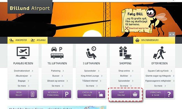
The airport’s website had five call-to-action buttons that pretty much consumed all the real estate on their homepage. These CTAs were Book Tickets, Book Parking, Arrive Home, Shop Online and Questions and Answers. This is how the site originally looked:

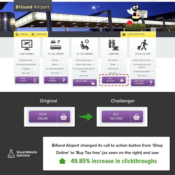
To get more customers to enter their shopping page, the company decided to create a variation of the fourth CTA button (“Shopping”) and A/B test it against the control (the original page). The text ‘Shop Online’ was replaced by the text ‘Buy Tax-Free’. VWO was used to set up and run the test. The test ran for 17 days.
This is the screenshot of the variation (the original was in Danish; this is an English translation using Google Translate):

Conclusion: A 49.85% increase in the number of visitors clicking on the Shopping page
The hypothesis was spot on. The variation won hands down, with the variation generating 49.85 more clickthroughs than the control. The clincher was that there was a 99% confidence associated with the results, meaning that the variation would perform better than the original 99 times out of hundred. Not surprisingly, Billund Airport executed the changes.
As conversion optimization specialists, we are always looking to understand why something worked- and tie the learnings to web design principles or other underpinnings in consumer behaviour, neurosciences etc.
So why did this small change deliver big results?
It’s all about phrasing the CTA in a way that conveys value to the visitor. The original text ‘Shop Online’ just stated the obvious; it didn’t do anything extra. It’s a bad value proposition. By comparison, the phrase ‘Buy Tax-Free’ has multiple advantages. Here are some of them:
1) Desirable value proposition
A business or marketing statement that summarizes why a consumer should buy a product or use a service.
If one is to go by this definition of value proposition, then ‘Buy Tax Free’ knocks it out of the park. It effortlessly conveys a clear benefit to potential shoppers which a ‘Shop Online’ can’t even hope to communicate – a strategy that also finds a mention in Content Verve’s 10 success story takeaways. By announcing on its homepage that it offers duty-free products, it is telling international flyers that shopping with them could yield substantial savings.
2) Competitive advantage
Visitors like to compare. Unless and until you have done something remarkable to make them love you, they will scour the length and breadth of internet (not possible, but tempting usage of the phrase) to find the best price, offer or whatever instant gratification they are looking for.
Billund Airport’s variation copy told international travelers exactly why shopping at Billund Airport was a better deal than buying from local stores. The ‘duty-free’ part gains it a competitive edge over other shops or eCommerce stores that might be selling similar products. For instance, this Shiseido Benefiance night cream displayed on Billund’s category page was priced at 500 DKK. The same cream was being sold for 640 DKK at Matas store, a prominent drugstore chain that operates across Denmark.
3) The word “free”
Billund Airport was only offering buyers the benefit of lower taxes; they were not giving anything out for free. But “free” is that endorphin-inducing word that makes shoppers go weak in the knees. From behavioral economists, neuro marketers to copywriting experts – everyone has vouched for the power of free.

Location
Billund, Denmark
Industry
Travel
Impact
49.85% increase in Click-through rate


