Follow us and stay on top of everything CRO
Read summarized version with
What is website redesign?
A website redesign is a detailed process of revamping your site, which includes updating content, refreshing layouts, and improving navigation for better conversions and site performance.
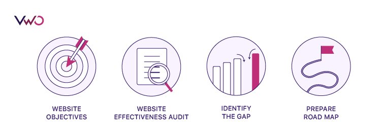
- Website objectives: Determine website objectives to define your initiatives, targets, and measures for the redesign, and what metrics you want to have in place to achieve your goal.
- Website effectiveness audit: It is imperative to audit your internal web capabilities as the first thing. For example, with SWOT analysis, you can analyze the overall effectiveness of your website. Conduct an industry analysis to determine trends and best practices.
- Identify the gaps: Create a checklist of website infrastructure that includes people, process flow, and technology to identify any gaps. For example, to better the UX, you can identify specific elements of the web page, such as a misplaced CTA button, a sketchy web form, or anything that is distracting or confusing the visitors.
- Prepare a road map: Identify steps and technologies that you need to close the gaps. For example, you can A/B test elements causing trouble and fix them in the new wireframe design.
The redesign process can potentially improve website performance if you have clarity on the site goals. The process entails technical aspects that would involve finalizing a color scheme, fonts, logo, design elements, button colors, button placement, etc. From the coding aspect, zeroing in on the content management system, coding language, etc., would become crucial.

Top 6 reasons when and why you should redesign your website
Companies go for a website redesign for many reasons. Some of the reasons are discussed in detail in the following sections.
Rebranding or repositioning
Rebranding is a marketing strategy to change the perception of an organization for business reasons. It helps the company stand out among a pool of competitors. Rebranding becomes mandatory in certain circumstances like mergers for instance. Rebranding also becomes inevitable when you want to:
- Accelerate growth
- Revive lost brand identity
- Update an outdated website
- Establish a unique brand voice
- Accommodate for new or amended products and services
Rebranding does not deal with just changing the name or logo of the organization, but positioning your brand in a way that connects with your users. Besides, it is also about developing visual elements that would communicate your brand consistently across all your marketing materials. It can include changing the look and feel of your website. Pitch decks, proposal templates, brochures, and one-sheet fliers are a few tools that can be utilized to communicate the message of your brand.
For instance, Siemens reinvented their brand as they knew it needed to be perceived as innovative as their products and services. To reflect their dedication to “ingenuity for life”—pairing technology with purpose, they relaunched their brand, projecting their entrepreneurial and innovative spirit in all their marketing material.
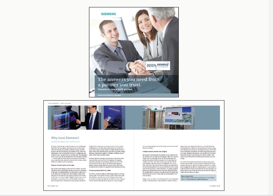

Image source: Stratabeat.com
Repositioning, on the other hand, is changing the understanding of your customers around the brand. Market or brand positioning is a brief description of where you fit into the market space.
For example, Starbucks positions itself as a source of quality coffee and beverages, while Tesla and Audi have established themselves in the market as luxury status symbols. Similarly, McDonald’s and Wendy’s project themselves as innovative leaders or low-cost providers with their inexpensive quick bites.
Companies might consider repositioning a product due to poor conversion rates or major shifts in the environment. Creating a unique impression in the customers’ minds should be the goal, so they can associate something desirable with your brand, which is distinct from the rest of the marketplace.
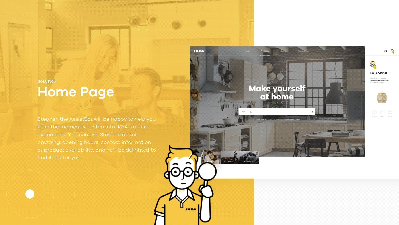
IKEA decided to take its in-store shopping experience online. It is a home goods and accessories company. The redesign highlights complete interior arrangements, similar to their brick and mortar stores, in a less cluttered way than their previous website. Also, to give a human and more personalized touch, a chatbot acting as a sales associate was introduced, which could guide the buyers through the purchasing experience on the website.
Research is an important aspect of brand repositioning. Finding your niche and communicating effectively with customers and prospects can help businesses find out if they are meeting their positioning goals.

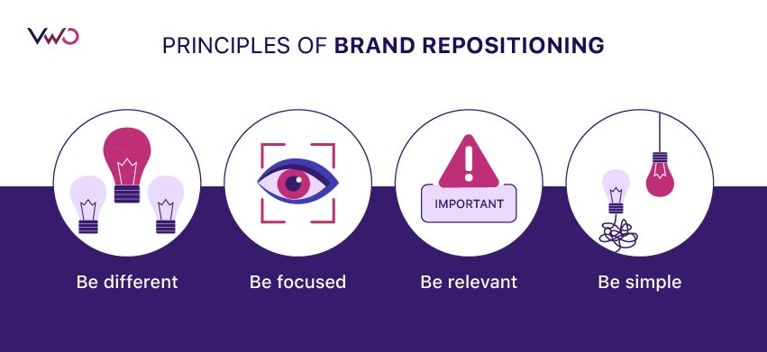
You must be aware of what your competitors in the market are up to and perform a competition analysis to determine your business’s strengths and weaknesses and carve out your positioning in the market. A platform collapses if any of the below principles are not followed in the positioning exercise, wherein you have to:
- Be different: Prioritizing your value proposition will take you a long way. Figuring out your brand’s USP is therefore an important principle in this exercise. For example, Apple has positioned itself as a tech company that offers user-friendly and innovative products. Your experience on an iPhone is going to be different from an Android mobile phone.
- Be focused : With a target market in place to serve, Apple has always centered their products around innovation and usability. The transition from an iPod to an iPhone is an excellent example of Apple’s focused vision.
- Be relevant: Apple stayed relevant and contemporary as their brand has always been about humanizing technology.
- Be simple: “Simplicity is the ultimate sophistication,” is what Apple’s first-ever marketing brochure headline read, back in 1977. Creating powerful products with a clean, friendly, and fun design, Apple did it all to connect with its target audience.
Companies should take a well-informed and consensual decision on website redesign aimed at rebranding and repositioning. Since it requires a number of resources and is a time-consuming process, a lot of contemplation and internal discussions should go into it.
Launch of a new product or service
Launching a product or a service line invariably calls for a redesign to accommodate the new features and functionalities. Companies take this step for various reasons that can range from rebranding or repositioning themselves in the market to?. Nevertheless, it needs team effort and extensive involvement of developers and design resources.
Whenever possible, launch a minimum viable product (MVPs). Either roll out a new feature with limited functionality or on a subset of pages. With MVPs, you can prove impact quickly and get more resources.
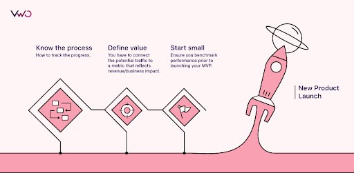
For this to happen, you are required to:
- Know the process–how to track the progress.
- Define value–You have to connect potential traffic to a metric that reflects revenue/business impact.
- Start small–Ensure you benchmark performance before launching your MVP.
Adding more functionality to a website
When you decide to add new functionalities, tweaking your website’s current layout becomes inevitable. Since functionalities in websites can directly affect your business, you must ensure that the feature you want to add to your website meets your desired business goals.
For example, if you own an eCommerce store, your users are likely to have a product in mind they came looking for at your site. You can plan to add a chatbot on the website that should provide value to visitors on the product page. Adding the chatbox, however, would require a bit of tweaking on the backend of your website.

Optimizing for conversions bases data-backed insights
CRO doesn’t focus on getting more site visitors but instead focuses on driving conversions from the existing user base. This way, you do not have to make an effort to get more people on the site. Therefore, having data backing your insights is crucial.
There are two kinds of data you should be looking to gather—qualitative and quantitative data.
Quantitative data:
1. Which pages get the highest traffic share?
2. On which stage does our audience drop off from the site?
3. Which sources/mediums drive the most converting traffic to the site? Why?
4. Which sources/mediums drive high traffic but no conversions? Why?
5. Which product pages have the lowest exit rates? Why?
6. Which products have the highest impressions: checkout ratio? Why?
These data will then be analyzed to get the facts out.
Qualitative data:
Besides analytics, you must engage yourself with real people, like your prospects or customers, to get insights from:
- Surveys: You can ask your visitors or users questions to fetch important data via emails or over your website by running surveys.
- Interviews: Nothing beats human conversations as we are wired for storytelling. Your questions should be framed in advance in a crisp and concise format to not only forage relevant information from the interviewee but also set a narrative to your conversation.
- Focus groups: These are among the best ways to gather quick information. You can have a sample size of 20-50, where you can ask questions in quiz formats, such as preference tests and click tests, to gather relevant data for your website.
- Oral history/transcription: It is a spoken account that reflects the personal opinions of the narrator. It is more precisely defined as the recording, preservation, and interpretation of historical information, which can serve as a data source for your redesign experiments as well.
You can also use tools like VWO’s AI-powered free heatmap generator, session recordings, form analytics, to gather qualitative data.
The insights from both qualitative and quantitative data can catapult your conversions when adapted wisely to your CRO program. These insights mainly feed into the next leg of your CRO journey in the form of actionable inputs that you must implement to optimize your website conversions. However, sometimes these optimizations require you to rethink your website functionality or design, and that’s when you might have to overhaul your site for the sake of improving conversions.

Revamping for a responsive web design
Website designs are bound to change with time and user behavior. Your website might be outdated, that is, it uses an outdated software, obsolete backend system, is not mobile-friendly, etc., which calls for a radical redesign. With a massive hike in mobile searches, you can’t sit back with your website without making it mobile responsive.
So, if you want to go for a redesign, you must carefully analyze user behavior through your quantitative and qualitative research, including surveys, competitive analysis, and auditing your current website. What can you solve for your users to enhance the UX?

For example, you can answer a few of the below questions if you want to optimize your mobile website:
- What is the time spent using mobile as media?
- What is the percentage of consumers who use mobile devices?
- Do they use an iPhone or an Android device?
- How many website visits are on mobile versus desktop devices?
- What are the mobile conversion rates versus desktop and visit share for eCommerce sites?
- What is the Mobile app versus mobile site usage?
- How important are mobile ads to your target customers and your business?
- What percentage of Google searches are from mobile?
You will get a lot of insights from this exercise. List your ideas, discuss within the team and outside, if possible, and start to test them for your hypotheses, which could be to go for a responsive design or an adaptive design, before churning them out to the design team.
Improving SEO and site performance
SEO determines how easily and quickly your customer finds your website. The major roadblock for Google crawlers to find your website is when it has graphics without alternative text; it has poorly used HTML tags; and irrelevant keywords.
Evaluating the website SEO through online tools such as SEOptimer, Website Grader, etc., to detect some glaring mistakes in your optimization could be helpful.
Steps for planning a website redesign
Conduct user research and analyze your current website
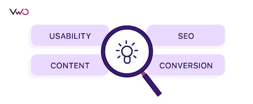
Analyzing the current website is the first step in the redesign process. You must know what is wrong with your existing website. There are four components that you need to analyze thoroughly:
- Usability
- Content
- SEO
- Conversion
Usability
It is crucial that your prospect understands your business’s core message the moment they land on your web page and can see, use, and navigate through the website easily.
Website speed, security, a convenient menu, and responsiveness are some of the factors that shape user experience.
For example, in a comparative study conducted to determine which popular beauty and cosmetics mobile website among the four brands in the study has the best user experience, users were asked questions around:
- The ease of using the beauty and cosmetics website;
- Challenges they face during their experience on the website;
- Is the website easy to navigate; and
- What makes navigation difficult?

It was found that:
- Speed, correct filters, and sorting made it easy for the users;
- Slow page loading, poor navigation, website responsiveness, and adaptability issues made it difficult;
- Easy and secure checkouts, helpful categories, filters, and sorting made the user experience great; and
- Cluttered web pages, non-intuitive forms made navigation difficult.
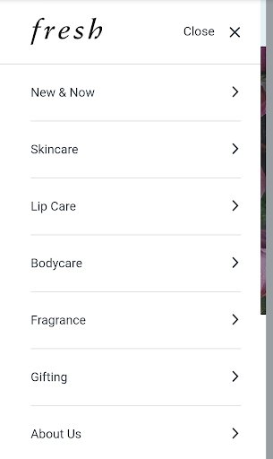
Fresh topped the list on usability testing with a minimalistic and clean design, clear CTAs, product sorting, and easy navigation. At the same time, Lush struggled to do so, having all the troubles already mentioned.


Lush and Clinique performed poorly on Usability testing. Their mobile sites can be optimized by:
- Fixing the website’s speed. For example, web pages with a lot of clutter take longer to load. Be concise in the content and design of your landing page.
- Figuring out what is impeding conversions and fixing it accordingly. A faulty webform, a bad CTA, or a poor adaptive mobile design could be some of the factors. For example, creating a responsive version of the website for different screen sizes can resolve the adaptability issues and increase conversion.

Content
Your website content is an important part of its design. Understand what your users want to read on your website while redesigning. What is that new thing you need to attract users’ eyeballs?
A good content strategy encompasses data-driven insights, such as user testing, UX reports, heat maps, session recordings, user-centric ideas, and testing that focus on the prospects’ behavior. As a website owner, it is natural for you to expect your visitors to process your web page, get the point, and move ahead in the funnel. At the same time, your prospects prefer the information to be relevant, comfortable to read, and grammatically correct.
So, if one design causes viewers to process things more variably over another on your web page, this will affect the visitor flow through your website. To capture your prospects’ attention, the content on your website should follow the correct information architecture and have great readability and accessibility.
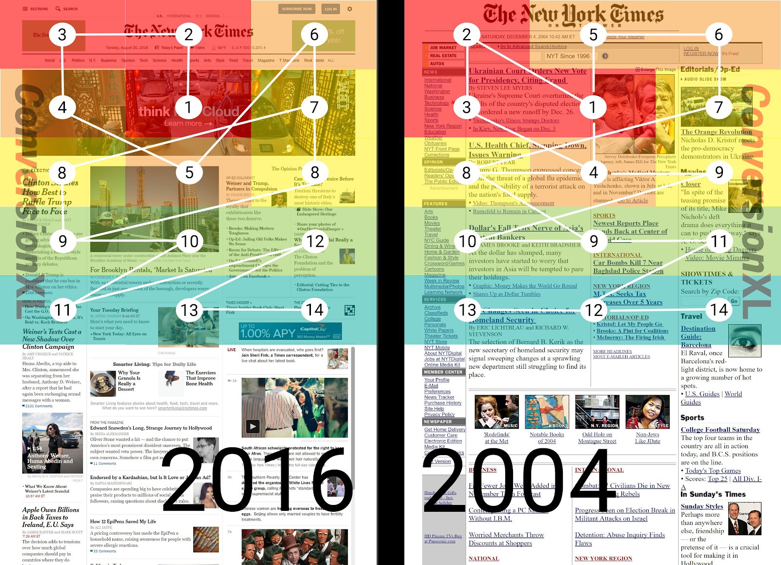
In a New York Times study, it was found that the large banner ads in the 2016 variation of the website left the users in the state of meandering and confusion, causing more variability in reading as compared to the 2004 version of the website. Given the designs tested, the center and upper left of the page had more immediate prominence.
Search Engine Optimization (SEO)

Fundamentally, SEO looks at the user intent. You won’t rank until you fulfill the user intent. Empathy is paramount to get the right intent from the users.
Technically, SEO determines how easily and quickly your customer finds your website. The major roadblock for Google crawlers to find your website is when it has graphics without alternative text, poorly used HTML tags, and irrelevant keywords.
Evaluating the website SEO through online tools such as SEOptimer, Website Grader, etc., to detect some glaring mistakes in your optimization could be helpful.
Conversions
Your homepage must ensure that the information your prospect is looking for is easily found. If the prospect is bouncing off from your home page, you probably do not have the correct user persona in place to engage your target audience.
Every action that prospects take on the website should be tied to the desired conversion goal.
The resolution for the possible bottlenecks of your website’s declining conversion can be found by answering the below:
- What functions does your website currently perform?
- If you didn’t have this website, what would happen then?
- What niche does your business occupy that sets you apart?
- Do you have a tagline describing the USP of your services?
- What pool does your ideal customer belong to? Is that an individual or an organization? Do you know their background, and how do they get to know about you?
- Do you plan to have any referrals to attract and persuade them?
- What CTAs would you would want to include? Where do they fit in your website visitor funnel?
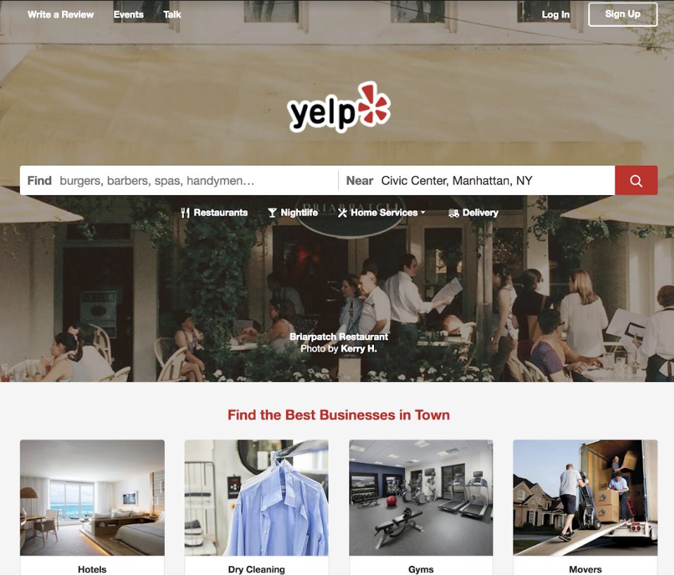
For example, Yelp changed its conversion strategy and started providing experience-based information rather than location-based.

Set clear goals to be achieved and key KPIs to track before and after the redesign
You must have complete clarity of the goals and expectations from your website redesign. Why are you conducting this exercise in the first place? Whatever your answer to this question, you should be fully convinced about it.
The popular SMART strategy can be well utilized to diminish the interminable confused state of mind while deciding your redesign goals.

SMART stands for:
- Specific: The goal of the website should not be vague but very specific. For example, you can say that the purpose of this website is to sell the maximum number of Audi cars in the city.
- Measurable: The website goals should be measurable. For example, you cannot just say you want to increase your car sales through this website. You would have to generate, let’s say, ten actionable leads every month in this case.
- Actionable: It is the verb in your goal-setting process. You need to be very specific in what steps to take and assign responsibilities to make this goal a success. For instance, generating ten leads through the website might not be enough. So, there should be an actionable plan in place to generate leads.
- Realistic: You have to be a realist when it comes to goal setting. If you do not set realistic goals, you are setting up for failure. You should set goals which you believe are achievable.
- Time-based: Goals can never be open-ended. You must define a deadline that keeps you motivated to succeed. An example could be: Create an autoresponder for the site by June 30, 2020.
To solve a problem or to accomplish a goal, you need different tools that would help create goals and allow you to think and make decisions, including those related to your KPIs.
A Key Performance Indicator (KPI) can be defined as a measurable value that shows how effectively a company is achieving its key business goals.
The goal defines “what” we want to achieve, whereas measure decides “how much” or “how many.”
Using the “How many” question, we create a basis for comparison, that is, whether or not the choices we made serve our goal.

KPIs can help to achieve business goals by:
- Defining specific goals: The metric can be the number of empty carts and checkouts in the case of eCommerce businesses.
- Defining indicator: Hike in the number of empty carts, resulting in an increased number of checkouts, is an indicator of reduced cart abandonment rate.
- Defining targets: For each KPI, you must have a clear goal. For example, the macro goal could be reducing cart abandonment by 50%.
- Defining data collection frequency: Some KPIs require data to be collected continuously, weekly, monthly, or annually. Collecting the data and tracking the numerical value around your metric guides and motivates you during the course of your campaign.
- Defining expiration: Similar to goals, KPIs are also time-based. It is imperative to revisit and revise your KPIs periodically to adapt to your evolving strategy and goals.
- Defining a way to communicate the KPIs: You must make your results visible, therefore effectively communicating your KPIs (data) should also be one of the KPIs.
How to create successful website redesign strategies and roadmaps
A website redesign is a huge project irrespective of your organization’s size, especially if you want to do it effectively. Thorough research, proper planning, and a little foresight would help make your next makeover a considerable success, while keeping it less stressful.

Let’s look at the steps to build a successful website redesign strategy:
1. Set a goal
Analyze what you want from your new site, which will help you centralize your efforts and determine whether you need a redesign. Preparing a list of specific and actionable objectives, such as increasing your web traffic, decreasing bounce rates, etc., that you plan to achieve through a redesign keeps you organized and motivated.
2. Develop a (UCD) user-centered design
UCD always has its focus on having a deep understanding of users, their requirements, values, abilities, and limitations. According to Plus, Statista, more than 50% of all web traffic comes from mobile devices, and this is likely to increase. Make sure your website is mobile responsive, so you don’t lose out on the traffic coming in from mobile devices.
3. Introduce the UI redesign
If you can imagine UX design as a vehicle, UI design is the driving console. While revisiting your existing site redesign, start with an interface inventory, which is nothing but a comprehensive collection of the bits and pieces, say typography, content (text, images, logos), and fonts that make up your interface. It ensures that user interfaces are developed consistently within a comprehensive framework. UI should never be complicated and give users the direction to accomplish their tasks (micro conversions) on your website.
For example, the onboarding flow on your website should be innovative and optimized for your website redesign. You can determine how user-friendly your registration or sign-up form on your home page or landing page is to push visitors further on to your website.
4. Redesign the website information architecture (IA)
Successful information architectures commit to understanding users. Optimizing IA starts with analyzing your website’s content and structure. For example, you can do a card sorting exercise for your complicated website elements that cause the majority of the visitors to drop off. When such practices are paired with other user-centered design techniques, an evolved process can take you a long way in your redesigning projects.
After running a content audit of your website, you can prioritize your content and run a card sorting exercise, followed by A/B testing, using some good a/b testing tools, to optimize what works best.
5. Create the revamped wireframes
A wireframe is a blueprint of a website that can be utilized across cross-functional teams for your redesign exercise. You can start with usability testing of your mockup ideas as soon as you get a rough draft to find surprising insights that can be implemented in your redesigning scheme.
Besides paper and pen, you can utilize tools like MockFlow, OmniGaffle, and GoMockingbird for your wireframe revamping exercise.
6. Focus on your content
The goal of your website should be to help users find information and complete tasks, which is why your content should be fresh, and the information provided should be useful and sustainable. The redesigned content should be user-focused and contain concise messaging that helps your users to take the desired action.
7. Ensure website layout resourcefulness and adaptability
The versatility of your website should be kept in mind during redesign. You should be able to make necessary tweaks, if and when required, to keep things fresh and running. Ensuring that your website has an adaptable layout will save you ample time and resources.
8. Launch the overhauled website
Prepare and follow a go-live checklist at the launch time, and perform quality checks of the work you have done. You should not go-ahead for launch in case any of your on-page work or redirects are not in place or tested. You must leverage your website similar to any marketing tool by engaging with your community, connecting with them on social platforms, and via emails sharing the new look of your website.
9. Develop a post-launch strategy
Have a complete, planned strategy for your website redesign. The designed CMS should not only enable change, but it should be backed by a team analyzing the data obtained from the redesign. It should also help use this information to improve the rest of your digital marketing strategy, including email marketing, small business management, SEO, etc.
It is natural to get overwhelmed and apprehensive during redesigning projects. You might face resistance from many in your teams, as it may not be not on everyone’s roadmap. But powerful changes are motivated by powerful reasons—the more powerful the reason, the more irresistible the change.
You have to find your own inspiration to make a change. Let’s understand this with the below:
a. Empathy: Sifting through your customers’ complaints is likely to guide you more towards the problem areas that your users are facing on their journey on your website. Dropbox, for example, gave these problem areas memorable names:
- Unwieldy navigation
- Tangled accounts
- Fragmented UI
b. Linearity: Once the challenges are understood, it is time to bring everyone on the same page—a shared vision. So for each one of the problems, Dropbox coined a corresponding solution that provided a clear description of the success:
- Simplified navigation
- Separated accounts
- Unified UI
c. Belief: It is crucial to give people a clear picture of how you plan to solve their problems. Dropbox created a prototype that felt believable. Deploying the prototype enabled Dropbox to run it by real users just by forwarding them a link. They ended up creating twenty prototypes. Many user testing sessions gave them the confidence that they had a design that performed better than their existing website did.
d. Proliferation: Having a proven prototype in hand is not enough. It is imperative to get the message out to the whole organization. You can do so by sharing a doc within your organization for documenting ideas and collaborating with others. Dropbox did so on Dropbox Paper, which is one of their tools where they stated the problems and their solutions linked to the prototype. After a few carefully sent emails and messages on Slack, they got people from all over the organization reading the document and studying the prototype.
e. Endurance: It is not easy to have everyone on board for a project which is not already on the roadmap. Only persistence and resilience would align the organization from top to bottom and make your case a winner. Prioritization and resources would have to be won gradually.
Phases of a website redesign
Let’s understand the phases of a website redesign in the following subheadings:
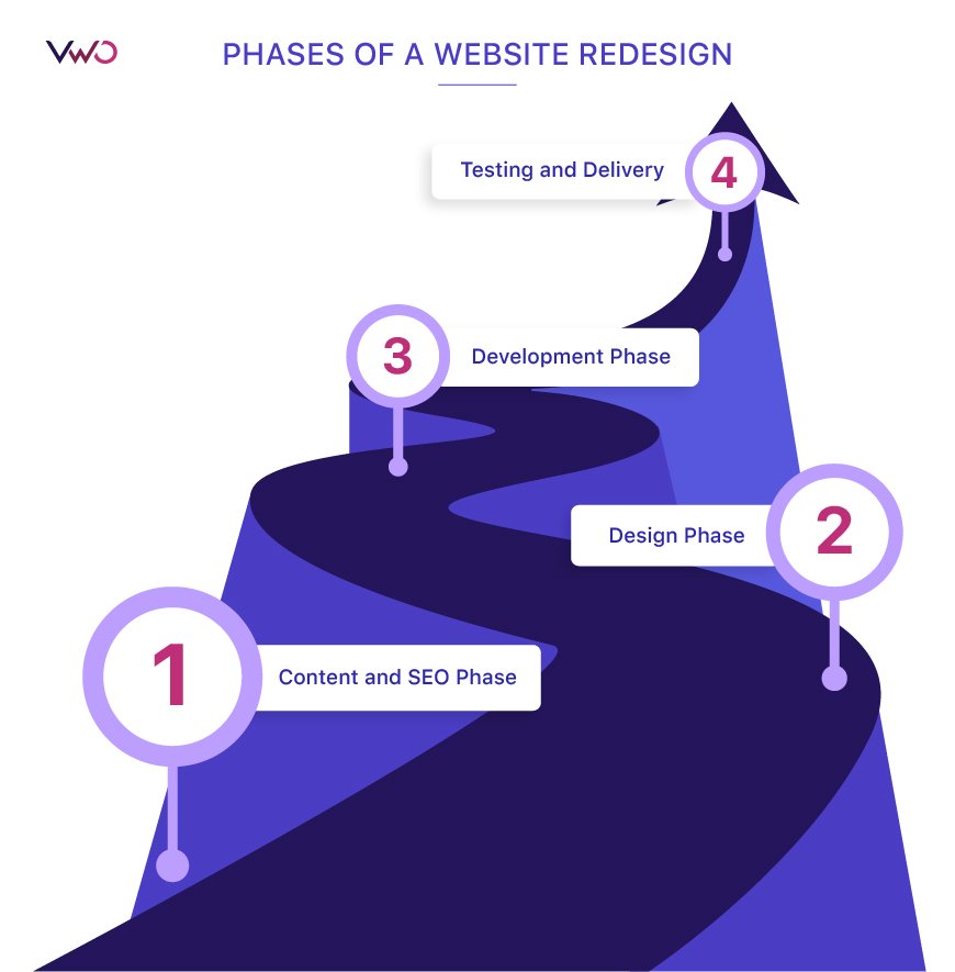
Content and SEO phase
The SEO strategy drives your content. The first step is the content audit, which builds a master list of all your content and may discover relationships between your content types on your previously unknown website.
- Start with navigation at the top of your website’s homepage.
- You must evaluate the type of content under each item. Do these topics need new subgrouping? If yes, then classify them on the next level.
- You must not end this exercise until you are down to specific page titles. Once you reach there, you have reached the maximum level of detail. In most of the cases, the largest content group will be your blog.
Card sorting is one of the methods that helps create a content prototype. This prototype is driven by insights from user testing. Quantitative research through UX reports, heat maps, session recordings, and testing focusing prospects’ behavior also supplement the essential insights for both content and SEO.
With these insights in place, SEO manages the discoverability of your website across search engines by optimizing elements such as alternative texts, HTML tags, irrelevant keywords, syntax queries, etc. You can evaluate your website SEO using online tools such as Website Grader, SEOptimer, or one of the many others to detect mistakes in your current website. In the case of new feature products to be added in the redesign process, SEO also examines targeted syntax queries with the new feature.
Design phase
Based on your quantitative and qualitative research insights, you have made choices while developing an initial wireframe and a clickable prototype. The design phase is the time when you bring the wireframe from paper or whiteboard to your computer.
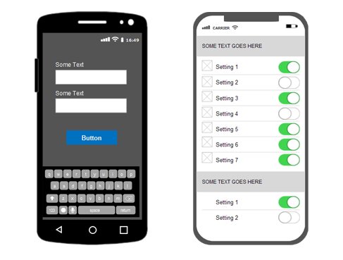
Wireframing and prototyping are essential for creating web pages and apps and the information architecture that must be taken care of through menus, breadcrumbs, and links on your website. The project should be a collaborative activity, and all the teams involved need to be aligned while finalizing the website flow and functionalities for the redesign. You can utilize prototyping tools such as Sketch, AdobeXD, Figma, etc.
Usability testing, which puts research to work, is also a part of the redesign phase.
You can utilize a low-fidelity prototype to gather insights from users and optimize the design during this phase. Subsequent rounds of review and testing tend to offer both generative and evaluative feedback to refine your design. It is better to do so in the design phase as it would be resource exhaustive to tweak designs in the development phase.
Development phase
After conducting all the research and ideation meetups, a website is created in the development phase. Empty pages, which are also known as shells, are built based on the site map. All the functionalities of the website are tested, and the content management system elements such as eCommerce shopping carts and forms are also made operational during this phase.
Ensure that communication between the developers and the design team is robust while making any changes. Ideally, all the changes must be incorporated during the design phase and tested on the prototype while finalizing the wireframe. Adding any changes on your website beyond this phase is not recommended.
Testing and delivery phase
With a website ready, your web designer takes a final look at it and starts testing for functionality and accessibility (plugin installation and SEO), ensuring optimization for different versions of the browsers, and more. Web designers must ensure that your website meets the latest web development standards.
After getting final approval from your development team, it is time to deliver the website. An FTP (File Transfer Protocol) program is generally used to upload the website files on to your server. Web designers do offer domain name registration and web hosting services too. Alternatively, you can have recommendations also.
Once these accounts have been set up, and your website is uploaded to the server after setting up these accounts, and as a final precautionary step to ensure the full functionality of the site, it should be put through one last run-through test.
Website redesign best practices for a delightful user experience
Ensure the on-site messaging resonates with your brand’s voice
Users want genuine digital experiences that bring ease, comfort, and a sense of connection. A clear brand voice impacts different stages of your user’s experience with your product, and it must be reflected in your sales collateral, social channels, and even customer support.
If you find trouble identifying your brand voice, grab a piece of paper and answer the below questions:
- What would my brand say, and how?
- How would my brand speak to users during the different stages of their experience?
- What does it hate?
- What does it love?
- Try some lateral thinking: what’s your brand’s favorite drink/meal? Why?
Muji is a popular Japanese retail store. They focused on making a clear focal point around their voice, which is design minimalism. Their website redesign resulted in a more minimalistic homepage with easy navigation, which was the primary concern they were facing in the US marketplace.
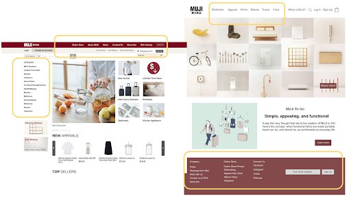
Image source: uxdesign.cc
Redesign keeping the user at the forefront
In any business, market and user research are crucial. Keep your user first by digging deep into their psyche and create target personas for your brand. You can conduct:
- Screener surveys: By asking questions to weed out users that would not provide any meaningful insights.
- Usability testing: This entails methods and steps to validate and test your prototype’s design by observing prospects’ experiences. It would provide you with insights around user behavior.
- Contextual inquiries: By conducting interviews and knowing users’ feedback. This data can be picked up from the screener surveys.
- Competitive analysis: By comparing website features between your brand and its competitors, and similar companies.
- Sitemaps: You can derive a flow that shows the structure and the relationships of the site.
Optimize for mobile devices
Speed and UX are the two most essential components of a great website experience.
If your mobile page is chronically slow, it will harm your organic ranking as well as usability.
It is also crucial to understand that users are aware of the brand options that are fast and offer seamless experiences. It is only natural for them to expect this level of convenience when they visit your website.
To optimize your mobile site, you need to audit first. You can use Google tools such as Test my site, Lighthouse, Accelerated Mobile Pages (AMP), and “landing pages” report in Google Ads to identify low-performing landing pages.
Streamline the website navigation

Changing the navigation in your website redesign could be a challenging task. To streamline the process, you should:
- Plan your redesign: Identify your goals, procure data from reliable sources, organize it, and schedule regular sessions with your customers to validate your ideas.
- Gather information on what your users care about: You must know your user: their occupation, interests, challenges they face, behavioral attributes, and more.
- Design (and test) the architecture first, then design visuals: This is similar to wireframes that you build on with higher fidelity. You will waste a lot of resources the other way around.
- Never redesign your navigation on a whim: Just because you started in a new position or something is trendy doesn’t mean it will make your product’s navigation better. Gather data and validate your hypotheses first.
- Be resilient. You may need to go through a few dead ends, but if your process is robust, you’ll get there, and your users will like you for it.
Create a redesign strategy centered around SEO
You need to empathize with your users to show up on the right searchers and rank high in the SERPs. In other words, you need to understand users’ buying intent and analyze how they conduct search queries.
Poor UX hurts SEO, and similarly, spammy SEO practices can ruin your user experience. For example, a lot of promotional, self-serving content on your homepage with irrelevant links is bound to drive people away.
A few SEO elements that you must keep in mind when designing a user-friendly site are:
- Writing long-form content that, apart from being informative and engaging, addresses your readers’ pain points.
- Enhancing the readability of your content by adding headings and breaking the text into smaller chunks.
- Adding internal links to pass link juice from one page to another, ensuring a natural flow.
- Optimizing your meta tags that will include page titles, meta descriptions, headings, or image alt tags, ensuring they are highly informative.
Reconsider all your CTAs
CTAs play an important role in the website redesign process. Generally, they aim to increase leads and improve conversion rates. When used accurately on business websites, emails, and blogs, CTAs enable business organizations to achieve the intended conversions.
You can create meaningful and productive CTAs by:
- Ensuring intuitive design and placement of CTA(s) on your website: CTAs must be effective, have contrasting colors so that they stand out.
- Ensuring CTAs are relevant to the page’s content.
- Strategically placing multiple CTAs across the site would enable the site visitors to perform desired actions, which ensures conversion by facilitating the buyers’ journey.
Experiment thoroughly before making the redesigned site live universally

Having an approved wireframe or a designed web page calls for testing before rolling it out.
- You must decide whether you want to test the website in person or remotely. Getting a set of tasks together that you would like to watch a stranger perform would certainly help.
- Your website’s task analysis can guide you to identify the problem and critical tasks. It would help participants perform and track these tasks effectively to yield desirable results.
- Observe carefully – what are your users trying to click on? How quickly are they performing these tasks? Do they look confused?
The data and observations made during user testing can help you in making better decisions to further optimize and take the best version of your site live.
Similarly, you can perform beta testing, especially if you are launching a new tool. You can do so by either having visitors opt-in for beta testing, or you may alert your visitors about the specific elements on your website that are in beta testing. After deciding whom you want to beta test with, give your participants an easy way to report errors and ask them to provide feedback.
Once you implement the feedback, you are ready to launch the tool. To gauge the audience engagement time and utility of your tool, utilize Google Analytics as well.
Website redesign pitfalls to avoid

Not defining the scope and requirements clearly before getting started
Website redesign exercises often involve overhauling the user interface of the existing website without any rhyme or reason. Most businesses mistakenly assume that updating their website’s appearance would lead to an increase in their conversions. They often go for solutions with vague metrics of success, like “new” and “shiny,” while not being mindful of the problems their customers face.
The lack of data-backed insights and dependence on vanity metrics cause disagreements between internal stakeholders. It culminates in a new website offering that is inferior to the existing website.
Failing to have an overarching brand message and positioning in place
Users are the ones who build a brand out of your company, and not the other way round. For this, companies should create a consistent personality and elicit a positive response from their audience. Consistency in brand messaging helps create a bond between the company and its audience, converting them from mere customers to brand advocates.
This personality should shine through each of its touch-points with its customers. Be it newsletters and brochures, social media posts, or 404 pages, the website is perhaps one of the most crucial touchpoints where you get to play with a lot of words to let your brand’s personality shine through.
Chasing an unreasonable timeline
A typical website overhaul can take anywhere from 3-12 months, which can vary widely depending on the exercise’s complexity. A comprehensive planning exercise would help you decipher the duration of the redesign for your website. The planning phase involves quality research and brainstorming strategy to ensure that you deliver value for your brand and your customers.
When redesigning a website is a part of a broader strategic decision, teams often work backward from the day of launch and build in small increments to figure out what can be achieved inside the mission window. This ensures that they can deliver the best result in the shortest time possible.
Prioritizing design over content (Prioritizing form Over functionality)
Users come to a website with an intent. Many sites are guilty of prioritizing their aesthetics over content.
The functionality of your website, such as intuitive and easy navigation and well-placed CTA buttons with a succinct copy, should always take precedence over the visual appeal. Apart from this, focusing on content quality and functionality of your website will facilitate your Search Engine Optimization efforts as well to drive more traffic.
Assuming your job ends with making the new site live
It is imperative to keep an eye on the optimization health of the website for the first few weeks after the redesigned website is live. You have to watch the rank. Apart from that, check the Google Webmaster Tools to understand whether there are any broken links or crawl errors, which can be extremely toxic for your ecosystem. If you find such errors, put on your hazmat suit and clean everything fast.
Compromising on technical aspects or site performance
During the overhauling process of a website, key technical aspects, such as site uptime, site speed, site navigation, mobile performance, content availability, need to be sincerely monitored. The same goes for the site performance metrics such as page load time, SEO site map, mobile responsive UX. Since optimization is an ongoing process, these are the key metrics that would help you guide further to better the redesigned website.
How to choose the right website redesign agency or services

Hire a website redesign agency that:
- Audits your current site: They must do a comprehensive audit of your website around the existing content strategy and information architecture.
- Understands your target audience: Ensure that they understand the ecosystem of your industry. Knowing the background, behavior, and demographics of the target group you are catering to is paramount.
- Centers their strategy around user experience: Make sure that these guys plan a strategy to ensure a seamless user experience at your website. Ask them the frequency of testing they practice before you say yes. More testing translates into more insights and hence better optimization.
- Has experience managing similar projects efficiently: Ask them if they have any previous experience working with clientele identical to you. It would be easier to work with agencies experienced in your domain.
- Is well-versed with implementing and experimenting with new technologies: Do your research and ensure how equipped and comfortable your agency is in handling the latest technologies, without which you can’t do much in optimization.
- Offers a full range of services, including SEO and digital strategy: Before sealing the deal, double-check what all they offer, which must include audit, SEO, and strategy.
Website Redesign Examples: Before and After
eCommerce: PearlsOnly
PearlsOnly is an online jewelry store and is worth more than $3 million with ever-growing customers in the United States, Canada, UK, and Australia.
Owing to a lack of dedicated resources and industry expertise, PearlsOnly was failing to do conversion optimization.
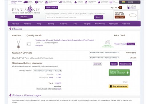
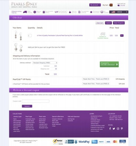
VWO Services analyzed PearlsOnly’s existing Google Analytics data and found some areas for optimization. They saw that a lot of people were dropping off at checkout and that the homepage had a high bounce rate. Also, the team found that the checkout page was cluttered and was distracting the users from the main CTA.
The VWO team created an improved version of the checkout page by keeping the CTAs in focus.
The aim of the test was to increase visits to their checkout page and increase revenue. With US visitors as the audience, the campaign was run for close to a month before the variation outperformed the original.
The test increased PearlsOnly’s revenue by 10%. After optimizing the checkout page, the team next tested the homepage, which again resulted in an increase in revenue.
Software: Lyyti
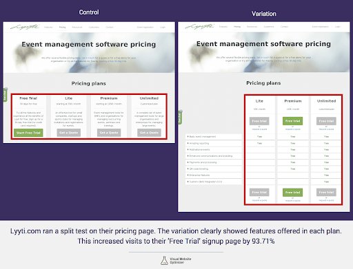
Lyyti.com is a Finland-based software company that specializes in providing SaaS-based event management solutions. Analysis of the website by using VWO heatmaps and click maps indicated that users frequently moved between the pricing and the features page.
The team decided to run an A/B test to evaluate the hypothesis that prominently displaying the features of all plans, and having multiple CTA buttons would increase visits to the free trial sign-up page and, consequently, increase sign-ups.
Two different variations of the pricing page were created and served evenly to visitors. The test was run for a period of over five months.
The variation won, increasing visits to the lead generation page by 93.71%.
Specialty Retail: Majestic Wine
Majestic Wine is a well-known wine retailer in the UK. The company launched its online store to grow its business by attracting clients from outside the UK as well.
The Majestic Wine team knew that it could improve conversions by optimizing their online store. But like most companies, they did not know what changes to make.
Analysis of the insights gathered from customers, and in-house staff feedback led them to conclude that their existing Weddings page did not provide a lot of the information that a potential customer would be looking for. The team felt that if they could get prospects to submit inquiries through the website, trained customer support staff could provide specific and relevant answers that, in turn, would help improve conversion rates.
Before making any changes to the website, the team decided to test the following hypotheses:
- Reducing distractions like too many outbound links on the webpage can encourage more people to buy from them or submit the inquiry form.
- Clearer articulation of their USP in the context of weddings will encourage more people to place orders or at least submit the inquiry form.
- A video that explains their services will boost conversion rates.
The Majestic Wines team could have used multivariate testing. But since individually testing so many elements would be time-consuming, the team decided to launch a new, wholly redesigned webpage and test for conversions:
The redesigned webpage delivered a discrete improvement in conversion rates.
Website optimization is a continuous process, so the team went ahead and removed another distraction that still seemed to affect conversion rates, the Download PDF Party Planner button right next to their Make an Enquiry Now CTA button at the bottom of the page.
The first test resulted in a 201% improvement in the goal conversion rate (inquiry form submission) with a statistical significance of 99.99%. The removal of the Download PDF Party Planner button further boosted the submission of inquiry forms by 36.9% with a 99.99% statistical significance.


Conclusion
Before you start your website redesign project, be clear on why you are embarking on this journey. For example, if your target audience or your main offering has changed, you need to rebrand your website, ensuring that you would still be able to persuade them to become a customer with your new website design.
- Most importantly, audit your website before starting with the redesign project. This would tell you what needs to stay and what needs to change. Test everything vigorously before validating any design.
- Once you know the ‘why’ behind your redesign project, you may identify a competitive agency for the task, and half your work is done. You would need to shadow them in the project to have the desired outcomes.
- Create a roadmap with your agency’s help around the entire redesign project so that you can track the progress across different stages. This would ensure your project doesn’t overshoot the time and costs estimates.
We hope that this guide will help you make your website redesign project a productive and fulfilling one.


