WhoAcceptsAmex Used A/B Testing To Identify The Best Font Size And Generated External Clicks
About WhoAcceptsAmex (UK) and VWO
Who Accepts Amex operates an affiliate model website based out of the UK. The site lists vendors that accept American Express cards and those that don’t. The company earns commissions from sales on other websites. Hence, every click on their website matters.
Goals
To get more clicks on their website, and hence earn more commission, they hired Lone Goat, a web analytics and Conversion Rate Optimization agency that uses the VWO platform for its work.
Tests run
Lone Goat analyzed data from the Who Accepts Amex website to find the page(s) most suitable for their optimization efforts. One of their major findings was that despite having more page-views, the ‘companies’ page template of the website produced fewer external clicks per page compared to the ‘categories’ template.
Therefore, this was the page chosen for the first optimization test. The first test they ran tried out different combinations of font styling – bold, underline, no styling, etc. – on links to the external websites. This test wasn’t successful and the control outperformed all variations.
The next test was to gauge the impact of font size on clicks. The objective was to determine if font size made a difference and if yes, which font size helped generate the largest number of clicks on the website.
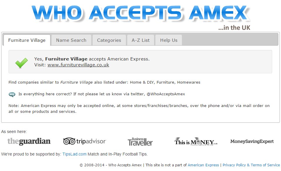
This is how the original web page (the control) looked:

The control, which had website links in font-size 14px, was tested against 6 variations from font-size 12px to 18px (each variation had a 1px increment).
The test was run for a duration of 28 days over nearly 3100 website visitors. The goal of the test was to track the number of external website clicks.
Conclusion
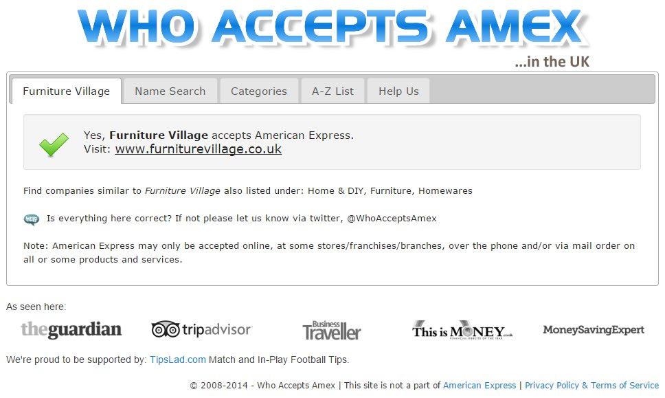
The variation with font-size 18px emerged as the winner and recorded 32.68% more clicks.
This is how the winning 18-px version looked:

All but one variation performed somewhat better than the control. The only one that fared worse than the control was the variation with font-size 17px (just 1px less than the winning variation), which recorded 16.14% fewer clicks as compared to the control (14px font-size).
It is tempting to conclude that visibility and contrast of the webpage content improved with font-size, which made it easier for visitors, and hence led to the superior outcomes vis-a-vis the control. But this does not explain why the 17px variation did not do better (or even as well) as the 15px or 16px variations.
Of course, even Google had trouble deciding the perfect blue for their toolbar and they (tested between 41 different shades of blue). Testing font-size is reported to be one an effective way to increase profits of your website. This list of 19 tests to improve conversion rates of your website also advises testing font-size.
As part of the ongoing conversion optimization process, Lone Goat planned to test effects of font-color and font-family as well.

Location
UK
Industry
Others
Impact
32.68% increase in Click-through rate


