VWO Services Drives Revenue Uplift for Panduro with Experimentation Consistency
About Panduro
Established in the 1950s, Panduro emerged when Carlo Panduro, a descendant of a Spanish legionnaire, began to manufacture souvenirs and jewelry in post-war Denmark. For years, The Panduro catalog was the main sales channel but in the 80s a serious focus on retail began.
With over 103 stores spread across 6 countries, Panduro has been the market leader in hobby materials.
Panduro employs approx. 650 people, and has a turnover of DKK 845 million. SEC.
The Panduro family continues to lead and develop the Group in close cooperation with the Board of Directors and CEO Rickard Kemfors. The company is owned by Thomas Panduro, Jesper Panduro, and Peter Panduro.
Goals
Elisabeth Isaksson is the UI/UX Designer at Panduro and typically takes care of the entire customer experience of the website. Panduro has been a legacy brand and Elisabeth realized that they needed to keep experimenting to keep up and improve the conversion rates on Panduro.com.
Since they did not have a CRO expert within the team, they decided to opt for a tool along with services to help them with rapid testing and experimentation. While looking for CRO platforms, some of Elisabeth’s peers recommended using VWO.
For each of the campaigns discussed in this success story, the end goal was different:
Campaign 1: Increase the clicks on the main CTA button in product boxes on the listing pages.
Campaign 2: To increase user interaction with filters so as to help them land on product pages easily.
Campaign 3: To increase the number of visitors using the search feature and landing on the search pages.
Campaign 4: Increase clicks on the “Add to Cart” button on the product page.
Tests run
Panduro, in collaboration with VWO Services, ran a series of campaigns to optimize their website and improve conversions. Discussed below are various campaigns that drove a significant increase in conversions for Panduro:
Campaign 1: CTA Change on the Product Listing Pages
Objective: Increase the clicks on the main CTA button in product boxes on the listing pages.
Observation: In the old version, the CTA button name was KÖP (Buy) which was confusing for the user to understand the trigger i.e. taking the user to the product page or adding the product to the cart.
Hypothesis: Changing the CTA to Snabbköp (Quick Buy) and Lägg i varukorgen (Add to cart) would be better to indicate the action upon clicking. Having an additional button “View Product” below the main CTA will also add a cue for the users who want to progress to the product description page.
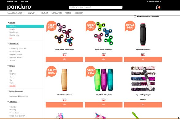
Control – CTA – KÖP (Buy)
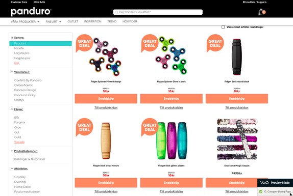
Variation 1 – CTA - Snabbköp (Quick Buy)
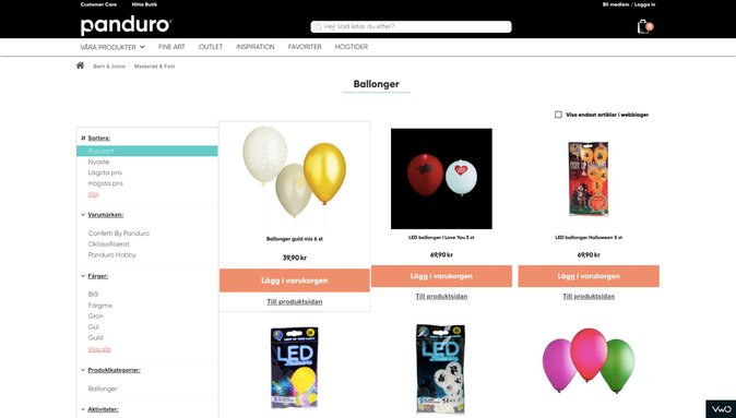
Variation 2 – CTA - Lägg i varukorgen (Add to cart)
Results:
The test ran for over 5 weeks and during this duration, the control was disabled due to low confidence levels. Variation 2 showed an uplift of 6% in the CVR for clicks on the main CTA button. The visits on revenue page also increased by 10% and thus the variation with Lägg i varukorgen (Add to cart) CTA was pushed live for 100% traffic.
Take a free trial to know how A/B testing works.
Campaign 2: Static Filter on Category Landing Pages | Mobile
Objective: To increase user interaction with filters so as to help them land on product pages easily.
Observation: Filters in the old version were not fixed at the top (below the top navigation) and thus the interaction was also low.
Hypothesis: It was expected that by bifurcating the filters into two parts i.e. Sort and category-specific filters, keeping them fixed at the top and making them more presentable and easier to the user, would increase the filter interaction and ultimately more users landing on the desired product pages.
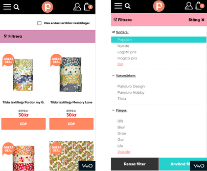
Control
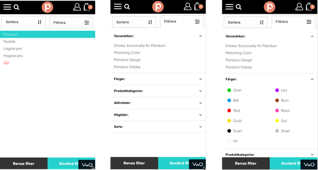
Variation
Results:
The test ran for 12 days and the interaction with filters increased by 53% with 100% confidence level. he variation was declared the winner and is currently being served to 100% traffic.
Campaign 3: Search Icon Positioning
Objective: To increase the number of visitors using the search feature and landing on the search pages.
Observation: It was observed that the CVR for users searching on the mobile was 65% higher than without search and the search icon in the old version was not highlighted properly.
Hypothesis: By highlighting the search bar in a way that it is opened when the user lands on the website and merges with the top navigation upon scrolling down, it would stand out, thus increasing the search-and-find of the desired product.
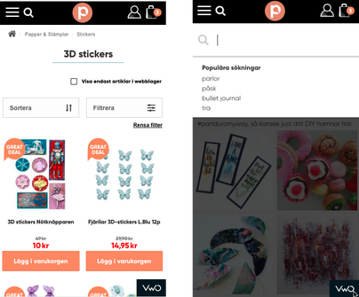
Control
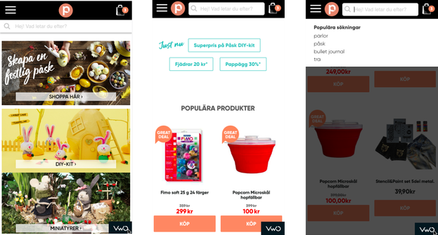
Variation
Results:
The test ran for a week and usage of the search feature increased by 14% with 100% confidence in the variation. The number of purchases showed an overall uplift of 2.67% and thus the variation was made live for the entire audience.
Campaign 4: Product Page Redesign | Mobile
Objective: Increase clicks on the “Add to Cart” button on the product page.
Observation: Through click maps, it was observed that the image was getting 60% of the total clicks on the product page. In order to look at the product images the user had to click on each image thumbnail since there was no carousel feature. Also, the product description page was long with other product recommendations. This led to the users losing sight of the main CTA button.
Hypothesis: This is what the control looked like.
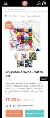
Control
Variation1- It was expected that by changing the image design to carousel and having static CTA button at the bottom which appears only when the CTA button on the page is not visible will optimize the clicks on the image and lead to more clicks on the main CTA button.
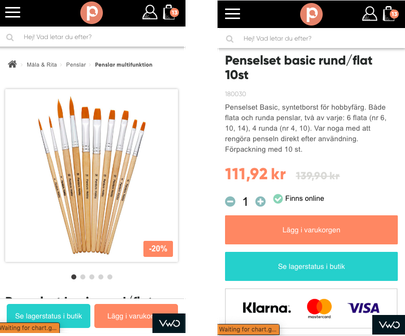
Variation 1
Variation2 – In addition to the changes in variation 1, few more changes were adopted in variation2 where savings in absolute numbers were highlighted to induce more purchases. The description was only partially shown with only few initial lines fading midway which displayed the entire content upon being clicked.
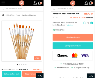
Variation 2
Results:
The test ran for 10 days and the total clicks on the “Add to Cart” button for Var 1 from both the existing and the static button was 9.78% higher than the control version and with 1.68% higher Ecomm CVR. Thus the variation 1 was declared the winner and is currently being served to 100% traffic.
Start a free trial today to know how A/B testing works.

Location
Sweden
Industry
Retail
Experiment goals
Increase the number of transactions
Impact
11.08% increase in transactions


