Locations Hawaii Increased Leads With a 3-Variation A/B Test
VWO and Location Hawaii
Launched in 1969, Locations Hawaii is a guide for real estate. The website helps people find the property that best suits them through innovative technology solutions, including their mobile app. For Locations Hawaii, it’s all about helping find the right property for them and making transactions as stress-free as possible in the process. Earning the trust and respect of the people of Hawaii each year is one of their proudest achievements, and they remain committed to the diverse island community.
Locations Hawaii believes that real estate isn’t about the property, it’s about people. They achieve their goals by helping people achieve their own personal goals. It’s how they achieved $1.7B in sales in 2019!
Locations Hawaii has been using VWO since 2018 for their website’s conversion rate optimization and experimentation programs. We got in touch with Joe Segal, Digital Marketing Manager, who steers website optimization to increase traffic leads, and business results, among other key activities.
Goals
The main objective for Joe is to deliver optimized experiences on the Locations Hawaii website while generating more user inquiries for business results. To achieve this, besides looking at user behavior data, he also has to come up with new ideas that can help increase user inquiries. One such idea, along with its optimization has been covered in this success story.
Observations
Property inquiries generated on the real estate search website are what drive the business. Joe’s challenge was to increase the number of inquiries being generated from the property details pages. To do this, he decided to step into the users’ shows and came up with ideas.
Tests run
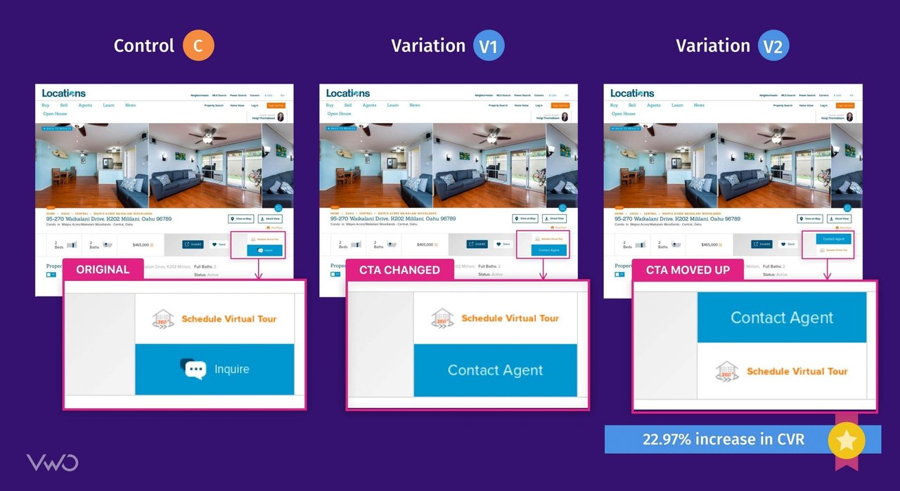
Joe hypothesized that by changing the call to action from “Inquire,” to a more value-added “Contact Agent” button on the property details pages, they will observe more user inquiries. He also thought that moving that button higher up in the fold and increasing it’s font size would result in more people asking questions about properties. This would lead to a stronger call to action which is also easier to see on the page.
Two variations were created based on these two ideas:
- A change of CTA from “Inquire” to “Contact Agent” with an increased font size
- Moving the new CTA (“Contact Agent”) above

100% traffic visiting any property page (using the “URL Matches” capability in the campaign setting section of VWO) became a part of the test. The A/B Test was run with three variations, and traffic was distributed equally among the variations. The test ran for 26 days with 37,000 visitors becoming a part of it. Variation 2 emerged as the winner with a 22.97% improvement in performance (conversion rates for user inquiry generation) over the control. Start your free trial today to see which design is the real winner for your website.
Conclusion
In the first week and a half, when there wasn’t enough data, the variations were losing big time to the control. It took over two weeks, but eventually, the variations started to do better, even gaining as high as 100% improvement over the control. Joe’s theory is that people who were already using the website regularly were thrown off by the new button wording, but over time they got used to it. This also comes to show that you need to give tests enough time to run before you make any decisions.
Joe’s next step is to test more variations of the “Schedule Virtual tour” button call to action wording on the property detail page. Start your free trial today to be sure about the changes you make on your website.
VWO is hands down the best tool I have ever used for planning, execution, and reporting on website testing and results. When I needed help, the VWO support staff was ALWAYS there to work with me through the details and get it right, no waiting. Now I have positive results to report to the bosses.

Joe Segal
Digital Marketing Manager

Location
Hawaii, USA
Industry
Real Estate
Experiment goals
Increase CTR on the main CTA (user inquiries)
Impact
22.97% increase in Conversion


