ArchiveSocial More Than Doubled Their Click-through Rate and Streamlined User Experience
About ArchiveSocial
Headquartered in North Carolina, USA, ArchiveSocial is a SaaS-based social media archiving solution. ArchiveSocial helps organizations fulfill their legal requirements and avoid lawsuits on social media.
Consistently working on safeguarding context for several brands across networks including Facebook, Twitter, and LinkedIn, ArchiveSocial took VWO’s help in safeguarding their own website visitor context.
We got in touch with Phillip Roberts, the Leading Web Developer at ArchiveSocial, to have an in-depth look at how VWO has helped the company.
Goals
For ArchiveSocial, the two most important KPIs are an uptick in leads and an increase in conversions, both via their Homepage and ‘Request demo’ page.
Therefore, they studied their existing pages with an aim to improve on these two metrics by creating hypotheses that could be tested using VWO. VWO Services worked in tandem with Phillip’s team to achieve the following specific objectives:
- Increase in conversions from the Homepage banner form.
- Accelerate pricing page conversion rate for lead generation.
- Improve user engagement on the site.
Observations
After a thorough examination of ArchiveSocial’s website, VWO Services, made a few observations:
- When a user lands on the Homepage, they are shown the email form field at the very bottom of the Homepage banner, without any differentiation from the remaining page.
- As the pricing page plays an important role in the final conversion, the team emphasized the need to improve this funnel from pricing to the final conversion page.
- There was hardly any traffic for the brand’s gated content on the ‘Resource’ page. The challenge was to get more traffic to the resources page and improve engagement on the page.
Tests run
Each of the above observations was tackled through three different tests, each with a different objective.
Test 1:
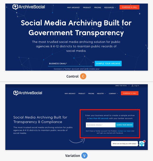
To make the primary CTA more legible, a variation of the same was created with differentiating colors. The CTA was also moved to a more prominent position – i.e. first fold, on the right.
Result: The campaign ran for 27 days for all incoming traffic. Traffic was split equally between the control and the variation. The variation saw an improvement in terms of clicks on the form field by a mighty 101.68%. Using VWO scrollmaps it was found that users were scrolling further beyond the first fold on the variation. The variation is now live for all users.

Test 2:
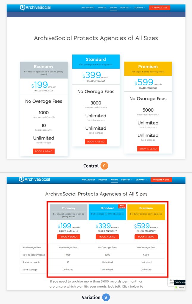
After collating data, a complete design overhaul for the Pricing page was constructed and run as an A/B test.
This test’s objective was to improve clicks on the CTAs across plans listed on the Pricing page and move users to the Thank you page, closing the conversion loop.
The focus was on highlighting the primary CTA button on the page and explaining to users which plan is worth their money by keeping the options extremely simple. At the same time, the design of the Pricing page leveraged ‘anchoring’ (cognitive bias) by highlighting the most popular (mid-priced) plan on the page design to draw customers’ eyes to it immediately.
Result: The campaign ran for seven weeks, with traffic equally split between the control and variation (all incoming traffic participating in the test). The variation won with the visits to the ‘Thank you’ page going up by 64.76%. The variation is now live for all the users.

With VWO Services, we have executed and implemented numerous A/B tests that have helped improve overall CRO architecture across our website.

Phillip Roberts
Web Developer
Test 3:
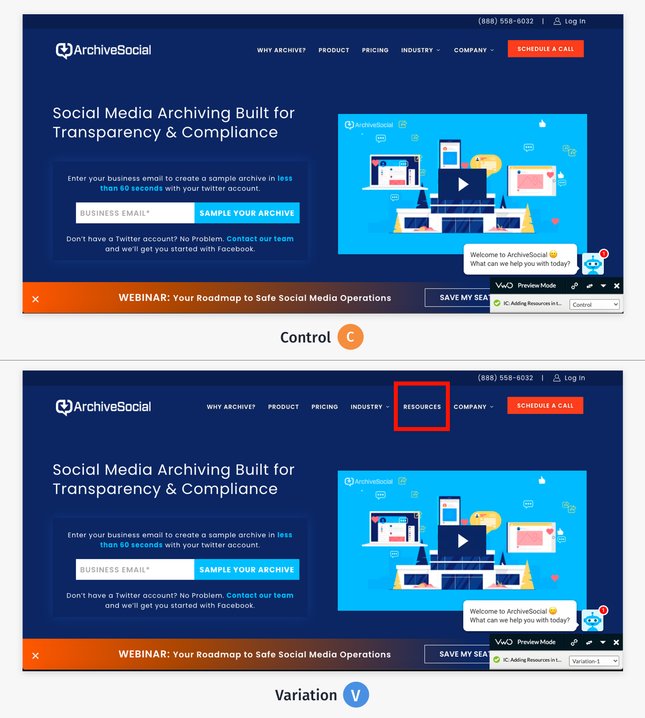
The hypothesis for this test was that making the Resources section more discoverable by adding the ‘Resources’ category in the top navigation would increase engagement.
A variation was created where the “Resources” category was added in the top navigation bar so as to make the user-flow to this section more intuitive.
Result: This campaign ran for 10 days, with all incoming traffic equally split between control and variation. 73.30% traffic uplift was seen on the resource page via variation, and the variation is now live for all the users.

Conclusion
The winning variations have made the website far more intuitive and user-focused. The ArchiveSocial team is also more confident about the website’s performance since the changes have been made through a proper loop of insights generation and testing.
Testing gives more confidence about the changes on the website, to see the real-time performance of the tests. Start your free trial today.

Location
North Carolina, USA
Industry
Services
Experiment goals
Improve the UX, Increase the CTR
Impact
101.68% increase in Click-through rate


