Movexa Changed Its Headline Messaging And Increased Purchases By 90%
About Vitamin Boat Corp. (Movexa)
The Vitamin Boat Corporation makes and sells a wide range of natural supplements. Its products are sold online as well as through stores across the US and Canada. Movexa is a joint-support supplement manufactured and sold by Vitamin Boat Corp.
The company engaged Source Patrol, a digital marketing agency that uses the VWO platform for website optimization work.
Goals
The objective of this testing campaign was to increase online sales.
Tests run
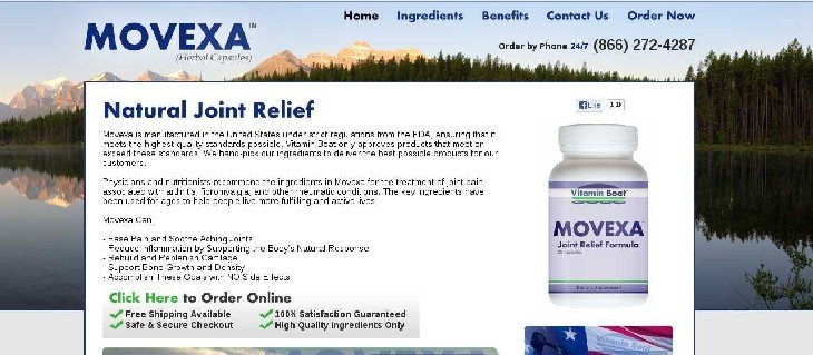
Movexa’s landing page originally looked like this:

The company wanted to increase online sales. Source Patrol was of the view that modifying the headline on the landing page would boost sales.
The team’s hypothesis was that adding the word “supplement” to the headline would enhance clarity of the landing page and increase sales. The conversion experts at Source Patrol were hopeful that a simple headline A/B test can have a huge impact on the conversion rate because the headline is one of the first elements that visitors see on a webpage.
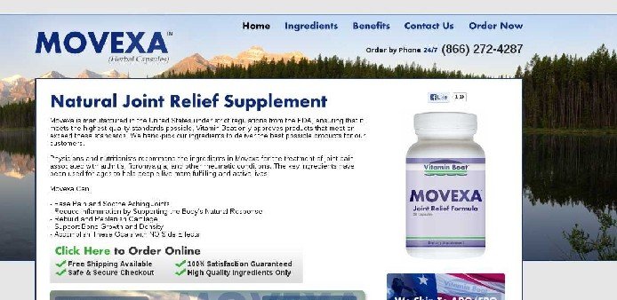
They created a Variation Page in which the headline included the word “supplement.”
This is how the variation looked:

The variation was A/B tested against the original using the VWO platform.
Conclusion
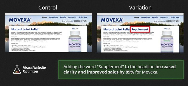
With a statistical significance of 98%, the variation beat the control. Purchases increased by 89.97%.
Here is the comparison image that summarizes the test:

So why did the addition of just one word make such a huge difference?
The simple answer is that the addition of the word “supplement” to the headline made it easier for visitors to instantly understand what Movexa was, even without reading the complete copy.
An excerpt from a Marketing Experiments article summarizes this perfectly: “The objective of your headline is not to sell, but to connect with your reader”.
The headline, which almost every visitor reads, is one of the most important elements on a page. It must be informative, descriptive, compelling and yet brief. With attention spans dipping rapidly, headline copy must be quick to grab attention and compel the reader to take the desired action. Therefore, adopting the old-school approach of using headlines on the lines of “Buy XYZ product today for an easy solution” were considered to not be effective.
Not only must the copy be crisp, it must also be in the font and color that grab instant attention. Not giving enough emphasis to headlines is one of the most common web design mistakes.
The Eyetrack III study revealed that big, bold headlines capture attention more than images. Even the navigation bars and almost everything else comes after that.

Location
US
Industry
Health
Impact
89.97% increase in Purchases


