Learnings From A Failed Test: FreestyleXtreme Changed Their Page Basis Customer Requests & Saw A Dip In Conversions
VWO and FreestyleXtreme
FreestyleXtreme is a UK-based eCommerce retailer that sells clothing for riders and action sports enthusiasts. They ship almost all over the world, and their website is available in 17 different languages.
The company uses the VWO platform for testing website optimization opportunities.
Goals: Increase conversions
A customer survey revealed to FreestyleXtreme that its customers expected more product information on the website. The FreestyleXtreme team also read many success stories about the importance of product descriptions on websites and how such information boosted conversions.
Convinced about the need to add product information, the team added product details. In addition to product details, they also explained the benefits of each product feature in simple terms.
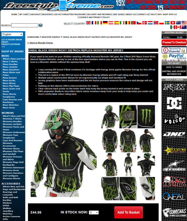
This is what the page looked like after product information was added at the top.

The team wanted to test if the addition of product information increased conversions.
Tests run: Test Pages with and without Product Descriptions
The team ran an an exploratory split URL test. The test hypothesis was that detailed product descriptions would increase conversions.
As they had already implemented the changes on the website, the team used the previous page (without the product descriptions) as the variation that was to be tested against the control (which had the product descriptions).
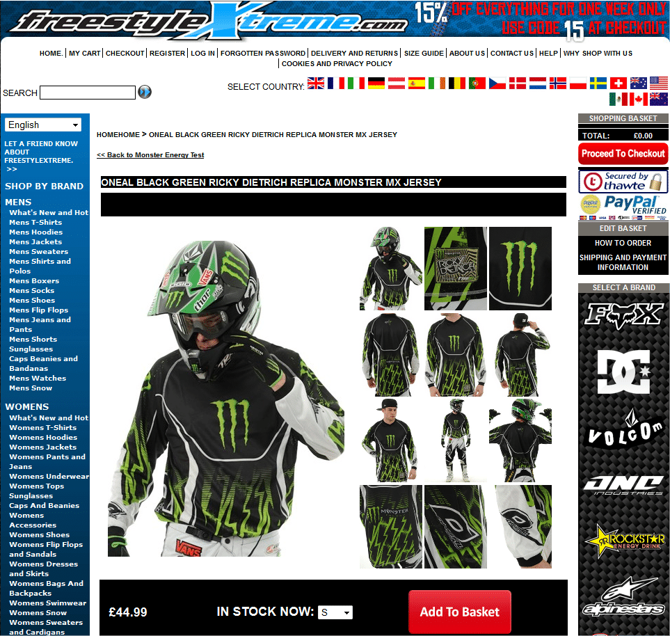
This is what the variation page looked like:

More than 7000 visitors were tested for each version.
Conclusion: 31.38% Drop in Conversions
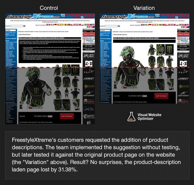
The results were unexpected. The variation (which had no product descriptions on the page) beat the control (which had product descriptions) by 31.38%. The confidence level associated was 96%. Unfortunately, this wasn’t a win for FreestyleXtreme.
Here’s the comparison image that summarizes the entire success story:

Just as successful changes are instructive, as conversion optimization experts, we analyzed why conversions dipped by almost a third despite adding product information that customers seemed to want.
There are 3 takeaways from this success story:
- The reason the page with the product descriptions lost is probably because of its poor layout. The addition of product descriptions to the top of the page pushed product images and call to action button below the fold. Any website is a combination of elements, and it is the combined effect of all these elements that determines how well the site delivers.
- Images play an important role in increasing conversions. People prefer to be able to see what they are buying. Only if they are pleased with the product image will they likely invest time to read the product specifications or descriptions. So, visual hierarchy must be planned in a way that naturally draws visitors’ attention to images by making images one of the primary elements on the page.
- Preventing such unfortunate outcomes is why we recommend running the test before making any change permanent on the site. What worked for one website may not work for another—the information is at best useful to formulate or refine hypotheses that need to be tested.

Location
UK
Industry
Retail
Impact
31.38% decrease in Conversion


