Uncommon Knowledge Tested Their Sign-Up Page To Receive Unexpected Results
VWO and Uncommon Knowledge
Uncommon Knowledge trains psychologists, therapists and other mental health practitioners by providing them tried and tested self help and psychology information. Their easy-to-understand self-help programs are also open to the public.
The company uses VWO to test optimization opportunities.
Goals: Increasing Sign-Ups for Free Videos
The company wanted to improve responses to an upcoming product launch. To increase awareness about the company and its expertise and to expand reach, they decided to offer their pack of 3 trauma treatment videos free to visitors who entered their first name and email address on the website.
This is how their original page that was used to collect names and email addresses looked:

It was essential that visitors were convinced enough to sign up for the free video pack and share their first name and email address. Harvesting these email addresses was important for the company, which planned to use this list to market the newly-launched product.
Tests run: Testing a New Page design For Effective Lead Generation
The page capturing first name/email address was crucial to motivate visitors to sign up for the free videos. As such, this was an easy choice for the test. With the goal of increasing sign-ups for the 3 trauma treatment videos,
Uncommon Knowledge decided to implement a new landing page that was more in tune with recent design trends.
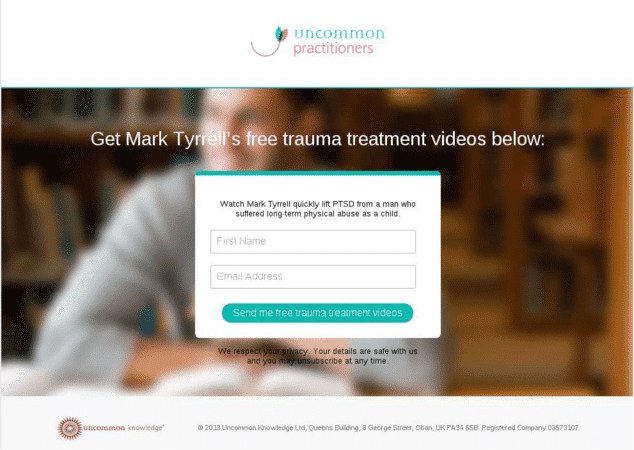
This is how the variation looked:

The new design gave up the traditional magazine layout. It was simple, and explicitly provided visitors with the much-needed assurance that their privacy would be respected and they could opt-out of their newsletter any time.
Conclusion: Original Page Delivered 19.55% More Leads than the New Page
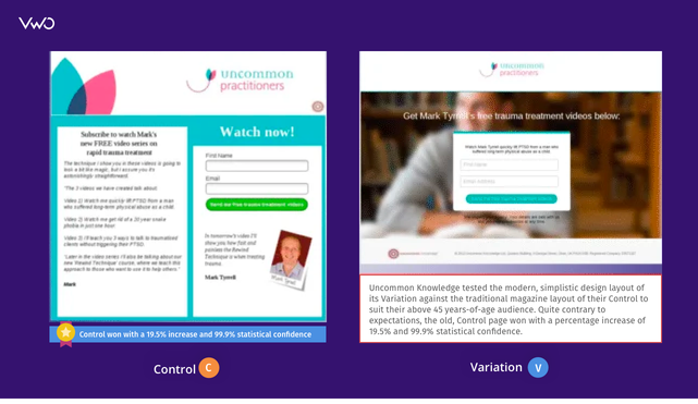
The redesigned landing page did not achieve the expected results. In fact, the original, old landing page beat the fancy new one by 19.55% with 99.99% statistical significance.
As the team from Uncommon Knowledge said, “This is a highly significant business result.”
Here is the comparison page showing the original and variation pages:

Although the new design did not deliver the expected results, the results of the A/B test were insightful.
This A/B test on their WordPress website showed that understanding one’s target audience can have a huge impact on the conversion rates. The test specifically reinforced the message that following trends blindly may not always be the best choice. While it is easy to follow the herd to follow “modern design styles,” these may not work for all.
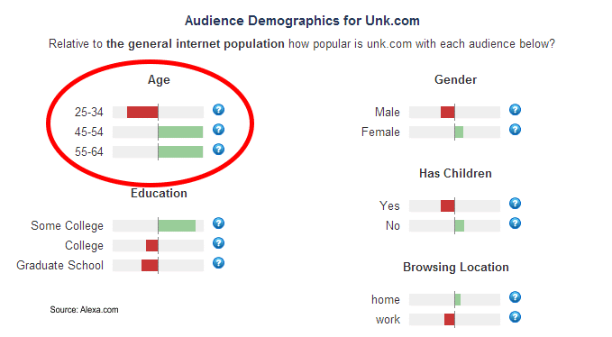
Every website must be designed and implemented in a way that makes it relevant to its target audience. The demographic profile of visitors to Uncommon Knowledge is shown below:

As can be seen from the above (and corroborated by age-range on the company’s Facebook page), a majority of visitors to the Uncommon Knowledge website are aged 45 years or more. As such, it would not be unreasonable to assume that this set of people were generally “low-tech” and would not be affected by the latest design trends.
The original page design gave these visitors a good idea about each of the 3 videos in the pack. This piqued their interest a little more than the message in the variation that just told them that it’s a three-pack video set on trauma management.
Also, Mark Tyrrell, Cofounder of Uncommon Knowledge and the author of its blogs, is quite well-known among the audience. His photograph (in the original version) added credibility to the overall offer.

Location
UK (Scotland)
Industry
Universities
Impact
19.55% increase in sign-ups


