How Roeder Studios Improved Its Sign-Up CTA To Increase Signups Using VWO
VWO and LKR Social Media (Roeder Studios)
LKR Social Media (or Roeder Studios) provides its clients with advice on social media marketing.
The company uses the VWO platform to run A/B tests to assess optimization opportunities.
Goals
The aim was to increase sign-ups for the Creating Fame Program.
Tests run
LKR’s Creating Fame program was launched with the objective of making people realize that regardless of their industry, they could make a mark in the online world within 5 days. All participants had to do was to spend about half an hour for 5 days, working on tasks such as creating a business pitch, and pitching guest posts and interviews.
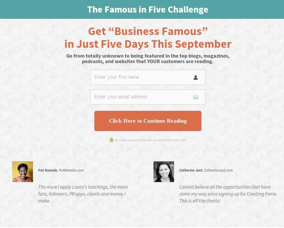
To attract participants to the program and get them to sign up, LKR launched a campaign. This was aimed at making people curious about the Creating Fame program. The original page where much-targeted traffic landed looked like this:

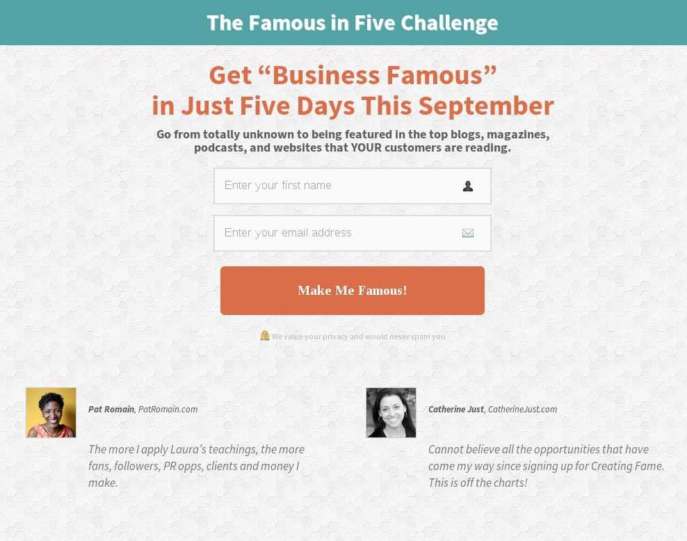
The team hypothesized that the original call-to-action button text was not punchy enough, and that making the CTA button text more specific and hard-hitting would improve sign-ups for the campaign. They created a Challenger version with the new call-to-action text that said Make Me Famous.
This is what the variation looked like:

After people enrolled for the 5-day challenge, they were redirected to an article that emphasized why it has become so important for small businesses to maintain a good online presence.
The A/B test was set up and run on the VWO platform. The goal tracked was the number of sign-ups.
Conclusion
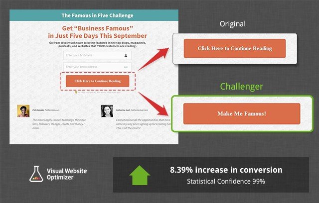
The challenger beat the original by 8.39%, with a statistical confidence of 99%.
Below is the screenshot of the test report from VWO:

Here is a comparison image showing the original CTA and the CTA in the variation.

Clearly, the changed CTA text had greater appeal and helped drive sign-ups. So what worked? The text in the Challenger was definitely more specific. The text Make Me Famous
conveyed the value of the campaign more effectively than the original CTA button text did. The new CTA button text tells people how they will benefit if they sign-up for the program.
What added to the appeal was the use of the word Me that made the CTA more personal. In fact, the use of the first person (I, me, my, and others) in call-to-action texts is considered a best practice.

Location
US
Industry
Services
Impact
8.39% increase in sign-ups


