
Follow us and stay on top of everything CRO
Read summarized version with
What is landing page optimization?
When it comes to increasing conversions, most marketers advocate a plethora of strategies to implement to increase numbers and stay on top in today’s thriving competition. Amid the list, optimizing landing pages is often the first and foremost crucial linchpin that businesses address, but not always in an end-to-end manner.
Landing page optimization can be defined as a process of improving the performance of various page elements and ensuring that they get your business the highest possible conversions from visitors who arrive on these targeted pages. It is a subset of Conversion Rate Optimization (CRO) and includes methods like A/B Testing to help lower your customer acquisition cost and maximize your ad spend value.
Let’s get into some depth and analyze why landing page optimization is critical for lead generation and overall business growth.
What is a landing page?
A landing page is a web page where visitors land and see your brand’s offerings. But, in terms of marketing, it’s typically a standalone page, which is different from other site pages including your homepage. It serves a singular and more focused purpose – to lead visitors to a specific product, service or offer, and encourage them to take the desired action.
Ideally, there are five types of high-converting landing pages that most businesses typically use. These are as follows:
1. Click through landing pages
One of the simplest forms of landing pages used in online marketing, their sole purpose is to offer an on-site visitor with all the necessary information regarding a product, service or an offer, and explain the advantages as well as the context of use to convince them to enter the conversion funnel. These pages are ideally created to increase click-throughs and guide visitors to specific targeted pages where they’ll find complete transaction details.
2. Lead capture landing pages
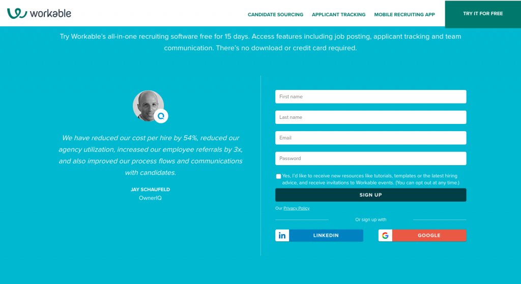
Otherwise known as squeeze pages, the core purpose of lead capture landing pages is to collect visitor data and create a bank of prospects for the marketing and sales team. A good lead capture landing page doesn’t have any exit paths from the page. Meaning, these pages do not have any internal or external links but only CTA button(s) to submit user details.
Workable is a good example to quote here. The company “Try It For Free” landing page is clear, concise, and focuses only on collecting visitor data. It doesn’t have any external links, just the right amount of content, and CTAs that are prominently visible to naked eyes.
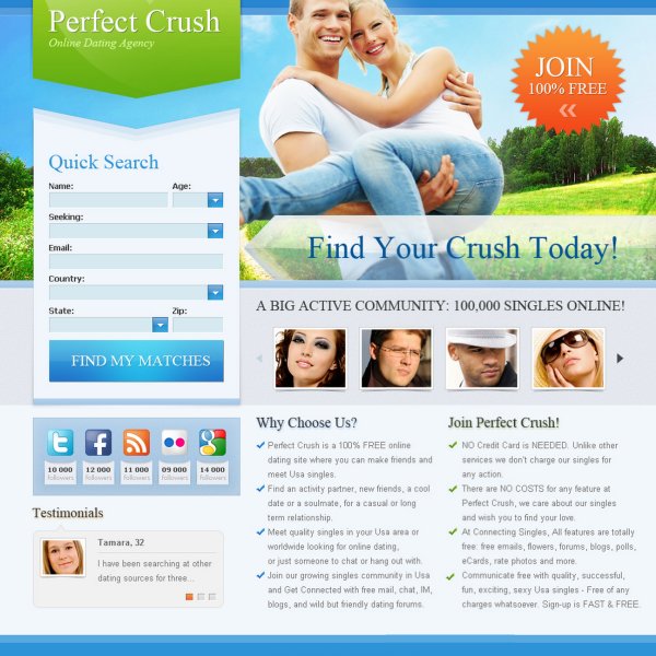
3. Viral landing pages
As the name suggests, these pages are ones that help businesses to promote their brand through word-of-mouth marketing. The goal behind having these landing pages is not just to get more visitors to sign up, but also to spread the word (to friends, family members, and peers) about what they’ve found. The image below is a great example of a viral landing page.
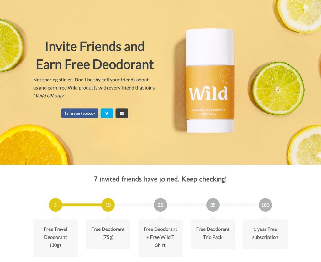
What makes this landing page so successful that not only is its content out-of-the-box, especially “pleasantly infrequent updates” expression but the addition of social icons (Facebook and Twitter) that puts visitors at ease with subscribing and sharing.
4. Microsites
A microsite is a subset that acts as a supplementary website to a fairly large website. These landing pages normally have their own vanity URLs related to the relevance and timing of the campaign. Although they’re more than just single pages, they’re classified as landing pages because their destinations, or where visitors are routed to are driven from paid online ads, print and television ads.
Spotify’s Year in Music is one of the most well executed microsites that you’ll ever come across.

Besides listening to an expansive variety of songs on its site, Spotify allows you to create your own personalized year round recap list. This includes a list of all the songs that you’ve listened to throughout the year, the top artists by season, and even details upon the amount of time you’ve spent listening to music. The experience is unique and makes it fun for you to share and compare your synopsis with your friends and peers.
Another great example of microsites is Movie Trailer sites. Not only do they help attract high traffic on your site but only exist for the sole purpose of promoting the movies.
Besides the above mentioned four high-converting landing pages, there are some uncommon or less-valued pages that have the capacity to generate leads as well. Let’s read about them in the section below.
5. Unsubscribe landing pages
As the name suggests, it’s a page that assures customers they’ve successfully unsubscribed from one or more of your services. It serves a purpose opposite to other landing pages. However, you can use this unaided page to your leverage. Besides providing assurance, you can use the page to give users an opportunity to manage their preferences, reconsider their decision, or prompt them to explore your site again.
Consider retaining critical sections of your website such as the footer, navigation bar, main menu, etc., like in this example from Whole Foods. Although the page doesn’t have a lot of content other than the confirmation message, it still carries the main menu and footer section with necessary brand information that is enough to prompt visitors to check out the Whole Foods’ website again.
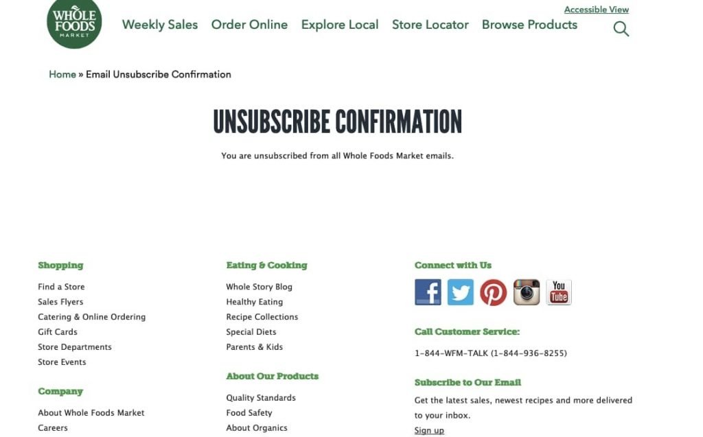
Just because users are unsubscribing to your services doesn’t mean they might not be interested in browsing through your site. We’d recommend adding a “Second Chance” button on the page for the users to resubscribe, just in case they decide to reconsider.
6. Long-form sales landing pages
When it comes to crafting sales landing pages for your website, let brevity take a back seat. Address every question that your prospects could possibly have, remove any barrier you foresee them facing during purchase, and communicate every benefit that your product or service offers, through this page.
Take Seth Godin’s altMBA, for example:
As you land on the page, you’re welcomed with a short two-minute video that emphasizes why it is the right time to apply. As you scroll through the page, you’re then shown the names of companies and pictures of students who’ve benefited from their course.
The following sections entail quotes from alumni students, links for subscriptions, and finally, a CTA button at the bottom of the page, prompting visitors to fill in the application form before the due date (mentioned right above the CTA to create a sense of urgency).
7. 404 landing pages
We understand that 404 errors can be frustrating for website visitors, pushing them to drop off. But, why not use these pages to your advantage? They don’t have to be dull and boring. You can instead make them as interesting and informative as possible. Add quirky images or gifs with crisp text, provide links to some of your top-rated product pages or heavy-lifting landing pages to uplift engagement.
Besides informing visitors that they’ve landed on a non-existent page, give them an opportunity to learn about your business and its offerings to induce a sense of curiosity. Use humor to offset the error and direct your visitors back to the homepage or other neutral landing page(s).
Take Pixar’s 404 Page, for example.
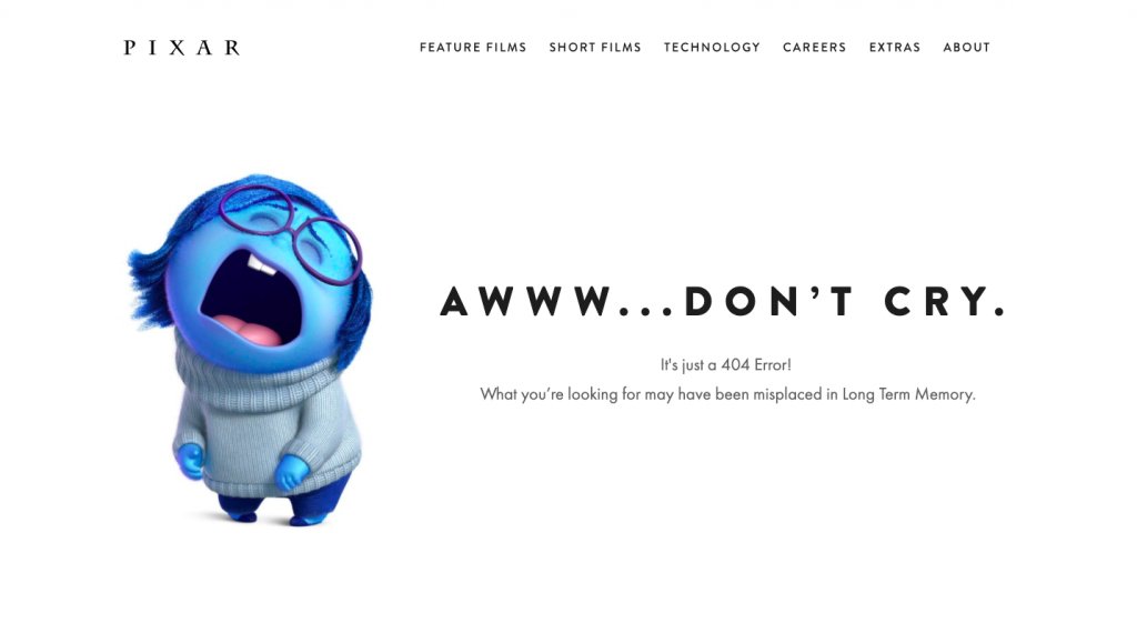
This world-famous American computer animation film studio features its beloved Sadness character on its 404 pages that resonates much with the page’s objective. It effortlessly conveys that they feel the visitors’ pain. They’ve also added some quirky text that plays on the plot of one of their most popular animated films, Inside Out.
What is an ideal landing page optimization process?
Understand that a landing page are key component of a website and an important tool in a marketer’s arsenal. When designed and optimized in an effective and efficient manner (ensuring they cater to all the needs and demands of the target audience and business objectives), they have the prowess to significantly contribute to revenue gains, achieve business goals, and serve as an aide to conversion rate optimization(CRO).
When optimizing or doing landing page testing, it’s always ideal to follow a set process to ensure they attain perfection. And, one of the best processes we typically vouch for is following the conversion pyramid as suggested by the Eisenberg brothers.
The pyramid typically comprises of five critical stages and it looks something like this:
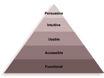
- Functional: Starting from the base level, the first milestone that landing pages must achieve is to be functional. They shouldn’t have any technical issues or create friction in a visitor’s on-site journey.
- Accessible: Next, they must be easily accessible. Meaning, your visitors mustn’t face difficulty while finding your targeted landing pages. Employing good SEO techniques along with PPC and other ad campaigns becomes essential. Moreso, they must also have the same impact on your visitors irrespective of the devices they use to arrive on these pages.
- Usable: Once your pages have fulfilled the requirements of the first two stages, they must next achieve the usability parameter. There shouldn’t be any readability or scrolling issues, banner blindness, and must be clutter-free. Smooth navigation always prompts users to take action faster than usual.
- Intuitive: The entire hierarchy of your landing page’s elements must make sense that visitors catch the basic essence of your page instantly.
- Persuasive: And, last but not least, all of your efforts made so far must persuade your on-site peepers to convert into leads and further into loyal brand advocates.
How to get started with landing page optimization?
In addition to the above-mentioned process, when you begin your landing page optimization journey, it’s equally important to consider analyzing two of the most critical steps of your sales conversion funnel – optimizing for multiple traffic sources, and toying with different on-page elements.
1. Optimizing for different traffic sources
Prospects coming to your site by clicking on a paid search ad will perform in a different manner than the ones landing on your site through social media ad spend. So, optimize your landing pages in a manner that they cater to each of your potential sources.
2. Toying with different on-page elements
Consider your landing page as a leaky bucket. Pouring more water may keep the bucket topped up and look good as new for a while, but eventually, the water will pour out leaving the bucket empty. Similarly, no matter how great your landing page looks, if you do not identify and patch the loopholes sooner (than later), you’ll end up losing most of your potential customers and hence, revenue.
Therefore, it is imperative to pay attention to and constantly optimize each of your landing page elements. Test different value propositions, change form fields, and create better user experiences. You can also consider including social proof to maximize credibility and traction.
Landing page optimization checklist
The primary objective of your landing page is to provide a hyper-focused experience that is designed to accomplish the singular conversion goal of your marketing campaign. In a desire to create a visually aesthetic landing page, try and not overdo it. An eye-catching image or a beautifully designed page may earn you a few praises, but in the long run, if they don’t convey the right message (in a simple and clear manner), they’re a lost cause. Instead, it’s essential to focus your energies to create uncluttered and easy-to-understand landing pages which promise conversions, as intended.
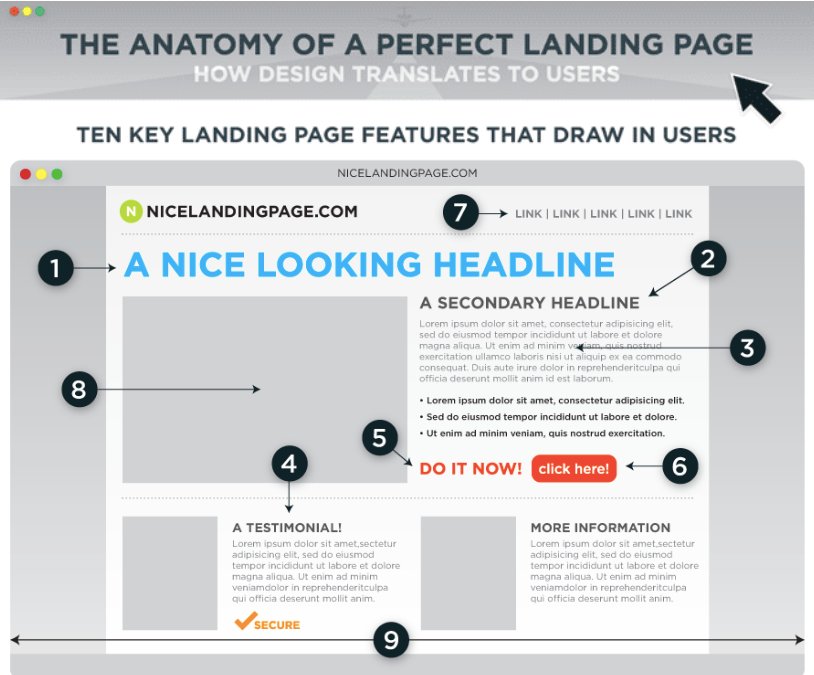
Below mentioned are 10 primary landing page elements you must seek to improve to build highly optimized landing pages:
1. Headline and sub-headline
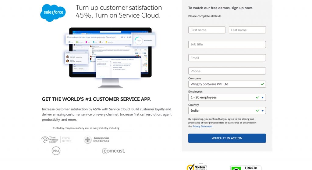
The objective of your headline and sub-headline must not be just to sell products or services to prospects, rather establish a connect with them and persuade them to take the desired action. So, optimizing them should be your first priority. Craft headline and sub-headline that are relevant and catchy to make visitors stay on your page and browse through your offerings. Salesforce request demo landing pages are a great example of landing pages with compelling and engaging headline and sub-headline.
2. Copy
The second thing to focus on when optimizing your landing page must be to draft copies that intrigue them. Ensure your copies are clear, concise, and to the point. Try to use bullet points as they’re a great way to hone in on key aspects of your offerings and make information easier for visitors to digest. Here’s an example of a landing page with an excellent copy.
3. Image
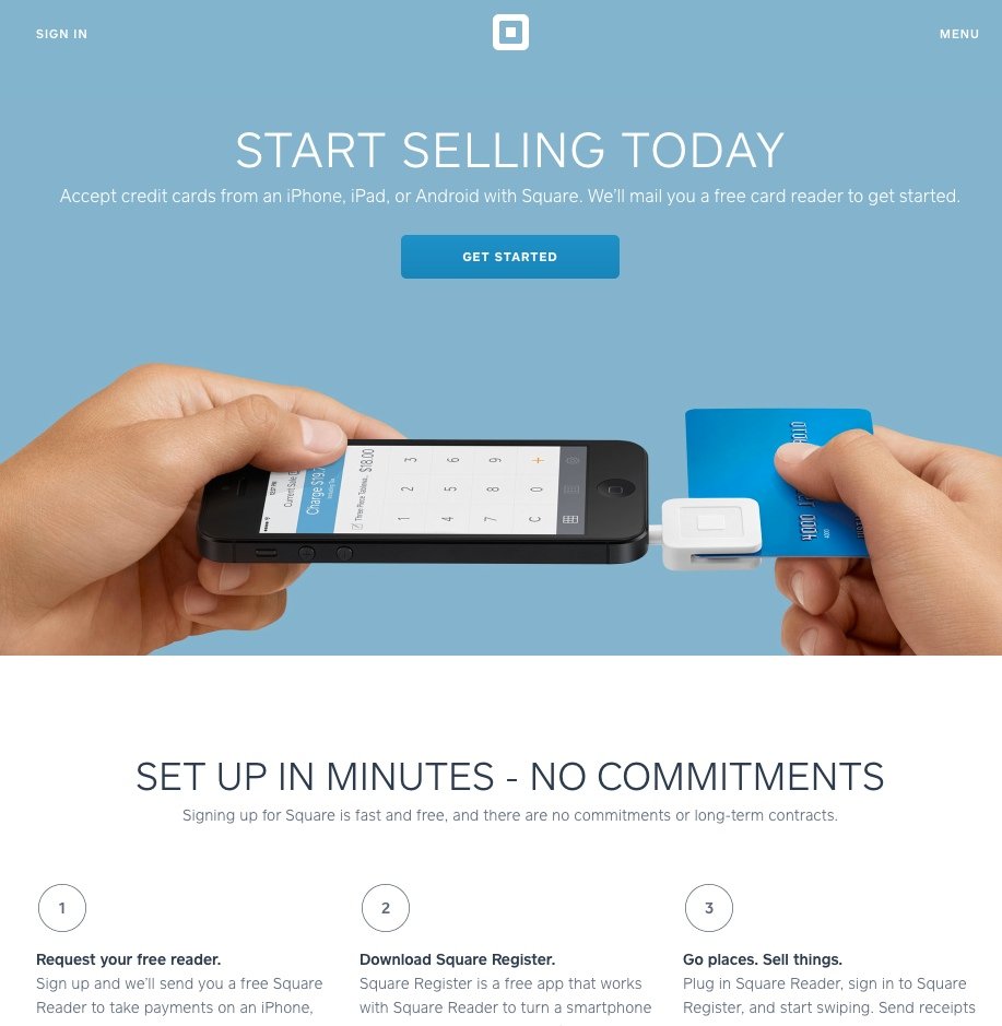
Images make for another critical element that visitors prominently notice and quickly resonate with when they arrive on your landing page. So, leverage them to your advantage. Use images that speak about your brand or illustrate offerings, set the tone for their entire experience, and increase your page’s engagement rate. See how Square, by using simple yet effective imagery, along with a catchy headline and sub-headline provokes its target audience to get started.
4. Call-to-action
Call-to-actions (CTAs) have the prowess to get you that one click that closes the deal for your business. Hence, crafting CTAs that are attractive, compelling, and impactful is crucial. Some best practices to get a higher click-through rate and more conversions out of your CTAs are as follows:
- Create a sense of urgency
- Use action-packed words but limit them between two and five
- Use a color combination that makes your CTA stands out
- Go with large and legible text size.
- First-person speech works wonders
- Get fancy with button graphics
- Have a healthy chunk of white space surrounding your CTA
Remember, the catchier the CTA, the higher shall be the click-through rate. Below given example is a testimony to our claim.
5. Forms
If your landing pages have been primarily designed to generate leads through forms, ensure they’re smartly placed on the page. Furthermore, keep your landing page form simple, concise, and only ask for information that’s most relevant and important to your business. This can significantly increase the chances of your prospects filling them.
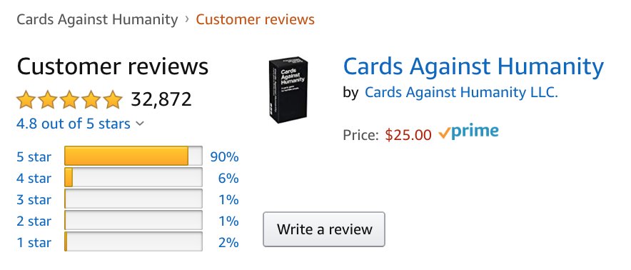
6. Social proof
Social proofing may take the form of testimonials or even an info-graphic showing names of companies who are also engaged with your brand. It is important to note that testimonials must be relevant to your user persona. For instance, if your landing page targets a young finance professional working at an investment management firm, it makes good sense to showcase testimonials from similar professionals to establish credibility. Look how Amazon uses social proofing to its advantage.
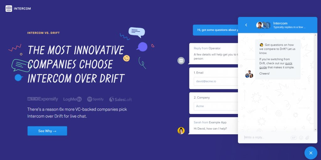
7. Live chat
If you get your value proposition right on your landing page, then having a live chat option can do wonders for your business. For the reason that visitors like live chats. They appreciate when they’re assisted right then and there while they’re active on the site. This not only helps invoke a feeling of satisfaction amid the visitors but build brand trust as well. In fact, a study by eMarketer advocates our claim. It states that 63% of respondents who engage in live chats are more likely to return to the website, and 62% are more likely to buy from the website.
Moreover, it’s also easier to move potential customers to the bottom of the sales funnel faster through a live chat session than other marketing means. Here’s how Intercom uses live chat to engage visitors on its page.
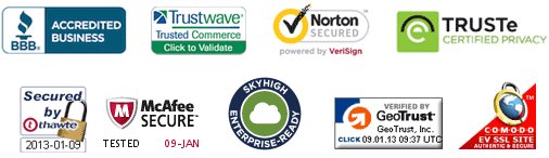
8. Trust Badges
Security labels act as reinforcements. And, the image below showcases that pretty well. They help build trust in the authenticity of your products and/or services. So, add testimonials, media coverage news, a few social media mentions and voila, to give your brand’s reputation and credibility some needed boost.
9. Color contrast
Some of the best landing pages over the internet that we’ve seen have made great use of contrast but in color and clarity. In this example from Starbucks, you can’t ignore the CTA.

Even though the “Join Now” button reflects the star’s color in the left-side logo, it’s far more pronounced and clear. Furthermore, the textured black background makes the headline and CTA pop instantly.
10. Above the fold
The term “above the fold” traces back to the newspaper. Notice that the most enticing stories are always placed on the first page above the traditional newspaper fold to instantly catch the attention of the readers and compel them to read the entire piece of news.
Apply the same logic to your landing pages. Keep the most important elements of your offerings above the fold — the point at which the visitors are urged to scroll through to get more information. Since it is a debatable topic, use qualitative tools like heatmaps, scrollmaps, session recordings, and run an A/B test to figure out which fold would best work for your brand is always suggested. Use VWO’s AI-powered free heatmap generator to understand where visitors are most likely to concentrate their attention on your webpages.
Understand that the above-mentioned best practices are not a “one size fits all” solution to optimize your landing pages and increase conversion rate. You must always conduct a thorough analysis of the performance of your pages, its respective elements, test them against something you hypothesize would work better, and only then make changes.
Landing page optimization best practices
Crafting a good landing page isn’t rocket science. It just requires some extra effort to ensure whatever you create, gives results. Besides optimizing the above-mentioned elements, it’s equally important to pay attention to many other off-the-site components that help boost the performance of a landing page. These are as follows:
1. Present hard-to-resist offers
A good landing page isn’t just the one that’s aesthetically pleasing, but one that presents offers that are hard to resist and warrant visitors to share their personal information. This Blue Apron’s landing page is exactly what we’ve defined above.
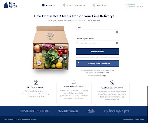
Besides having a great overall look and feel, the page’s headline is compelling enough to urge users to sign up and redeem the offer. Moreso, rather than having a regular ‘Sign up’ CTA, the company chose to use words like ‘Redeem Offer,’ which are more instigating in nature.
Understand that if your landing page answers some important questions like, “Will my target audience benefit from my offer?”, “Is my offer better than my competitors?” etc., you’re sure to benefit from them in the long run.
2. Decrease page load time
Landing page load time is a metric to take seriously. As a well proven fact, even a single second’s delay in page load time can cost your business at least 7% fewer conversions and 11% fewer page views.
Besides this, slow page load time also triggers dissatisfaction and frustration amid visitors and customers. So, working towards maintaining an ideal load time is highly critical.
3. Keep a visitor’s journey in mind
When driving traffic to your landing pages, always maintain a clear vision of the target audience you’re catering to and where they stand in their on-site journey. Using visitor behavior analysis, segregate your inflowing traffic into different segments and target them in a manner that they’re compelled to enter your conversion funnel. Meaning, you must have a clear knowledge of whether your target audience is trying to diagnose a problem (awareness), looking for a solution against a problem (consideration), or ready to convert into leads/customers (decision). It’s a pretty simple rule — meet your visitors where they are and you’ll surely hit the bull’s eye.
4. Create a seamless experience
Not everybody appreciates being surprised. So, avoid creating such situations. Show your visitors exactly what you’ve advertised when they arrive on your page and ensure to be consistent with your copy. Try and use the same words on your landing page as used in your paid ads, social posts, blog CTAs, or emails. The more you stand true to your words, the more seamless experience your visitors will have, and the more will be the chances of increasing conversions.
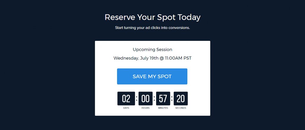
5. Use urgency and scarcity in your offer(s)
Of the six principles of persuasion, urgency and scarcity can work wonders for your landing pages. For the reason that both urgency and scarcity have the prowess to instigate the fear of losing or missing out when you make it clear that your offerings are either in high demand or short in supply, that visitors feel the urge to take the desired action instantly.
Given below is a great example of scarcity and urgency. Instapage uses a countdown timer to not only showcase urgency but encourage visitors to register for webinars before time runs out.
6. Pay attention to landing page SEO
Consider search engine optimization (SEO) as a secret weapon that has the prowess to get your landing pages the attention they need to rank higher on the world wide web, and in turn, generate leads. The approach isn’t just about adding some random keywords to your page content. Rather, it’s about ensuring that whatever you’re trying to cater through your landing page resonates with what visitors search for on the internet. It’s just a better way to convert your visitors faster.
For instance, let’s say you’ve created a landing page around homemade vegan chocolates and want more people to visit your site and place orders. Simply add relevant keywords around homemade vegan chocolates to your landing page content, meta title, and description, and watch SEO do its magic.
The more relevant your keywords are to the searches made by your visitors, the higher are the chances of your landing pages ranking higher on SERP.
What are some landing page metrics you must track?
Simply building an up and running landing page isn’t enough. Measuring its performance against certain critical metrics to see whether or not it’s helping you fulfill the intended goals is equally critical. While different businesses may use different metrics to measure the performance of their landing pages. following are some of the most commonly used metrics across industries that are enough to get started:
1. Page visits
As the name suggests, page visits typically account to the number of people who’ve visited your page over a certain period. The higher the visitors, the higher is the probability of conversions. If this number is lower than you’ve expected, then try and optimize your paid strategy, use emails and social media platforms to get the desired traction, or refine your keywords to push the fence sitters to visit your page.
2. Bounce rate
After page views, this is typically the next most important metric to consider when interpreting the performance of a landing page.
Bounce rate refers to the percentage of people who drop off from your landing page (or website) without visiting a second page. A visitor can bounce off your page due to a plethora of reasons. Some of them are as follows:
- Your content may not align with your claimed offer
- Your copy may not be catchy enough to capture the attention of a visitor
- Your page’s overall visual hierarchy might not be appealing or informative
- Your visitors find what they were looking for and leave the page
A good landing page bounce rate typically falls into three categories. These are as follows:
- Excellent: ranging between 26 & 40%
- Average: ranging between 41 & 55%
- Decent: ranging between 56 & 70%
A bounce rate higher than 70% specifically in the case of a lead capture landing page, is considered poor. The best way to decrease your page’s bounce rate is by thoroughly checking them for leaks. Use VWO’s capabilities such as Heatmaps, Scrollmaps, Session Recordings, to map visitor behavior and identify loopholes.
3. Traffic source
Knowing which traffic sources bring in high-converting website visitors can help you channelize your marketing efforts better and drive more conversions. The clearer you are about the results the various traffic sources drive for your business, the better shall be your targeting.
Mentioned below are some examples of traffic sources to closely watch:
- Direct Traffic: Visitors who land on your page or website by directly typing the URL into their browser.
- Referral Traffic: Visitors who land on your page by clicking on a link present on another website or source.
- Social Media Traffic: Visitors who find their way to your website or landing page by clicking on a link present on a social media post or profile.
- Organic Traffic: Visitors who find your website or landing page by entering search queries or keywords on search engines like Google, Yahoo, Bing, etc.
- Email Traffic: Visitors who clicked on a link or CTA button present in one of your marketing emails and landed on your page.
- Pay Per Click Traffic: Visitors who land on your page by clicking on a PPC ad.
4. Submission rate
This typically defines the percentage of visitors who fill and submit your lead-generation form(s) and arrive on thank you page(s). The higher the number of submissions, the better optimized your landing page is. In case of low conversions, it’s always a good idea to make tweaks to your page and run A/B tests to check for leakages so you can optimize accordingly.
5. Form abandonment rate
Form abandonment rate informs you about the percentage of visitors who landed on your page, interacted with the form (began the form filing process) but left without submitting it.
This can happen for a number of reasons. Maybe your form is too long or raises data security concerns, bombards the user with questions that visitors may be hesitant to answer, or is just too difficult to attempt.
The best way to improve your form submission rate is to make sure that the information you’re seeking through the form duly matches the perceived value you’re offering. Before floating the form, it’s best to self-evaluate it. Ask yourself, “Would I provide my residential address in an event registration form?”, “Should I enter my credit card details while signing up for a free trial?”, “Should I furnish my phone number?” etc. If your answer is no, consider removing such fields from your form(s) or revising content to reduce abandonments. You can also read through our form analytics guide to understand how to optimize web forms for better lead generations and run A/B tests to check the viability of your form(s).
6. Lead-to-customer percentage
Besides the above-mentioned metrics, measuring lead-to-customer percentage is also critical. This metric typically helps to identify the percentage of leads generated through landing pages that converted into paying customers.
Consider your job is to improve landing page conversion rate. You spend much time promoting it on the internet and the analytics report shows people are signing up for your offer. However, if you’re unable to convert these leads into paying customers, your conversion rate will turn into a vanity metric.
Sometimes, landing page optimization goes beyond tracking key metrics and jotting down numbers. It may involve redefining your target audience, or re-evaluating your sales and nurture programs. Lead-to-customer rate provides such insights for you to analyze your efforts and make smarter decisions.
Note that a good conversion rate varies depending on your offers and industry, where it lies in your conversion or sales funnel, and the quality of leads generated through the landing page. Typically, the average landing page conversion rate is 2.35%. However, a good landing page conversion rate lies between 5% and 10%.
Landing page optimization tools
VWO
VWO is a CRO platform that enables users to optimize their landing pages in VWO’s no-code Visual Editor. It offers personalization of content and segmentation capabilities for your campaigns which you may want to present to a specific user group, thereby improving the UX and conversions of your website. It comes with a 30-day all-inclusive free trial and is popular among organizations of all sizes.
Google Optimize
Google Optimize is a free experimentation suite from Google that also comes with an enterprise edition. This tool comes with an integrated Analytics and Tag Manager. It focuses on personalization and optimization experience and strongly relies on the goals and audience that you set in Google Analytics to give you precise results.
Landing page optimization examples
You can optimize your landing pages using A/B testing and Multivariate testing.
A/B testing
A/B testing (also known as Split testing) is the most robust approach to compare two versions of a landing page. The changes between the two variants could be small (incremental) or big (radical) depending on the goals of the test. A/B tests help to identify elements and changes that impact user behavior and continuously iterate towards the most effective version of the landing page.
For example, replacing web forms with chatbots is a common use case for A/B testing to optimize landing pages. New-age businesses are experimenting with chatbots to replace web forms and figure out which approach helps increase conversion rates.
Multivariate testing
With Multivariate Testing (MVT), you can test a higher number of variables on a web page as compared to A/B testing. As testing for multiple variations requires more traffic to reach statistical significance, multivariate tests are recommended for websites with high traffic.
Multivariate tests are a powerful solution for landing pages. Testing multiple elements such as hero image, headline, and website copy simultaneously becomes a child’s play with multivariate testing, as you don’t have to create separate versions of the same webpage for all possible combinations. Also, you can expedite the testing and optimization process.
Hyundai used MVT to achieve a 208% increase in the CTR from the landing page for one of their cars. Since Hyundai’s car landing pages had a lot of different elements (car headline, car visuals, description, testimonials, and others), an MVT helped understand which elements influenced a visitor’s decision to request a test drive or download a brochure.
What to do post-conversion: lead nurturing?
Once you’ve optimized your landing pages, it’s time to nurture all the leads you’ve captured so far and turn them into paying, loyal customers. Here’s how to do it:
1. Optimize your ‘Thank You’ page
Though we’ve just concluded optimizing all the landing pages, let’s add one more page to our optimization list – the thank you page. Besides being the first page that a person interacts with after they convert, a thank you page serves as an opportunity window to delight your new customers and assure them that they’ve made the right choice.
Remember, your objective is twofold here – deliver the promised offer(s) and get your new customers interested in your other offerings as well.
A good thank you page should:
- thank and welcome customers. .
- provide links to website content pieces relevant to their purchase
- prompt customers to follow you on social media channels to stay updated
- ask them to subscribe to your website blog
2. Guide them along their buying journey
While you mustn’t force your leads to convert into paying customers, you can surely influence them and their decision(s) throughout their buying journey.
A buyer’s journey is an amalgamation of three primary steps a lead or a prospect goes through before turning into a paying customer. These steps are as follows:
Stage 1: The awareness stage
Gather valuable information about your prospects and make a note of their problems and pain points. Use this data to solve their issues (by directing them to blogs, knowledge base articles, sponsored content, etc.). Make sure to optimize your content pages as well, and prompt them to move to the next stage.
Stage 2: The interest stage
As your prospects enter the interest stage, help them zero in on their final decision and nudge them to choose your product(s) or service(s). They’ve already interacted with your website. Now, either direct them to a landing page with product or service demo videos or prompt them for a one-on-one demo call/discussion to swell their interest.
Stage 3: The decision stage
After weighing all the pros and cons, your leads have finally decided to make a purchase. Once they’re here, focus on providing lucrative offers and entice them to complete the buying process. Have dedicated landing pages with promotion or discounts offers, coupons or promo codes, especially for first-time customers, and even complementary services to keep their interest intact.
Converting leads into customers can be a cumbersome task as people are expected to do their due diligence before even filing lead generation forms. Hence, it is critical to understand the importance of nurturing them at every stage to ensure all their doubts and queries are resolved.
3. Form a relationship
Once an individual signs up to receive information about your product(s) or services(s), they become your potential clients. It is now time to work hard and build a relationship with them to ensure they convert into paying customers. The good thing here is that these leads are already interested in your product(s) or service(s). All you need to do is identify and address their pain points, provide additional/complementary demo sessions, and ensure they leave your website happy and satisfied.
Why should you A/B test landing pages
If you’re not already convinced about optimizing landing pages, here’s a report by MarketingSherpa that shows landing pages are indeed one of the most effective pages to test. In fact, organizations around the world today are allocating more of their budgets and resources to the optimization of landing pages.
Landing page optimization statistics
Let’s look at some industry statistics to understand the importance of continuously optimizing your landing page:
- Interactive landing pages have the prowess to attract and retain more customers.
- Long form landing pages have the potential to generate upto 220% more leads.
- Targeting and correctly testing landing pages can increase conversion rates by about 300%.
- Optimizing your landing pages and smartly aligning its elements can increase conversions by 86%.
- Landing pages that load slow can result in a 7% reduction in overall conversion rate.
It is obvious that once you’ve tapped the potential of your landing page, you’ll test it again.
A/B testing landing page elements
The last piece of the puzzle when creating a perfect landing page is to A/B test them. Testing different versions of your landing page elements can not only help you determine what would best attract your customers and their attention but detail upon elements which have the prowess to get you more conversions as well.
Refine your value proposition, test different colors, add different smiling faces, use a video against an eBook. Test every page element you believe (post thorough analysis) would make your business gain.
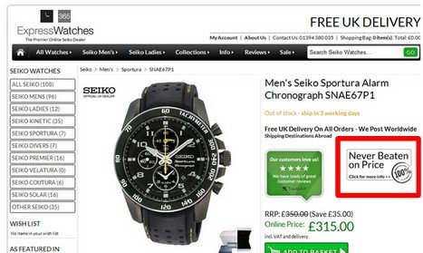
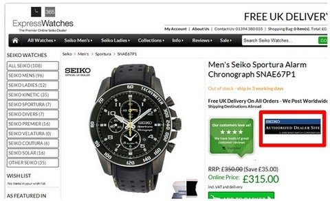
For example, by replacing a guarantee symbol with trust symbol, Express Watches, an online dealer of Seiko watches increased conversions by 107%.
See the before (control) and after (variation) screenshots.
Pluimen.nl, a Dutch company that sells gift vouchers, revamped one of its landing pages to increase its revenue by 19%.
The original landing page or the Control had 2 CTA buttons – Buy Now and Check Experiences, which were evidently causing friction. Here’s what the Control looked like:
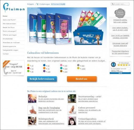
After extensive analysis, Pluimen decided to remove the Buy Now CTA from the page. They ran an A/B test to validate their hypothesis.
This is what the Variation looked like:
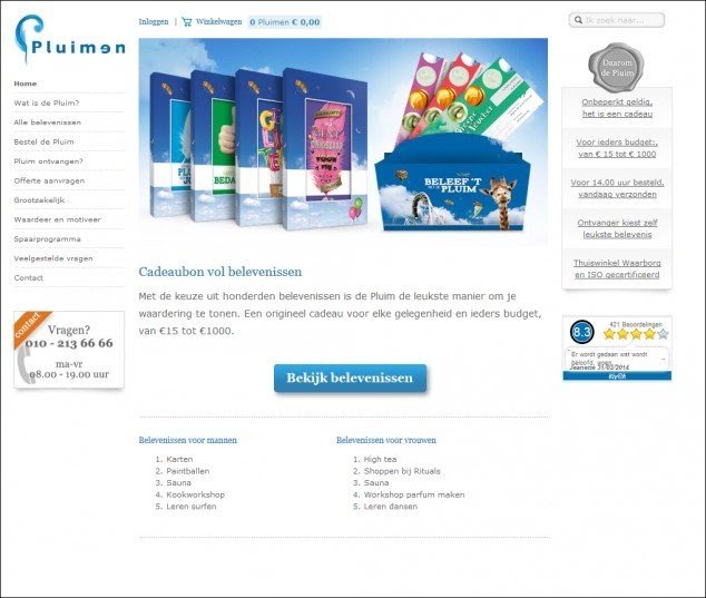
The test not only increased their revenue by 19%, but decreased bounce rate by 8.5%, uplifted conversions by 10.9% and overall transitions by 11.4%.
There is no end to A/B testing. For every landing page you design, make it a rule to always test different variations to reach the pinnacle of optimization.
What are the common landing page optimization mistakes?
As simple as it may sound, landing page optimization is not a child’s play. It demands a lot of homework and due diligence to avoid committing silly mistakes and achieving the optimum level required.
Below mentioned are some common mistakes that you must avoid committing while optimizing landing pages:
Mistake #1: Too much text
Here’s an example of a landing page with too much text.
It won’t come as a surprise if the brand wasn’t earning any conversions from this page. The reason being, in today’s age and day, no one has the time or patience to read through endless paragraphs to finally understand what your brand actually offers. People in fact have graduated to being ‘web-scanners’ than ‘web-readers.’ If they don’t find what they’re looking for in the first 3-5 seconds of they arriving on your page, they’ll definitely exit without even thinking twice.
Avoid stuffing your landing pages with paragraphs. Use minimal text, simple graphic detailing, and imagery to make the page look impressive and impactful. Below given is an example of a good, conversion-fetching landing page must look:
Mistake #2: Lack of descriptive headline
Here’s an example of a confusing headline: “Changing how the world works”
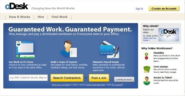
Never think that a visitor is going to spend minutes reading through all text on your page and then make his best guess of what you are offering. Instead, you should make their job easy. Have a big, bold descriptive headline that doesn’t just say it all but is prominently visible to the naked eyes. oDesk has revamped its site and it now looks something like this:
A descriptive headline serves another important job: it *sticks* in the head of a visitor as long as they stay on your site. Contrast this to the scenario where there is no helpful headline which a visitor can fall back on and your page turns out to be too confusing to understand.
Given below are some types of headlines which you must avoid crafting:
- No-headline: No matter how bad it is, you should definitely have a headline of some kind on your landing page.
- Overvalued Headline: Avoid headlines such as “Welcome to the future of social media marketing.” Such headlines are usually vague and convey no information at all.
- All Focus on Benefits: Quoting VWO’s example here. In the first version of VWO homepage, it’s headline said, “Magical tool to convert visitors into customers.” While that headline spoke much about the benefits of the tool, it did not talk about what the tool really was. So, it was eventually changed to, “World’s easiest A/B testing tool” which turned out to be a much better option than its previous version.
In a nutshell, headlines should be short, concise, and descriptive enough to do the needful.
Mistake #3: Lack of a single, prominent call-to-action
Once the visitor arrives on your page, thinks that you are credible, reads the descriptive headline and is finally convinced to spend some time on your site, what’s the next page you want him to see? That decision should not be left on the visitor because only you know (and not them) which is the most relevant page that your visitors should view next.
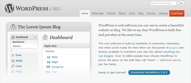
Example of single, prominent call-to-action: “Download WordPress”
If you don’t have a single prominent call-to-action or have far too many call-to-actions on your landing page, visitors are likely to get confused – what to do next (since all links from your landing page/homepage seem to be of equal importance). Even if you have two prominent buttons (e.g. one of ‘Learn More’ and other for the ‘Sign Up’), try reducing it to one button. Don’t force your visitor to make a choice.
Mistake #4: Lack of social proof or ROI proof
Even today, most marketers argue that adding social proofs or ROI proofs is unnecessary. They believe that it just takes up space on the page and does not play a major role in helping the page achieve its desired goal. But, in today’s time, humans crave for social proof. They want to know who else is using your products and/or services, how have they benefited from them, and base their decisions on these chunks of information. So, add social proofs or ROI proofs to your landing pages. Give your visitors a reason to believe in your brand. These can be in the form of testimonials, company logos, customer photos or case studies. Here’s a perfect, self-explanatory example for you to understand better.
Mistake #5: Lack of use of impactful images
The problem is, people use cheesy stock images thinking that they make their site prettier. But pretty is not enough. They have to be relevant too. And, Marketing Experiments confirms that. The company, in one of its case studies, states that using a real image, as that of their company’s Founder on one of their landing pages proved to be more beneficial to the company than using a stock image of a smiling girl wearing headphones. By doing so, the company saw a 35% increase in their sign ups than before.

Stock photos look phony and can reduce or even hamper the credibility of your brand. Hence, It’s always a good idea to replace them with a more real and relatable images.
Mistake 6: Lack of visual hierarchy
When people “skim” through your landing page, your design should lead the conversation in their mind. Font size, bold text, image size, you can use all these and a lot more to guide the thought process of your prospects that finally makes them enter your conversion funnel.
Below is an example of visual hierarchy of the Build Conference landing page:
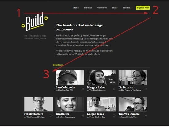
The visual hierarchy on the above landing page seems good. The F-shaped scan pattern of visitors will make them notice the brand first. The second element they notice will be the well-contrasted call-to-action button on top right. And, the third will be the credentials of the speakers.
But the designers missed something really important here – not giving much weightage to the page headline. When you look at the image again, you’ll realize that you almost missed reading the headline due to lack of prominence. Had the headline being bolder with a bigger font, it would have made the page more intrigue and commanding.
Another important thing to remember in the visual hierarchy is the right placement of your call-to-action button. Sometimes it is important that you nurture the prospects before you show them the call-to-action.
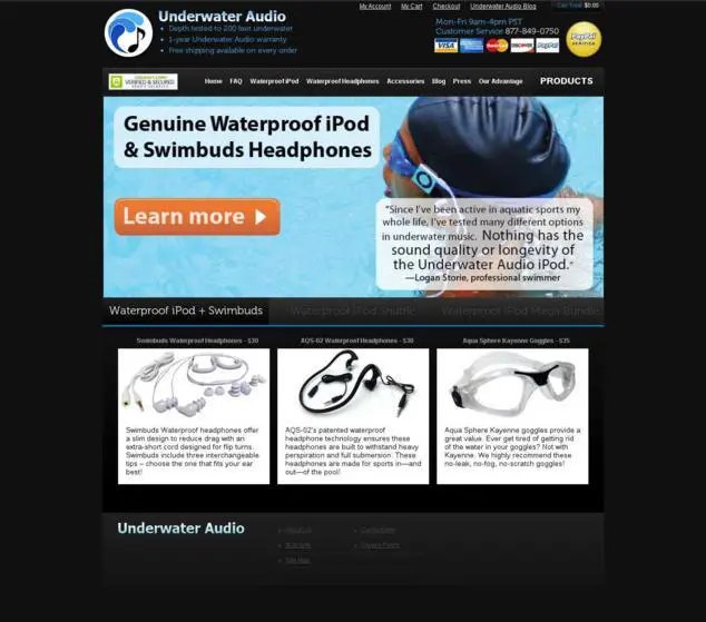
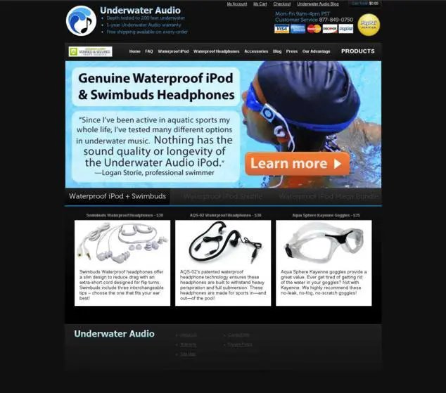
Underwater Audio, a US-based eCommerce company, used visual hierarchy and revamped their landing pages, which increased their online sales by 35.6%. The company simply swapped the CTA button and the testimonial bubble and saw that their page was not only clearly conveying their desired message but encouraging visitors to click on the CTA button as well.
Here’s how its original and revamped page looked like:
Conclusion
Since landing pages are responsible for getting a majority of new leads to your business, they demand utmost attention. Take into account the above mentioned points, make the necessary changes to these lead generation pages, and increase your conversion rates.
Frequently asked questions on landing page optimization
Optimizing a landing page involves making changes to the various elements present on the landing page, i.e., testing out the headline, copy, images and call-to-action buttons to increase the number of conversions.
The main objective of landing pages is to provide the most optimal user experience. So, in essence, this is a valid reason to use them in SEO. However, in the longer run, landing pages are not good for SEO because they are Orphan pages, and don’t have many internal links or outlinks.
Yes! Landing pages still work. Landing pages are very efficient when it comes to PPC campaigns. They are highly customized and designed to meet the needs of a particular target audience. That’s why one can observe a very high conversion rate on landing pages.
There is no single answer to this metric of the conversion rate for landing pages. It depends upon the industry of your online business. Conventionally, a conversion rate in the range of 2% to 5% is considered good.


