 DE
DE
 BR
BR
Follow us and stay on top of everything CRO
Read summarized version with
 ChatGPT
 Perplexity
 Gemini
 Claude
 Grok
Grok
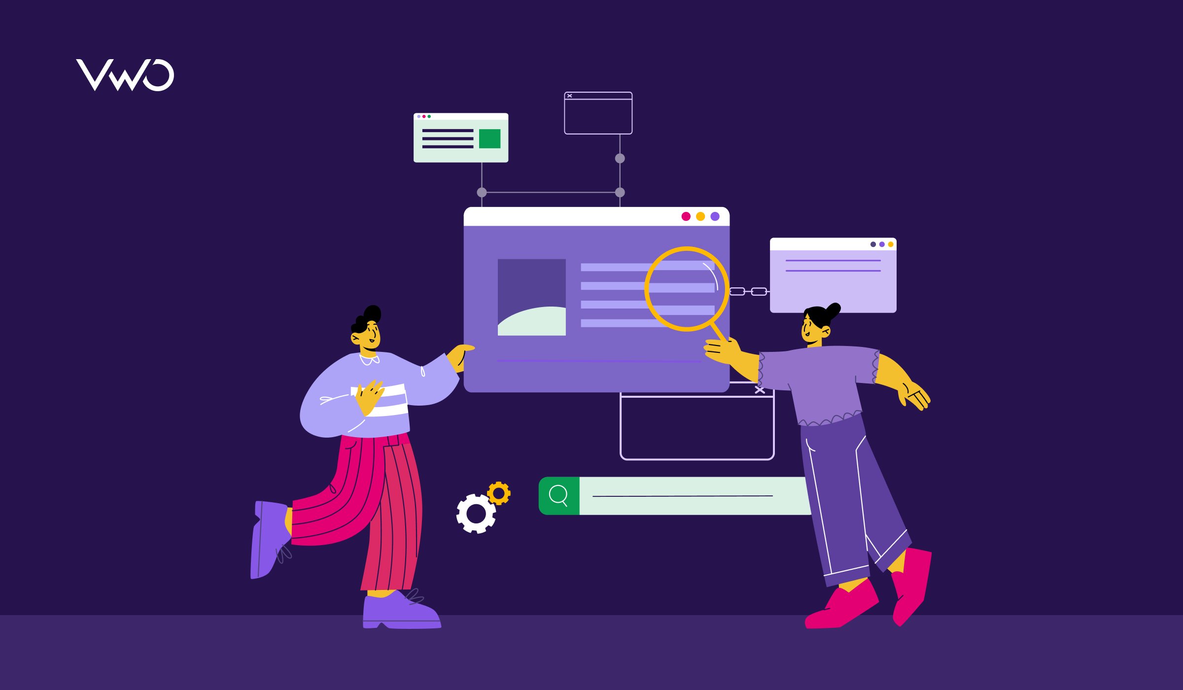
Ever found yourself lost on a website, unable to find what you need? It’s frustrating, isn’t it?
Is your website underperforming while your content is spot on? If your website metrics aren’t meeting expectations, the problem might not be with your content but with how users navigate your site. Such indications suggest that it’s time to improve your website navigation.
Whether you’re running an eCommerce store, a SaaS platform, or an informational blog, good navigation is not just an optional feature—it’s essential for a positive user experience, reducing bounce rates and driving conversions.
Quality web designs use robust navigation to meet business aims and provide a consistent user experience across desktop and mobile devices. To keep visitors from leaving, optimize your website navigation with our easy-to-follow tips today!
What is website navigation optimization, and what is its importance?
Website navigation is the framework that allows users to navigate across different sections of a site, significantly impacting user experience by ensuring quick and efficient access to information.
Optimizing this navigation system is crucial because it enhances the site’s usability, making it more intuitive for users and more navigable for search engines. An optimized navigation structure improves search engine ranking, which leads to better user engagement, reduced bounce rates, and, ultimately, higher conversion rates. This makes navigation optimization vital to effective website design and SEO strategy.
Download Free: Website Optimization Guide
Effective website navigation optimization strategies
The practical strategies for optimizing website navigation outlined below emphasize designing clear, straightforward pathways that guide users to information swiftly and efficiently. These strategies enhance user satisfaction and boost the website’s overall performance by focusing on simplicity, logical organization, and easy access.
1. Understand user needs and information architecture
At the heart of intuitive and user-friendly website navigation lies a deep understanding of your audience’s needs, behaviors, and goals. Before delving into the structure and layout of navigation menus, investing time in comprehensive user research and analysis of your target audience’s preferences is essential.
2. Gather user insights
To develop navigation that truly aligns, deeply engage with your users’ perspectives through comprehensive research methods:
- User interviews: Engage in direct conversations with customers and prospects, uncovering their pain points, motivations, and goals for interacting with your website.
- User surveys: Gather quantitative insights into user demographics, browsing behaviors, and satisfaction levels with your current navigation approach.
- Usability testing: Observe users navigating your website, identifying friction, confusion, or frustration that may hinder their journey.
- Heatmaps: Utilize heatmaps to visualize where users are clicking, scrolling, and engaging most on your website, providing valuable insights into their navigation patterns.
- Session recordings: Record user sessions on your website, allowing you to replay and analyze their navigation paths, clicks, and interactions, helping you identify potential areas for improvement.
This comprehensive research enables you to create detailed user personas and map complex user journeys, offering a clear roadmap for designing navigation experiences that meet your audience’s expectations and requirements.
3. Analyze information architecture
Armed with a thorough understanding of your users’ needs, you can now concentrate on developing a clear and intuitive information architecture (IA) that logically organizes your content and functionalities. Keep in mind these guiding principles of effective IA:
- Hierarchical structure: Categorize information into clear, well-defined hierarchies that align with users’ mental models, facilitating intuitive navigation and content discovery.
- Consistent naming: Employ consistent terminology and naming conventions across all navigation elements, ensuring users can easily recognize and interpret the information they seek.
- Grouping: Strategically cluster related content and functionalities to simplify users’ search process. Dropdown menus, mega menus, or tailored navigation solutions can facilitate this organization.
- Consistency: Ensure your navigation design remains consistent across all website pages to promote a smooth and coherent user experience and minimize your visitors’ cognitive effort.
- Scalability and flexibility: Design an IA that can adapt and evolve as your website grows, accommodating new content and features without compromising usability or coherence.
By thoughtfully applying these IA principles, you’ll create a robust framework that guides users through your website’s offerings, fostering a delightful and productive experience that keeps them engaged and satisfied.
4. Optimize website structure and navigation menu
With a solid understanding of your users and a well-designed information architecture, it’s time to focus on the practical aspects of website navigation optimization. Organizing your website’s overall structure is essential to make it more intuitive and user-friendly.
Additionally, you should optimize the components of your navigation menu by ensuring that each item is straightforward, purposeful, and logically ordered to facilitate easy browsing. This optimization enhances the user experience and bolsters your site’s SEO by making it easier for search engines to crawl and index your content effectively.
Analyze your eCommerce website for FREE
Website structure: The types
Website structure is the logical organization and hierarchy of a website’s content, pages, and functionalities. It maps out how different sections and elements are interconnected and displayed, ensuring users can navigate smoothly and find information effortlessly while optimizing the site for search engine indexing.
While there are numerous approaches to website structure design, we’ll concentrate on the most widely adopted and effective methods.
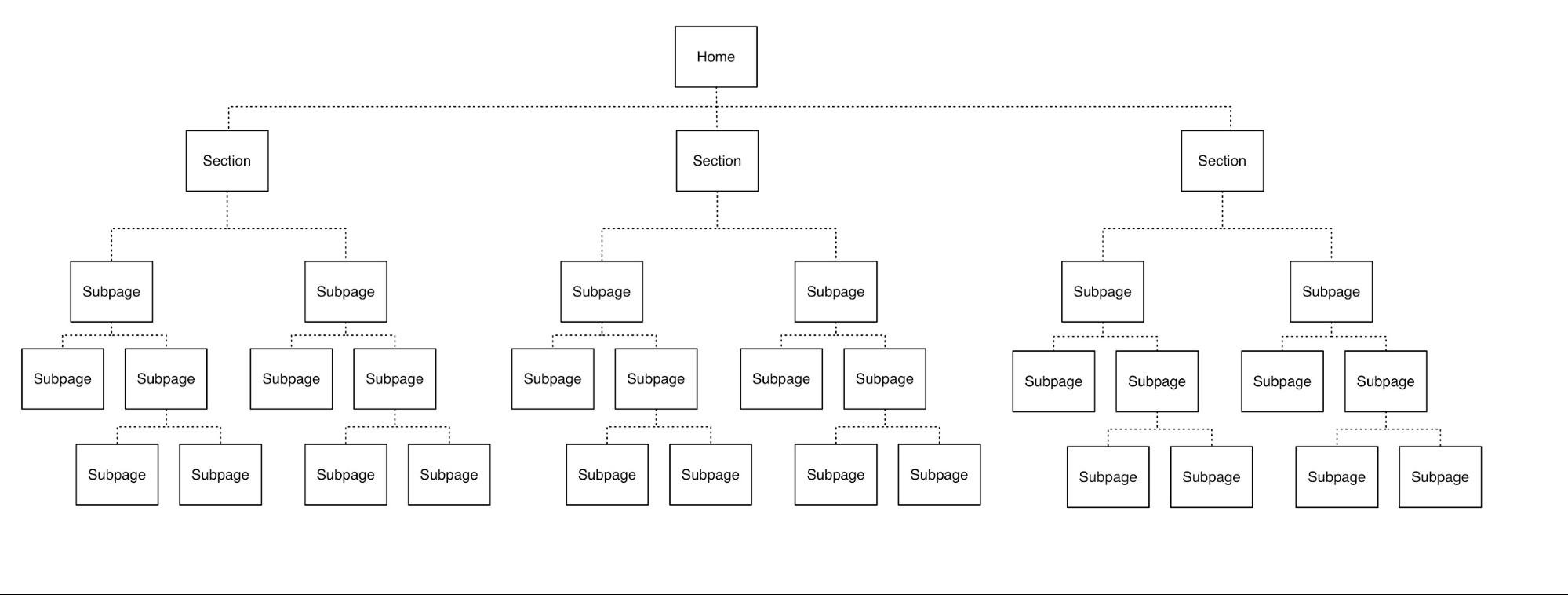
a. Hierarchical navigation
The hierarchical approach is the most versatile and widely adopted structure, suitable for websites of any scale. It follows a nested, tree-like arrangement where broad categories branch into more specific subcategories and individual pages.
This multi-level organization aids users’ intuitive navigation and content discovery. It also facilitates efficient content management, adding new sections seamlessly without disrupting the overall framework.
Moreover, this clear hierarchy provides well-defined pathways for search engine crawlers to index your content, strengthening SEO efforts effectively. The hierarchical model’s adaptability and inherent sense of order make it a powerful choice for delivering optimal user experiences across diverse site architectures.
b. Linear/sequential navigation
A linear navigation model provides users with a clear, straightforward path through content, much like reading a book from the first page to the last without skipping anything. This approach typically features a single, top-level navigation menu and is especially effective for simpler websites or new businesses with less content. It ensures that users experience the site’s offerings in a predefined sequence.

Choosing the proper navigation structure—linear for minimalistic sites or hierarchical for complex ones—depends on your website’s scope. Informed by a team of SEO experts, UX designers, and content specialists, this decision optimizes user experience and search engine visibility. Carefully weigh the pros and cons to select the best structure for your SEO and user engagement objectives.
Navigation menu and its types
A navigation menu is a vital feature of a website. It is often displayed as a horizontal or vertical bar on all landing pages. It enables visitors to easily navigate the site, whether to your online store or the “About Us” page.
The navigation menu significantly enhances user experience, with almost half of all users who land on a company’s website from a referral or search engine relying on the navigation menu to find their way around.
This provides a significant opportunity for business owners to thoughtfully design their navigation, direct visitors to high-converting pages, and win new customers.
There are various navigation menus, each tailored to serve specific purposes and equally effective depending on the design, user interface, and type of website you are developing.
a. Top horizontal navigation menu
The top horizontal menu, often positioned at the top of a webpage within the website header, is a popular navigation choice that organizes key pages side by side. Typical sections such as “About,” “Products,” “Pricing,” and “Contact” are typically included, as these are the sections visitors most frequently seek.
This layout ensures that navigation remains visible even as users scroll, offering a clean and accessible way to navigate the site’s main sections. Its widespread use and familiar format make it practical, providing users with a seamless and intuitive experience.

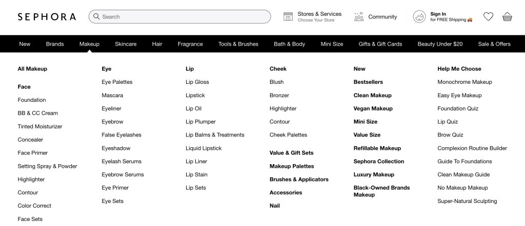
b. Dropdown menu
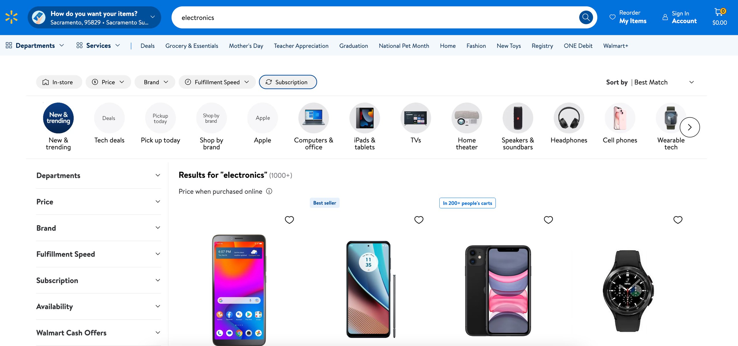
A dropdown menu is an efficient tool for content-rich sites with complex information architectures. It neatly organizes many options that can’t be listed side by side on the top-level navigation.
Dropdown menus are commonly used in website shopping sections. They facilitate navigation through various products and services based on categories and criteria. They’re also effective on home pages, allowing quick access to different pages.
For example, Sephora uses dropdown menus extensively to display its diverse product range, providing a tidy and user-friendly navigation experience without overwhelming users.
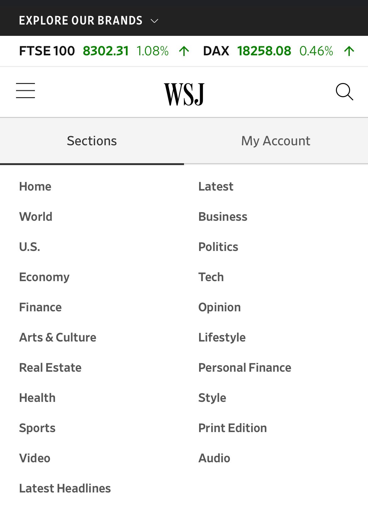
c. Hamburger menu
The hamburger navigation menu is widely used in mobile web design for its space-saving design. On larger screens, navigation items display horizontally, but on mobile, they collapse behind a hamburger icon—three horizontal lines typically located in the upper corner. Clicking this icon reveals a dropdown or pop-out menu with navigation links, perfect for sites with limited space.
This format enhances user interface experiences on both mobile and desktop platforms by providing a clean, accessible way to navigate through the site without overwhelming the visual layout.
Check out the Wall Street Journal’s menu view on smaller devices:
d. Vertical sidebar menu
Vertical sidebar navigation menus offer a sleek, space-efficient solution for website navigation. Stacking items vertically along the page’s side allows for descriptive link titles without consuming excessive real estate. This approach enables more top-level options compared to horizontal menus. The vertical layout neatly presents all site pages in a logical, prioritized order.
Given that users typically focus on the initial options, it’s essential to sequence the links based on their importance strategically. By prioritizing links according to their importance, you can effectively guide visitors through your site, leading them to critical areas without overt direction. Thus, you can enhance user engagement and make navigation intuitive.
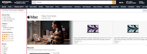
Amazon employs vertical navigation to display advanced search features while keeping the page uncluttered.
e. Footer menu
The footer menu, often found at the bottom of a webpage, complements the horizontal navigation bar by extending the range of navigation options. It includes additional items not featured at the top, catering to users who scroll to the end of the page.
Contrary to what some might expect, many users engage with footer menus. This neatly organized section marks the end of the page and recapitulates the content above, encouraging further exploration through clickable links.
This subtle cue enhances user engagement by providing easy access to important sections of the site that are less prominently displayed.
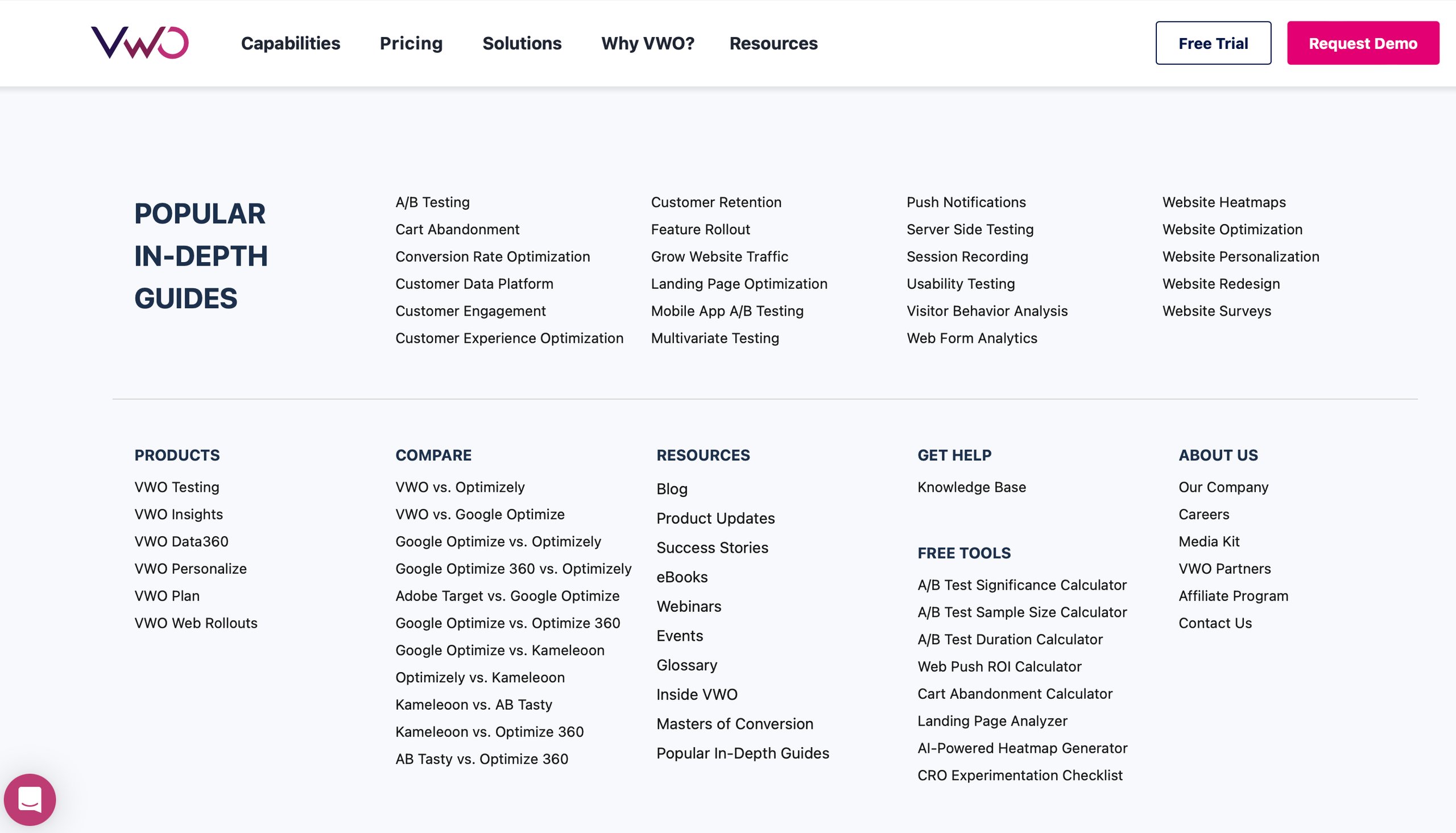
The VWO footer extends the horizontal menu, providing clickable links to all the product pages, resources, tools, etc.
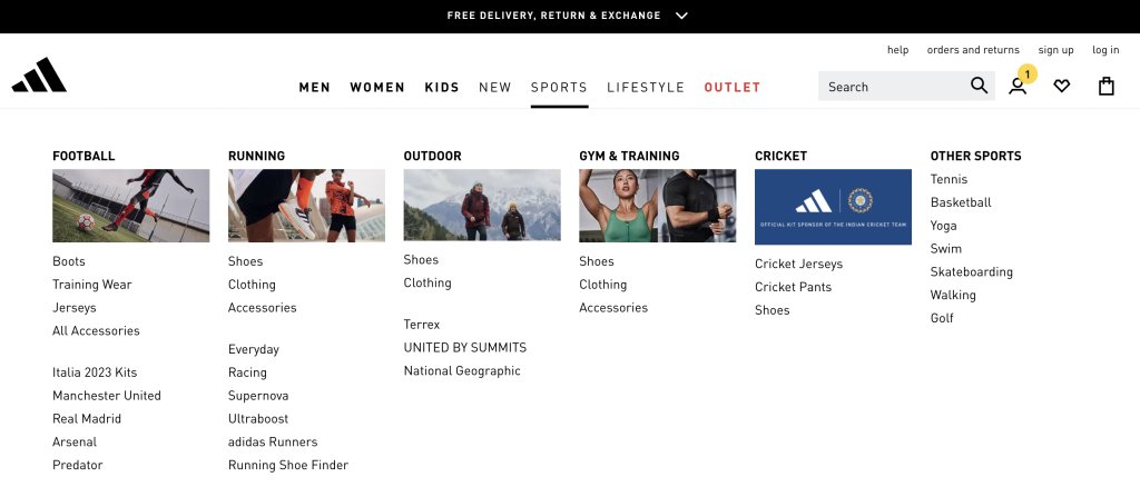
f. Mega menu
A mega menu is an expandable, rectangular menu that organizes options into columns. It is ideal for content-rich sites like online retailers. Unlike traditional linear menus, mega menus allow for the display of extensive product lists in one comprehensive panel, using typography and background styling to categorize items clearly.
They support dozens or even hundreds of links in a user-friendly layout. They can incorporate rich content like images and videos, enhancing functionality and visual appeal for an improved user experience.
Navigation menu design best practices
No matter the layout of your website, adhering to essential design principles and employing effective strategies for your navigation menu can significantly improve user experience, creating an intuitive interface that meets your audience’s needs and expectations. Below are some strategies to keep in mind:
- Clear and concise labels: Ensure that the labels on your navigation menu are clear, concise, and directly descriptive. Avoid industry jargon or ambiguous terms that might confuse users.
- An optimal number of links: Keep the main navigation links between 5 and 7 to prevent overwhelming users. For sites with more content, consider using dropdown menus or a mega menu to maintain organization and ease of access.
- Consistent placement: Position your navigation menu consistently, typically at the top of the page or in a sidebar. This placement helps users quickly locate and interact with the navigation, enhancing usability.
- Strategic internal linking: Internal links within your navigation menus can help establish a logical flow, guide users toward related or recommended content, and improve site structure for SEO purposes.
- Descriptive anchor text: For internal links, use clear and relevant anchor text that accurately describes the content on the linked page, enhancing user understanding and aiding search engine crawlers in comprehending your site’s context.
- Call-to-action integration: Embed eye-catching call-to-action (CTA) buttons with clear, action-driven language within your navigation menu to encourage users to take desired actions, such as purchasing, signing up for a service, or downloading a resource. This strategy enhances user navigation by providing precise and accessible pathways to essential conversions.
- Mobile-friendly design: Ensure optimal usability on mobile devices by incorporating responsive design techniques like hamburger menus, sticky navigation, or accordion-style menus that adapt to smaller screens.
- Visual distinction: Distinguish your navigation menu from other site content using unique colors, typography, and other visual elements. This helps users quickly recognize and engage with the navigation menu.
- Predictive or autosuggest: Consider incorporating predictive search or autosuggest functionality within the navigation menu to help users quickly find relevant content based on input.
- Accessibility considerations: Adhere to web accessibility guidelines, such as providing keyboard navigation, appropriate color contrast, and alternative text for screen readers, to ensure the navigation menu is accessible to users with disabilities.
Additional navigation methods
In addition to the standard navigation menu, you can explore more advanced navigation patterns to enhance the user experience on your website. Some popular options include:
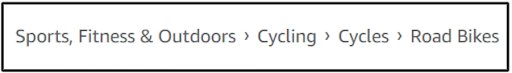
1. Breadcrumb navigation
Typically located at the top of a page, the breadcrumb navigation displays the user’s current position within the website’s hierarchy, aiding in orientation and facilitating easy navigation back to higher-level sections. To improve its functionality, make breadcrumb navigation interactive by enabling users to click on the breadcrumb links to directly access any page they choose.
2. Sticky navigation
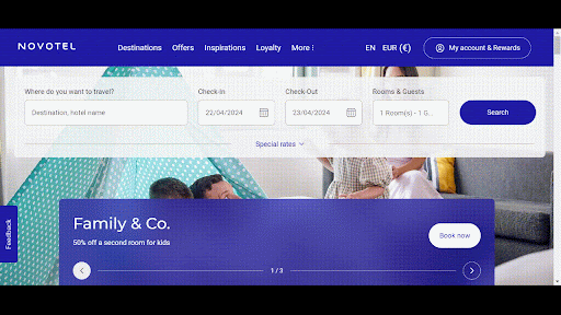
Sticky navigation keeps the main menu at the top of the screen while users scroll, ensuring constant accessibility to navigation tools. This feature enhances user experience by making it easier to move between site sections without repeatedly scrolling to the top. The Novotel website features a sticky menu bar at the top of the page:
3. Contextual navigation
Contextual navigation, including features like related content links or “you might also like” sections, guides users to additional relevant information or features that complement their current browsing context or activity, enhancing content discovery and engagement.
4. Pagination and load more options
To enhance user experience on content-rich pages or extensive search results, implement pagination or “Load More” buttons. This approach divides lengthy lists into smaller, more manageable sections, significantly boosting site usability and performance.

5. Faceted navigation
Faceted navigation is a system that allows users to apply multiple filters to categorize search results or items. Consider incorporating this feature for websites with large product catalogs or content collections, such as eCommerce sites, job portals, etc. It enables users to filter and refine their search results using specific attributes or metadata, helping them find relevant items more quickly.
Analyze your eCommerce website for free
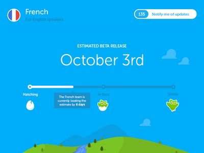
6. Gamification elements
Enhance your navigation menu with gamification features like progress bars and achievement badges to motivate user exploration and engagement. Websites like Duolingo effectively use these elements to boost interaction with their content, making the navigation experience more enjoyable and rewarding.
Continuous optimization
Crafting an effective website navigation is an ongoing journey, not a one-time destination. To ensure your navigation remains intuitive and aligned with evolving user needs and business goals, uphold a mindset of continuous testing, iteration, and data-driven refinement.
1. Experiment with A/B Testing
Employ A/B testing to evaluate different navigation structures, labels, placements, and features such as mega menus or sticky navigation. By monitoring how these variations affect user behavior and key metrics like bounce rate, conversion rate, and time on site, you can determine which design best suits your audience and business objectives.
2. Collect user feedback
Gather user feedback via surveys, interviews, or usability tests to better understand their experiences with site navigation. This direct input is invaluable as it highlights specific pain points and opportunities for improvement, offering essential data to refine and enhance your navigation strategy.
3. Monitor navigation metrics
Utilize Google Analytics to closely monitor key navigation metrics, including click-through rates, bounce rates on navigation pages, time spent on navigation-focused pages, and user navigation paths.
Analyzing these statistics will help you identify high-performing areas and those that need enhancement, allowing for precise adjustments to optimize your navigation strategy.
4. Make data-driven improvements
With insights from user feedback, A/B testing, and analytics, confidently refine your navigation strategy. Consider reorganizing the information architecture, updating menu designs, or adopting new navigation patterns to meet user expectations and behaviors better. These targeted improvements will help optimize the user experience based on reliable data.
By cultivating a culture of continuous optimization, your website’s navigation will remain a dynamic, user-centric asset that evolves alongside your business and the ever-changing digital landscape. This proactive approach ensures your navigation meets current needs and anticipates and adapts to emerging trends and user preferences.
While this blog outlines best practices for improving website navigation, achieving optimal results involves a structured approach. Grab our latest eBook to discover essential steps for enhancing navigation.
Future trends in website navigation optimization
As digital experiences continue to evolve, website navigation optimization must adapt to keep pace with emerging technologies and user expectations. Several key trends are set to shape the future of navigation optimization:
Hyper-personalization powered by AI
Artificial intelligence and machine learning will be pivotal in delivering hyper-personalized navigation experiences tailored to each user. AI-driven systems can dynamically optimize navigation elements like menu structures, content recommendations, and visual elements by analyzing user data, such as browsing behavior, preferences, and contextual factors, to create highly relevant and intuitive user journeys.
Multimodal navigation interactions
With the rise of voice interfaces, gesture controls, and extended reality (XR) technologies, website navigation will become increasingly multimodal. Users may navigate websites using natural language commands, physical gestures, or immersive spatial interactions within virtual environments. Optimizing these emerging interaction modalities will be crucial for providing seamless and intuitive navigation experiences.
Real-time adaptation and continuous learning
Navigation optimization will increasingly leverage real-time data and continuous learning algorithms to dynamically adapt and refine the user experience. Navigation systems can make instant adjustments to improve usability, reduce friction points, and enhance user satisfaction by continuously monitoring user behavior, engagement metrics, and feedback.
Predictive and contextual navigation
Leveraging advanced analytics and machine learning techniques, navigation optimization will become more predictive and context-aware. Systems will anticipate user needs and proactively surface relevant content, features, or navigational pathways based on factors such as location, device, browsing history, and situational context.
Minimalist and content-focused navigation
As users seek more precise and direct paths to their desired content, the trend toward minimalist navigation will grow. This involves reducing the number of menu options, focusing on essential items, and utilizing hidden menus or hamburger icons to clean up the visual space and reduce cognitive load.
Emphasis on accessibility and inclusive design
As digital inclusivity becomes increasingly paramount, website navigation optimization will prioritize accessibility and inclusive design principles. This includes optimizing navigation for users with diverse abilities, devices, and cultural backgrounds, ensuring equitable access and usability.
By staying updated on these emerging trends and adopting advanced techniques, website owners can ensure their navigation systems are future-proof, keeping their online presence engaging, user-focused, and adaptable to changes in the digital landscape.
Conclusion
Navigating a website should be as effortless and intuitive as flipping through the pages of your favorite book. Optimizing your website’s navigation requires a thoughtful approach that prioritizes your visitors’ needs and business objectives.
Remember, real people navigate your site, and their user experience can significantly affect their engagement and retention. Moreover, a well-designed navigation benefits search engine indexing, enhancing your site’s visibility and searchability.
If you’re looking to enhance your website navigation, VWO provides the necessary testing, analytics, and optimization tools. These tools enable you to create seamless experiences that boost engagement, increase conversions, and ensure success in the digital landscape. Take a free trial today!
By focusing on these elements, you can create an inviting and efficient online environment that meets and exceeds user expectations, paving the way for improved engagement and increased conversions.


 Analyzing Your Website