 DE
DE
 BR
BR
Follow us and stay on top of everything CRO
Read summarized version with
 ChatGPT
 Perplexity
 Gemini
 Claude
 Grok
Grok
Are you ready to take your website from “Zero to Hero”?
Striking a harmonious balance between visual beauty and functional simplicity is the essence of web design. It provides a solid foundation for intuitive and engaging online experiences.
To craft such a website, one must have a solid grasp of core design principles and adhere to recognized best practices. This blog emphasizes the synergy between innovative design and user-centric functionality, highlighting the need for websites to adapt and evolve in response to modern consumer demands.
Understanding website design optimization
Website design optimization involves refining the site’s structure, content, and design elements to improve performance, engagement, and conversions. It’s a holistic approach considering everything from mobile responsiveness to loading speeds and SEO. In essence, website design and optimization work together to deliver a seamless user experience while meeting business objectives.
Download Free: Website Optimization Guide
What are some design components of an optimized website?
Below are the key components that form the backbone of a stellar website design:
1. Engagement and conversion elements
a. User-centric design
A user-focused design puts the user at the heart of the website experience, making the site intuitive, easy to use, and engaging.
Benefits:
It ensures the website is functional and enjoyable for users, leading to higher engagement rates and conversion opportunities. A well-thought-out user interface (UI) guides visitors smoothly from point A to point B, eliminating confusion and ensuring a positive user experience.
How can you optimize?
To create a more engaging and user-friendly website:
- Understand your audience:
- Conduct surveys and utilize analytics to gauge visitor behavior.
- Create user personas based on research to better address user needs.
- Embrace mobile-first design:
- Prioritize responsive design to ensure your site looks great on mobile devices.
- Utilize flexible grid layouts and touch-friendly navigation.
- Regular testing:
- Implement A/B testing to compare different design elements.
- Use heatmaps to see where users click and how they navigate your site.
- Gather and implement feedback:
- Encourage user feedback through surveys and feedback buttons.
- Regularly update your design based on user suggestions and usability testing results.
b. Effective use of CTAs
A call to action (CTA) is a direct prompt on a website that uses buttons or hyperlinks to guide users toward a desired action, such as subscribing or purchasing. Crafting effective CTAs grabs attention and drives the audience toward a specific engagement with the website.
Benefits:
CTAs nudge users toward a website’s key actions, significantly impacting conversion rates. They act as signposts on the user journey, leading visitors through the funnel to conversion.
How can you optimize?
- Language and urgency:
- Use clear and direct language that encourages immediate action.
- Emphasize the benefits of clicking to clarify what users will gain.
- Visual appeal:
- Use contrasting colors to ensure CTAs visually pop from the page.
- Experiment with size and shape to attract attention without overwhelming.
- Placement:
- Position CTAs in high-visibility areas to maximize user engagement.
- Consider placing them both above the fold and at the end of the content for varied interaction points.
- Testing:
- Conduct A/B testing to evaluate various CTA designs and messaging.
- Utilize heatmaps to analyze user interaction and refine CTA placement and design.
c. Trust signals
Trust signals on a website, such as testimonials, certifications, and awards, provide visitors with evidence of the business’s trustworthiness and credibility.
Benefits:
Incorporating trust badges on a website can enhance a visitor’s confidence in the site’s security and legitimacy. This added layer of reassurance can gently nudge conversion rates upward by making users feel more comfortable about engaging with the site and completing transactions.
How can you optimize?
To improve trust in your website, consider these simplified steps:
- Utilize social proof:
- Feature real testimonials and reviews prominently to enhance trust.
- Highlight achievements:
- Display any awards or recognitions to demonstrate credibility and success.
- Simplify communication:
- Make contact information easy to find and integrate instant communication tools like chat for quick support.
2. Performance and optimization elements
a. Mobile optimization
Mobile optimization enhances your website for better navigation on mobile devices, ensuring a seamless user experience with interfaces designed for compact screens.
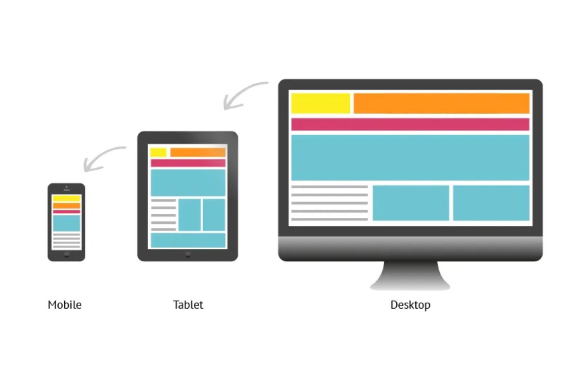
Benefits:
With almost 55% of users accessing the web via mobile devices, delivering a user-friendly experience across devices is vital. It directly impacts user engagement and retention, making it essential for businesses to thrive in the digital marketplace.
How can you optimize?
- Use responsive design techniques to ensure your website adjusts to any screen size.
- Optimize images and use mobile-friendly navigation elements.
- Test your site on various devices and browsers for consistent performance.
b. Speed and performance
Website speed and performance refer to how quickly a site loads and becomes interactive for users.
Benefits:
Optimizing website speed and performance leads to significant benefits: it boosts customer engagement and retention, improves search engine rankings, lowers bounce rates, and increases conversion rates. These enhancements make websites more user-friendly and effective in attracting and retaining customers.
How can you optimize?
- Optimize media files:
- Compress images and videos to decrease file sizes for faster loading.
- Streamline code:
- Minimize and optimize CSS and JavaScript to enhance site efficiency.
- Enable browser caching:
- Leverage caching to speed up asset loading times on repeat visits.
- Use CDNs:
- Deploy content delivery networks to accelerate content distribution globally.
- Implement server-side caching:
- Use caching on the server to improve overall page load speeds.
- Monitor Performance:
- Regularly use tools like Google PageSpeed Insights to identify and rectify performance issues.
c. SEO-ready design
An SEO-ready design incorporates elements that help improve a website’s visibility in search engine results pages, making it easier for users to find.
Benefits:
A well-designed, SEO-friendly website can significantly improve your online visibility and drive more qualified traffic to your business. It can maximize your reach, attract potential customers, and drive business growth.
How can you optimize?
- Header tag structure:
- For better readability, organize content using proper header tags (H1, H2, H3).
- Enhance meta tags:
- Use descriptive, keyword-focused meta tags and descriptions to boost search engine visibility.
- Ensure crawlability:
- Make your site accessible and easily indexed by search engines.
- Regular content updates:
- Maintain high-quality content to keep users and search engines engaged.
3. Visual design elements
a. Unique Typography
Typography in web design involves font styles and type settings to enhance readability, visual appeal, and overall brand identity.
Benefits:
A unique typography can make a website stand out, guiding users’ attention and setting the brand’s tone. It can also improve readability and user engagement.
How can you optimize?
- Brand alignment:
- Select fonts that reflect your brand’s personality and are easily readable on any device.
- Cross-platform compatibility:
- Ensure fonts perform well across different browsers and don’t slow down your website.
- Use of web-safe fonts:
- Opt for web-safe fonts or carefully embed custom fonts to maintain consistency across all user experiences.
- Regular testing:
- Continuously test typography to optimize font sizes, weights, and spacing for optimal readability and visual appeal
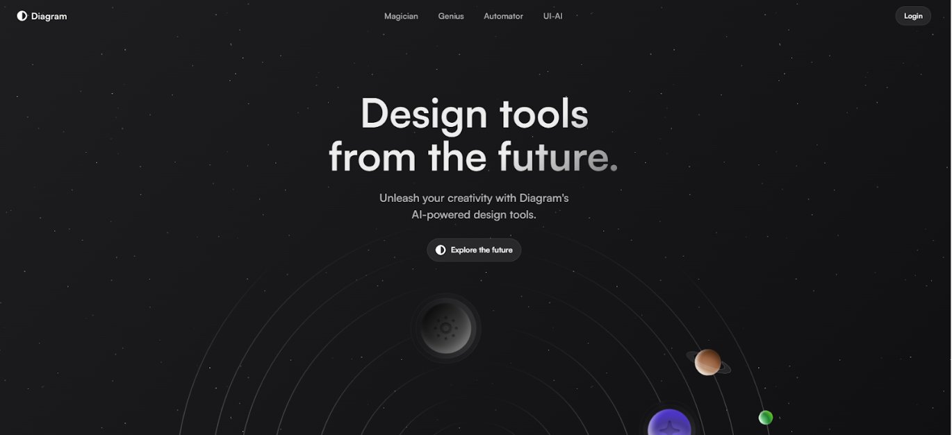
b. Engaging and responsive hero images
Hero images are large, banner-like photos placed prominently on a web page, usually at the top. These images are the visitor’s first visual encounter and are crucial to making a solid first impression.
Benefits:
Engaging and responsive hero images can immediately capture the visitor’s attention and are instrumental in:
- Making a strong, lasting first impression
- Capturing the user’s attention and driving engagement
- Aligning with the brand’s visual identity and messaging
- Conveying the essence of the product, service, or overall website
- Enhancing the overall aesthetic and design of the web page
The Diagram’s hero image offers a peek at its bold promise of a visionary future – “Design tools from the future.”
How can you optimize?
To ensure your hero images are engaging and responsive:
- Choose impactful images:
- Prioritize high-quality, visually compelling images that grab attention and tell a story.
- Optimize for speed:
- Reduce image file sizes to ensure quick loading and balancing quality and performance.
- Responsive adaptation:
- Utilize adaptive techniques to ensure images perform well on different devices, adjusting for size and resolution.
- SEO and accessibility:
- Add descriptive alt text to images, aiding search engine optimization and making content accessible to all users.
- Creative layouts:
- Experiment with various orientations and compositions to find the most engaging layout for your audience.
- Continuous improvement:
- Conduct regular testing and iterations on your images to refine and optimize their impact on your site’s visitors.
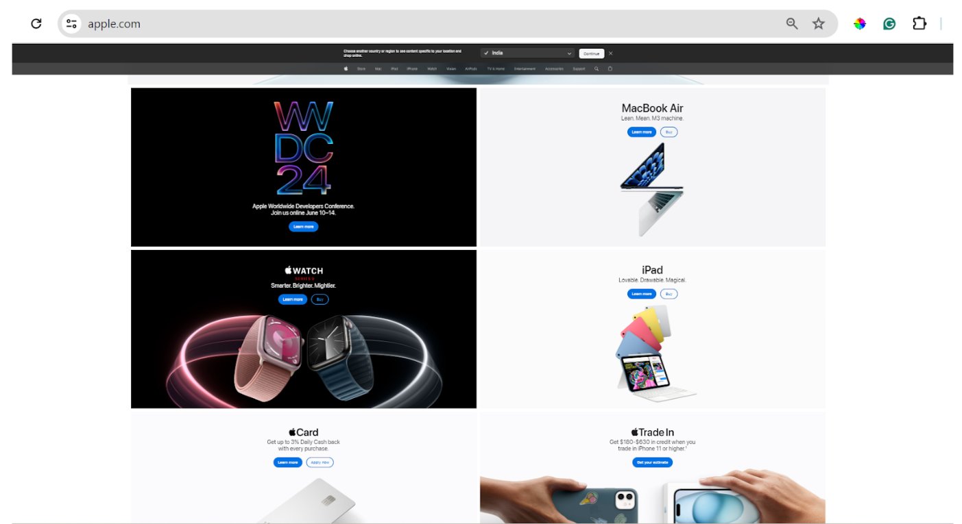
c. High-quality product images
Product images are the online equivalent of a physical storefront display, visually representing what a business is selling. They must be high-resolution to allow for zooming and examining product details closely.
Benefits:
High-quality, visually compelling product images can significantly enhance the online shopping experience, increasing customer engagement, trust, and conversions.
Apple, for instance, uses high-resolution images for its products, allowing customers to appreciate the design and quality, reinforcing the brand’s reputation for precision and innovation.
How can you optimize?
Optimize product images:
- Balance quality and speed:
- Ensure images are high resolution for clarity but compressed to enhance website loading speed.
- Multiple perspectives:
- Display products from various angles to give customers a comprehensive view.
- Zoom functionality:
- Incorporate a zoom feature that allows for a detailed product examination.
- Accessible descriptions:
- Provide detailed alt text for each image to improve SEO and user accessibility.
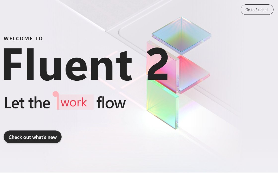
c. Semi-flat design
Semi-flat design is a web design approach that blends the simplicity of flat design with subtle depth elements like shadows, gradients, and layers to create a balanced, visually engaging user interface.
Benefits:
The semi-flat design approach enhances website metrics like click-through rates, time on page, and conversions by blending the flat design’s minimalist aesthetics with added depth and hierarchy.
This strategy effectively directs the user’s attention to valuable content and interactions, creating a clean yet functional digital experience that feels modern and polished.
Microsoft’s Fluent Design incorporates light shadows and depth to add dimension while maintaining the simplicity of the flat design.
How can you optimize?
- Visual simplicity:
- Keep the overall aesthetic clean and uncluttered to enhance user experience.
- Strategic use of effects:
- Apply shadows and gradients sparingly to enhance hierarchy and focus areas without overwhelming users subtly.
- Enhance navigation:
- Ensure that interactive elements are prominent and easily identifiable to facilitate smooth navigation.
d. Background Videos
Background videos add motion and depth directly on web pages, as full-screen visuals, or as a subtle backdrop to the website’s content. They enhance the aesthetics and dynamically improve the user experience by creating visually appealing websites.
Benefits:
Background videos capture the brand’s identity and essence effectively, conveying messages more dynamically than static images or text. They enhance the visual appeal and significantly boost user engagement and conversion rates by creating an immersive experience that draws viewers deeper into the content.
How can you optimize?
- Media optimization:
- Compress video files to reduce size without sacrificing quality, ensuring faster load times.
- Autoplay settings:
- Enable autoplay without sound to capture attention without interrupting the user experience.
- Fallback solutions:
- Provide alternative images for scenarios where videos are unsupported, ensuring a visually engaging experience for all users.
- Responsiveness testing:
- Regularly test and adjust video sizing and positioning to ensure it displays correctly across different devices.
- Accessibility considerations:
- Include captions or transcripts for videos to aid hearing-impaired users, enhancing accessibility and inclusivity.
4. Navigation elements
a. Hamburger menus
Many websites feature extensive menus that, while functional, can dominate valuable screen space. The hamburger menu offers a streamlined solution by condensing the navigation into a small icon, saving space and simplifying user access without overcrowding the screen.
The hamburger menu design gets its name from the iconic appearance that resembles a hamburger – three horizontal lines representing the menu layers.
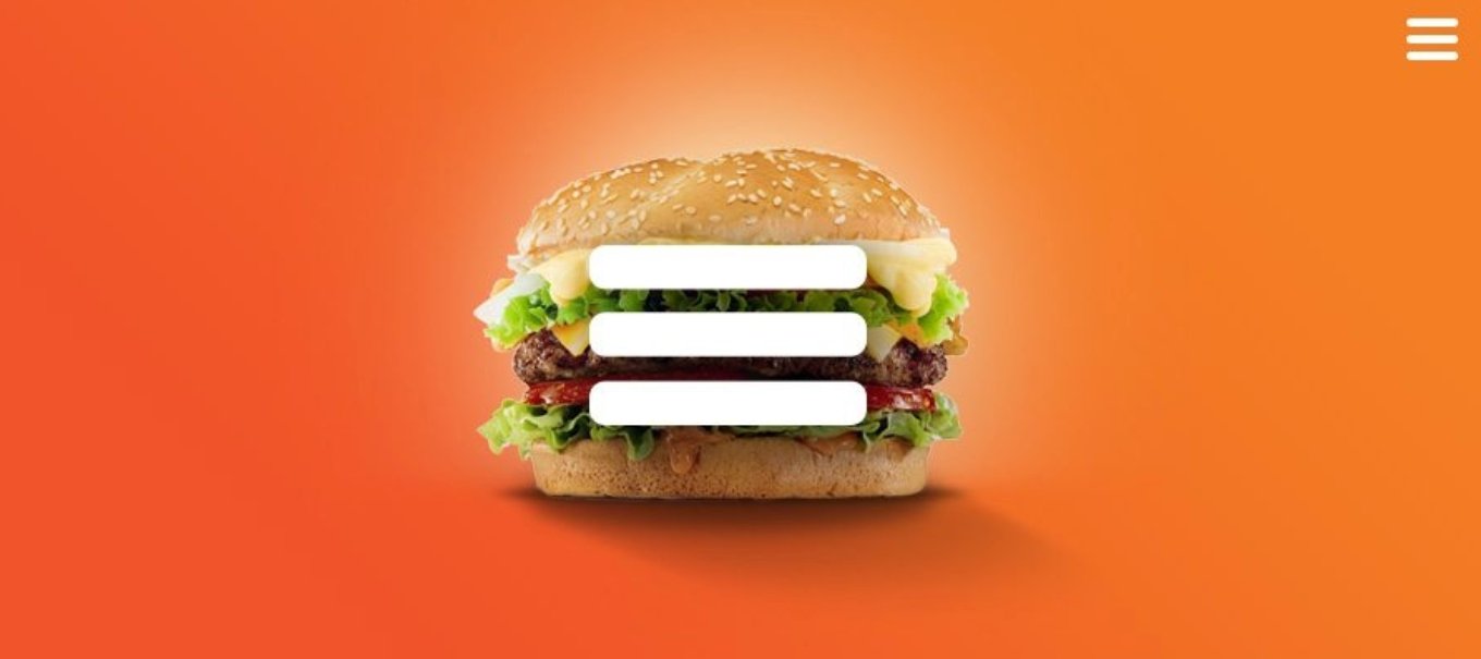
Benefits:
Hamburger menus enhance the usability of mobile websites by collapsing extensive navigation into a simple icon, which clears up screen space and focuses attention on the valuable content itself, promoting a cleaner, more content-oriented, and user-centric design.
How can you optimize?
- Icon placement:
- Ensure the hamburger icon is easily visible and instantly recognizable to users.
- Menu organization:
- Structure menu items in a clear, logical order to enhance ease of navigation.
- Keep the number of options minimal to avoid clutter and enhance user experience.
- Cross-device testing:
- Conduct thorough testing across various devices and screen sizes to ensure the menu operates smoothly and is user-friendly universally.
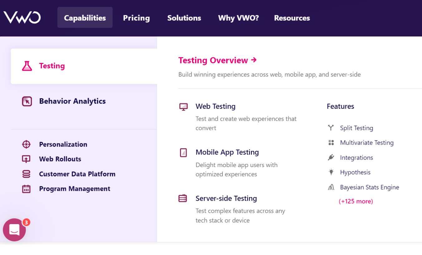
b. Clear navigation structure
A website’s navigation structure is the backbone of a seamless user experience. It guides users to explore different site sections effortlessly and efficiently without confusion.
Benefits:
A well-designed navigation structure delivers significant benefits that enhance the overall user experience and drive key business objectives:
- Reduces user frustration
- Decreases bounce rates
- Improves a website’s effectiveness
- Enhances information discovery
- Boosts engagement and conversions
- Strengthens brand impression and presence
VWO, for example, uses a clear and hierarchical navigation structure that makes exploring solutions easy.
How can you optimize?
- Logical structure:
- Arrange content logically and use descriptive labels that reflect the content they link to.
- Responsive design:
- Ensure the navigation adapts seamlessly to different devices, enhancing accessibility and user experience.
- User testing:
- Conduct usability testing with real users to gain valuable feedback and identify areas for improvement.
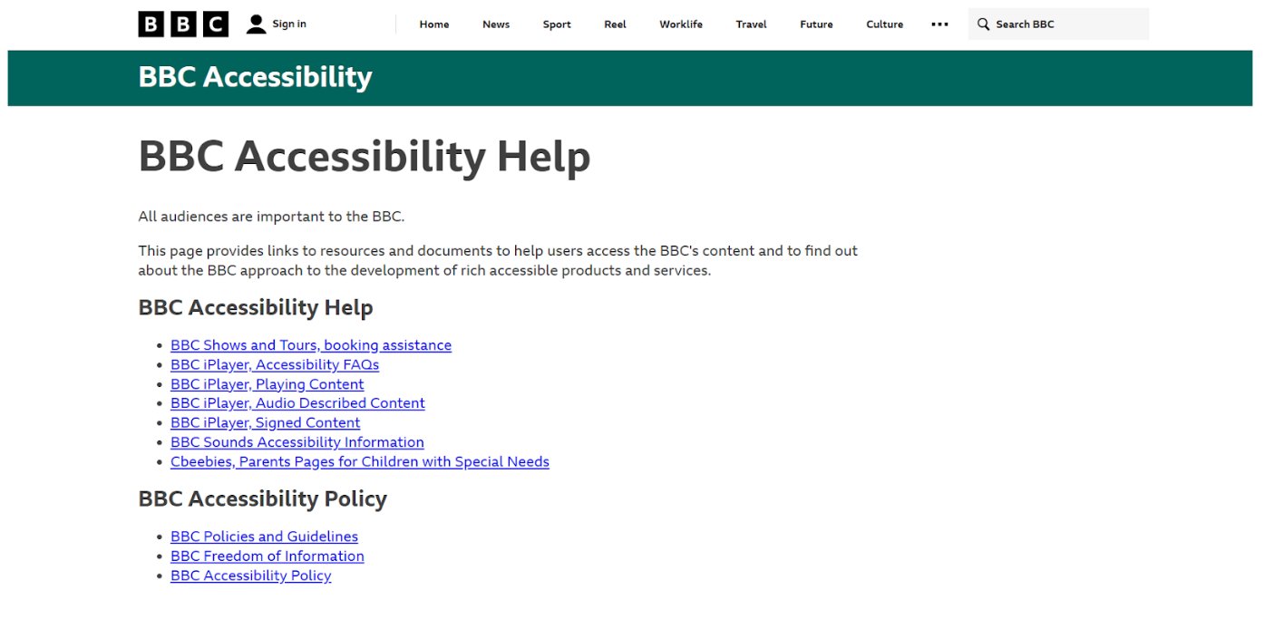
c. Accessibility/user focus
Accessibility in web design ensures that websites are navigable and usable by people with disabilities, including visual, auditory, physical, and cognitive impairments.
Benefits:
Enhancing web accessibility expands your audience’s reach and improves site usability for all visitors. These improvements can increase user satisfaction and retention and improve search engine rankings, making your site more visible and effective.
The BBC website is known for its focus on accessibility. It provides an enormous video, audio, and image-based content library with appropriate text alternatives.
How can you optimize?
- Adhere to WCAG:
- Follow the Web Content Accessibility Guidelines to design an inclusive website.
- Semantic HTML:
- Use HTML5 to structure your content meaningfully, enhancing accessibility for screen readers.
- Keyboard navigability:
- Ensure all interactive elements are navigable using a keyboard to accommodate users with mobility limitations.
- Text alternatives:
- Provide alt text for images and video captions to support users relying on text-based information.
d. Footers
The website footer is a versatile and valuable real estate, serving as the foundation for a well-rounded digital experience. Located at the bottom of every page, the footer often houses:
- Contact details
- Navigational links
- Social media icons
- Legal information
- Subscription forms
Benefits:
A thoughtfully designed footer does more than just conclude a webpage; it enhances usability, strengthens brand identity, and promotes user engagement by making essential resources readily accessible.
Additionally, a footer can drive conversions by facilitating lead generation and content discovery, contributing to a more streamlined and professional user experience.
How can you optimize?
- Clear organization:
- Keep footer content tidy and relevant. Arrange links and information in a clear, accessible format.
- Essential links:
- Include direct shortcuts to important pages such as FAQs, contact details, and popular resources.
- Social connectivity:
- Add links to your social media profiles to enhance engagement and community building.
- Visual harmony:
- Match the footer’s design with the site’s overall style to reinforce brand identity and ensure visual continuity.
5. Additional considerations
a. Cross-browser compatibility
Cross-browser compatibility is essential to ensure a website performs consistently and appears as intended across various browsers. It is also vital to accessing a broader audience and delivering a uniform user experience.
Benefits:
Ensuring cross-browser compatibility prevents the alienation of users with specific browser preferences or limitations and expands website reach.
By accommodating various browsers, websites enhance engagement and positively impact key metrics like SEO and conversion rates, ensuring all users have access to a functional and visually appealing experience.
How can you optimize?
- Implement responsive web design principles.
- Test website compatibility across various browsers and devices
- Employ CSS reset stylesheets to maintain consistency
- Utilize cross-browser testing tools for efficient issue identification and resolution
b. Card Design
Card design involves organizing information into digestible chunks contained within “cards.” This design pattern is versatile and mobile-friendly, making it ideal for displaying a collection of information in a clear, organized manner.
Benefits:
The card-based design organizes information into distinct, modular units that improve scanability and help with quick information retrieval. Its interactive nature encourages user exploration, enhancing engagement and time spent on the site. Its scalable, responsive layout also provides a consistent experience across various devices, from desktops to mobile phones.
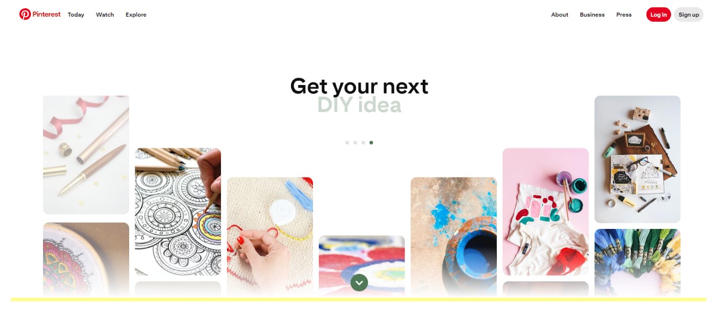
Pinterest is a perfect example, utilizing card design to display pins in a manner that’s easy to browse and interact with, ensuring users can effortlessly find and engage with the content of interest.
How can you optimize?
- Uniform design:
- Ensure all cards have a consistent design with clearly related images and text for better visual consistency.
- Responsive layout:
- Design cards to be responsive, allowing them to stack or rearrange according to screen size.
- Clear content:
- Employ high-quality thumbnails and concise titles to quickly convey the essence of the card’s content.
c. Feature Videos
Did you know that 30% of the top landing pages incorporate video, increasing conversions by over 80%?
Feature videos are short clips that highlight a product or service’s key benefits or features. They’re typically found on the homepage or product pages to grab attention and communicate value propositions quickly and effectively.
Benefits:
Feature videos boost digital marketing by effectively conveying product details, increasing conversion rates, improving SEO, and reducing bounce rates.
They enhance viewer engagement, extend site visits, and are likely to be shared, broadening social reach. Overall, they improve customer understanding and satisfaction, driving better marketing results.
Dropbox uses feature videos effectively on its homepage to demonstrate how its service works, simplifying complex information into an easy-to-digest format.
How can you optimize?
- Concise and engaging:
- Keep feature videos short and focused to maintain viewer interest.
- Optimize loading speed:
- Compress video files to enhance loading times while preserving quality.
- Include captions:
- Add captions for improved accessibility and SEO benefits.
- Manage autoplay:
- Ensure autoplay settings do not disrupt the user experience, particularly with sound.
d. Branding
Branding in web design involves integrating a company’s logo, color palette, and unique style elements to create a cohesive and memorable online presence. This integration ensures the website effectively communicates the brand’s identity and values to its audience.
Benefits:
Strong branding in web design significantly enhances metrics by improving user retention, increasing conversion rates, and boosting overall site traffic. Consistent brand representation builds trust and recognition, leading to a more engaged and loyal audience.
How can you optimize?
- Maintain uniformity:
- Ensure consistent use of logos, colors, and fonts across all pages to strengthen brand identity.
- Prominent logo display:
- Position the logo clearly on each page for immediate brand recognition.
- Align content with brand voice:
- Integrate all content with the brand’s voice and values for a unified presentation.
- Responsive design:
- Adapt branding elements for optimal display on various devices, preserving consistency.
- Utilize visual hierarchy:
- Employ visual hierarchy techniques to highlight key branding elements, improving engagement and recall.
e. White Space
White space, also known as negative space, refers to the unmarked areas of a design or layout that help to separate and highlight different elements. It is crucial in enhancing readability and overall visual balance, making content more approachable and easier to navigate.
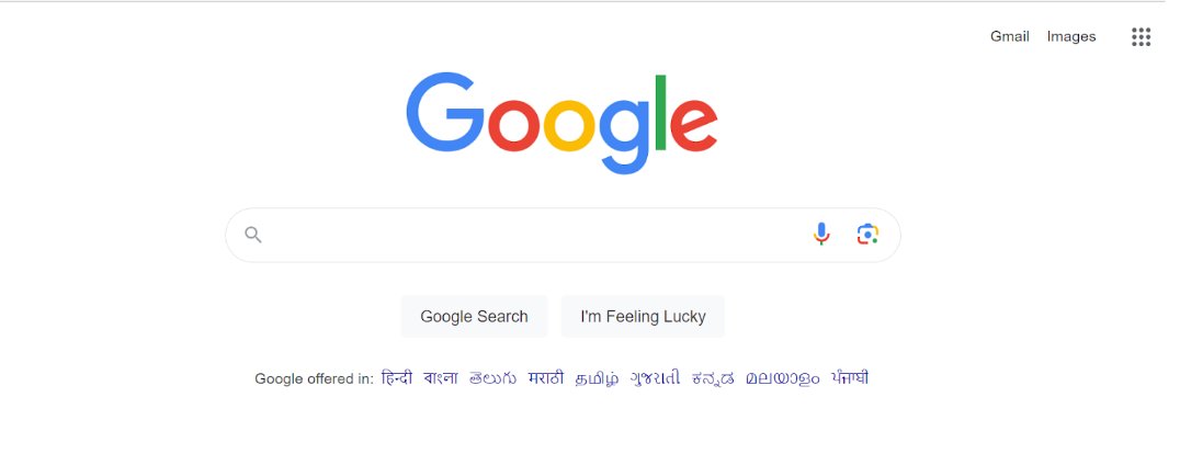
Google’s simplicity is partly due to its effective use of white space, which focuses the user’s attention on the search bar and results.
Benefits:
White space minimizes cognitive overload, simplifying how visitors absorb and understand the information displayed. This design approach enhances user experience and creates a sense of balance and sophistication throughout the digital experience, leading to better user engagement and higher conversion rates.
How can you optimize?
- Consistent layout:
- Keep margins and padding consistent to ensure a neat layout.
- Adjust white space to differentiate and prioritize elements, guiding user focus.
- Clear design:
- Provide sufficient space around text and images to avoid overcrowding and enhance clarity.
- Use empty spaces purposefully to highlight important content without excess clutter.
- Responsive design:
- Tailor white space for various device screens to keep the layout clean and user-friendly.
- Continuous refinement:
- Conduct user testing to gather feedback and identify opportunities to optimize the use of white space.
- Review and refine the white space implementation regularly to align with evolving user needs and design best practices.
Website design optimization: success stories
Real results, real stories: Explore compelling success stories from businesses that have achieved remarkable improvements in user engagement and conversion metrics through website design optimization.
Media Contour’s split URL testing strategy leads to increased client revenue
Media Contour, a Dallas-based digital agency specializing in digital marketing and conversion rate optimization, partnered with Life Pro Fitness to enhance the effectiveness of their product pages.
Using VWO’s comprehensive toolset, including heatmaps, clickmaps, and session recordings, the team at Media Contour identified critical user pain points and areas ripe for improvement.
The primary objective was to increase the revenue per visitor. The initial analysis revealed that essential product information and CTAs were not immediately visible, which might be hindering conversions.
In response to the goal requirements, the team strategically moved additional product images and critical features to more visible areas above the fold while repositioning the “Add-to-cart” and “Buy now” CTAs to enhance visibility and accessibility.
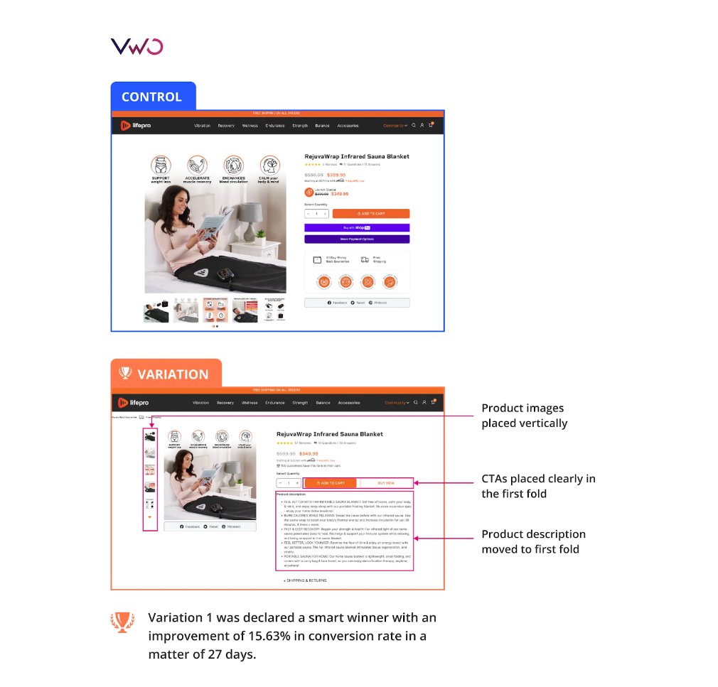
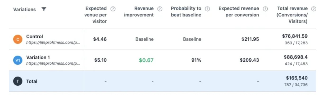
The changes were tested over 27 days using a split URL approach. The optimized version showed that making vital information and CTAs easily accessible could significantly enhance user engagement. This adjustment led to a 15.63% conversion rate improvement and a revenue increase of $0.67 per visitor.
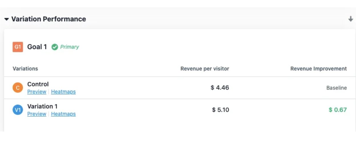
This test not only elevated the projected annual revenue from $76,841 to $88,698 but also provided crucial insights into effective CTA placement and the importance of making essential information readily available.
The success of this experiment demonstrates the power of strategic positioning and data-driven optimization in significantly improving online sales metrics.
WhoAcceptsAmex enhances click-through rate with font size optimization
WhoAcceptsAmex, a UK affiliate site listing American Express-friendly retailers, partnered with VWO and Lone Goat to enhance its click-through rates and commissions. After a failed font styling test, the focus shifted to optimizing the font size of the website links on the ‘companies’ page, which had low click rates despite high traffic.
The team implemented a comprehensive A/B testing strategy that compared the original 14px font size against six variations ranging from 12px to 18px. They conducted the test over 28 days with nearly 3100 visitors to identify which font size would maximize external website clicks.
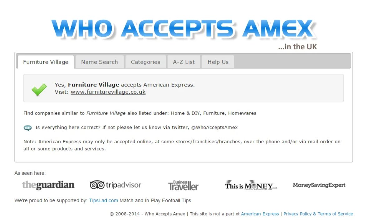
The 18px font size emerged as the clear winner, increasing clicks by 32.68%, significantly outperforming the control.
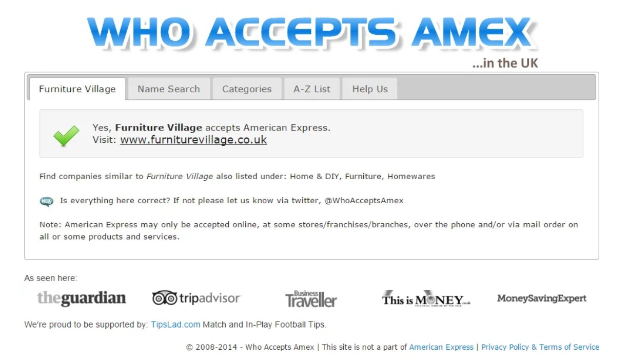
This success story highlights the crucial impact of font size on readability and user engagement, guiding future tests on other typographic elements like font color, size, etc., to further refine user experience and increase conversions.
Key takeaways
With millions of websites vying for attention, yours must deliver aesthetics and functionality. Modern web design demands ongoing evaluation to ensure your site offers engaging visuals, compelling content, and a consistent user experience across all devices.
The strategies discussed provide a robust framework for developing stylish, efficient, responsive websites that capture user interest and boost conversions.
Remember to validate your design decisions with A/B testing and split-URL testing. With VWO, these tests are easy to set up and execute. The intuitive reports will help you make faster decisions, stay ahead of your competition, and deliver the best user experiences.