Bizztravel Wintersports Tested Navigation To Achieve A Jump In Conversions
VWO and Bizztravel Wintersports
A leading player in the Dutch online travel industry, the Bizz Travel Group, specializes in creating its own leisure products and selling them directly to consumers through its websites. Bizztravel Wintersport is a part of the Bizz Travel Group and specializes in skiing holiday packages in the Alps.
Bizztravel Wintersport used VWO tools to test changes to its website that would improve conversions.
Goals
The company undertook A/B testing to test the best navigation design that would enable better visitor engagement by making information easily accessible thereby improving its conversion rate.
Tests run
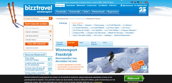
This is what Bizztravel’s original navigation and region page looked like:
Google Analytics statistics revealed that:
- Site search is used often to search for ski village names, such as Gerlos and Val Thorens.
- About 23% of visitors enter through the home page, but the rest enter deeper into the site. They are forced to try and navigate through a Country > Region > Village system to find a ski village.
- A visitor clicks an average of 5 times before clicking a ski village link.
Bizztravel Wintersports’ site navigation did not reflect the manner in which visitors looked for a winter sports vacation. On clicking the tabs on the header, visitors were taken to the region page that didn’t show them the information they were looking for. Consequently, they were forced to browse through a ski region layer before getting to ski villages.
For example, many visitors do not know that the village of Flaine is located in the region of Le Grand Massif. So, to find the Flaine page on the original website, a visitor had to click through an average of 5 regions. The site navigation caused visitors to get lost during the seemingly simple task of finding a vacation. Not surprisingly, many visitors bounced.
The bottom line: About 75% of visitors never even saw the website home page!
The Bizztravel team decided to simplify navigation to ensure that visitors would find what they were looking for. They came up with a new page header with navigation structured in such a way that visitors could find and visit target pages from anywhere on the site.
The underlying premise was that a clear and simple navigation menu would allow visitors to find their desired page faster, and this would reduce early exits caused by frustration. It was also expected that these changes would increase conversion rates. VWO heatmaps were used to analyze where users spent the most time. This provided clues to what the most prominent offerings on the header ought to be.
Based on the information gathered and subsequent analysis, the following changes were made to the navigation header:
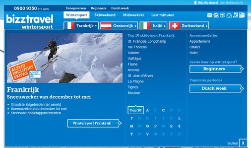
- Direct links to ski villages (such as Gerlos, Val Thorens, and Flaine) were added.
- Direct links were added to special marketing theme pages (examples: Christmas and New Year vacations).
- A link to a list of Bizztravel’s 10 most popular ski village destinations was added.
- Country flags were added to make it easy for visitors to figure out where the destination was.
- Company information and less relevant links were moved to the footer.
The variation had a drop-down menu that reduced the need for visitors to rummage through the clutter of information in the control. The variation gave visitors easier access to information they might be looking for, say “Top 10 skiing destinations in France.”
The navigation A/B test pitted the variation against the original (control). The primary goal of the A/B test was to track visits to Bizztravel’s “Thank You” page (Bedankt). During the test, visitors were randomly directed to either the control page that showed the old header or the variation that incorporated all the design changes outlined above.
Bizztravel’s winning variation looked like this:
Result: Compared to the original, the redesigned navigation registered a 21.34% higher goal completion. The results had an associated confidence level of 97%.
Conclusion
The results of this test offered useful insights for web design and navigation:
- The navigation menu should be designed keeping in mind user preferences. Understand what the user expects, and then design the menu accordingly.
- The menu should have clear subcategories. List only the most important ones, as a long drop-down list can overwhelm visitors.
- All pages of the website should display the navigation menu so that a visitor can access any page from anywhere on the site.
- Pay attention to how tabs are named so that visitors get exactly what you say you offer (and what they expect).

Location
Groningen, Netherlands
Industry
Travel
Impact
21% increase in Conversion