Underwater Audio Updated Information To Increase Revenue
VWO and Underwater Audio
Underwater Audio is a US-based supplier of products such as aqua goggles, swimbuds, headphones, and waterproof iPods. Customers from several countries around the globe order their exclusive products through its eCommerce website.
The company uses the VWO platform for its website optimization requirements.
Goals
The company’s eCommerce site and its product comparison page received sufficient traffic. However, engagement on its website was relatively low. This led to low conversions to sales. So, the objective of this campaign was to improve engagement and sales.
Tests run
This is what the original product comparison page looked like:
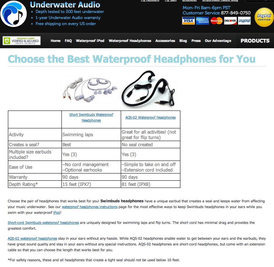
As Emily from Underwater Audio said, “The (rather) unattractive table had information in terse phrases organized in no particular fashion (activity, seal, size, features, warranty, depth). The paragraphs continued below the fold and essentially repeated the table, with only a few unique additions hidden in the text. In short, it was not the most engaging page!”.
The test hypothesis was that providing product information concisely to make it easier for visitors to comprehend the key features and benefits of different products available would highlight the value clearly and enable prospects to make the purchase decision easily.
Underwater Audio created a Challenger page and A/B tested it against the original page. The test was set up and run by using the VWO platform.
This is what variation looked like:
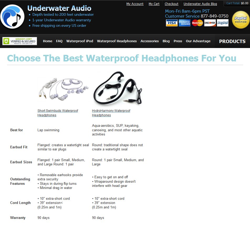
The redesigned page (the variation) featured the following changes:
- Product specifications were organized under easy-to-read headings that represented typical information elements that prospects needed to make their decision. Product features and specifications were detailed for better clarity.
- Additional information about 2 headphones that was earlier detailed in the paragraphs below-the-fold was included in the table itself.
- Instead of showing several call-to-action links on the page, only one link to each product page was retained. This made the action on the page clearer for the visitors.
- The table layout was improved; the whitespace on the page was better utilized to make the division between the columns clear without the thick cell borders that ruined the aesthetic appeal of the page.
- The font of the page was changed to make it consistent with the rest of the site.
Conclusion
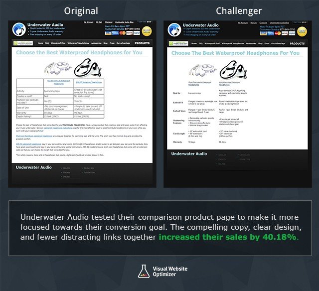
The test hypothesis was proved right, with the challenger beating the original to deliver 40.81% higher sales.
Here’s the comparison image for easy reference:
So, why did the redesigned page prove to be more effective?
Customers expect specific information to help them make up their minds. Specificity is one of the most important basics of effective copywriting because it answers the visitor’s question around “what’s in it for me” (W.I.I.F.M.). Would you buy something online if you are not sure of its benefits?
Websites that provide such information are better positioned to persuade visitors to buy.
The redesigned page scored on these counts:
- It provided prospects with the information they needed to make their decision. More important, the information was easy to spot and hence easy to read comprehend.
- It eliminated distractions by reducing the number of call-to-actions on the page.

Location
US
Industry
Retail
Impact
40.81% increase in Revenue