It is interesting how counter-intuitive A/B testing results can get. One of the best examples of that counter-intuitiveness is a recent A/B split test. This test was done by a Visual Website Optimizer customer Vendio, an Alibaba.com company that specializes in providing free e-Commerce stores to its merchants. They have special landing pages for the free store signup and the objective of this test was to increase signup conversion rate on one of those landing pages.
A/B test details
Their original landing page (control) combined marketing content and registration fields in an attempt to reduce the number of clicks for a successful registration. This is how it looked:
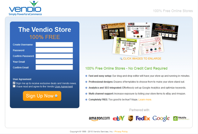
Original Landing Page (with embedded signup form)
Note that it uses the so-called “best-practice” of embedding the signup form in the landing page itself. They had long been using the layout of the original page because as a best practice they presumed that reducing the number of clicks for a registration increased conversion rate. Although the page was performing relatively well, they wanted to make sure the included registration fields weren’t too aggressive or limiting in any manner.
So, the variation that they tested had somewhat similar imagery and content but the page didn’t include any registration fields and had slightly different styling. Clicking on ‘Signup Now’ button simply took the visitor to a page with signup form. In other words, Vendio added an extra step in their conversion funnel. Not a smart move, huh? This is how variation looked like:
Variation (no signup form) – 60% increase in signups!
A/B test results
Guess what? The page without the registration fields performed better – much better – to the tune of a 60% increase in conversions! Here is what Vendio had to say about the results:
Best practices are NOT always true! It’s still hard to believe, but the numbers don’t lie.
So, that’s the biggest lesson here and it is worth repeating: “Best practices are NOT always true”. If you do changes on your website or landing pages without A/B testing them, you are actually flying in the dark. Another lesson here is that it is it is worth testing radically different ideas – which, on the first glance, may appear not-so-smart (like removing signup form from the landing page!).
Testimonial about Visual Website Optimizer
After the successful test, Vendio gave us a great testimonial:
Visual Website Optimizer was extraordinarily valuable. It was far easier to use than other solutions (some of which we couldn’t even get to work properly after implementation). Without VWO we would still be missing out on all those registrations, and we are continuing to see great and other surprising results with VWO.
Comments (43)
It’s not anti-intuitive for me at all. I much prefer the second version. The first one looks “spammy”, just like one of those “parked” domains websites, that you only need one glance to spot.
I don’t know why, though.
The first version makes the signup form too prominent while the second version is showing what the products is before trying to make me sign up.
I’m pretty sure that you can keep the signup form on the same page with a solid design like the second version that would make the signup form less prominent on the page.
In one sentence: show me what you sell and let me decide what to do. That’s the best practice.
I think it’s pretty obvious, the 2nd version has a bigger title text – they see exactly what it is straight away. That title text contains the word ‘free’.
Don’t you think that part of the reason is actually that on the second layout 100% Free is much more visible than on the first one? I would guess that the whether customer sees 100% free promotion makes much bigger impact on conversion then moving the form from one page to another.
@Janusz: yes, a big reason for why variation performed well is because it has large “Free E-commerce store” written in the headline. Moreover, in control page, the form competed for attention with product description. In variation, the description and the pitch gets full attention of the visitor.
@Paras: “Moreover, in control page, the form competed for attention with product description.”
..Actually, I would say the product description competed for attention with the Form. Since reading is done left to right and dark bold colors tend to attract focus, my guess is that users focused too much on the sign-up form and were less inclined to spend additional time reading the messaging content.
I wonder what the test results would have shown if the form was moved to the right or bottom of the page and different colors were used.
…maybe the best practice is sound but the execution was flawed….
@Mark: There are so many variables affecting conversions that it is hard to tell (without testing) what could have worked better. Yes, probably shifting signup form to the left and toning down the color would have worked. But who knows unless we do an actual A/B test?
This is not a proper A/B test. There are too many uncontrolled variables.
All that you can say is that the second design resulted in 60% more conversions.
This you can take as an indication that the second design is more successful, you can in no way whatsoever conclude that it is because of the sign-up form.
It may be because of the sign-up form, it may be because of the different layout, it may be because of the big “100% free”, it may be because the people involved just happened to not like blue.
The only way to come to a proper conclusion is to run an A/B test on two designs for which the ONLY difference is the feature you’re investigating.
@Ian: yes, it is hard to say the *exact* factor which resulted in better conversions. In an ideal world, you would vary one factor at a time. But most organizations don’t have luxury of time and traffic. So they have to take this approach. But you are right we can only guess that removal of signup form is the cause but cannot be certain because the test provides no evidence for it.
(Just to be clear.. I do actually think that it is because of the signup form, they’re ensuring that the first impression of the page is always the sales pitch rather than an intimidating form, they don’t see the form until they are already bought into the idea. However it is quite wrong to claim that this A/B test provides evidence of that)
Yep – for your purposes it’s not too relevant, as you’ve demonstrated that the second design is the one to go for. Regardless of whether you have the resources available to investigate the exact reasons you have still arrived at a more successful product.
However it’s very relevant for the purposes of this article, which is obviously false and misleading both in title and content.
Ironically, it’s precisely because of the wrong conclusions being drawn and evidence falsely attributed that you end up with the kind of incorrect best practices that the article is referencing.
“Spammy” is the first thing that came to mind when I saw the first version. I think people want to decide when they’ll like to see the registration form. Also, after clicking to link to sign up, the user has already made some sort of commitment and is more likely to follow through.
“Don’t give them what you want them to have, give them what they want and when they want it.” Well, what I really mean is that you at the very least should build your funnel to make them feel like it’s all their choice!
Huh? You mean the way Google has been doing this with their minimal sign up pages (for many years now) actually makes sense?
Great topic! Never knew.
I like the 2nd one, because it concentrates on telling me the value add, before wasting space on a sign up form, before I understand why I need it.
http://tech.rawsignal.com
Honestly the 2nd page looks much more professional and I would be more inclined to click the sign up button based on the design changes.
worst a/b testing ever. way too many variables.
The page that had a higher sign-up rate seems to funnel the eye down more to the sign-up button. The first page would probably make most people click off before even reading anything because no one wants to sign-up for anything anymore unless they feel they have already be locked in somewhat. Great case-study though and teaches everyone to test everything.
There is no such thing as “best practices”.
Anyone who uses this term is trying to convince you of something. And in my experience that person is usually ignoring the realities of the local landscape.
Always know your customers.
Form B does not perform better because it is less ‘pitchy’ –
The act of clicking on SignUp psychologically commits the user to fill out a form.
The original page had to call to action for the form . Plus the form was on the left, people read left to right and they need the pitch first before they sign up. The first page was just BAD…no wonder you saw such a large change.
*NO call to action
Interesting article,
That was one of the first experiments we created when we started to use A/B testings, and really surprising for us it showed interesting cultural differences across the markets where we operated.
As you have said, our conclusion was “never assume the best practices are true”. For all of you operating across different countries it reinforces the needing of a specific strategy of testing across countries.
Very good article, thanks for writting it.
jordi
To do a/b testing, you should change ONE variable. This abcdefghijk/lmnopqrs… testing.
the “no credit card required” language alone in the first layout looks creepy, just getting that out alone may well have made all the difference, but we’ll never know because of all the variables changed.
Funny…
If you look up their site and click on the Adwords ad, they are STILL using the optin form.
Maybe this article isn’t all it’s cracked up to be.
flawed spit test..
come on guys!
it’s not an apple to apple comparison.
test your new design with and without a sign up form below…
sign up will win.
really poor thought process on this one…
Agree with Marc.
It’s not an apple-to-apple comparison.
My opinion? The headline (100% FREE Ecommerce Website) is more prominent in the formless design.
The form is not a magic deterrent.
Design 1 “leads” with the form and not the value proposition. It focuses on “SIGN UP” … but for what?
In design 2, the value proposition is more prominent and the user feels confident and empowered (informed) — so they sign up.
Still interesting.
I think “best practices” are constantly evolving and A/B testing is one of the most important methods to ensure that what you think is “best practice” is actually the case right now. I agree with others that the first does seem to “sales” but the second is more informative.
I’m just learning about testing and landing pages and I’m a bit confused. How much of the site do I have to change? If I change a lot, how do I know which change actually made a difference?
Interesting test – though it is not the first time it is seen that asking for too much in the begining of a process leads to lower conversion..
Great post. I am a huge fan of data-driven design.
I do think, however, that you changed multiple variables at once in this A/B test. So there is a little bit of confusion about what the effect of the signup-form removal was vs. the effect of the other changes.